Statistical Rethinking
A Bayesian Course with Examples in R and Stan

Statistical Rethinking
CHAPMAN & HALL/CRC Texts in Statistical Science Series
Joseph K. Blitzstein, Harvard University, USA Julian J. Faraway, University of Bath, UK Martin Tanner, Northwestern University, USA Jim Zidek, University of British Columbia, Canada
Recently Published Titles
Theory of Spatial Statistics
A Concise Introduction M.N.M van Lieshout
Bayesian Statistical Methods
Brian J. Reich and Sujit K. Ghosh
Sampling
Design and Analysis, Second Edition Sharon L. Lohr
The Analysis of Time Series
An Introduction with R, Seventh Edition Chris Chatfield and Haipeng Xing
Time Series
A Data Analysis Approach Using R Robert H. Shumway and David S. Stoffer
Practical Multivariate Analysis, Sixth Edition
Abdelmonem Afifi, Susanne May, Robin A. Donatello, and Virginia A. Clark
Time Series: A First Course with Bootstrap Starter
Tucker S. McElroy and Dimitris N. Politis
Probability and Bayesian Modeling
Jim Albert and Jingchen Hu
Surrogates
Gaussian Process Modeling, Design, and Optimization for the Applied Sciences Robert B. Gramacy
Statistical Analysis of Financial Data
With Examples in R James Gentle
Statistical Rethinking
A Bayesian Course with Examples in R and Stan, Second Edition Richard McElreath
For more information about this series, please visit: https://www.crcpress.com/Chapman– HallCRC-Texts-in-Statistical-Science/book-series/CHTEXSTASCI
Statistical Rethinking
A Bayesian Course with Examples in R and Stan
Second Edition
Richard McElreath

Second edition published 2020 by CRC Press 6000 Broken Sound Parkway NW, Suite 300, Boca Raton, FL 33487-2742
and by CRC Press 2 Park Square, Milton Park, Abingdon, Oxon, OX14 4RN
© 2020 Taylor & Francis Group, LLC
First edition published by CRC Press 2015
CRC Press is an imprint of Taylor & Francis Group, LLC
Reasonable efforts have been made to publish reliable data and information, but the author and publisher cannot assume responsibility for the validity of all materials or the consequences of their use. The authors and publishers have attempted to trace the copyright holders of all material reproduced in this publication and apologize to copyright holders if permission to publish in this form has not been obtained. If any copyright material has not been acknowledged please write and let us know so we may rectify in any future reprint.
Except as permitted under U.S. Copyright Law, no part of this book may be reprinted, reproduced, transmitted, or utilized in any form by any electronic, mechanical, or other means, now known or hereafter invented, including photocopying, microfilming, and recording, or in any information storage or retrieval system, without written permission from the publishers.
For permission to photocopy or use material electronically from this work, access www.copyright.com or contact the Copyright Clearance Center, Inc. (CCC), 222 Rosewood Drive, Danvers, MA 01923, 978-750-8400. For works that are not available on CCC please contact mpkbookspermissions@tandf.co.uk
Trademark notice: Product or corporate names may be trademarks or registered trademarks, and are used only for identification and explanation without intent to infringe.
Library of Congress Cataloging‑in‑Publication Data
Library of Congress Control Number:2019957006
ISBN: 978-0-367-13991-9 (hbk) ISBN: 978-0-429-02960-8 (ebk)
Contents
| Preface to the Second Edition | |
|---|---|
| Preface | xi |
| Audience Teaching strategy |
xi xii |
| How to use this book | xii |
| Installing the rethinking R package |
xvi |
| Acknowledgments | xvi |
| Chapter 1. The Golem of Prague |
1 |
| 1.1. Statistical golems |
1 |
| 1.2. Statistical rethinking |
4 |
| 1.3. Tools for golem engineering |
10 |
| 1.4. Summary |
17 |
| Chapter 2. Small Worlds and Large Worlds |
19 |
| 2.1. The garden of forking data |
20 |
| 2.2. Building a model |
28 |
| 2.3. Components of the model |
32 |
| 2.4. Making the model go |
36 |
| 2.5. Summary |
46 |
| 2.6. Practice |
46 |
| Chapter 3. Sampling the Imaginary |
49 |
| 3.1. Sampling from a grid-approximate posterior |
52 |
| 3.2. Sampling to summarize |
53 |
| 3.3. Sampling to simulate prediction |
61 |
| 3.4. Summary |
68 |
| 3.5. Practice |
68 |
| Chapter 4. Geocentric Models |
71 |
| 4.1. Why normal distributions are normal |
72 |
| 4.2. A language for describing models |
77 |
| 4.3. Gaussian model of height |
78 |
| 4.4. Linear prediction |
91 |
| 4.5. Curves from lines |
110 |
| 4.6. Summary |
120 |
| 4.7. Practice |
120 |
| Chapter 5. The Many Variables & The Spurious Waffles |
123 |
| 5.1. Spurious association |
125 |
| 5.2. Masked relationship |
144 |
| 5.3. | Categorical variables | 153 |
|---|---|---|
| 5.4. | Summary | 158 |
| 5.5. | Practice | 159 |
| Chapter 6. | The Haunted DAG & The Causal Terror | 161 |
| 6.1. | Multicollinearity | 163 |
| 6.2. | Post-treatment bias | 170 |
| 6.3. | Collider bias | 176 |
| 6.4. | Confronting confounding | 183 |
| 6.5. | Summary | 189 |
| 6.6. | Practice | 189 |
| Chapter 7. 7.1. |
Ulysses’ Compass The problem with parameters |
191 193 |
| 7.2. 7.3. |
Entropy and accuracy Golem taming: regularization |
202 214 |
| 7.4. 7.5. |
Predicting predictive accuracy Model comparison |
217 225 |
| 7.6. | Summary | 235 |
| 7.7. | Practice | 235 |
| Chapter 8. | Conditional Manatees | 237 |
| 8.1. | Building an interaction | 239 |
| 8.2. | Symmetry of interactions | 250 |
| 8.3. | Continuous interactions | 252 |
| 8.4. | Summary | 260 |
| 8.5. | Practice | 260 |
| Chapter 9. | Markov Chain Monte Carlo | 263 |
| 9.1. | Good King Markov and his island kingdom | 264 |
| 9.2. | Metropolis algorithms | 267 |
| 9.3. | Hamiltonian Monte Carlo | 270 |
| 9.4. | Easy HMC: ulam |
279 |
| 9.5. | Care and feeding of your Markov chain | 287 |
| 9.6. | Summary | 296 |
| 9.7. | Practice | 296 |
| Chapter 10. | Big Entropy and the Generalized Linear Model | 299 |
| 10.1. | Maximum entropy | 300 |
| 10.2. | Generalized linear models | 312 |
| 10.3. | Maximum entropy priors | 321 |
| 10.4. | Summary | 321 |
| Chapter 11. | God Spiked the Integers | 323 |
| 11.1. | Binomial regression | 324 |
| 11.2. | Poisson regression | 345 |
| 11.3. | Multinomial and categorical models | 359 |
| 11.4. | Summary | 365 |
| 11.5. | Practice | 366 |
| Chapter 12. | Monsters and Mixtures | 369 |
| 12.1. | Over-dispersed counts | 369 |
| 12.2. | Zero-inflated outcomes | 376 |
| 12.3. Ordered categorical outcomes |
380 |
|---|---|
| 12.4. Ordered categorical predictors |
391 |
| 12.5. Summary |
397 |
| 12.6. Practice |
397 |
| Chapter 13. Models With Memory |
399 |
| 13.1. Example: Multilevel tadpoles |
401 |
| 13.2. Varying effects and the underfitting/overfitting trade-off |
408 |
| 13.3. More than one type of cluster |
415 |
| 13.4. Divergent transitions and non-centered priors |
420 |
| 13.5. Multilevel posterior predictions |
426 |
| 13.6. Summary |
431 |
| 13.7. Practice |
431 |
| Chapter 14. Adventures in Covariance |
435 |
| 14.1. Varying slopes by construction |
437 |
| 14.2. Advanced varying slopes |
447 |
| 14.3. Instruments and causal designs |
455 |
| 14.4. Social relations as correlated varying effects |
462 |
| 14.5. Continuous categories and the Gaussian process |
467 |
| 14.6. Summary |
485 |
| 14.7. Practice |
485 |
| Chapter 15. Missing Data and Other Opportunities |
489 |
| 15.1. Measurement error |
491 |
| 15.2. Missing data |
499 |
| 15.3. Categorical errors and discrete absences |
516 |
| 15.4. Summary |
521 |
| 15.5. Practice |
521 |
| Chapter 16. Generalized Linear Madness |
525 |
| 16.1. Geometric people |
526 |
| 16.2. Hidden minds and observed behavior |
531 |
| 16.3. Ordinary differential nut cracking |
536 |
| 16.4. Population dynamics |
541 |
| 16.5. Summary |
550 |
| 16.6. Practice |
550 |
| Chapter 17. Horoscopes |
553 |
| Endnotes | 557 |
| Bibliography | 573 |
| Citation index | 585 |
| Topic index | 589 |

Preface to the Second Edition
It came as a complete surprise to me that I wrote a statistics book. It is even more surprising how popular the book has become. But I had set out to write the statistics book that I wish I could have had in graduate school. No one should have to learn this stuff the way I did. I am glad there is an audience to benefit from the book.
It consumed five years to write it. There was an initial set of course notes, melted down and hammered into a first 200-page manuscript. I discarded that first manuscript. But it taught me the outline of the book I really wanted to write. Then, several years of teaching with the manuscript further refined it.
Really, I could have continued refining it every year. Going to press carries the penalty of freezing a dynamic process of both learning how to teach the material and keeping up with changes in the material. As time goes on, I see more elements of the book that I wish I had done differently. I’ve also received a lot of feedback on the book, and that feedback has given me ideas for improving it.
So in the second edition, I put those ideas into action. The major changes are:
The R package has some new tools. The map tool from the first edition is still here, but now it is named quap. This renaming is to avoid misunderstanding. We just used it to get a quadratic approximation to the posterior. So now it is named as such. A bigger change is that map2stan has been replaced by ulam. The new ulam is very similar to map2stan, and in many cases can be used identically. But it is also much more flexible, mainly because it does not make any assumptions about GLM structure and allows explicit variable types. All the map2stan code is still in the package and will continue to work. But now ulam allows for much more, especially in later chapters. Both of these tools allow sampling from the prior distribution, using extract.prior, as well as the posterior. This helps with the next change.
Much more prior predictive simulation. A prior predictive simulation means simulating predictions from a model, using only the prior distribution instead of the posterior distribution. This is very useful for understanding the implications of a prior. There was only a vestigial amount of this in the first edition. Now many modeling examples have some prior predictive simulation. I think this is one of the most useful additions to the second edition, since it helps so much with understanding not only priors but also the model itself.
More emphasis on the distinction between prediction and inference. Chapter 5, the chapter on multiple regression, has been split into two chapters. The first chapter focuses on helpful aspects of regression; the second focuses on ways that it can mislead. This allows as well a more direct discussion of causal inference. This means that DAGs—directed acyclic
graphs—make an appearance. The chapter on overfitting, Chapter 7 now, is also more direct in cautioning about the predictive nature of information criteria and cross-validation. Cross-validation and importance sampling approximations of it are now discussed explicitly.
New model types. Chapter 4 now presents simple splines. Chapter 7 introduces one kind or robust regression. Chapter 12 explains how to use ordered categorical predictor variables. Chapter 13 presents a very simple type of social network model, the social relations model. Chapter 14 has an example of a phylogenetic regression, with a somewhat critical and heterodox presentation. And there is an entirely new chapter, Chapter 16, that focuses on models that are not easily conceived of as GLMMs, including ordinary differential equation models.
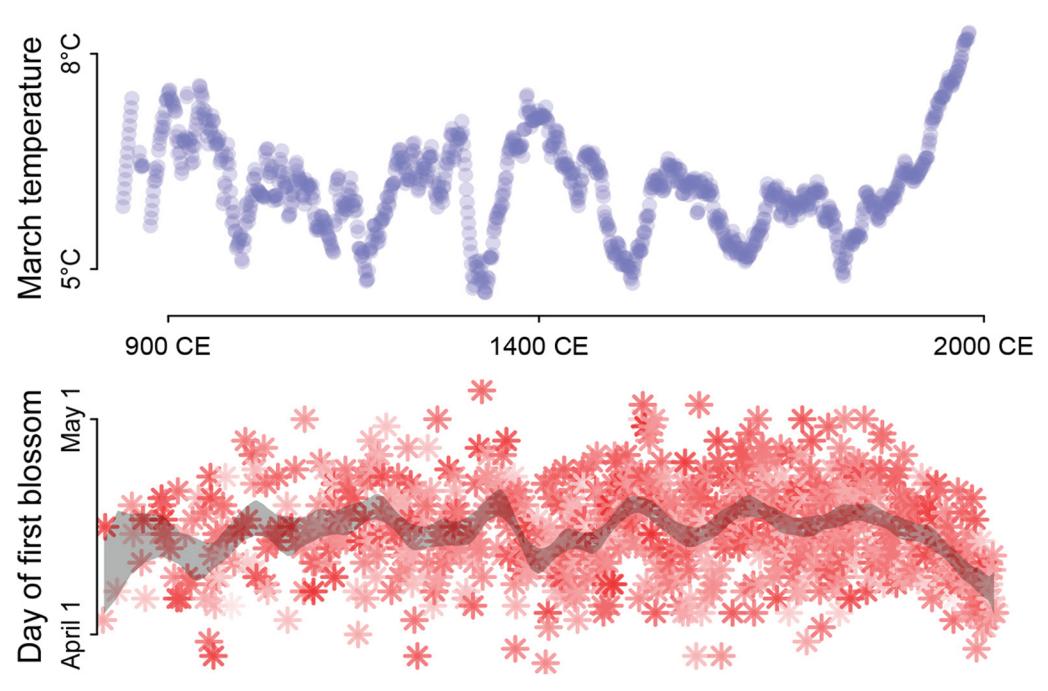
Some new data examples. There are some new data examples, including the Japanese cherry blossoms time series on the cover and a larger primate evolution data set with 300 species and a matching phylogeny.
More presentation of raw Stan models. There are many more places now where raw Stan model code is explained. I hope this makes a transition to working directly in Stan easier. But most of the time, working directly in Stan is still optional.
Kindness and persistence. As in the first edition, I have tried to make the material as kind as possible. None of this stuff is easy, and the journey into understanding is long and haunted. It is important that readers expect that confusion is normal. This is also the reason that I have not changed the basic modeling strategy in the book.
First, I force the reader to explicitly specify every assumption of the model. Some readers of the first edition lobbied me to use simplified formula tools like brms or rstanarm. Those are fantastic packages, and graduating to use them after this book is recommended. But I don’t see how a person can come to understand the model when using those tools. The priors being hidden isn’t the most limiting part. Instead, since linear model formulas like y ~ (1|x) + z don’t show the parameters, nor even all of the terms, it is not easy to see how the mathematical model relates to the code. It is ultimately kinder to be a bit cruel and require more work. So the formula lists remain. You’ll thank me later.
Second, half the book goes by before MCMC appears. Some readers of the first edition wanted me to start instead with MCMC. I do not do this because Bayes is not about MCMC. We seek the posterior distribution, but there are many legitimate approximations of it. MCMC is just one set of strategies. Using quadratic approximation in the first half also allows a clearer tie to non-Bayesian algorithms. And since finding the quadratic approximation is fast, it means readers don’t have to struggle with too many things at once.
Thanks. Many readers and colleagues contributed comments that improved upon the first edition. There are too many to name individually. Several anonymous reviewers provided many pages of constructive criticism. Bret Beheim and Aki Vehtari commented on multiple chapters. My colleagues at the Max Planck Institute for Evolutionary Anthropology in Leipzig made the largest contributions, by working through draft chapters and being relentlessly honest.
Richard McElreath Leipzig, 14 December 2019
Preface
Masons, when they start upon a building, Are careful to test out the scaffolding;
Make sure that planks won’t slip at busy points, Secure all ladders, tighten bolted joints.
And yet all this comes down when the job’s done Showing off walls of sure and solid stone.
So if, my dear, there sometimes seem to be Old bridges breaking between you and me
Never fear. We may let the scaffolds fall Confident that we have built our wall.
(“Scaffolding” by Seamus Heaney, 1939–2013)
This book means to help you raise your knowledge of and confidence in statistical modeling. It is meant as a scaffold, one that will allow you to construct the wall that you need, even though you will discard it afterwards. As a result, this book teaches the material in often inconvenient fashion, forcing you to perform step-by-step calculations that are usually automated. The reason for all the algorithmic fuss is to ensure that you understand enough of the details to make reasonable choices and interpretations in your own modeling work. So although you will move on to use more automation, it’s important to take things slow at first. Put up your wall, and then let the scaffolding fall.
Audience
The principle audience is researchers in the natural and social sciences, whether new PhD students or seasoned professionals, who have had a basic course on regression but nevertheless remain uneasy about statistical modeling. This audience accepts that there is something vaguely wrong about typical statistical practice in the early twenty-first century, dominated as it is by p-values and a confusing menagerie of testing procedures. They see alternative methods in journals and books. But these people are not sure where to go to learn about these methods.
As a consequence, this book doesn’t really argue against p-values and the like. The problem in my opinion isn’t so much p-values as the set of odd rituals that have evolved around
them, in the wilds of the sciences, as well as the exclusion of so many other useful tools. So the book assumes the reader is ready to try doing statistical inference without p-values. This isn’t the ideal situation. It would be better to have material that helps you spot common mistakes and misunderstandings of p-values and tests in general, as all of us have to understand such things, even if we don’t use them. So I’ve tried to sneak in a little material of that kind, but unfortunately cannot devote much space to it. The book would be too long, and it would disrupt the teaching flow of the material.
It’s important to realize, however, that the disregard paid to p-values is not a uniquely Bayesian attitude. Indeed, significance testing can be—and has been—formulated as a Bayesian procedure as well. So the choice to avoid significance testing is stimulated instead by epistemological concerns, some of which are briefly discussed in the first chapter.
Teaching strategy
The book uses much more computer code than formal mathematics. Even excellent mathematicians can have trouble understanding an approach, until they see a working algorithm. This is because implementation in code form removes all ambiguities. So material of this sort is easier to learn, if you also learn how to implement it.
In addition to any pedagogical value of presenting code, so much of statistics is now computational that a purely mathematical approach is anyways insufficient. As you’ll see in later parts of this book, the same mathematical statistical model can sometimes be implemented in different ways, and the differences matter. So when you move beyond this book to more advanced or specialized statistical modeling, the computational emphasis here will help you recognize and cope with all manner of practical troubles.
Every section of the book is really just the tip of an iceberg. I’ve made no attempt to be exhaustive. Rather I’ve tried to explain something well. In this attempt, I’ve woven a lot of concepts and material into data analysis examples. So instead of having traditional units on, for example, centering predictor variables, I’ve developed those concepts in the context of a narrative about data analysis. This is certainly not a style that works for all readers. But it has worked for a lot of my students. I suspect it fails dramatically for those who are being forced to learn this information. For the internally motivated, it reflects how we really learn these skills in the context of our research.
How to use this book
This book is not a reference, but a course. It doesn’t try to support random access. Rather, it expects sequential access. This has immense pedagogical advantages, but it has the disadvantage of violating how most scientists actually read books.
This book has a lot of code in it, integrated fully into the main text. The reason for this is that doing model-based statistics in the twenty-first century requires simple programming. The code is really not optional. Everyplace, I have erred on the side of including too much code, rather than too little. In my experience teaching scientific programming, novices learn more quickly when they have working code to modify, rather than needing to write an algorithm from scratch. My generation was probably the last to have to learn some programming to use a computer, and so coding has gotten harder and harder to teach as time goes on. My students are very computer literate, but they sometimes have no idea what computer code looks like.
What the book assumes. This book does not try to teach the reader to program, in the most basic sense. It assumes that you have made a basic effort to learn how to install and process data in R. In most cases, a short introduction to R programming will be enough. I know many people have found Emmanuel Paradis’ R for Beginners helpful. You can find it and many other beginner guides here:
http://cran.r-project.org/other-docs.html
To make use of this book, you should know already that y<-7 stores the value 7 in the symbol y. You should know that symbols which end in parentheses are functions. You should recognize a loop and understand that commands can be embedded inside other commands (recursion). Knowing that R vectorizes a lot of code, instead of using loops, is important. But you don’t have to yet be confident with R programming.
Inevitably you will come across elements of the code in this book that you haven’t seen before. I have made an effort to explain any particularly important or unusual programming tricks in my own code. In fact, this book spends a lot of time explaining code. I do this because students really need it. Unless they can connect each command to the recipe and the goal, when things go wrong, they won’t know whether it is because of a minor or major error. The same issue arises when I teach mathematical evolutionary theory—students and colleagues often suffer from rusty algebra skills, so when they can’t get the right answer, they often don’t know whether it’s because of some small mathematical misstep or instead some problem in strategy. The protracted explanations of code in this book aim to build a level of understanding that allows the reader to diagnose and fix problems.
Why R. This book uses R for the same reason that it uses English: Lots of people know it already. R is convenient for doing computational statistics. But many other languages are equally fine. I recommend Python (especially PyMC) and Julia as well. The first edition ended up with code translations for various languages and styles. Hopefully, the second edition will as well.
Using the code. Code examples in the book are marked by a shaded box, and output from example code is often printed just beneath a shaded box, but marked by a fixed-width typeface. For example:
R code print( "All models are wrong, but some are useful." ) 0.1[1] “All models are wrong, but some are useful.”
Next to each snippet of code, you’ll find a number that you can search for in the accompanying code snippet file, available from the book’s website. The intention is that the reader follow along, executing the code in the shaded boxes and comparing their own output to that printed in the book. I really want you to execute the code, because just as one cannot learn martial arts by watching Bruce Lee movies, you can’t learn to program statistical models by only reading a book. You have to get in there and throw some punches and, likewise, take some hits.
If you ever get confused, remember that you can execute each line independently and inspect the intermediate calculations. That’s how you learn as well as solve problems. For example, here’s a confusing way to multiply the numbers 10 and 20:
R code x <- 1:2 0.2
        x <- x*10
        x <- log(x)
        x <- sum(x)
        x <- exp(x)
        x
200
If you don’t understand any particular step, you can always print out the contents of the symbol x immediately after that step. For the code examples, this is how you come to understand them. For your own code, this is how you find the source of any problems and then fix them.
Optional sections. Reflecting realism in how books like this are actually read, there are two kinds of optional sections: (1) Rethinking and (2) Overthinking. The Rethinking sections look like this:
Rethinking: Think again. The point of these Rethinking boxes is to provide broader context for the material. They allude to connections to other approaches, provide historical background, or call out common misunderstandings. These boxes are meant to be optional, but they round out the material and invite deeper thought.
The Overthinking sections look like this:
Overthinking: Getting your hands dirty. These sections, set in smaller type, provide more detailed explanations of code or mathematics. This material isn’t essential for understanding the main text. But it does have a lot of value, especially on a second reading. For example, sometimes it matters how you perform a calculation. Mathematics tells that these two expressions are equivalent:
\[\begin{aligned} p\_1 &= \log(0.01^{200}) \\ p\_2 &= 200 \times \log(0.01) \end{aligned}\]
But when you use R to compute them, they yield different answers:
R code
  0.3 ( log( 0.01^200 ) )
        ( 200 * log(0.01) )
[1] -Inf
[1] -921.034The second line is the right answer. This problem arises because of rounding error, when the computer rounds very small decimal values to zero. This loses precision and can introduce substantial errors in inference. As a result, we nearly always do statistical calculations using the logarithm of a probability, rather than the probability itself.
You can ignore most of these Overthinking sections on a first read.
The command line is the best tool. Programming at the level needed to perform twentyfirst century statistical inference is not that complicated, but it is unfamiliar at first. Why not just teach the reader how to do all of this with a point-and-click program? There are big advantages to doing statistics with text commands, rather than pointing and clicking on menus.
Everyone knows that the command line is more powerful. But it also saves you time and fulfills ethical obligations. With a command script, each analysis documents itself, so that years from now you can come back to your analysis and replicate it exactly. You can re-use your old files and send them to colleagues. Pointing and clicking, however, leaves no trail of breadcrumbs. A file with your R commands inside it does. Once you get in the habit of planning, running, and preserving your statistical analyses in this way, it pays for itself many times over. With point-and-click, you pay down the road, rather than only up front. It is also a basic ethical requirement of science that our analyses be fully documented and repeatable. The integrity of peer review and the cumulative progress of research depend upon it. A command line statistical program makes this documentation natural. A pointand-click interface does not. Be ethical.
So we don’t use the command line because we are hardcore or elitist (although we might be). We use the command line because it is better. It is harder at first. Unlike the point-andclick interface, you do have to learn a basic set of commands to get started with a command line interface. However, the ethical and cost saving advantages are worth the inconvenience.
How you should work. But I would be cruel, if I just told the reader to use a command-line tool, without also explaining something about how to do it. You do have to relearn some habits, but it isn’t a major change. For readers who have only used menu-driven statistics software before, there will be some significant readjustment. But after a few days, it will seem natural to you. For readers who have used command-driven statistics software like Stata and SAS, there is still some readjustment ahead. I’ll explain the overall approach first. Then I’ll say why even Stata and SAS users are in for a change.
The sane approach to scripting statistical analyses is to work back and forth between two applications: (1) a plain text editor of your choice and (2) the R program running in a terminal. There are several applications that integrate the text editor with the R console. The most popular of these is RStudio. It has a lot of options, but really it is just an interface that includes both a script editor and an R terminal.
A plain text editor is a program that creates and edits simple formatting-free text files. Common examples include Notepad (in Windows) and TextEdit (in Mac OS X) and Emacs (in most *NIX distributions, including Mac OS X). There is also a wide selection of fancy text editors specialized for programmers. You might investigate, for example, RStudio and the Atom text editor, both of which are free. Note that MSWord files are not plain text.
You will use a plain text editor to keep a running log of the commands you feed into the R application for processing. You absolutely do not want to just type out commands directly into R itself. Instead, you want to either copy and paste lines of code from your plain text editor into R, or instead read entire script files directly into R. You might enter commands directly into R as you explore data or debug or merely play. But your serious work should be implemented through the plain text editor, for the reasons explained in the previous section.
You can add comments to your R scripts to help you plan the code and remember later what the code is doing. To make a comment, just begin a line with the # symbol. To help clarify the approach, below I provide a very short complete script for running a linear regression on one of R’s built-in sets of data. Even if you don’t know what the code does yet, hopefully you will see it as a basic model of clarity of formatting and use of comments.
# see ?cars for details
data(cars)
# fit a linear regression of distance on speed
m <- lm( dist ~ speed , data=cars )
# estimated coefficients from the model
coef(m)
# plot residuals against speed
plot( resid(m) ~ speed , data=cars )
Even those who are familiar with scripting Stata or SAS will be in for some readjustment. Programs like Stata and SAS have a different paradigm for how information is processed. In those applications, procedural commands like PROC GLM are issued in imitation of menu commands. These procedures produce a mass of default output that the user then sifts through. R does not behave this way. Instead, R forces the user to decide which bits of information she wants. One fits a statistical model in R and then must issue later commands to ask questions about it. This more interrogative paradigm will become familiar through the examples in the text. But be aware that you are going to take a more active role in deciding what questions to ask about your models.
Installing the rethinking R package
The code examples require that you have installed the rethinking R package. This package contains the data examples and many of the modeling tools that the text uses. The rethinking package itself relies upon another package, rstan, for fitting the more advanced models in the second half of the book.
You should install rstan first. Navigate your internet browser to mc-stan.org and follow the instructions for your platform. You will need to install both a C++ compiler (also called the “tool chain”) and the rstan package. Instructions for doing both are at mc-stan.org. Then from within R, you can install rethinking with this code:
R code install.packages(c("coda","mvtnorm","devtools","dagitty")) 0.5
       library(devtools)
       devtools::install_github("rmcelreath/rethinking")
Note that rethinking is not on the CRAN package archive, at least not yet. You’ll always be able to perform a simple internet search and figure out the current installation instructions for the most recent version of the rethinking package. If you encounter any bugs while using the package, you can check github.com/rmcelreath/rethinking to see if a solution is already posted. If not, you can leave a bug report and be notified when a solution becomes available. In addition, all of the source code for the package is found there, in case you aspire to do some tinkering of your own. Feel free to “fork” the package and bend it to your will.
Acknowledgments
Many people have contributed advice, ideas, and complaints to this book. Most important among them have been the graduate students who have taken statistics courses from
me over the last decade, as well as the colleagues who have come to me for advice. These people taught me how to teach them this material, and in some cases I learned the material only because they needed it. A large number of individuals donated their time to comment on sections of the book or accompanying computer code. These include: Rasmus Bååth, Ryan Baldini, Bret Beheim, Maciek Chudek, John Durand, Andrew Gelman, Ben Goodrich, Mark Grote, Dave Harris, Chris Howerton, James Holland Jones, Jeremy Koster, Andrew Marshall, Sarah Mathew, Karthik Panchanathan, Pete Richerson, Alan Rogers, Cody Ross, Noam Ross, Aviva Rossi, Kari Schroeder, Paul Smaldino, Rob Trangucci, Shravan Vasishth, Annika Wallin, and a score of anonymous reviewers. Bret Beheim and Dave Harris were brave enough to provide extensive comments on an early draft. Caitlin DeRango and Kotrina Kajokaite invested their time in improving several chapters and problem sets. Mary Brooke McEachern provided crucial opinions on content and presentation, as well as calm support and tolerance. A number of anonymous reviewers provided detailed feedback on individual chapters. None of these people agree with all of the choices I have made, and all mistakes and deficiencies remain my responsibility. But especially when we haven’t agreed, their opinions have made the book stronger.
The book is dedicated to Dr. Parry M. R. Clarke (1977–2012), who asked me to write it. Parry’s inquisition of statistical and mathematical and computational methods helped everyone around him. He made us better.

1 The Golem of Prague
In the sixteenth century, the House of Habsburg controlled much of Central Europe, the Netherlands, and Spain, as well as Spain’s colonies in the Americas. The House was maybe the first true world power. The Sun shone always on some portion of it. Its ruler was also Holy Roman Emperor, and his seat of power was Prague. The Emperor in the late sixteenth century, Rudolph II, loved intellectual life. He invested in the arts, the sciences (including astrology and alchemy), and mathematics, making Prague into a world center of learning and scholarship. It is appropriate then that in this learned atmosphere arose an early robot, the Golem of Prague.
A golem (goh-lem) is a clay robot from Jewish folklore, constructed from dust and fire and water. It is brought to life by inscribing emet, Hebrew for “truth,” on its brow. Animated by truth, but lacking free will, a golem always does exactly what it is told. This is lucky, because the golem is incredibly powerful, able to withstand and accomplish more than its creators could. However, its obedience also brings danger, as careless instructions or unexpected events can turn a golem against its makers. Its abundance of power is matched by its lack of wisdom.
In some versions of the golem legend, Rabbi Judah Loew ben Bezalel sought a way to defend the Jews of Prague. As in many parts of sixteenth century Central Europe, the Jews of Prague were persecuted. Using secret techniques from the Kabbalah, Rabbi Judah was able to build a golem, animate it with “truth,” and order it to defend the Jewish people of Prague. Not everyone agreed with Judah’s action, fearing unintended consequences of toying with the power of life. Ultimately Judah was forced to destroy the golem, as its combination of extraordinary power with clumsiness eventually led to innocent deaths. Wiping away one letter from the inscription emet to spell instead met, “death,” Rabbi Judah decommissioned the robot.
1.1. Statistical golems
Scientists also make golems.1 Our golems rarely have physical form, but they too are often made of clay, living in silicon as computer code. These golems are scientific models. But these golems have real effects on the world, through the predictions they make and the intuitions they challenge or inspire. A concern with “truth” enlivens these models, but just like a golem or a modern robot, scientific models are neither true nor false, neither prophets nor charlatans. Rather they are constructs engineered for some purpose. These constructs are incredibly powerful, dutifully conducting their programmed calculations.
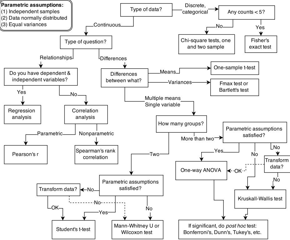
Figure 1.1. Example decision tree, or flowchart, for selecting an appropriate statistical procedure. Beginning at the top, the user answers a series of questions about measurement and intent, arriving eventually at the name of a procedure. Many such decision trees are possible.
Sometimes their unyielding logic reveals implications previously hidden to their designers. These implications can be priceless discoveries. Or they may produce silly and dangerous behavior. Rather than idealized angels of reason, scientific models are powerful clay robots without intent of their own, bumbling along according to the myopic instructions they embody. Like with Rabbi Judah’s golem, the golems of science are wisely regarded with both awe and apprehension. We absolutely have to use them, but doing so always entails some risk.
There are many kinds of statistical models. Whenever someone deploys even a simple statistical procedure, like a classical t-test, she is deploying a small golem that will obediently carry out an exact calculation, performing it the same way (nearly2 ) every time, without complaint. Nearly every branch of science relies upon the senses of statistical golems. In many cases, it is no longer possible to even measure phenomena of interest, without making use of a model. To measure the strength of natural selection or the speed of a neutrino or the number of species in the Amazon, we must use models. The golem is a prosthesis, doing the measuring for us, performing impressive calculations, finding patterns where none are obvious.
However, there is no wisdom in the golem. It doesn’t discern when the context is inappropriate for its answers. It just knows its own procedure, nothing else. It just does as it’s told.
And so it remains a triumph of statistical science that there are now so many diverse golems, each useful in a particular context. Viewed this way, statistics is neither mathematics nor a science, but rather a branch of engineering. And like engineering, a common set of design principles and constraints produces a great diversity of specialized applications.
This diversity of applications helps to explain why introductory statistics courses are so often confusing to the initiates. Instead of a single method for building, refining, and critiquing statistical models, students are offered a zoo of pre-constructed golems known as “tests.” Each test has a particular purpose. Decision trees, like the one in Figure 1.1, are common. By answering a series of sequential questions, users choose the “correct” procedure for their research circumstances.
Unfortunately, while experienced statisticians grasp the unity of these procedures, students and researchers rarely do. Advanced courses in statistics do emphasize engineering principles, but most scientists never get that far. Teaching statistics this way is somewhat like teaching engineering backwards, starting with bridge building and ending with basic physics. So students and many scientists tend to use charts like Figure 1.1 without much thought to their underlying structure, without much awareness of the models that each procedure embodies, and without any framework to help them make the inevitable compromises required by real research. It’s not their fault.
For some, the toolbox of pre-manufactured golems is all they will ever need. Provided they stay within well-tested contexts, using only a few different procedures in appropriate tasks, a lot of good science can be completed. This is similar to how plumbers can do a lot of useful work without knowing much about fluid dynamics. Serious trouble begins when scholars move on to conducting innovative research, pushing the boundaries of their specialties. It’s as if we got our hydraulic engineers by promoting plumbers.
Why aren’t the tests enough for research? The classical procedures of introductory statistics tend to be inflexible and fragile. By inflexible, I mean that they have very limited ways to adapt to unique research contexts. By fragile, I mean that they fail in unpredictable ways when applied to new contexts. This matters, because at the boundaries of most sciences, it is hardly ever clear which procedure is appropriate. None of the traditional golems has been evaluated in novel research settings, and so it can be hard to choose one and then to understand how it behaves. A good example is Fisher’s exact test, which applies (exactly) to an extremely narrow empirical context, but is regularly used whenever cell counts are small. I have personally read hundreds of uses of Fisher’s exact test in scientific journals, but aside from Fisher’s original use of it, I have never seen it used appropriately. Even a procedure like ordinary linear regression, which is quite flexible in many ways, being able to encode a large diversity of interesting hypotheses, is sometimes fragile. For example, if there is substantial measurement error on prediction variables, then the procedure can fail in spectacular ways. But more importantly, it is nearly always possible to do better than ordinary linear regression, largely because of a phenomenon known as overfitting (Chapter 7).
The point isn’t that statistical tools are specialized. Of course they are. The point is that classical tools are not diverse enough to handle many common research questions. Every active area of science contends with unique difficulties of measurement and interpretation, converses with idiosyncratic theories in a dialect barely understood by other scientists from other tribes. Statistical experts outside the discipline can help, but they are limited by lack of fluency in the empirical and theoretical concerns of the discipline.
Furthermore, no statistical tool does anything on its own to address the basic problem of inferring causes from evidence. Statistical golems do not understand cause and effect. They only understand association. Without our guidance and skepticism, pre-manufactured golems may do nothing useful at all. Worse, they might wreck Prague.
What researchers need is some unified theory of golem engineering, a set of principles for designing, building, and refining special-purpose statistical procedures. Every major branch of statistical philosophy possesses such a unified theory. But the theory is never taught in introductory—and often not even in advanced—courses. So there are benefits in rethinking statistical inference as a set of strategies, instead of a set of pre-made tools.
1.2. Statistical rethinking
A lot can go wrong with statistical inference, and this is one reason that beginners are so anxious about it. When the goal is to choose a pre-made test from a flowchart, then the anxiety can mount as one worries about choosing the “correct” test. Statisticians, for their part, can derive pleasure from scolding scientists, making the psychological battle worse.
But anxiety can be cultivated into wisdom. That is the reason that this book insists on working with the computational nuts and bolts of each golem. If you don’t understand how the golem processes information, then you can’t interpret the golem’s output. This requires knowing the model in greater detail than is customary, and it requires doing the computations the hard way, at least until you are wise enough to use the push-button solutions.
There are conceptual obstacles as well, obstacles with how scholars define statistical objectives and interpret statistical results. Understanding any individual golem is not enough, in these cases. Instead, we need some statistical epistemology, an appreciation of how statistical models relate to hypotheses and the natural mechanisms of interest. What are we supposed to be doing with these little computational machines, anyway?
The greatest obstacle that I encounter among students and colleagues is the tacit belief that the proper objective of statistical inference is to test null hypotheses.3 This is the proper objective, the thinking goes, because Karl Popper argued that science advances by falsifying hypotheses. Karl Popper (1902–1994) is possibly the most influential philosopher of science, at least among scientists. He did persuasively argue that science works better by developing hypotheses that are, in principle, falsifiable. Seeking out evidence that might embarrass our ideas is a normative standard, and one that most scholars—whether they describe themselves as scientists or not—subscribe to. So maybe statistical procedures should falsify hypotheses, if we wish to be good statistical scientists.
But the above is a kind of folk Popperism, an informal philosophy of science common among scientists but not among philosophers of science. Science is not described by the falsification standard, and Popper recognized that.4 In fact, deductive falsification is impossible in nearly every scientific context. In this section, I review two reasons for this impossibility.
- Hypotheses are not models. The relations among hypotheses and different kinds of models are complex. Many models correspond to the same hypothesis, and many hypotheses correspond to a single model. This makes strict falsification impossible.
- Measurement matters. Even when we think the data falsify a model, another observer will debate our methods and measures. They don’t trust the data. Sometimes they are right.
For both of these reasons, deductive falsification never works. The scientific method cannot be reduced to a statistical procedure, and so our statistical methods should not pretend. Statistical evidence is part of the hot mess that is science, with all of its combat and egotism and mutual coercion. If you believe, as I do, that science does often work, then learning that it
doesn’t work via falsification shouldn’t change your mind. But it might help you do better science. It might open your eyes to many legitimately useful functions of statistical golems.
Rethinking: Is NHST falsificationist? Null hypothesis significance testing, NHST, is often identified with the falsificationist, or Popperian, philosophy of science. However, usually NHST is used to falsify a null hypothesis, not the actual research hypothesis. So the falsification is being done to something other than the explanatory model. This seems the reverse from Karl Popper’s philosophy.5
1.2.1. Hypotheses are not models. When we attempt to falsify a hypothesis, we must work with a model of some kind. Even when the attempt is not explicitly statistical, there is always a tacit model of measurement, of evidence, that operationalizes the hypothesis. All models are false,6 so what does it mean to falsify a model? One consequence of the requirement to work with models is that it’s no longer possible to deduce that a hypothesis is false, just because we reject a model derived from it.
Let’s explore this consequence in the context of an example from population biology (Figure 1.2). Beginning in the 1960s, evolutionary biologists became interested in the proposal that the majority of evolutionary changes in gene frequency are caused not by natural selection, but rather by mutation and drift. No one really doubted that natural selection is responsible for functional design. This was a debate about genetic sequences. So began several productive decades of scholarly combat over “neutral” models of molecular evolution.7 This combat is most strongly associated with Motoo Kimura (1924–1994), who was perhaps the strongest advocate of neutral models. But many other population geneticists participated. As time has passed, related disciplines such as community ecology8 and anthropology9 have experienced (or are currently experiencing) their own versions of the neutrality debate.
Let’s use the schematic in Figure 1.2 to explore connections between motivating hypotheses and different models, in the context of the neutral evolution debate. On the left, there are two stereotyped, informal hypotheses: Either evolution is “neutral” (H0) or natural selection matters somehow (H1). These hypotheses have vague boundaries, because they begin as verbal conjectures, not precise models. There are hundreds of possible detailed processes that can be described as “neutral,” depending upon choices about population structure, number of sites, number of alleles at each site, mutation rates, and recombination.
Once we have made these choices, we have the middle column in Figure 1.2, detailed process models of evolution. P0A and P0B differ in that one assumes the population size and structure have been constant long enough for the distribution of alleles to reach a steady state. The other imagines instead that population size fluctuates through time, which can be true even when there is no selective difference among alleles. The “selection matters” hypothesis H1 likewise corresponds to many different process models. I’ve shown two big players: a model in which selection always favors certain alleles and another in which selection fluctuates through time, favoring different alleles.10
An important feature of these process models is that they express causal structure. Different process models formalize different cause and effect relationships. Whether analyzed mathematically or through simulation, the direction of time in a model means that some things cause other things, but not the reverse. You can use such models to perform experiments and probe their causal implications. Sometimes these probes reveal, before we even turn to statistical inference, that the model cannot explain a phenomenon of interest.
In order to challenge process models with data, they have to be made into statistical models. Unfortunately, statistical models do not embody specific causal relationships. A
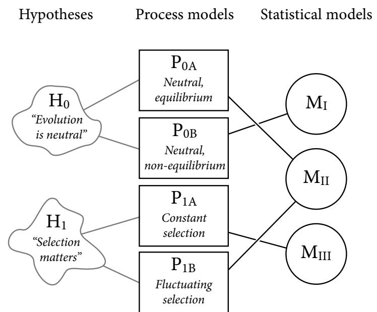
Figure 1.2. Relations among hypotheses (left), detailed process models (middle), and statistical models (right), illustrated by the example of “neutral” models of evolution. Hypotheses (H) are typically vague, and so correspond to more than one process model (P). Statistical evaluations of hypotheses rarely address process models directly. Instead, they rely upon statistical models (M), all of which reflect only some aspects of the process models. As a result, relations are multiple in both directions: Hypotheses do not imply unique models, and models do not imply unique hypotheses. This fact greatly complicates statistical inference.
statistical model expresses associations among variables. As a result, many different process models may be consistent with any single statistical model.
How do we get a statistical model from a causal model? One way is to derive the expected frequency distribution of some quantity—a “statistic”—from the causal model. For example, a common statistic in this context is the frequency distribution (histogram) of the frequency of different genetic variants (alleles). Some alleles are rare, appearing in only a few individuals. Others are very common, appearing in very many individuals in the population. A famous result in population genetics is that a model like P0A produces a power law distribution of allele frequencies. And so this fact yields a statistical model, MII, that predicts a power law in the data. In contrast the constant selection process model P1A predicts something quite different, MIII.
Unfortunately, other selection models (P1B) imply the same statistical model, MII, as the neutral model. They also produce power laws. So we’ve reached the uncomfortable lesson:
- Any given statistical model (M) may correspond to more than one process model (P).
- Any given hypothesis (H) may correspond to more than one process model (P).
- Any given statistical model (M) may correspond to more than one hypothesis (H).
Now look what happens when we compare the statistical models to data. The classical approach is to take the “neutral” model as a null hypothesis. If the data are not sufficiently similar to the expectation under the null, then we say that we “reject” the null hypothesis. Suppose we follow the history of this subject and take P0A as our null hypothesis. This implies data corresponding to MII. But since the same statistical model corresponds to a selection model P1B, it’s not clear what to make of either rejecting or accepting the null. The null model is not unique to any process model nor hypothesis. If we reject the null, we can’t really conclude that selection matters, because there are other neutral models that predict different distributions of alleles. And if we fail to reject the null, we can’t really conclude that evolution is neutral, because some selection models expect the same frequency distribution.
This is a huge bother. Once we have the diagram in Figure 1.2, it’s easy to see the problem. But few of us are so lucky. While population genetics has recognized this issue, scholars in other disciplines continue to test frequency distributions against power law expectations, arguing even that there is only one neutral model.11 Even if there were only one neutral model, there are so many non-neutral models that mimic the predictions of neutrality, that neither rejecting nor failing to reject the null model carries much inferential power.
So what can be done? Well, if you have multiple process models, a lot can be done. If it turns out that all of the process models of interest make very similar predictions, then you know to search for a different description of the evidence, a description under which the processes look different. For example, while P0A and P1B make very similar power law predictions for the frequency distribution of alleles, they make very dissimilar predictions for the distribution of changes in allele frequency over time. Explicitly compare predictions of more than one model, and you can save yourself from some ordinary kinds of folly.
Statistical models can be confused in other ways as well, such as the confusion caused by unobserved variables and sampling bias. Process models allow us to design statistical models with these problems in mind. The statistical model alone is not enough.
Rethinking: Entropy and model identification. One reason that statistical models routinely correspond to many different detailed process models is because they rely upon distributions like the normal, binomial, Poisson, and others. These distributions are members of a family, the exponential family. Nature loves the members of this family. Nature loves them because nature loves entropy, and all of the exponential family distributions are maximum entropy distributions. Taking the natural personification out of that explanation will wait until Chapter 10. The practical implication is that one can no more infer evolutionary process from a power law than one can infer developmental process from the fact that height is normally distributed. This fact should make us humble about what typical regression models—the meat of this book—can teach us about mechanistic process. On the other hand, the maximum entropy nature of these distributions means we can use them to do useful statistical work, even when we can’t identify the underlying process.
1.2.2. Measurement matters. The logic of falsification is very simple. We have a hypothesis H, and we show that it entails some observation D. Then we look for D. If we don’t find it, we must conclude that H is false. Logicians call this kind of reasoning modus tollens, which is Latin shorthand for “the method of destruction.” In contrast, finding D tells us nothing certain about H, because other hypotheses might also predict D.
A compelling scientific fable that employs modus tollens concerns the color of swans. Before discovering Australia, all swans that any European had ever seen had white feathers. This led to the belief that all swans are white. Let’s call this a formal hypothesis:
H0: All swans are white.
When Europeans reached Australia, however, they encountered swans with black feathers. This evidence seemed to instantly prove H0 to be false. Indeed, not all swans are white. Some are certainly black, according to all observers. The key insight here is that, before voyaging to Australia, no number of observations of white swans could prove H0 to be true. However it required only one observation of a black swan to prove it false.
This is a seductive story. If we can believe that important scientific hypotheses can be stated in this form, then we have a powerful method for improving the accuracy of our theories: look for evidence that disconfirms our hypotheses. Whenever we find a black swan, H0 must be false. Progress!
Seeking disconfirming evidence is important, but it cannot be as powerful as the swan story makes it appear. In addition to the correspondence problems among hypotheses and models, discussed in the previous section, most of the problems scientists confront are not so logically discrete. Instead, we most often face two simultaneous problems that make the swan fable misrepresentative. First, observations are prone to error, especially at the boundaries of scientific knowledge. Second, most hypotheses are quantitative, concerning degrees of existence, rather than discrete, concerning total presence or absence. Let’s briefly consider each of these problems.
1.2.2.1. Observation error. All observers agree under most conditions that a swan is either black or white. There are few intermediate shades, and most observers’ eyes work similarly enough that there will be little disagreement about which swans are white and which are black. But this kind of example is hardly commonplace in science, at least in mature fields. Instead, we routinely confront contexts in which we are not sure if we have detected a disconfirming result. At the edges of scientific knowledge, the ability to measure a hypothetical phenomenon is often in question as much as the phenomenon itself. Here are two examples.
In 2005, a team of ornithologists from Cornell claimed to have evidence of an individual Ivory-billed Woodpecker (Campephilus principalis), a species thought extinct. The hypothesis implied here is:
H0: The Ivory-billed Woodpecker is extinct.
It would only take one observation to falsify this hypothesis. However, many doubted the evidence. Despite extensive search efforts and a $50,000 cash reward for information leading to a live specimen, no satisfying evidence has yet (by 2020) emerged. Even if good physical evidence does eventually arise, this episode should serve as a counterpoint to the swan story. Finding disconfirming cases is complicated by the difficulties of observation. Black swans are not always really black swans, and sometimes white swans are really black swans. There are mistaken confirmations (false positives) and mistaken disconfirmations (false negatives). Against this background of measurement difficulties, scientists who already believe that the Ivory-billed Woodpecker is extinct will always be suspicious of a claimed falsification. Those who believe it is still alive will tend to count the vaguest evidence as falsification.
Another example, this one from physics, focuses on the detection of faster-than-light (FTL) neutrinos.12 In September 2011, a large and respected team of physicists announced detection of neutrinos—small, neutral sub-atomic particles able to pass easily and harmlessly through most matter—that arrived from Switzerland to Italy in slightly faster-thanlightspeed time. According to Einstein, neutrinos cannot travel faster than the speed of light. So this seems to be a falsification of special relativity. If so, it would turn physics on its head.
The dominant reaction from the physics community was not “Einstein was wrong!” but instead “How did the team mess up the measurement?” The team that made the measurement had the same reaction, and asked others to check their calculations and attempt to replicate the result.
What could go wrong in the measurement? You might think measuring speed is a simple matter of dividing distance by time. It is, at the scale and energy you live at. But with a fundamental particle like a neutrino, if you measure when it starts its journey, you stop the journey. The particle is consumed by the measurement. So more subtle approaches are needed. The detected difference from light-speed, furthermore, is quite small, and so even the latency of the time it takes a signal to travel from a detector to a control room can be orders of magnitude larger. And since the “measurement” in this case is really an estimate from a statistical model, all of the assumptions of the model are now suspect. By 2013, the physics community was unanimous that the FTL neutrino result was measurement error. They found the technical error, which involved a poorly attached cable.13 Furthermore, neutrinos clocked from supernova events are consistent with Einstein, and those distances are much larger and so would reveal differences in speed much better.
In both the woodpecker and neutrino dramas, the key dilemma is whether the falsification is real or spurious. Measurement is complicated in both cases, but in quite different ways, rendering both true-detection and false-detection plausible. Popper was aware of this limitation inherent in measurement, and it may be one reason that Popper himself saw science as being broader than falsification. But the probabilistic nature of evidence rarely appears when practicing scientists discuss the philosophy and practice of falsification.14 My reading of the history of science is that these sorts of measurement problems are the norm, not the exception.15
1.2.2.2. Continuous hypotheses. Another problem for the swan story is that most interesting scientific hypotheses are not of the kind “all swans are white” but rather of the kind:
H0: 80% of swans are white.
Or maybe:
H0: Black swans are rare.
Now what are we to conclude, after observing a black swan? The null hypothesis doesn’t say black swans do not exist, but rather that they have some frequency. The task here is not to disprove or prove a hypothesis of this kind, but rather to estimate and explain the distribution of swan coloration as accurately as we can. Even when there is no measurement error of any kind, this problem will prevent us from applying the modus tollens swan story to our science.16
You might object that the hypothesis above is just not a good scientific hypothesis, because it isn’t easy to disprove. But if that’s the case, then most of the important questions about the world are not good scientific hypotheses. In that case, we should conclude that the definition of a “good hypothesis” isn’t doing us much good. Now, nearly everyone agrees that it is a good practice to design experiments and observations that can differentiate competing hypotheses. But in many cases, the comparison must be probabilistic, a matter of degree, not kind.17
1.2.3. Falsification is consensual. The scientific community does come to regard some hypotheses as false. The caloric theory of heat and the geocentric model of the universe are no
longer taught in science courses, unless it’s to teach how they were falsified. And evidence often—but not always—has something to do with such falsification.
But falsification is alwaysconsensual, not logical. In light of the real problems of measurement error and the continuous nature of natural phenomena, scientific communities argue towards consensus about the meaning of evidence. These arguments can be messy. After the fact, some textbooks misrepresent the history so it appears like logical falsification.18 Such historical revisionism may hurt everyone. It may hurt scientists, by rendering it impossible for their own work to live up to the legends that precede them. It may make science an easy target, by promoting an easily attacked model of scientific epistemology. And it may hurt the public, by exaggerating the definitiveness of scientific knowledge.19
1.3. Tools for golem engineering
So if attempting to mimic falsification is not a generally useful approach to statistical methods, what are we to do? We are to model. Models can be made into testing procedures all statistical tests are also models20—but they can also be used to design, forecast, and argue. Doing research benefits from the ability to produce and manipulate models, both because scientific problems are more general than “testing” and because the pre-made golems you maybe met in introductory statistics courses are ill-fit to many research contexts. You may not even know which statistical model to use, unless you have a generative model in addition.
If you want to reduce your chances of wrecking Prague, then some golem engineering know-how is needed. Make no mistake: You will wreck Prague eventually. But if you are a good golem engineer, at least you’ll notice the destruction. And since you’ll know a lot about how your golem works, you stand a good chance to figure out what went wrong. Then your next golem won’t be as bad. Without engineering training, you’re always at someone’s mercy.
We want to use our models for several distinct purposes: designing inquiry, extracting information from data, and making predictions. In this book I’ve chosen to focus on tools to help with each purpose. These tools are:
- Bayesian data analysis
- Model comparison
- Multilevel models
- Graphical causal models
These tools are deeply related to one another, so it makes sense to teach them together. Understanding of these tools comes, as always, only with implementation—you can’t comprehend golem engineering until you do it. And so this book focuses mostly on code, how to do things. But in the remainder of this chapter, I provide introductions to these tools.
1.3.1. Bayesian data analysis. Supposing you have some data, how should you use it to learn about the world? There is no uniquely correct answer to this question. Lots of approaches, both formal and heuristic, can be effective. But one of the most effective and general answers is to use Bayesian data analysis. Bayesian data analysis takes a question in the form of a model and uses logic to produce an answer in the form of probability distributions.
In modest terms, Bayesian data analysis is no more than counting the numbers of ways the data could happen, according to our assumptions. Things that can happen more ways are more plausible. Probability theory is relevant because probability is just a calculus for counting. This allows us to use probability theory as a general way to represent plausibility, whether in reference to countable events in the world or rather theoretical constructs like parameters. The rest follows logically. Once we have defined the statistical model, Bayesian data analysis forces a purely logical way of processing the data to produce inference.
Chapter 2 explains this in depth. For now, it will help to have another approach to compare. Bayesian probability is a very general approach to probability, and it includes as a special case another important approach, the frequentist approach. The frequentist approach requires that all probabilities be defined by connection to the frequencies of events in very large samples.21 This leads to frequentist uncertainty being premised on imaginary resampling of data—if we were to repeat the measurement many many times, we would end up collecting a list of values that will have some pattern to it. It means also that parameters and models cannot have probability distributions, only measurements can. The distribution of these measurements is called a sampling distribution. This resampling is never done, and in general it doesn’t even make sense—it is absurd to consider repeat sampling of the diversification of song birds in the Andes. As Sir Ronald Fisher, one of the most important frequentist statisticians of the twentieth century, put it:22
[…] the only populations that can be referred to in a test of significance have no objective reality, being exclusively the product of the statistician’s imagination […]
But in many contexts, like controlled greenhouse experiments, it’s a useful device for describing uncertainty. Whatever the context, it’s just part of the model, an assumption about what the data would look like under resampling. It’s just as fantastical as the Bayesian gambit of using probability to describe all types of uncertainty, whether empirical or epistemological.23
But these different attitudes towards probability do enforce different trade-offs. Consider this simple example where the difference between Bayesian and frequentist probability matters. In the year 1610, Galileo turned a primitive telescope to the night sky and became the first human to see Saturn’s rings. Well, he probably saw a blob, with some smaller blobs attached to it (Figure 1.3). Since the telescope was primitive, it couldn’t really focus the image very well. Saturn always appeared blurred. This is a statistical problem, of a sort. There’s uncertainty about the planet’s shape, but notice that none of the uncertainty is a result of variation in repeat measurements. We could look through the telescope a thousand times, and it will always give the same blurred image (for any given position of the Earth and Saturn). So the sampling distribution of any measurement is constant, because the measurement is deterministic—there’s nothing “random” about it. Frequentist statistical inference has a lot of trouble getting started here. In contrast, Bayesian inference proceeds as usual, because the deterministic “noise” can still be modeled using probability, as long as we don’t identify probability with frequency. As a result, the field of image reconstruction and processing is dominated by Bayesian algorithms.24
In more routine statistical procedures, like linear regression, this difference in probability concepts has less of an effect. However, it is important to realize that even when a Bayesian procedure and frequentist procedure give exactly the same answer, our Bayesian golems aren’t justifying their inferences with imagined repeat sampling. More generally, Bayesian golems treat “randomness” as a property of information, not of the world. Nothing in the real world—excepting controversial interpretations of quantum physics—is actually random. Presumably, if we had more information, we could exactly predict everything. We just use randomness to describe our uncertainty in the face of incomplete knowledge. From the perspective of our golem, the coin toss is “random,” but it’s really the golem that is random, not the coin.
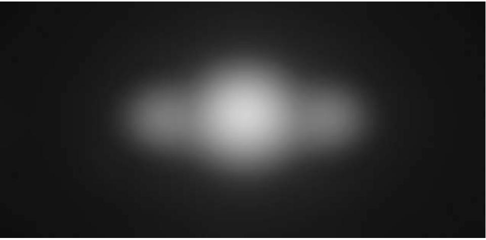
Figure 1.3. Saturn, much like Galileo must have seen it. The true shape is uncertain, but not because of any sampling variation. Probability theory can still help.
Note that the preceding description doesn’t invoke anyone’s “beliefs” or subjective opinions. Bayesian data analysis is just a logical procedure for processing information. There is a tradition of using this procedure as a normative description of rational belief, a tradition called Bayesianism. 25 But this book neither describes nor advocates it. In fact, I’ll argue that no statistical approach, Bayesian or otherwise, is by itself sufficient.
Before moving on to describe the next two tools, it’s worth emphasizing an advantage of Bayesian data analysis, at least when scholars are learning statistical modeling. This entire book could be rewritten to remove any mention of “Bayesian.” In places, it would become easier. In others, it would become much harder. But having taught applied statistics both ways, I have found that the Bayesian framework presents a distinct pedagogical advantage: many people find it more intuitive. Perhaps the best evidence for this is that very many scientists interpret non-Bayesian results in Bayesian terms, for example interpreting ordinary p-values as Bayesian posterior probabilities and non-Bayesian confidence intervals as Bayesian ones (you’ll learn posterior probability and confidence intervals in Chapters 2 and 3). Even statistics instructors make these mistakes.26 Statisticians appear doomed to republish the same warnings about misinterpretation of p-values forever. In this sense then, Bayesian models lead to more intuitive interpretations, the ones scientists tend to project onto statistical results. The opposite pattern of mistake—interpreting a posterior probability as a p-value—seems to happen only rarely.
None of this ensures that Bayesian analyses will be more correct than non-Bayesian analyses. It just means that the scientist’s intuitions will less commonly be at odds with the actual logic of the framework. This simplifies some of the aspects of teaching statistical modeling.
Rethinking: Probability is not unitary. It will make some readers uncomfortable to suggest that there is more than one way to define “probability.” Aren’t mathematical concepts uniquely correct? They are not. Once you adopt some set of premises, or axioms, everything does follow logically in mathematical systems. But the axioms are open to debate and interpretation. So not only is there “Bayesian” and “frequentist” probability, but there are different versions of Bayesian probability even, relying upon different arguments to justify the approach. In more advanced Bayesian texts, you’ll come across names like Bruno de Finetti, Richard T. Cox, and Leonard “Jimmie” Savage. Each of these figures is associated with a somewhat different conception of Bayesian probability. There are others. This book mainly follows the “logical” Cox (or Laplace-Jeffreys-Cox-Jaynes) interpretation. This interpretation is presented beginning in the next chapter, but unfolds fully only in Chapter 10.
How can different interpretations of probability theory thrive? By themselves, mathematical entities don’t necessarily “mean” anything, in the sense of real world implication. What does it mean to take the square root of a negative number? What does it mean to take a limit as something approaches infinity? These are essential and routine concepts, but their meanings depend upon context and analyst, upon beliefs about how well abstraction represents reality. Mathematics doesn’t access the real world directly. So answering such questions remains a contentious and entertaining project, in all branches of applied mathematics. So while everyone subscribes to the same axioms of probability, not everyone agrees in all contexts about how to interpret probability.
Rethinking: A little history. Bayesian statistical inference is much older than the typical tools of introductory statistics, most of which were developed in the early twentieth century. Versions of the Bayesian approach were applied to scientific work in the late 1700s and repeatedly in the nineteenth century. But after World War I, anti-Bayesian statisticians, like Sir Ronald Fisher, succeeded in marginalizing the approach. All Fisher said about Bayesian analysis (then called inverse probability) in his influential 1925 handbook was:27
[…] the theory of inverse probability is founded upon an error, and must be wholly rejected.
Bayesian data analysis became increasingly accepted within statistics during the second half of the twentieth century, because it proved not to be founded upon an error. All philosophy aside, it worked. Beginning in the 1990s, new computational approaches led to a rapid rise in application of Bayesian methods.28 Bayesian methods remain computationally expensive, however. And so as data sets have increased in scale—millions of rows is common in genomic analysis, for example—alternatives to or approximations to Bayesian inference remain important, and probably always will.
1.3.2. Model comparison and prediction. Bayesian data analysis provides a way for models to learn from data. But when there is more than one plausible model—and in most mature fields there should be—how should we choose among them? One answer is to prefer models that make good predictions. This answer creates a lot of new questions, since knowing which model will make the best predictions seems to require knowing the future. We’ll look at two related tools, neither of which knows the future: cross-validation and information criteria. These tools aim to compare models based upon expected predictive accuracy.
Comparing models by predictive accuracy can be useful in itself. And it will be even more useful because it leads to the discovery of an amazing fact: Complex models often make worse predictions than simpler models. The primary paradox of prediction is overfitting. 29 Future data will not be exactly like past data, and so any model that is unaware of this fact tends to make worse predictions than it could. And more complex models tend towards more overfitting than simple ones—the smarter the golem, the dumber its predictions. So if we wish to make good predictions, we cannot judge our models simply on how well they fit our data. Fitting is easy; prediction is hard.
Cross-validation and information criteria help us in three ways. First, they provide useful expectations of predictive accuracy, rather than merely fit to sample. So they compare models where it matters. Second, they give us an estimate of the tendency of a model to
overfit. This will help us to understand how models and data interact, which in turn helps us to design better models. We’ll take this point up again in the next section. Third, crossvalidation and information criteria help us to spot highly influential observations.
Bayesian data analysis has been worked on for centuries. Information criteria are comparatively very young and the field is evolving quickly. Many statisticians have never used information criteria in an applied problem, and there is no consensus about which metrics are best and how best to use them. Still, information criteria are already in frequent use in the sciences, appearing in prominent publications and featuring in prominent debates.30 Their power is often exaggerated, and we will be careful to note what they cannot do as well as what they can.
Rethinking: The Neanderthal in you. Even simple models need alternatives. In 2010, a draft genome of a Neanderthal demonstrated more DNA sequences in common with non-African contemporary humans than with African ones. This finding is consistent with interbreeding between Neanderthals and modern humans, as the latter dispersed from Africa. However, just finding DNA in common between modern Europeans and Neanderthals is not enough to demonstrate interbreeding. It is also consistent with ancient structure in the African continent.31 In short, if ancient northeast Africans had unique DNA sequences, then both Neanderthals and modern Europeans could possess these sequences from a common ancestor, rather than from direct interbreeding. So even in the seemingly simple case of estimating whether Neanderthals and modern humans share unique DNA, there is more than one process-based explanation. Model comparison is necessary.
1.3.3. Multilevel models. In an apocryphal telling of Hindu cosmology, it is said that the Earth rests on the back of a great elephant, who in turn stands on the back of a massive turtle. When asked upon what the turtle stands, a guru is said to reply, “it’s turtles all the way down.”
Statistical models don’t contain turtles, but they do contain parameters. And parameters support inference. Upon what do parameters themselves stand? Sometimes, in some of the most powerful models, it’s parameters all the way down. What this means is that any particular parameter can be usefully regarded as a placeholder for a missing model. Given some model of how the parameter gets its value, it is simple enough to embed the new model inside the old one. This results in a model with multiple levels of uncertainty, each feeding into the next—a multilevel model.
Multilevel models—also known as hierarchical, random effects, varying effects, or mixed effects models—are becoming de rigueur in the biological and social sciences. Fields as diverse as educational testing and bacterial phylogenetics now depend upon routine multilevel models to process data. Like Bayesian data analysis, multilevel modeling is not particularly new. But it has only been available on desktop computers for a few decades. And since such models have a natural Bayesian representation, they have grown hand-in-hand with Bayesian data analysis.
One reason to be interested in multilevel models is because they help us deal with overfitting. Cross-validation and information criteria measure overfitting risk and help us to recognize it. Multilevel models actually do something about it. What they do is exploit an amazing trick known as partial pooling that pools information across units in the data in order to produce better estimates for all units. The details will wait until Chapter 13.
Partial pooling is the key technology, and the contexts in which it is appropriate are diverse. Here are four commonplace examples.
- To adjust estimates for repeat sampling. When more than one observation arises from the same individual, location, or time, then traditional, single-level models may mislead us.
- To adjust estimates for imbalance in sampling. When some individuals, locations, or times are sampled more than others, we may also be misled by single-level models.
- To study variation. If our research questions include variation among individuals or other groups within the data, then multilevel models are a big help, because they model variation explicitly.
- To avoid averaging. Pre-averaging data to construct variables can be dangerous. Averaging removes variation, manufacturing false confidence. Multilevel models preserve the uncertainty in the original, pre-averaged values, while still using the average to make predictions.
All four apply to contexts in which the researcher recognizes clusters or groups of measurements that may differ from one another. These clusters or groups may be individuals such as different students, locations such as different cities, or times such as different years. Since each cluster may well have a different average tendency or respond differently to any treatment, clustered data often benefit from being modeled by a golem that expects such variation.
But the scope of multilevel modeling is much greater than these examples. Diverse model types turn out to be multilevel: models for missing data (imputation), measurement error, factor analysis, some time series models, types of spatial and network regression, and phylogenetic regressions all are special applications of the multilevel strategy. And some commonplace procedures, like the paired t-test, are really multilevel models in disguise. Grasping the concept of multilevel modeling may lead to a perspective shift. Suddenly singlelevel models end up looking like mere components of multilevel models. The multilevel strategy provides an engineering principle to help us to introduce these components into a particular analysis, exactly where we think we need them.
I want to convince the reader of something that appears unreasonable: multilevel regression deserves to be the default form of regression. Papers that do not use multilevel models should have to justify not using a multilevel approach. Certainly some data and contexts do not need the multilevel treatment. But most contemporary studies in the social and natural sciences, whether experimental or not, would benefit from it. Perhaps the most important reason is that even well-controlled treatments interact with unmeasured aspects of the individuals, groups, or populations studied. This leads to variation in treatment effects, in which individuals or groups vary in how they respond to the same circumstance. Multilevel models attempt to quantify the extent of this variation, as well as identify which units in the data responded in which ways.
These benefits don’t come for free, however. Fitting and interpreting multilevel models can be considerably harder than fitting and interpreting a traditional regression model. In practice, many researchers simply trust their black-box software and interpret multilevel regression exactly like single-level regression. In time, this will change. There was a time in applied statistics when even ordinary multiple regression was considered cutting edge, something for only experts to fiddle with. Instead, scientists used many simple procedures, like t-tests. Now, almost everyone uses multivariate tools. The same will eventually be true of multilevel models. Scholarly culture and curriculum still have some catching up to do.
Rethinking: Multilevel election forecasting. One of the older applications of multilevel modeling is to forecast the outcomes of elections. In the 1960s, John Tukey (1915–2000) began working for the National Broadcasting Company (NBC) in the United States, developing real-time election prediction models that could exploit diverse types of data: polls, past elections, partial results, and complete results from related districts. The models used a multilevel framework similar to the models presented in Chapters 13 and 14. Tukey developed and used such models for NBC through 1978.32 Contemporary election prediction and poll aggregation remains an active topic for multilevel modeling.33
1.3.4. Graphical causal models. When the wind blows, branches sway. If you are human, you immediately interpret this statement as causal: The wind makes the branches move. But all we see is a statistical association. From the data alone, it could also be that the branches swaying makes the wind. That conclusion seems foolish, because you know trees do not sway their own branches. A statistical model is an amazing association engine. It makes it possible to detect associations between causes and their effects. But a statistical model is never sufficient for inferring cause, because the statistical model makes no distinction between the wind causing the branches to sway and the branches causing the wind to blow. Facts outside the data are needed to decide which explanation is correct.
Cross-validation and information criteria try to guess predictive accuracy. When I introduced them above, I described overfitting as the primary paradox in prediction. Now we turn to a secondary paradox in prediction: Models that are causally incorrect can make better predictions than those that are causally correct. As a result, focusing on prediction can systematically mislead us. And while you may have heard that randomized controlled experiments allow causal inference, randomized experiments entail the same risks. No one is safe.
I will call this the identification problem and carefully distinguish it from the problem of raw prediction. Consider two different meanings of “prediction.” The simplest applies when we are external observers simply trying to guess what will happen next. In that case, tools like cross-validation are very useful. But these tools will happily recommend models that contain confounding variables and suggest incorrect causal relationships. Why? Confounded relationships are real associations, and they can improve prediction. After all, if you look outside and see branches swaying, it really does predict wind. Successful prediction does not require correct causal identification. In fact, as you’ll see later in the book, predictions may actually improve when we use a model that is causally misleading.
But what happens when we intervene in the world? Then we must consider a second meaning of “prediction.” Suppose we recruit many people to climb into the trees and sway the branches. Will it make wind? Not much. Often the point of statistical modeling is to produce understanding that leads to generalization and application. In that case, we need more than just good predictions, in the absence of intervention. We also need an accurate causal understanding. But comparing models on the basis of predictive accuracy—or p-values or anything else—will not necessarily produce it.
So what can be done? What is needed is a causal model that can be used to design one or more statistical models for the purpose of causal identification. As I mentioned in the neutral molecular evolution example earlier in this chapter, a complete scientific model contains more information than a statistical model derived from it. And this additional information contains causal implications. These implications make it possible to test alternative causal models. The implications and tests depend upon the details. Newton’s laws of motion for
example precisely predict the consequences of specific interventions. And these precise predictions tell us that the laws are only approximately right.
Unfortunately, much scientific work lacks such precise models. Instead we must work with vaguer hypotheses and try to estimate vague causal effects. Economics for example has no good quantitative model for predicting the effect of changing the minimum wage. But the very good news is that even when you don’t have a precise causal model, but only a heuristic one indicating which variables causally influence others, you can still do useful causal inference. Economics might, for example, be able to estimate the causal effect of changing the minimum wage, even without a good scientific model of the economy.
Formal methods for distinguishing causal inference from association date from the first half of the twentieth century, but they have more recently been extended to the study of measurement, experimental design, and the ability to generalize (or transport) results across samples.34 We’ll meet these methods through the use of a graphical causal model. The simplest graphical causal model is a directed acyclic graph, usually called a DAG. DAGs are heuristic—they are not detailed statistical models. But they allow us to deduce which statistical models can provide valid causal inferences, assuming the DAG is true.
But where does a DAG itself come from? The terrible truth about statistical inference is that its validity relies upon information outside the data. We require a causal model with which to design both the collection of data and the structure of our statistical models. But the construction of causal models is not a purely statistical endeavor, and statistical analysis can never verify all of our assumptions. There will never be a golem that accepts naked data and returns a reliable model of the causal relations among the variables. We’re just going to have to keep doing science.
Rethinking: Causal salad. Causal inference requires a causal model that is separate from the statistical model. The data are not enough. Every philosophy agrees upon that much. Responses, however, are diverse. The most conservative response is to declare “causation” to be unprovable mental candy, like debating the nature of the afterlife.35 Slightly less conservative is to insist that cause can only be inferred under strict conditions of randomization and experimental control. This would be very limiting. Many scientific questions can never be studied experimentally—human evolution, for example. Many others could in principle be studied experimentally, but it would be unethical to do so. And many experiments are really just attempts at control—patients do not always take their medication.
But the approach which dominates in many parts of biology and the social sciences is instead causal salad. 36 Causal salad means tossing various “control” variables into a statistical model, observing changes in estimates, and then telling a story about causation. Causal salad seems founded on the notion that only omitted variables can mislead us about causation. But included variables can just as easily confound us. When tossing a causal salad, a model that makes good predictions may still mislead about causation. If we use the model to plan an intervention, it will get everything wrong. There will be examples in later chapters.
1.4. Summary
This first chapter has argued for a rethinking of popular statistical and scientific philosophy. Instead of choosing among various black-box tools for testing null hypotheses, we should learn to build and analyze multiple non-null models of natural phenomena. To support this goal, the chapter introduced Bayesian inference, model comparison, multilevel models, and graphical causal models. The remainder of the book is organized into four parts.
- Chapters 2 and 3 are foundational. They introduce Bayesian inference and the basic tools for performing Bayesian calculations. They move quite slowly and emphasize a purely logical interpretation of probability theory.
- The next five chapters, 4 through 8, build multiple linear regression as a Bayesian tool. This tool supports causal inference, but only when we analyze separate causal models that help us determine which variables to include. For this reason, you’ll learn basic causal reasoning supported by causal graphs. These chapters emphasize plotting results instead of attempting to interpret estimates of individual parameters. Problems of model complexity—overfitting—also feature prominently. So you’ll also get an introduction to information theory and predictive model comparison in Chapter 7.
- The third part of the book, Chapters 9 through 12, presents generalized linear models of several types. Chapter 9 introduces Markov chain Monte Carlo, used to fit the models in later chapters. Chapter 10 introduces maximum entropy as an explicit procedure to help us design and interpret these models. Then Chapters 11 and 12 detail the models themselves.
- The last part, Chapters 13 through 16, gets around to multilevel models, as well as specialized models that address measurement error, missing data, and spatial covariation. This material is fairly advanced, but it proceeds in the same mechanistic way as earlier material. Chapter 16 departs from the rest of the book in deploying models which are not of the generalized linear type but are rather scientific models expressed directly as statistical models.
The final chapter, Chapter 17, returns to some of the issues raised in this first one.
At the end of each chapter, there are practice problems ranging from easy to hard. These problems help you test your comprehension. The harder ones expand on the material, introducing new examples and obstacles. Some of the hard problems are quite hard. Don’t worry, if you get stuck from time to time. Working in groups is a good way to get unstuck, just like in real research.
2 Small Worlds and Large Worlds
When Cristoforo Colombo (Christopher Columbus) infamously sailed west in the year 1492, he believed that the Earth was spherical. In this, he was like most educated people of his day. He was unlike most people, though, in that he also believed the planet was much smaller than it actually is—only 30,000 km around its middle instead of the actual 40,000 km(Figure 2.1).37 This was one of the most consequential mistakes in European history. If Colombo had believed instead that the Earth was 40,000 km around, he would have correctly reasoned that his fleet could not carry enough food and potable water to complete a journey all the way westward to Asia. But at 30,000 km around, Asia would lie a bit west of the coast of California. It was possible to carry enough supplies to make it that far. Emboldened in part by his unconventional estimate, Colombo set sail, eventually landing in the Bahamas.
Colombo made a prediction based upon his view that the world was small. But since he lived in a large world, aspects of the prediction were wrong. In his case, the error was lucky. His small world model was wrong in an unanticipated way: There was a lot of land in the way. If he had been wrong in the expected way, with nothing but ocean between Europe and Asia, he and his entire expedition would have run out of supplies long before reaching the East Indies.
Colombo’s small and large worlds provide a contrast between model and reality. All statistical modeling has these two frames: the small world of the model itself and the large world we hope to deploy the model in.38 Navigating between these two worlds remains a central challenge of statistical modeling. The challenge is greater when we forget the distinction.
The small world is the self-contained logical world of the model. Within the small world, all possibilities are nominated. There are no pure surprises, like the existence of a huge continent between Europe and Asia. Within the small world of the model, it is important to be able to verify the model’s logic, making sure that it performs as expected under favorable assumptions. Bayesian models have some advantages in this regard, as they have reasonable claims to optimality: No alternative model could make better use of the information in the data and support better decisions, assuming the small world is an accurate description of the real world.39
The large world is the broader context in which one deploys a model. In the large world, there may be events that were not imagined in the small world. Moreover, the model is always an incomplete representation of the large world, and so will make mistakes, even if all kinds of events have been properly nominated. The logical consistency of a model in the small world is no guarantee that it will be optimal in the large world. But it is certainly a warm comfort.
Figure 2.1. Illustration of Martin Behaim’s 1492 globe, showing the small world that Colombo anticipated. Europe lies on the righthand side. Asia lies on the left. The big island labeled “Cipangu” is Japan.
In this chapter, you will begin to build Bayesian models. The way that Bayesian models learn from evidence is arguably optimal in the small world. When their assumptions approximate reality, they also perform well in the large world. But large world performance has to be demonstrated rather than logically deduced. Passing back and forth between these two worlds allows both formal methods, like Bayesian inference, and informal methods, like peer review, to play an indispensable role.
This chapter focuses on the small world. It explains probability theory in its essential form: counting the ways things can happen. Bayesian inference arises automatically from this perspective. Then the chapter presents the stylized components of a Bayesian statistical model, a model for learning from data. Then it shows you how to animate the model, to produce estimates.
All this work provides a foundation for the next chapter, in which you’ll learn to summarize Bayesian estimates, as well as begin to consider large world obligations.
Rethinking: Fast and frugal in the large world. The natural world is complex, as trying to do science serves to remind us. Yet everything from the humble tick to the industrious squirrel to the idle sloth manages to frequently make adaptive decisions. But it’s a good bet that most animals are not Bayesian, if only because being Bayesian is expensive and depends upon having a good model. Instead, animals use various heuristics that are fit to their environments, past or present. These heuristics take adaptive shortcuts and so may outperform a rigorous Bayesian analysis, once costs of information gathering and processing (and overfitting, Chapter 7) are taken into account.40 Once you already know which information to ignore or attend to, being fully Bayesian is a waste. It’s neither necessary nor sufficient for making good decisions, as real animals demonstrate. But for human animals, Bayesian analysis provides a general way to discover relevant information and process it logically. Just don’t think that it is the only way.
2.1. The garden of forking data
Our goal in this section will be to build Bayesian inference up from humble beginnings, so there is no superstition about it. Bayesian inference is really just counting and comparing of possibilities. Consider by analogy Jorge Luis Borges’ short story “The Garden of Forking Paths.” The story is about a man who encounters a book filled with contradictions. In most books, characters arrive at plot points and must decide among alternative paths. A protagonist may arrive at a man’s home. She might kill the man, or rather take a cup of tea. Only
one of these paths is taken—murder or tea. But the book within Borges’ story explores all paths, with each decision branching outward into an expanding garden of forking paths.
This is the same device that Bayesian inference offers. In order to make good inference about what actually happened, it helps to consider everything that could have happened. A Bayesian analysis is a garden of forking data, in which alternative sequences of events are cultivated. As we learn about what did happen, some of these alternative sequences are pruned. In the end, what remains is only what is logically consistent with our knowledge.
This approach provides a quantitative ranking of hypotheses, a ranking that is maximally conservative, given the assumptions and data that go into it. The approach cannot guarantee a correct answer, on large world terms. But it can guarantee the best possible answer, on small world terms, that could be derived from the information fed into it.
Consider the following toy example.
2.1.1. Counting possibilities. Suppose there’s a bag, and it contains four marbles. These marbles come in two colors: blue and white. We know there are four marbles in the bag, but we don’t know how many are of each color. We do know that there are five possibilities: (1) [ ], (2) [ ], (3) [ ], (4) [ ], (5) [ ]. These are the only possibilities consistent with what we know about the contents of the bag. Call these five possibilities the conjectures.
Our goal is to figure out which of these conjectures is most plausible, given some evidence about the contents of the bag. We do have some evidence: A sequence of three marbles is pulled from the bag, one at a time, replacing the marble each time and shaking the bag before drawing another marble. The sequence that emerges is: , in that order. These are the data.
So now let’s plant the garden and see how to use the data to infer what’s in the bag. Let’s begin by considering just the single conjecture, [ ], that the bag contains one blue and three white marbles. On the first draw from the bag, one of four things could happen, corresponding to one of four marbles in the bag. So we can visualize the possibilities branching outward:
Notice that even though the three white marbles look the same from a data perspective we just record the color of the marbles, after all—they are really different events. This is important, because it means that there are three more ways to see than to see .
Now consider the garden as we get another draw from the bag. It expands the garden out one layer:
Now there are 16 possible paths through the garden, one for each pair of draws. On the second draw from the bag, each of the paths above again forks into four possible paths. Why?
Figure 2.2. The 64 possible paths generated by assuming the bag contains one blue and three white marbles.
Because we believe that our shaking of the bag gives each marble a fair chance at being drawn, regardless of which marble was drawn previously. The third layer is built in the same way, and the full garden is shown in Figure 2.2. There are 43 = 64 possible paths in total.
As we consider each draw from the bag, some of these paths are logically eliminated. The first draw tuned out to be , recall, so the three white paths at the bottom of the garden are eliminated right away. If you imagine the real data tracing out a path through the garden, it must have passed through the one blue path near the origin. The second draw from the bag produces , so three of the paths forking out of the first blue marble remain. As the data trace out a path, we know it must have passed through one of those three white paths (after the first blue path), but we don’t know which one, because we recorded only the color of each marble. Finally, the third draw is . Each of the remaining three paths in the middle layer sustain one blue path, leaving a total of three ways for the sequence to appear, assuming the bag contains [ ]. Figure 2.3 shows the garden again, now with logically eliminated paths grayed out. We can’t be sure which of those three paths the actual data took. But as long as we’re considering only the possibility that the bag contains one blue and three white marbles, we can be sure that the data took one of those three paths. Those are the only paths consistent with both our knowledge of the bag’s contents (four marbles, white or blue) and the data ( ).
This demonstrates that there are three (out of 64) ways for a bag containing [ ] to produce the data . We have no way to decide among these three ways. The inferential power comes from comparing this count to the numbers of ways each of the other conjectures of the bag’s contents could produce the same data. For example, consider the conjecture [ ]. There are zero ways for this conjecture to produce the observed data, because even one is logically incompatible with it. The conjecture [ ] is likewise logically incompatible with the data. So we can eliminate these two conjectures, because neither provides even a single path that is consistent with the data.
Figure 2.4 displays the full garden now, for the remaining three conjectures: [ ], [ ], and [ ]. The upper-left wedge displays the same garden as Figure 2.3. The upper-right shows the analogous garden for the conjecture that the bag contains three blue marbles and one white marble. And the bottom wedge shows the garden for two blue
Figure 2.3. After eliminating paths inconsistent with the observed sequence, only 3 of the 64 paths remain.
and two white marbles. Now we count up all of the ways each conjecture could produce the observed data. For one blue and three white, there are three ways, as we counted already. For two blue and two white, there are eight paths forking through the garden that are logically consistent with the observed sequence. For three blue and one white, there are nine paths that survive.
To summarize, we’ve considered five different conjectures about the contents of the bag, ranging from zero blue marbles to four blue marbles. For each of these conjectures, we’ve counted up how many sequences, paths through the garden of forking data, could potentially produce the observed data, :
| Conjecture | Ways to produce |
|---|---|
| [ ] |
= 0 × 4 × 0 0 |
| [ ] |
× × = 1 3 1 3 |
| [ ] |
= × × 2 2 2 8 |
| [ ] |
= 3 × 1 × 3 9 |
| [ ] |
× × = 4 0 4 0 |
Notice that the number of ways to produce the data, for each conjecture, can be computed by first counting the number of paths in each “ring” of the garden and then by multiplying these counts together. This is just a computational device. It tells us the same thing as Figure 2.4, but without having to draw the garden. The fact that numbers are multiplied during calculation doesn’t change the fact that this is still just counting of logically possible paths. This point will come up again, when you meet a formal representation of Bayesian inference.
So what good are these counts? By comparing these counts, we have part of a solution for a way to rate the relative plausibility of each conjectured bag composition. But it’s only a part of a solution, because in order to compare these counts we first have to decide how many ways each conjecture could itself be realized. We might argue that when we have no reason to assume otherwise, we can just consider each conjecture equally plausible and compare the counts directly. But often we do have reason to assume otherwise.
Figure 2.4. The garden of forking data, showing for each possible composition of the bag the forking paths that are logically compatible with the data.
Rethinking: Justification. My justification for using paths through the garden as measures of relative plausibility is humble: If we wish to reason about plausibility and remain consistent with ordinary logic—statements about true and false—then we should obey this procedure.41 There are other justifications that lead to the same mathematical procedure. Regardless of how you choose to philosophically justify it, notice that it actually works. Justifications and philosophy motivate procedures, but it is the results that matter. The many successful real world applications of Bayesian inference may be all the justification you need. Twentieth century opponents of Bayesian data analysis argued that Bayesian inference was easy to justify, but hard to apply.42 That is luckily no longer true. Indeed, the opposite is often true—scientists are switching to Bayesian approaches because it lets them use the models they want. Just be careful not to assume that because Bayesian inference is justified that no other approach can also be justified. Golems come in many types, and some of all types are useful.
2.1.2. Combining other information. We may have additional information about the relative plausibility of each conjecture. This information could arise from knowledge of how the contents of the bag were generated. It could also arise from previous data. Whatever the source, it would help to have a way to combine different sources of information to update the plausibilities. Luckily there is a natural solution: Just multiply the counts.
To grasp this solution, suppose we’re willing to say each conjecture is equally plausible at the start. So we just compare the counts of ways in which each conjecture is compatible with the observed data. This comparison suggests that [ ] is slightly more plausible than [ ], and both are about three times more plausible than [ ]. Since these are our initial counts, and we are going to update them next, let’s label them prior.
Now suppose we draw another marble from the bag to get another observation: . Now you have two choices. You could start all over again, making a garden with four layers to trace out the paths compatible with the data sequence . Or you could take the previous counts—the prior counts—over conjectures (0, 3, 8, 9, 0) and just update them in light of the new observation. It turns out that these two methods are mathematically identical, as long as the new observation is logically independent of the previous observations.
Here’s how to do it. First we count the numbers of ways each conjecture could produce the new observation, . Then we multiply each of these new counts by the prior numbers of ways for each conjecture. In table form:
| Ways to | Prior | ||
|---|---|---|---|
| Conjecture | produce | counts | New count |
| [ ] |
0 | 0 | = 0 × 0 0 |
| [ ] |
1 | 3 | × = 3 1 3 |
| [ ] |
2 | 8 | = × 8 2 16 |
| [ ] |
3 | 9 | = 9 × 3 27 |
| [ ] |
4 | 0 | × = 0 4 0 |
The new counts in the right-hand column above summarize all the evidence for each conjecture. As new data arrive, and provided those data are independent of previous observations, then the number of logically possible ways for a conjecture to produce all the data up to that point can be computed just by multiplying the new count by the old count.
This updating approach amounts to nothing more than asserting that (1) when we have previous information suggesting there are Wprior ways for a conjecture to produce a previous observation Dprior and (2) we acquire new observations Dnew that the same conjecture can produce in Wnew ways, then (3) the number of ways the conjecture can account for both Dprior as well as Dnew is just the product Wprior × Wnew. For example, in the table above the conjecture [ ] has Wprior = 8 ways to produce Dprior = . It also has Wnew = 2 ways to produce the new observation Dnew = . So there are 8 × 2 = 16 ways for the conjecture to produce both Dprior and Dnew. Why multiply? Multiplication is just a shortcut to enumerating and counting up all of the paths through the garden that could produce all the observations.
In this example, the prior data and new data are of the same type: marbles drawn from the bag. But in general, the prior data and new data can be of different types. Suppose for example that someone from the marble factory tells you that blue marbles are rare. So for every bag containing [ ], they made two bags containing [ ] and three bags containing [ ]. They also ensured that every bag contained at least one blue and one white marble. We can update our counts again:
| Factory | |||
|---|---|---|---|
| Conjecture | Prior count | count | New count |
| [ ] |
0 | 0 | × = 0 0 0 |
| [ ] |
3 | 3 | = 3 × 3 9 |
| [ ] |
16 | 2 | × = 16 2 32 |
| [ ] |
27 | 1 | = × 27 1 27 |
| [ ] |
0 | 0 | = 0 × 0 0 |
Now the conjecture [ ] is most plausible, but barely better than [ ]. Is there a threshold difference in these counts at which we can safely decide that one of the conjectures is the correct one? You’ll spend the next chapter exploring that question.
Rethinking: Original ignorance. Which assumption should we use, when there is no previous information about the conjectures? The most common solution is to assign an equal number of ways that each conjecture could be correct, before seeing any data. This is sometimes known as the principle of indifference: When there is no reason to say that one conjecture is more plausible than another, weigh all of the conjectures equally. This book does not use nor endorse “ignorance” priors. As we’ll see in later chapters, the structure of the model and the scientific context always provide information that allows us to do better than ignorance.
For the sort of problems we examine in this book, the principle of indifference results in inferences very comparable to mainstream non-Bayesian approaches, most of which contain implicit equal weighting of possibilities. For example a typical non-Bayesian confidence interval weighs equally all of the possible values a parameter could take, regardless of how implausible some of them are. In addition, many non-Bayesian procedures have moved away from equal weighting, through the use of penalized likelihood and other methods. We’ll discuss this in Chapter 7.
2.1.3. From counts to probability. It is helpful to think of this strategy as adhering to a principle of honest ignorance: When we don’t know what caused the data, potential causes that may produce the data in more ways are more plausible. This leads us to count paths through the garden of forking data. We’re counting the implications of assumptions.
It’s hard to use these counts though, so we almost always standardize them in a way that transforms them into probabilities. Why is it hard to work with the counts? First, since relative value is all that matters, the size of the counts 3, 8, and 9 contain no information of value. They could just as easily be 30, 80, and 90. The meaning would be the same. It’s just the relative values that matter. Second, as the amount of data grows, the counts will very quickly grow very large and become difficult to manipulate. By the time we have 10 data points, there are already more than one million possible sequences. We’ll want to analyze data sets with thousands of observations, so explicitly counting these things isn’t practical.
Luckily, there’s a mathematical way to compress all of this. Specifically, we define the updated plausibility of each possible composition of the bag, after seeing the data, as:
plausibility of [ ] after seeing ∝ ways [ ] can produce × prior plausibility [ ]
That little ∝ means proportional to. We want to compare the plausibility of each possible bag composition. So it’ll be helpful to define p as the proportion of marbles that are blue. For [ ], p = 1/4 = 0.25. Also let Dnew = . And now we can write:
plausibility of p after Dnew ∝ ways p can produce Dnew × prior plausibility of p
The above just means that for any value p can take, we judge the plausibility of that value p as proportional to the number of ways it can get through the garden of forking data. This expression just summarizes the calculations you did in the tables of the previous section.
Finally, we construct probabilities by standardizing the plausibility so that the sum of the plausibilities for all possible conjectures will be one. All you need to do in order to standardize is to add up all of the products, one for each value p can take, and then divide each product by the sum of products:
plausibility of p after Dnew = ways p can produce Dnew × prior plausibility p sum of products
A worked example is needed for this to really make sense. So consider again the table from before, now updated using our definitions of p and “plausibility”:
| Ways to | ||||
|---|---|---|---|---|
| Possible composition | p | produce data | Plausibility | |
| [ ] |
0 | 0 | 0 | |
| [ ] |
0.25 | 3 | 0.15 | |
| [ ] |
0.5 | 8 | 0.40 | |
| [ ] |
0.75 | 9 | 0.45 | |
| [ ] |
1 | 0 | 0 |
You can quickly compute these plausibilities in R:
2.1 ways <- c( 0 , 3 , 8 , 9 , 0 ) ways/sum(ways)
[1] 0.00 0.15 0.40 0.45 0.00
The values in ways are the products mentioned before. And sum(ways) is the denominator “sum of products” in the expression near the top of the page.
These plausibilities are also probabilities—they are non-negative (zero or positive) real numbers that sum to one. And all of the mathematical things you can do with probabilities you can also do with these values. Specifically, each piece of the calculation has a direct partner in applied probability theory. These partners have stereotyped names, so it’s worth learning them, as you’ll see them again and again.
- • A conjectured proportion of blue marbles, p, is usually called a parameter value. It’s just a way of indexing possible explanations of the data.
- • The relative number of ways that a value p can produce the data is usually called a likelihood. It is derived by enumerating all the possible data sequences that could have happened and then eliminating those sequences inconsistent with the data.
- • The prior plausibility of any specific p is usually called the prior probability.
- • The new, updated plausibility of any specific p is usually called the posterior probability.
In the next major section, you’ll meet the more formal notation for these objects and see how they compose a simple statistical model.
Rethinking: Randomization. When you shuffle a deck of cards or assign subjects to treatments by flipping a coin, it is common to say that the resulting deck and treatment assignments are randomized. What does it mean to randomize something? It just means that we have processed the thing so that we know almost nothing about its arrangement. Shuffling a deck of cards changes our state of knowledge, so that we no longer have any specific information about the ordering of cards. However, the bonus that arises from this is that, if we really have shuffled enough to erase any prior knowledge of the ordering, then the order the cards end up in is very likely to be one of the many orderings with high information entropy. The concept of information entropy will be increasingly important as we progress, and will be unpacked in Chapters 7 and 10.
2.2. Building a model
By working with probabilities instead of raw counts, Bayesian inference is made much easier, but it looks much harder. So in this section, we follow up on the garden of forking data by presenting the conventional form of a Bayesian statistical model. The toy example we’ll use here has the anatomy of a typical statistical analysis, so it’s the style that you’ll grow accustomed to. But every piece of it can be mapped onto the garden of forking data. The logic is the same.
Suppose you have a globe representing our planet, the Earth. This version of the world is small enough to hold in your hands. You are curious how much of the surface is covered in water. You adopt the following strategy: You will toss the globe up in the air. When you catch it, you will record whether or not the surface under your right index finger is water or land. Then you toss the globe up in the air again and repeat the procedure.43 This strategy generates a sequence of samples from the globe. The first nine samples might look like:
W L W W W L W L W
where W indicates water and L indicates land. So in this example you observe six W (water) observations and three L (land) observations. Call this sequence of observations the data.
To get the logic moving, we need to make assumptions, and these assumptions constitute the model. Designing a simple Bayesian model benefits from a design loop with three steps.
- Data story: Motivate the model by narrating how the data might arise.
- Update: Educate your model by feeding it the data.
- Evaluate: All statistical models require supervision, leading to model revision.
The next sections walk through these steps, in the context of the globe tossing evidence.
2.2.1. A data story. Bayesian data analysis usually means producing a story for how the data came to be. This story may be descriptive, specifying associations that can be used to predict outcomes, given observations. Or it may be causal, a theory of how some events produce other events. Typically, any story you intend to be causal may also be descriptive. But many descriptive stories are hard to interpret causally. But all data stories are complete, in the sense that they are sufficient for specifying an algorithm for simulating new data. In the next chapter, you’ll see examples of doing just that, as simulating new data is useful not only for model criticism but also for model construction.
You can motivate your data story by trying to explain how each piece of data is born. This usually means describing aspects of the underlying reality as well as the sampling process. The data story in this case is simply a restatement of the sampling process:
- The true proportion of water covering the globe is p.
- (2) A single toss of the globe has a probability p of producing a water (W) observation. It has a probability 1 − p of producing a land (L) observation.
- Each toss of the globe is independent of the others.
The data story is then translated into a formal probability model. This probability model is easy to build, because the construction process can be usefully broken down into a series of component decisions. Before meeting these components, however, it’ll be useful to visualize how a Bayesian model behaves. After you’ve become acquainted with how such a model learns from data, we’ll pop the machine open and investigate its engineering.
Rethinking: The value of storytelling. The data story has value, even if you quickly abandon it and never use it to build a model or simulate new observations. Indeed, it is important to eventually discard the story, because many different stories correspond to the same model. As a result, showing that a model does a good job does not in turn uniquely support our data story. Still, the story has value because in trying to outline the story, often one realizes that additional questions must be answered. Most data stories are much more specific than are the verbal hypotheses that inspire data collection. Hypotheses can be vague, such as “it’s more likely to rain on warm days.” When you are forced to consider sampling and measurement and make a precise statement of how temperature predicts rain, many stories and resulting models will be consistent with the same vague hypothesis. Resolving that ambiguity often leads to important realizations and model revisions, before any model is fit to data.
2.2.2. Bayesian updating. Our problem is one of using the evidence—the sequence of globe tosses—to decide among different possible proportions of water on the globe. These proportions are like the conjectured marbles inside the bag, from earlier in the chapter. Each possible proportion may be more or less plausible, given the evidence. A Bayesian model begins with one set of plausibilities assigned to each of these possibilities. These are the prior plausibilities. Then it updates them in light of the data, to produce the posterior plausibilities. This updating process is a kind of learning, called Bayesian updating. The details of this updating—how it is mechanically achieved—can wait until later in the chapter. For now, let’s look only at how such a machine behaves.
For the sake of the example only, let’s program our Bayesian machine to initially assign the same plausibility to every proportion of water, every value of p. We’ll do better than this later. Now look at the top-left plot in Figure 2.5. The dashed horizontal line represents this initial plausibility of each possible value of p. After seeing the first toss, which is a “W,” the model updates the plausibilities to the solid line. The plausibility of p = 0 has now fallen to exactly zero—the equivalent of “impossible.” Why? Because we observed at least one speck of water on the globe, so now we know there is some water. The model executes this logic automatically. You don’t have it instruct it to account for this consequence. Probability theory takes care of it for you, because it is essentially counting paths through the garden of forking data, as in the previous section.
Likewise, the plausibility of p > 0.5 has increased. This is because there is not yet any evidence that there is land on the globe, so the initial plausibilities are modified to be consistent with this. Note however that the relative plausibilities are what matter, and there isn’t yet much evidence. So the differences in plausibility are not yet very large. In this way, the amount of evidence seen so far is embodied in the plausibilities of each value of p.
In the remaining plots in Figure 2.5, the additional samples from the globe are introduced to the model, one at a time. Each dashed curve is just the solid curve from the previous
W L W W W L W L W
Figure 2.5. How a Bayesian model learns. Each toss of the globe produces an observation of water (W) or land (L). The model’s estimate of the proportion of water on the globe is a plausibility for every possible value. The lines and curves in this figure are these collections of plausibilities. In each plot, previous plausibilities (dashed curve) are updated in light of the latest observation to produce a new set of plausibilities (solid curve).
plot, moving left to right and top to bottom. Every time a “W” is seen, the peak of the plausibility curve moves to the right, towards larger values of p. Every time an “L” is seen, it moves the other direction. The maximum height of the curve increases with each sample, meaning that fewer values of p amass more plausibility as the amount of evidence increases. As each new observation is added, the curve is updated consistent with all previous observations.
plausibility
Notice that every updated set of plausibilities becomes the initial plausibilities for the next observation. Every conclusion is the starting point for future inference. However, this updating process works backwards, as well as forwards. Given the final set of plausibilities in the bottom-right plot of Figure 2.5, and knowing the final observation (W), it is possible to mathematically divide out the observation, to infer the previous plausibility curve. So the data could be presented to your model in any order, or all at once even. In most cases, you will present the data all at once, for the sake of convenience. But it’s important to realize that this merely represents abbreviation of an iterated learning process.
Rethinking: Sample size and reliable inference. It is common to hear that there is a minimum number of observations for a useful statistical estimate. For example, there is a widespread superstition that 30 observations are needed before one can use a Gaussian distribution. Why? In non-Bayesian statistical inference, procedures are often justified by the method’s behavior at very large sample sizes, so-called asymptotic behavior. As a result, performance at small samples sizes is questionable.
In contrast, Bayesian estimates are valid for any sample size. This does not mean that more data isn’t helpful—it certainly is. Rather, the estimates have a clear and valid interpretation, no matter the sample size. But the price for this power is dependency upon the initial plausibilities, the prior. If the prior is a bad one, then the resulting inference will be misleading. There’s no free lunch,44 when it comes to learning about the world. A Bayesian golem must choose an initial plausibility, and a non-Bayesian golem must choose an estimator. Both golems pay for lunch with their assumptions.
2.2.3. Evaluate. The Bayesian model learns in a way that is demonstrably optimal, provided that it accurately describes the real, large world. This is to say that your Bayesian machine guarantees perfect inference within the small world. No other way of using the available information, beginning with the same state of information, could do better.
Don’t get too excited about this logical virtue, however. The calculations may malfunction, so results always have to be checked. And if there are important differences between the model and reality, then there is no logical guarantee of large world performance. And even if the two worlds did match, any particular sample of data could still be misleading. So it’s worth keeping in mind at least two cautious principles.
First, the model’s certainty is no guarantee that the model is a good one. As the amount of data increases, the globe tossing model will grow increasingly sure of the proportion of water. This means that the curves in Figure 2.5 will become increasingly narrow and tall, restricting plausible values within a very narrow range. But models of all sorts—Bayesian or not—can be very confident about an inference, even when the model is seriously misleading. This is because the inferences are conditional on the model. What your model is telling you is that, given a commitment to this particular model, it can be very sure that the plausible values are in a narrow range. Under a different model, things might look differently. There will be examples in later chapters.
Second, it is important to supervise and critique your model’s work. Consider again the fact that the updating in the previous section works in any order of data arrival. We could shuffle the order of the observations, as long as six W’s and three L’s remain, and still end up with the same final plausibility curve. That is only true, however, because the model assumes that order is irrelevant to inference. When something is irrelevant to the machine, it won’t affect the inference directly. But it may affect it indirectly, because the data will depend upon order. So it is important to check the model’s inferences in light of aspects of the data it does not know about. Such checks are an inherently creative enterprise, left to the analyst and the scientific community. Golems are very bad at it.
In Chapter 3, you’ll see some examples of such checks. For now, note that the goal is not to test the truth value of the model’s assumptions. We know the model’s assumptions are never exactly right, in the sense of matching the true data generating process. Therefore there’s no point in checking if the model is true. Failure to conclude that a model is false must be a failure of our imagination, not a success of the model. Moreover, models do not need to be exactly true in order to produce highly precise and useful inferences. All manner of small world assumptions about error distributions and the like can be violated in the large world, but a model may still produce a perfectly useful estimate. This is because models are essentially information processing machines, and there are some surprising aspects of information that cannot be easily captured by framing the problem in terms of the truth of assumptions.45
Instead, the objective is to check the model’s adequacy for some purpose. This usually means asking and answering additional questions, beyond those that originally constructed the model. Both the questions and answers will depend upon the scientific context. So it’s hard to provide general advice. There will be many examples, throughout the book, and of course the scientific literature is replete with evaluations of the suitability of models for different jobs—prediction, comprehension, measurement, and persuasion.
Rethinking: Deflationary statistics. It may be that Bayesian inference is the best general purpose method of inference known. However, Bayesian inference is much less powerful than we’d like it to be. There is no approach to inference that provides universal guarantees. No branch of applied mathematics has unfettered access to reality, because math is not discovered, like the proton. Instead it is invented, like the shovel.46
2.3. Components of the model
Now that you’ve seen how the Bayesian model behaves, it’s time to open up the machine and learn how it works. Consider three different things that we counted in the previous sections.
- The number of ways each conjecture could produce an observation
- The accumulated number of ways each conjecture could produce the entire data
- The initial plausibility of each conjectured cause of the data
Each of these things has a direct analog in conventional probability theory. And so the usual way we build a statistical model involves choosing distributions and devices for each that represent the relative numbers of ways things can happen.
In this section, you’ll meet these components in some detail and see how each relates to the counting you did earlier in the chapter. The job in front of us is really nothing more than naming all of the variables and defining each. We’ll take these tasks in turn.
2.3.1. Variables. Variables are just symbols that can take on different values. In a scientific context, variables include things we wish to infer, such as proportions and rates, as well as things we might observe, the data. In the globe tossing model, there are three variables.
The first variable is our target of inference, p, the proportion of water on the globe. This variable cannot be observed. Unobserved variables are usually called parameters. But while p itself is unobserved, we can infer it from the other variables.
The other variables are the observed variables, the counts of water and land. Call the count of water W and the count of land L. The sum of these two variables is the number of globe tosses: N = W + L.
2.3.2. Definitions. Once we have the variables listed, we then have to define each of them. In defining each, we build a model that relates the variables to one another. Remember, the goal is to count all the ways the data could arise, given the assumptions. This means, as in the globe tossing model, that for each possible value of the unobserved variables, such as p, we need to define the relative number of ways—the probability—that the values of each observed variable could arise. And then for each unobserved variable, we need to define the prior plausibility of each value it could take. I appreciate that this is all a bit abstract. So here are the specifics, for the globe.
2.3.2.1. Observed variables. For the count of water W and land L, we define how plausible any combination of W and L would be, for a specific value of p. This is very much like the marble counting we did earlier in the chapter. Each specific value of p corresponds to a specific plausibility of the data, as in Figure 2.5.
So that we don’t have to literally count, we can use a mathematical function that tells us the right plausibility. In conventional statistics, a distribution function assigned to an observed variable is usually called a likelihood. That term has special meaning in non-Bayesian statistics, however.47 We will be able to do things with our distributions that non-Bayesian models forbid. So I will sometimes avoid the term likelihood and just talk about distributions of variables. But when someone says, “likelihood,” they will usually mean a distribution function assigned to an observed variable.
In the case of the globe tossing model, the function we need can be derived directly from the data story. Begin by nominating all of the possible events. There are two: water (W) and land (L). There are no other events. The globe never gets stuck to the ceiling, for example. When we observe a sample of W’s and L’s of length N (nine in the actual sample), we need to say how likely that exact sample is, out of the universe of potential samples of the same length. That might sound challenging, but it’s the kind of thing you get good at very quickly, once you start practicing.
In this case, once we add our assumptions that (1) every toss is independent of the other tosses and (2) the probability of W is the same on every toss, probability theory provides a unique answer, known as the binomial distribution. This is the common “coin tossing” distribution. And so the probability of observing W waters and L lands, with a probability p of water on each toss, is:
\[\Pr(W, L|p) = \frac{(W+L)!}{W!L!} p^W (1-p)^L\]
Read the above as:
The counts of “water” W and “land’ L are distributed binomially, with probability p of”water” on each toss.
And the binomial distribution formula is built into R, so you can easily compute the likelihood of the data—six W’s in nine tosses—under any value of p with:
2.2 dbinom( 6 , size=9 , prob=0.5 )
[1] 0.1640625
That number is the relative number of ways to get six water, holding p at 0.5 and N = W + L at nine. So it does the job of counting relative number of paths through the garden. Change the 0.5 to any other value, to see how the value changes.
Much later in the book, in Chapter 10, we’ll see that the binomial distribution is rather special, because it represents the maximum entropy way to count binary events. “Maximum entropy” might sound like a bad thing. Isn’t entropy disorder? Doesn’t “maximum entropy” mean the death of the universe? Actually it means that the distribution contains no additional information other than: There are two events, and the probabilities of each in each trial are p and 1 − p. Chapter 10 explains this in more detail, and the details can certainly wait.
Overthinking: Names and probability distributions. The “d” in dbinom stands for density. Functions named in this way almost always have corresponding partners that begin with “r” for random samples and that begin with “p” for cumulative probabilities. See for example the help ?dbinom.
Rethinking: A central role for likelihood. A great deal of ink has been spilled focusing on how Bayesian and non-Bayesian data analyses differ. Focusing on differences is useful, but sometimes it distracts us from fundamental similarities. Notably, the most influential assumptions in both Bayesian and many non-Bayesian models are the distributions assigned to data, the likelihood functions. The likelihoods influence inference for every piece of data, and as sample size increases, the likelihood matters more and more. This helps to explain why Bayesian and non-Bayesian inferences are often so similar. If we had to explain Bayesian inference using only one aspect of it, we should describe likelihood, not priors.
2.3.2.2. Unobserved variables. The distributions we assign to the observed variables typically have their own variables. In the binomial above, there is p, the probability of sampling water. Since p is not observed, we usually call it a parameter. Even though we cannot observe p, we still have to define it.
In future chapters, there will be more parameters in your models. In statistical modeling, many of the most common questions we ask about data are answered directly by parameters:
- • What is the average difference between treatment groups?
- • How strong is the association between a treatment and an outcome?
- • Does the effect of the treatment depend upon a covariate?
- • How much variation is there among groups?
You’ll see how these questions become extra parameters inside the distribution function we assign to the data.
For every parameter you intend your Bayesian machine to consider, you must provide a distribution of prior plausibility, its prior. A Bayesian machine must have an initial plausibility assignment for each possible value of the parameter, and these initial assignments do useful work. When you have a previous estimate to provide to the machine, that can become the prior, as in the steps in Figure 2.5. Back in Figure 2.5, the machine did its learning one piece of data at a time. As a result, each estimate becomes the prior for the next step. But this doesn’t resolve the problem of providing a prior, because at the dawn of time, when N = 0, the machine still had an initial state of information for the parameter p: a flat line specifying equal plausibility for every possible value.
So where do priors come from? They are both engineering assumptions, chosen to help the machine learn, and scientific assumptions, chosen to reflect what we know about a phenomenon. The flat prior in Figure 2.5 is very common, but it is hardly ever the best prior. Later chapters will focus on prior choice a lot more.
There is a school of Bayesian inference that emphasizes choosing priors based upon the personal beliefs of the analyst.48 While this subjective Bayesian approach thrives in some statistics and philosophy and economics programs, it is rare in the sciences. Within Bayesian data analysis in the natural and social sciences, the prior is considered to be just part of the model. As such it should be chosen, evaluated, and revised just like all of the other components of the model. In practice, the subjectivist and the non-subjectivist will often analyze data in nearly the same way.
None of this should be understood to mean that any statistical analysis is not inherently subjective, because of course it is—lots of little subjective decisions are involved in all parts of science. It’s just that priors and Bayesian data analysis are no more inherently subjective than are likelihoods and the repeat sampling assumptions required for significance testing.49 Anyone who has visited a statistics help desk at a university has probably experienced this subjectivity—statisticians do not in general exactly agree on how to analyze anything but the simplest of problems. The fact that statistical inference uses mathematics does not imply that there is only one reasonable or useful way to conduct an analysis. Engineering uses math as well, but there are many ways to build a bridge.
Beyond all of the above, there’s no law mandating we use only one prior. If you don’t have a strong argument for any particular prior, then try different ones. Because the prior is an assumption, it should be interrogated like other assumptions: by altering it and checking how sensitive inference is to the assumption. No one is required to swear an oath to the assumptions of a model, and no set of assumptions deserves our obedience.
Overthinking: Prior as probability distribution. You could write the prior in the example here as:
\[\Pr(p) = \frac{1}{1-0} = 1.\]
The prior is a probability distribution for the parameter. In general, for a uniform prior from a to b, the probability of any point in the interval is 1/(b − a). If you’re bothered by the fact that the probability of every value of p is 1, remember that every probability distribution must sum (integrate) to 1. The expression 1/(b − a) ensures that the area under the flat line from a to b is equal to 1. There will be more to say about this in Chapter 4.
Rethinking: Datum or parameter? It is typical to conceive of data and parameters as completely different kinds of entities. Data are measured and known; parameters are unknown and must be estimated from data. Usefully, in the Bayesian framework the distinction between a datum and a parameter is not so fundamental. Sometimes we observe a variable, but sometimes we do not. In that case, the same distribution function applies, even though we didn’t observe the variable. As a result, the same assumption can look like a “likelihood” or a “prior,” depending upon context, without any change to the model. Much later in the book (Chapter 15), you’ll see how to exploit this deep identity between certainty (data) and uncertainty (parameters) to incorporate measurement error and missing data into your modeling.
Rethinking: Prior, prior pants on fire. Historically, some opponents of Bayesian inference objected to the arbitrariness of priors. It’s true that priors are very flexible, being able to encode many different states of information. If the prior can be anything, isn’t it possible to get any answer you want? Indeed it is. Regardless, after a couple hundred years of Bayesian calculation, it hasn’t turned out that people use priors to lie. If your goal is to lie with statistics, you’d be a fool to do it with priors, because such a lie would be easily uncovered. Better to use the more opaque machinery of the likelihood. Or better yet—don’t actually take this advice!—massage the data, drop some “outliers,” and otherwise engage in motivated data transformation.
It is true though that choice of the likelihood is much more conventionalized than choice of prior. But conventional choices are often poor ones, smuggling in influences that can be hard to discover. In this regard, both Bayesian and non-Bayesian models are equally harried, because both traditions depend heavily upon likelihood functions and conventionalized model forms. And the fact that the non-Bayesian procedure doesn’t have to make an assumption about the prior is of little comfort. This is because non-Bayesian procedures need to make choices that Bayesian ones do not, such as choice of estimator or likelihood penalty. Often, such choices can be shown to be equivalent to some Bayesian choice of prior or rather choice of loss function. (You’ll meet loss functions later in Chapter 3.)
2.3.3. A model is born. With all the above work, we can now summarize our model. The observed variables W and L are given relative counts through the binomial distribution. So we can write, as a shortcut:
\[W \sim \text{Binomial}(N, p)\]
where N = W + L. The above is just a convention for communicating the assumption that the relative counts of ways to realize W in N trials with probability p on each trial comes from the binomial distribution. And the unobserved parameter p similarly gets:
\[p \sim \text{Uniform}(0, 1)\]
This means that p has a uniform—flat—prior over its entire possible range, from zero to one. As I mentioned earlier, this is obviously not the best we could do, since we know the Earth has more water than land, even if we do not know the exact proportion yet.
Next, let’s see how to use these assumptions to generate inference.
2.4. Making the model go
Once you have named all the variables and chosen definitions for each, a Bayesian model can update all of the prior distributions to their purely logical consequences: the posterior distribution. For every unique combination of data, likelihood, parameters, and prior, there is a unique posterior distribution. This distribution contains the relative plausibility of different parameter values, conditional on the data and model. The posterior distribution takes the form of the probability of the parameters, conditional on the data. In this case, it would be Pr(p|W, L), the probability of each possible value of p, conditional on the specific W and L that we observed.
2.4.1. Bayes’ theorem. The mathematical definition of the posterior distribution arises from Bayes’ theorem. This is the theorem that gives Bayesian data analysis its name. But the theorem itself is a trivial implication of probability theory. Here’s a quick derivation of it, in the context of the globe tossing example. Really this will just be a re-expression of the garden of forking data derivation from earlier in the chapter. What makes it look different
is that it will use the rules of probability theory to coax out the updating rule. But it is still just counting.
The joint probability of the data W and L and any particular value of p is:
\[\Pr(W, L, p) = \Pr(W, L|p) \Pr(p)\]
This just says that the probability of W, L and p is the product of Pr(W, L|p) and the prior probability Pr(p). This is like saying that the probability of rain and cold on the same day is equal to the probability of rain, when it’s cold, times the probability that it’s cold. This much is just definition. But it’s just as true that:
\[\Pr(W, L, p) = \Pr(p | W, L) \Pr(W, L)\]
All I’ve done is reverse which probability is conditional, on the right-hand side. It is still a true definition. It’s like saying that the probability of rain and cold on the same day is equal to the probability that it’s cold, when it’s raining, times the probability of rain. Compare this statement to the one in the previous paragraph.
Now since both right-hand sides above are equal to the same thing, Pr(W, L, p), they are also equal to one another:
\[\Pr(W, L | p) \Pr(p) = \Pr(p | W, L) \Pr(W, L)\]
So we can now solve for the thing that we want, Pr(p|W, L):
\[\Pr(p|W, L) = \frac{\Pr(W, L|p)\Pr(p)}{\Pr(W, L)}\]
And this is Bayes’ theorem. It says that the probability of any particular value of p, considering the data, is equal to the product of the relative plausibility of the data, conditional on p, and the prior plausibility of p, divided by this thing Pr(W, L), which I’ll call the average probability of the data. In word form:
\[\text{Posterior} = \frac{\text{Probability of the data} \times \text{Prior}}{\text{Average probability of the data}}\]
The average probability of the data, Pr(W, L), can be confusing. It is commonly called the “evidence” or the “average likelihood,” neither of which is a transparent name. The probability Pr(W, L)is literally the average probability of the data. Averaged over what? Averaged over the prior. It’s job is just to standardize the posterior, to ensure it sums (integrates) to one. In mathematical form:
\[\Pr(W, L) = \operatorname{E}\left(\Pr(W, L|p)\right) = \int \Pr(W, L|p) \Pr(p) dp\]
The operator E means to take an expectation. Such averages are commonly called marginals in mathematical statistics, and so you may also see this same probability called a marginal likelihood. And the integral above just defines the proper way to compute the average over a continuous distribution of values, like the infinite possible values of p.
The key lesson is that the posterior is proportional to the product of the prior and the probability of the data. Why? Because for each specific value of p, the number of paths through the garden of forking data is the product of the prior number of paths and the new number of paths. Multiplication is just compressed counting. The average probability on the bottom just standardizes the counts so they sum to one. So while Bayes’ theorem looks complicated, because the relationship with counting paths is obscured, it just expresses the counting that logic demands.
Figure 2.6. The posterior distribution as a product of the prior distribution and likelihood. Top: A flat prior constructs a posterior that is simply proportional to the likelihood. Middle: A step prior, assigning zero probability to all values less than 0.5, results in a truncated posterior. Bottom: A peaked prior that shifts and skews the posterior, relative to the likelihood.
Figure 2.6 illustrates the multiplicative interaction of a prior and a probability of data. On each row, a prior on the left is multiplied by the probability of data in the middle to produce a posterior on the right. The probability of data in each case is the same. The priors however vary. As a result, the posterior distributions vary.
Rethinking: Bayesian data analysis isn’t about Bayes’ theorem. A common notion about Bayesian data analysis, and Bayesian inference more generally, is that it is distinguished by the use of Bayes’ theorem. This is a mistake. Inference under any probability concept will eventually make use of Bayes’ theorem. Common introductory examples of “Bayesian” analysis using HIV and DNA testing are not uniquely Bayesian. Since all of the elements of the calculation are frequencies of observations, a non-Bayesian analysis would do exactly the same thing. Instead, Bayesian approaches get to use Bayes’ theorem more generally, to quantify uncertainty about theoretical entities that cannot be observed, like parameters and models. Powerful inferences can be produced under both Bayesian and non-Bayesian probability concepts, but different justifications and sacrifices are necessary.
2.4.2. Motors. Recall that your Bayesian model is a machine, a figurative golem. It has builtin definitions for the likelihood, the parameters, and the prior. And then at its heart lies a motor that processes data, producing a posterior distribution. The action of this motor can be thought of asconditioning the prior on the data. As explained in the previous section, this conditioning is governed by the rules of probability theory, which defines a uniquely logical posterior for set of assumptions and observations.
However, knowing the mathematical rule is often of little help, because many of the interesting models in contemporary science cannot be conditioned formally, no matter your skill in mathematics. And while some broadly useful models like linear regression can be conditioned formally, this is only possible if you constrain your choice of prior to special forms that are easy to do mathematics with. We’d like to avoid forced modeling choices of this kind, instead favoring conditioning engines that can accommodate whichever prior is most useful for inference.
What this means is that various numerical techniques are needed to approximate the mathematics that follows from the definition of Bayes’ theorem. In this book, you’ll meet three different conditioning engines, numerical techniques for computing posterior distributions:
- Grid approximation
- Quadratic approximation
- Markov chain Monte Carlo (MCMC)
There are many other engines, and new ones are being invented all the time. But the three you’ll get to know here are common and widely useful. In addition, as you learn them, you’ll also learn principles that will help you understand other techniques.
Rethinking: How you fit the model is part of the model. Earlier in this chapter, I implicitly defined the model as a composite of a prior and a likelihood. That definition is typical. But in practical terms, we should also consider how the model is fit to data as part of the model. In very simple problems, like the globe tossing example that consumes this chapter, calculation of the posterior density is trivial and foolproof. In even moderately complex problems, however, the details of fitting the model to data force us to recognize that our numerical technique influences our inferences. This is because different mistakes and compromises arise under different techniques. The same model fit to the same data using different techniques may produce different answers. When something goes wrong, every piece of the machine may be suspect. And so our golems carry with them their updating engines, as much slaves to their engineering as they are to the priors and likelihoods we program into them.
2.4.3. Grid approximation. One of the simplest conditioning techniques is grid approximation. While most parameters are continuous, capable of taking on an infinite number of values, it turns out that we can achieve an excellent approximation of the continuous posterior distribution by considering only a finite grid of parameter values. At any particular
value of a parameter, p ′ , it’s a simple matter to compute the posterior probability: just multiply the prior probability of p ′ by the likelihood at p ′ . Repeating this procedure for each value in the grid generates an approximate picture of the exact posterior distribution. This procedure is called grid approximation. In this section, you’ll see how to perform a grid approximation, using simple bits of R code.
Grid approximation will mainly be useful as a pedagogical tool, as learning it forces the user to really understand the nature of Bayesian updating. But in most of your real modeling, grid approximation isn’t practical. The reason is that it scales very poorly, as the number of parameters increases. So in later chapters, grid approximation will fade away, to be replaced by other, more efficient techniques. Still, the conceptual value of this exercise will carry forward, as you graduate to other techniques.
In the context of the globe tossing problem, grid approximation works extremely well. So let’s build a grid approximation for the model we’ve constructed so far. Here is the recipe:
- Define the grid. This means you decide how many points to use in estimating the posterior, and then you make a list of the parameter values on the grid.
- Compute the value of the prior at each parameter value on the grid.
- Compute the likelihood at each parameter value.
- Compute the unstandardized posterior at each parameter value, by multiplying the prior by the likelihood.
- Finally, standardize the posterior, by dividing each value by the sum of all values.
In the globe tossing context, here’s the code to complete all five of these steps:
R code
  2.3 # define grid
p_grid <- seq( from=0 , to=1 , length.out=20 )
# define prior
prior <- rep( 1 , 20 )
# compute likelihood at each value in grid
likelihood <- dbinom( 6 , size=9 , prob=p_grid )
# compute product of likelihood and prior
unstd.posterior <- likelihood * prior
# standardize the posterior, so it sums to 1
posterior <- unstd.posterior / sum(unstd.posterior)The above code makes a grid of only 20 points. To display the posterior distribution now:
R code
2.4 plot( p_grid , posterior , type="b" ,
        xlab="probability of water" , ylab="posterior probability" )
    mtext( "20 points" )
You’ll get the right-hand plot in Figure 2.7. Try sparser grids (5 points) and denser grids (100 or 1000 points). The correct density for your grid is determined by how accurate you want your approximation to be. More points means more precision. In this simple example, you can go crazy and use 100,000 points, but there won’t be much change in inference after the first 100.
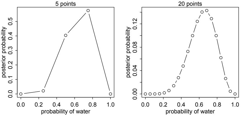
Figure 2.7. Computing posterior distribution by grid approximation. In each plot, the posterior distribution for the globe toss data and model is approximated with a finite number of evenly spaced points. With only 5 points (left), the approximation is terrible. But with 20 points (right), the approximation is already quite good. Compare to the analytically solved, exact posterior distribution in Figure 2.5 (page 30).
Now to replicate the different priors in Figure 2.5, try these lines of code—one at a time—for the prior grid:
2.5 prior <- ifelse( p_grid < 0.5 , 0 , 1 )
prior <- exp( -5*abs( p_grid - 0.5 ) )
The rest of the code remains the same.
Overthinking: Vectorization. One of R’s useful features is that it makes working with lists of numbers almost as easy as working with single values. So even though both lines of code above say nothing about how dense your grid is, whatever length you chose for the vector p_grid will determine the length of the vector prior. In R jargon, the calculations above are vectorized, because they work on lists of values, vectors. In a vectorized calculation, the calculation is performed on each element of the input vector—p_grid in this case—and the resulting output therefore has the same length. In other computing environments, the same calculation would require a loop. R can also use loops, but vectorized calculations are typically faster. They can however be much harder to read, when you are starting out with R. Be patient, and you’ll soon grow accustomed to vectorized calculations.
2.4.4. Quadratic approximation. We’ll stick with the grid approximation to the globe tossing posterior, for the rest of this chapter and the next. But before long you’ll have to resort to another approximation, one that makes stronger assumptions. The reason is that the number of unique values to consider in the grid grows rapidly as the number of parameters in your model increases. For the single-parameter globe tossing model, it’s no problem to compute a grid of 100 or 1000 values. But for two parameters approximated by 100 values each, that’s already 1002 = 10,000 values to compute. For 10 parameters, the grid becomes many
billions of values. These days, it’s routine to have models with hundreds or thousands of parameters. The grid approximation strategy scales very poorly with model complexity, so it won’t get us very far.
A useful approach is quadratic approximation. Under quite general conditions, the region near the peak of the posterior distribution will be nearly Gaussian—or “normal”—in shape. This means the posterior distribution can be usefully approximated by a Gaussian distribution. A Gaussian distribution is convenient, because it can be completely described by only two numbers: the location of its center (mean) and its spread (variance).
A Gaussian approximation is called “quadratic approximation” because the logarithm of a Gaussian distribution forms a parabola. And a parabola is a quadratic function. So this approximation essentially represents any log-posterior with a parabola.
We’ll use quadratic approximation for much of the first half of this book. For many of the most common procedures in applied statistics—linear regression, for example—the approximation works very well. Often, it is even exactly correct, not actually an approximation at all. Computationally, quadratic approximation is very inexpensive, at least compared to grid approximation and MCMC (discussed next). The procedure, which R will happily conduct at your command, contains two steps.
- Find the posterior mode. This is usually accomplished by some optimization algorithm, a procedure that virtually “climbs” the posterior distribution, as if it were a mountain. The golem doesn’t know where the peak is, but it does know the slope under its feet. There are many well-developed optimization procedures, most of them more clever than simple hill climbing. But all of them try to find peaks.
- Once you find the peak of the posterior, you must estimate the curvature near the peak. This curvature is sufficient to compute a quadratic approximation of the entire posterior distribution. In some cases, these calculations can be done analytically, but usually your computer uses some numerical technique instead.
To compute the quadratic approximation for the globe tossing data, we’ll use a tool in the rethinking package: quap. We’re going to be using quap a lot in the first half of this book. It’s a flexible model fitting tool that will allow us to specify a large number of different “regression” models. So it’ll be worth trying it out right now. You’ll get a more thorough understanding of it later.
To compute the quadratic approximation to the globe tossing data:
R code2.6 library(rethinking)
globe.qa <- quap(
alist(
W ~ dbinom( W+L ,p) , # binomial likelihood
p ~ dunif(0,1) # uniform prior
) ,
data=list(W=6,L=3) )
# display summary of quadratic approximation
precis( globe.qa )To use quap, you provide a formula, a list of data. The formula defines the probability of the data and the prior. I’ll say much more about these formulas in Chapter 4. Now let’s see the output:
Mean StdDev 5.5% 94.5%
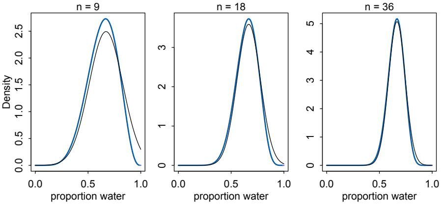
Figure 2.8. Accuracy of the quadratic approximation. In each plot, the exact posterior distribution is plotted in blue, and the quadratic approximation is plotted as the black curve. Left: The globe tossing data with n = 9 tosses and w = 6 waters. Middle: Double the amount of data, with the same fraction of water, n = 18 and w = 12. Right: Four times as much data, n = 36 and w = 24.
p 0.67 0.16 0.42 0.92
The function precis presents a brief summary of the quadratic approximation. In this case, it shows the posterior mean value of p = 0.67, which it calls the “Mean.” The curvature is labeled “StdDev” This stands for standard deviation. This value is the standard deviation of the posterior distribution, while the mean value is its peak. Finally, the last two values in the precis output show the 89% percentile interval, which you’ll learn more about in the next chapter. You can read this kind of approximation like: Assuming the posterior is Gaussian, it is maximized at 0.67, and its standard deviation is 0.16.
Since we already know the posterior, let’s compare to see how good the approximation is. I’ll use the analytical approach here, which uses dbeta. I won’t explain this calculation, but it ensures that we have exactly the right answer. You can find an explanation and derivation of it in just about any mathematical textbook on Bayesian inference.
2.7 # analytical calculation
W <- 6
L <- 3
curve( dbeta( x , W+1 , L+1 ) , from=0 , to=1 )
# quadratic approximation
curve( dnorm( x , 0.67 , 0.16 ) , lty=2 , add=TRUE )
You can see this plot (with a little extra formatting) on the left in Figure 2.8. The blue curve is the analytical posterior and the black curve is the quadratic approximation. The black curve does alright on its left side, but looks pretty bad on its right side. It even assigns positive probability to p = 1, which we know is impossible, since we saw at least one land sample.
As the amount of data increases, however, the quadratic approximation gets better. In the middle of Figure 2.8, the sample size is doubled to n = 18 tosses, but with the same fraction
of water, so that the mode of the posterior is in the same place. The quadratic approximation looks better now, although still not great. At quadruple the data, on the right side of the figure, the two curves are nearly the same now.
This phenomenon, where the quadratic approximation improves with the amount of data, is very common. It’s one of the reasons that so many classical statistical procedures are nervous about small samples: Those procedures use quadratic (or other) approximations that are only known to be safe with infinite data. Often, these approximations are useful with less than infinite data, obviously. But the rate of improvement as sample size increases varies greatly depending upon the details. In some models, the quadratic approximation can remain terrible even with thousands of samples.
Using the quadratic approximation in a Bayesian context brings with it all the same concerns. But you can always lean on some algorithm other than quadratic approximation, if you have doubts. Indeed, grid approximation works very well with small samples, because in such cases the model must be simple and the computations will be quite fast. You can also use MCMC, which is introduced next.
Rethinking: Maximum likelihood estimation. The quadratic approximation, either with a uniform prior or with a lot of data, is often equivalent to a maximum likelihood estimate (MLE) and its standard error. The MLE is a very common non-Bayesian parameter estimate. This correspondence between a Bayesian approximation and a common non-Bayesian estimator is both a blessing and a curse. It is a blessing, because it allows us to re-interpret a wide range of published non-Bayesian model fits in Bayesian terms. It is a curse, because maximum likelihood estimates have some curious drawbacks, and the quadratic approximation can share them. We’ll explore these drawbacks in later chapters, and they are one of the reasons we’ll turn to Markov chain Monte Carlo for the second half of the book.
Overthinking: The Hessians are coming. Sometimes it helps to know more about how the quadratic approximation is computed. In particular, the approximation sometimes fails. When it does, chances are you’ll get a confusing error message that says something about the “Hessian.” Students of world history may know that the Hessians were German mercenaries hired by the British in the eighteenth century to do various things, including fight against the American revolutionary George Washington. These mercenaries are named after a region of what is now central Germany, Hesse.
The Hessian that concerns us here has little to do with mercenaries. It is named after mathematician Ludwig Otto Hesse (1811–1874). A Hessian is a square matrix of second derivatives. It is used for many purposes in mathematics, but in the quadratic approximation it is second derivatives of the log of posterior probability with respect to the parameters. It turns out that these derivatives are sufficient to describe a Gaussian distribution, because the logarithm of a Gaussian distribution is just a parabola. Parabolas have no derivatives beyond the second, so once we know the center of the parabola (the posterior mode) and its second derivative, we know everything about it. And indeed the second derivative (with respect to the outcome) of the logarithm of a Gaussian distribution is proportional to its inverse squared standard deviation (its “precision”: page 76). So knowing the standard deviation tells us everything about its shape.
The standard deviation is typically computed from the Hessian, so computing the Hessian is nearly always a necessary step. But sometimes the computation goes wrong, and your golem will choke while trying to compute the Hessian. In those cases, you have several options. Not all hope is lost. But for now it’s enough to recognize the term and associate it with an attempt to find the standard deviation for a quadratic approximation.
2.4.5. Markov chain Monte Carlo. There are lots of important model types, like multilevel (mixed-effects) models, for which neither grid approximation nor quadratic approximation is always satisfactory. Such models may have hundreds or thousands or tens-of-thousands of parameters. Grid approximation routinely fails here, because it just takes too long—the Sun will go dark before your computer finishes the grid. Special forms of quadratic approximation might work, if everything is just right. But commonly, something is not just right. Furthermore, multilevel models do not always allow us to write down a single, unified function for the posterior distribution. This means that the function to maximize (when finding the MAP) is not known, but must be computed in pieces.
As a result, various counterintuitive model fitting techniques have arisen. The most popular of these is Markov chain Monte Carlo (MCMC), which is a family of conditioning engines capable of handling highly complex models. It is fair to say that MCMC is largely responsible for the insurgence of Bayesian data analysis that began in the 1990s. While MCMC is older than the 1990s, affordable computer power is not, so we must also thank the engineers. Much later in the book(Chapter 9), you’ll meet simple and precise examples of MCMC model fitting, aimed at helping you understand the technique.
The conceptual challenge with MCMC lies in its highly non-obvious strategy. Instead of attempting to compute or approximate the posterior distribution directly, MCMC techniques merely draw samples from the posterior. You end up with a collection of parameter values, and the frequencies of these values correspond to the posterior plausibilities. You can then build a picture of the posterior from the histogram of these samples.
We nearly always work directly with these samples, rather than first constructing some mathematical estimate from them. And the samples are in many ways more convenient than having the posterior, because they are easier to think with. And so that’s where we turn in the next chapter, to thinking with samples.
Overthinking: Monte Carlo globe tossing. If you are eager to see MCMC in action, a working Markov chain for the globe tossing model does not require much code. The following R code is sufficient for a MCMC estimate of the posterior:
2.8 n_samples <- 1000
p <- rep( NA , n_samples )
p[1] <- 0.5
W <- 6
L <- 3
for ( i in 2:n_samples ) {
   p_new <- rnorm( 1 , p[i-1] , 0.1 )
   if ( p_new < 0 ) p_new <- abs( p_new )
   if ( p_new > 1 ) p_new <- 2 - p_new
   q0 <- dbinom( W , W+L , p[i-1] )
   q1 <- dbinom( W , W+L , p_new )
   p[i] <- ifelse( runif(1) < q1/q0 , p_new , p[i-1] )
}
The values in p are samples from the posterior distribution. To compare to the analytical posterior:
2.9 dens( p , xlim=c(0,1) )
curve( dbeta( x , W+1 , L+1 ) , lty=2 , add=TRUE )
It’s weird. But it works. I’ll explain this algorithm, the Metropolis algorithm, in Chapter 9.
2.5. Summary
This chapter introduced the conceptual mechanics of Bayesian data analysis. The target of inference in Bayesian inference is a posterior probability distribution. Posterior probabilities state the relative numbers of ways each conjectured cause of the data could have produced the data. These relative numbers indicate plausibilities of the different conjectures. These plausibilities are updated in light of observations through Bayesian updating.
More mechanically, a Bayesian model is a composite of variables and distributional definitions for these variables. The probability of the data, often called the likelihood, provides the plausibility of an observation (data), given a fixed value for the parameters. The prior provides the plausibility of each possible value of the parameters, before accounting for the data. The rules of probability tell us that the logical way to compute the plausibilities, after accounting for the data, is to use Bayes’ theorem. This results in the posterior distribution.
In practice, Bayesian models are fit to data using numerical techniques, like grid approximation, quadratic approximation, and Markov chain Monte Carlo. Each method imposes different trade-offs.
2.6. Practice
Problems are labeled Easy (E), Medium (M), and Hard (H).
2E1. Which of the expressions below correspond to the statement: the probability of rain on Monday?
- Pr(rain)
- Pr(rain|Monday)
- Pr(Monday|rain)
- Pr(rain, Monday)/ Pr(Monday)
2E2. Which of the following statements corresponds to the expression: Pr(Monday|rain)?
- The probability of rain on Monday.
- The probability of rain, given that it is Monday.
- The probability that it is Monday, given that it is raining.
- The probability that it is Monday and that it is raining.
2E3. Which of the expressions below correspond to the statement: the probability that it is Monday, given that it is raining?
- Pr(Monday|rain)
- Pr(rain|Monday)
- Pr(rain|Monday) Pr(Monday)
- Pr(rain|Monday) Pr(Monday)/ Pr(rain)
- Pr(Monday|rain) Pr(rain)/ Pr(Monday)
2E4. The Bayesian statistician Bruno de Finetti (1906–1985) began his 1973 book on probability theory with the declaration: “PROBABILITY DOES NOT EXIST.” The capitals appeared in the original, so I imagine de Finetti wanted us to shout this statement. What he meant is that probability is a device for describing uncertainty from the perspective of an observer with limited knowledge; it has no objective reality. Discuss the globe tossing example from the chapter, in light of this statement. What does it mean to say “the probability of water is 0.7”?
2M1. Recall the globe tossing model from the chapter. Compute and plot the grid approximate posterior distribution for each of the following sets of observations. In each case, assume a uniform prior for p.
- W, W, W
- W, W, W, L
- L, W, W, L, W, W, W
2M2. Now assume a prior for p that is equal to zero when p < 0.5 and is a positive constant when p ≥ 0.5. Again compute and plot the grid approximate posterior distribution for each of the sets of observations in the problem just above.
2M3. Suppose there are two globes, one for Earth and one for Mars. The Earth globe is 70% covered in water. The Mars globe is 100% land. Further suppose that one of these globes—you don’t know which—was tossed in the air and produced a “land” observation. Assume that each globe was equally likely to be tossed. Show that the posterior probability that the globe was the Earth, conditional on seeing “land” (Pr(Earth|land)), is 0.23.
2M4. Suppose you have a deck with only three cards. Each card has two sides, and each side is either black or white. One card has two black sides. The second card has one black and one white side. The third card has two white sides. Now suppose all three cards are placed in a bag and shuffled. Someone reaches into the bag and pulls out a card and places it flat on a table. A black side is shown facing up, but you don’t know the color of the side facing down. Show that the probability that the other side is also black is 2/3. Use the counting method (Section 2 of the chapter) to approach this problem. This means counting up the ways that each card could produce the observed data (a black side facing up on the table).
2M5. Now suppose there are four cards: B/B, B/W, W/W, and another B/B. Again suppose a card is drawn from the bag and a black side appears face up. Again calculate the probability that the other side is black.
2M6. Imagine that black ink is heavy, and so cards with black sides are heavier than cards with white sides. As a result, it’s less likely that a card with black sides is pulled from the bag. So again assume there are three cards: B/B, B/W, and W/W. After experimenting a number of times, you conclude that for every way to pull the B/B card from the bag, there are 2 ways to pull the B/W card and 3 ways to pull the W/W card. Again suppose that a card is pulled and a black side appears face up. Show that the probability the other side is black is now 0.5. Use the counting method, as before.
2M7. Assume again the original card problem, with a single card showing a black side face up. Before looking at the other side, we draw another card from the bag and lay it face up on the table. The face that is shown on the new card is white. Show that the probability that the first card, the one showing a black side, has black on its other side is now 0.75. Use the counting method, if you can. Hint: Treat this like the sequence of globe tosses, counting all the ways to see each observation, for each possible first card.
2H1. Suppose there are two species of panda bear. Both are equally common in the wild and live in the same places. They look exactly alike and eat the same food, and there is yet no genetic assay capable of telling them apart. They differ however in their family sizes. Species A gives birth to twins 10% of the time, otherwise birthing a single infant. Species B births twins 20% of the time, otherwise birthing singleton infants. Assume these numbers are known with certainty, from many years of field research.
Now suppose you are managing a captive panda breeding program. You have a new female panda of unknown species, and she has just given birth to twins. What is the probability that her next birth will also be twins?
2H2. Recall all the facts from the problem above. Now compute the probability that the panda we have is from species A, assuming we have observed only the first birth and that it was twins.
2H3. Continuing on from the previous problem, suppose the same panda mother has a second birth and that it is not twins, but a singleton infant. Compute the posterior probability that this panda is species A.
2H4. A common boast of Bayesian statisticians is that Bayesian inference makes it easy to use all of the data, even if the data are of different types.
So suppose now that a veterinarian comes along who has a new genetic test that she claims can identify the species of our mother panda. But the test, like all tests, is imperfect. This is the information you have about the test:
- • The probability it correctly identifies a species A panda is 0.8.
- • The probability it correctly identifies a species B panda is 0.65.
The vet administers the test to your panda and tells you that the test is positive for species A. First ignore your previous information from the births and compute the posterior probability that your panda is species A. Then redo your calculation, now using the birth data as well.
3 Sampling the Imaginary
Lots of books on Bayesian statistics introduce posterior inference by using a medical testing scenario. To repeat the structure of common examples, suppose there is a blood test that correctly detects vampirism 95% of the time. In more precise and mathematical notation, Pr(positive test result|vampire) = 0.95. It’s a very accurate test, nearly always catching real vampires. It also make mistakes, though, in the form of false positives. One percent of the time, it incorrectly diagnoses normal people as vampires, Pr(positive test result|mortal) = 0.01. The final bit of information we are told is that vampires are rather rare, being only 0.1% of the population, implying Pr(vampire) = 0.001. Suppose now that someone tests positive for vampirism. What’s the probability that he or she is a bloodsucking immortal?
The correct approach is just to use Bayes’ theorem to invert the probability, to compute Pr(vampire|positive). The calculation can be presented as:
\[\Pr(\text{vampire}|\text{positive}) = \frac{\Pr(\text{positive}|\text{vampire})\Pr(\text{vampire})}{\Pr(\text{positive})}\]
where Pr(positive) is the average probability of a positive test result, that is,
\[\begin{aligned} \Pr(\text{positive}) &= \Pr(\text{positive}|\text{unpire})\Pr(\text{unpire})\\ &+ \Pr(\text{positive}|\text{mortal})(1 - \Pr(\text{vampire})) \end{aligned}\]
Performing the calculation in R:
3.1 Pr_Positive_Vampire <- 0.95
Pr_Positive_Mortal <- 0.01
Pr_Vampire <- 0.001
Pr_Positive <- Pr_Positive_Vampire * Pr_Vampire +
            Pr_Positive_Mortal * ( 1 - Pr_Vampire )
( Pr_Vampire_Positive <- Pr_Positive_Vampire*Pr_Vampire / Pr_Positive )
[1] 0.08683729
That corresponds to an 8.7% chance that the suspect is actually a vampire.
Most people find this result counterintuitive. And it’s a very important result, because it mimics the structure of many realistic testing contexts, such as HIV and DNA testing, criminal profiling, and even statistical significance testing (see the Rethinking box at the end of this section). Whenever the condition of interest is very rare, having a test that finds all the true cases is still no guarantee that a positive result carries much information at all. The reason is that most positive results are false positives, even when all the true positives are detected correctly.
But I don’t like these examples, for two reasons. First, there’s nothing uniquely “Bayesian” about them. Remember: Bayesian inference is distinguished by a broad view of probability, not by the use of Bayes’ theorem. Since all of the probabilities I provided above reference frequencies of events, rather than theoretical parameters, all major statistical philosophies would agree to use Bayes’ theorem in this case. Second, and more important to our work in this chapter, these examples make Bayesian inference seem much harder than it has to be. Few people find it easy to remember which number goes where, probably because they never grasp the logic of the procedure. It’s just a formula that descends from the sky. If you are confused, it is only because you are trying to understand.
There is a way to present the same problem that does make it more intuitive, however. Suppose that instead of reporting probabilities, as before, I tell you the following:
- In a population of 100,000 people, 100 of them are vampires.
- Of the 100 who are vampires, 95 of them will test positive for vampirism.
- Of the 99,900 mortals, 999 of them will test positive for vampirism.
Now tell me, if we test all 100,000 people, what proportion of those who test positive for vampirism actually are vampires? Many people, although certainly not all people, find this presentation a lot easier.50 Now we can just count up the number of people who test positive: 95 + 999 = 1094. Out of these 1094 positive tests, 95 of them are real vampires, so that implies:
\[\Pr(\text{vampire}|\text{positive}) = \frac{95}{1094} \approx 0.087\]
It’s exactly the same answer as before, but without a seemingly arbitrary rule.
The second presentation of the problem, using counts rather than probabilities, is often called the frequency format or natural frequencies. Why a frequency format helps people intuit the correct approach remains contentious. Some people think that human psychology naturally works better when it receives information in the form a person in a natural environment would receive it. In the real world, we encounter counts only. No one has ever seen a probability, the thinking goes. But everyone sees counts (“frequencies”) in their daily lives.
Regardless of the explanation for this phenomenon, we can exploit it. And in this chapter we exploit it by taking the probability distributions from the previous chapter and sampling from them to produce counts. The posterior distribution is a probability distribution. And like all probability distributions, we can imagine drawing samples from it. The sampled events in this case are parameter values. Most parameters have no exact empirical realization. The Bayesian formalism treats parameter distributions as relative plausibility, not as any physical random process. In any event, randomness is always a property of information, never of the real world. But inside the computer, parameters are just as empirical as the outcome of a coin flip or a die toss or an agricultural experiment. The posterior defines the expected frequency that different parameter values will appear, once we start plucking parameters out of it.
Rethinking: The natural frequency phenomenon is not unique. Changing the representation of a problem often makes it easier to address or inspires new ideas that were not available in an old representation.51 In physics, switching between Newtonian and Lagrangian mechanics can make problems much easier. In evolutionary biology, switching between inclusive fitness and multilevel selection sheds new light on old models. And in statistics, switching between Bayesian and non-Bayesian representations often teaches us new things about both approaches.
This chapter teaches you basic skills for working with samples from the posterior distribution. It will seem a little silly to work with samples at this point, because the posterior distribution for the globe tossing model is very simple. It’s so simple that it’s no problem to work directly with the grid approximation or even the exact mathematical form.52 But there are two reasons to adopt the sampling approach early on, before it’s really necessary.
First, many scientists are uncomfortable with integral calculus, even though they have strong and valid intuitions about how to summarize data. Working with samples transforms a problem in calculus into a problem in data summary, into a frequency format problem. An integral in a typical Bayesian context is just the total probability in some interval. That can be a challenging calculus problem. But once you have samples from the probability distribution, it’s just a matter of counting values in the interval. An empirical attack on the posterior allows the scientist to ask and answer more questions about the model, without relying upon a captive mathematician. For this reason, it is easier and more intuitive to work with samples from the posterior, than to work with probabilities and integrals directly.
Second, some of the most capable methods of computing the posterior produce nothing but samples. Many of these methods are variants of Markov chain Monte Carlo techniques (MCMC, Chapter 9). So if you learn early on how to conceptualize and process samples from the posterior, when you inevitably must fit a model to data using MCMC, you will already know how to make sense of the output. Beginning with Chapter 9 of this book, you will use MCMC to open up the types and complexity of models you can practically fit to data. MCMC is no longer a technique only for experts, but rather part of the standard toolkit of quantitative science. So it’s worth planning ahead.
So in this chapter we’ll begin to use samples to summarize and simulate model output. The skills you learn here will apply to every problem in the remainder of the book, even though the details of the models and how the samples are produced will vary.
Rethinking: Why statistics can’t save bad science. The vampirism example at the start of this chapter has the same logical structure as many different signal detection problems: (1) There is some binary state that is hidden from us; (2) we observe an imperfect cue of the hidden state; (3) we (should) use Bayes’ theorem to logically deduce the impact of the cue on our uncertainty.
Scientific inference is sometimes framed in similar terms: (1) An hypothesis is either true or false; (2) we get a statistical cue of the hypothesis’ falsity; (3) we (should) use Bayes’ theorem to logically deduce the impact of the cue on the status of the hypothesis. It’s the third step that is hardly ever done. I’m not really a fan of this framing. But let’s consider a toy example, so you can see the implications. Suppose the probability of a positive finding, when an hypothesis is true, is Pr(sig|true) = 0.95. That’s the power of the test. Suppose that the probability of a positive finding, when an hypothesis is false, is Pr(sig|false) = 0.05. That’s the false-positive rate, like the 5% of conventional significance testing. Finally, we have to state the base rate at which hypotheses are true. Suppose for example that 1 in every 100 hypotheses turns out to be true. Then Pr(true) = 0.01. No one knows this value, but the history of science suggests it’s small. See Chapter 17 for more discussion. Now compute the posterior:
\[\Pr(\text{true}|\text{pos}) = \frac{\Pr(\text{pos}|\text{true})\Pr(\text{true})}{\Pr(\text{pos})} = \frac{\Pr(\text{pos}|\text{true})\Pr(\text{true})}{\Pr(\text{pos}|\text{true})\Pr(\text{true}) + \Pr(\text{pos}|\text{false})\Pr(\text{false})}\]
Plug in the appropriate values, and the answer is approximately Pr(true|pos) = 0.16. So a positive finding corresponds to a 16% chance that the hypothesis is true. This is the same low base-rate phenomenon that applies in medical (and vampire) testing. You can shrink the false-positive rate to 1% and get this posterior probability up to 0.5, only as good as a coin flip. The most important thing to do is to improve the base rate, Pr(true), and that requires thinking, not testing.53
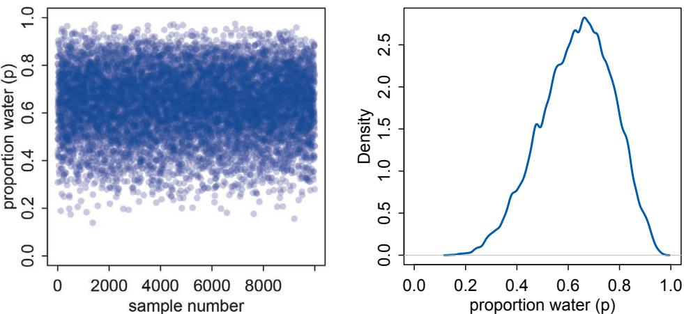
Figure 3.1. Sampling parameter values from the posterior distribution. Left: 10,000 samples from the posterior implied by the globe tossing data and model. Right: The density of samples (vertical) at each parameter value (horizontal).
3.1. Sampling from a grid-approximate posterior
Before beginning to work with samples, we need to generate them. Here’s a reminder for how to compute the posterior for the globe tossing model, using grid approximation. Remember, the posterior here means the probability of p conditional on the data.
R code
3.2 p_grid <- seq( from=0 , to=1 , length.out=1000 )
    prob_p <- rep( 1 , 1000 )
    prob_data <- dbinom( 6 , size=9 , prob=p_grid )
    posterior <- prob_data * prob_p
    posterior <- posterior / sum(posterior)
Now we wish to draw 10,000 samples from this posterior. Imagine the posterior is a bucket full of parameter values, numbers such as 0.1, 0.7, 0.5, 1, etc. Within the bucket, each value exists in proportion to its posterior probability, such that values near the peak are much more common than those in the tails. We’re going to scoop out 10,000 values from the bucket. Provided the bucket is well mixed, the resulting samples will have the same proportions as the exact posterior density. Therefore the individual values of p will appear in our samples in proportion to the posterior plausibility of each value.
Here’s how you can do this in R, with one line of code:
R code
3.3 samples <- sample( p_grid , prob=posterior , size=1e4 , replace=TRUE )
The workhorse here is sample, which randomly pulls values from a vector. The vector in this case is p_grid, the grid of parameter values. The probability of each value is given by posterior, which you computed just above.
The resulting samples are displayed in Figure 3.1. On the left, all 10,000 (1e4) random samples are shown sequentially.
3.4 plot( samples )In this plot, it’s as if you are flying over the posterior distribution, looking down on it. There are many more samples from the dense region near 0.6 and very few samples below 0.25. On the right, the plot shows the density estimate computed from these samples.
3.5 library(rethinking)
dens( samples )
You can see that the estimated density is very similar to ideal posterior you computed via grid approximation. If you draw even more samples, maybe 1e5 or 1e6, the density estimate will get more and more similar to the ideal.
All you’ve done so far is crudely replicate the posterior density you had already computed. That isn’t of much value. But next it is time to use these samples to describe and understand the posterior. That is of great value.
3.2. Sampling to summarize
Once your model produces a posterior distribution, the model’s work is done. But your work has just begun. It is necessary to summarize and interpret the posterior distribution. Exactly how it is summarized depends upon your purpose. But common questions include:
- • How much posterior probability lies below some parameter value?
- • How much posterior probability lies between two parameter values?
- • Which parameter value marks the lower 5% of the posterior probability?
- • Which range of parameter values contains 90% of the posterior probability?
- • Which parameter value has highest posterior probability?
These simple questions can be usefully divided into questions about (1) intervals of defined boundaries, (2) questions about intervals of defined probability mass, and (3) questions about point estimates. We’ll see how to approach these questions using samples from the posterior.
3.2.1. Intervals of defined boundaries. Suppose I ask you for the posterior probability that the proportion of water is less than 0.5. Using the grid-approximate posterior, you can just add up all of the probabilities, where the corresponding parameter value is less than 0.5:
3.6 # add up posterior probability where p < 0.5
sum( posterior[ p_grid < 0.5 ] )
R code
[1] 0.1718746
So about 17% of the posterior probability is below 0.5. Couldn’t be easier. But since grid approximation isn’t practical in general, it won’t always be so easy. Once there is more than one parameter in the posterior distribution (wait until the next chapter for that complication), even this simple sum is no longer very simple.
So let’s see how to perform the same calculation, using samples from the posterior. This approach does generalize to complex models with many parameters, and so you can use it everywhere. All you have to do is similarly add up all of the samples below 0.5, but also
R code
divide the resulting count by the total number of samples. In other words, find the frequency of parameter values below 0.5:
R code
  3.7 sum( samples < 0.5 ) / 1e4
[1] 0.1726
And that’s nearly the same answer as the grid approximation provided, although your answer will not be exactly the same, because the exact samples you drew from the posterior will be different. This region is shown in the upper-left plot in Figure 3.2. Using the same approach, you can ask how much posterior probability lies between 0.5 and 0.75:
R code
  3.8 sum( samples > 0.5 & samples < 0.75 ) / 1e4
[1] 0.6059
So about 61% of the posterior probability lies between 0.5 and 0.75. This region is shown in the upper-right plot of Figure 3.2.
Overthinking: Counting with sum. In the R code examples just above, I used the function sum to effectively count up how many samples fulfill a logical criterion. Why does this work? It works because R internally converts a logical expression, like samples < 0.5, to a vector of TRUE and FALSE results, one for each element of samples, saying whether or not each element matches the criterion. Go ahead and enter samples < 0.5 on the R prompt, to see this for yourself. Then when you sum this vector of TRUE and FALSE, R counts each TRUE as 1 and each FALSE as 0. So it ends up counting how many TRUE values are in the vector, which is the same as the number of elements in samples that match the logical criterion.
3.2.2. Intervals of defined mass. It is more common to see scientific journals reporting an interval of defined mass, usually known as a confidence interval. An interval of posterior probability, such as the ones we are working with, may instead be called a credible interval. We’re going to call it a compatibility interval instead, in order to avoid the unwarranted implications of “confidence” and “credibility.”54 What the interval indicates is a range of parameter values compatible with the model and data. The model and data themselves may not inspire confidence, in which case the interval will not either.
These posterior intervals report two parameter values that contain between them a specified amount of posterior probability, a probability mass. For this type of interval, it is easier to find the answer by using samples from the posterior than by using a grid approximation. Suppose for example you want to know the boundaries of the lower 80% posterior probability. You know this interval starts at p = 0. To find out where it stops, think of the samples as data and ask where the 80th percentile lies:
R code
  3.9 quantile( samples , 0.8 )
80%
0.7607608
This region is shown in the bottom-left plot in Figure 3.2. Similarly, the middle 80% interval lies between the 10th percentile and the 90th percentile. These boundaries are found using the same approach:
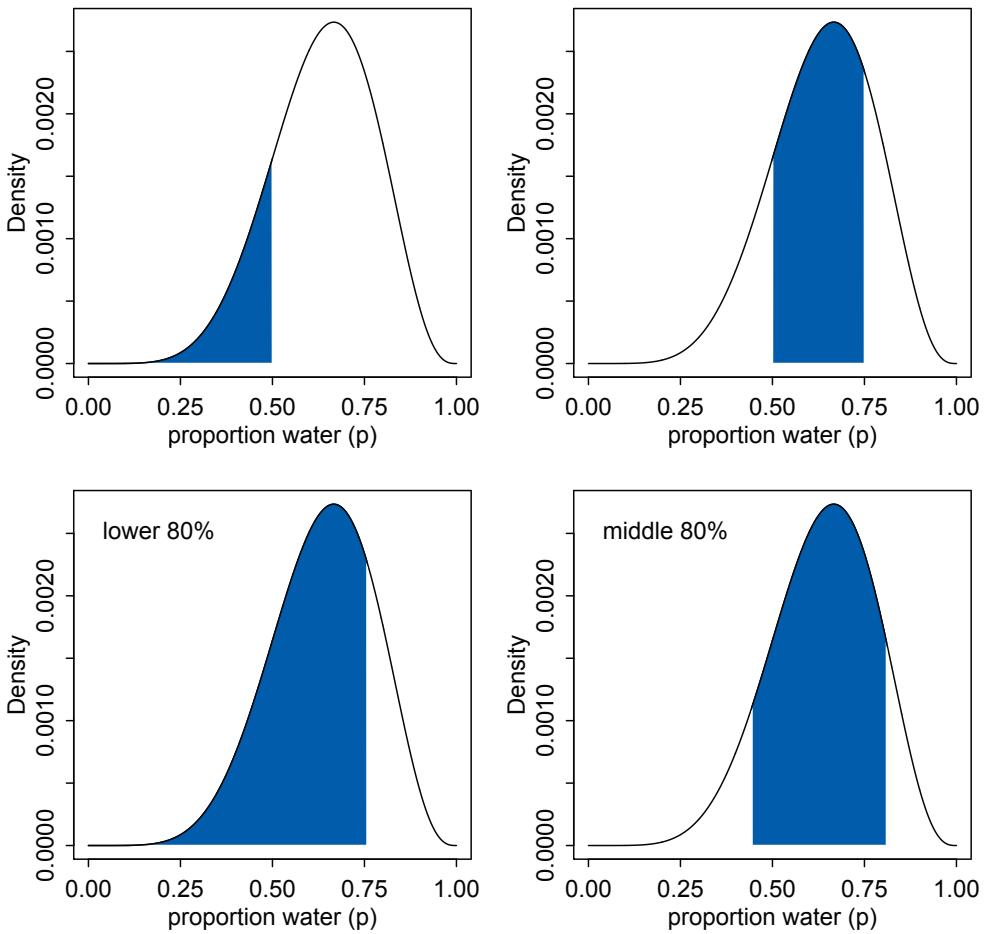
Figure 3.2. Two kinds of posterior interval. Top row: Intervals of defined boundaries. Top-left: The blue area is the posterior probability below a parameter value of 0.5. Top-right: The posterior probability between 0.5 and 0.75. Bottom row: Intervals of defined mass. Bottom-left: Lower 80% posterior probability exists below a parameter value of about 0.75. Bottom-right: Middle 80% posterior probability lies between the 10% and 90% quantiles.
3.10 quantile( samples , c( 0.1 , 0.9 ) )
10% 90% 0.4464464 0.8118118
This region is shown in the bottom-right plot in Figure 3.2.
Intervals of this sort, which assign equal probability mass to each tail, are very common in the scientific literature. We’ll call them percentile intervals (PI). These intervals do a good job of communicating the shape of a distribution, as long as the distribution isn’t too asymmetrical. But in terms of supporting inferences about which parameters are consistent with the data, they are not perfect. Consider the posterior distribution and different intervals
in Figure 3.3. This posterior is consistent with observing three waters in three tosses and a uniform (flat) prior. It is highly skewed, having its maximum value at the boundary, p = 1. You can compute it, via grid approximation, with:
R code3.11 p_grid <- seq( from=0 , to=1 , length.out=1000 )
prior <- rep(1,1000)
likelihood <- dbinom( 3 , size=3 , prob=p_grid )
posterior <- likelihood * prior
posterior <- posterior / sum(posterior)
samples <- sample( p_grid , size=1e4 , replace=TRUE , prob=posterior )This code also goes ahead to sample from the posterior. Now, on the left of Figure 3.3, the 50% percentile compatibility interval is shaded. You can conveniently compute this from the samples with PI (part of rethinking):
R code
 3.12 PI( samples , prob=0.5 )
25% 75%
0.7037037 0.9329329This interval assigns 25% of the probability mass above and below the interval. So it provides the central 50% probability. But in this example, it ends up excluding the most probable parameter values, near p = 1. So in terms of describing the shape of the posterior distribution—which is really all these intervals are asked to do—the percentile interval can be misleading.
In contrast, the right-hand plot in Figure 3.3 displays the 50% highest posterior density interval (HPDI).57 The HPDI is the narrowest interval containing the specified probability mass. If you think about it, there must be an infinite number of posterior intervals
Rethinking: Why 95%? The most common interval mass in the natural and social sciences is the 95% interval. This interval leaves 5% of the probability outside, corresponding to a 5% chance of the parameter not lying within the interval (although see below). This customary interval also reflects the customary threshold for statistical significance, which is 5% or p < 0.05. It is not easy to defend the choice of 95% (5%), outside of pleas to convention. Ronald Fisher is sometimes blamed for this choice, but his widely cited 1925 invocation of it was not enthusiastic:
“The [number of standard deviations] for which P = .05, or 1 in 20, is 1.96 or nearly 2; it is convenient to take this point as a limit in judging whether a deviation is to be considered significant or not.”55
Most people don’t think of convenience as a serious criterion. Later in his career, Fisher actively advised against always using the same threshold for significance.56
So what are you supposed to do then? There is no consensus, but thinking is always a good idea. If you are trying to say that an interval doesn’t include some value, then you might use the widest interval that excludes the value. Often, all compatibility intervals do is communicate the shape of a distribution. In that case, a series of nested intervals may be more useful than any one interval. For example, why not present 67%, 89%, and 97% intervals, along with the median? Why these values? No reason. They are prime numbers, which makes them easy to remember. But all that matters is they be spaced enough to illustrate the shape of the posterior. And these values avoid 95%, since conventional 95% intervals encourage many readers to conduct unconscious hypothesis tests.
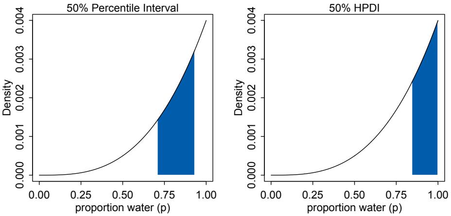
Figure 3.3. The difference between percentile and highest posterior density compatibility intervals. The posterior density here corresponds to a flat prior and observing three water samples in three total tosses of the globe. Left: 50% percentile interval. This interval assigns equal mass (25%) to both the left and right tail. As a result, it omits the most probable parameter value, p = 1. Right: 50% highest posterior density interval, HPDI. This interval finds the narrowest region with 50% of the posterior probability. Such a region always includes the most probable parameter value.
with the same mass. But if you want an interval that best represents the parameter values most consistent with the data, then you want the densest of these intervals. That’s what the HPDI is. Compute it from the samples with HPDI (also part of rethinking):
3.13 HPDI( samples , prob=0.5 )
  |0.5 0.5|
0.8408408 1.0000000
This interval captures the parameters with highest posterior probability, as well as being noticeably narrower: 0.16 in width rather than 0.23 for the percentile interval.
So the HPDI has some advantages over the PI. But in most cases, these two types of interval are very similar.58 They only look so different in this case because the posterior distribution is highly skewed. If we instead used samples from the posterior distribution for six waters in nine tosses, these intervals would be nearly identical. Try it for yourself, using different probability masses, such as prob=0.8 and prob=0.95. When the posterior is bell shaped, it hardly matters which type of interval you use. Remember, we’re not launching rockets or calibrating atom smashers, so fetishizing precision to the 5th decimal place will not improve your science.
The HPDI also has some disadvantages. HPDI is more computationally intensive than PI and suffers from greatersimulation variance, which is a fancy way of saying that it is sensitive to how many samples you draw from the posterior. It is also harder to understand and many scientific audiences will not appreciate its features, while they will immediately understand a percentile interval, as ordinary non-Bayesian intervals are typically interpreted (incorrectly) as percentile intervals (although see the Rethinking box below).
Overall, if the choice of interval type makes a big difference, then you shouldn’t be using intervals to summarize the posterior. Remember, the entire posterior distribution is the Bayesian “estimate.” It summarizes the relative plausibilities of each possible value of the parameter. Intervals of the distribution are just helpful for summarizing it. If choice of interval leads to different inferences, then you’d be better off just plotting the entire posterior distribution.
Rethinking: What do compatibility intervals mean? It is common to hear that a 95% “confidence” interval means that there is a probability 0.95 that the true parameter value lies within the interval. In strict non-Bayesian statistical inference, such a statement is never correct, because strict non-Bayesian inference forbids using probability to measure uncertainty about parameters. Instead, one should say that if we repeated the study and analysis a very large number of times, then 95% of the computed intervals would contain the true parameter value. If the distinction is not entirely clear to you, then you are in good company. Most scientists find the definition of a confidence interval to be bewildering, and many of them slip unconsciously into a Bayesian interpretation.
But whether you use a Bayesian interpretation or not, a 95% interval does not contain the true value 95% of the time. The history of science teaches us that confidence intervals exhibit chronic overconfidence.59 The word true should set off alarms that something is wrong with a statement like “contains the true value.” The 95% is a small world number (see the introduction to Chapter 2), only true in the model’s logical world. So it will never apply exactly to the real or large world. It is what the golem believes, but you are free to believe something else. Regardless, the width of the interval, and the values it covers, can provide valuable advice.
3.2.3. Point estimates. The third and final common summary task for the posterior is to produce point estimates of some kind. Given the entire posterior distribution, what value should you report? This seems like an innocent question, but it is difficult to answer. The Bayesian parameter estimate is precisely the entire posterior distribution, which is not a single number, but instead a function that maps each unique parameter value onto a plausibility value. So really the most important thing to note is that you don’t have to choose a point estimate. It’s hardly ever necessary and often harmful. It discards information.
But if you must produce a single point to summarize the posterior, you’ll have to ask and answer more questions. Consider the following example. Suppose again the globe tossing experiment in which we observe 3 waters out of 3 tosses, as in Figure 3.3. Let’s consider three alternative point estimates. First, it is very common for scientists to report the parameter value with highest posterior probability, a maximum a posteriori (MAP) estimate. You can easily compute the MAP in this example:
R code3.14 p_grid[ which.max(posterior) ][1] 1
Or if you instead have samples from the posterior, you can still approximate the same point:
R code
 3.15 chainmode( samples , adj=0.01 )
[1] 0.9985486
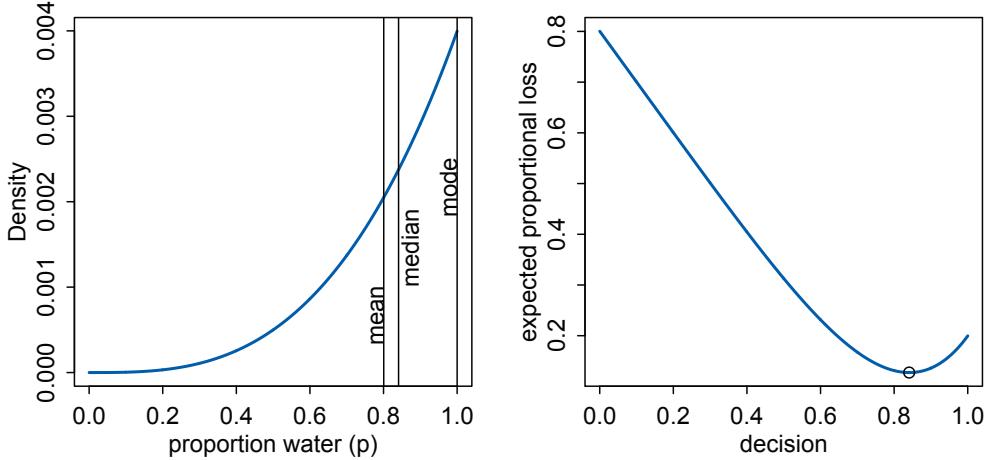
Figure 3.4. Point estimates and loss functions. Left: Posterior distribution (blue) after observing 3 water in 3 tosses of the globe. Vertical lines show the locations of the mode, median, and mean. Each point implies a different loss function. Right: Expected loss under the rule that loss is proportional to absolute distance of decision (horizontal axis) from the true value. The point marks the value of p that minimizes the expected loss, the posterior median.
But why is this point, the mode, interesting? Why not report the posterior mean or median?
| mean( samples ) |
R code 3.16 |
|---|---|
| median( samples ) |
[1] 0.8005558 [1] 0.8408408
These are also point estimates, and they also summarize the posterior. But all three—the mode (MAP), mean, and median—are different in this case. How can we choose? Figure 3.4 shows this posterior distribution and the locations of these point summaries.
One principled way to go beyond using the entire posterior as the estimate is to choose a loss function. A loss function is a rule that tells you the cost associated with using any particular point estimate. While statisticians and game theorists have long been interested in loss functions, and how Bayesian inference supports them, scientists hardly ever use them explicitly. The key insight is that different loss functions imply different point estimates.
Here’s an example to help us work through the procedure. Suppose I offer you a bet. Tell me which value of p, the proportion of water on the Earth, you think is correct. I will pay you $100, if you get it exactly right. But I will subtract money from your gain, proportional to the distance of your decision from the correct value. Precisely, your loss is proportional to the absolute value of d−p, where d is your decision and p is the correct answer. We could change the precise dollar values involved, without changing the important aspects of this problem. What matters is that the loss is proportional to the distance of your decision from the true value.
Now once you have the posterior distribution in hand, how should you use it to maximize your expected winnings? It turns out that the parameter value that maximizes expected winnings (minimizes expected loss) is the median of the posterior distribution. Let’s calculate that fact, without using a mathematical proof. Those interested in the proof should follow the endnote.60
Calculating expected loss for any given decision means using the posterior to average over our uncertainty in the true value. Of course we don’t know the true value, in most cases. But if we are going to use our model’s information about the parameter, that means using the entire posterior distribution. So suppose we decide p = 0.5 will be our decision. Then the expected loss will be:
R code
 3.17 sum( posterior*abs( 0.5 - p_grid ) )
[1] 0.3128752
The symbols posterior and p_grid are the same ones we’ve been using throughout this chapter, containing the posterior probabilities and the parameter values, respectively. All the code above does is compute the weighted average loss, where each loss is weighted by its corresponding posterior probability. There’s a trick for repeating this calculation for every possible decision, using the function sapply.
R code 3.18 loss <- sapply( p_grid , function(d) sum( posterior*abs( d - p_grid ) ) )
Now the symbol loss contains a list of loss values, one for each possible decision, corresponding the values in p_grid. From here, it’s easy to find the parameter value that minimizes the loss:
R code
3.19 p_grid[ which.min(loss) ][1] 0.8408408
And this is actually the posterior median, the parameter value that splits the posterior density such that half of the mass is above it and half below it. Try median(samples) for comparison. It may not be exactly the same value, due to sampling variation, but it will be close.
So what are we to learn from all of this? In order to decide upon a point estimate, a single-value summary of the posterior distribution, we need to pick a loss function. Different loss functions nominate different point estimates. The two most common examples are the absolute loss as above, which leads to the median as the point estimate, and the quadratic loss (d − p) 2 , which leads to the posterior mean (mean(samples)) as the point estimate. When the posterior distribution is symmetrical and normal-looking, then the median and mean converge to the same point, which relaxes some anxiety we might have about choosing a loss function. For the original globe tossing data (6 waters in 9 tosses), for example, the mean and median are barely different.
In principle, though, the details of the applied context may demand a rather unique loss function. Consider a practical example like deciding whether or not to order an evacuation, based upon an estimate of hurricane wind speed. Damage to life and property increases very rapidly as wind speed increases. There are also costs to ordering an evacuation when none is needed, but these are much smaller. Therefore the implied loss function is highly asymmetric, rising sharply as true wind speed exceeds our guess, but rising only slowly as true wind speed falls below our guess. In this context, the optimal point estimate would tend to be larger than posterior mean or median. Moreover, the real issue is whether or not to order an evacuation. Producing a point estimate of wind speed may not be necessary at all.
Usually, research scientists don’t think about loss functions. And so any point estimate like the mean or MAP that they may report isn’t intended to support any particular decision, but rather to describe the shape of the posterior. You might argue that the decision to make is whether or not to accept an hypothesis. But the challenge then is to say what the relevant costs and benefits would be, in terms of the knowledge gained or lost.61 Usually it’s better to communicate as much as you can about the posterior distribution, as well as the data and the model itself, so that others can build upon your work. Premature decisions to accept or reject hypotheses can cost lives.62
It’s healthy to keep these issues in mind, if only because they remind us that many of the routine questions in statistical inference can only be answered under consideration of a particular empirical context and applied purpose. Statisticians can provide general outlines and standard answers, but a motivated and attentive scientist will always be able to improve upon such general advice.
3.3. Sampling to simulate prediction
Another common job for samples is to ease simulation of the model’s implied observations. Generating implied observations from a model is useful for at least four reasons.
- Model design. We can sample not only from the posterior, but also from the prior. Seeing what the model expects, before the data arrive, is the best way to understand the implications of the prior. We’ll do a lot of this in later chapters, where there will be multiple parameters and so their joint implications are not always very clear.
- Model checking. After a model is updated using data, it is worth simulating implied observations, to check both whether the fit worked correctly and to investigate model behavior.
- Software validation. In order to be sure that our model fitting software is working, it helps to simulate observations under a known model and then attempt to recover the values of the parameters the data were simulated under.
- Research design. If you can simulate observations from your hypothesis, then you can evaluate whether the research design can be effective. In a narrow sense, this means doing power analysis, but the possibilities are much broader.
- Forecasting. Estimates can be used to simulate new predictions, for new cases and future observations. These forecasts can be useful as applied prediction, but also for model criticism and revision.
In this final section of the chapter, we’ll look at how to produce simulated observations and how to perform some simple model checks.
3.3.1. Dummy data. Let’s summarize the globe tossing model that you’ve been working with for two chapters now. A fixed true proportion of water p exists, and that is the target of our inference. Tossing the globe in the air and catching it produces observations of “water” and “land” that appear in proportion to p and 1 − p, respectively.
Now note that these assumptions not only allow us to infer the plausibility of each possible value of p, after observation. That’s what you did in the previous chapter. These assumptions also allow us to simulate the observations that the model implies. They allow this, because likelihood functions work in both directions. Given a realized observation, the likelihood function says how plausible the observation is. And given only the parameters, the likelihood defines a distribution of possible observations that we can sample from, to simulate observation. In this way, Bayesian models are always generative, capable of simulating predictions. Many non-Bayesian models are also generative, but many are not.
We will call such simulated data dummy data, to indicate that it is a stand-in for actual data. With the globe tossing model, the dummy data arises from a binomial likelihood:
\[\Pr(W|N,p) = \frac{N!}{W!(N-W)!}p^W(1-p)^{N-W}\]
where W is an observed count of “water” and N is the number of tosses. Suppose N = 2, two tosses of the globe. Then there are only three possible observations: 0 water, 1 water, 2 water. You can quickly compute the probability of each, for any given value of p. Let’s use p = 0.7, which is just about the true proportion of water on the Earth:
R code
 3.20 dbinom( 0:2 , size=2 , prob=0.7 )
[1] 0.09 0.42 0.49This means that there’s a 9% chance of observing w = 0, a 42% chance of w = 1, and a 49% chance of w = 2. If you change the value of p, you’ll get a different distribution of implied observations.
Now we’re going to simulate observations, using these probabilities. This is done by sampling from the distribution just described above. You could use sample to do this, but R provides convenient sampling functions for all the ordinary probability distributions, like the binomial. So a single dummy data observation of W can be sampled with:
R code3.21 rbinom( 1 , size=2 , prob=0.7 )[1] 1
That 1 means “1 water in 2 tosses.” The “r” in rbinom stands for “random.” It can also generate more than one simulation at a time. A set of 10 simulations can be made by:
R code
 3.22 rbinom( 10 , size=2 , prob=0.7 )
[1] 2 2 2 1 2 1 1 1 0 2Let’s generate 100,000 dummy observations, just to verify that each value (0, 1, or 2) appears in proportion to its likelihood:
R code
 3.23 dummy_w <- rbinom( 1e5 , size=2 , prob=0.7 )
       table(dummy_w)/1e5
dummy_w
0 1 2
0.08904 0.41948 0.49148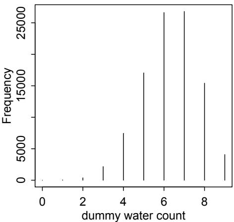
Figure 3.5. Distribution of simulated sample observations from 9 tosses of the globe. These samples assume the proportion of water is 0.7.
And those values are very close to the analytically calculated likelihoods further up. You will see slightly different values, due to simulation variance. Execute the code above multiple times, to see how the exact realized frequencies fluctuate from simulation to simulation.
Only two tosses of the globe isn’t much of a sample, though. So now let’s simulate the same sample size as before, 9 tosses.
3.24 dummy_w <- rbinom( 1e5 , size=9 , prob=0.7 )
simplehist( dummy_w , xlab="dummy water count" )
The resulting plot is shown in Figure 3.5. Notice that most of the time the expected observation does not contain water in its true proportion, 0.7. That’s the nature of observation: There is a one-to-many relationship between data and data-generating processes. You should experiment with sample size, the size input in the code above, as well as the prob, to see how the distribution of simulated samples changes shape and location.
So that’s how to perform a basic simulation of observations. What good is this? There are many useful jobs for these samples. In this chapter, we’ll put them to use in examining the implied predictions of a model. But to do that, we’ll have to combine them with samples from the posterior distribution. That’s next.
Rethinking: Sampling distributions. Many readers will already have seen simulated observations. Sampling distributions are the foundation of common non-Bayesian statistical traditions. In those approaches, inference about parameters is made through the sampling distribution. In this book, inference about parameters is never done directly through a sampling distribution. The posterior distribution is not sampled, but deduced logically. Then samples can be drawn from the posterior, as earlier in this chapter, to aid in inference. In neither case is “sampling” a physical act. In both cases, it’s just a mathematical device and produces only small world (Chapter 2) numbers.
3.3.2. Model checking. Model checking means (1) ensuring the model fitting worked correctly and (2) evaluating the adequacy of a model for some purpose. Since Bayesian models are always generative, able to simulate observations as well as estimate parameters from observations, once you condition a model on data, you can simulate to examine the model’s empirical expectations.
3.3.2.1. Did the software work? In the simplest case, we can check whether the software worked by checking for correspondence between implied predictions and the data used to fit the model. You might also call these implied predictions retrodictions, as they ask how well the model reproduces the data used to educate it. An exact match is neither expected nor desired. But when there is no correspondence at all, it probably means the software did something wrong.
There is no way to really be sure that software works correctly. Even when the retrodictions correspond to the observed data, there may be subtle mistakes. And when you start working with multilevel models, you’ll have to expect a certain pattern of lack of correspondence between retrodictions and observations. Despite there being no perfect way to ensure software has worked, the simple check I’m encouraging here often catches silly mistakes, mistakes of the kind everyone makes from time to time.
In the case of the globe tossing analysis, the software implementation is simple enough that it can be checked against analytical results. So instead let’s move directly to considering the model’s adequacy.
3.3.2.2. Is the model adequate? After assessing whether the posterior distribution is the correct one, because the software worked correctly, it’s useful to also look for aspects of the data that are not well described by the model’s expectations. The goal is not to test whether the model’s assumptions are “true,” because all models are false. Rather, the goal is to assess exactly how the model fails to describe the data, as a path towards model comprehension, revision, and improvement.
All models fail in some respect, so you have to use your judgment—as well as the judgments of your colleagues—to decide whether any particular failure is or is not important. Few scientists want to produce models that do nothing more than re-describe existing samples. So imperfect prediction (retrodiction) is not a bad thing. Typically we hope to either predict future observations or understand enough that we might usefully tinker with the world. We’ll consider these problems in future chapters.
For now, we need to learn how to combine sampling of simulated observations, as in the previous section, with sampling parameters from the posterior distribution. We expect to do better when we use the entire posterior distribution, not just some point estimate derived from it. Why? Because there is a lot of information about uncertainty in the entire posterior distribution. We lose this information when we pluck out a single parameter value and then perform calculations with it. This loss of information leads to overconfidence.
Let’s do some basic model checks, using simulated observations for the globe tossing model. The observations in our example case are counts of water, over tosses of the globe. The implied predictions of the model are uncertain in two ways, and it’s important to be aware of both.
First, there is observation uncertainty. For any unique value of the parameter p, there is a unique implied pattern of observations that the model expects. These patterns of observations are the same gardens of forking data that you explored in the previous chapter. These patterns are also what you sampled in the previous section. There is uncertainty in the predicted observations, because even if you know p with certainty, you won’t know the next globe toss with certainty (unless p = 0 or p = 1).
Second, there is uncertainty about p. The posterior distribution over p embodies this uncertainty. And since there is uncertainty about p, there is uncertainty about everything
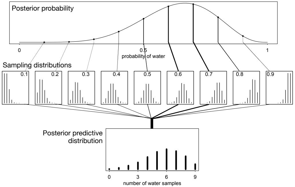
Figure 3.6. Simulating predictions from the total posterior. Top: The familiar posterior distribution for the globe tossing data. Ten example parameter values are marked by the vertical lines. Values with greater posterior probability indicated by thicker lines. Middle row: Each of the ten parameter values implies a unique sampling distribution of predictions. Bottom: Combining simulated observation distributions for all parameter values (not just the ten shown), each weighted by its posterior probability, produces the posterior predictive distribution. This distribution propagates uncertainty about parameter to uncertainty about prediction.
that depends upon p. The uncertainty in p will interact with the sampling variation, when we try to assess what the model tells us about outcomes.
We’d like to propagate the parameter uncertainty—carry it forward—as we evaluate the implied predictions. All that is required is averaging over the posterior density for p, while computing the predictions. For each possible value of the parameter p, there is an implied distribution of outcomes. So if you were to compute the sampling distribution of outcomes at each value of p, then you could average all of these prediction distributions together, using the posterior probabilities of each value of p, to get a posterior predictive distribution.
Figure 3.6 illustrates this averaging. At the top, the posterior distribution is shown, with 10 unique parameter values highlighted by the vertical lines. The implied distribution of observations specific to each of these parameter values is shown in the middle row of plots. Observations are never certain for any value of p, but they do shift around in response to it. Finally, at the bottom, the sampling distributions for all values of p are combined, using the posterior probabilities to compute the weighted average frequency of each possible observation, zero to nine water samples.
The resulting distribution is for predictions, but it incorporates all of the uncertainty embodied in the posterior distribution for the parameter p. As a result, it is honest. While the model does a good job of predicting the data—the most likely observation is indeed the observed data—predictions are still quite spread out. If instead you were to use only a single parameter value to compute implied predictions, say the most probable value at the peak of posterior distribution, you’d produce an overconfident distribution of predictions, narrower than the posterior predictive distribution in Figure 3.6 and more like the sampling distribution shown for p = 0.6 in the middle row. The usual effect of this overconfidence will be to lead you to believe that the model is more consistent with the data than it really is the predictions will cluster around the observations more tightly. This illusion arises from tossing away uncertainty about the parameters.
So how do you actually do the calculations? To simulate predicted observations for a single value of p, say p = 0.6, you can use rbinom to generate random binomial samples:
R code 3.25 w <- rbinom( 1e4 , size=9 , prob=0.6 )
This generates 10,000 (1e4) simulated predictions of 9 globe tosses (size=9), assuming p = 0.6. The predictions are stored as counts of water, so the theoretical minimum is zero and the theoretical maximum is nine. You can use simplehist(w) (in the rethinking package) to get a clean histogram of your simulated outcomes.
All you need to propagate parameter uncertainty into these predictions is replace the value 0.6 with samples from the posterior:
R code 3.26 w <- rbinom( 1e4 , size=9 , prob=samples )
The symbol samples above is the same list of random samples from the posterior distribution that you’ve used in previous sections. For each sampled value, a random binomial observation is generated. Since the sampled values appear in proportion to their posterior probabilities, the resulting simulated observations are averaged over the posterior. You can manipulate these simulated observations just like you manipulate samples from the posterior—you can compute intervals and point statistics using the same procedures. If you plot these samples, you’ll see the distribution shown in the right-hand plot in Figure 3.6.
The simulated model predictions are quite consistent with the observed data in this case—the actual count of 6 lies right in the middle of the simulated distribution. There is quite a lot of spread to the predictions, but a lot of this spread arises from the binomial process itself, not uncertainty about p. Still, it’d be premature to conclude that the model is perfect. So far, we’ve only viewed the data just as the model views it: Each toss of the globe is completely independent of the others. This assumption is questionable. Unless the person tossing the globe is careful, it is easy to induce correlations and therefore patterns among the sequential tosses. Consider for example that about half of the globe (and planet) is covered by the Pacific Ocean. As a result, water and land are not uniformly distributed on the globe, and therefore unless the globe spins and rotates enough while in the air, the position when tossed could easily influence the sample once it lands. The same problem arises in coin tosses, and indeed skilled individuals can influence the outcome of a coin toss, by exploiting the physics of it.63
So with the goal of seeking out aspects of prediction in which the model fails, let’s look at the data in two different ways. Recall that the sequence of nine tosses was W L W W W L
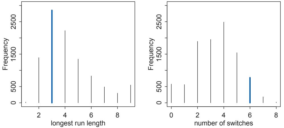
Figure 3.7. Alternative views of the same posterior predictive distribution (see Figure 3.6). Instead of considering the data as the model saw it, as a sum of water samples, now we view the data as both the length of the maximum run of water or land (left) and the number of switches between water and land samples (right). Observed values highlighted in blue. While the simulated predictions are consistent with the run length (3 water in a row), they are much less consistent with the frequent switches (6 switches in 9 tosses).
W L W. First, consider the length of the longest run of either water or land. This will provide a crude measure of correlation between tosses. So in the observed data, the longest run is 3 W’s. Second, consider the number of times in the data that the sample switches from water to land or from land to water. This is another measure of correlation between samples. In the observed data, the number of switches is 6. There is nothing special about these two new ways of describing the data. They just serve to inspect the data in new ways. In your own modeling, you’ll have to imagine aspects of the data that are relevant in your context, for your purposes.
Figure 3.7 shows the simulated predictions, viewed in these two new ways. On the left, the length of the longest run of water or land is plotted, with the observed value of 3 highlighted by the bold line. Again, the true observation is the most common simulated observation, but with a lot of spread around it. On the right, the number of switches from water to land and land to water is shown, with the observed value of 6 highlighted in bold. Now the simulated predictions appear less consistent with the data, as the majority of simulated observations have fewer switches than were observed in the actual sample. This is consistent with lack of independence between tosses of the globe, in which each toss is negatively correlated with the last.
Does this mean that the model is bad? That depends. The model will always be wrong in some sense, be mis-specified. But whether or not the mis-specification should lead us to try other models will depend upon our specific interests. In this case, if tosses do tend to switch from W to L and L to W, then each toss will provide less information about the true coverage of water on the globe. In the long run, even the wrong model we’ve used throughout the chapter will converge on the correct proportion. But it will do so more slowly than the posterior distribution may lead us to believe.
Rethinking: What does more extreme mean? A common way of measuring deviation of observation from model is to count up the tail area that includes the observed data and any more extreme data. Ordinary p-values are an example of such a tail-area probability. When comparing observations to distributions of simulated predictions, as in Figure 3.6 and Figure 3.7, we might wonder how far out in the tail the observed data must be before we conclude that the model is a poor one. Because statistical contexts vary so much, it’s impossible to give a universally useful answer.
But more importantly, there are usually very many ways to view data and define “extreme.” Ordinary p-values view the data in just the way the model expects it, and so provide a very weak form of model checking. For example, the far-right plot in Figure 3.6 evaluates model fit in the best way for the model. Alternative ways of defining “extreme” may provide a more serious challenge to a model. The different definitions of extreme in Figure 3.7 can more easily embarrass it.
Model fitting remains an objective procedure—everyone and every golem conducts Bayesian updating in a way that doesn’t depend upon personal preferences. But model checking is inherently subjective, and this actually allows it to be quite powerful, since subjective knowledge of an empirical domain provides expertise. Expertise in turn allows for imaginative checks of model performance. Since golems have terrible imaginations, we need the freedom to engage our own imaginations. In this way, the objective and subjective work together.64
3.4. Summary
This chapter introduced the basic procedures for manipulating posterior distributions. Our fundamental tool is samples of parameter values drawn from the posterior distribution. Working with samples transforms a problem of integral calculus into a problem of data summary. These samples can be used to produce intervals, point estimates, posterior predictive checks, as well as other kinds of simulations.
Posterior predictive checks combine uncertainty about parameters, as described by the posterior distribution, with uncertainty about outcomes, as described by the assumed likelihood function. These checks are useful for verifying that your software worked correctly. They are also useful for prospecting for ways in which your models are inadequate.
Once models become more complex, posterior predictive simulations will be used for a broader range of applications. Even understanding a model often requires simulating implied observations. We’ll keep working with samples from the posterior, to make these tasks as easy and customizable as possible.
3.5. Practice
Problems are labeled Easy (E), Medium (M), and Hard (H).
Easy. The Easy problems use the samples from the posterior distribution for the globe tossing example. This code will give you a specific set of samples, so that you can check your answers exactly.
R code
 3.27 p_grid <- seq( from=0 , to=1 , length.out=1000 )
       prior <- rep( 1 , 1000 )
       likelihood <- dbinom( 6 , size=9 , prob=p_grid )
       posterior <- likelihood * prior
       posterior <- posterior / sum(posterior)
set.seed(100)
samples <- sample( p_grid , prob=posterior , size=1e4 , replace=TRUE )Use the values in samples to answer the questions that follow.
3E1. How much posterior probability lies below p = 0.2?
3E2. How much posterior probability lies above p = 0.8?
3E3. How much posterior probability lies between p = 0.2 and p = 0.8?
3E4. 20% of the posterior probability lies below which value of p?
3E5. 20% of the posterior probability lies above which value of p?
3E6. Which values of p contain the narrowest interval equal to 66% of the posterior probability?
3E7. Which values of p contain 66% of the posterior probability, assuming equal posterior probability both below and above the interval?
3M1. Suppose the globe tossing data had turned out to be 8 water in 15 tosses. Construct the posterior distribution, using grid approximation. Use the same flat prior as before.
3M2. Draw 10,000 samples from the grid approximation from above. Then use the samples to calculate the 90% HPDI for p.
3M3. Construct a posterior predictive check for this model and data. This means simulate the distribution of samples, averaging over the posterior uncertainty in p. What is the probability of observing 8 water in 15 tosses?
3M4. Using the posterior distribution constructed from the new (8/15) data, now calculate the probability of observing 6 water in 9 tosses.
3M5. Start over at 3M1, but now use a prior that is zero below p = 0.5 and a constant above p = 0.5. This corresponds to prior information that a majority of the Earth’s surface is water. Repeat each problem above and compare the inferences. What difference does the better prior make? If it helps, compare inferences (using both priors) to the true value p = 0.7.
3M6. Suppose you want to estimate the Earth’s proportion of water very precisely. Specifically, you want the 99% percentile interval of the posterior distribution of p to be only 0.05 wide. This means the distance between the upper and lower bound of the interval should be 0.05. How many times will you have to toss the globe to do this?
Hard. The Hard problems here all use the data below. These data indicate the gender (male=1, female=0) of officially reported first and second born children in 100 two-child families.
3.28 birth1 <- c(1,0,0,0,1,1,0,1,0,1,0,0,1,1,0,1,1,0,0,0,1,0,0,0,1,0,
0,0,0,1,1,1,0,1,0,1,1,1,0,1,0,1,1,0,1,0,0,1,1,0,1,0,0,0,0,0,0,0,
1,1,0,1,0,0,1,0,0,0,1,0,0,1,1,1,1,0,1,0,1,1,1,1,1,0,0,1,0,1,1,0,
1,0,1,1,1,0,1,1,1,1)
birth2 <- c(0,1,0,1,0,1,1,1,0,0,1,1,1,1,1,0,0,1,1,1,0,0,1,1,1,0,
1,1,1,0,1,1,1,0,1,0,0,1,1,1,1,0,0,1,0,1,1,1,1,1,1,1,1,1,1,1,1,1,
1,1,1,0,1,1,0,1,1,0,1,1,1,0,0,0,0,0,0,1,0,0,0,1,1,0,0,1,0,0,1,1,
0,0,0,1,1,1,0,0,0,0)
So for example, the first family in the data reported a boy (1) and then a girl (0). The second family reported a girl (0) and then a boy (1). The third family reported two girls. You can load these two vectors into R’s memory by typing:
R code 3.29 library(rethinking) data(homeworkch3)
Use these vectors as data. So for example to compute the total number of boys born across all of these births, you could use:
R code
 3.30 sum(birth1) + sum(birth2)
[1] 111
3H1. Using grid approximation, compute the posterior distribution for the probability of a birth being a boy. Assume a uniform prior probability. Which parameter value maximizes the posterior probability?
3H2. Using the sample function, draw 10,000 random parameter values from the posterior distribution you calculated above. Use these samples to estimate the 50%, 89%, and 97% highest posterior density intervals.
3H3. Use rbinom to simulate 10,000 replicates of 200 births. You should end up with 10,000 numbers, each one a count of boys out of 200 births. Compare the distribution of predicted numbers of boys to the actual count in the data (111 boys out of 200 births). There are many good ways to visualize the simulations, but the dens command (part of the rethinking package) is probably the easiest way in this case. Does it look like the model fits the data well? That is, does the distribution of predictions include the actual observation as a central, likely outcome?
3H4. Now compare 10,000 counts of boys from 100 simulated first borns only to the number of boys in the first births, birth1. How does the model look in this light?
3H5. The model assumes that sex of first and second births are independent. To check this assumption, focus now on second births that followed female first borns. Compare 10,000 simulated counts of boys to only those second births that followed girls. To do this correctly, you need to count the number of first borns who were girls and simulate that many births, 10,000 times. Compare the counts of boys in your simulations to the actual observed count of boys following girls. How does the model look in this light? Any guesses what is going on in these data?
4 Geocentric Models
History has been unkind to Ptolemy. Claudius Ptolemy (born 90 CE, died 168 CE) was an Egyptian mathematician and astronomer, famous for his geocentric model of the solar system. These days, when scientists wish to mock someone, they might compare him to a supporter of the geocentric model. But Ptolemy was a genius. His mathematical model of the motions of the planets(Figure 4.1) was extremely accurate. To achieve its accuracy, it employed a device known as an epicycle, a circle on a circle. It is even possible to have epiepicycles, circles on circles on circles. With enough epicycles in the right places, Ptolemy’s model could predict planetary motion with great accuracy. And so the model was utilized for over a thousand years. And Ptolemy and people like him worked it all out without the aid of a computer. Anyone should be flattered to be compared to Ptolemy.
The trouble of course is that the geocentric model is wrong, in many respects. If you used it to plot the path of your Mars probe, you’d miss the red planet by quite a distance. But for spotting Mars in the night sky, it remains an excellent model. It would have to be re-calibrated every century or so, depending upon which heavenly body you wish to locate. But the geocentric model continues to make useful predictions, provided those predictions remain within a narrow domain of questioning.
The strategy of using epicycles might seem crazy, once you know the correct structure of the solar system. But it turns out that the ancients had hit upon a generalized system of approximation. Given enough circles embedded in enough places, the Ptolemaic strategy is the same as a Fourier series, a way of decomposing a periodic function (like an orbit) into a series of sine and cosine functions. So no matter the actual arrangement of planets and moons, a geocentric model can be built to describe their paths against the night sky.
Linear regression is the geocentric model of applied statistics. By “linear regression,” we will mean a family of simple statistical golems that attempt to learn about the mean and variance of some measurement, using an additive combination of other measurements. Like geocentrism, linear regression can usefully describe a very large variety of natural phenomena. Like geocentrism, linear regression is a descriptive model that corresponds to many different process models. If we read its structure too literally, we’re likely to make mistakes. But used wisely, these little linear golems continue to be useful.
This chapter introduces linear regression as a Bayesian procedure. Under a probability interpretation, which is necessary for Bayesian work, linear regression uses a Gaussian (normal) distribution to describe our golem’s uncertainty about some measurement of interest. This type of model is simple, flexible, and commonplace. Like all statistical models, it is not universally useful. But linear regression has a strong claim to being foundational, in the sense that once you learn to build and interpret linear regression models, you can more easily move on to other types of regression which are less normal.
Figure 4.1. The Ptolemaic Universe, in which complex motion of the planets in the night sky was explained by orbits within orbits, called epicycles. The model is incredibly wrong, yet makes quite good predictions.
4.1. Why normal distributions are normal
Suppose you and a thousand of your closest friends line up on the halfway line of a soccer field (football pitch). Each of you has a coin in your hand. At the sound of the whistle, you begin flipping the coins. Each time a coin comes up heads, that person moves one step towards the left-hand goal. Each time a coin comes up tails, that person moves one step towards the right-hand goal. Each person flips the coin 16 times, follows the implied moves, and then stands still. Now we measure the distance of each person from the halfway line. Can you predict what proportion of the thousand people who are standing on the halfway line? How about the proportion 5 yards left of the line?
It’s hard to say where any individual person will end up, but you can say with great confidence what the collection of positions will be. The distances will be distributed in approximately normal, or Gaussian, fashion. This is true even though the underlying distribution is binomial. It does this because there are so many more possible ways to realize a sequence of left-right steps that sums to zero. There are slightly fewer ways to realize a sequence that ends up one step left or right of zero, and so on, with the number of possible sequences declining in the characteristic bell curve of the normal distribution.
4.1.1. Normal by addition. Let’s see this result, by simulating this experiment in R. To show that there’s nothing special about the underlying coin flip, assume instead that each step is different from all the others, a random distance between zero and one yard. Thus a coin is flipped, a distance between zero and one yard is taken in the indicated direction, and the process repeats. To simulate this, we generate for each person a list of 16 random numbers between −1 and 1. These are the individual steps. Then we add these steps together to get the position after 16 steps. Then we need to replicate this procedure 1000 times. This is the sort of task that would be harrowing in a point-and-click interface, but it is made trivial by the command line. Here’s a single line to do the whole thing:
R code 4.1 pos <- replicate( 1000 , sum( runif(16,-1,1) ) )
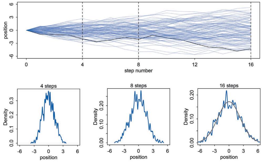
Figure 4.2. Random walks on the soccer field converge to a normal distribution. The more steps are taken, the closer the match between the real empirical distribution of positions and the ideal normal distribution, superimposed in the last plot in the bottom panel.
You can plot the distribution of final positions in a number of different ways, including hist(pos) and plot(density(pos)). In Figure 4.2, I show the result of these random walks and how their distribution evolves as the number of steps increases. The top panel plots 100 different, independent random walks, with one highlighted in black. The vertical dashes indicate the locations corresponding to the distribution plots underneath, measured after 4, 8, and 16 steps. Although the distribution of positions starts off seemingly idiosyncratic, after 16 steps, it has already taken on a familiar outline. The familiar “bell” curve of the Gaussian distribution is emerging from the randomness. Go ahead and experiment with even larger numbers of steps to verify for yourself that the distribution of positions is stabilizing on the Gaussian. You can square the step sizes and transform them in a number of arbitrary ways, without changing the result: Normality emerges. Where does it come from?
Any process that adds together random values from the same distribution converges to a normal. But it’s not easy to grasp why addition should result in a bell curve of sums.65 Here’s a conceptual way to think of the process. Whatever the average value of the source distribution, each sample from it can be thought of as a fluctuation from that average value. When we begin to add these fluctuations together, they also begin to cancel one another out. A large positive fluctuation will cancel a large negative one. The more terms in the sum, the more chances for each fluctuation to be canceled by another, or by a series of smaller ones in the opposite direction. So eventually the most likely sum, in the sense that there are the most ways to realize it, will be a sum in which every fluctuation is canceled by another, a sum of zero (relative to the mean).66
It doesn’t matter what shape the underlying distribution possesses. It could be uniform, like in our example above, or it could be (nearly) anything else.67 Depending upon the underlying distribution, the convergence might be slow, but it will be inevitable. Often, as in this example, convergence is rapid.
4.1.2. Normal by multiplication. Here’s another way to get a normal distribution. Suppose the growth rate of an organism is influenced by a dozen loci, each with several alleles that code for more growth. Suppose also that all of these loci interact with one another, such that each increase growth by a percentage. This means that their effects multiply, rather than add. For example, we can sample a random growth rate for this example with this line of code:
R code
  4.2 prod( 1 + runif(12,0,0.1) )
This code just samples 12 random numbers between 1.0 and 1.1, each representing a proportional increase in growth. Thus 1.0 means no additional growth and 1.1 means a 10% increase. The product of all 12 is computed and returned as output. Now what distribution do you think these random products will take? Let’s generate 10,000 of them and see:
R code4.3 growth <- replicate( 10000 , prod( 1 + runif(12,0,0.1) ) )
dens( growth , norm.comp=TRUE )The reader should execute this code in R and see that the distribution is approximately normal again. I said normal distributions arise from summing random fluctuations, which is true. But the effect at each locus was multiplied by the effects at all the others, not added. So what’s going on here?
We again get convergence towards a normal distribution, because the effect at each locus is quite small. Multiplying small numbers is approximately the same as addition. For example, if there are two loci with alleles increasing growth by 10% each, the product is:
\[1.1 \times 1.1 = 1.21\]
We could also approximate this product by just adding the increases, and be off by only 0.01:
1.1 × 1.1 = (1 + 0.1)(1 + 0.1) = 1 + 0.2 + 0.01 ≈ 1.2
The smaller the effect of each locus, the better this additive approximation will be. In this way, small effects that multiply together are approximately additive, and so they also tend to stabilize on Gaussian distributions. Verify this for yourself by comparing:
R code
4.4 big <- replicate( 10000 , prod( 1 + runif(12,0,0.5) ) )
    small <- replicate( 10000 , prod( 1 + runif(12,0,0.01) ) )
The interacting growth deviations, as long as they are sufficiently small, converge to a Gaussian distribution. In this way, the range of causal forces that tend towards Gaussian distributions extends well beyond purely additive interactions.
4.1.3. Normal by log-multiplication. But wait, there’s more. Large deviates that are multiplied together do not produce Gaussian distributions, but they do tend to produce Gaussian distributions on the log scale. For example:
4.5 log.big <- replicate( 10000 , log(prod(1 + runif(12,0,0.5))) )Yet another Gaussian distribution. We get the Gaussian distribution back, because adding logs is equivalent to multiplying the original numbers. So even multiplicative interactions of large deviations can produce Gaussian distributions, once we measure the outcomes on the log scale. Since measurement scales are arbitrary, there’s nothing suspicious about this transformation. After all, it’s natural to measure sound and earthquakes and even information (Chapter 7) on a log scale.
4.1.4. Using Gaussian distributions. We’re going to spend the rest of this chapter using the Gaussian distribution as a skeleton for our hypotheses, building up models of measurements as aggregations of normal distributions. The justifications for using the Gaussian distribution fall into two broad categories: (1) ontological and (2) epistemological.
By the ontological justification, the world is full of Gaussian distributions, approximately. We’re never going to experience a perfect Gaussian distribution. But it is a widespread pattern, appearing again and again at different scales and in different domains. Measurement errors, variations in growth, and the velocities of molecules all tend towards Gaussian distributions. These processes do this because at their heart, these processes add together fluctuations. And repeatedly adding finite fluctuations results in a distribution of sums that have shed all information about the underlying process, aside from mean and spread.
One consequence of this is that statistical models based on Gaussian distributions cannot reliably identify micro-process. This recalls the modeling philosophy from Chapter 1 (page 6). But it also means that these models can do useful work, even when they cannot identify process. If we had to know the development biology of height before we could build a statistical model of height, human biology would be sunk.
There are many other patterns in nature, so make no mistake in assuming that the Gaussian pattern is universal. In later chapters, we’ll see how other useful and common patterns, like the exponential and gamma and Poisson, also arise from natural processes. The Gaussian is a member of a family of fundamental natural distributions known as the exponential family. All of the members of this family are important for working science, because they populate our world.
But the natural occurrence of the Gaussian distribution is only one reason to build models around it. By the epistemological justification, the Gaussian represents a particular state of ignorance. When all we know or are willing to say about a distribution of measures (measures are continuous values on the real number line) is their mean and variance, then the Gaussian distribution arises as the most consistent with our assumptions.
That is to say that the Gaussian distribution is the most natural expression of our state of ignorance, because if all we are willing to assume is that a measure has finite variance, the Gaussian distribution is the shape that can be realized in the largest number of ways and does not introduce any new assumptions. It is the least surprising and least informative assumption to make. In this way, the Gaussian is the distribution most consistent with our assumptions. Or rather, it is the most consistent with our golem’s assumptions. If you don’t think the distribution should be Gaussian, then that implies that you know something else that you should tell your golem about, something that would improve inference.
This epistemological justification is premised on information theory and maximum entropy. We’ll dwell on information theory in Chapter 7 and maximum entropy in Chapter 10. Then in later chapters, other common and useful distributions will be used to build generalized linear models (GLMs). When these other distributions are introduced, you’ll learn the constraints that make them the uniquely most appropriate distributions.
For now, let’s take the ontological and epistemological justifications of just the Gaussian distribution as reasons to start building models of measures around it. Throughout all of this modeling, keep in mind that using a model is not equivalent to swearing an oath to it. The golem is your servant, not the other way around.
Rethinking: Heavy tails. The Gaussian distribution is common in nature and has some nice properties. But there are some risks in using it as a default data model. The extreme ends of a distribution are known as its tails. And the Gaussian distribution has some very thin tails—there is very little probability in them. Instead most of the mass in the Gaussian lies within one standard deviation of the mean. Many natural (and unnatural) processes have much heavier tails. These processes have much higher probabilities of producing extreme events. A real and important example is financial time series—the ups and downs of a stock market can look Gaussian in the short term, but over medium and long periods, extreme shocks make the Gaussian model (and anyone who uses it) look foolish.68 Historical time series may behave similarly, and any inference for example of trends in warfare is prone to heavy-tailed surprises.69 We’ll consider alternatives to the Gaussian later.
Overthinking: Gaussian distribution. You don’t have to memorize the Gaussian probability distribution. You’re computer already knows it. But some knowledge of its form can help demystify it. The probability density (see below) of some value y, given a Gaussian (normal) distribution with mean µ and standard deviation σ, is:
\[p(\boldsymbol{y}|\boldsymbol{\mu},\sigma) = \frac{1}{\sqrt{2\pi\sigma^2}} \exp\left(-\frac{(\boldsymbol{y}-\boldsymbol{\mu})^2}{2\sigma^2}\right).\]
This looks monstrous. The important bit is just the (y − µ) 2 bit. This is the part that gives the normal distribution its fundamental quadratic shape. Once you exponentiate the quadratic shape, you get the classic bell curve. The rest of it just scales and standardizes the distribution.
The Gaussian is a continuous distribution, unlike the discrete distributions of earlier chapters. Probability distributions with only discrete outcomes, like the binomial, are called probability mass functions and denoted Pr. Continuous ones like the Gaussian are called probability density functions, denoted with p or just plain old f, depending upon author and tradition. For mathematical reasons, probability densities can be greater than 1. Try dnorm(0,0,0.1), for example, which is the way to make R calculate p(0|0, 0.1). The answer, about 4, is no mistake. Probability density is the rate of change in cumulative probability. So where cumulative probability is increasing rapidly, density can easily exceed 1. But if we calculate the area under the density function, it will never exceed 1. Such areas are also called probability mass. You can usually ignore these density/mass details while doing computational work. But it’s good to be aware of the distinction. Sometimes the difference matters.
The Gaussian distribution is routinely seen without σ but with another parameter, τ . The parameter τ in this context is usually called precision and defined as τ = 1/σ2 . When σ is large, τ is small. This change of parameters gives us the equivalent formula (just substitute σ = 1/ √ τ ):
\[p(\mathbf{y}|\mu,\tau) = \sqrt{\frac{\tau}{2\pi}} \exp\left(-\frac{1}{2}\tau(\mathbf{y}-\mu)^2\right).\]
This form is common in Bayesian data analysis, and Bayesian model fitting software, such as BUGS or JAGS, sometimes requires using τ rather than σ.
4.2. A language for describing models
This book adopts a standard language for describing and coding statistical models. You find this language in many statistical texts and in nearly all statistical journals, as it is general to both Bayesian and non-Bayesian modeling. Scientists increasingly use this same language to describe their statistical methods, as well. So learning this language is an investment, no matter where you are headed next.
Here’s the approach, in abstract. There will be many examples later, but it is important to get the general recipe before seeing these.
- First, we recognize a set of variables to work with. Some of these variables are observable. We call these data. Others are unobservable things like rates and averages. We call these parameters.
- We define each variable either in terms of the other variables or in terms of a probability distribution.
- The combination of variables and their probability distributions defines a joint generative model that can be used both to simulate hypothetical observations as well as analyze real ones.
This outline applies to models in every field, from astronomy to art history. The biggest difficulty usually lies in the subject matter—which variables matter and how does theory tell us to connect them?—not in the mathematics.
After all these decisions are made—and most of them will come to seem automatic to you before long—we summarize the model with something mathy like:
\[\begin{aligned} \mathcal{y}\_i &\sim \text{Normal}(\mu\_i, \sigma) \\ \mu\_i &= \beta \mathbf{x}\_i \\ \beta &\sim \text{Normal}(\mathbf{0}, 10) \\ \sigma &\sim \text{Exponential}(1) \\ \mathbf{x}\_i &\sim \text{Normal}(\mathbf{0}, 1) \end{aligned}\]
If that doesn’t make much sense, good. That indicates that you are holding the right textbook, since this book teaches you how to read and write these mathematical model descriptions. We won’t do any mathematical manipulation of them. Instead, they provide an unambiguous way to define and communicate our models. Once you get comfortable with their grammar, when you start reading these mathematical descriptions in other books or in scientific journals, you’ll find them less obtuse.
The approach above surely isn’t the only way to describe statistical modeling, but it is a widespread and productive language. Once a scientist learns this language, it becomes easier to communicate the assumptions of our models. We no longer have to remember seemingly arbitrary lists of bizarre conditions like homoscedasticity (constant variance), because we can just read these conditions from the model definitions. We will also be able to see natural ways to change these assumptions, instead of feeling trapped within some procrustean model type, like regression or multiple regression or ANOVA or ANCOVA or such. These are all the same kind of model, and that fact becomes obvious once we know how to talk about models as mappings of one set of variables through a probability distribution onto another set of variables. Fundamentally, these models define the ways values of some variables can arise, given values of other variables (Chapter 2).
4.2.1. Re-describing the globe tossing model. It’s good to work with examples. Recall the proportion of water problem from previous chapters. The model in that case was always:
\[\begin{aligned} &W \sim \text{Binomial}(N, p) \\ &p \sim \text{Uniform}(0, 1) \end{aligned}\]
where W was the observed count of water, N was the total number of tosses, and p was the proportion of water on the globe. Read the above statement as:
The count W is distributed binomially with sample size N and probability p. The prior for p is assumed to be uniform between zero and one.
Once we know the model in this way, we automatically know all of its assumptions. We know the binomial distribution assumes that each sample (globe toss) is independent of the others, and so we also know that the model assumes that sample points are independent of one another.
For now, we’ll focus on simple models like the above. In these models, the first line defines the likelihood function used in Bayes’ theorem. The other lines define priors. Both of the lines in this model are stochastic, as indicated by the ∼ symbol. A stochastic relationship is just a mapping of a variable or parameter onto a distribution. It is stochastic because no single instance of the variable on the left is known with certainty. Instead, the mapping is probabilistic: Some values are more plausible than others, but very many different values are plausible under any model. Later, we’ll have models with deterministic definitions in them.
Overthinking: From model definition to Bayes’ theorem. To relate the mathematical format above to Bayes’ theorem, you could use the model definition to define the posterior distribution:
\[\Pr(p|\boldsymbol{\omega}, n) = \frac{\text{Binomial}(\boldsymbol{\omega}|n, p)\text{Uniform}(p|0, 1)}{\int \text{Binomial}(\boldsymbol{\omega}|n, p)\text{Uniform}(p|0, 1)dp}\]
That monstrous denominator is just the average likelihood again. It standardizes the posterior to sum to 1. The action is in the numerator, where the posterior probability of any particular value of p is seen again to be proportional to the product of the likelihood and prior. In R code form, this is the same grid approximation calculation you’ve been using all along. In a form recognizable as the above expression:
R code4.6 w <- 6; n <- 9;
p_grid <- seq(from=0,to=1,length.out=100)
posterior <- dbinom(w,n,p_grid)*dunif(p_grid,0,1)
posterior <- posterior/sum(posterior)Compare to the calculations in earlier chapters.
4.3. Gaussian model of height
Let’s build a linear regression model now. Well, it’ll be a “regression” once we have a predictor variable in it. For now, we’ll get the scaffold in place and construct the predictor variable in the next section. For the moment, we want a single measurement variable to model as a Gaussian distribution. There will be two parameters describing the distribution’s shape, the mean µ and the standard deviation σ. Bayesian updating will allow us to consider every possible combination of values for µ and σ and to score each combination by its relative
plausibility, in light of the data. These relative plausibilities are the posterior probabilities of each combination of values µ, σ.
Another way to say the above is this. There are an infinite number of possible Gaussian distributions. Some have small means. Others have large means. Some are wide, with a large σ. Others are narrow. We want our Bayesian machine to consider every possible distribution, each defined by a combination of µ and σ, and rank them by posterior plausibility. Posterior plausibility provides a measure of the logical compatibility of each possible distribution with the data and model.
In practice we’ll use approximations to the formal analysis. So we won’t really consider every possible value of µ and σ. But that won’t cost us anything in most cases. Instead the thing to worry about is keeping in mind that the “estimate” here will be the entire posterior distribution, not any point within it. And as a result, the posterior distribution will be a distribution of Gaussian distributions. Yes, a distribution of distributions. If that doesn’t make sense yet, then that just means you are being honest with yourself. Hold on, work hard, and it will make plenty of sense before long.
4.3.1. The data. The data contained in data(Howell1) are partial census data for the Dobe area !Kung San, compiled from interviews conducted by Nancy Howell in the late 1960s.70 For the non-anthropologists reading along, the !Kung San are the most famous foraging population of the twentieth century, largely because of detailed quantitative studies by people like Howell. Load the data and place them into a convenient object with:
4.7 library(rethinking)
data(Howell1)
d <- Howell1
What you have now is a data frame named simply d. I use the name d over and over again in this book to refer to the data frame we are working with at the moment. I keep its name short to save you typing. A data frame is a special kind of object in R. It is a table with named columns, corresponding to variables, and numbered rows, corresponding to individual cases. In this example, the cases are individuals. Inspect the structure of the data frame, the same way you can inspect the structure of any symbol in R:
4.8 str( d )
‘data.frame’: 544 obs. of 4 variables: $ height: num 152 140 137 157 145 … $ weight: num 47.8 36.5 31.9 53 41.3 … $ age : num 63 63 65 41 51 35 32 27 19 54 … $ male : int 1 0 0 1 0 1 0 1 0 1 …
We can also use rethinking’s precis summary function, which we’ll also use to summarize posterior distributions later on:
4.9 precis( d )
‘data.frame’: 544 obs. of 4 variables: mean sd 5.5% 94.5% histogram height 138.26 27.60 81.11 165.74 ▁▁▁▁▁▁▁▂▁▇▇▅▁ weight 35.61 14.72 9.36 54.50 ▁▂▃▂▂▂▂▅▇▇▃▂▁
R code
R code
age 29.34 20.75 1.00 66.13 ▇▅▅▃▅▂▂▁▁ male 0.47 0.50 0.00 1.00 ▇▁▁▁▁▁▁▁▁▇
If you cannot see the histograms on your system, use instead precis(d,hist=FALSE). This data frame contains four columns. Each column has 544 entries, so there are 544 individuals in these data. Each individual has a recorded height (centimeters), weight (kilograms), age (years), and “maleness” (0 indicating female and 1 indicating male).
We’re going to work with just the height column, for the moment. The column containing the heights is really just a regular old R vector, the kind of list we have been working with in many of the code examples. You can access this vector by using its name:
R code 4.10 d$height
Read the symbol $ as extract, as in extract the column named height from the data frame d.
All we want for now are heights of adults in the sample. The reason to filter out nonadults for now is that height is strongly correlated with age, before adulthood. Later in the chapter, I’ll ask you to tackle the age problem. But for now, better to postpone it. You can filter the data frame down to individuals of age 18 or greater with:
R code4.11 d2 <- d[ d$age >= 18 , ]
We’ll be working with the data frame d2 now. It should have 352 rows (individuals) in it.
Overthinking: Data frames and indexes. The square bracket notation used in the code above isindex notation. It is very powerful, but also quite compact and confusing. The data frame d is a matrix, a rectangular grid of values. You can access any value in the matrix with d[row,col], replacing row and col with row and column numbers. If row or col are lists of numbers, then you get more than one row or column. If you leave the spot for row or col blank, then you get all of whatever you leave blank. For example, d[ 3 , ] gives all columns at row 3. Typing d[,] just gives you the entire matrix, because it returns all rows and all columns.
So what d[ d$age >= 18 , ] does is give you all of the rows in which d$age is greater-thanor-equal-to 18. It also gives you all of the columns, because the spot after the comma is blank. The result is stored in d2, the new data frame containing only adults. With a little practice, you can use this square bracket index notion to perform custom searches of your data, much like performing a database query.
It might seem like this whole data frame thing is unnecessary. If we’re working with only one column here, why bother with this d thing at all? You don’t have to use a data frame, as you can just pass raw vectors to every command we’ll use in this book. But keeping related variables in the same data frame is a convenience. Once we have more than one variable, and we wish to model one as a function of the others, you’ll better see the value of the data frame. You won’t have to wait long. More technically, a data frame is a special kind of list in R. So you access the individual variables with the usual list “double bracket” notation, like d[[1]] for the first variable or d[[‘x’]] for the variable named x. Unlike regular lists, however, data frames force all variables to have the same length. That isn’t always a good thing. In the second half of the book, we’ll start using ordinary list collections instead of data frames.
4.3.2. The model. Our goal is to model these values using a Gaussian distribution. First, go ahead and plot the distribution of heights, with dens(d2$height). These data look rather Gaussian in shape, as is typical of height data. This may be because height is a sum of many small growth factors. As you saw at the start of the chapter, a distribution of sums tends to converge to a Gaussian distribution. Whatever the reason, adult heights from a single population are nearly always approximately normal.
So it’s reasonable for the moment to adopt the stance that the model should use a Gaussian distribution for the probability distribution of the data. But be careful about choosing the Gaussian distribution only when the plotted outcome variable looks Gaussian to you. Gawking at the raw data, to try to decide how to model them, is usually not a good idea. The data could be a mixture of different Gaussian distributions, for example, and in that case you won’t be able to detect the underlying normality just by eyeballing the outcome distribution. Furthermore, as mentioned earlier in this chapter, the empirical distribution needn’t be actually Gaussian in order to justify using a Gaussian probability distribution.
So which Gaussian distribution? There are an infinite number of them, with an infinite number of different means and standard deviations. We’re ready to write down the general model and compute the plausibility of each combination of µ and σ. To define the heights as normally distributed with a mean µ and standard deviation σ, we write:
\[h\_i \sim \text{Normal}(\mu, \sigma)\]
In many books you’ll see the same model written as hi ∼ N (µ, σ), which means the same thing. The symbol h refers to the list of heights, and the subscript i means each individual element of this list. It is conventional to use i because it stands for index. The index i takes on row numbers, and so in this example can take any value from 1 to 352 (the number of heights in d2$height). As such, the model above is saying that all the golem knows about each height measurement is defined by the same normal distribution, with mean µ and standard deviation σ. Before long, those little i’s are going to show up on the right-hand side of the model definition, and you’ll be able to see why we must bother with them. So don’t ignore the i, even if it seems like useless ornamentation right now.
Rethinking: Independent and identically distributed. The short model above assumes that the values hi are independent and identically distributed, abbreviated i.i.d., iid, or IID. You might even see the same model written:
\[h\_i \overset{\text{id}}{\sim} \text{Normal}(\mu, \sigma).\]
“iid” indicates that each value hi has the same probability function, independent of the other h values and using the same parameters. A moment’s reflection tells us that this is often untrue. For example, heights within families are correlated because of alleles shared through recent shared ancestry.
The i.i.d. assumption doesn’t have to seem awkward, as long as you remember that probability is inside the golem, not outside in the world. The i.i.d. assumption is about how the golem represents its uncertainty. It is an epistemological assumption. It is not a physical assumption about the world, an ontological one. E. T. Jaynes (1922–1998) called this the mind projection fallacy, the mistake of confusing epistemological claims with ontological claims.71 The point isn’t that epistemology trumps reality, but that in ignorance of such correlations the best distribution may be i.i.d.72 This issue will return in Chapter 10. Furthermore, there is a mathematical result known as de Finetti’s theorem that says values which are exchangeable can be approximated by mixtures of i.i.d. distributions. Colloquially, exchangeable values can be reordered. The practical impact is that “i.i.d.” cannot be read literally. There are also types of correlation that do little to the overall shape of a distribution, only affecting the sequence in which values appear. For example, pairs of sisters have highly correlated heights. But the overall distribution of female height remains normal. Markov chain Monte Carlo (Chapter 9) exploits this, using highly correlated sequential samples to estimate most any distribution we like.
To complete the model, we’re going to need some priors. The parameters to be estimated are both µ and σ, so we need a prior Pr(µ, σ), the joint prior probability for all parameters. In most cases, priors are specified independently for each parameter, which amounts to assuming Pr(µ, σ) = Pr(µ) Pr(σ). Then we can write:
\[h\_l \sim \text{Normal}(\mu, \sigma) \tag{\text{likelihood}}\]
\[ \mu \sim \text{Normal}(178, 20)\tag{\mu \text{ prior}} \]
\[ \sigma \sim \text{Uniform}(0, 50) \tag{\sigma \text{ prior}} \]
The labels on the right are not part of the model, but instead just notes to help you keep track of the purpose of each line. The prior for µ is a broad Gaussian prior, centered on 178 cm, with 95% of probability between 178 ± 40 cm.
Why 178 cm? Your author is 178 cm tall. And the range from 138 cm to 218 cm encompasses a huge range of plausible mean heights for human populations. So domain-specific information has gone into this prior. Everyone knows something about human height and can set a reasonable and vague prior of this kind. But in many regression problems, as you’ll see later, using prior information is more subtle, because parameters don’t always have such clear physical meaning.
Whatever the prior, it’s a very good idea to plot your priors, so you have a sense of the assumption they build into the model. In this case:
\[\begin{array}{ccccc} \text{R code} & \mathsf{curve}(\mathsf{d}\mathsf{n}\mathsf{r}\mathsf{m}(\mathsf{x}\mathsf{,},\ \mathsf{178}\ ,\ \mathsf{20}\ ) & , \mathsf{fr}\mathsf{om}\mathsf{=186}\ ,\ \mathsf{to}\mathsf{=256}\ )\\\end{array}\]
Execute that code yourself, to see that the golem is assuming that the average height (not each individual height) is almost certainly between 140 cm and 220 cm. So this prior carries a little information, but not a lot. The σ prior is a truly flat prior, a uniform one, that functions just to constrain σ to have positive probability between zero and 50 cm. View it with:
R code 4.13 curve( dunif( x , 0 , 50 ) , from=-10 , to=60 )
A standard deviation like σ must be positive, so bounding it at zero makes sense. How should we pick the upper bound? In this case, a standard deviation of 50 cm would imply that 95% of individual heights lie within 100 cm of the average height. That’s a very large range.
All this talk is nice. But it’ll help to see what these priors imply about the distribution of individual heights. The prior predictive simulation is an essential part of your modeling. Once you’ve chosen priors for h, µ, and σ, these imply a joint prior distribution of individual heights. By simulating from this distribution, you can see what your choices imply about observable height. This helps you diagnose bad choices. Lots of conventional choices are indeed bad ones, and we’ll be able to see this through prior predictive simulations.
Okay, so how to do this? You can quickly simulate heights by sampling from the prior, like you sampled from the posterior back in Chapter 3. Remember, every posterior is also potentially a prior for a subsequent analysis, so you can process priors just like posteriors.
R code4.14 sample_mu <- rnorm( 1e4 , 178 , 20 )
sample_sigma <- runif( 1e4 , 0 , 50 )
prior_h <- rnorm( 1e4 , sample_mu , sample_sigma )
dens( prior_h )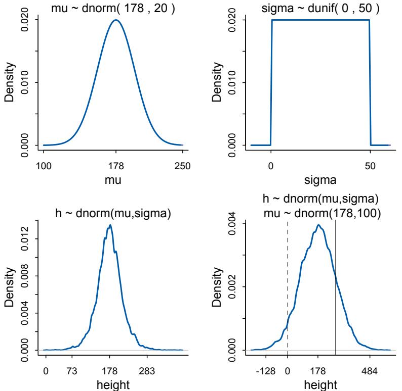
Figure 4.3. Prior predictive simulation for the height model. Top row: Prior distributions for µ and σ. Bottom left: The prior predictive simulation for height, using the priors in the top row. Values at 3 standard deviations shown on horizontal axis. Bottom right: Prior predictive simulation using µ ∼ Normal(178, 100).
This density, as well as the individual densities for µ and σ, is shown in Figure 4.3. It displays a vaguely bell-shaped density with thick tails. It is the expected distribution of heights, averaged over the prior. Notice that the prior probability distribution of height is not itself Gaussian. This is okay. The distribution you see is not an empirical expectation, but rather the distribution of relative plausibilities of different heights, before seeing the data.
Prior predictive simulation is very useful for assigning sensible priors, because it can be quite hard to anticipate how priors influence the observable variables. As an example, consider a much flatter and less informative prior for µ, like µ ∼ Normal(178, 100). Priors with such large standard deviations are quite common in Bayesian models, but they are hardly ever sensible. Let’s use simulation again to see the implied heights:
4.15 sample_mu <- rnorm( 1e4 , 178 , 100 )
prior_h <- rnorm( 1e4 , sample_mu , sample_sigma )
dens( prior_h )
The result is displayed in the lower right of Figure 4.3. Now the model, before seeing the data, expects 4% of people, those left of the dashed line, to have negative height. It also expects some giants. One of the tallest people in recorded history, Robert Pershing Wadlow (1918–1940) stood 272 cm tall. In our prior predictive simulation, 18% of people (right of solid line) are taller than this.
Does this matter? In this case, we have so much data that the silly prior is harmless. But that won’t always be the case. There are plenty of inference problems for which the data alone are not sufficient, no matter how numerous. Bayes lets us proceed in these cases. But only if we use our scientific knowledge to construct sensible priors. Using scientific knowledge to build priors is not cheating. The important thing is that your prior not be based on the values in the data, but only on what you know about the data before you see it.
Rethinking: A farewell to epsilon. Some readers will have already met an alternative notation for a Gaussian linear model:
\[\begin{aligned} h\_i &= \mu + \epsilon\_i \\ \epsilon\_i &\sim \text{Normal}(0, \sigma) \end{aligned}\]
This is equivalent to the hi ∼ Normal(µ, σ)form, with the ϵ standing in for the Gaussian density. But this ϵ form is poor form. The reason is that it does not usually generalize to other types of models. This means it won’t be possible to express non-Gaussian models using tricks like ϵ. Better to learn one system that does generalize.
Overthinking: Model definition to Bayes’ theorem again. It can help to see how the model definition on the previous page allows us to build up the posterior distribution. The height model, with its priors for µ and σ, defines this posterior distribution:
\[\Pr(\mu, \sigma | h) = \frac{\prod\_{i} \text{Normal}(h\_i | \mu, \sigma) \text{Normal}(\mu | 178, 20) \text{Uniform}(\sigma | 0, 50)}{\int \int \prod\_{i} \text{Normal}(h\_i | \mu, \sigma) \text{Normal}(\mu | 178, 20) \text{Uniform}(\sigma | 0, 50) d\mu d\sigma}\]
This looks monstrous, but it’s the same creature as before. There are two new things that make it seem complicated. The first is that there is more than one observation in h, so to get the joint likelihood across all the data, we have to compute the probability for each hi and then multiply all these likelihoods together. The product on the right-hand side takes care of that. The second complication is the two priors, one for µ and one for σ. But these just stack up. In the grid approximation code in the section to follow, you’ll see the implications of this definition in the R code. Everything will be calculated on the log scale, so multiplication will become addition. But otherwise it’s just a matter of executing Bayes’ theorem.
4.3.3. Grid approximation of the posterior distribution. Since this is the first Gaussian model in the book, and indeed the first model with more than one parameter, it’s worth quickly mapping out the posterior distribution through brute force calculations. This isn’t the approach I encourage in any other place, because it is laborious and computationally expensive. Indeed, it is usually so impractical as to be essentially impossible. But as always, it is worth knowing what the target actually looks like, before you start accepting approximations of it. A little later in this chapter, you’ll use quadratic approximation to estimate the posterior distribution, and that’s the approach you’ll use for several chapters more. Once you have the samples you’ll produce in this subsection, you can compare them to the quadratic approximation in the next.
Unfortunately, doing the calculations here requires some technical tricks that add little, if any, conceptual insight. So I’m going to present the code here without explanation. You can execute it and keep going for now, but later return and follow the endnote for an explanation of the algorithm.73 For now, here are the guts of the golem:
R code
4.16 mu.list <- seq( from=150, to=160 , length.out=100 )
sigma.list <- seq( from=7 , to=9 , length.out=100 )
post <- expand.grid( mu=mu.list , sigma=sigma.list )
post$LL <- sapply( 1:nrow(post) , function(i) sum(
   dnorm( d2$height , post$mu[i] , post$sigma[i] , log=TRUE ) ) )
post$prod <- post$LL + dnorm( post$mu , 178 , 20 , TRUE ) +
   dunif( post$sigma , 0 , 50 , TRUE )
post$prob <- exp( post$prod - max(post$prod) )
You can inspect this posterior distribution, now residing in post$prob, using a variety of plotting commands. You can get a simple contour plot with:
| R code | |||||
|---|---|---|---|---|---|
| contour_xyz( post$mu |
, | post$sigma | , | post$prob ) |
4.17 |
Or you can plot a simple heat map with:
| image_xyz( | post$mu , post$sigma |
, | post$prob ) |
R code 4.18 |
|
|---|---|---|---|---|---|
The functions contour_xyz and image_xyz are both in the rethinking package.
4.3.4. Sampling from the posterior. To study this posterior distribution in more detail, again I’ll push the flexible approach of sampling parameter values from it. This works just like it did in Chapter 3, when you sampled values of p from the posterior distribution for the globe tossing example. The only new trick is that since there are two parameters, and we want to sample combinations of them, we first randomly sample row numbers in post in proportion to the values in post$prob. Then we pull out the parameter values on those randomly sampled rows. This code will do it:
R code
4.19 sample.rows <- sample( 1:nrow(post) , size=1e4 , replace=TRUE ,
   prob=post$prob )
sample.mu <- post$mu[ sample.rows ]
sample.sigma <- post$sigma[ sample.rows ]
You end up with 10,000 samples, with replacement, from the posterior for the height data. Take a look at these samples:
R code 4.20 plot( sample.mu , sample.sigma , cex=0.5 , pch=16 , col=col.alpha(rangi2,0.1) )
I reproduce this plot in Figure 4.4. Note that the function col.alpha is part of the rethinking R package. All it does is make colors transparent, which helps the plot in Figure 4.4 more easily show density, where samples overlap. Adjust the plot to your tastes by playing around with cex (character expansion, the size of the points), pch (plot character), and the 0.1 transparency value.
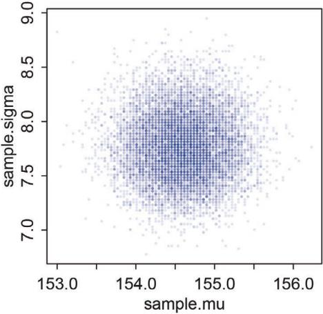
Figure 4.4. Samples from the posterior distribution for the heights data. The density of points is highest in the center, reflecting the most plausible combinations of µ and σ. There are many more ways for these parameter values to produce the data, conditional on the model.
Now that you have these samples, you can describe the distribution of confidence in each combination of µ and σ by summarizing the samples. Think of them like data and describe them, just like inChapter 3. For example, to characterize the shapes of the marginal posterior densities of µ and σ, all we need to do is:
R code 4.21 dens( sample.mu ) dens( sample.sigma )
The jargon “marginal” here means “averaging over the other parameters.” Execute the above code and inspect the plots. These densities are very close to being normal distributions. And this is quite typical. As sample size increases, posterior densities approach the normal distribution. If you look closely, though, you’ll notice that the density for σ has a longer right-hand tail. I’ll exaggerate this tendency a bit later, to show you that this condition is very common for standard deviation parameters.
To summarize the widths of these densities with posterior compatibility intervals:
R code
 4.22 PI( sample.mu )
       PI( sample.sigma )
Since these samples are just vectors of numbers, you can compute any statistic from them that you could from ordinary data: mean, median, or quantile, for example.
Overthinking: Sample size and the normality of σ’s posterior. Before moving on to using quadratic approximation (quap) as shortcut to all of this inference, it is worth repeating the analysis of the height data above, but now with only a fraction of the original data. The reason to do this is to demonstrate that, in principle, the posterior is not always so Gaussian in shape. There’s no trouble with the mean, µ. For a Gaussian likelihood and a Gaussian prior on µ, the posterior distribution is always Gaussian as well, regardless of sample size. It is the standard deviation σ that causes problems. So if you care about σ—often people do not—you do need to be careful of abusing the quadratic approximation.
The deep reasons for the posterior of σ tending to have a long right-hand tail are complex. But a useful way to conceive of the problem is that variances must be positive. As a result, there must be more uncertainty about how big the variance (or standard deviation) is than about how small it is. For example, if the variance is estimated to be near zero, then you know for sure that it can’t be much smaller. But it could be a lot bigger.
Let’s quickly analyze only 20 of the heights from the height data to reveal this issue. To sample 20 random heights from the original list:
4.23 d3 <- sample( d2$height , size=20 )
Now I’ll repeat all the code from the previous subsection, modified to focus on the 20 heights in d3 rather than the original data. I’ll compress all of the code together here.
4.24 mu.list <- seq( from=150, to=170 , length.out=200 )
sigma.list <- seq( from=4 , to=20 , length.out=200 )
post2 <- expand.grid( mu=mu.list , sigma=sigma.list )
post2$LL <- sapply( 1:nrow(post2) , function(i)
   sum( dnorm( d3 , mean=post2$mu[i] , sd=post2$sigma[i] ,
   log=TRUE ) ) )
post2$prod <- post2$LL + dnorm( post2$mu , 178 , 20 , TRUE ) +
   dunif( post2$sigma , 0 , 50 , TRUE )
post2$prob <- exp( post2$prod - max(post2$prod) )
sample2.rows <- sample( 1:nrow(post2) , size=1e4 , replace=TRUE ,
   prob=post2$prob )
sample2.mu <- post2$mu[ sample2.rows ]
sample2.sigma <- post2$sigma[ sample2.rows ]
plot( sample2.mu , sample2.sigma , cex=0.5 ,
   col=col.alpha(rangi2,0.1) ,
   xlab="mu" , ylab="sigma" , pch=16 )
After executing the code above, you’ll see another scatter plot of the samples from the posterior density, but this time you’ll notice a distinctly longer tail at the top of the cloud of points. You should also inspect the marginal posterior density for σ, averaging over µ, produced with:
4.25 dens( sample2.sigma , norm.comp=TRUE )
R code
This code will also show a normal approximation with the same mean and variance. Now you can see that the posterior for σ is not Gaussian, but rather has a long tail towards higher values.
4.3.5. Finding the posterior distribution with quap. Now we leave grid approximation behind and move on to one of the great engines of applied statistics, the quadratic approximation. Our interest in quadratic approximation, recall, is as a handy way to quickly make inferences about the shape of the posterior. The posterior’s peak will lie at the maximum a posteriori estimate (MAP), and we can get a useful image of the posterior’s shape by using the quadratic approximation of the posterior distribution at this peak.
To build the quadratic approximation, we’ll use quap, a command in the rethinking package. The quap function works by using the model definition you were introduced to earlier in this chapter. Each line in the definition has a corresponding definition in the form of R code. The engine inside quap then uses these definitions to define the posterior probability at each combination of parameter values. Then it can climb the posterior distribution and find the peak, its MAP. Finally, it estimates the quadratic curvature at the MAP to produce an approximation of the posterior distribution. Remember: This procedure is very similar to what many non-Bayesian procedures do, just without any priors.
Let’s begin by repeating the code to load the data and select out the adults:
R code
R code
 4.26 library(rethinking)
       data(Howell1)
       d <- Howell1
       d2 <- d[ d$age >= 18 , ]
Now we’re ready to define the model, using R’s formula syntax. The model definition in this case is just as before, but now we’ll repeat it with each corresponding line of R code shown on the right-hand margin:
| Normal(µ, σ) ∼ hi |
height ~ dnorm(mu,sigma) |
|---|---|
| µ Normal(178, 20) ∼ |
mu ~ dnorm(178,20) |
| σ Uniform(0, 50) ∼ |
sigma ~ dunif(0,50) |
Now place the R code equivalents into an alist. Here’s an alist of the formulas above:
R code
 4.27 flist <- alist(
           height ~ dnorm( mu , sigma ) ,
           mu ~ dnorm( 178 , 20 ) ,
           sigma ~ dunif( 0 , 50 )
       )
Note the commas at the end of each line, except the last. These commas separate each line of the model definition.
Fit the model to the data in the data frame d2 with:
R code
 4.28 m4.1 <- quap( flist , data=d2 )
After executing this code, you’ll have a fit model stored in the symbol m4.1. Now take a look at the posterior distribution:
R code
 4.29 precis( m4.1 )
mean sd 5.5% 94.5% mu 154.61 0.41 153.95 155.27 sigma 7.73 0.29 7.27 8.20
These numbers provide Gaussian approximations for each parameter’s marginal distribution. This means the plausibility of each value of µ, after averaging over the plausibilities of each value of σ, is given by a Gaussian distribution with mean 154.6 and standard deviation 0.4.
The 5.5% and 94.5% quantiles are percentile interval boundaries, corresponding to an 89% compatibility interval. Why 89%? It’s just the default. It displays a quite wide interval, so it shows a high-probability range of parameter values. If you want another interval, such as the conventional and mindless 95%, you can use precis(m4.1,prob=0.95). But I don’t recommend 95% intervals, because readers will have a hard time not viewing them as significance tests. 89 is also a prime number, so if someone asks you to justify it, you can stare at them meaningfully and incant, “Because it is prime.” That’s no worse justification than the conventional justification for 95%.
I encourage you to compare these 89% boundaries to the compatibility intervals from the grid approximation earlier. You’ll find that they are almost identical. When the posterior is approximately Gaussian, then this is what you should expect.
Overthinking: Start values for quap. quap estimates the posterior by climbing it like a hill. To do this, it has to start climbing someplace, at some combination of parameter values. Unless you tell it otherwise, quap starts at random values sampled from the prior. But it’s also possible to specify a starting value for any parameter in the model. In the example in the previous section, that means the parameters µ and σ. Here’s a good list of starting values in this case:
4.30 start <- list(
  mu=mean(d2$height),
  sigma=sd(d2$height)
)
m4.1 <- quap( flist , data=d2 , start=start )
These start values are good guesses of the rough location of the MAP values.
Note that the list of start values is a regular list, not an alist like the formula list is. The two functions alist and list do the same basic thing: allow you to make a collection of arbitrary R objects. They differ in one important respect: list evaluates the code you embed inside it, while alist does not. So when you define a list of formulas, you should use alist, so the code isn’t executed. But when you define a list of start values for parameters, you should use list, so that code like mean(d2$height) will be evaluated to a numeric value.
The priors we used before are very weak, both because they are nearly flat and because there is so much data. So I’ll splice in a more informative prior for µ, so you can see the effect. All I’m going to do is change the standard deviation of the prior to 0.1, so it’s a very narrow prior. I’ll also build the formula right into the call to quap this time.
4.31 m4.2 <- quap(
  alist(
     height ~ dnorm( mu , sigma ) ,
     mu ~ dnorm( 178 , 0.1 ) ,
     sigma ~ dunif( 0 , 50 )
  ) , data=d2 )
precis( m4.2 )
mean sd 5.5% 94.5% mu 177.86 0.10 177.70 178.02 sigma 24.52 0.93 23.03 26.00
Notice that the estimate for µ has hardly moved off the prior. The prior was very concentrated around 178. So this is not surprising. But also notice that the estimate for σ has changed quite a lot, even though we didn’t change its prior at all. Once the golem is certain that the mean is near 178—as the prior insists—then the golem has to estimate σ conditional on that fact. This results in a different posterior for σ, even though all we changed is prior information about the other parameter.
4.3.6. Sampling from a quap. The above explains how to get a quadratic approximation of the posterior, using quap. But how do you then get samples from the quadratic approximate posterior distribution? The answer is rather simple, but non-obvious, and it requires
R code
recognizing that a quadratic approximation to a posterior distribution with more than one parameter dimension—µ and σ each contribute one dimension—is just a multi-dimensional Gaussian distribution.
As a consequence, when R constructs a quadratic approximation, it calculates not only standard deviations for all parameters, but also the covariances among all pairs of parameters. Just like a mean and standard deviation (or its square, a variance) are sufficient to describe a one-dimensional Gaussian distribution, a list of means and a matrix of variances and covariances are sufficient to describe a multi-dimensional Gaussian distribution. To see this matrix of variances and covariances, for model m4.1, use:
R code
 4.32 vcov( m4.1 )
mu sigma
mu 0.1697395865 0.0002180593
sigma 0.0002180593 0.0849057933The above is a variance-covariance matrix. It is the multi-dimensional glue of a quadratic approximation, because it tells us how each parameter relates to every other parameter in the posterior distribution. A variance-covariance matrix can be factored into two elements: (1) a vector of variances for the parameters and (2) a correlation matrix that tells us how changes in any parameter lead to correlated changes in the others. This decomposition is usually easier to understand. So let’s do that now:
R code4.33 diag( vcov( m4.1 ) )
cov2cor( vcov( m4.1 ) )mu sigma
0.16973959 0.08490579mu sigma mu 1.000000000 0.001816412 sigma 0.001816412 1.000000000
The two-element vector in the output is the list of variances. If you take the square root of this vector, you get the standard deviations that are shown in precis output. The two-by-two matrix in the output is the correlation matrix. Each entry shows the correlation, bounded between −1 and +1, for each pair of parameters. The 1’s indicate a parameter’s correlation with itself. If these values were anything except 1, we would be worried. The other entries are typically closer to zero, and they are very close to zero in this example. This indicates that learning µ tells us nothing about σ and likewise that learning σ tells us nothing about µ. This is typical of simple Gaussian models of this kind. But it is quite rare more generally, as you’ll see in later chapters.
Okay, so how do we get samples from this multi-dimensional posterior? Now instead of sampling single values from a simple Gaussian distribution, we sample vectors of values from a multi-dimensional Gaussian distribution. The rethinking package provides a convenience function to do exactly that:
R code
 4.34 library(rethinking)
       post <- extract.samples( m4.1 , n=1e4 )
head(post)
mu sigma 1 155.0031 7.443893 2 154.0347 7.771255 3 154.9157 7.822178 4 154.4252 7.530331 5 154.5307 7.655490 6 155.1772 7.974603
You end up with a data frame, post, with 10,000 (1e4) rows and two columns, one column for µ and one for σ. Each value is a sample from the posterior, so the mean and standard deviation of each column will be very close to the MAP values from before. You can confirm this by summarizing the samples:
| precis(post) | 4.35 | |||||
|---|---|---|---|---|---|---|
| quap | posterior: | 10000 | samples from |
m4.1 | ||
| mean sd |
5.5% | 94.5% | histogram | |||
| mu 154.61 |
0.41 | 153.95 | 155.27 | ▁▁▁▅▇▂▁▁ | ||
| sigma | 7.72 0.29 |
7.26 | 8.18 | ▁▁▁▂▅▇▇▃▁▁▁▁ |
Compare these values to the output from precis(m4.1). And you can use plot(post) to see how much they resemble the samples from the grid approximation in Figure 4.4 (page 86). These samples also preserve the covariance between µ and σ. This hardly matters right now, because µ and σ don’t covary at all in this model. But once you add a predictor variable to your model, covariance will matter a lot.
Overthinking: Under the hood with multivariate sampling. The function extract.samples is for convenience. It is just running a simple simulation of the sort you conducted near the end of Chapter 3. Here’s a peak at the motor. The work is done by a multi-dimensional version of rnorm, mvrnorm. The function rnorm simulates random Gaussian values, while mvrnorm simulates random vectors of multivariate Gaussian values. Here’s how to use it to do what extract.samples does:
4.36 library(MASS)
post <- mvrnorm( n=1e4 , mu=coef(m4.1) , Sigma=vcov(m4.1) )
You don’t usually need to use mvrnorm directly like this, but sometimes you want to simulate multivariate Gaussian outcomes. In that case, you’ll need to access mvrnorm directly. And of course it’s always good to know a little about how the machine operates. Later on, we’ll work with posterior distributions that cannot be correctly approximated this way.
4.4. Linear prediction
What we’ve done above is a Gaussian model of height in a population of adults. But it doesn’t really have the usual feel of “regression” to it. Typically, we are interested in modeling how an outcome is related to some other variable, a predictor variable. If the predictor variable has any statistical association with the outcome variable, then we can use it to predict R code
the outcome. When the predictor variable is built inside the model in a particular way, we’ll have linear regression.
So now let’s look at how height in these Kalahari foragers (the outcome variable) covaries with weight (the predictor variable). This isn’t the most thrilling scientific question, I know. But it is an easy relationship to start with, and if it seems dull, it’s because you don’t have a theory about growth and life history in mind. If you did, it would be thrilling. We’ll try later on to add some of that thrill, when we reconsider this example from a more causal perspective. Right now, I ask only that you focus on the mechanics of estimating an association between two variables.
Go ahead and plot adult height and weight against one another:
R code4.37 library(rethinking)
data(Howell1); d <- Howell1; d2 <- d[ d$age >= 18 , ]
plot( d2$height ~ d2$weight )The resulting plot is not shown here. You really should do it yourself. Once you can see the plot, you’ll see that there’s obviously a relationship: Knowing a person’s weight helps you predict height.
To make this vague observation into a more precise quantitative model that relates values of weight to plausible values of height, we need some more technology. How do we take our Gaussian model from the previous section and incorporate predictor variables?
Rethinking: What is “regression”? Many diverse types of models are called “regression.” The term has come to mean using one or more predictor variables to model the distribution of one or more outcome variables. The original use of term, however, arose from anthropologist Francis Galton’s (1822–1911) observation that the sons of tall and short men tended to be more similar to the population mean, hence regression to the mean. 74
The causal reasons for regression to the mean are diverse. In the case of height, the causal explanation is a key piece of the foundation of population genetics. But this phenomenon arises statistically whenever individual measurements are assigned a common distribution, leading to shrinkage as each measurement informs the others. In the context of Galton’s height data, attempting to predict each son’s height on the basis of only his father’s height is folly. Better to use the population of fathers. This leads to a prediction for each son which is similar to each father but “shrunk” towards the overall mean. Such predictions are routinely better. This same regression/shrinkage phenomenon applies at higher levels of abstraction and forms one basis of multilevel modeling(Chapter 13).
4.4.1. The linear model strategy. The strategy is to make the parameter for the mean of a Gaussian distribution, µ, into a linear function of the predictor variable and other, new parameters that we invent. This strategy is often simply called the linear model. The linear model strategy instructs the golem to assume that the predictor variable has a constant and additive relationship to the mean of the outcome. The golem then computes the posterior distribution of this constant relationship.
What this means, recall, is that the machine considers every possible combination of the parameter values. With a linear model, some of the parameters now stand for the strength of association between the mean of the outcome, µ, and the value of some other variable. For each combination of values, the machine computes the posterior probability, which is a measure of relative plausibility, given the model and data. So the posterior distribution ranks the infinite possible combinations of parameter values by their logical plausibility. As a result, the posterior distribution provides relative plausibilities of the different possible strengths of association, given the assumptions you programmed into the model. We ask the golem: “Consider all the lines that relate one variable to the other. Rank all of these lines by plausibility, given these data.” The golem answers with a posterior distribution.
Here’s how it works, in the simplest case of only one predictor variable. We’ll wait until the next chapter to confront more than one predictor. Recall the basic Gaussian model:
\[h\_l \sim \text{Normal}(\mu, \sigma) \tag{1\text{\textquotedblleft}l\text{\textquotedblright}\text{\textquotedblright}} \tag{1\text{\textquotedblleft}l\text{\textquotedblright}\text{\textquotedblright}\text{\textquotedblright}}\]
\[ \mu \sim \text{Normal}(178, 20) \tag{\mu \text{ prior}} \]
\[ \sigma \sim \text{Uniform}(0, 50) \tag{\sigma \text{ prior}} \]
Now how do we get weight into a Gaussian model of height? Let x be the name for the column of weight measurements, d2$weight. Let the average of the x values be ¯x, “ex bar”. Now we have a predictor variable x, which is a list of measures of the same length as h. To get weight into the model, we define the mean µ as a function of the values in x. This is what it looks like, with explanation to follow:
\[\begin{aligned} h\_i &\sim \text{Normal}(\mu\_i, \sigma) & \text{[like-like]}\\ \mu\_i &= \alpha + \beta(\mathbf{x}\_i - \bar{\mathbf{x}}) & \text{[like-to-closed]}\\ \alpha &\sim \text{Normal}(178, 20) & \text{[}\alpha \text{ prior]}\\ \beta &\sim \text{Normal}(0, 10) & \text{[}\beta \text{ prior]}\\ \sigma &\sim \text{Uniform}(0, 50) & \text{[}\sigma \text{ prior]} \end{aligned}\]
Again, I’ve labeled each line on the right-hand side by the type of definition it encodes. We’ll discuss each in turn.
4.4.1.1. Probability of the data. Let’s begin with just the probability of the observed height, the first line of the model. This is nearly identical to before, except now there is a little index i on the µ as well as the h. You can read hi as “each h” and µi as “each µ.” The mean µ now depends upon unique values on each row i. So the little i on µi indicates that the mean depends upon the row.
4.4.1.2. Linear model. The mean µ is no longer a parameter to be estimated. Rather, as seen in the second line of the model, µi is constructed from other parameters, α and β, and the observed variable x. This line is not a stochastic relationship—there is no ∼ in it, but rather an = in it—because the definition of µi is deterministic. That is to say that, once we know α and β and xi , we know µi with certainty.
The value xi is just the weight value on row i. It refers to the same individual as the height value, hi , on the same row. The parameters α and β are more mysterious. Where did they come from? We made them up. The parameters µ and σ are necessary and sufficient to describe a Gaussian distribution. But α and β are instead devices we invent for manipulating µ, allowing it to vary systematically across cases in the data.
You’ll be making up all manner of parameters as your skills improve. One way to understand these made-up parameters is to think of them as targets of learning. Each parameter is something that must be described in the posterior distribution. So when you want to know something about the data, you ask your golem by inventing a parameter for it. This will make more and more sense as you progress. Here’s how it works in this context. The second line
of the model definition is just:
\[ \mu\_i = \alpha + \beta(\mathbf{x}\_i - \bar{\mathbf{x}}), \]
What this tells the regression golem is that you are asking two questions about the mean of the outcome.
- What is the expected height when xi = ¯x? The parameter α answers this question, because when xi = ¯x, µi = α. For this reason, α is often called the intercept. But we should think not in terms of some abstract line, but rather in terms of the meaning with respect to the observable variables.
- What is the change in expected height, when xi changes by 1 unit? The parameter β answers this question. It is often called a “slope,” again because of the abstract line. Better to think of it as a rate of change in expectation.
Jointly these two parameters ask the golem to find a line that relates x to h, a line that passes through α when xi = ¯x and has slope β. That is a task that golems are very good at. It’s up to you, though, to be sure it’s a good question.
Rethinking: Nothing special or natural about linear models. Note that there’s nothing special about the linear model, really. You can choose a different relationship between α and β and µ. For example, the following is a perfectly legitimate definition for µi :
\[ \mu\_{\mathbf{i}} = \alpha \exp(-\beta \mathbf{x\_i}), \]
This does not define a linear regression, but it does define a regression model. The linear relationship we are using instead is conventional, but nothing requires that you use it. It is very common in some fields, like ecology and demography, to use functional forms for µ that come from theory, rather than the geocentrism of linear models. Models built out of substantive theory can dramatically outperform linear models of the same phenomena.75 We’ll revisit this point later in the book.
Overthinking: Units and regression models. Readers who had a traditional training in physical sciences will know how to carry units through equations of this kind. For their benefit, here’s the model again (omitting priors for brevity), now with units of each symbol added.
\[\begin{aligned} h\_i \text{cm} &\sim \text{Normal}(\mu\_i \text{cm}, \sigma \text{cm}) \\ \mu\_i \text{cm} &= \alpha \text{cm} + \beta \frac{\text{cm}}{\text{kg}} (\text{x}\_i \text{kg} - \bar{\text{x}} \text{kg}) \end{aligned}\]
So you can see that β must have units of cm/kg in order for the mean µi to have units of cm. One of the facts that labeling with units clears up is that a parameter like β is a kind of rate—centimeters per kilogram. There’s also a tradition called dimensionless analysis that advocates constructing variables so that they are unit-less ratios. In this context, for example, we might divide height by a reference height, removing its units. Measurement scales are arbitrary human constructions, and sometimes the unit-less analysis is more natural and general.
4.4.1.3. Priors. The remaining lines in the model define distributions for the unobserved variables. These variables are commonly known as parameters, and their distributions as priors. There are three parameters: α, β, and σ. You’ve seen priors for α and σ before, although α was called µ back then.
The prior for β deserves explanation. Why have a Gaussian prior with mean zero? This prior places just as much probability below zero as it does above zero, and when β = 0,
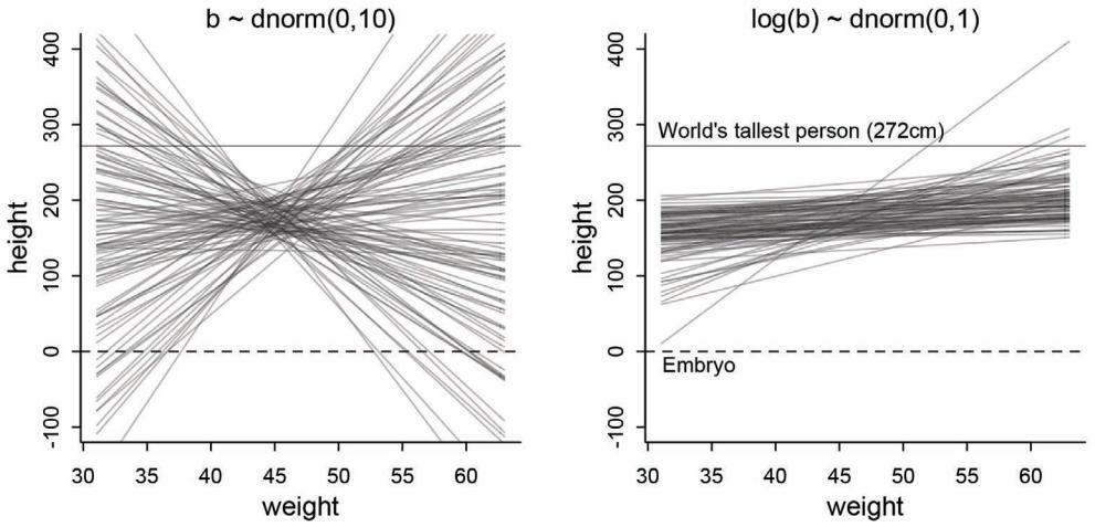
Figure 4.5. Prior predictive simulation for the height and weight model. Left: Simulation using the β ∼ Normal(0, 10) prior. Right: A more sensible log(β) ∼ Normal(0, 1) prior.
weight has no relationship to height. To figure out what this prior implies, we have to simulate the prior predictive distribution. There is no other reliable way to understand.
The goal is to simulate heights from the model, using only the priors. First, let’s consider a range of weight values to simulate over. The range of observed weights will do fine. Then we need to simulate a bunch of lines, the lines implied by the priors for α and β. Here’s how to do it, setting a seed so you can reproduce it exactly:
4.38 set.seed(2971)
N <- 100 # 100 lines
a <- rnorm( N , 178 , 20 )
b <- rnorm( N , 0 , 10 )
Now we have 100 pairs of α and β values. Now to plot the lines:
4.39 plot( NULL , xlim=range(d2$weight) , ylim=c(-100,400) ,
   xlab="weight" , ylab="height" )
abline( h=0 , lty=2 )
abline( h=272 , lty=1 , lwd=0.5 )
mtext( "b ~ dnorm(0,10)" )
xbar <- mean(d2$weight)
for ( i in 1:N ) curve( a[i] + b[i]*(x - xbar) ,
   from=min(d2$weight) , to=max(d2$weight) , add=TRUE ,
   col=col.alpha("black",0.2) )
The result is displayed in Figure 4.5. For reference, I’ve added a dashed line at zero—no one is shorter than zero—and the “Wadlow” line at 272 cm for the world’s tallest person. The pattern doesn’t look like any human population at all. It essentially says that the relationship R code
between weight and height could be absurdly positive or negative. Before we’ve even seen the data, this is a bad model. Can we do better?
We can do better immediately. We know that average height increases with average weight, at least up to a point. Let’s try restricting it to positive values. The easiest way to do this is to define the prior as Log-Normal instead. If you aren’t accustomed to playing with logarithms, that’s okay. There’s more detail in the box at the end of this section.
Defining β as Log-Normal(0,1) means to claim that the logarithm of β has a Normal(0,1) distribution. Plainly:
β ∼ Log-Normal(0, 1)
R provides the dlnorm and rlnorm densities for working with log-normal distributions. You can simulate this relationship to see what this means for β:
R code
 4.40 b <- rlnorm( 1e4 , 0 , 1 )
       dens( b , xlim=c(0,5) , adj=0.1 )
If the logarithm of β is normal, then β itself is strictly positive. The reason is that exp(x) is greater than zero for any real number x. This is the reason that Log-Normal priors are commonplace. They are an easy way to enforce positive relationships. So what does this earn us? Do the prior predictive simulation again, now with the Log-Normal prior:
R code
 4.41 set.seed(2971)
      N <- 100 # 100 lines
      a <- rnorm( N , 178 , 20 )
      b <- rlnorm( N , 0 , 1 )
Plotting as before produces the right-hand plot in Figure 4.5. This is much more sensible. There is still a rare impossible relationship. But nearly all lines in the joint prior for α and β are now within human reason.
We’re fussing about this prior, even though as you’ll see in the next section there is so much data in this example that the priors end up not mattering. We fuss for two reasons. First, there are many analyses in which no amount of data makes the prior irrelevant. In such cases, non-Bayesian procedures are no better off. They also depend upon structural features of the model. Paying careful attention to those features is essential. Second, thinking about the priors helps us develop better models, maybe even eventually going beyond geocentrism.
Rethinking: What’s the correct prior? People commonly ask what the correct prior is for a given analysis. The question sometimes implies that for any given set of data, there is a uniquely correct prior that must be used, or else the analysis will be invalid. This is a mistake. There is no more a uniquely correct prior than there is a uniquely correct likelihood. Statistical models are machines for inference. Many machines will work, but some work better than others. Priors can be wrong, but only in the same sense that a kind of hammer can be wrong for building a table.
In choosing priors, there are simple guidelines to get you started. Priors encode states of information before seeing data. So priors allow us to explore the consequences of beginning with different information. In cases in which we have good prior information that discounts the plausibility of some parameter values, like negative associations between height and weight, we can encode that information directly into priors. When we don’t have such information, we still usually know enough about the plausible range of values. And you can vary the priors and repeat the analysis in order to study
how different states of initial information influence inference. Frequently, there are many reasonable choices for a prior, and all of them produce the same inference. And conventional Bayesian priors are conservative, relative to conventional non-Bayesian approaches. We’ll see how this conservatism arises in Chapter 7.
Making choices tends to make novices nervous. There’s an illusion sometimes that default procedures are more objective than procedures that require user choice, such as choosing priors. If that’s true, then all “objective” means is that everyone does the same thing. It carries no guarantees of realism or accuracy.
Rethinking: Prior predictive simulation and p-hacking A serious problem in contemporary applied statistics is “p-hacking,” the practice of adjusting the model and the data to achieve a desired result. The desired result is usually a p-value less then 5%. The problem is that when the model is adjusted in light of the observed data, then p-values no longer retain their original meaning. False results are to be expected. We don’t pay any attention to p-values in this book. But the danger remains, if we choose our priors conditional on the observed sample, just to get some desired result. The procedure we’ve performed in this chapter is to choose priors conditional on pre-data knowledge of the variables their constraints, ranges, and theoretical relationships. This is why the actual data are not shown in the earlier section. We are judging our priors against general facts, not the sample. We’ll look at how the model performs against the real data next.
4.4.2. Finding the posterior distribution. The code needed to approximate the posterior is a straightforward modification of the kind of code you’ve already seen. All we have to do is incorporate our new model for the mean into the model specification inside quap and be sure to add a prior for the new parameter, β. Let’s repeat the model definition, now with the corresponding R code on the right-hand side:
| ∼ Normal(µi , σ) hi |
height ~ dnorm(mu,sigma) |
|---|---|
| µi = α + β(xi ¯x) − |
mu <- a + b*(weight-xbar) |
| α Normal(178, 20) ∼ |
a ~ dnorm(178,20) |
| β Log-Normal(0, 1) ∼ |
b ~ dlnorm(0,1) |
| σ Uniform(0, 50) ∼ |
sigma ~ dunif(0,50) |
Notice that the linear model, in the R code on the right-hand side, uses the R assignment operator, <-, even though the mathematical definition uses the symbol =. This is a code convention shared by several Bayesian model fitting engines, so it’s worth getting used to the switch. You just have to remember to use <- instead of = when defining a linear model.
That’s it. The above allows us to build the posterior approximation:
4.42 # load data again, since it's a long way back
library(rethinking)
data(Howell1); d <- Howell1; d2 <- d[ d$age >= 18 , ]
# define the average weight, x-bar
xbar <- mean(d2$weight)
# fit model
m4.3 <- quap(
alist(
height ~ dnorm( mu , sigma ) ,
mu <- a + b*( weight - xbar ) ,
a ~ dnorm( 178 , 20 ) ,
b ~ dlnorm( 0 , 1 ) ,
sigma ~ dunif( 0 , 50 )
) , data=d2 )Rethinking: Everything that depends upon parameters has a posterior distribution. In the model above, the parameter µ is no longer a parameter, since it has become a function of the parameters α and β. But since the parameters α and β have a joint posterior, so too does µ. Later in the chapter, you’ll work directly with the posterior distribution of µ, even though it’s not a parameter anymore. Since parameters are uncertain, everything that depends upon them is also uncertain. This includes statistics like µ, as well as model-based predictions, measures of fit, and everything else that uses parameters. By working with samples from the posterior, all you have to do to account for posterior uncertainty in any quantity is to compute that quantity for each sample from the posterior. The resulting quantities, one for each posterior sample, will approximate the quantity’s posterior distribution.
Overthinking: Logs and exps, oh my. My experience is that many natural and social scientists have naturally forgotten whatever they once knew about logarithms. Logarithms appear all the time in applied statistics. You can usefully think of y = log(x) as assigning to y the order of magnitude of x. The function x = exp(y) is the reverse, turning a magnitude into a value. These definitions will make a mathematician shriek. But much of our computational work relies only on these intuitions.
These definitions allow the Log-Normal prior for β to be coded another way. Instead of defining a parameter β, we define a parameter that is the logarithm of β and then assign it a normal distribution. Then we can reverse the logarithm inside the linear model. It looks like this:
R code4.43 m4.3b <- quap(
alist(
height ~ dnorm( mu , sigma ) ,
mu <- a + exp(log_b)*( weight - xbar ),
a ~ dnorm( 178 , 20 ) ,
log_b ~ dnorm( 0 , 1 ) ,
sigma ~ dunif( 0 , 50 )
) , data=d2 )Note the exp(log_b) in the definition of mu. This is the same model as m4.3. It will make the same predictions. But instead of β in the posterior distribution, you get log(β). It is easy to translate between the two, because β = exp(log(β)). In code form: b <- exp(log_b).
4.4.3. Interpreting the posterior distribution. One trouble with statistical models is that they are hard to understand. Once you’ve fit the model, it can only report posterior distribution. This is the right answer to the question you asked. But it’s your responsibility to process the answer and make sense of it.
There are two broad categories of processing: (1) reading tables and (2) plotting simulations. For some simple questions, it’s possible to learn a lot just from tables of marginal
values. But most models are very hard to understand from tables of numbers alone. A major difficulty with tables alone is their apparent simplicity compared to the complexity of the model and data that generated them. Once you have more than a couple of parameters in a model, it is very hard to figure out from numbers alone how all of them act to influence prediction. This is also the reason we simulate from priors. Once you begin adding interaction terms (Chapter 8) or polynomials (later in this chapter), it may not even be possible to guess the direction of influence a predictor variable has on an outcome.
So throughout this book, I emphasize plotting posterior distributions and posterior predictions, instead of attempting to understand a table. Plotting the implications of your models will allow you to inquire about things that are hard to read from tables:
- Whether or not the model fitting procedure worked correctly
- The absolute magnitude, rather than merely relative magnitude, of a relationship between outcome and predictor
- The uncertainty surrounding an average relationship
- The uncertainty surrounding the implied predictions of the model, as these are distinct from mere parameter uncertainty
In addition, once you get the hang of processing posterior distributions into plots, you can ask any question you can think of, for any model type. And readers of your results will appreciate a figure much more than they will a table of estimates.
So in the remainder of this section, I first spend a little time talking about tables of estimates. Then I move on to show how to plot estimates that always incorporate information from the full posterior distribution, including correlations among parameters.
Rethinking: What do parameters mean? A basic issue with interpreting model-based estimates is in knowing the meaning of parameters. There is no consensus about what a parameter means, however, because different people take different philosophical stances towards models, probability, and prediction. The perspective in this book is a common Bayesian perspective: Posterior probabilities of parameter values describe the relative compatibility of different states of the world with the data, according to the model. These are small world(Chapter 2) numbers. So reasonable people may disagree about the large world meaning, and the details of those disagreements depend strongly upon context. Such disagreements are productive, because they lead to model criticism and revision, something that golems cannot do for themselves. In later chapters, you’ll see that parameters can refer to observable quantities—data—as well as unobservable values. This makes parameters even more useful and their interpretation even more context dependent.
4.4.3.1. Tables of marginal distributions. With the new linear regression trained on the Kalahari data, we inspect the marginal posterior distributions of the parameters:
4.44 precis( m4.3 )
mean sd 5.5% 94.5% a 154.60 0.27 154.17 155.03 b 0.90 0.04 0.84 0.97 sigma 5.07 0.19 4.77 5.38
The first row gives the quadratic approximation for α, the second the approximation for β, and the third approximation for σ. Let’s try to make some sense of them.
Let’s focus on b (β), because it’s the new parameter. Since β is a slope, the value 0.90 can be read as a person 1 kg heavier is expected to be 0.90 cm taller. 89% of the posterior probability lies between 0.84 and 0.97. That suggests that β values close to zero or greatly above one are highly incompatible with these data and this model. It is most certainly not evidence that the relationship between weight and height is linear, because the model only considered lines. It just says that, if you are committed to a line, then lines with a slope around 0.9 are plausible ones.
Remember, the numbers in the default precis output aren’t sufficient to describe the quadratic posterior completely. For that, we also require the variance-covariance matrix. You can see the covariances among the parameters with vcov:
R code
4.45 round( vcov( m4.3 ) , 3 )| a | b | sigma | |
|---|---|---|---|
| a | 0.073 | 0.000 | 0.000 |
| b | 0.000 | 0.002 | 0.000 |
| sigma | 0.000 | 0.000 | 0.037 |
Very little covariation among the parameters in this case. Using pairs(m4.3) shows both the marginal posteriors and the covariance. In the practice problems at the end of the chapter, you’ll see that the lack of covariance among the parameters results from centering.
4.4.3.2. Plotting posterior inference against the data. It’s almost always much more useful to plot the posterior inference against the data. Not only does plotting help in interpreting the posterior, but it also provides an informal check on model assumptions. When the model’s predictions don’t come close to key observations or patterns in the plotted data, then you might suspect the model either did not fit correctly or is rather badly specified. But even if you only treat plots as a way to help in interpreting the posterior, they are invaluable. For simple models like this one, it is possible (but not always easy) to just read the table of numbers and understand what the model says. But for even slightly more complex models, especially those that include interaction effects (Chapter 8), interpreting posterior distributions is hard. Combine with this the problem of incorporating the information in vcov into your interpretations, and the plots are irreplaceable.
We’re going to start with a simple version of that task, superimposing just the posterior mean values over the height and weight data. Then we’ll slowly add more and more information to the prediction plots, until we’ve used the entire posterior distribution.
We’ll start with just the raw data and a single line. The code below plots the raw data, computes the posterior mean values for a and b, then draws the implied line:
R code4.46 plot( height ~ weight , data=d2 , col=rangi2 )
post <- extract.samples( m4.3 )
a_map <- mean(post$a)
b_map <- mean(post$b)
curve( a_map + b_map*(x - xbar) , add=TRUE )You can see the resulting plot in Figure 4.6. Each point in this plot is a single individual. The black line is defined by the mean slope β and mean intercept α. This is not a bad line. It certainly looks highly plausible. But there are an infinite number of other highly plausible lines near it. Let’s draw those too.
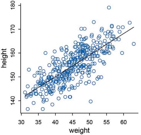
Figure 4.6. Height in centimeters (vertical) plotted against weight in kilograms (horizontal), with the line at the posterior mean plotted in black.
4.4.3.3. Adding uncertainty around the mean. The posterior mean line is just the posterior mean, the most plausible line in the infinite universe of lines the posterior distribution has considered. Plots of the average line, like Figure 4.6, are useful for getting an impression of the magnitude of the estimated influence of a variable. But they do a poor job of communicating uncertainty. Remember, the posterior distribution considers every possible regression line connecting height to weight. It assigns a relative plausibility to each. This means that each combination of α and β has a posterior probability. It could be that there are many lines with nearly the same posterior probability as the average line. Or it could be instead that the posterior distribution is rather narrow near the average line.
So how can we get that uncertainty onto the plot? Together, a combination of α and β define a line. And so we could sample a bunch of lines from the posterior distribution. Then we could display those lines on the plot, to visualize the uncertainty in the regression relationship.
To better appreciate how the posterior distribution contains lines, we work with all of the samples from the model. Let’s take a closer look at the samples now:
4.47 post <- extract.samples( m4.3 )
post[1:5,]
a b sigma 1 154.5505 0.9222372 5.188631 2 154.4965 0.9286227 5.278370 3 154.4794 0.9490329 4.937513 4 155.2289 0.9252048 4.869807 5 154.9545 0.8192535 5.063672
Each row is a correlated random sample from the joint posterior of all three parameters, using the covariances provided by vcov(m4.3). The paired values of a and b on each row define a line. The average of very many of these lines is the posterior mean line. But the scatter around that average is meaningful, because it alters our confidence in the relationship between the predictor and the outcome.
So now let’s display a bunch of these lines, so you can see the scatter. This lesson will be easier to appreciate, if we use only some of the data to begin. Then you can see how adding
in more data changes the scatter of the lines. So we’ll begin with just the first 10 cases in d2. The following code extracts the first 10 cases and re-estimates the model:
R code
 4.48 N <- 10
       dN <- d2[ 1:N , ]
       mN <- quap(
           alist(
               height ~ dnorm( mu , sigma ) ,
               mu <- a + b*( weight - mean(weight) ) ,
               a ~ dnorm( 178 , 20 ) ,
               b ~ dlnorm( 0 , 1 ) ,
               sigma ~ dunif( 0 , 50 )
           ) , data=dN )
Now let’s plot 20 of these lines, to see what the uncertainty looks like.
R code
 4.49 # extract 20 samples from the posterior
       post <- extract.samples( mN , n=20 )
       # display raw data and sample size
       plot( dN$weight , dN$height ,
           xlim=range(d2$weight) , ylim=range(d2$height) ,
           col=rangi2 , xlab="weight" , ylab="height" )
       mtext(concat("N = ",N))
       # plot the lines, with transparency
       for ( i in 1:20 )
           curve( post$a[i] + post$b[i]*(x-mean(dN$weight)) ,
               col=col.alpha("black",0.3) , add=TRUE )
The last line loops over all 20 lines, using curve to display each.
The result is shown in the upper-left plot in Figure 4.7. By plotting multiple regression lines, sampled from the posterior, it is easy to see both the highly confident aspects of the relationship and the less confident aspects. The cloud of regression lines displays greater uncertainty at extreme values for weight.
The other plots in Figure 4.7 show the same relationships, but for increasing amounts of data. Just re-use the code from before, but change N <- 10 to some other value. Notice that the cloud of regression lines grows more compact as the sample size increases. This is a result of the model growing more confident about the location of the mean.
4.4.3.4. Plotting regression intervals and contours. The cloud of regression lines in Figure 4.7 is an appealing display, because it communicates uncertainty about the relationship in a way that many people find intuitive. But it’s more common, and often much clearer, to see the uncertainty displayed by plotting an interval or contour around the average regression line. In this section, I’ll walk you through how to compute any arbitrary interval you like, using the underlying cloud of regression lines embodied in the posterior distribution.
Focus for the moment on a single weight value, say 50 kilograms. You can quickly make a list of 10,000 values of µ for an individual who weighs 50 kilograms, by using your samples from the posterior:
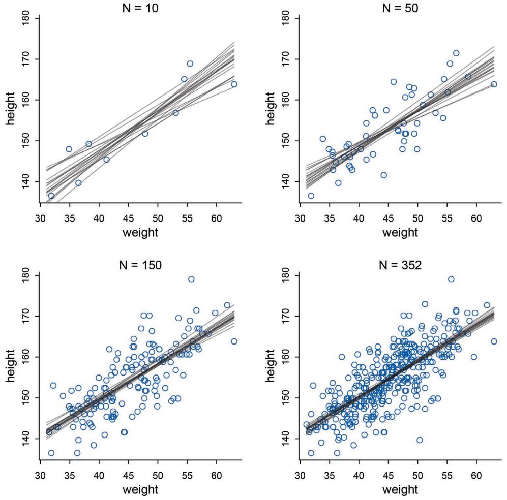
Figure 4.7. Samples from the quadratic approximate posterior distribution for the height/weight model, m4.3, with increasing amounts of data. In each plot, 20 lines sampled from the posterior distribution, showing the uncertainty in the regression relationship.
4.50 post <- extract.samples( m4.3 ) mu_at_50 <- post$a + post$b * ( 50 - xbar )
The code to the right of the <- above takes its form from the equation for µi :
\[ \mu\_i = \alpha + \beta(\mathbf{x}\_i - \bar{\mathbf{x}}) \]
The value of xi in this case is 50. Go ahead and take a look inside the result, mu_at_50. It’s a vector of predicted means, one for each random sample from the posterior. Since joint a and b went into computing each, the variation across those means incorporates the uncertainty in and correlation between both parameters. It might be helpful at this point to actually plot the density for this vector of means:
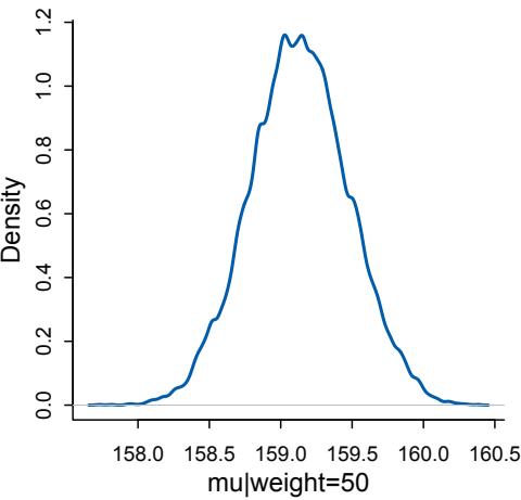
Figure 4.8. The quadratic approximate posterior distribution of the mean height, µ, when weight is 50 kg. This distribution represents the relative plausibility of different values of the mean.
R code
 4.51 dens( mu_at_50 , col=rangi2 , lwd=2 , xlab="mu|weight=50" )
I reproduce this plot in Figure 4.8. Since the components of µ have distributions, so too does µ. And since the distributions of α and β are Gaussian, so too is the distribution of µ (adding Gaussian distributions always produces a Gaussian distribution).
Since the posterior for µ is a distribution, you can find intervals for it, just like for any posterior distribution. To find the 89% compatibility interval of µ at 50 kg, just use the PI command as usual:
R code
 4.52 PI( mu_at_50 , prob=0.89 )
5% 94% 158.5860 159.6706
What these numbers mean is that the central 89% of the ways for the model to produce the data place the average height between about 159 cm and 160 cm (conditional on the model and data), assuming the weight is 50 kg.
That’s good so far, but we need to repeat the above calculation for every weight value on the horizontal axis, not just when it is 50 kg. We want to draw 89% intervals around the average slope in Figure 4.6.
This is made simple by strategic use of the link function, a part of the rethinking package. What link will do is take your quap approximation, sample from the posterior distribution, and then compute µ for each case in the data and sample from the posterior distribution. Here’s what it looks like for the data you used to fit the model:
R code
 4.53 mu <- link( m4.3 )
       str(mu)
num [1:1000, 1:352] 157 157 158 157 157 …
You end up with a big matrix of values of µ. Each row is a sample from the posterior distribution. The default is 1000 samples, but you can use as many or as few as you like. Each column
is a case (row) in the data. There are 352 rows in d2, corresponding to 352 individuals. So there are 352 columns in the matrix mu above.
Now what can we do with this big matrix? Lots of things. The function link provides a posterior distribution of µ for each case we feed it. So above we have a distribution of µ for each individual in the original data. We actually want something slightly different: a distribution of µ for each unique weight value on the horizontal axis. It’s only slightly harder to compute that, by just passing link some new data:
4.54 # define sequence of weights to compute predictions for
# these values will be on the horizontal axis
weight.seq <- seq( from=25 , to=70 , by=1 )
# use link to compute mu
# for each sample from posterior
# and for each weight in weight.seq
mu <- link( m4.3 , data=data.frame(weight=weight.seq) )
str(mu)
num [1:1000, 1:46] 136 136 138 136 137 ...And now there are only 46 columns in mu, because we fed it 46 different values for weight. To visualize what you’ve got here, let’s plot the distribution of µ values at each height.
4.55 # use type="n" to hide raw data
plot( height ~ weight , d2 , type="n" )
# loop over samples and plot each mu value
for ( i in 1:100 )
   points( weight.seq , mu[i,] , pch=16 , col=col.alpha(rangi2,0.1) )
The result is shown on the left-hand side of Figure 4.9. At each weight value in weight.seq, a pile of computed µ values are shown. Each of these piles is a Gaussian distribution, like that in Figure 4.8. You can see now that the amount of uncertainty in µ depends upon the value of weight. And this is the same fact you saw in Figure 4.7.
The final step is to summarize the distribution for each weight value. We’ll use apply, which applies a function of your choice to a matrix.
4.56 # summarize the distribution of mu
mu.mean <- apply( mu , 2 , mean )
mu.PI <- apply( mu , 2 , PI , prob=0.89 )
Read apply(mu,2,mean) as compute the mean of each column (dimension “2”) of the matrix mu. Nowmu.mean contains the average µ at each weight value, and mu.PI contains 89% lower and upper bounds for each weight value. Be sure to take a look inside mu.mean and mu.PI, to demystify them. They are just different kinds of summaries of the distributions in mu, with each column being for a different weight value. These summaries are only summaries. The “estimate” is the entire distribution.
You can plot these summaries on top of the data with a few lines of R code:
R code
R code
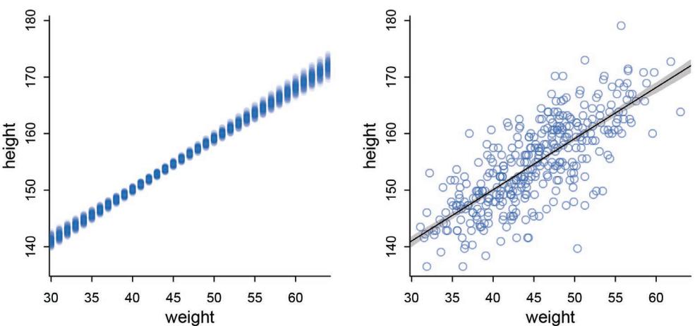
Figure 4.9. Left: The first 100 values in the distribution of µ at each weight value. Right: The !Kung height data again, now with 89% compatibility interval of the mean indicated by the shaded region. Compare this region to the distributions of blue points on the left.
R code
 4.57 # plot raw data
       # fading out points to make line and interval more visible
       plot( height ~ weight , data=d2 , col=col.alpha(rangi2,0.5) )
       # plot the MAP line, aka the mean mu for each weight
       lines( weight.seq , mu.mean )
       # plot a shaded region for 89% PI
       shade( mu.PI , weight.seq )
You can see the results in the right-hand plot in Figure 4.9.
Using this approach, you can derive and plot posterior prediction means and intervals for quite complicated models, for any data you choose. It’s true that it is possible to use analytical formulas to compute intervals like this. I have tried teaching such an analytical approach before, and it has always been disaster. Part of the reason is probably my own failure as a teacher, but another part is that most social and natural scientists have never had much training in probability theory and tend to get very nervous around R ’s. I’m sure with enough effort, every one of them could learn to do the mathematics. But all of them can quickly learn to generate and summarize samples derived from the posterior distribution. So while the mathematics would be a more elegant approach, and there is some additional insight that comes from knowing the mathematics, the pseudo-empirical approach presented here is very flexible and allows a much broader audience of scientists to pull insight from their statistical modeling. And again, when you start estimating models with MCMC (Chapter 9), this is really the only approach available. So it’s worth learning now.
To summarize, here’s the recipe for generating predictions and intervals from the posterior of a fit model.
- (1) Use link to generate distributions of posterior values for µ. The default behavior of link is to use the original data, so you have to pass it a list of new horizontal axis values you want to plot posterior predictions across.
- Use summary functions like mean or PI to find averages and lower and upper bounds of µ for each value of the predictor variable.
- Finally, use plotting functions like lines and shade to draw the lines and intervals. Or you might plot the distributions of the predictions, or do further numerical calculations with them. It’s really up to you.
This recipe works for every model we fit in the book. As long as you know the structure of the model—how parameters relate to the data—you can use samples from the posterior to describe any aspect of the model’s behavior.
Rethinking: Overconfident intervals. The compatibility interval for the regression line in Figure 4.9 clings tightly to the MAP line. Thus there is very little uncertainty about the average height as a function of average weight. But you have to keep in mind that these inferences are always conditional on the model. Even a very bad model can have very tight compatibility intervals. It may help if you think of the regression line in Figure 4.9 as saying: Conditional on the assumption that height and weight are related by a straight line, then this is the most plausible line, and these are its plausible bounds.
Overthinking: How link works. The function link is not really very sophisticated. All it is doing is using the formula you provided when you fit the model to compute the value of the linear model. It does this for each sample from the posterior distribution, for each case in the data. You could accomplish the same thing for any model, fit by any means, by performing these steps yourself. This is how it’d look for m4.3.
4.58 post <- extract.samples(m4.3)
mu.link <- function(weight) post$a + post$b*( weight - xbar )
weight.seq <- seq( from=25 , to=70 , by=1 )
mu <- sapply( weight.seq , mu.link )
mu.mean <- apply( mu , 2 , mean )
mu.CI <- apply( mu , 2 , PI , prob=0.89 )
And the values in mu.mean and mu.CI should be very similar (allowing for simulation variance) to what you got the automated way, using link.
Knowing this manual method is useful both for (1) understanding and (2) sheer power. Whatever the model you find yourself with, this approach can be used to generate posterior predictions for any component of it. Automated tools like link save effort, but they are never as flexible as the code you can write yourself.
4.4.3.5. Prediction intervals. Now let’s walk through generating an 89% prediction interval for actual heights, not just the average height, µ. This means we’ll incorporate the standard deviation σ and its uncertainty as well. Remember, the first line of the statistical model here is:
\[h\_i \sim \text{Normal}(\mu\_i, \sigma)\]
What you’ve done so far is just use samples from the posterior to visualize the uncertainty in µi , the linear model of the mean. But actual predictions of heights depend also upon the distribution in the first line. The Gaussian distribution on the first line tells us that the model
expects observed heights to be distributed around µ, not right on top of it. And the spread around µ is governed by σ. All of this suggests we need to incorporate σ in the predictions somehow.
Here’s how you do it. Imagine simulating heights. For any unique weight value, you sample from a Gaussian distribution with the correct mean µ for that weight, using the correct value of σ sampled from the same posterior distribution. If you do this for every sample from the posterior, for every weight value of interest, you end up with a collection of simulated heights that embody the uncertainty in the posterior as well as the uncertainty in the Gaussian distribution of heights. There is a tool called sim which does this:
R code
 4.59 sim.height <- sim( m4.3 , data=list(weight=weight.seq) )
       str(sim.height)
num [1:1000, 1:46] 140 131 136 137 142 ...This matrix is much like the earlier one, mu, but it contains simulated heights, not distributions of plausible average height, µ.
We can summarize these simulated heights in the same way we summarized the distributions of µ, by using apply:
R code
 4.60 height.PI <- apply( sim.height , 2 , PI , prob=0.89 )
Now height.PI contains the 89% posterior prediction interval of observable (according to the model) heights, across the values of weight in weight.seq.
Let’s plot everything we’ve built up: (1) the average line, (2) the shaded region of 89% plausible µ, and (3) the boundaries of the simulated heights the model expects.
R code
 4.61 # plot raw data
       plot( height ~ weight , d2 , col=col.alpha(rangi2,0.5) )
       # draw MAP line
       lines( weight.seq , mu.mean )
       # draw HPDI region for line
       shade( mu.HPDI , weight.seq )
       # draw PI region for simulated heights
       shade( height.PI , weight.seq )
The code above uses some objects computed in previous sections, so go back and execute that code, if you need to.
In Figure 4.10, I plot the result. The wide shaded region in the figure represents the area within which the model expects to find 89% of actual heights in the population, at each weight. There is nothing special about the value 89% here. You could plot the boundary for other percents, such as 67% and 97% (also both primes), and add those to the plot. Doing so would help you see more of the shape of the predicted distribution of heights. I leave that as an exercise for the reader. Just go back to the code above and add prob=0.67, for example, to the call to PI. That will give you 67% intervals, instead of 89% ones.
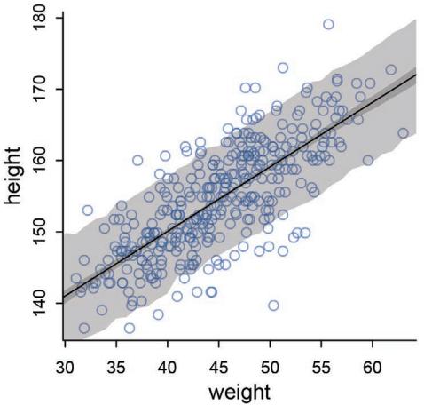
Figure 4.10. 89% prediction interval for height, as a function of weight. The solid line is the average line for the mean height at each weight. The two shaded regions show different 89% plausible regions. The narrow shaded interval around the line is the distribution of µ. The wider shaded region represents the region within which the model expects to find 89% of actual heights in the population, at each weight.
Notice that the outline for the wide shaded interval is a little rough. This is the simulation variance in the tails of the sampled Gaussian values. If it really bothers you, increase the number of samples you take from the posterior distribution. The optional n parameter for sim.height controls how many samples are used. Try for example:
R code
4.62 sim.height <- sim( m4.3 , data=list(weight=weight.seq) , n=1e4 )
height.PI <- apply( sim.height , 2 , PI , prob=0.89 )
Run the plotting code again, and you’ll see the shaded boundary smooth out some. With extreme percentiles, it can be very hard to get out all of the roughness. Luckily, it hardly matters, except for aesthetics. Moreover, it serves to remind us that all statistical inference is approximate. The fact that we can compute an expected value to the 10th decimal place does not imply that our inferences are precise to the 10th decimal place.
Rethinking: Two kinds of uncertainty. In the procedure above, we encountered both uncertainty in parameter values and uncertainty in a sampling process. These are distinct concepts, even though they are processed much the same way and end up blended together in the posterior predictive simulation. The posterior distribution is a ranking of the relative plausibilities of every possible combination of parameter values. The distribution of simulated outcomes, like height, is instead a distribution that includes sampling variation from some process that generates Gaussian random variables. This sampling variation is still a model assumption. It’s no more or less objective than the posterior distribution. Both kinds of uncertainty matter, at least sometimes. But it’s important to keep them straight, because they depend upon different model assumptions. Furthermore, it’s possible to view the Gaussian likelihood as a purely epistemological assumption (a device for estimating the mean and variance of a variable), rather than an ontological assumption about what future data will look like. In that case, it may not make complete sense to simulate outcomes.
Overthinking: Rolling your own sim. Just like with link, it’s useful to know a little about how sim operates. For every distribution like dnorm, there is a companion simulation function. For the Gaussian distribution, the companion is rnorm, and it simulates sampling from a Gaussian distribution. What we want R to do is simulate a height for each set of samples, and to do this for each value of weight. The following will do it:
R code4.63 post <- extract.samples(m4.3)
weight.seq <- 25:70
sim.height <- sapply( weight.seq , function(weight)
rnorm(
n=nrow(post) ,
mean=post$a + post$b*( weight - xbar ) ,
sd=post$sigma ) )
height.PI <- apply( sim.height , 2 , PI , prob=0.89 )The values in height.PI will be practically identical to the ones computed in the main text and displayed in Figure 4.10.
4.5. Curves from lines
In the next chapter, you’ll see how to use linear models to build regressions with more than one predictor variable. But before then, it helps to see how to model the outcome as a curved function of a predictor. The models so far all assume that a straight line describes the relationship. But there’s nothing special about straight lines, aside from their simplicity.
We’ll consider two commonplace methods that use linear regression to build curves. The first is polynomial regression. The second is b-splines. Both approaches work by transforming a single predictor variable into several synthetic variables. But splines have some clear advantages. Neither approach aims to do more than describe the function that relates one variable to another. Causal inference, which we’ll consider much more beginning in the next chapter, wants more.
4.5.1. Polynomial regression. Polynomial regression uses powers of a variable—squares and cubes—as extra predictors. This is an easy way to build curved associations. Polynomial regressions are very common, and understanding how they work will help scaffold later models. To understand how polynomial regression works, let’s work through an example, using the full !Kung data, not just the adults:
R code4.64 library(rethinking)
data(Howell1)
d <- Howell1Go ahead and plot( height ~ weight , d ). The relationship is visibly curved, now that we’ve included the non-adult individuals.
The most common polynomial regression is a parabolic model of the mean. Let x be standardized body weight. Then the parabolic equation for the mean height is:
\[ \mu\_i = \alpha + \beta\_1 \mathfrak{x}\_i + \beta\_2 \mathfrak{x}\_i^2 \]
The above is a parabolic (second order) polynomial. The α + β1xi part is the same linear function of x in a linear regression, just with a little “1” subscript added to the parameter name, so we can tell it apart from the new parameter. The additional term uses the square of xi to construct a parabola, rather than a perfectly straight line. The new parameter β2 measures the curvature of the relationship.
Fitting these models to data is easy. Interpreting them can be hard. We’ll begin with the easy part, fitting a parabolic model of height on weight. The first thing to do is to standardize the predictor variable. We’ve done this in previous examples. But this is especially helpful for working with polynomial models. When predictor variables have very large values in them, there are sometimes numerical glitches. Even well-known statistical software can suffer from these glitches, leading to mistaken estimates. These problems are very common for polynomial regression, because the square or cube of a large number can be truly massive. Standardizing largely resolves this issue. It should be your default behavior.
To define the parabolic model, just modify the definition of µi . Here’s the model:
| Normal(µi , σ) hi ∼ |
height ~ dnorm(mu,sigma) |
|---|---|
| 2 µi = α + β1xi + β2x i |
mu <- a + b1weight.s + b2weight.s^2 |
| α ∼ Normal(178, 20) |
a ~ dnorm(178,20) |
| β1 Log-Normal(0, 1) ∼ |
b1 ~ dlnorm(0,1) |
| β2 Normal(0, 1) ∼ |
b2 ~ dnorm(0,1) |
| σ Uniform(0, 50) ∼ |
sigma ~ dunif(0,50) |
The confusing issue here is assigning a prior for β2, the parameter on the squared value of x. Unlike β1, we don’t want a positive constraint. In the practice problems at the end of the chapter, you’ll use prior predictive simulation to understand why. These polynomial parameters are in general very difficult to understand. But prior predictive simulation does help a lot.
Approximating the posterior is straightforward. Just modify the definition of mu so that it contains both the linear and quadratic terms. But in general it is better to pre-process any variable transformations—you don’t need the computer to recalculate the transformations on every iteration of the fitting procedure. So I’ll also build the square of weight_s as a separate variable:
4.65 d$weight_s <- ( d$weight - mean(d$weight) )/sd(d$weight)
d$weight_s2 <- d$weight_s^2
m4.5 <- quap(
   alist(
       height ~ dnorm( mu , sigma ) ,
       mu <- a + b1*weight_s + b2*weight_s2 ,
       a ~ dnorm( 178 , 20 ) ,
       b1 ~ dlnorm( 0 , 1 ) ,
       b2 ~ dnorm( 0 , 1 ) ,
       sigma ~ dunif( 0 , 50 )
   ) , data=d )
Now, since the relationship between the outcome height and the predictor weight depends upon two slopes, b1 and b2, it isn’t so easy to read the relationship off a table of coefficients:
4.66 precis( m4.5 ) mean sd 5.5% 94.5% a 146.06 0.37 145.47 146.65 b1 21.73 0.29 21.27 22.19
R code
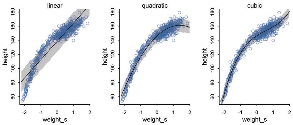
Figure 4.11. Polynomial regressions of height on weight (standardized), for the full !Kung data. In each plot, the raw data are shown by the circles. The solid curves show the path of µ in each model, and the shaded regions show the 89% interval of the mean (close to the solid curve) and the 89% interval of predictions (wider). Left: Linear regression. Middle: A second order polynomial, a parabolic or quadratic regression. Right: A third order polynomial, a cubic regression.
| b2 | -7.80 | 0.27 | -8.24 | -7.37 |
|---|---|---|---|---|
| sigma | 5.77 | 0.18 | 5.49 | 6.06 |
The parameter α (a) is still the intercept, so it tells us the expected value of height when weight is at its mean value. But it is no longer equal to the mean height in the sample, since there is no guarantee it should in a polynomial regression.76 And those β1 and β2 parameters are the linear and square components of the curve. But that doesn’t make them transparent.
You have to plot these model fits to understand what they are saying. So let’s do that. We’ll calculate the mean relationship and the 89% intervals of the mean and the predictions, like in the previous section. Here’s the working code:
R code
4.67 weight.seq <- seq( from=-2.2 , to=2 , length.out=30 )
     pred_dat <- list( weight_s=weight.seq , weight_s2=weight.seq^2 )
     mu <- link( m4.5 , data=pred_dat )
     mu.mean <- apply( mu , 2 , mean )
     mu.PI <- apply( mu , 2 , PI , prob=0.89 )
     sim.height <- sim( m4.5 , data=pred_dat )
     height.PI <- apply( sim.height , 2 , PI , prob=0.89 )
Plotting all of this is straightforward:
R code
 4.68 plot( height ~ weight_s , d , col=col.alpha(rangi2,0.5) )
       lines( weight.seq , mu.mean )
       shade( mu.PI , weight.seq )
       shade( height.PI , weight.seq )
The results are shown in Figure 4.11. The left panel of the figure shows the familiar linear regression from earlier in the chapter, but now with the standardized predictor and full data with both adults and non-adults. The linear model makes some spectacularly poor predictions, at both very low and middle weights. Compare this to the middle panel, our new quadratic regression. The curve does a better job of finding a central path through the data.
The right panel in Figure 4.11 shows a higher-order polynomial regression, a cubic regression on weight. The model is:
\[\begin{aligned} h\_i &\sim \text{Normal}(\mu\_i, \sigma) \\ \mu\_i &= \alpha + \beta\_1 \mathbf{x}\_i + \beta\_2 \mathbf{x}\_i^2 + \beta\_3 \mathbf{x}\_i^3 \\ \alpha &\sim \text{Normal}(178, 20) \\ \beta\_1 &\sim \text{Log-Normal}(0, 1) \\ \beta\_2 &\sim \text{Normal}(0, 1) \\ \beta\_3 &\sim \text{Normal}(0, 1) \\ \sigma &\sim \text{Uniform}(0, 50) \end{aligned} \qquad \begin{aligned} \text{a } &\sim \text{holomorphic} \\ \text{b } &\sim \text{donor}(178, 20) \\ \text{b } &\sim \text{donor}(\text{e}, 1) \\ \text{b } &\sim \text{donor}(\text{e}, 1) \\ \sigma &\sim \text{ionform}(\text{e}, \text{1}) \\ \sigma &\sim \text{ionform}(\text{0}, 50) \end{aligned}\]
Fit the model with a slight modification of the parabolic model’s code:
4.69 d$weight_s3 <- d$weight_s^3
m4.6 <- quap(
   alist(
      height ~ dnorm( mu , sigma ) ,
      mu <- a + b1*weight_s + b2*weight_s2 + b3*weight_s3 ,
      a ~ dnorm( 178 , 20 ) ,
      b1 ~ dlnorm( 0 , 1 ) ,
      b2 ~ dnorm( 0 , 10 ) ,
      b3 ~ dnorm( 0 , 10 ) ,
      sigma ~ dunif( 0 , 50 )
   ) , data=d )
Computing the curve and intervals is similarly a small modification of the previous code. This cubic curve is even more flexible than the parabola, so it fits the data even better.
But it’s not clear that any of these models make a lot of sense. They are good geocentric descriptions of the sample, yes. But there are two problems. First, a better fit to the sample might not actually be a better model. That’s the subject of Chapter 7. Second, the model contains no biological information. We aren’t learning any causal relationship between height and weight. We’ll deal with this second problem much later, in Chapter 16.
Rethinking: Linear, additive, funky. The parabolic model of µi above is still a “linear model” of the mean, even though the equation is clearly not of a straight line. Unfortunately, the word “linear” means different things in different contexts, and different people use it differently in the same context. What “linear” means in this context is that µi is a linear function of any single parameter. Such models have the advantage of being easier to fit to data. They are also often easier to interpret, because they assume that parameters act independently on the mean. They have the disadvantage of being used thoughtlessly. When you have expert knowledge, it is often easy to do better than a linear model. These models are geocentric devices for describing partial correlations. We should feel embarrassed to use them, just so we don’t become satisfied with the phenomenological explanations they provide.
Overthinking: Converting back to natural scale. The plots in Figure 4.11 have standard units on the horizontal axis. These units are sometimes called z-scores. But suppose you fit the model using standardized variables, but want to plot the estimates on the original scale. All that’s really needed is first to turn off the horizontal axis when you plot the raw data:
R code 4.70 plot( height ~ weight_s , d , col=col.alpha(rangi2,0.5) , xaxt=“n” )
The xaxt at the end there turns off the horizontal axis. Then you explicitly construct the axis, using the axis function.
R code4.71 at <- c(-2,-1,0,1,2)
labels <- at*sd(d$weight) + mean(d$weight)
axis( side=1 , at=at , labels=round(labels,1) )The first line above defines the location of the labels, in standardized units. The second line then takes those units and converts them back to the original scale. The third line draws the axis. Take a look at the help ?axis for more details.
4.5.2. Splines. The second way to introduce a curve is to construct something known as a spline. The word spline originally referred to a long, thin piece of wood or metal that could be anchored in a few places in order to aid drafters or designers in drawing curves. In statistics, a spline is a smooth function built out of smaller, component functions. There are actually many types of splines. The b-spline we’ll look at here is commonplace. The “B” stands for “basis,” which here just means “component.” B-splines build up wiggly functions from simpler less-wiggly components. Those components are called basis functions. While there are fancier splines, we want to start B-splines because they force you to make a number of choices that other types of splines automate. You’ll need to understand B-splines before you can understand fancier splines.
To see how B-splines work, we’ll need an example that is much wigglier—that’s a scientific term—than the !Kung stature data. Cherry trees blossom all over Japan in the spring each year, and the tradition of flower viewing (Hanami 花見) follows. The timing of the blossoms can vary a lot by year and century. Let’s load a thousand years of blossom dates:
R code4.72 library(rethinking)
data(cherry_blossoms)
d <- cherry_blossoms
precis(d)
'data.frame': 1215 obs. of 5 variables:
mean sd 5.5% 94.5% histogram
year 1408.00 350.88 867.77 1948.23 ▇▇▇▇▇▇▇▇▇▇▇▇▁
doy 104.54 6.41 94.43 115.00 ▁▂▅▇▇▃▁▁
temp 6.14 0.66 5.15 7.29 ▁▃▅▇▃▂▁▁
temp_upper 7.19 0.99 5.90 8.90 ▁▂▅▇▇▅▂▂▁▁▁▁▁▁▁
temp_lower 5.10 0.85 3.79 6.37 ▁▁▁▁▁▁▁▃▅▇▃▂▁▁▁See ?cherry_blossoms for details and sources. We’re going to work with the historical record of first day of blossom, doy, for now. It ranges from 86 (late March) to 124 (early May). The years with recorded blossom dates run from 812 CE to 2015 CE. You should go ahead and plot doy against year to see (also see the figure on the next page). There might be some wiggly trend in that cloud. It’s hard to tell.
Let’s try extracting a trend with a B-spline. The short explanation of B-splines is that they divide the full range of some predictor variable, like year, into parts. Then they assign a parameter to each part. These parameters are gradually turned on and off in a way that makes their sum into a fancy, wiggly curve. The long explanation contains lots more details. But all of those details just exist to achieve this goal of building up a big, curvy function from individually less curvy local functions.
Here’s a longer explanation, with visual examples. Our goal is to approximate the blossom trend with a wiggly function. With B-splines, just like with polynomial regression, we do this by generating new predictor variables and using those in the linear model, µi . Unlike polynomial regression, B-splines do not directly transform the predictor by squaring or cubing it. Instead they invent a series of entirely new, synthetic predictor variables. Each of these synthetic variables exists only to gradually turn a specific parameter on and off within a specific range of the real predictor variable. Each of the synthetic variables is called a basis function. The linear model ends up looking very familiar:
\[ \mu\_i = \alpha + \omega\_1 B\_{i,1} + \omega\_2 B\_{i,2} + \omega\_3 B\_{i,3} + \dots \]
where Bi,n is the n-th basis function’s value on row i, and the w parameters are corresponding weights for each. The parameters act like slopes, adjusting the influence of each basis function on the mean µi . So really this is just another linear regression, but with some fancy, synthetic predictor variables. These synthetic variables do some really elegant descriptive (geocentric) work for us.
How do we construct these basis variables B? I display the simplest case in Figure 4.12, in which I approximate the blossom date data with a combination of linear approximations. First, I divide the full range of the horizontal axis into four parts, using pivot points called knots. The knots are shown by the + symbols in the top plot. I’ve placed the knots at even quantiles of the blossom data. In the blossom data, there are fewer recorded blossom dates deep in the past. So using even quantiles does not produce evenly spaced knots. This is why the second knot is so far from the first knot. Don’t worry right now about the code to make these knots. You’ll see it later.
Focus for now just on the picture. The knots act as pivots for five different basis functions, our B variables. These synthetic variables are used to gently transition from one region of the horizontal axis to the next. Essentially, these variables tell you which knot you are close to. Beginning on the left of the top plot, basis function 1 has value 1 and all of the others are set to zero. As we move rightwards towards the second knot, basis 1 declines and basis 2 increases. At knot 2, basis 2 has value 1, and all of the others are set to zero.
The nice feature of these basis functions is that they make the influence of each parameter quite local. At any point on the horizontal axis in Figure 4.12, only two basis functions have non-zero values. For example, the dashed blue line in the top plot shows the year 1200. Basis functions 1 and 2 are non-zero for that year. So the parameters for basis functions 1 and 2 are the only parameters influencing prediction for the year 1200. This is quite unlike polynomial regression, where parameters influence the entire shape of the curve.
In the middle plot in Figure 4.12, I show each basis function multiplied by its corresponding weight parameter. I got these weights by fitting the model to the data. I’ll show you how to do that in a moment. Again focus on the figure for now. Weight parameters can be positive or negative. So for example basis function 5 ends up below the zero line. It has
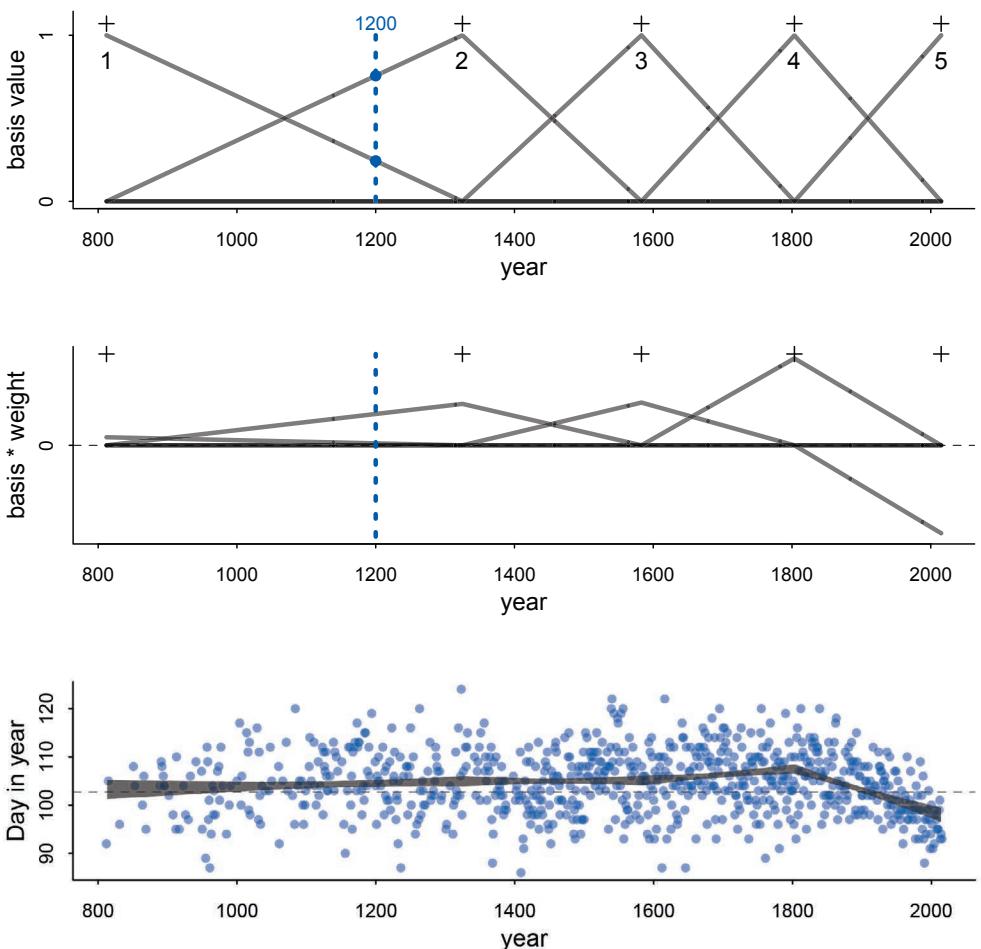
Figure 4.12. Using B-splines to make local, linear approximations. Top: Each basis function is a variable that turns on specific ranges of the predictor variable. At any given value on the horizontal axis, e.g. 1200, only two have non-zero values. Middle: Parameters called weights multiply the basis functions. The spline at any given point is the sum of these weighted basis functions. Bottom: The resulting B-spline shown against the data. Each weight parameter determines the slope in a specific range of the predictor variable.
negative weight. To construct a prediction for any given year, say for example 1200 again, we just add up these weighted basis functions at that year. In the year 1200, only basis functions 1 and 2 influence prediction. Their sum is slightly above the zero (the mean).
Finally, in the bottom plot of Figure 4.12, I display the spline, as a 97% posterior interval for µ, over the raw blossom date data. All the spline seems to pick up is a change in trend around 1800. You can probably guess which global climate trend this reflects. But there is more going on in the data, before 1800. To see it, we can do two things. First, we can use more knots. The more knots, the more flexible the spline. Second, instead of linear approximations, we can use higher-degree polynomials.
Let’s build up the code that will let you reproduce the plots in Figure 4.12, but also let you change the knots and degree to anything you like. First, we choose the knots. Remember, the knots are just values of year that serve as pivots for our spline. Where should the knots go? There are different ways to answer this question.77 You can, in principle, put the knots wherever you like. Their locations are part of the model, and you are responsible for them. Let’s do what we did in the simple example above, place the knots at different evenlyspaced quantiles of the predictor variable. This gives you more knots where there are more observations. We used only 5 knots in the first example. Now let’s go for 15:
4.73 d2 <- d[ complete.cases(d$doy) , ] # complete cases on doy
num_knots <- 15
knot_list <- quantile( d2$year , probs=seq(0,1,length.out=num_knots) )
Go ahead and inspect knot_list to see that it contains 15 dates.
The next choice is polynomial degree. This determines how basis functions combine, which determines how the parameters interact to produce the spline. For degree 1, as in Figure 4.12, two basis functions combine at each point. For degree 2, three functions combine at each point. For degree 3, four combine. R already has a nice function that will build basis functions for any list of knots and degree. This code will construct the necessary basis functions for a degree 3 (cubic) spline:
4.74 library(splines)
B <- bs(d2$year,
  knots=knot_list[-c(1,num_knots)] ,
  degree=3 , intercept=TRUE )
The matrix B should have 827 rows and 17 columns. Each row is a year, corresponding to the rows in the d2 data frame. Each column is a basis function, one of our synthetic variables defining a span of years within which a corresponding parameter will influence prediction. To display the basis functions, just plot each column against year:
R code
4.75 plot( NULL , xlim=range(d2$year) , ylim=c(0,1) , xlab="year" , ylab="basis" )
for ( i in 1:ncol(B) ) lines( d2$year , B[,i] )
I show these cubic basis functions in the top plot of Figure 4.13.
Now to get the parameter weights for each basis function, we need to actually define the model and make it run. The model is just a linear regression. The synthetic basis functions do all the work. We’ll use each column of the matrix B as a variable. We’ll also have an intercept to capture the average blossom day. This will make it easier to define priors on the basis weights, because then we can just conceive of each as a deviation from the intercept.
In mathematical form, we start with the probability of the data and the linear model:
\[D\_{l} \sim \text{Normal}(\mu\_{l}, \sigma)\]
\[\mu\_{l} = \alpha + \sum\_{k=1}^{K} w\_{k} B\_{k,i}\]
R code
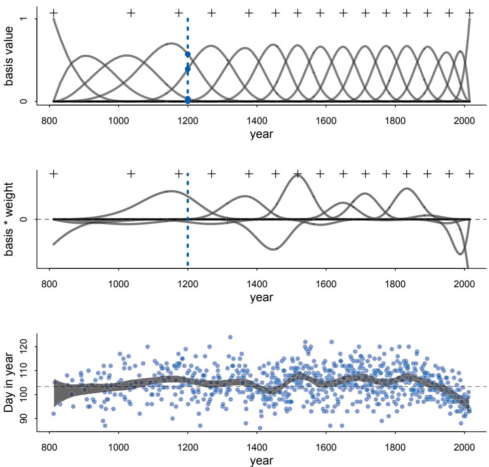
Figure 4.13. A cubic spline with 15 knots. The top plot is, just like in the previous figure, the basis functions. However now more of these overlap. The middle plot is again each basis weighted by its corresponding parameter. And the sum of these weighted basis functions, at each point, produces the spline shown at the bottom, displayed as a 97% posterior interval of µ.
And then the priors:
\[\begin{aligned} \alpha &\sim \text{Normal}(100, 10) \\ \omega\_{\text{j}} &\sim \text{Normal}(0, 10) \\ \sigma &\sim \text{Exponential}(1) \end{aligned}\]
That linear model might look weird. But all it is doing is multiplying each basis value by a corresponding parameter wk and then adding up all K of those products. This is just a compact way of writing a linear model. The rest should be familiar. Although I will ask you to simulate from those priors in the practice problems at the end of the chapter. You might guess already that the w priors influence how wiggly the spline can be.
This is also the first time we’ve used an exponential distribution as a prior. Exponential distributions are useful priors for scale parameters, parameters that must be positive. The prior for σ is exponential with a rate of 1. The way to read an exponential distribution is to think of it as containing no more information than an average deviation. That average
is the inverse of the rate. So in this case it is 1/1 = 1. If the rate were 0.5, the mean would be 1/0.5 = 2. We’ll use exponential priors for the rest of the book, in place of uniform priors. It is much more common to have a sense of the average deviation than of the maximum.
To build this model in quap, we just need a way to do that sum. The easiest way is to use matrix multiplication. If you aren’t familiar with linear algebra in this context, that’s fine. There is an Overthinking box at the end with some more detail about why this works. The only other trick is to use a start list for the weights to tell quap how many there are.
4.76 m4.7 <- quap(
   alist(
      D ~ dnorm( mu , sigma ) ,
      mu <- a + B %*% w ,
      a ~ dnorm(100,10),
      w ~ dnorm(0,10),
      sigma ~ dexp(1)
   ), data=list( D=d2$doy , B=B ) ,
   start=list( w=rep( 0 , ncol(B) ) ) )
You can look at the posterior means if you like with precis(m4.7,depth=2). But it won’t reveal much. You should see 17 w parameters. But you can’t tell what the model thinks from the parameter summaries. Instead we need to plot the posterior predictions. First, here are the weighted basis functions:
4.77 post <- extract.samples( m4.7 )
w <- apply( post$w , 2 , mean )
plot( NULL , xlim=range(d2$year) , ylim=c(-6,6) ,
   xlab="year" , ylab="basis * weight" )
for ( i in 1:ncol(B) ) lines( d2$year , w[i]*B[,i] )
This plot, with the knots added for reference, is displayed in the middle row of Figure 4.13. And finally the 97% posterior interval for µ, at each year:
4.78 mu <- link( m4.7 )
mu_PI <- apply(mu,2,PI,0.97)
plot( d2$year , d2$doy , col=col.alpha(rangi2,0.3) , pch=16 )
shade( mu_PI , d2$year , col=col.alpha("black",0.5) )
This is shown in the bottom of the figure. The spline is much wigglier now. Something happened around 1500, for example. If you add more knots, you can make this even wigglier. You might wonder how many knots is correct. We’ll be ready to address that question in a few more chapters. Really we’ll answer it by changing the question. So hang on to the question, and we’ll turn to it later.
Distilling the trend across years provides a lot of information. But year is not really a causal variable, only a proxy for features of each year. In the practice problems below, you’ll compare this trend to the temperature record, in an attempt to explain those wiggles.
Overthinking: Matrix multiplication in the spline model. Matrix algebra is a stressful topic for many scientists. If you have had a course in it, it’s obvious what it does. But if you haven’t, it is mysterious. R code
R code
Matrix algebra is just a new way to represent ordinary algebra. It is often much more compact. So to make model m4.7 easier to program, we used a matrix multiplication of the basis matrix B by the vector of parameters w: B %*% w. This notation is just linear algebra shorthand for (1) multiplying each element of the vector w by each value in the corresponding row of B and then (2) summing up each result. You could also fit the same model with the following less-elegant code:
R code
4.79 m4.7alt <- quap(
          alist(
              D ~ dnorm( mu , sigma ) ,
              mu <- a + sapply( 1:827 , function(i) sum( B[i,]*w ) ) ,
              a ~ dnorm(100,1),
              w ~ dnorm(0,10),
              sigma ~ dexp(1)
          ),
          data=list( D=d2$doy , B=B ) ,
          start=list( w=rep( 0 , ncol(B) ) ) )
So you end up with exactly what you need: A sum linear predictor for each year (row). If you haven’t worked with much linear algebra, matrix notation can be intimidating. It is useful to remember that it is nothing more than the mathematics you already know, but expressed in a highly compressed form that is convenient when working with repeated calculations on lists of numbers.
4.5.3. Smooth functions for a rough world. The splines in the previous section are just the beginning. A entire class of models, generalized additive models (GAMs), focuses on predicting an outcome variable using smooth functions of some predictor variables. The topic is deep enough to deserve its own book.78
4.6. Summary
This chapter introduced the simple linear regression model, a framework for estimating the association between a predictor variable and an outcome variable. The Gaussian distribution comprises the likelihood in such models, because it counts up the relative numbers of ways different combinations of means and standard deviations can produce an observation. To fit these models to data, the chapter introduced quadratic approximation of the posterior distribution and the tool quap. It also introduced new procedures for visualizing prior and posterior distributions.
The next chapter expands on these concepts by introducing regression models with more than one predictor variable. The basic techniques from this chapter are the foundation of most of the examples in future chapters. So if much of the material was new to you, it might be worth reviewing this chapter now, before pressing onwards.
4.7. Practice
Problems are labeled Easy (E), Medium (M), and Hard (H).
4E1. In the model definition below, which line is the likelihood?
yi ∼ Normal(µ, σ) µ ∼ Normal(0, 10) σ ∼ Exponential(1)
4E2. In the model definition just above, how many parameters are in the posterior distribution?
4E3. Using the model definition above, write down the appropriate form of Bayes’ theorem that includes the proper likelihood and priors.
4E4. In the model definition below, which line is the linear model?
\[\begin{aligned} \mathcal{Y}\_i &\sim \text{Normal}(\mu, \sigma) \\ \mu\_i &= \alpha + \beta \mathbf{x}\_i \\ \alpha &\sim \text{Normal}(0, 10) \\ \beta &\sim \text{Normal}(0, 1) \end{aligned}\]
\[\sigma \sim \text{Exponential}(2)\]
4E5. In the model definition just above, how many parameters are in the posterior distribution?
4M1. For the model definition below, simulate observed y values from the prior (not the posterior).
yi ∼ Normal(µ, σ) µ ∼ Normal(0, 10) σ ∼ Exponential(1)
4M2. Translate the model just above into a quap formula.
4M3. Translate the quap model formula below into a mathematical model definition.
y ~ dnorm( mu , sigma ),
mu <- a + b*x,
a ~ dnorm( 0 , 10 ),
b ~ dunif( 0 , 1 ),
sigma ~ dexp( 1 )
4M4. A sample of students is measured for height each year for 3 years. After the third year, you want to fit a linear regression predicting height using year as a predictor. Write down the mathematical model definition for this regression, using any variable names and priors you choose. Be prepared to defend your choice of priors.
4M5. Now suppose I remind you that every student got taller each year. Does this information lead you to change your choice of priors? How?
4M6. Now suppose I tell you that the variance among heights for students of the same age is never more than 64cm. How does this lead you to revise your priors?
4M7. Refit model m4.3 from the chapter, but omit the mean weight xbar this time. Compare the new model’s posterior to that of the original model. In particular, look at the covariance among the parameters. What is different? Then compare the posterior predictions of both models.
4M8. In the chapter, we used 15 knots with the cherry blossom spline. Increase the number of knots and observe what happens to the resulting spline. Then adjust also the width of the prior on the weights—change the standard deviation of the prior and watch what happens. What do you think the combination of knot number and the prior on the weights controls?
4H1. The weights listed below were recorded in the !Kung census, but heights were not recorded for these individuals. Provide predicted heights and 89% intervals for each of these individuals. That is, fill in the table below, using model-based predictions.
| Individual | weight | expected height | 89% interval |
|---|---|---|---|
| 1 | 46.95 | ||
| 2 | 43.72 | ||
| 3 | 64.78 | ||
| 4 | 32.59 | ||
| 5 | 54.63 |
4H2. Select out all the rows in the Howell1 data with ages below 18 years of age. If you do it right, you should end up with a new data frame with 192 rows in it.
Fit a linear regression to these data, using quap. Present and interpret the estimates. For every 10 units of increase in weight, how much taller does the model predict a child gets?
Plot the raw data, with height on the vertical axis and weight on the horizontal axis. Superimpose the MAP regression line and 89% interval for the mean. Also superimpose the 89% interval for predicted heights.
What aspects of the model fit concern you? Describe the kinds of assumptions you would change, if any, to improve the model. You don’t have to write any new code. Just explain what the model appears to be doing a bad job of, and what you hypothesize would be a better model.
4H3. Suppose a colleague of yours, who works on allometry, glances at the practice problems just above. Your colleague exclaims, “That’s silly. Everyone knows that it’s only the logarithm of body weight that scales with height!” Let’s take your colleague’s advice and see what happens.
Model the relationship between height (cm) and the natural logarithm of weight (log-kg). Use the entire Howell1 data frame, all 544 rows, adults and non-adults. Can you interpret the resulting estimates?
Begin with this plot: plot( height ~ weight , data=Howell1 ). Then use samples from the quadratic approximate posterior of the model in (a) to superimpose on the plot: (1) the predicted mean height as a function of weight, (2) the 97% interval for the mean, and (3) the 97% interval for predicted heights.
4H4. Plot the prior predictive distribution for the parabolic polynomial regression model in the chapter. You can modify the code that plots the linear regression prior predictive distribution. Can you modify the prior distributions of α, β1, and β2 so that the prior predictions stay within the biologically reasonable outcome space? That is to say: Do not try to fit the data by hand. But do try to keep the curves consistent with what you know about height and weight, before seeing these exact data.
4H5. Return to data(cherry_blossoms) and model the association between blossom date (doy) and March temperature (temp). Note that there are many missing values in both variables. You may consider a linear model, a polynomial, or a spline on temperature. How well does temperature trend predict the blossom trend?
4H6. Simulate the prior predictive distribution for the cherry blossom spline in the chapter. Adjust the prior on the weights and observe what happens. What do you think the prior on the weights is doing?
4H8. The cherry blossom spline in the chapter used an intercept α, but technically it doesn’t require one. The first basis functions could substitute for the intercept. Try refitting the cherry blossom spline without the intercept. What else about the model do you need to change to make this work?
5 The Many Variables & The Spurious Waffles
One of the most reliable sources of waffles in North America, if not the entire world, is a Waffle House diner. Waffle House is nearly always open, even just after a hurricane. Most diners invest in disaster preparedness, including having their own electrical generators. As a consequence, the United States’ disaster relief agency (FEMA) informally uses Waffle House as an index of disaster severity.79 If the Waffle House is closed, that’s a serious event.
It is ironic then that steadfast Waffle House is associated with the nation’s highest divorce rates (Figure 5.1). States with many Waffle Houses per person, like Georgia and Alabama, also have some of the highest divorce rates in the United States. The lowest divorce rates are found where there are zero Waffle Houses. Could always-available waffles and hash brown potatoes put marriage at risk?
Probably not. This is an example of a misleading correlation. No one thinks there is any plausible mechanism by which Waffle House diners make divorce more likely. Instead, when we see a correlation of this kind, we immediately start asking about other variables that are really driving the relationship between waffles and divorce. In this case, Waffle House began in Georgia in the year 1955. Over time, the diners spread across the Southern United States, remaining largely within it. So Waffle House is associated with the South. Divorce is not a uniquely Southern institution, but the Southern United States has some of the highest divorce rates in the nation. So it’s probably just an accident of history that Waffle House and high divorce rates both occur in the South.
Such accidents are commonplace. It is not surprising that Waffle House is correlated with divorce, because correlation in general is not surprising. In large data sets, every pair of variables has a statistically discernible non-zero correlation.80 But since most correlations do not indicate causal relationships, we need tools for distinguishing mere association from evidence of causation. This is why so much effort is devoted to multiple regression, using more than one predictor variable to simultaneously model an outcome. Reasons given for multiple regression models include:
- Statistical “control” for confounds. A confound is something that misleads us about a causal influence—there will be a more precise definition in the next chapter. The spurious waffles and divorce correlation is one type of confound, where southernness makes a variable with no real importance (Waffle House density) appear to be important. But confounds are diverse. They can hide important effects just as easily as they can produce false ones.
- Multiple and complex causation. A phenomenon may arise from multiple simultaneous causes, and causes can cascade in complex ways. And since one cause can hide another, they must be measured simultaneously.
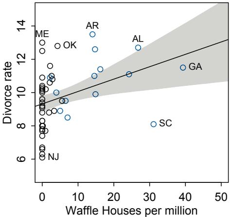
Figure 5.1. The number of Waffle House diners per million people is associated with divorce rate (in the year 2009) within the United States. Each point is a State. “Southern” (former Confederate) States shown in blue. Shaded region is 89% percentile interval of the mean. These data are in data(WaffleDivorce) in the rethinking package.
- Interactions. The importance of one variable may depend upon another. For example, plants benefit from both light and water. But in the absence of either, the other is no benefit at all. Such interactions occur very often. Effective inference about one variable will often depend upon consideration of others.
In this chapter, we begin to deal with the first of these two, using multiple regression to deal with simple confounds and to take multiple measurements of association. You’ll see how to include any arbitrary number of main effects in your linear model of the Gaussian mean. These main effects are additive combinations of variables, the simplest type of multiple variable model. We’ll focus on two valuable things these models can help us with: (1) revealing spurious correlations like the Waffle House correlation with divorce and (2) revealing important correlations that may be masked by unrevealed correlations with other variables. Along the way, you’ll meet categorical variables, which require special handling compared to continuous variables.
However, multiple regression can be worse than useless, if we don’t know how to use it. Just adding variables to a model can do a lot of damage. In this chapter, we’ll begin to think formally about causal inference and introduce graphical causal models as a way to design and interpret regression models. The next chapter continues on this theme, describing some serious and common dangers of adding predictor variables, ending with a unifying framework for understanding the examples in both this chapter and the next.
Rethinking: Causal inference. Despite its central importance, there is no unified approach to causal inference yet in the sciences. There are even people who argue that cause does not really exist; it’s just a psychological illusion.81 And in complex dynamical systems, everything seems to cause everything else. “Cause” loses intuitive value. About one thing, however, there is general agreement: Causal inference always depends upon unverifiable assumptions. Another way to say this is that it’s always possible to imagine some way in which your inference about cause is mistaken, no matter how careful the design or analysis. A lot can be accomplished, despite this barrier.82
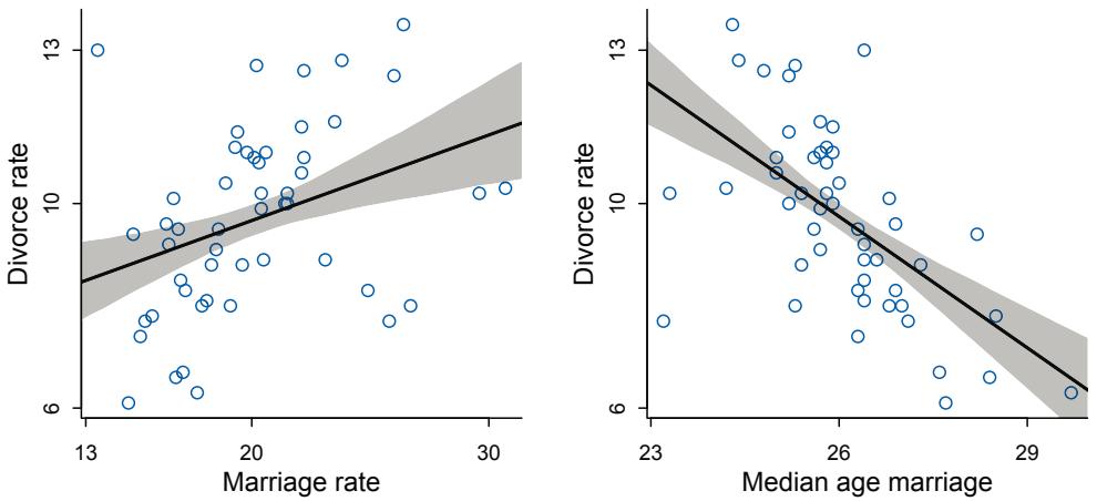
Figure 5.2. Divorce rate is associated with both marriage rate (left) and median age at marriage (right). Both predictor variables are standardized in this example. The average marriage rate across States is 20 per 1000 adults, and the average median age at marriage is 26 years.
5.1. Spurious association
Let’s leave waffles behind, at least for the moment. An example that is easier to understand is the correlation between divorce rate and marriage rate (Figure 5.2). The rate at which adults marry is a great predictor of divorce rate, as seen in the left-hand plot in the figure. But does marriage cause divorce? In a trivial sense it obviously does: One cannot get a divorce without first getting married. But there’s no reason high marriage rate must cause more divorce. It’s easy to imagine high marriage rate indicating high cultural valuation of marriage and therefore being associated with low divorce rate.
Another predictor associated with divorce is the median age at marriage, displayed in the right-hand plot in Figure 5.2. Age at marriage is also a good predictor of divorce rate higher age at marriage predicts less divorce. But there is no reason this has to be causal, either, unless age at marriage is very late and the spouses do not live long enough to get a divorce.
Let’s load these data and standardize the variables of interest:
5.1 # load data and copy
library(rethinking)
data(WaffleDivorce)
d <- WaffleDivorce
# standardize variables
d$D <- standardize( d$Divorce )
d$M <- standardize( d$Marriage )
d$A <- standardize( d$MedianAgeMarriage )
You can replicate the right-hand plot in the figure using a linear regression model:
\[\begin{aligned} D\_i &\sim \text{Normal}(\mu\_i, \sigma) \\ \mu\_i &= \alpha + \beta\_A A\_i \\ \alpha &\sim \text{Normal}(0, 0.2) \\ \beta\_A &\sim \text{Normal}(0, 0.5) \\ \sigma &\sim \text{Exponential}(1) \end{aligned}\]
Di is the standardized (zero centered, standard deviation one) divorce rate for State i, and Ai is State i’s standardized median age at marriage. The linear model structure should be familiar from the previous chapter.
What about those priors? Since the outcome and the predictor are both standardized, the intercept α should end up very close to zero. What does the prior slope βA imply? If βA = 1, that would imply that a change of one standard deviation in age at marriage is associated likewise with a change of one standard deviation in divorce. To know whether or not that is a strong relationship, you need to know how big a standard deviation of age at marriage is:
R code
5.2 sd( d$MedianAgeMarriage )[1] 1.24363
So when βA = 1, a change of 1.2 years in median age at marriage is associated with a full standard deviation change in the outcome variable. That seems like an insanely strong relationship. The prior above thinks that only 5% of plausible slopes are more extreme than 1. We’ll simulate from these priors in a moment, so you can see how they look in the outcome space.
To compute the approximate posterior, there are no new code tricks or techniques here. But I’ll add comments to help explain the mass of code to follow.
R code5.3 m5.1 <- quap(
alist(
D ~ dnorm( mu , sigma ) ,
mu <- a + bA * A ,
a ~ dnorm( 0 , 0.2 ) ,
bA ~ dnorm( 0 , 0.5 ) ,
sigma ~ dexp( 1 )
) , data = d )To simulate from the priors, we can use extract.prior and link as in the previous chapter. I’ll plot the lines over the range of 2 standard deviations for both the outcome and predictor. That’ll cover most of the possible range of both variables.
R code
  5.4 set.seed(10)
       prior <- extract.prior( m5.1 )
       mu <- link( m5.1 , post=prior , data=list( A=c(-2,2) ) )
       plot( NULL , xlim=c(-2,2) , ylim=c(-2,2) )
       for ( i in 1:50 ) lines( c(-2,2) , mu[i,] , col=col.alpha("black",0.4) )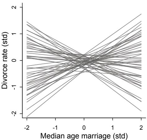
Figure 5.3. Plausible regression lines implied by the priors in m5.1. These are weakly informative priors in that they allow some implusibly strong relationships but generally bound the lines to possible ranges of the variables.
Figure 5.3 displays the result. You may wish to try some vaguer, flatter priors and see how quickly the prior regression lines become ridiculous.
Now for the posterior predictions. The procedure is exactly like the examples from the previous chapter: link, then summarize with mean and PI, and then plot.
5.5 # compute percentile interval of mean
A_seq <- seq( from=-3 , to=3.2 , length.out=30 )
mu <- link( m5.1 , data=list(A=A_seq) )
mu.mean <- apply( mu , 2, mean )
mu.PI <- apply( mu , 2 , PI )
# plot it all
plot( D ~ A , data=d , col=rangi2 )
lines( A_seq , mu.mean , lwd=2 )
shade( mu.PI , A_seq )
If you inspect the precis output, you’ll see that posterior for βA is reliably negative, as seen in Figure 5.2.
You can fit a similar regression for the relationship in the left-hand plot:
5.6 m5.2 <- quap(
  alist(
     D ~ dnorm( mu , sigma ) ,
     mu <- a + bM * M ,
     a ~ dnorm( 0 , 0.2 ) ,
     bM ~ dnorm( 0 , 0.5 ) ,
     sigma ~ dexp( 1 )
  ) , data = d )
As you can see in the figure, this relationship isn’t as strong as the previous one.
But merely comparing parameter means between different bivariate regressions is no way to decide which predictor is better. Both of these predictors could provide independent value, or they could be redundant, or one could eliminate the value of the other.
R code
To make sense of this, we’re going to have to think causally. And then, only after we’ve done some thinking, a bigger regression model that includes both age at marriage and marriage rate will help us.
5.1.1. Think before you regress. There are three observed variables in play: divorce rate (D), marriage rate (M), and the median age at marriage (A) in each State. The pattern we see in the previous two models and illustrated in Figure 5.2 is symptomatic of a situation in which only one of the predictor variables, A in this case, has a causal impact on the outcome, D, even though both predictor variables are strongly associated with the outcome.
To understand this better, it is helpful to introduce a particular type of causal graph known as a DAG, short for directed acyclic graph. Graph means it is nodes and connections. Directed means the connections have arrows that indicate directions of causal influence. And acyclic means that causes do not eventually flow back on themselves. A DAG is a way of describing qualitative causal relationships among variables. It isn’t as detailed as a full model description, but it contains information that a purely statistical model does not. Unlike a statistical model, a DAG will tell you the consequences of intervening to change a variable. But only if the DAG is correct. There is no inference without assumption.
The full framework for using DAGs to design and critique statistical models is complicated. So instead of smothering you in the whole framework right now, I’ll build it up one example at a time. By the end of the next chapter, you’ll have a set of simple rules that let you accomplish quite a lot of criticism. And then other applications will be introduced in later chapters.
Let’s start with the basics. Here is a possible DAG for our divorce rate example:
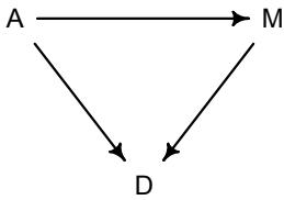
If you want to see the code to draw this, see the Overthinking box at the end of this section. It may not look like much, but this type of diagram does a lot of work. It represents a heuristic causal model. Like other models, it is an analytical assumption. The symbols A, M, and D are our observed variables. The arrows show directions of influence. What this DAG says is:
- A directly influences D
- M directly influences D
- A directly influences M
These statements can then have further implications. In this case, age of marriage influences divorce in two ways. First it has a direct effect, A → D. Perhaps a direct effect would arise because younger people change faster than older people and are therefore more likely to grow incompatible with a partner. Second, it has an indirect effect by influencing the marriage rate, which then influences divorce, A → M → D. If people get married earlier, then the marriage rate may rise, because there are more young people. Consider for example if an evil dictator forced everyone to marry at age 65. Since a smaller fraction of the population lives to 65 than to 25, forcing delayed marriage will also reduce the marriage rate. If marriage rate itself has any direct effect on divorce, maybe by making marriage more or less normative, then some of that direct effect could be the indirect effect of age at marriage.
To infer the strength of these different arrows, we need more than one statistical model. Model m5.1, the regression of D onA, tells us only that the total influence of age at marriage is strongly negative with divorce rate. The “total” here means we have to account for every path from A to D. There are two such paths in this graph: A → D, a direct path, and A → M → D, an indirect path. In general, it is possible that a variable like A has no direct effect at all on an outcome like D. It could still be associated with D entirely through the indirect path. That type of relationship is known as mediation, and we’ll have another example later.
As you’ll see however, the indirect path does almost no work in this case. How can we show that? We know from m5.2 that marriage rate is positively associated with divorce rate. But that isn’t enough to tell us that the path M → D is positive. It could be that the association between M and D arises entirely from A’s influence on both M and D. Like this:
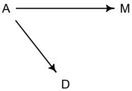
This DAG is also consistent with the posterior distributions of models m5.1 and m5.2. Why? Because both M and D “listen” to A. They have information from A. So when you inspect the association between D and M, you pick up that common information that they both got from listening to A. You’ll see a more formal way to deduce this, in the next chapter.
So which is it? Is there a direct effect of marriage rate, or rather is age at marriage just driving both, creating a spurious correlation between marriage rate and divorce rate? To find out, we need to consider carefully what each DAG implies. That’s what’s next.
Rethinking: What’s a cause? Questions of causation can become bogged down in philosophical debates. These debates are worth having. But they don’t usually intersect with statistical concerns. Knowing a cause in statistics means being able to correctly predict the consequences of an intervention. There are contexts in which even this is complicated. For example, it isn’t possible to directly change someone’s body weight. Changing someone’s body weight would mean intervening on another variable, like diet, and that variable would have other causal effects in addition. But being underweight can still be a legitimate cause of disease, even when we can’t intervene on it directly.
Overthinking: Drawing a DAG. There are several packages for drawing and analyzing DAGs. In this book, we’ll use dagitty. It is both an R package and something you can use in your internet browser: http://www.dagitty.net/. To draw the simple DAG you saw earlier in this section:
5.7 library(dagitty)
dag5.1 <- dagitty( "dag{ A -> D; A -> M; M -> D }" )
coordinates(dag5.1) <- list( x=c(A=0,D=1,M=2) , y=c(A=0,D=1,M=0) )
drawdag( dag5.1 )
The -> arrows in the DAG definition indicate directions of influence. The coordinates function lets you arrange the plot as you like.
5.1.2. Testable implications. How do we use data to compare multiple, plausible causal models? The first thing to consider is the testable implications of each model. Consider the two DAGs we have so far considered:
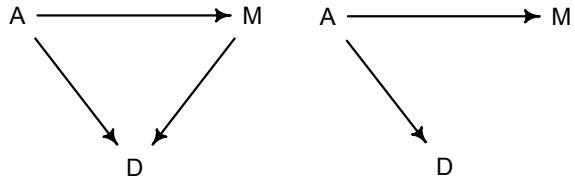
Any DAG may imply that some variables are independent of others under certain conditions. These are the model’s testable implications, its conditional independencies. Conditional independencies come in two forms. First, they are statements of which variables should be associated with one another (or not) in the data. Second, they are statements of which variables become dis-associated when we condition on some other set of variables.
What does “conditioning” mean? Informally, conditioning on a variable Z means learning its value and then asking if X adds any additional information about Y. If learning X doesn’t give you any more information about Y, then we might say that Y is independent of X conditional on Z. This conditioning statement is sometimes written as: Y ⊥⊥ X|Z. This is very weird notation and any feelings of annoyance on your part are justified. We’ll work with this concept a lot, so don’t worry if it doesn’t entirely make sense right now. You’ll see examples very soon.
Let’s consider conditional independence in the context of the divorce example. What are the conditional independencies of the DAGs at the top of the page? How do we derive these conditional independencies? Finding conditional independencies is not hard, but also not at all obvious. With a little practice, it becomes very easy. The more general rules can wait until the next chapter. For now, let’s consider each DAG in turn and inspect the possibilities.
For the DAG on the left above, the one with three arrows, first note that every pair of variables is correlated. This is because there is a causal arrow between every pair. These arrows create correlations. So before we condition on anything, everything is associated with everything else. This is already a testable implication. We could write it:
\[D \not\perp A \qquad D \not\perp M \qquad A \not\perp M\]
That ̸⊥⊥ thing means “not independent of.” If we now look in the data and find that any pair of variables are not associated, then something is wrong with the DAG (assuming the data are correct). In these data, all three pairs are in fact strongly associated. Check for yourself. You can use cor to measure simple correlations. Correlations are sometimes terrible measures of association—many different patterns of association with different implications can produce the same correlation. But they do honest work in this case.
Are there any other testable implications for the first DAG above? No. It will be easier to see why, if we slide over to consider the second DAG, the one in which M has no influence on D. In this DAG, it is still true that all three variables are associated with one another. A is associated with D and M because it influences them both. And D and M are associated with one another, because M influences them both. They share a cause, and this leads them to be correlated with one another through that cause. But suppose we condition on A. All of the information in M that is relevant to predicting D is in A. So once we’ve conditioned on A, M tells us nothing more about D. So in the second DAG, a testable implication is that D is independent of M, conditional on A. In other words, D ⊥⊥ M|A. The same thing does not happen with the first DAG. Conditioning on A does not make D independent of M, because M really influences D all by itself in this model.
In the next chapter, I’ll show you the general rules for deducing these implications. For now, the dagitty package has the rules built in and can find the implications for you. Here’s the code to define the second DAG and display the implied conditional independencies.
5.8 DMA_dag2 <- dagitty('dag{ D <- A -> M }')
impliedConditionalIndependencies( DMA_dag2 )
D _||_ M | A
The first DAG has no conditional independencies. You can define it and check with this:
| DMA_dag1 <- dagitty(‘dag{ D <- A -> M -> D }’) |
R code |
|---|---|
| 5.9 | |
| impliedConditionalIndependencies( DMA_dag1 ) |
There are no conditional independencies, so there is no output to display.
Let’s try to summarize. The testable implications of the first DAG are that all pairs of variables should be associated, whatever we condition on. The testable implications of the second DAG are that all pairs of variables should be associated, before conditioning on anything, but that D and M should be independent after conditioning on A. So the only implication that differs between these DAGs is the last one: D ⊥⊥ M|A.
To test this implication, we need a statistical model that conditions on A, so we can see whether that renders D independent of M. And that is what multiple regression helps with. It can address a useful descriptive question:
Is there any additional value in knowing a variable, once I already know all of the other predictor variables?
So for example once you fit a multiple regression to predict divorce using both marriage rate and age at marriage, the model addresses the questions:
- After I already know marriage rate, what additional value is there in also knowing age at marriage?
- After I already know age at marriage, what additional value is there in also knowing marriage rate?
The parameter estimates corresponding to each predictor are the (often opaque) answers to these questions. The questions above are descriptive, and the answers are also descriptive. It is only the derivation of the testable implications above that gives these descriptive results a causal meaning. But that meaning is still dependent upon believing the DAG.
Rethinking: “Control” is out of control. Very often, the question just above is spoken of as “statistical control,” as in controlling for the effect of one variable while estimating the effect of another. But this is sloppy language, as it implies too much. Statistical control is quite different from experimental control, as we’ll explore more in the next chapter. The point here isn’t to police language. Instead, the point is to observe the distinction between small world and large world interpretations. Since most people who use statistics are not statisticians, sloppy language like “control” can promote a sloppy culture of interpretation. Such cultures tend to overestimate the power of statistical methods, so resisting them can be difficult. Disciplining your own language may be enough. Disciplining another’s language is hard to do, without seeming like a fastidious scold, as this very box must seem.
5.1.3. Multiple regression notation. Multiple regression formulas look a lot like the polynomial models at the end of the previous chapter—they add more parameters and variables to the definition of µi . The strategy is straightforward:
- Nominate the predictor variables you want in the linear model of the mean.
- For each predictor, make a parameter that will measure its conditional association with the outcome.
- Multiply the parameter by the variable and add that term to the linear model.
Examples are always necessary, so here is the model that predicts divorce rate, using both marriage rate and age at marriage.
| Normal(µi , σ) |
[probability of data] |
|---|---|
| α + βMMi + βAAi |
[linear model] |
| Normal(0, 0.2) |
[prior for α] |
| Normal(0, 0.5) |
[prior for βM] |
| Normal(0, 0.5) |
[prior for βA] |
| Exponential(1) | [prior for σ] |
You can use whatever symbols you like for the parameters and variables, but here I’ve chosen R for marriage rate and A for age at marriage, reusing these symbols as subscripts for the corresponding parameters. But feel free to use whichever symbols reduce the load on your own memory.
So what does it mean to assume µi = α+βMMi+βAAi? Mechanically, it means that the expected outcome for any State with marriage rate Mi and median age at marriage Ai is the sum of three independent terms. If you are like most people, this is still pretty mysterious. The mechanical meaning of the equation doesn’t map onto a unique causal meaning. Let’s take care of the mechanical bits first, before returning to interpretation.
Overthinking: Compact notation and the design matrix. Often, linear models are written using a compact form like:
\[\mu\_{\bar{\imath}} = \alpha + \sum\_{j=1}^{n} \beta\_j \mathbf{x}\_{\bar{\jmath}i}\]
where j is an index over predictor variables and n is the number of predictor variables. This may be read as the mean is modeled as the sum of an intercept and an additive combination of the products of parameters and predictors. Even more compactly, using matrix notation:
m = Xb
where m is a vector of predicted means, one for each row in the data, b is a (column) vector of parameters, one for each predictor variable, and X is a matrix. This matrix is called a design matrix. It has as many rows as the data, and as many columns as there are predictors plus one. So X is basically a data frame, but with an extra first column. The extra column is filled with 1s. These 1s are multiplied by the first parameter, which is the intercept, and so return the unmodified intercept. When X is matrix-multiplied by b, you get the predicted means. In R notation, this operation is X %*% b.
We’re not going to use the design matrix approach. But it’s good to recognize it, and sometimes it can save you a lot of work. For example, for linear regressions, there is a nice matrix formula for the maximum likelihood (or least squares) estimates. Most statistical software exploits that formula.
5.1.4. Approximating the posterior. To fit this model to the divorce data, we just expand the linear model. Here’s the model definition again, with the code on the right-hand side:
| ∼ Normal(µi , σ) Di |
D ~ dnorm(mu,sigma) |
|---|---|
| µi = α + βMMi + βAAi |
mu <- a + bMM + bAA |
| α Normal(0, 0.2) ∼ |
a ~ dnorm(0,0.2) |
| βM Normal(0, 0.5) ∼ |
bM ~ dnorm(0,0.5) |
| βA ∼ Normal(0, 0.5) |
bA ~ dnorm(0,0.5) |
| σ ∼ Exponential(1) |
sigma ~ dexp(1) |
And here is the quap code to approximate the posterior distribution:
5.10 m5.3 <- quap(
   alist(
      D ~ dnorm( mu , sigma ) ,
      mu <- a + bM*M + bA*A ,
      a ~ dnorm( 0 , 0.2 ) ,
      bM ~ dnorm( 0 , 0.5 ) ,
      bA ~ dnorm( 0 , 0.5 ) ,
      sigma ~ dexp( 1 )
   ) , data = d )
precis( m5.3 )| mean | sd | 5.5% | 94.5% | |
|---|---|---|---|---|
| a | 0.00 | 0.10 | -0.16 | 0.16 |
| bM | -0.07 | 0.15 | -0.31 | 0.18 |
| bA | -0.61 | 0.15 | -0.85 | -0.37 |
| sigma | 0.79 | 0.08 | 0.66 | 0.91 |
The posterior mean for marriage rate, bM, is now close to zero, with plenty of probability of both sides of zero. The posterior mean for age at marriage, bA, is essentially unchanged. It will help to visualize the posterior distributions for all three models, focusing just on the slope parameters βA and βM:
5.11 plot( coeftab(m5.1,m5.2,m5.3), par=c("bA","bM") )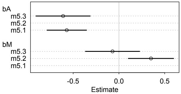
The posterior means are shown by the points and the 89% compatibility intervals by the solid horizontal lines. Notice how bA doesn’t move, only grows a bit more uncertain, while R code
bM is only associated with divorce when age at marriage is missing from the model. You can interpret these distributions as saying:
Once we know median age at marriage for a State, there is little or no additional predictive power in also knowing the rate of marriage in that State.
In that weird notation, D ⊥⊥ M|A. This tests the implication of the second DAG from earlier. Since the first DAG did not imply this result, it is out.
Note that this does not mean that there is no value in knowing marriage rate. Consistent with the earlier DAG, if you didn’t have access to age-at-marriage data, then you’d definitely find value in knowing the marriage rate. M is predictive but not causal. Assuming there are no other causal variables missing from the model (more on that in the next chapter), this implies there is no important direct causal path from marriage rate to divorce rate. The association between marriage rate and divorce rate is spurious, caused by the influence of age of marriage on both marriage rate and divorce rate. I’ll leave it to the reader to investigate the relationship between age at marriage, A, and marriage rate, M, to complete the picture.
But how did model m5.3 achieve the inference that marriage rate adds no additional information, once we know age at marriage? Let’s draw some pictures.
Overthinking: Simulating the divorce example. The divorce data are real data. See the sources in ?WaffleDivorce. But it is useful to simulate the kind of causal relationships shown in the previous DAG: M ← A → D. Every DAG implies a simulation, and such simulations can help us design models to correctly infer relationships among variables. In this case, you just need to simulate each of the three variables:
R code5.12 N <- 50 # number of simulated States
age <- rnorm( N ) # sim A
mar <- rnorm( N , -age ) # sim A -> M
div <- rnorm( N , age ) # sim A -> DNow if you use these variables in models m5.1, m5.2, and m5.3, you’ll see the same pattern of posterior inferences. It is also possible to simulate that both A and M influence D: div <- rnorm(N, age + mar ). In that case, a naive regression of D on A will overestimate the influence of A, just like a naive regression of D on M will overestimate the importance of M. The multiple regression will help sort things out for you in this situation as well. But interpreting the parameter estimates will always depend upon what you believe about the causal model, because typically several (or very many) causal models are consistent with any one set of parameter estimates. We’ll discuss this later in the chapter as Markov equivalence.
5.1.5. Plotting multivariate posteriors. Let’s pause for a moment, before moving on. There are a lot of moving parts here: three variables, some strange DAGs, and three models. If you feel at all confused, it is only because you are paying attention.
It will help to visualize the model’s inferences. Visualizing the posterior distribution in simple bivariate regressions, like those in the previous chapter, is easy. There’s only one predictor variable, so a single scatterplot can convey a lot of information. And so in the previous chapter we used scatters of the data. Then we overlaid regression lines and intervals to both (1) visualize the size of the association between the predictor and outcome and (2) to get a crude sense of the ability of the model to predict the individual observations.
With multivariate regression, you’ll need more plots. There is a huge literature detailing a variety of plotting techniques that all attempt to help one understand multiple linear
regression. None of these techniques is suitable for all jobs, and most do not generalize beyond linear regression. So the approach I take here is to instead help you compute whatever you need from the model. I offer three examples of interpretive plots:
- Predictor residual plots. These plots show the outcome against residual predictor values. They are useful for understanding the statistical model, but not much else.
- Posterior prediction plots. These show model-based predictions against raw data, or otherwise display the error in prediction. They are tools for checking fit and assessing predictions. They are not causal tools.
- Counterfactual plots. These show the implied predictions for imaginary experiments. These plots allow you to explore the causal implications of manipulating one or more variables.
Each of these plot types has its advantages and deficiencies, depending upon the context and the question of interest. In the rest of this section, I show you how to manufacture each of these in the context of the divorce data.
5.1.5.1. Predictor residual plots. A predictor residual is the average prediction error when we use all of the other predictor variables to model a predictor of interest. That’s a complicated concept, so we’ll go straight to the example, where it will make sense. The benefit of computing these things is that, once plotted against the outcome, we have a bivariate regression that has already conditioned on all of the other predictor variables. It leaves the variation that is not expected by the model of the mean, µ, as a function of the other predictors.
In our model of divorce rate, we have two predictors: (1) marriage rate M and (2) median age at marriage A. To compute predictor residuals for either, we just use the other predictor to model it. So for marriage rate, this is the model we need:
Mi ∼ Normal(µi , σ) µi = α + βAi α ∼ Normal(0, 0.2) β ∼ Normal(0, 0.5) σ ∼ Exponential(1)
As before, M is marriage rate and A is median age at marriage. Note that since we standardized both variables, we already expect the mean α to be around zero, as before. So I’m reusing the same priors as earlier. This code will approximate the posterior:
5.13 m5.4 <- quap(
  alist(
     M ~ dnorm( mu , sigma ) ,
     mu <- a + bAM * A ,
     a ~ dnorm( 0 , 0.2 ) ,
     bAM ~ dnorm( 0 , 0.5 ) ,
     sigma ~ dexp( 1 )
  ) , data = d )
And then we compute the residuals by subtracting the observed marriage rate in each State from the predicted rate, based upon the model above:
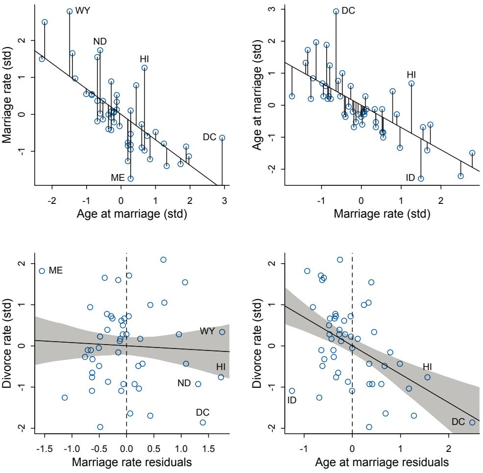
Figure 5.4. Understanding multiple regression through residuals. The top row shows each predictor regressed on the other predictor. The lengths of the line segments connecting the model’s expected value of the outcome, the regression line, and the actual value are the residuals. In the bottom row, divorce rate is regressed on the residuals from the top row. Bottom left: Residual variation in marriage rate shows little association with divorce rate. Bottom right: Divorce rate on age at marriage residuals, showing remaining variation, and this variation is associated with divorce rate.
R code
 5.14 mu <- link(m5.4)
       mu_mean <- apply( mu , 2 , mean )
       mu_resid <- d$M - mu_mean
When a residual is positive, that means that the observed rate was in excess of what the model expects, given the median age at marriage in that State. When a residual is negative, that means the observed rate was below what the model expects. In simpler terms, States with positive residuals have high marriage rates for their median age of marriage, while States with negative residuals have low rates for their median age of marriage. It’ll help to plot the relationship between these two variables, and show the residuals as well. In Figure 5.4, upper left, I show m5.4 along with line segments for each residual. Notice that the residuals are variation in marriage rate that is left over, after taking out the purely linear relationship between the two variables.
Now to use these residuals, let’s put them on a horizontal axis and plot them against the actual outcome of interest, divorce rate. In Figure 5.4 also (lower left), I plot these residuals against divorce rate, overlaying the linear regression of the two variables. You can think of this plot as displaying the linear relationship between divorce and marriage rates, having conditioned already on median age of marriage. The vertical dashed line indicates marriage rate that exactly matches the expectation from median age at marriage. So States to the right of the line have higher marriage rates than expected. States to the left of the line have lower rates. Average divorce rate on both sides of the line is about the same, and so the regression line demonstrates little relationship between divorce and marriage rates.
The same procedure works for the other predictor. The top right plot in Figure 5.4 shows the regression of A on M and the residuals. In the lower right, these residuals are used to predict divorce rate. States to the right of the vertical dashed line have older-than-expected median age at marriage, while those to the left have younger-than-expected median age at marriage. Now we find that the average divorce rate on the right is lower than the rate on the left, as indicated by the regression line. States in which people marry older than expected for a given rate of marriage tend to have less divorce.
So what’s the point of all of this? There’s conceptual value in seeing the model-based predictions displayed against the outcome, after subtracting out the influence of other predictors. The plots in Figure 5.4 do this. But this procedure also brings home the message that regression models measure the remaining association of each predictor with the outcome, after already knowing the other predictors. In computing the predictor residual plots, you had to perform those calculations yourself. In the unified multivariate model, it all happens automatically. Nevertheless, it is useful to keep this fact in mind, because regressions can behave in surprising ways as a result. We’ll have an example soon.
Linear regression models do all of this simultaneous measurement with a very specific additive model of how the variables relate to one another. But predictor variables can be related to one another in non-additive ways. The basic logic of statistical conditioning does not change in those cases, but the details definitely do, and these residual plots cease to be useful. Luckily there are other ways to understand a model. That’s where we turn next.
Rethinking: Residuals are parameters, not data. There is a tradition, especially in parts of biology, of using residuals from one model as data in another model. For example, a biologist might regress brain size on body size and then use the brain size residuals as data in another model. This procedure is always a mistake. Residuals are not known. They are parameters, variables with unobserved values. Treating them as known values throws away uncertainty. The right way to adjust for body size is to include it in the same model,83 preferably a model designed in light of an explicit causal model.
5.1.5.2. Posterior prediction plots. It’s important to check the model’s implied predictions against the observed data. This is what you did in Chapter 3, when you simulated globe tosses, averaging over the posterior, and comparing the simulated results to the observed. These kinds of checks are useful in many ways. For now, we’ll focus on two uses.
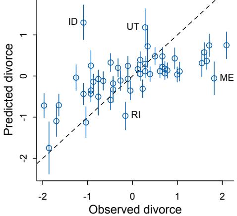
Figure 5.5. Posterior predictive plot for the multivariate divorce model, m5.3. The horizontal axis is the observed divorce rate in each State. The vertical axis is the model’s posterior predicted divorce rate, given each State’s median age at marriage and marriage rate. The blue line segments are 89% compatibility intervals. The diagonal line shows where posterior predictions exactly match the sample.
- Did the model correctly approximate the posterior distribution? Golems do make mistakes, as do golem engineers. Errors can be more easily diagnosed by comparing implied predictions to the raw data. Some caution is required, because not all models try to exactly match the sample. But even then, you’ll know what to expect from a successful approximation. You’ll see some examples later (Chapter 13).
- How does the model fail? Models are useful fictions. So they always fail in some way. Sometimes, a model fits correctly but is still so poor for our purposes that it must be discarded. More often, a model predicts well in some respects, but not in others. By inspecting the individual cases where the model makes poor predictions, you might get an idea of how to improve it. The difficulty is that this process is essentially creative and relies upon the analyst’s domain expertise. No robot can (yet) do it for you. It also risks chasing noise, a topic we’ll focus on in later chapters.
How could we produce a simple posterior predictive check in the divorce example? Let’s begin by simulating predictions, averaging over the posterior.
R code
 5.15 # call link without specifying new data
       # so it uses original data
       mu <- link( m5.3 )
       # summarize samples across cases
       mu_mean <- apply( mu , 2 , mean )
       mu_PI <- apply( mu , 2 , PI )
       # simulate observations
       # again no new data, so uses original data
       D_sim <- sim( m5.3 , n=1e4 )
       D_PI <- apply( D_sim , 2 , PI )
This code is similar to what you’ve seen before, but now using the original observed data.
For multivariate models, there are many different ways to display these simulations. The simplest is to just plot predictions against observed. This code will do that, and then add a line to show perfect prediction and line segments for the confidence interval of each prediction:
5.16 plot( mu_mean ~ d$D , col=rangi2 , ylim=range(mu_PI) ,
   xlab="Observed divorce" , ylab="Predicted divorce" )
abline( a=0 , b=1 , lty=2 )
for ( i in 1:nrow(d) ) lines( rep(d$D[i],2) , mu_PI[,i] , col=rangi2 )
The resulting plot appears in Figure 5.5. It’s easy to see from this arrangement of the simulations that the model under-predicts for States with very high divorce rates while it overpredicts for States with very low divorce rates. That’s normal. This is what regression does—it is skeptical of extreme values, so it expects regression towards the mean. But beyond this general regression to the mean, some States are very frustrating to the model, lying very far from the diagonal. I’ve labeled some points like this, including Idaho (ID) and Utah (UT), both of which have much lower divorce rates than the model expects them to have. The easiest way to label a few select points is to use identify:
5.17 identify( x=d$D , y=mu_mean , labels=d$Loc )After executing the line of code above, R will wait for you to click near a point in the active plot window. It’ll then place a label near that point, on the side you choose. When you are done labeling points, press your right mouse button (or press esc, on some platforms).
What is unusual about Idaho and Utah? Both of these States have large proportions of members of the Church of Jesus Christ of Latter-day Saints. Members of this church have low rates of divorce, wherever they live. This suggests that having a finer view on the demographic composition of each State, beyond just median age at marriage, would help.
Rethinking: Stats, huh, yeah what is it good for? Often people want statistical modeling to do things that statistical modeling cannot do. For example, we’d like to know whether an effect is “real” or rather spurious. Unfortunately, modeling merely quantifies uncertainty in the precise way that the model understands the problem. Usually answers to large world questions about truth and causation depend upon information not included in the model. For example, any observed correlation between an outcome and predictor could be eliminated or reversed once another predictor is added to the model. But if we cannot think of the right variable, we might never notice. Therefore all statistical models are vulnerable to and demand critique, regardless of the precision of their estimates and apparent accuracy of their predictions. Rounds of model criticism and revision embody the real tests of scientific hypotheses. A true hypothesis will pass and fail many statistical “tests” on its way to acceptance.
Overthinking: Simulating spurious association. One way that spurious associations between a predictor and outcome can arise is when a truly causal predictor, call it xreal, influences both the outcome, y, and a spurious predictor, xspur. This can be confusing, however, so it may help to simulate this scenario and see both how the spurious data arise and prove to yourself that multiple regression can reliably indicate the right predictor, xreal. So here’s a very basic simulation:
5.18 N <- 100 # number of cases
x_real <- rnorm( N ) # x_real as Gaussian with mean 0 and stddev 1
x_spur <- rnorm( N , x_real ) # x_spur as Gaussian with mean=x_real
y <- rnorm( N , x_real ) # y as Gaussian with mean=x_real
d <- data.frame(y,x_real,x_spur) # bind all together in data frame
R code
R code
Now the data frame d has 100 simulated cases. Because x_real influences both y and x_spur, you can think of x_spur as another outcome of x_real, but one which we mistake as a potential predictor of y. As a result, both xreal and xspur are correlated with y. You can see this in the scatterplots from pairs(d). But when you include both x variables in a linear regression predicting y, the posterior mean for the association between y and xspur will be close to zero.
5.1.5.3. Counterfactual plots. A second sort of inferential plot displays the causal implications of the model. I call these plots counterfactual, because they can be produced for any values of the predictor variables you like, even unobserved combinations like very high median age of marriage and very high marriage rate. There are no States with this combination, but in a counterfactual plot, you can ask the model for a prediction for such a State, asking questions like “What would Utah’s divorce rate be, if it’s median age at marriage were higher?” Used with clarity of purpose, counterfactual plots help you understand the model, as well as generate predictions for imaginary interventions and compute how much some observed outcome could be attributed to some cause.
Note that the term “counterfactual” is highly overloaded in statistics and philosophy. It hardly ever means the same thing when used by different authors. Here, I use it to indicate some computation that makes use of the structural causal model, going beyond the posterior distribution. But it could refer to questions about both the past and the future.
The simplest use of a counterfactual plot is to see how the outcome would change as you change one predictor at a time. If some predictor X took on a new value for one or more cases in our data, how would the outcome Y have changed? Changing just one predictor X might also change other predictors, depending upon the causal model. Suppose for example that you pay young couples to postpone marriage until they are 35 years old. Surely this will also decrease the number of couples who ever get married—some people will die before turning 35, among other reasons—decreasing the overall marriage rate. An extraordinary and evil degree of control over people would be necessary to really hold marriage rate constant while forcing everyone to marry at a later age.
So let’s see how to generate plots of model predictions that take the causal structure into account. The basic recipe is:
- Pick a variable to manipulate, the intervention variable.
- Define the range of values to set the intervention variable to.
- For each value of the intervention variable, and for each sample in posterior, use the causal model to simulate the values of other variables, including the outcome.
In the end, you end up with a posterior distribution of counterfactual outcomes that you can plot and summarize in various ways, depending upon your goal.
Let’s see how to do this for the divorce model. Again we take this DAG as given:
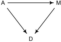
To simulate from this, we need more than the DAG. We also need a set of functions that tell us how each variable is generated. For simplicity, we’ll use Gaussian distributions for each variable, just like in model m5.3. But model m5.3 ignored the assumption that A influences M. We didn’t need that to estimate A → D. But we do need it to predict the consequences of manipulating A, because some of the effect of A acts through M.
To estimate the influence of A on M, all we need is to regress A on M. There are no other variables in the DAG creating an association between A and M. We can just add this regression to the quap model, running two regressions at the same time:
5.19 data(WaffleDivorce)
d <- list()
d$A <- standardize( WaffleDivorce$MedianAgeMarriage )
d$D <- standardize( WaffleDivorce$Divorce )
d$M <- standardize( WaffleDivorce$Marriage )
m5.3_A <- quap(
   alist(
     ## A -> D <- M
       D ~ dnorm( mu , sigma ) ,
       mu <- a + bM*M + bA*A ,
       a ~ dnorm( 0 , 0.2 ) ,
       bM ~ dnorm( 0 , 0.5 ) ,
       bA ~ dnorm( 0 , 0.5 ) ,
       sigma ~ dexp( 1 ),
     ## A -> M
       M ~ dnorm( mu_M , sigma_M ),
       mu_M <- aM + bAM*A,
       aM ~ dnorm( 0 , 0.2 ),
       bAM ~ dnorm( 0 , 0.5 ),
       sigma_M ~ dexp( 1 )
   ) , data = d )
Look at the precis(5.3_A) summary. You’ll see that M and A are strongly negatively associated. If we interpret this causally, it indicates that manipulating A reduces M.
The goal is to simulate what would happen, if we manipulate A. So next we define a range of values for A.
5.20 A_seq <- seq( from=-2 , to=2 , length.out=30 )This defines a list of 30 imaginary interventions, ranging from 2 standard deviations below and 2 above the mean. Now we can use sim, which you met in the previous chapter, to simulate observations from model m5.3_A. But this time we’ll tell it to simulate both M and D, in that order. Why in that order? Because we have to simulate the influence of A on M before we simulate the joint influence of A and M on D. The vars argument to sim tells it both which observables to simulate and in which order.
5.21 # prep data
sim_dat <- data.frame( A=A_seq )
# simulate M and then D, using A_seq
s <- sim( m5.3_A , data=sim_dat , vars=c("M","D") )
R code
R code
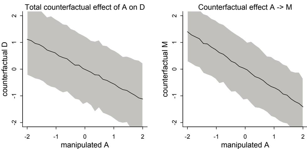
Figure 5.6. Counterfactual plots for the multivariate divorce model, m5.3. These plots visualize the predicted effect of manipulating age at marriage A on divorce rate D. Left: Total causal effect of manipulating A (horizontal) on D. This plot contains both paths, A → D and A → M → D. Right: Simulated values of M show the estimated influence A → M.
That’s all there is to it. But do at least glance at the Overthinking box at the end of this section, where I show you the individual steps, so you can perform this kind of counterfactual simulation for any model fit with any software. Now to plot the predictions:
R code5.22 plot( sim_dat$A , colMeans(s$D) , ylim=c(-2,2) , type="l" ,
xlab="manipulated A" , ylab="counterfactual D" )
shade( apply(s$D,2,PI) , sim_dat$A )
mtext( "Total counterfactual effect of A on D" )The resulting plot is shown in Figure 5.6 (left side). This predicted trend in D includes both paths: A → D and A → M → D. We found previously that M → D is very small, so the second path doesn’t contribute much to the trend. But if M were to strongly influence D, the code above would include the effect. The counterfactual simulation also generated values for M. These are shown on the right in Figure 5.6. The object s from the code above includes these simulated M values. Try to reproduce the figure yourself.
Of course these calculations also permit numerical summaries. For example, the expected causal effect of increasing median age at marriage from 20 to 30 is:
R code
5.23 # new data frame, standardized to mean 26.1 and std dev 1.24
     sim2_dat <- data.frame( A=(c(20,30)-26.1)/1.24 )
     s2 <- sim( m5.3_A , data=sim2_dat , vars=c("M","D") )
     mean( s2$D[,2] - s2$D[,1] )
[1] -4.591425
This is a huge effect of four and one half standard deviations, probably impossibly large.
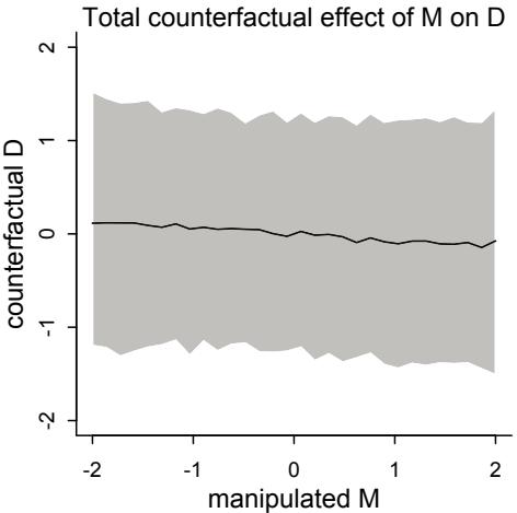
Figure 5.7. The counterfactual effect of manipulating marriage rate M on divorce rate D. Since M → D was estimated to be very small, there is no strong trend here. By manipulating M, we break the influence of A on M, and this removes the association between M and D.
The trick with simulating counterfactuals is to realize that when we manipulate some variable X, we break the causal influence of other variables on X. This is the same as saying we modify the DAG so that no arrows enter X. Suppose for example that we now simulate the effect of manipulating M. This implies the DAG:
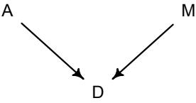
The arrow A → M is deleted, because if we control the values of M, then A no longer influences it. It’s like a perfectly controlled experiment. Now we can modify the code above to simulate the counterfactual result of manipulating M. We’ll simulate a counterfactual for an average state, with A = 0, and see what changing M does.
R code
5.24 sim_dat <- data.frame( M=seq(from=-2,to=2,length.out=30) , A=0 )
s <- sim( m5.3_A , data=sim_dat , vars="D" )
plot( sim_dat$M , colMeans(s) , ylim=c(-2,2) , type="l" ,
   xlab="manipulated M" , ylab="counterfactual D" )
shade( apply(s,2,PI) , sim_dat$M )
mtext( "Total counterfactual effect of M on D" )
We only simulate D now—note the vars argument to sim() in the code above. We don’t simulate A, because M doesn’t influence it. I show this plot in Figure 5.7. This trend is less strong, because there is no evidence for a strong influence of M on D.
In more complex models with many potential paths, the same strategy will compute counterfactuals for an exposure of interest. But as you’ll see in later examples, often it is simply not possible to estimate a plausible, un-confounded causal effect of some exposure X on some outcome Y. But even in those cases, there are still important counterfactuals to consider. So we’ll return to this theme in future chapters.
Overthinking: Simulating counterfactuals. The example in this section used sim() to hide the details. But simulating counterfactuals on your own is not hard. It just uses the model definition. Assume we’ve already fit model m5.3_A, the model that includes both causal paths A → D and A → M → D. We define a range of values that we want to assign to A:
R code
 5.25 A_seq <- seq( from=-2 , to=2 , length.out=30 )
Next we need to extract the posterior samples, because we’ll simulate observations for each set of samples. Then it really is just a matter of using the model definition with the samples, as in previous examples. The model defines the distribution of M. We just convert that definition to the corresponding simulation function, which is rnorm in this case:
R code5.26 post <- extract.samples( m5.3_A )
M_sim <- with( post , sapply( 1:30 ,
function(i) rnorm( 1e3 , aM + bAM*A_seq[i] , sigma_M ) ) )I used the with function, which saves us having to type post$ in front of every parameter name. The linear model inside rnorm comes right out of the model definition. This produces a matrix of values, with samples in rows and cases corresponding to the values in A_seq in the columns. Now that we have simulated values for M, we can simulate D too:
R code5.27 D_sim <- with( post , sapply( 1:30 ,
function(i) rnorm( 1e3 , a + bA*A_seq[i] + bM*M_sim[,i] , sigma ) ) )If you plot A_seq against the column means of D_sim, you’ll see the same result as before. In complex models, there might be many more variables to simulate. But the basic procedure is the same.
5.2. Masked relationship
The divorce rate example demonstrates that multiple predictor variables are useful for knocking out spurious association. A second reason to use more than one predictor variable is to measure the direct influences of multiple factors on an outcome, when none of those influences is apparent from bivariate relationships. This kind of problem tends to arise when there are two predictor variables that are correlated with one another. However, one of these is positively correlated with the outcome and the other is negatively correlated with it.
You’ll consider this kind of problem in a new data context, information about the composition of milk across primate species, as well as some facts about those species, like body mass and brain size.84 Milk is a huge investment, being much more expensive than gestation. Such an expensive resource is likely adjusted in subtle ways, depending upon the physiological and development details of each mammal species. Let’s load the data into R first:
R code
 5.28 library(rethinking)
       data(milk)
       d <- milk
       str(d)
You should see in the structure of the data frame that you have 29 rows for 8 variables. The variables we’ll consider for now are kcal.per.g (kilocalories of energy per gram of milk), mass (average female body mass, in kilograms), and neocortex.perc (percent of total brain mass that is neocortex mass).
A popular hypothesis has it that primates with larger brains produce more energetic milk, so that brains can grow quickly. Answering questions of this sort consumes a lot of effort in evolutionary biology, because there are many subtle statistical issues that arise when comparing species. It doesn’t help that many biologists have no reference model other than a series of regressions, and so the output of the regressions is not really interpretable. The causal meaning of statistical estimates always depends upon information outside the data.
We won’t solve these problems here. But we will explore a useful example. The question here is to what extent energy content of milk, measured here by kilocalories, is related to the percent of the brain mass that is neocortex. Neocortex is the gray, outer part of the brain that is especially elaborate in some primates. We’ll end up needing female body mass as well, to see the masking that hides the relationships among the variables. Let’s standardize these three variables. As in previous examples, standardizing helps us both get a reliable approximation of the posterior as well as build reasonable priors.
5.29 d$K <- standardize( d$kcal.per.g )
d$N <- standardize( d$neocortex.perc )
d$M <- standardize( log(d$mass) )
The first model to consider is the simple bivariate regression between kilocalories and neocortex percent. You already know how to set up this regression. In mathematical form:
\[\begin{aligned} K\_i &\sim \text{Normal}(\mu\_i, \sigma) \\ \mu\_i &= \alpha + \beta\_N N\_i \end{aligned}\]
where K is standardized kilocalories and N is standardized neocortex percent. We still need to consider the priors. But first let’s just try to run this as a quap model with some vague priors, because there is another key modeling issue to address first.
5.30 m5.5_draft <- quap(
  alist(
     K ~ dnorm( mu , sigma ) ,
     mu <- a + bN*N ,
     a ~ dnorm( 0 , 1 ) ,
     bN ~ dnorm( 0 , 1 ) ,
     sigma ~ dexp( 1 )
  ) , data=d )
When you execute this code, you’ll get a confusing error message:
Error in quap(alist(K ~ dnorm(mu, sigma), mu <- a + bN * N, a ~ dnorm(0, :
  initial value in 'vmmin' is not finite
The start values for the parameters were invalid. This could be caused by
missing values (NA) in the data or by start values outside the parameter
constraints. If there are no NAs, try using explicit start values.
What has gone wrong here? This particular error message means that the model didn’t return a valid probability for even the starting parameter values. In this case, the culprit is the missing values in the N variable. Take a look inside the original variable and see for yourself: R code
| R code 5.31 |
d$neocortex.perc | ||||||||||
|---|---|---|---|---|---|---|---|---|---|---|---|
| [1] | 55.16 | NA | NA | NA | NA | 64.54 | 64.54 | 67.64 | NA 68.85 |
58.85 61.69 |
|
| [13] | 60.32 | NA | NA | 69.97 | NA | 70.41 | NA | 73.40 | NA 67.53 |
NA 71.26 |
|
| [25] | 72.60 | NA | 70.24 | 76.30 | 75.49 |
Each NA in the output is a missing value. If you pass a vector like this to a likelihood function like dnorm, it doesn’t know what to do. After all, what’s the probability of a missing value? Whatever the answer, it isn’t a number, and so dnorm returns a NaN. Unable to even get started, quap (or rather optim, which does the real work) gives up and barks about some weird thing called vmmin not being finite. This kind of opaque error message is unfortunately the norm in R. The additional part of the message suggesting NA values might be responsible is just quap taking a guess.
This is easy to fix. What you need to do here is manually drop all the cases with missing values. This is known as a complete case analysis. More automated model fitting commands, like lm and glm, will silently drop such cases for you. But this isn’t always a good thing. First, it’s validity depends upon the process that caused these particular values to go missing. In Chapter 15, you’ll explore this in much more depth. Second, once you start comparing models, you must compare models fit to the same data. If some variables have missing values that others do not, automated tools will silently produce misleading comparisons.
Let’s march forward for now, dropping any cases with missing values. It’s worth learning how to do this yourself. To make a new data frame with only complete cases, use:
R code
 5.32 dcc <- d[ complete.cases(d$K,d$N,d$M) , ]
This makes a new data frame, dcc, that consists of the 17 rows from d that have no missing values in any of the variables listed inside complete.cases. Now let’s work with the new data frame. All that is new in the code is using dcc instead of d:
R code
 5.33 m5.5_draft <- quap(
           alist(
               K ~ dnorm( mu , sigma ) ,
               mu <- a + bN*N ,
               a ~ dnorm( 0 , 1 ) ,
               bN ~ dnorm( 0 , 1 ) ,
               sigma ~ dexp( 1 )
           ) , data=dcc )
Before considering the posterior predictions, let’s consider those priors. As in many simple linear regression problems, these priors are harmless. But are they reasonable? It is important to build reasonable priors, because as the model becomes less simple, the priors can be very helpful, but only if they are scientifically reasonable. To simulate and plot 50 prior regression lines:
R code
 5.34 prior <- extract.prior( m5.5_draft )
       xseq <- c(-2,2)
       mu <- link( m5.5_draft , post=prior , data=list(N=xseq) )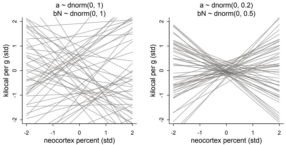
Figure 5.8. Prior predictive distributions for the first primate milk model, m5.5. Each plot shows a range of 2 standard deviations for each variable. Left: The vague first guess. These priors are clearly silly. Right: Slightly less silly priors that at least stay within the potential space of observations.
plot( NULL , xlim=xseq , ylim=xseq )
for ( i in 1:50 ) lines( xseq , mu[i,] , col=col.alpha("black",0.3) )
The result is displayed on the left side of Figure 5.8. I’ve shown a range of 2 standard deviations for both variables. So that is most of the outcome space. These lines are crazy. As in previous examples, we can do better by both tightening the α prior so that it sticks closer to zero. With two standardized variables, when predictor is zero, the expected value of the outcome should also be zero. And the slope βN needs to be a bit tighter as well, so that it doesn’t regularly produce impossibly strong relationships. Here’s an attempt:
5.35 m5.5 <- quap(
  alist(
     K ~ dnorm( mu , sigma ) ,
     mu <- a + bN*N ,
     a ~ dnorm( 0 , 0.2 ) ,
     bN ~ dnorm( 0 , 0.5 ) ,
     sigma ~ dexp( 1 )
  ) , data=dcc )
If you plot these priors, you’ll get what is shown on the right side of Figure 5.8. These are still very vague priors, but at least the lines stay within the high probability region of the observable data.
Now let’s look at the posterior:
R code
 5.36 precis( m5.5 )
mean sd 5.5% 94.5%
a 0.04 0.15 -0.21 0.29
bN 0.13 0.22 -0.22 0.49
sigma 1.00 0.16 0.74 1.26From this summary, you can possibly see that this is neither a strong nor very precise association. The standard deviation is almost twice the posterior mean. But as always, it’s much easier to see this if we draw a picture. Tables of numbers are golem speak, and we are not golems. We can plot the predicted mean and 89% compatibility interval for the mean to see this more easily. The code below contains no surprises. But if have extended the range of N values to consider, in xseq, so that the plot looks nicer.
R code
5.37 xseq <- seq( from=min(dcc$N)-0.15 , to=max(dcc$N)+0.15 , length.out=30 )
     mu <- link( m5.5 , data=list(N=xseq) )
     mu_mean <- apply(mu,2,mean)
     mu_PI <- apply(mu,2,PI)
     plot( K ~ N , data=dcc )
     lines( xseq , mu_mean , lwd=2 )
     shade( mu_PI , xseq )
I display this plot in the upper-left of Figure 5.9. The posterior mean line is weakly positive, but it is highly imprecise. A lot of mildly positive and negative slopes are plausible, given this model and these data.
Now consider another predictor variable, adult female body mass, mass in the data frame. Let’s use the logarithm of mass, log(mass), as a predictor as well. Why the logarithm of mass instead of the raw mass in kilograms? It is often true that scaling measurements like body mass are related by magnitudes to other variables. Taking the log of a measure translates the measure into magnitudes. So by using the logarithm of body mass here, we’re saying that we suspect that the magnitude of a mother’s body mass is related to milk energy, in a linear fashion. Much later, in Chapter 16, you’ll see why these logarithmic relationships are almost inevitable results of the physics of organisms.
Now we construct a similar model, but consider the bivariate relationship between kilocalories and body mass. Since body mass is also standardized, we can use the same priors and stay within possible outcome values. But if you were a domain expert in growth, you could surely do better than this.
R code5.38 m5.6 <- quap(
alist(
K ~ dnorm( mu , sigma ) ,
mu <- a + bM*M ,
a ~ dnorm( 0 , 0.2 ) ,
bM ~ dnorm( 0 , 0.5 ) ,
sigma ~ dexp( 1 )
) , data=dcc )
precis(m5.6)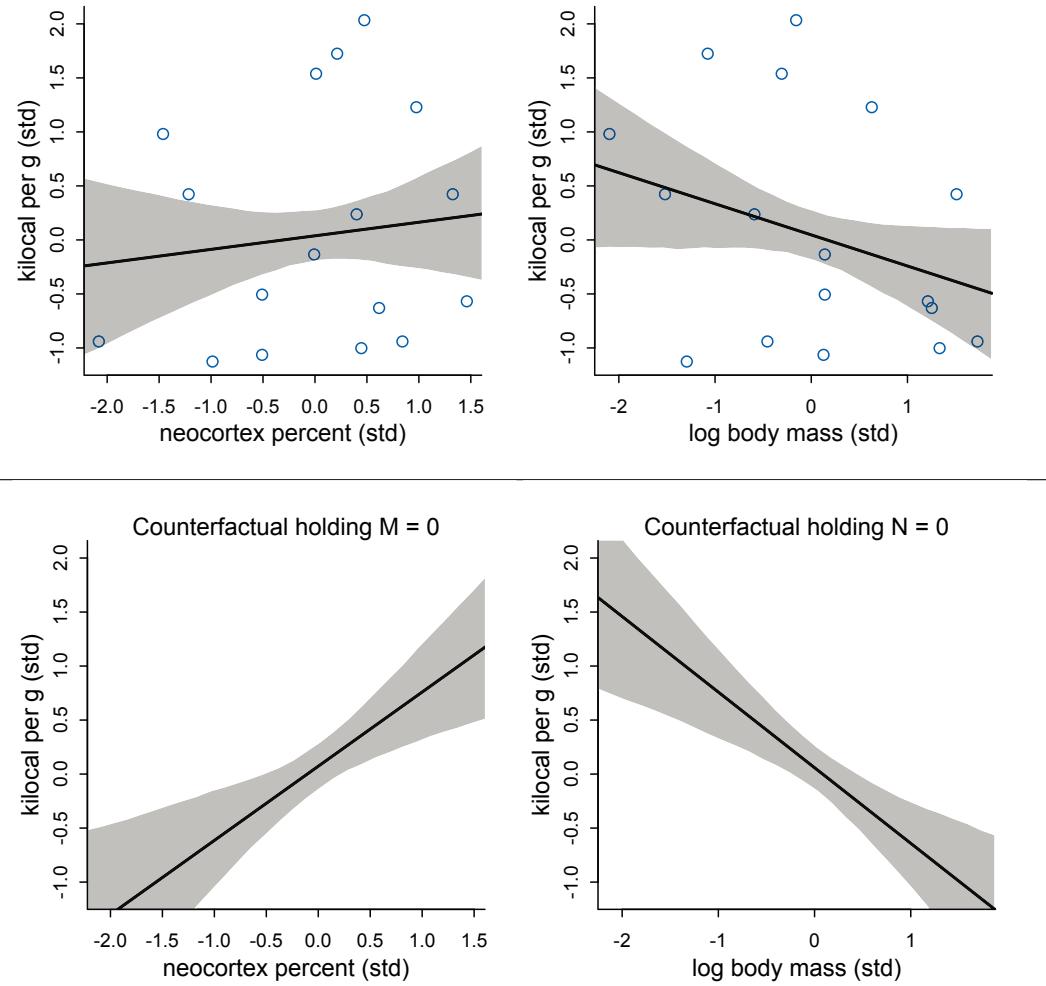
Figure 5.9. Milk energy and neocortex among primates. In the top two plots, simple bivariate regressions of kilocalories per gram of milk (K) on (left) neocortex percent (N) and (right) log female body mass (M) show weak associations. In the bottom row, a model with both neocortex percent (N) and log body mass (M) shows stronger associations.
| mean | sd | 5.5% | 94.5% | |
|---|---|---|---|---|
| a | 0.05 | 0.15 | -0.20 | 0.29 |
| bM | -0.28 | 0.19 | -0.59 | 0.03 |
| sigma | 0.95 | 0.16 | 0.70 | 1.20 |
Log-mass is negatively associated with kilocalories. This association does seem stronger than that of neocortex percent, although in the opposite direction. It is quite uncertain though, with a wide compatibility interval that is consistent with a wide range of both weak and stronger relationships. This regression is shown in the upper-right of Figure 5.9. You should modify the code that plotted the upper-left plot in the same figure, to be sure you understand how to do this.
Now let’s see what happens when we add both predictor variables at the same time to the regression. This is the multivariate model, in math form:
Ki ∼ Normal(µi , σ) µi = α + βNNi + βMMi α ∼ Normal(0, 0.2) βN ∼ Normal(0, 0.5) βM ∼ Normal(0, 0.5) σ ∼ Exponential(1)
Approximating the posterior requires no new tricks:
R code
 5.39 m5.7 <- quap(
           alist(
               K ~ dnorm( mu , sigma ) ,
               mu <- a + bN*N + bM*M ,
               a ~ dnorm( 0 , 0.2 ) ,
               bN ~ dnorm( 0 , 0.5 ) ,
               bM ~ dnorm( 0 , 0.5 ) ,
               sigma ~ dexp( 1 )
           ) , data=dcc )
precis(m5.7)| 94.5% | |||
|---|---|---|---|
| 0.07 | 0.13 | -0.15 | 0.28 |
| 0.68 | 0.25 | 0.28 | 1.07 |
| -0.70 | 0.22 | -1.06 | -0.35 |
| 0.74 | 0.13 | 0.53 | 0.95 |
| mean | sd | 5.5% |
By incorporating both predictor variables in the regression, the posterior association of both with the outcome has increased. Visually comparing this posterior to those of the previous two models helps to see the pattern of change:
R code 5.40 plot( coeftab( m5.5 , m5.6 , m5.7 ) , pars=c(“bM”,“bN”) )
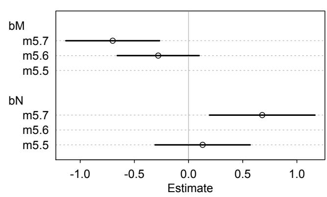
The posterior means for neocortex percent and log-mass have both moved away from zero. Adding both predictors to the model seems to have made their estimates move apart.
What happened here? Why did adding neocortex and body mass to the same model lead to stronger associations for both? This is a context in which there are two variables correlated with the outcome, but one is positively correlated with it and the other is negatively correlated with it. In addition, both of the explanatory variables are positively correlated with one another. Try a simple pairs( ~K + M + N , dcc ) plot to appreciate this pattern of correlation. The result of this pattern is that the variables tend to cancel one another out.
This is another case in which multiple regression automatically finds the most revealing cases and uses them to produce inferences. What the regression model does is ask if species that have high neocortex percent for their body mass have higher milk energy. Likewise, the model asks if species with high body massfor their neocortex percent have higher milk energy. Bigger species, like apes, have milk with less energy. But species with more neocortex tend to have richer milk. The fact that these two variables, body size and neocortex, are correlated across species makes it hard to see these relationships, unless we account for both.
Some DAGs will help. There are at least three graphs consistent with these data.
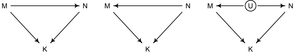
Beginning on the left, the first possibility is that body mass (M) influences neocortex percent (N). Both then influence kilocalories in milk (K). Second, in the middle, neocortex could instead influence body mass. The two variables still end up correlated in the sample. Finally, on the right, there could be an unobserved variable U that influences both M and N, producing a correlation between them. In this book, I’ll circle variables that are unobserved. One of the threats to causal inference is that there are potentially many unobserved variables that influence an outcome or the predictors. We’ll consider this more in the next chapter.
Which of these graphs is right? We can’t tell from the data alone, because these graphs imply the same set of conditional independencies. In this case, there are no conditional independencies—each DAG above implies that all pairs of variables are associated, regardless of what we condition on. A set of DAGs with the same conditional independencies is known as a Markov equivalence set. In the Overthinking box on the next page, I’ll show you how to simulate observations consistent with each of these DAGs, how each can produce the masking phenomenon, and how to use the dagitty package to compute the complete set of Markov equivalent DAGs. Remember that while the data alone can never tell you which causal model is correct, your scientific knowledge of the variables will eliminate a large number of silly, but Markov equivalent, DAGs.
The final thing we’d like to do with these models is to finish Figure 5.9. Let’s make counterfactual plots again. Suppose the third DAG above is the right one. Then imagine manipulating M and N, breaking the influence of U on each. In the real world, such experiments are impossible. If we change an animal’s body size, natural selection would then change the other features to match it. But these counterfactual plots do help us see how the model views the association between each predictor and the outcome. Here is the code to produce the lower-left plot in Figure 5.9 (page 149).
R code
5.41 xseq <- seq( from=min(dcc$M)-0.15 , to=max(dcc$M)+0.15 , length.out=30 )
     mu <- link( m5.7 , data=data.frame( M=xseq , N=0 ) )
     mu_mean <- apply(mu,2,mean)
     mu_PI <- apply(mu,2,PI)
     plot( NULL , xlim=range(dcc$M) , ylim=range(dcc$K) )
     lines( xseq , mu_mean , lwd=2 )
     shade( mu_PI , xseq )
You should try to reproduce the lower-right plot by modifying this code. In the practice problems, I’ll ask you to consider what would happen, if you chose one of the other DAGs at the top of the page.
Overthinking: Simulating a masking relationship. Just as with understanding spurious association (page 139), it may help to simulate data in which two meaningful predictors act to mask one another. In the previous section, I showed three DAGs consistent with this. To simulate data consistent with the first DAG:
R code
 5.42 # M -> K <- N
# M -> N
n <- 100
M <- rnorm( n )
N <- rnorm( n , M )
K <- rnorm( n , N - M )
d_sim <- data.frame(K=K,N=N,M=M)You can quickly see the masking pattern of inferences by replacing dcc with d_sim in models m5.5, m5.6, and m5.7. Look at the precis summaries and you’ll see the same masking pattern where the slopes become more extreme in m5.7. The other two DAGs can be simulated like this:
R code
 5.43 # M -> K <- N
        # N -> M
        n <- 100
        N <- rnorm( n )
        M <- rnorm( n , N )
        K <- rnorm( n , N - M )
        d_sim2 <- data.frame(K=K,N=N,M=M)
        # M -> K <- N
        # M <- U -> N
        n <- 100
        U <- rnorm( n )
        N <- rnorm( n , U )
        M <- rnorm( n , U )
        K <- rnorm( n , N - M )
        d_sim3 <- data.frame(K=K,N=N,M=M)
In the primate milk example, it may be that the positive association between large body size and neocortex percent arises from a tradeoff between lifespan and learning. Large animals tend to live a long time. And in such animals, an investment in learning may be a better investment, because learning can be amortized over a longer lifespan. Both large body size and large neocortex then influence milk composition, but in different directions, for different reasons. This story implies that the DAG with an arrow from M to N, the first one, is the right one. But with the evidence at hand, we cannot easily see which is right. To compute the Markov equivalence set, let’s define the first DAG and ask dagitty to do the hard work:
5.44 dag5.7 <- dagitty( "dag{
  M -> K <- N
  M -> N }" )
coordinates(dag5.7) <- list( x=c(M=0,K=1,N=2) , y=c(M=0.5,K=1,N=0.5) )
MElist <- equivalentDAGs(dag5.7)
Now MElist should contain six different DAGs. To plot them all, you can use drawdag(MElist). Which of these do you think you could eliminate, based upon scientific knowledge of the variables?
5.3. Categorical variables
A common question for statistical methods is to what extent an outcome changes as a result of presence or absence of a category. A category here means discrete and unordered. For example, consider the different species in the milk energy data again. Some of them are apes, while others are New World monkeys. We might want to ask how predictions should vary when the species is an ape instead of a monkey. Taxonomic group is a categorical variable, because no species can be half-ape and half-monkey (discreteness), and there is no sense in which one is larger or smaller than the other (unordered). Other common examples of categorical variables include:
- • Sex: male, female
- • Developmental status: infant, juvenile, adult
- • Geographic region: Africa, Europe, Melanesia
Many readers will already know that variables like this, routinely called factors, can easily be included in linear models. But what is not widely understood is how these variables are represented in a model. The computer does all of the work for us, hiding the machinery. But there are some subtleties that make it worth exposing the machinery. Knowing how the machine (golem) works both helps you interpret the posterior distribution and gives you additional power in building the model.
Rethinking: Continuous countries. With automated software and lack of attention, categorical variables can be dangerous. In 2015, a high-impact journal published a study of 1170 children from six countries, finding a strong negative association between religiosity and generosity.85 The paper caused a small stir among religion researchers, because it disagreed with the existing literature. Upon reanalysis, it was found that the country variable, which is categorical, was entered as a continuous variable instead. This made Canada (value 2) twice as much “country” as the United States (value 1). After reanalysis with country as a categorical variable, the result vanished and the original paper has been retracted. This is a happy ending, because the authors shared their data. How many cases like this exist, undiscovered because the data have never been shared and are possible lost forever?
5.3.1. Binary categories. In the simplest case, the variable of interest has only two categories, like male and female. Let’s rewind to the Kalahari data you met in Chapter 4. Back then, we ignored sex when predicting height, but obviously we expect males and females to have different averages. Take a look at the variables available:
R code
 5.45 data(Howell1)
       d <- Howell1
       str(d)
'data.frame': 544 obs. of 4 variables:
$ height: num 152 140 137 157 145 ...
$ weight: num 47.8 36.5 31.9 53 41.3 ...
$ age : num 63 63 65 41 51 35 32 27 19 54 ...
$ male : int 1 0 0 1 0 1 0 1 0 1 ...The male variable is our new predictor, an example of a indicator variable. Indicator variables—sometimes also called “dummy” variables—are devices for encoding unordered categories into quantitative models. There is no sense here in which “male” is one more than “female.” The purpose of the male variable is to indicate when a person in the sample is “male.” So it takes the value 1 whenever the person is male, but it takes the value 0 when the person belongs to any other category. It doesn’t matter which category is indicated by the 1. The model won’t care. But correctly interpreting the model demands that you remember, so it’s a good idea to name the variable after the category assigned the 1 value.
There are two ways to make a model with this information. The first is to use the indicator variable directly inside the linear model, as if it were a typical predictor variable. The effect of an indicator variable is to turn a parameter on for those cases in the category. Simultaneously, the variable turns the same parameter off for those cases in another category. This will make more sense, once you see it in the mathematical definition of the model. Consider again a linear model of height, as in Chapter 4. Now we’ll ignore weight and the other variables and focus only on sex.
hi ∼ Normal(µi , σ) µi = α + βmmi α ∼ Normal(178, 20) βm ∼ Normal(0, 10) σ ∼ Uniform(0, 50)
where h is height and m is the dummy variable indicating a male individual. The parameter βm influences prediction only for those cases where mi = 1. When mi = 0, it has no effect on prediction, because it is multiplied by zero inside the linear model, α+βmmi , canceling it out, whatever its value. This is just to say that, when mi = 1, the linear model is µi = α+βm. And when mi = 0, the linear model is simply µi = α.
Using this approach means that βm represents the expected difference between males and females in height. The parameter α is used to predict both female and male heights. But male height gets an extra βm. This also means that α is no longer the average height in the sample, but rather just the average female height. This can make assigning sensible priors a little harder. If you don’t have a sense of the expected difference in height—what would be reasonable before seeing the data?—then this approach can be a bother. Of course you could get away with a vague prior in this case—there is a lot of data.
Another consequence of having to assign a prior to the difference is that this approach necessarily assumes there is more uncertainty about one of the categories—“male” in this case—than the other. Why? Because a prediction for a male includes two parameters and therefore two priors. We can simulate this directly from the priors. The prior distributions for µ for females and males are:
5.46 mu_female <- rnorm(1e4,178,20)
mu_male <- rnorm(1e4,178,20) + rnorm(1e4,0,10)
precis( data.frame( mu_female , mu_male ) )
'data.frame': 10000 obs. of 2 variables:
          mean sd 5.5% 94.5% histogram
mu_female 178.41 20.04 146.30 209.94 ▁▁▃▇▇▂▁▁
mu_male 177.97 22.40 142.39 214.82 ▁▁▁▃▇▇▂▁▁
The prior for males is wider, because it uses both parameters. While in a regression this simple, these priors will wash out very quickly, in general we should be careful. We aren’t actually more unsure about male height than female height, a priori. Is there another way?
Another approach available to us is an index variable. An index variable contains integers that correspond to different categories. The integers are just names, but they also let us reference a list of corresponding parameters, one for each category. In this case, we can construct our index like this:
5.47 d$sex <- ifelse( d$male==1 , 2 , 1 )
str( d$sex )
num [1:544] 2 1 1 2 1 2 1 2 1 2 …
Now “1” means female and “2” means male. No order is implied. These are just labels. And the mathematical version of the model becomes:
\[\begin{aligned} h\_i &\sim \text{Normal}(\mu\_i, \sigma) \\ \mu\_i &= \alpha\_{\text{SE}[i]} \\ \alpha\_j &\sim \text{Normal}(178, 20) \quad \text{for } j = 1..2 \\ \sigma &\sim \text{Uniform}(0, 50) \end{aligned}\]
What this does is create a list of α parameters, one for each unique value in the index variable. So in this case we end up with two α parameters, named α1 and α2. The numbers correspond to the values in the index variable sex. I know this seems overly complicated, but it solves our problem with the priors. Now the same prior can be assigned to each, corresponding to the notion that all the categories are the same, prior to the data. Neither category has more prior uncertainty than the other. And as you’ll see in a bit, this approach extends effortlessly to contexts with more than two categories.
Let’s approximate the posterior for the above model, the one using an index variable.
5.48 m5.8 <- quap(
  alist(
     height ~ dnorm( mu , sigma ) ,
     mu <- a[sex] ,
     a[sex] ~ dnorm( 178 , 20 ) ,
     sigma ~ dunif( 0 , 50 )
  ) , data=d )
precis( m5.8 , depth=2 )
R code
R code
| mean | sd | 5.5% | 94.5% | |
|---|---|---|---|---|
| a[1] | 134.91 | 1.61 | 132.34 | 137.48 |
| a[2] | 142.58 | 1.70 | 139.86 | 145.29 |
| sigma | 27.31 | 0.83 | 25.98 | 28.63 |
Note the depth=2 that I added to precis. This tells it to show any vector parameters, like our newa vector. Vector (and matrix) parameters are hidden by precies by default, because sometimes there are lots of these and you don’t want to inspect their individual values. You’ll see what I mean in later chapters.
Interpreting these parameters is easy enough—they are the expected heights in each category. But often we are interested in differences between categories. In this case, what is the expected difference between females and males? We can compute this using samples from the posterior. In fact, I’ll extract posterior samples into a data frame and insert our calculation directly into the same frame:
R code5.49 post <- extract.samples(m5.8)
post$diff_fm <- post$a[,1] - post$a[,2]
precis( post , depth=2 )| quap | posterior: | 10000 | samples | from | m5.8 |
|---|---|---|---|---|---|
| mean | sd | 5.5% | 94.5% | histogram | |
| sigma | 27.29 | 0.84 | 25.95 | 28.63 | ▁▁▁▁▃▇▇▇▃▂▁▁▁ |
| a[1] | 134.91 | 1.59 | 132.37 | 137.42 | ▁▁▁▂▅▇▇▅▂▁▁▁▁ |
| a[2] | 142.60 | 1.71 | 139.90 | 145.35 | ▁▁▁▅▇▃▁▁▁ |
| diff_fm | -7.70 | 2.33 | -11.41 | -3.97 | ▁▁▁▁▃▇▇▃▁▁▁ |
Our calculation appears at the bottom, as a new parameter in the posterior. This is the expected difference between a female and male in the sample. This kind of calculation is called a contrast. No matter how many categories you have, you can use samples from the posterior to compute the contrast between any two.
5.3.2. Many categories. Binary categories are easy, whether you use an indicator variable or instead an index variable. But when there are more than two categories, the indicator variable approach explodes. You’ll need a new indicator variable for each new category. If you have k unique categories, you need k − 1 indicator variables. Automated tools like R’s lm do in fact go this route, constructing k−1 indicator variables for you and returning k−1 parameters (in addition to the intercept).
But we’ll instead stick with the index variable approach. It does not change at all when you add more categories. You do get more parameters, of course, just as many as in the indicator variable approach. But the model specification looks just like it does in the binary case. And the priors continue to be easier, unless you really do have prior information about contrasts. It is also important to get used to index variables, because multilevel models (Chapter 13) depend upon them.
Let’s explore an example using the primate milk data again. We’re interested now in the clade variable, which encodes the broad taxonomic membership of each species:
R code
 5.50 data(milk)
       d <- milk
       levels(d$clade)
[1] “Ape” “New World Monkey” “Old World Monkey” “Strepsirrhine”
We want an index value for each of these four categories. You could do this by hand, but just coercing the factor to an integer will do the job:
R code
5.51 d$clade_id <- as.integer( d$clade )
Let’s use a model to measure the average milk energy in each clade. In math form:
Ki ∼ Normal(µi
                , σ)
µi = αclade[i]
αj ∼ Normal(0, 0.5) for j = 1..4
σ ∼ Exponential(1)
Remember, K is the standardized kilocalories. I widened the prior on α a little, to allow the different clades to disperse, if the data wants them to. But I encourage you to play with that prior and repeatedly re-approximate the posterior so you can see how the posterior differences among the categories depend upon it. Firing up quap now:
5.52 d$K <- standardize( d$kcal.per.g )
m5.9 <- quap(
   alist(
       K ~ dnorm( mu , sigma ),
       mu <- a[clade_id],
       a[clade_id] ~ dnorm( 0 , 0.5 ),
       sigma ~ dexp( 1 )
   ) , data=d )
labels <- paste( "a[" , 1:4 , "]:" , levels(d$clade) , sep="" )
plot( precis( m5.9 , depth=2 , pars="a" ) , labels=labels ,
   xlab="expected kcal (std)" )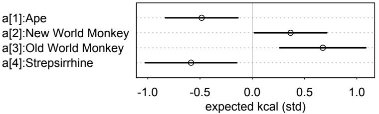
I used the optional labels argument to augment the parameter names a[1] through a[4] with the clade names from the original variable. In practice, you have to be very careful to keep track of which index values go with which categories. Don’t trust R’s factor variable type to necessarily do things right.
If you have another kind of categorical variable that you’d like to add to the model, the approach is just the same. For example, let’s randomly assign these primates to some made up categories: [1] Gryffindor, [2] Hufflepuff, [3] Ravenclaw, and [4] Slytherin.
5.53 set.seed(63)
d$house <- sample( rep(1:4,each=8) , size=nrow(d) )
R code
Now we can include these categories as another predictor in the model:
R code
 5.54 m5.10 <- quap(
           alist(
               K ~ dnorm( mu , sigma ),
               mu <- a[clade_id] + h[house],
               a[clade_id] ~ dnorm( 0 , 0.5 ),
               h[house] ~ dnorm( 0 , 0.5 ),
               sigma ~ dexp( 1 )
           ) , data=d )
If you inspect the posterior, you’ll see that Slytherin stands out.
Rethinking: Differences and statistical significance. A common error in interpretation of parameter estimates is to suppose that because one parameter is sufficiently far from zero—is “significant”—and another parameter is not—is “not significant”—that the difference between the parameters is also significant. This is not necessarily so.86 This isn’t just an issue for non-Bayesian analysis: If you want to know the distribution of a difference, then you must compute that difference, a contrast. It isn’t enough to just observe, for example, that a slope among males overlaps a lot with zero while the same slope among females is reliably above zero. You must compute the posterior distribution of the difference in slope between males and females. For example, suppose you have posterior distributions for two parameters, βf and βm. βf ’s mean and standard deviation is 0.15±0.02, and βm’s is 0.02±0.10. So while βf is reliably different from zero (“significant”) and βm is not, the difference between the two (assuming they are uncorrelated) is (0.15 − 0.02) ± √ 0.022 + 0.1 2 ≈ 0.13 ± 0.10. The distribution of the difference overlaps a lot with zero. In other words, you can be confident that βf is far from zero, but you cannot be sure that the difference between βf and βm is far from zero.
In the context of non-Bayesian significance testing, this phenomenon arises from the fact that statistical significance is inferentially powerful in one way: difference from the null. When βm overlaps with zero, it may also overlap with values very far from zero. Its value is uncertain. So when you then compare βm to βf , that comparison is also uncertain, manifesting in the width of the posterior distribution of the difference βf − βm. Lurking underneath this example is a more fundamental mistake in interpreting statistical significance: The mistake of accepting the null hypothesis. Whenever an article or book says something like “we found no difference” or “no effect,” this usually means that some parameter was not significantly different from zero, and so the authors adopted zero as the estimate. This is both illogical and extremely common.
5.4. Summary
This chapter introduced multiple regression, a way of constructing descriptive models for how the mean of a measurement is associated with more than one predictor variable. The defining question of multiple regression is: What is the value of knowing each predictor, once we already know the other predictors? The answer to this question does not by itself provide any causal information. Causal inference requires additional assumptions. Simple directed acyclic graph (DAG) models of causation are one way to represent those assumptions. In the next chapter we’ll continue building the DAG framework and see how adding predictor variables can create as many problems as it can solve.
5.5. Practice
Problems are labeled Easy (E), Medium (M), and Hard (H).
5E1. Which of the linear models below are multiple linear regressions?
- µi = α + βxi (2) µi = βxxi + βzzi (3) µi = α + β(xi − zi) (4) µi = α + βxxi + βzzi
5E2. Write down a multiple regression to evaluate the claim: Animal diversity is linearly related to latitude, but only after controlling for plant diversity. You just need to write down the model definition.
5E3. Write down a multiple regression to evaluate the claim: Neither amount of funding nor size of laboratory is by itself a good predictor of time to PhD degree; but together these variables are both positively associated with time to degree. Write down the model definition and indicate which side of zero each slope parameter should be on.
5E4. Suppose you have a single categorical predictor with 4 levels (unique values), labeled A, B, C and D. Let Ai be an indicator variable that is 1 where case i is in category A. Also suppose Bi , Ci , and Di for the other categories. Now which of the following linear models are inferentially equivalent ways to include the categorical variable in a regression? Models are inferentially equivalent when it’s possible to compute one posterior distribution from the posterior distribution of another model.
- µi = α + βAAi + βBBi + βDDi
- µi = α + βAAi + βBBi + βCCi + βDDi
- µi = α + βBBi + βCCi + βDDi
- µi = αAAi + αBBi + αCCi + αDDi
- µi = αA(1 − Bi − Ci − Di) + αBBi + αCCi + αDDi
5M1. Invent your own example of a spurious correlation. An outcome variable should be correlated with both predictor variables. But when both predictors are entered in the same model, the correlation between the outcome and one of the predictors should mostly vanish (or at least be greatly reduced).
5M2. Invent your own example of a masked relationship. An outcome variable should be correlated with both predictor variables, but in opposite directions. And the two predictor variables should be correlated with one another.
5M3. It is sometimes observed that the best predictor of fire risk is the presence of firefighters— States and localities with many firefighters also have more fires. Presumably firefighters do not cause fires. Nevertheless, this is not a spurious correlation. Instead fires cause firefighters. Consider the same reversal of causal inference in the context of the divorce and marriage data. How might a high divorce rate cause a higher marriage rate? Can you think of a way to evaluate this relationship, using multiple regression?
5M4. In the divorce data, States with high numbers of members of the Church of Jesus Christ of Latter-day Saints (LDS) have much lower divorce rates than the regression models expected. Find a list of LDS population by State and use those numbers as a predictor variable, predicting divorce rate using marriage rate, median age at marriage, and percent LDS population (possibly standardized). You may want to consider transformations of the raw percent LDS variable.
5M5. One way to reason through multiple causation hypotheses is to imagine detailed mechanisms through which predictor variables may influence outcomes. For example, it is sometimes argued that the price of gasoline (predictor variable) is positively associated with lower obesity rates (outcome variable). However, there are at least two important mechanisms by which the price of gas could reduce obesity. First, it could lead to less driving and therefore more exercise. Second, it could lead to less driving, which leads to less eating out, which leads to less consumption of huge restaurant meals. Can you outline one or more multiple regressions that address these two mechanisms? Assume you can have any predictor data you need.
5H1. In the divorce example, suppose the DAG is: M → A → D. What are the implied conditional independencies of the graph? Are the data consistent with it?
5H2. Assuming that the DAG for the divorce example is indeed M → A → D, fit a new model and use it to estimate the counterfactual effect of halving a State’s marriage rate M. Use the counterfactual example from the chapter (starting on page 140) as a template.
5H3. Return to the milk energy model, m5.7. Suppose that the true causal relationship among the variables is:
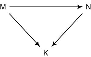
Now compute the counterfactual effect on K of doubling M. You will need to account for both the direct and indirect paths of causation. Use the counterfactual example from the chapter (starting on page 140) as a template.
5H4. Here is an open practice problem to engage your imagination. In the divorce date, States in the southern United States have many of the highest divorce rates. Add the South indicator variable to the analysis. First, draw one or more DAGs that represent your ideas for how Southern American culture might influence any of the other three variables (D, M or A). Then list the testable implications of your DAGs, if there are any, and fit one or more models to evaluate the implications. What do you think the influence of “Southerness” is?
6 The Haunted DAG & The Causal Terror
It seems like the most newsworthy scientific studies are the least trustworthy. The more likely it is to kill you, if true, the less likely it is to be true. The more boring the topic, the more rigorous the results. How could this widely believed negative correlation exist? There doesn’t seem to be any reason for studies of topics that people care about to produce less reliable results. Maybe popular topics attract more and worse researchers, like flies drawn to the smell of honey?
Actually all that is necessary for such a negative correlation to arise is that peer reviewers care about both newsworthiness and trustworthiness. Whether it is grant review or journal review, if editors and reviewers care about both, then the act of selection itself is enough to make the most newsworthy studies the least trustworthy. In fact, it’s hard to imagine how scientific peer review could avoid creating this negative correlation. And, dear reader, this fact will help us understand the perils of multiple regression.
Here’s a simple simulation to illustrate the point.87 Suppose a grant review panel receives 200 research proposals. Among these proposals, there is no correlation at all between trustworthiness (rigor, scholarship, plausibility of success) and newsworthiness (social welfare value, public interest). The panel weighs trustworthiness and newsworthiness equally. Then they rank the proposals by their combined scores and select the top 10% for funding.
At the end of this section, I show the code to simulate this thought experiment. Figure 6.1 displays the full sample of simulated proposals, with those selected in blue. I’ve drawn a simple linear regression line through the selected proposals. There’s the negative correlation, −0.77 in this example. Strong selection induces a negative correlation among the criteria used in selection. Why? If the only way to cross the threshold is to score high, it is more common to score high on one item than on both. Therefore among funded proposals, the most newsworthy studies can actually have less than average trustworthiness (less than 0 in the figure). Similarly the most trustworthy studies can be less newsworthy than average.
This general phenomenon has been recognized for a long time. It is sometimes called Berkson’s paradox. 88 But it is easier to remember if we call it the selection-distortion effect. Once you appreciate this effect, you’ll see it everywhere. Why do so many restaurants in good locations have bad food? The only way a restaurant with less-than-good food can survive is if it is in a nice location. Similarly, restaurants with excellent food can survive even in bad locations. Selection-distortion ruins your city.
What does this have to do with multiple regression? Unfortunately, everything. The previous chapter demonstrated some amazing powers of multiple regression. It can smoke out spurious correlations and clear up masking effects. This may encourage the view that, when in doubt, just add everything to the model and let the oracle of regression sort it out.
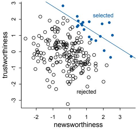
Figure 6.1. Why the most newsworthy studies might be the least trustworthy. 200 research proposals are ranked by combined trustworthiness and newsworthiness. The top 10% are selected for funding. While there is no correlation before selection, the two criteria are strongly negatively correlated after selection. The correlation here is −0.77.
Regression will not sort it out. Regression is indeed an oracle, but a cruel one. It speaks in riddles and delights in punishing us for asking bad questions. The selection-distortion effect can happen inside of a multiple regression, because the act of adding a predictor induces statistical selection within the model, a phenomenon that goes by the unhelpful name collider bias. This can mislead us into believing, for example, that there is a negative association between newsworthiness and trustworthiness in general, when in fact it is just a consequence of conditioning on some variable. This is both a deeply confusing fact and one that is important to understand in order to regress responsibly.
This chapter and the next are both about terrible things that can happen when we simply add variables to a regression, without a clear idea of a causal model. In this chapter, we’ll explore three different hazards: multicollinearity, post-treatment bias, and collider bias. We’ll end by tying all of these examples together in a framework that can tell us which variables we must and must not add to a model in order to arrive at valid inferences. But this framework does not do the most important step for us: It will not give us a valid model.
Overthinking: Simulated science distortion. Simulations like this one are easy to do in R, or in any other scripting language, once you have seen a few examples. In this simulation, we just draw some random Gaussian criteria for a sample of proposals and then select the top 10% combined scores.
R code
  6.1 set.seed(1914)
        N <- 200 # num grant proposals
        p <- 0.1 # proportion to select
        # uncorrelated newsworthiness and trustworthiness
        nw <- rnorm(N)
        tw <- rnorm(N)
        # select top 10% of combined scores
        s <- nw + tw # total score
        q <- quantile( s , 1-p ) # top 10% threshold
        selected <- ifelse( s >= q , TRUE , FALSE )
        cor( tw[selected] , nw[selected] )
I chose a specific seed so you can replicate the result in Figure 6.1, but if you rerun the simulation without the set.seed line, you’ll see there is nothing special about the seed I used.
6.1. Multicollinearity
It is commonly true that there are many potential predictor variables to add to a regression model. In the case of the primate milk data, for example, there are 7 variables available to predict any column we choose as an outcome. Why not just build a model that includes all 7? There are several hazards.
Let’s begin with the least of your worries: multicollinearity. Multicollinearity means a very strong association between two or more predictor variables. The raw correlation isn’t what matters. Rather what matters is the association, conditional on the other variables in the model. The consequence of multicollinearity is that the posterior distribution will seem to suggest that none of the variables is reliably associated with the outcome, even if all of the variables are in reality strongly associated with the outcome.
This frustrating phenomenon arises from the details of how multiple regression works. In fact, there is nothing wrong with multicollinearity. The model will work fine for prediction. You will just be frustrated trying to understand it. The hope is that once you understand multicollinearity, you will better understand regression models in general.
Let’s begin with a simple simulation. Then we’ll turn to the primate milk data again and see multicollinearity in a real data set.
6.1.1. Multicollinear legs. Imagine trying to predict an individual’s height using the length of his or her legs as predictor variables. Surely height is positively associated with leg length, or at least our simulation will assume it is. Nevertheless, once you put both legs (right and left) into the model, something vexing will happen.
The code below will simulate the heights and leg lengths of 100 individuals. For each, first a height is simulated from a Gaussian distribution. Then each individual gets a simulated proportion of height for their legs, ranging from 0.4 to 0.5. Finally, each leg is salted with a little measurement or developmental error, so the left and right legs are not exactly the same length, as is typical in real populations. At the end, the code puts height and the two leg lengths into a common data frame.
R code
6.2 N <- 100 # number of individuals
set.seed(909)
height <- rnorm(N,10,2) # sim total height of each
leg_prop <- runif(N,0.4,0.5) # leg as proportion of height
leg_left <- leg_prop*height + # sim left leg as proportion + error
   rnorm( N , 0 , 0.02 )
leg_right <- leg_prop*height + # sim right leg as proportion + error
   rnorm( N , 0 , 0.02 )
                             # combine into data frame
d <- data.frame(height,leg_left,leg_right)
Now let’s analyze these data, predicting the outcome heightwith both predictors, leg_left and leg_right. Before approximating the posterior, however, consider what we expect. On average, an individual’s legs are 45% of their height (in these simulated data). So we should expect the beta coefficient that measures the association of a leg with height to end up around the average height (10) divided by 45% of the average height (4.5). This is 10/4.5 ≈ 2.2. Now let’s see what happens instead. I’ll use very vague, bad priors here, just so we can be sure that the priors aren’t responsible for what is about to happen.
R code
  6.3 m6.1 <- quap(
           alist(
               height ~ dnorm( mu , sigma ) ,
               mu <- a + bl*leg_left + br*leg_right ,
               a ~ dnorm( 10 , 100 ) ,
               bl ~ dnorm( 2 , 10 ) ,
               br ~ dnorm( 2 , 10 ) ,
               sigma ~ dexp( 1 )
           ) , data=d )
       precis(m6.1)
mean sd 5.5% 94.5% a 0.98 0.28 0.53 1.44 bl 0.21 2.53 -3.83 4.25 br 1.78 2.53 -2.26 5.83 sigma 0.62 0.04 0.55 0.69
Those posterior means and standard deviations look crazy. This is a case in which a graphical view of the precis output is more useful, because it displays the posterior means and 89% intervals in a way that allows us with a glance to see that something has gone wrong here:
R code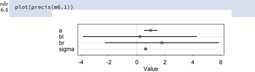
Go ahead and try the simulation a few more times, omitting the set.seed line. If both legs have almost identical lengths, and height is so strongly associated with leg length, then why is this posterior distribution so weird? Did the posterior approximation work correctly?
It did work correctly, and the posterior distribution here is the right answer to the question we asked. The problem is the question. Recall that a multiple linear regression answers the question: What is the value of knowing each predictor, after already knowing all of the other predictors? So in this case, the question becomes: What is the value of knowing each leg’s length, after already knowing the other leg’s length?
The answer to this weird question is equally weird, but perfectly logical. The posterior distribution is the answer to this question, considering every possible combination of the parameters and assigning relative plausibilities to every combination, conditional on this model and these data. It might help to look at the joint posterior distribution for bl and br:
R code6.5 post <- extract.samples(m6.1)
plot( bl ~ br , post , col=col.alpha(rangi2,0.1) , pch=16 )The resulting plot is shown on the left of Figure 6.2. The posterior distribution for these two parameters is very highly correlated, with all of the plausible values of bl and br lying
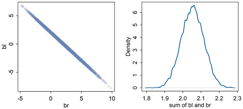
Figure 6.2. Left: Posterior distribution of the association of each leg with height, from model m6.1. Since both variables contain almost identical information, the posterior is a narrow ridge of negatively correlated values. Right: The posterior distribution of the sum of the two parameters is centered on the proper association of either leg with height.
along a narrow ridge. When bl is large, then br must be small. What has happened here is that since both leg variables contain almost exactly the same information, if you insist on including both in a model, then there will be a practically infinite number of combinations of bl and br that produce the same predictions.
One way to think of this phenomenon is that you have approximated this model:
\[\begin{aligned} \mathcal{y}\_i &\sim \text{Normal}(\mu\_i, \sigma) \\ \mu\_i &= \alpha + \beta\_1 \mathfrak{x}\_i + \beta\_2 \mathfrak{x}\_i \end{aligned}\]
The variable y is the outcome, like height in the example, and x is a single predictor, like the leg lengths in the example. Here x is used twice, which is a perfect example of the problem caused by using both leg lengths. From the golem’s perspective, the model for µi is:
\[ \mu\_{\bar{\imath}} = \alpha + (\beta\_1 + \beta\_2)\mathbf{x}\_{\bar{\imath}} \]
All I’ve done is factor xi out of each term. The parameters β1 and β2 cannot be pulled apart, because they never separately influence the mean µ. Only their sum, β1+β2, influences µ. So this means the posterior distribution ends up reporting the very large range of combinations of β1 and β2 that make their sum close to the actual association of x with y.
And the posterior distribution in this simulated example has done exactly that: It has produced a good estimate of the sum of bl and br. Here’s how you can compute the posterior distribution of their sum, and then plot it:
6.6 sum_blbr <- post$bl + post$br
dens( sum_blbr , col=rangi2 , lwd=2 , xlab="sum of bl and br" )
And the resulting density plot is shown on the right-hand side of Figure 6.2. The posterior mean is in the right neighborhood, a little over 2, and the standard deviation is much smaller
than it is for either component of the sum, bl or br. If you fit a regression with only one of the leg length variables, you’ll get approximately the same posterior mean:
R code
  6.7 m6.2 <- quap(
           alist(
               height ~ dnorm( mu , sigma ) ,
               mu <- a + bl*leg_left,
               a ~ dnorm( 10 , 100 ) ,
               bl ~ dnorm( 2 , 10 ) ,
               sigma ~ dexp( 1 )
           ) , data=d )
       precis(m6.2)
mean sd 5.5% 94.5% a 1.00 0.28 0.54 1.45 bl 1.99 0.06 1.89 2.09 sigma 0.62 0.04 0.55 0.69
That 1.99 is almost identical to the mean value of sum_blbr.
The basic lesson is only this: When two predictor variables are very strongly correlated (conditional on other variables in the model), including both in a model may lead to confusion. The posterior distribution isn’t wrong, in such cases. It’s telling you that the question you asked cannot be answered with these data. And that’s a great thing for a model to say, that it cannot answer your question. And if you are just interested in prediction, you’ll find that this leg model makes fine predictions. It just doesn’t make any claims about which leg is more important.
This leg example is clear and cute. But it is also purely statistical. We aren’t asking any serious causal questions here. Let’s try a more causally interesting example next.
6.1.2. Multicollinear milk. In the leg length example, it’s easy to see that including both legs in the model is a little silly. But the problem that arises in real data sets is that we may not anticipate a clash between highly correlated predictors. And therefore we may mistakenly read the posterior distribution to say that neither predictor is important. In this section, we look at an example of this issue with real data.
Let’s return to the primate milk data from earlier in the chapter:
R code
  6.8 library(rethinking)
       data(milk)
       d <- milk
       d$K <- standardize( d$kcal.per.g )
       d$F <- standardize( d$perc.fat )
       d$L <- standardize( d$perc.lactose )
In this example, we are concerned with the perc.fat (percent fat) and perc.lactose (percent lactose) variables. We’ll use these to model the total energy content, kcal.per.g. The code above has already standardized these three variables. You’re going to use these three variables to explore a natural case of multicollinearity. Note that there are no missing values, NA, in these columns, so there’s no need here to extract complete cases. But you can rest assured that quap, unlike reckless functions like lm, would never silently drop cases.
Start by modeling kcal.per.g as a function of perc.fat and perc.lactose, but in two bivariate regressions. Look back in Chapter 5 (page 147), for a discussion of these priors.
6.9 # kcal.per.g regressed on perc.fat
m6.3 <- quap(
   alist(
       K ~ dnorm( mu , sigma ) ,
       mu <- a + bF*F ,
       a ~ dnorm( 0 , 0.2 ) ,
       bF ~ dnorm( 0 , 0.5 ) ,
       sigma ~ dexp( 1 )
   ) , data=d )
# kcal.per.g regressed on perc.lactose
m6.4 <- quap(
   alist(
       K ~ dnorm( mu , sigma ) ,
       mu <- a + bL*L ,
       a ~ dnorm( 0 , 0.2 ) ,
       bL ~ dnorm( 0 , 0.5 ) ,
       sigma ~ dexp( 1 )
   ) , data=d )
precis( m6.3 )
precis( m6.4 )
     mean sd 5.5% 94.5%
a 0.00 0.08 -0.12 0.12
bF 0.86 0.08 0.73 1.00
sigma 0.45 0.06 0.36 0.54
      mean sd 5.5% 94.5%
a 0.00 0.07 -0.11 0.11
bL -0.90 0.07 -1.02 -0.79
sigma 0.38 0.05 0.30 0.46
The posterior distributions for bF and bL are essentially mirror images of one another. The posterior mean of bF is as positive as the mean of bL is negative. Both are narrow posterior distributions that lie almost entirely on one side or the other of zero. Given the strong association of each predictor with the outcome, we might conclude that both variables are reliable predictors of total energy in milk, across species. The more fat, the more kilocalories in the milk. The more lactose, the fewer kilocalories in milk. But watch what happens when we place both predictor variables in the same regression model:
6.10 m6.5 <- quap(
  alist(
    K ~ dnorm( mu , sigma ) ,
    mu <- a + bF*F + bL*L ,
    a ~ dnorm( 0 , 0.2 ) ,
R code
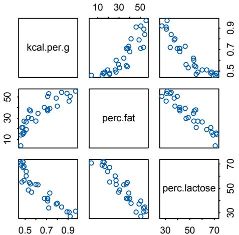
Figure 6.3. A pairs plot of the total energy, percent fat, and percent lactose variables from the primate milk data. Percent fat and percent lactose are strongly negatively correlated with one another, providing mostly the same information.
bF ~ dnorm( 0 , 0.5 ) ,
        bL ~ dnorm( 0 , 0.5 ) ,
        sigma ~ dexp( 1 )
    ) ,
    data=d )
precis( m6.5 )| mean | sd | 5.5% | 94.5% | |
|---|---|---|---|---|
| a | 0.00 | 0.07 | -0.11 | 0.11 |
| bF | 0.24 | 0.18 | -0.05 | 0.54 |
| bL | -0.68 | 0.18 | -0.97 | -0.38 |
| sigma | 0.38 | 0.05 | 0.30 | 0.46 |
Now the posterior means of both bF and bL are closer to zero. And the standard deviations for both parameters are twice as large as in the bivariate models (m6.3 and m6.4).
This is the same statistical phenomenon as in the leg length example. What has happened is that the variables perc.fat and perc.lactose contain much of the same information. They are almost substitutes for one another. As a result, when you include both in a regression, the posterior distribution ends up describing a long ridge of combinations of bF and bL that are equally plausible. In the case of the fat and lactose, these two variables form essentially a single axis of variation. The easiest way to see this is to use a pairs plot:
R code6.11 pairs( ~ kcal.per.g + perc.fat + perc.lactose , data=d , col=rangi2 )I display this plot in Figure 6.3. Along the diagonal, the variables are labeled. In each scatterplot off the diagonal, the vertical axis variable is the variable labeled on the same row and the horizontal axis variable is the variable labeled in the same column. For example, the two scatterplots in the first row in Figure 6.3 are kcal.per.g (vertical) against perc.fat (horizontal) and then kcal.per.g (vertical) against perc.lactose (horizontal). Notice
that percent fat is positively correlated with the outcome, while percent lactose is negatively correlated with it. Now look at the right-most scatterplot in the middle row. This plot is the scatter of percent fat (vertical) against percent lactose (horizontal). Notice that the points line up almost entirely along a straight line. These two variables are negatively correlated, and so strongly so that they are nearly redundant. Either helps in predicting kcal.per.g, but neither helps as much once you already know the other.
In the scientific literature, you might encounter a variety of dodgy ways of coping with multicollinearity. Few of them take a causal perspective. Some fields actually teach students to inspect pairwise correlations before fitting a model, to identify and drop highly correlated predictors. This is a mistake. Pairwise correlations are not the problem. It is the conditional associations—not correlations—that matter. And even then, the right thing to do will depend upon what is causing the collinearity. The associations within the data alone are not enough to decide what to do.
What is likely going on in the milk example is that there is a core tradeoff in milk composition that mammal mothers must obey. If a species nurses often, then the milk tends to be watery and low in energy. Such milk is high in sugar (lactose). If instead a species nurses rarely, in short bouts, then the milk needs to be higher in energy. Such milk is very high in fat. This implies a causal model something like this:
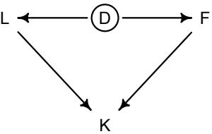
The central tradeoff decides how dense, D, the milk needs to be. We haven’t observed this variable, so it’s shown circled. Then fat, F, and lactose, L, are determined. Finally, the composition of F and L determines the kilocalories, K. If we could measure D, or had an evolutionary and economic model to predict it based upon other aspects of a species, that would be better than stumbling through regressions.
The problem of multicollinearity is a member of a family of problems with fitting models, a family sometimes known as non-identifiability. When a parameter is non-identifiable, it means that the structure of the data and model do not make it possible to estimate the parameter’s value. Sometimes this problem arises from mistakes in coding a model, but many important types of models present non-identifiable or weakly identifiable parameters, even when coded completely correctly. Nature does not owe us easy inference, even when the model is correct.
In general, there’s no guarantee that the available data contain much information about a parameter of interest. When that’s true, your Bayesian machine will return a posterior distribution very similar to the prior. Comparing the posterior to the prior can therefore be a good idea, a way of seeing how much information the model extracted from the data. When the posterior and prior are similar, it doesn’t mean the calculations are wrong—you got the right answer to the question you asked. But it might lead you to ask a better question.
Rethinking: Identification guaranteed; comprehension up to you. Technically speaking, identifiability is not a concern for Bayesian models. The reason is that as long as the posterior distribution is proper—which just means that it integrates to 1—then all of the parameters are identified. But this
technical fact doesn’t also mean that you can make sense of the posterior distribution. So it’s probably better to speak of weakly identified parameters in a Bayesian context. But the difference may be only technical. The truth is that even when a DAG says a causal effect should be identifiable, it may not be statistically identifiable. We have to work just as hard at the statistics as we do at the design.
Overthinking: Simulating collinearity. To see how imprecise of the posterior increases with association between two predictors, let’s use a simulation. The code below makes a function that generates correlated predictors, fits a model, and returns the standard deviation of the posterior distribution for the slope relating perc.fat to kcal.per.g. Then the code repeatedly calls this function, with different degrees of correlation as input, and collects the results.
R code6.12 library(rethinking)
data(milk)
d <- milk
sim.coll <- function( r=0.9 ) {
d$x <- rnorm( nrow(d) , mean=r*d$perc.fat ,
sd=sqrt( (1-r^2)*var(d$perc.fat) ) )
m <- lm( kcal.per.g ~ perc.fat + x , data=d )
sqrt( diag( vcov(m) ) )[2] # stddev of parameter
}
rep.sim.coll <- function( r=0.9 , n=100 ) {
stddev <- replicate( n , sim.coll(r) )
mean(stddev)
}
r.seq <- seq(from=0,to=0.99,by=0.01)
stddev <- sapply( r.seq , function(z) rep.sim.coll(r=z,n=100) )
plot( stddev ~ r.seq , type="l" , col=rangi2, lwd=2 , xlab="correlation" )So for each correlation value in r.seq, the code generates 100 regressions and returns the average standard deviation from them. This code uses implicit flat priors, which are bad priors. So it does exaggerate the effect of collinear variables. When you use informative priors, the inflation in standard deviation can be much slower.
6.2. Post-treatment bias
It is routine to worry about mistaken inferences that arise from omitting predictor variables. Such mistakes are often called omitted variable bias, and the examples from the previous chapter illustrate it. It is much less routine to worry about mistaken inferences arising from including variables. But included variable bias is real. Carefully randomized experiments can be ruined just as easily as uncontrolled observational studies. Blindly tossing variables into the causal salad is never a good idea.
Included variable bias takes several forms. The first is post-treatment bias. 89 Posttreatment bias is a risk in all types of studies. The language “post-treatment” comes in fact from thinking about experimental designs. Suppose for example that you are growing some plants in a greenhouse. You want to know the difference in growth under different antifungal soil treatments, because fungus on the plants tends to reduce their growth. Plants are initially seeded and sprout. Their heights are measured. Then different soil treatments are applied. Final measures are the height of the plant and the presence of fungus. There are four variables of interest here: initial height, final height, treatment, and presence of fungus.
Final height is the outcome of interest. But which of the other variables should be in the model? If your goal is to make a causal inference about the treatment, you shouldn’t include the fungus, because it is a post-treatment effect.
Let’s simulate some data, to make the example more transparent and see what exactly goes wrong when we include a post-treatment variable.
6.13 set.seed(71)
# number of plants
N <- 100
# simulate initial heights
h0 <- rnorm(N,10,2)
# assign treatments and simulate fungus and growth
treatment <- rep( 0:1 , each=N/2 )
fungus <- rbinom( N , size=1 , prob=0.5 - treatment*0.4 )
h1 <- h0 + rnorm(N, 5 - 3*fungus)
# compose a clean data frame
d <- data.frame( h0=h0 , h1=h1 , treatment=treatment , fungus=fungus )
precis(d)| mean | sd | 5.5% | 94.5% | histogram | |
|---|---|---|---|---|---|
| h0 | 9.96 | 2.10 | 6.57 | 13.08 | ▁▂▂▂▇▃▂▃▁▁▁▁ |
| h1 | 14.40 | 2.69 | 10.62 | 17.93 | ▁▁▃▇▇▇▁▁ |
| treatment | 0.50 | 0.50 | 0.00 | 1.00 | ▇▁▁▁▁▁▁▁▁▇ |
| fungus | 0.23 | 0.42 | 0.00 | 1.00 | ▇▁▁▁▁▁▁▁▁▂ |
Now you should have a data frame d with the simulated plant experiment data.
Rethinking: Causal inference heuristics. The danger of post-treatment bias has been known for a long time. So many scientists have been taught the heuristic that while it is risky to condition on posttreatment variables, pre-treatment variables are safe. This heuristic may lead to sensible estimates in many cases. But it is not principled. Pre-treatment variables can also create bias, as you’ll see later in this chapter. There is nothing wrong, in principle, with heuristics. They are safe in the context for which they were developed. But we still need principles to know when to deploy them.
6.2.1. A prior is born. When designing the model, it helps to pretend you don’t have the data generating process just above. In real research, you will not know the real data generating process. But you will have a lot of scientific information to guide model construction. So let’s spend some time taking this mock analysis seriously.
We know that the plants at time t = 1 should be taller than at time t = 0, whatever scale they are measured on. So if we put the parameters on a scale of proportion of height at time t = 0, rather than on the absolute scale of the data, we can set the priors more easily. To make this simpler, let’s focus right now only on the height variables, ignoring the predictor variables. We might have a linear model like:
h1,i ∼ Normal(µi , σ) µi = h0,i × p
where h0,i is plant i’s height at time t = 0, h1,i is its height at time t = 1, and p is a parameter measuring the proportion of h0,i that h1,i is. More precisely, p = h1,i/h0,i . If p = 1, the plant hasn’t changed at all from time t = 0 to time t = 1. If p = 2, it has doubled in height. So if we center our prior for p on 1, that implies an expectation of no change in height. That is less than we know. But we should allow p to be less than 1, in case the experiment goes horribly wrong and we kill all the plants. We also have to ensure that p > 0, because it is a proportion. Back inChapter 4 (page 96), we used a Log-Normal distribution, because it is always positive. Let’s use one again. If we use p ∼ Log-Normal(0, 0.25), the prior distribution looks like:
R code
 6.14 sim_p <- rlnorm( 1e4 , 0 , 0.25 )
       precis( data.frame(sim_p) )
'data.frame': 10000 obs. of 1 variables:
mean sd 5.5% 94.5% histogram
sim_p 1.03 0.26 0.67 1.48 ▁▃▇▇▃▁▁▁▁▁▁So this prior expects anything from 40% shrinkage up to 50% growth. Let’s fit this model, so you can see how it just measures the average growth in the experiment.
R code
 6.15 m6.6 <- quap(
           alist(
                h1 ~ dnorm( mu , sigma ),
                mu <- h0*p,
                p ~ dlnorm( 0 , 0.25 ),
                sigma ~ dexp( 1 )
           ), data=d )
       precis(m6.6)
mean sd 5.5% 94.5% p 1.43 0.02 1.40 1.45 sigma 1.79 0.13 1.59 1.99
About 40% growth, on average. Now to include the treatment and fungus variables. We’ll include both of them, following the notion that we’d like to measure the impact of both the treatment and the fungus itself. The parameters for these variables will also be on the proportion scale. They will be changes in proportion growth. So we’re going to make a linear model of p now.
h1,i ∼ Normal(µi
                , σ)
 µi = h0,i × p
  p = α + βTTi + βFFi
 α ∼ Log-Normal(0, 0.25)
βT ∼ Normal(0, 0.5)
βF ∼ Normal(0, 0.5)
 σ ∼ Exponential(1)
The proportion of growth p is now a function of the predictor variables. It looks like any other linear model. The priors on the slopes are almost certainly too flat. They place 95% of the prior mass between −1 (100% reduction) and +1 (100% increase) and two-thirds of the prior mass between −0.5 and +0.5. After we finish this section, you may want to loop back and try simulating from these priors. Here’s the code to approximate the posterior:
6.16 m6.7 <- quap(
   alist(
      h1 ~ dnorm( mu , sigma ),
      mu <- h0 * p,
      p <- a + bt*treatment + bf*fungus,
      a ~ dlnorm( 0 , 0.2 ) ,
      bt ~ dnorm( 0 , 0.5 ),
      bf ~ dnorm( 0 , 0.5 ),
      sigma ~ dexp( 1 )
   ), data=d )
precis(m6.7)
mean sd 5.5% 94.5% a 1.48 0.02 1.44 1.52 bt 0.00 0.03 -0.05 0.05 bf -0.27 0.04 -0.33 -0.21 sigma 1.41 0.10 1.25 1.57
That a parameter is the same as p before. And it has nearly the same posterior. The marginal posterior for bt, the effect of treatment, is solidly zero, with a tight interval. The treatment is not associated with growth. The fungus seems to have hurt growth, however. Given that we know the treatment matters, because we built the simulation that way, what happened here?
6.2.2. Blocked by consequence. The problem is that fungus is mostly a consequence of treatment. This is to say that fungus is a post-treatment variable. So when we control for fungus, the model is implicitly answering the question: Once we already know whether or not a plant developed fungus, does soil treatment matter? The answer is “no,” because soil treatment has its effects on growth through reducing fungus. But we actually want to know, based on the design of the experiment, is the impact of treatment on growth. To measure this properly, we should omit the post-treatment variable fungus. Here’s what the inference looks like in that case:
6.17 m6.8 <- quap(
   alist(
      h1 ~ dnorm( mu , sigma ),
      mu <- h0 * p,
      p <- a + bt*treatment,
      a ~ dlnorm( 0 , 0.2 ),
      bt ~ dnorm( 0 , 0.5 ),
      sigma ~ dexp( 1 )
   ), data=d )
precis(m6.8)
mean sd 5.5% 94.5% a 1.38 0.03 1.34 1.42 bt 0.08 0.03 0.03 0.14 sigma 1.75 0.12 1.55 1.94 R code
Now the impact of treatment is clearly positive, as it should be. It makes sense to control for pre-treatment differences, like the initial height h0, that might mask the causal influence of treatment. But including post-treatment variables can actually mask the treatment itself. This doesn’t mean you don’t want the model that includes both treatment and fungus. The fact that including fungus zeros the coefficient for treatment suggests that the treatment works for exactly the anticipated reasons. It tells us about mechanism. But a correct inference about the treatment still depends upon omitting the post-treatment variable.
6.2.3. Fungus and d-separation. It helps to look at this problem in terms of a DAG. In this case, I’ll show you how to draw it using the dagitty R package, because we are going to use that package now to do some graph analysis.
R code
 6.18 library(dagitty)
       plant_dag <- dagitty( "dag {
           H_0 -> H_1
           F -> H_1
           T -> F
       }")
       coordinates( plant_dag ) <- list( x=c(H_0=0,T=2,F=1.5,H_1=1) ,
                                           y=c(H_0=0,T=0,F=0,H_1=0) )
       drawdag( plant_dag )
H0 H1 F T
So the treatment T influences the presence of fungus F which influences plant height at time 1, H1. Plant height at time 1 is also influenced by plant height at time 0, H0. That’s our DAG. When we include F, the post-treatment effect, in the model, we end up blocking the path from the treatment to the outcome. This is the DAG way of saying that learning the treatment tells us nothing about the outcome, once we know the fungus status.
An even more DAG way to say this is that conditioning on F induces d-separation. The “d” stands for directional. 90 D-separation means that some variables on a directed graph are independent of others. There is no path connecting them. In this case, H1 is d-separated from T, but only when we condition on F. Conditioning on F effectively blocks the directed path T → F → H1, making T and H1 independent (d-separated). In the previous chapter, you saw the notation H1 ⊥⊥ T|F for this kind of statement, when we discussed implied conditional independencies. Why does this happen? There is no information in T about H1 that is not also in F. So once we know F, learning T provides no additional information about H1. You can query the implied conditional independencies for this DAG:
R code 6.19 impliedConditionalIndependencies(plant_dag)
F _||_ H0 H0 _||_ T H1 _||_ T | F
There are three. The third one is the focus of our discussion. But the other two implications provide ways to test the DAG. What F ⊥⊥ H0 and H0 ⊥⊥ T say is that the original plant height, H0, should not be associated with the treatment T or fungus F, provided we do not condition on anything.
Obviously the problem of post-treatment variables applies just as well to observational studies as it does to experiments. But in experiments, it can be easier to tell which variables are pre-treatment, like h0, and which are post-treatment, like fungus. In observational studies, it is harder to know. But there are many traps in experiments as well.91 For example, conditioning on a post-treatment variable can not only fool you into thinking the treatment doesn’t work. It can also fool you into thinking it does work. Consider the DAG below:
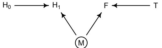
In this graph, the treatment T influences fungus F, but fungus doesn’t influence plant growth. Maybe the plant species just isn’t bothered by this particular fungus. The new variable M is moisture. It influences both H1 and F. M is circled to indicate that it is unobserved. Any unobserved common cause of H1 and F will do—it doesn’t have to be moisture of course. A regression of H1 on T will show no association between the treatment and plant growth. But if we include F in the model, suddenly there will be an association. Let’s try it. I’ll just modify the plant growth simulation so that fungus has no influence on growth, but moisture M influences both H1 and F:
6.20 set.seed(71)
N <- 1000
h0 <- rnorm(N,10,2)
treatment <- rep( 0:1 , each=N/2 )
M <- rbern(N)
fungus <- rbinom( N , size=1 , prob=0.5 - treatment*0.4 + 0.4*M )
h1 <- h0 + rnorm( N , 5 + 3*M )
d2 <- data.frame( h0=h0 , h1=h1 , treatment=treatment , fungus=fungus )
Rerun the models from earlier, models m6.7 and m6.8, using the data in d2 now. You’ll see that including fungus again confounds inference about the treatment, this time by making it seem like it helped the plants, even though it had no effect.
This result is rather mysterious. Why should M have this effect? The next section is all about effects like this.
Rethinking: Model selection doesn’t help. In the next chapter, you’ll learn about model selection using information criteria. Like other model comparison and selection schemes, these criteria help in contrasting and choosing model structure. But such approaches are no help in the example presented just above, since the model that includes fungus both fits the sample better and would make better out-of-sample predictions. Model m6.7 misleads because it asks the wrong question, not because it would make poor predictions. As argued in Chapter 1, prediction and causal inference are just not the same task. No statistical procedure can substitute for scientific knowledge and attention to it. We need multiple models because they help us understand causal paths, not just so we can choose one or another for prediction.
6.3. Collider bias
At the start of the chapter, I argued that all that is necessary for scientific studies to show a negative association between trustworthiness and newsworthiness is that selection processes—grant and journal review—care about both. Now I want to explain how this same selection phenomenon can happen inside a statistical model. When it does, it can seriously distort our inferences, a phenomenon known as collider bias.
Let’s consider a DAG for this example. The model is that trustworthiness (T) and newsworthiness (N) are not associated in the population of research proposals submitted to grant review panels. But both of them influence selection (S) for funding. This is the graph:
T S N
The fact that two arrows enter S means it is a collider. The core concept is easy to understand: When you condition on a collider, it creates statistical—but not necessarily causal associations among its causes. In this case, once you learn that a proposal has been selected (S), then learning its trustworthiness (T) also provides information about its newsworthiness (N). Why? Because if, for example, a selected proposal has low trustworthiness, then it must have high newsworthiness. Otherwise it wouldn’t have been funded. The same works in reverse: If a proposal has low newsworthiness, we’d infer that it must have higher than average trustworthiness. Otherwise it would not have been selected for funding.
This is the informational phenomenon that generates the negative association between T and N in the population of selected proposals. And it means we have to pay attention to processes that select our sample of observations and may distort associations among variables. But the same phenomenon will also generate a misleading association inside a statistical model, when you include the collider as a predictor variable. If you are not careful, you can make an erroneous causal inference. Let’s consider an extended example.
6.3.1. Collider of false sorrow. Consider the question of how aging influences happiness. If we have a large survey of people rating how happy they are, is age associated with happiness? If so, is that association causal? Here, I want to show you how controlling for a plausible confound of happiness can actually bias inference about the influence of age.92
Suppose, just to be provocative, that an individual’s average happiness is a trait that is determined at birth and does not change with age. However, happiness does influence events in one’s life. One of those events is marriage. Happier people are more likely to get married. Another variable that causally influences marriage is age: The more years you are alive, the more likely you are to eventually get married. Putting these three variables together, this is the causal model:
H M A
Happiness (H) and age (A) both cause marriage (M). Marriage is therefore a collider. Even though there is no causal association between happiness and age, if we condition on marriage which means here, if we include it as a predictor in a regression—then it will induce a statistical association between age and happiness. And this can mislead us to think that happiness changes with age, when in fact it is constant.
To convince you of this, let’s do another simulation. Simulations are useful in these examples, because these are the only times when we know the true causal model. If a procedure cannot figure out the truth in a simulated example, we shouldn’t trust it in a real one. We’re going to do a fancier simulation this time, using an agent-based model of aging and marriage to produce a simulated data set to use in a regression. Here is the simulation design:
- Each year, 20 people are born with uniformly distributed happiness values.
- Each year, each person ages one year. Happiness does not change.
- At age 18, individuals can become married. The odds of marriage each year are proportional to an individual’s happiness.
- Once married, an individual remains married.
- After age 65, individuals leave the sample. (They move to Spain.)
I’ve written this algorithm into the rethinking package. You can run it out for 1000 years and collect the resulting data:
6.21 library(rethinking)
d <- sim_happiness( seed=1977 , N_years=1000 )
precis(d)| ‘data.frame’: | 1300 obs. |
3 variables: |
||||
|---|---|---|---|---|---|---|
| mean | sd | 5.5% | 94.5% | histogram | ||
| age | 33.0 | 18.77 | 4.00 | 62.00 | ▇▇▇▇▇▇▇▇▇▇▇▇▇ | |
| married | 0.3 | 0.46 | 0.00 | 1.00 | ▇▁▁▁▁▁▁▁▁▃ | |
| happiness | 0.0 | 1.21 | -1.79 | 1.79 | ▇▅▇▅▅▇▅▇ |
These data comprise 1300 people of all ages from birth to 65 years old. The variables correspond to the variables in the DAG above, and the simulation itself obeys the DAG.
I’ve plotted these data in Figure 6.4, showing each individual as a point. Filled points are married individuals. Age is on the horizontal, and happiness the vertical, with the happiest individuals at the top. At age 18, they become able to marry, and then gradually more individuals are married each year. So at older ages, more individuals are married. But at all ages, the happiest individuals are more likely to be married.
Suppose you come across these data and want to ask whether age is related to happiness. You don’t know the true causal model. But you reason, reasonably, that marriage status might be a confound. If married people are more or less happy, on average, then you need to condition on marriage status in order to infer the relationship between age and happiness.
So let’s consider a multiple regression model aimed at inferring the influence of age on happiness, while controlling for marriage status. This is just a plain multiple regression, like the others in this and the previous chapter. The linear model is this:
\[ \mu\_{\bar{l}} = \alpha\_{\text{MIN}[\bar{l}]} + \beta\_{\bar{A}} \mathbf{A}\_{\bar{l}} \]
where mid[i] is an index for the marriage status of individual i, with 1 meaning single and 2 meaning married. This is just the categorical variable strategy from Chapter 4. It’s easier to make priors, when we use multiple intercepts, one for each category, than when we use indicator variables.
Now we should do our duty and think about the priors. Let’s consider the slope βA first, because how we scale the predictor A will determine the meaning of the intercept. We’ll focus only on the adult sample, those 18 or over. Imagine a very strong relationship between
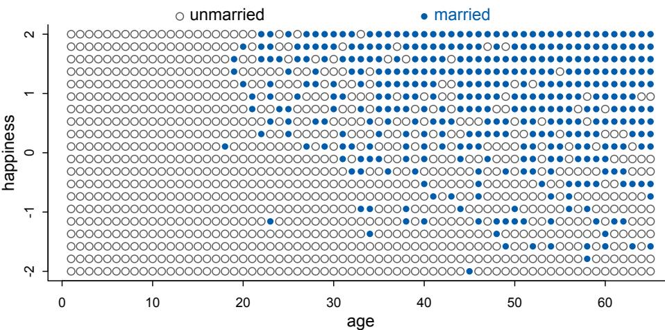
Figure 6.4. Simulated data, assuming that happiness is uniformly distributed and never changes. Each point is a person. Married individuals are shown with filled blue points. At each age after 18, the happiest individuals are more likely to be married. At later ages, more individuals tend to be married. Marriage status is a collider of age and happiness: A → M ← H. If we condition on marriage in a regression, it will mislead us to believe that happiness declines with age.
age and happiness, such that happiness is at its maximum at age 18 and its minimum at age 65. It’ll be easier if we rescale age so that the range from 18 to 65 is one unit. This will do it:
R code
6.22 d2 <- d[ d$age>17 , ] # only adults
     d2$A <- ( d2$age - 18 ) / ( 65 - 18 )
Now this new variable A ranges from 0 to 1, where 0 is age 18 and 1 is age 65. Happiness is on an arbitrary scale, in these data, from −2 to +2. So our imaginary strongest relationship, taking happiness from maximum to minimum, has a slope with rise over run of (2 − (−2))/1 = 4. Remember that 95% of the mass of a normal distribution is contained within 2 standard deviations. So if we set the standard deviation of the prior to half of 4, we are saying that we expect 95% of plausible slopes to be less than maximally strong. That isn’t a very strong prior, but again, it at least helps bound inference to realistic ranges. Now for the intercepts. Each α is the value of µi when Ai = 0. In this case, that means at age 18. So we need to allow α to cover the full range of happiness scores. Normal(0, 1) will put 95% of the mass in the −2 to +2 interval.
Finally, let’s approximate the posterior. We need to construct the marriage status index variable, as well. I’ll do that, and then immediately present the quap code.
R code
 6.23 d2$mid <- d2$married + 1
       m6.9 <- quap(
           alist(
               happiness ~ dnorm( mu , sigma ),
mu <- a[mid] + bA*A,
a[mid] ~ dnorm( 0 , 1 ),
bA ~ dnorm( 0 , 2 ),
sigma ~ dexp(1)
) , data=d2 )
precis(m6.9,depth=2)mean sd 5.5% 94.5% a[1] -0.23 0.06 -0.34 -0.13 a[2] 1.26 0.08 1.12 1.40 bA -0.75 0.11 -0.93 -0.57 sigma 0.99 0.02 0.95 1.03
The model is quite sure that age is negatively associated with happiness. We’d like to compare the inferences from this model to a model that omits marriage status. Here it is, followed by a comparison of the marginal posterior distributions:
6.24 m6.10 <- quap(
  alist(
     happiness ~ dnorm( mu , sigma ),
     mu <- a + bA*A,
     a ~ dnorm( 0 , 1 ),
     bA ~ dnorm( 0 , 2 ),
     sigma ~ dexp(1)
  ) , data=d2 )
precis(m6.10)
mean sd 5.5% 94.5%
a 0.00 0.08 -0.12 0.12
bA 0.00 0.13 -0.21 0.21
sigma 1.21 0.03 1.17 1.26This model, in contrast, finds no association between age and happiness.
The pattern above is exactly what we should expect when we condition on a collider. The collider is marriage status. It is a common consequence of age and happiness. As a result, when we condition on it, we induce a spurious association between the two causes. So it looks like, to model m6.9, that age is negatively associated with happiness. But this is just a statistical association, not a causal association. Once we know whether someone is married or not, then their age does provide information about how happy they are.
You can see this in Figure 6.4. Consider only the blue points, the married people. Among only the blue points, older individuals have lower average happiness. This is because more people get married as time goes on, so the mean happiness among married people approaches the population average of zero. Now consider only the open points, the unmarried people. Here it is also true that mean happiness declines with age. This is because happier individuals migrate over time into the married sub-population. So in both the married and unmarried sub-populations, there is a negative relationship between age and happiness. But in neither sub-population does this accurately reflect causation.
It’s easy to plead with this example. Shouldn’t marriage also influence happiness? What if happiness does change with age? But this misses the point. If you don’t have a causal model, you can’t make inferences from a multiple regression. And the regression itself does not provide the evidence you need to justify a causal model. Instead, you need some science.
6.3.2. The haunted DAG. Collider bias arises from conditioning on a common consequence, as in the previous example. If we can just get our graph sorted, we can avoid it. But it isn’t always so easy to see a potential collider, because there may be unmeasured causes. Unmeasured causes can still induce collider bias. So I’m sorry to say that we also have to consider the possibility that our DAG may be haunted.
Suppose for example that we want to infer the direct influence of both parents (P) and grandparents (G) on the educational achievement of children (C).93 Since grandparents also presumably influence their own children’s education, there is an arrow G → P. This sounds pretty easy, so far. It’s similar in structure to our divorce rate example from the last chapter:
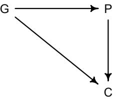
U
But suppose there are unmeasured, common influences on parents and their children, such as neighborhoods, that are not shared by grandparents (who live on the south coast of Spain now). Then our DAG becomes haunted by the unobserved U:
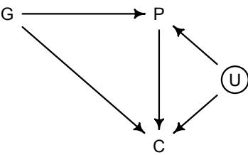
Now P is a common consequence of G and U, so if we condition on P, it will bias inference about G → C, even if we never get to measure U. I don’t expect that fact to be immediately obvious. So let’s crawl through a quantitative example.
First, let’s simulate 200 triads of grandparents, parents, and children. This simulation will be simple. We’ll just project our DAG as a series of implied functional relationships. The DAG above implies that:
- P is some function of G and U
- C is some function of G, P, and U
- G and U are not functions of any other known variables
We can make these implications into a simple simulation, using rnorm to generate simulated observations. But to do this, we need to be a bit more precise than “some function of.” So I’ll invent some strength of association:
R code
 6.25 N <- 200 # number of grandparent-parent-child triads
       b_GP <- 1 # direct effect of G on P
       b_GC <- 0 # direct effect of G on C
       b_PC <- 1 # direct effect of P on C
       b_U <- 2 # direct effect of U on P and C
These parameters are like slopes in a regression model. Notice that I’ve assumed that grandparents G have zero effect on their grandkids C. The example doesn’t depend upon that effect being exactly zero, but it will make the lesson clearer. Now we use these slopes to draw random observations:
6.26 set.seed(1)
U <- 2*rbern( N , 0.5 ) - 1
G <- rnorm( N )
P <- rnorm( N , b_GP*G + b_U*U )
C <- rnorm( N , b_PC*P + b_GC*G + b_U*U )
d <- data.frame( C=C , P=P , G=G , U=U )
I’ve made the neighborhood effect, U, binary. This will make the example easier to understand. But the example doesn’t depend upon that assumption. The other lines are just linear models embedded in rnorm.
Now what happens when we try to infer the influence of grandparents? Since some of the total effect of grandparents passes through parents, we realize we need to control for parents. Here is a simple regression of C on P and G. Normally I would advise standardizing the variables, because it makes establishing sensible priors a lot easier. But I’m going to keep the simulated data on its original scale, so you can see what happens to inference about the slopes above. If we changed the scale, we shouldn’t expect to get those values back. But if we leave the scale alone, we should be able to recover something close to those values. So I apologize for using vague priors here, just to push forward in the example.
6.27 m6.11 <- quap(
   alist(
      C ~ dnorm( mu , sigma ),
      mu <- a + b_PC*P + b_GC*G,
      a ~ dnorm( 0 , 1 ),
      c(b_PC,b_GC) ~ dnorm( 0 , 1 ),
      sigma ~ dexp( 1 )
   ), data=d )
precis(m6.11)
mean sd 5.5% 94.5% a -0.12 0.10 -0.28 0.04 b_PC 1.79 0.04 1.72 1.86 b_GC -0.84 0.11 -1.01 -0.67 sigma 1.41 0.07 1.30 1.52
The inferred effect of parents looks too big, almost twice as large as it should be. That isn’t surprising. Some of the correlation between P and C is due to U, and the model doesn’t know about U. That’s a simple confound. More surprising is that the model is confident that the direct effect of grandparents is to hurt their grandkids. The regression is not wrong. But a causal interpretation of that association would be.
How does collider bias arise in this case? Consider Figure 6.5. Note that I did standardize the variables to make this plot. So the units on the axes are standard deviations. The horizontal axis is grandparent education. The vertical is grandchild education. There are two clouds of points. The blue cloud comprises children who live in good neighborhoods
R code
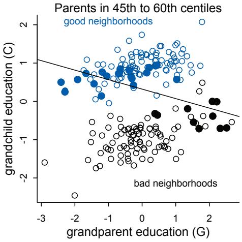
Figure 6.5. Unobserved confounds and collider bias. In this example, grandparents influence grandkids only indirectly, through parents. However, unobserved neighborhood effects on parents and their children create the illusion that grandparents harm their grandkids education. Parental education is a collider: Once we condition on it, grandparental education becomes negatively associated with grandchild education.
(U = 1). The black cloud comprises children who live in bad neighborhoods (U = −1). Notice that both clouds of points show positive associations between G and C. More educated grandparents have more educated grandkids, but this effect arises entirely through parents. Why? Because we assumed it is so. The direct effect of G in the simulation is zero.
So how does the negative association arise, when we condition on parents? Conditioning on parents is like looking within sub-populations of parents with similar education. So let’s try that. In Figure 6.5, I’ve highlighted in filled points those parents between the 45th and 60th centiles of education. There is nothing special of this range. It just makes the phenomenon easier to see. Now if we draw a regression line through only these points, regressing C on G, the slope is negative. There is the negative association that our multiple regression finds. But why does it exist?
It exists because, once we know P, learning G invisibly tells us about the neighborhood U, and U is associated with the outcome C. I know this is confusing. As I keep saying, if you are confused, it is only because you are paying attention. So consider two different parents with the same education level, say for example at the median 50th centile. One of these parents has a highly educated grandparent. The other has a poorly educated grandparent. The only probable way, in this example, for these parents to have the same education is if they live in different types of neighborhoods. We can’t see these neighborhood effects—we haven’t measured them, recall—but the influence of neighborhood is still transmitted to the children C. So for our mythical two parents with the same education, the one with the highly educated grandparent ends up with a less well educated child. The one with the less educated grandparent ends up with the better educated child. G predicts lower C.
The unmeasured U makes P a collider, and conditioning on P produces collider bias. So what can we do about this? You have to measure U. Here’s the regression that conditions also on U:
R code
 6.28 m6.12 <- quap(
           alist(
               C ~ dnorm( mu , sigma ),
               mu <- a + b_PC*P + b_GC*G + b_U*U,
               a ~ dnorm( 0 , 1 ),
c(b_PC,b_GC,b_U) ~ dnorm( 0 , 1 ),
sigma ~ dexp( 1 )
), data=d )
precis(m6.12)mean sd 5.5% 94.5%
a -0.12 0.07 -0.24 -0.01
b_PC 1.01 0.07 0.91 1.12
b_GC -0.04 0.10 -0.20 0.11
b_U 2.00 0.15 1.76 2.23
sigma 1.02 0.05 0.94 1.10And those are the slopes we simulated with.
Rethinking: Statistical paradoxes and causal explanations. The grandparents example serves as an example of Simpson’s paradox: Including another predictor (P in this case) can reverse the direction of association between some other predictor (G) and the outcome (C). Usually, Simpson’s paradox is presented in cases where adding the new predictor helps us. But in this case, it misleads us. Simpson’s paradox is a statistical phenomenon. To know whether the reversal of the association correctly reflects causation, we need something more than just a statistical model.94
6.4. Confronting confounding
In this chapter and in the previous one, there have been several examples of how we can use multiple regression to deal with confounding. But we have also seen how multiple regression can cause confounding—controlling for the wrong variables ruins inference. Hopefully I have succeeded in scaring you away from just adding everything to a model and hoping regression will sort it out, as well as inspired you to believe that effective inference is possible, if we are careful enough and knowledgable enough.
But which principles explain why sometimes leaving out variables and sometimes adding them can produce the same phenomenon? Are there other causal monsters lurking out there, haunting our graphs? We need some principles to pull these examples together.
Let’s define confounding as any context in which the association between an outcome Y and a predictor of interest X is not the same as it would be, if we had experimentally determined the values of X. 95 For example, suppose we are interested in the association between education E and wages W. The problem is that in a typical population there are many unobserved variables U that influence both E and W. Examples include where a person lives, who their parents are, and who their friends are. This is what the DAG looks like:
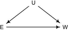
If we regress W on E, the estimate of the causal effect will be confounded by U. It is confounded, because there are two paths connecting E and W: (1) E → W and (2) E ← U → W. A “path” here just means any series of variables you could walk through to get from one variable to another, ignoring the directions of the arrows. Both of these paths create a statistical association between E and W. But only the first path is causal. The second path is non-causal.
Why? Because if only the second path existed, and we changed E, it would not change W. Any causal influence of E on W operates only on the first path.
How can we isolate the causal path? The most famous solution is to run an experiment. If we could assign education levels at random, it changes the graph:
Manipulation removes the influence of U on E. The unobserved variables do not influence education when we ourselves determine education. With the influence of U removed from E, this then removes the path E ← U → W. It blocks the second path. Once the path is blocked, there is only one way for information to go between E and W, and then measuring the association between E and W would yield a useful measure of causal influence. Manipulation removes the confounding, because it blocks the other path between E and W.
Luckily, there are statistical ways to achieve the same result, without actually manipulating E. How? The most obvious is to add U to the model, to condition on U. Why does this also remove the confounding? Because it also blocks the flow of information between E and W through U. It blocks the second path.
To understand why conditioning on U blocks the path E ← U → W, think of this path in isolation, as a complete model. Once you learn U, also learning E will give you no additional information about W. Suppose for example that U is the average wealth in a region. Regions with high wealth have better schools, resulting in more education E, as well as better paying jobs, resulting in higher wages W. If you don’t know the region a person lives in, learning the person’s education E will provide information about their wages W, because E and W are correlated across regions. But after you learn which region a person lives in, assuming there is no other path between E and W, then learning E tells you nothing more about W. This is the sense in which conditioning on U blocks the path—it makes E and W independent, conditional on U.
6.4.1. Shutting the backdoor. Blocking confounding paths between some predictor X and some outcome Y is known as shutting the backdoor. We don’t want any spurious association sneaking in through a non-causal path that enters the back of the predictor X. In the example above, the path E ← U → W is a backdoor path, because it enters E with an arrow and also connects E to W. This path is non-causal—intervening on E will not cause a change in W through this path—but it still produces an association between E and W.
Now for some good news. Given a causal DAG, it is always possible to say which, if any, variables one must control for in order to shut all the backdoor paths. It is also possible to say which variables one must not control for, in order to avoid making new confounds. And some more good news—there are only four types of variable relations that combine to form all possible paths. So you really only need to understand four things and how information flows in each of them. I’ll define the four types of relations. Then we’ll work some examples.
Figure 6.6 shows DAGs for each elemental relation. Every DAG, no matter how big and complicated, is built out of these four relations. Let’s consider each, going left to right.
- The first type of relation is the one we worked with just above, a fork: X ← Z → Y. This is the classic confounder. In a fork, some variable Z is a common cause of X
Figure 6.6. The four elemental confounds. Any directed acyclic graph is built from these elementary relationships. From left to right: X ⊥⊥ Y|Z in both the Fork and the Pipe, X ̸⊥⊥ Y|Z in the Collider, and conditioning on the Descendent D is like conditioning on its parent Z.
and Y, generating a correlation between them. If we condition on Z, then learning X tells us nothing about Y. X and Y are independent, conditional on Z.
- The second type of relation is a pipe: X → Z → Y. We saw this when we discussed the plant growth example and post-treatment bias: The treatment X influences fungus Z which influences growth Y. If we condition on Z now, we also block the path from X to Y. So in both a fork and a pipe, conditioning of the middle variable blocks the path.
- The third type of relation is a collider: X → Z ← Y. You met colliders earlier in this chapter. Unlike the other two types of relations, in a collider there is no association between X and Y unless you condition on Z. Conditioning on Z, the collider variable, opens the path. Once the path is open, information flows between X and Y. However neither X nor Y has any causal influence on the other.
- The fourth relation is the descendent. A descendent is a variable influenced by another variable. Conditioning on a descendent partly conditions on its parent. In the far right DAG in Figure 6.6, conditioning on D will also condition, to a lesser extent, on Z. The reason is that D has some information about Z. In this example, this will partially open the path from X to Y, because Z is a collider. But in general the consequence of conditioning on a descendent depends upon the nature of its parent. Descendants are common, because often we cannot measure a variable directly and instead have only some proxy for it.
No matter how complicated a causal DAG appears, it is always built out of these four types of relations. And since you know how to open and close each, you (or your computer) can figure out which variables you need to include or not include. Here’s the recipe:
- List all of the paths connecting X (the potential cause of interest) and Y (the outcome).
- Classify each path by whether it is open or closed. A path is open unless it contains a collider.
- Classify each path by whether it is a backdoor path. A backdoor path has an arrow entering X.
- If there are any open backdoor paths, decide which variable(s) to condition on to close it (if possible).
Let’s consider some examples.
6.4.2. Two roads. The DAG below contains an exposure of interestX, an outcome of interest Y, an unobserved variable U, and three observed covariates (A, B, and C).
We are interested in the X → Y path, the causal effect of X on Y. Which of the observed covariates do we need to add to the model, in order to correctly infer it? To figure this out, look for backdoor paths. Aside from the direct path, there are two paths from X to Y:
- X ← U ← A → C → Y
- X ← U → B ← C → Y
These are both backdoor paths that could confound inference. Now ask which of these paths is open. If a backdoor path is open, then we must close it. If a backdoor path is closed already, then we must not accidentally open it and create a confound.
Consider the first path, passing through A. This path is open, because there is no collider within it. There is just a fork at the top and two pipes, one on each side. Information will flow through this path, confounding X → Y. It is a backdoor. To shut this backdoor, we need to condition on one of its variables. We can’t condition on U, since it is unobserved. That leaves A or C. Either will shut the backdoor. You can ask your computer to reproduce this analysis, to analyze the graph and find the necessary variables to control for in order to block the backdoor. The dagitty R package provides adjustmentSets for this purpose:
R code
 6.29 library(dagitty)
       dag_6.1 <- dagitty( "dag {
           U [unobserved]
           X -> Y
           X <- U <- A -> C -> Y
           U -> B <- C
       }")
       adjustmentSets( dag_6.1 , exposure="X" , outcome="Y" )
{ C } { A }
Conditioning on either C or A would suffice. Conditioning on C is the better idea, from the perspective of efficiency, since it could also help with the precision of the estimate of X → Y. Notice that conditioning on U would also work. But since we told dagitty that U is unobserved (see the code above), it didn’t suggest it in the adjustment sets.
Now consider the second path, passing through B. This path does contain a collider, U → B ← C. It is therefore already closed. That is why adjustmentSets above did not mention B. In fact, if we do condition on B, it will open the path, creating a confound. Then our inference about X → Y will change, but without the DAG, we won’t know whether that change is helping us or rather misleading us. The fact that including a variable changes the X → Y coefficient does not always mean that the coefficient is better now. You could have just conditioned on a collider.
6.4.3. Backdoor waffles. As a final example, let’s return to the Waffle House and divorce rate correlation from the introduction to Chapter 5. We’ll make a DAG, use it to find a minimal set of covariates, and use it as well to derive the testable implications of the DAG. This is important, because sometimes you really can test whether your DAG is consistent with the evidence. The data alone can never tell us when a DAG is right. But the data can tell us when a DAG is wrong.
We’re interested in the total causal effect of the number of Waffle Houses on divorce rate in each State. Presumably, the naive correlation between these two variables is spurious. What is the minimal adjustment set that will block backdoor paths from Waffle House to divorce? Let’s make a graph:
In this graph, S is whether or not a State is in the southern United States, A is median age at marriage, M is marriage rate, W is number of Waffle Houses, and D is divorce rate. This graph assumes that southern States have lower ages of marriage (S → A), higher rates of marriage both directly (S → M) and mediated through age of marriage (S → A → M), as well as more waffles (S → W). Age of marriage and marriage rate both influence divorce.
There are three open backdoor paths between W and D. Just trace backwards, starting at W and ending up at D. But notice that all of them pass first through S. So we can close them all by conditioning on S. That’s all there is to it. Your computer can confirm this answer:
6.30 library(dagitty)
dag_6.2 <- dagitty( "dag {
   A -> D
   A -> M -> D
   A <- S -> M
   S -> W -> D
}")
adjustmentSets( dag_6.2 , exposure="W" , outcome="D" )
{ A, M } { S }
We could control for either A and M or for S alone.
This DAG is obviously not satisfactory—it assumes there are no unobserved confounds, which is very unlikely for this sort of data. But we can still learn something by analyzing it. While the data cannot tell us whether a graph is correct, it can sometimes suggest how a graph is wrong. Earlier, we discussed conditional independencies, which are some of a model’s testable implications. Conditional independencies are pairs of variables that are not associated, once we condition on some set of other variables. By inspecting these implied conditional independencies, we can at least test some of the features of a graph.
Now that you know the elemental confounds, you are ready to derive any DAG’s conditional independencies on your own. You can find conditional independencies using the same path logic you learned for finding and closing backdoors. You just have to focus on a
pair of variables, find all paths connecting them, and figure out if there is any set of variables you could condition on to close them all. In a large graph, this is quite a chore, because there are many pairs of variables and possibly many paths. But your computer is good at such chores. In this case, there are three implied conditional independencies:
R code 6.31 impliedConditionalIndependencies( dag_6.2 )
A _||_ W | S D _||_ S | A, M, W M _||_ W | S
Read the first as “median age of marriage should be independent of (_||_) Waffle Houses, conditioning on (|) a State being in the south.” In the second, divorce and being in the south should be independent when we simultaneously condition on all of median age of marriage, marriage rate, and Waffle Houses. Finally, marriage rate and Waffle Houses should be independent, conditioning on being in the south.
In the practice problems at the end of this chapter, I’ll ask you to evaluate these implications, as well as try to assess the causal influence of Waffle Houses on divorce.
Rethinking: DAGs are not enough. If you don’t have a real, mechanistic model of your system, DAGs are fantastic tools. They make assumptions transparent and easier to critique. And if nothing else, they highlight the danger of using multiple regression as a substitute for theory. But DAGs are not a destination. Once you have a dynamical model of your system, you don’t need a DAG. In fact, many dynamical systems have complex behavior that is sensitive to initial conditions, and so cannot be usefully represented by DAGs.96 But these models can still be analyzed and causal interventions designed from them. In fact, domain specific structural causal models can make causal inference possible even when a DAG with the same structure cannot decide how to proceed. Additional assumptions, when accurate, give us power.
The fact that DAGs are not useful for everything is no argument against them. All theory tools have limitations. I have yet to see a better tool than DAGs for teaching the foundations of and obstacles to causal inference. And general tools like DAGs have added value in abstracting away from specific details and teaching us general principles. For example, DAGs clarify why experiments work and highlight threats to experiments like differential measurement error (Chapter 15).
Overthinking: A smooth operator. To define confounding with precise notation, we need to adopt something called the do-operator. 97 Confounding occurs when:
\[\Pr(Y|X) \neq \Pr(Y|\text{do}(X))\]
That do(X) means to cut all of the backdoor paths into X, as if we did a manipulative experiment. The do-operator changes the graph, closing the backdoors. The do-operator defines a causal relationship, because Pr(Y|do(X)) tells us the expected result of manipulating X on Y, given a causal graph. We might say that some variable X is a cause of Y when Pr(Y|do(X)) ≠ Pr(Y|do(not-X)). The ordinary conditional probability comparison, Pr(Y|X) ≠ Pr(Y|not-X), is not the same. It does not close the backdoor. Note that what the do-operator gives you is not just the direct causal effect. It is the total causal effect through all forward paths. To get a direct causal effect, you might have to close more doors. The do-operator can also be used to derive causal inference strategies even when some back doors cannot be closed. We’ll look at one example in a later chapter.
6.5. Summary
Multiple regression is no oracle, but only a golem. It is logical, but the relationships it describes are conditional associations, not causal influences. Therefore additional information, from outside the model, is needed to make sense of it. This chapter presented introductory examples of some common frustrations: multicollinearity, post-treatment bias, and collider bias. Solutions to these frustrations can be organized under a coherent framework in which hypothetical causal relations among variables are analyzed to cope with confounding. In all cases, causal models exist outside the statistical model and can be difficult to test. However, it is possible to reach valid causal inferences in the absence of experiments. This is good news, because we often cannot perform experiments, both for practical and ethical reasons.
6.6. Practice
Problems are labeled Easy (E), Medium (M), and Hard (H).
6E1. List three mechanisms by which multiple regression can produce false inferences about causal effects.
6E2. For one of the mechanisms in the previous problem, provide an example of your choice, perhaps from your own research.
6E3. List the four elemental confounds. Can you explain the conditional dependencies of each?
6E4. How is a biased sample like conditioning on a collider? Think of the example at the open of the chapter.
6M1. Modify the DAG on page 186 to include the variable V, an unobserved cause of C and Y: C ← V → Y. Reanalyze the DAG. How many paths connect X to Y? Which must be closed? Which variables should you condition on now?
6M2. Sometimes, in order to avoid multicollinearity, people inspect pairwise correlations among predictors before including them in a model. This is a bad procedure, because what matters is the conditional association, not the association before the variables are included in the model. To highlight this, consider the DAG X → Z → Y. Simulate data from this DAG so that the correlation between X and Z is very large. Then include both in a model prediction Y. Do you observe any multicollinearity? Why or why not? What is different from the legs example in the chapter?
6M3. Learning to analyze DAGs requires practice. For each of the four DAGs below, state which variables, if any, you must adjust for (condition on) to estimate the total causal influence of X on Y.
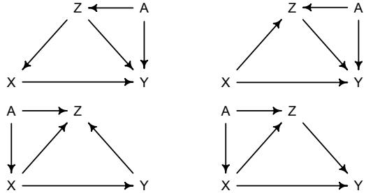
6H1. Use the Waffle House data, data(WaffleDivorce), to find the total causal influence of number of Waffle Houses on divorce rate. Justify your model or models with a causal graph.
6H2. Build a series of models to test the implied conditional independencies of the causal graph you used in the previous problem. If any of the tests fail, how do you think the graph needs to be amended? Does the graph need more or fewer arrows? Feel free to nominate variables that aren’t in the data.
All three problems below are based on the same data. The data in data(foxes) are 116 foxes from 30 different urban groups in England. These foxes are like street gangs. Group size varies from 2 to 8 individuals. Each group maintains its own urban territory. Some territories are larger than others. The area variable encodes this information. Some territories also have more avgfood than others. We want to model the weight of each fox. For the problems below, assume the following DAG:
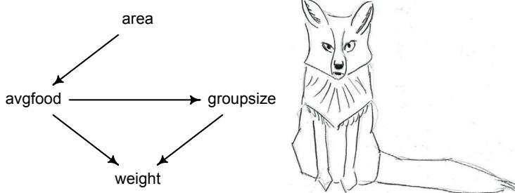
6H3. Use a model to infer the total causal influence of area on weight. Would increasing the area available to each fox make it heavier (healthier)? You might want to standardize the variables. Regardless, use prior predictive simulation to show that your model’s prior predictions stay within the possible outcome range.
6H4. Now infer the causal impact of adding food to a territory. Would this make foxes heavier? Which covariates do you need to adjust for to estimate the total causal influence of food?
6H5. Now infer the causal impact of group size. Which covariates do you need to adjust for? Looking at the posterior distribution of the resulting model, what do you think explains these data? That is, can you explain the estimates for all three problems? How do they go together?
6H6. Consider your own research question. Draw a DAG to represent it. What are the testable implications of your DAG? Are there any variables you could condition on to close all backdoor paths? Are there unobserved variables that you have omitted? Would a reasonable colleague imagine additional threats to causal inference that you have ignored?
6H7. For the DAG you made in the previous problem, can you write a data generating simulation for it? Can you design one or more statistical models to produce causal estimates? If so, try to calculate interesting counterfactuals. If not, use the simulation to estimate the size of the bias you might expect. Under what conditions would you, for example, infer the opposite of a true causal effect?
7 Ulysses’ Compass
Mikołaj Kopernik (also known as Nicolaus Copernicus, 1473–1543): Polish astronomer, ecclesiastical lawyer, and blasphemer. Famous for his heliocentric model of the solar system, Kopernik argued for replacing the geocentric model, because the heliocentric model was more “harmonious.” This position eventually lead (decades later) to Galileo’s famous disharmony with, and trial by, the Church.
This story has become a fable of science’s triumph over ideology and superstition. But Kopernik’s justification looks poor to us now, ideology aside. There are two problems: The model was neither particularly harmonious nor more accurate than the geocentric model. The Copernican model was very complicated. In fact, it had similar epicycle clutter as the Ptolemaic model (Figure 7.1). Kopernik had moved the Sun to the center, but since he still used perfect circles for orbits, he still needed epicycles. And so “harmony” doesn’t quite describe the model’s appearance. Just like the Ptolemaic model, the Kopernikan model was effectively a Fourier series, a means of approximating periodic functions. This leads to the second problem: The heliocentric model made exactly the same predictions as the geocentric model. Equivalent approximations can be constructed whether the Earth is stationary or rather moving. So there was no reason to prefer it on the basis of accuracy alone.
Kopernik didn’t appeal just to some vague harmony, though. He also argued for the superiority of his model on the basis of needing fewer causes: “We thus follow Nature, who producing nothing in vain or superfluous often prefers to endow one cause with many effects.”98 And it was true that a heliocentric model required fewer circles and epicycles to make the same predictions as a geocentric model. In this sense, it was simpler.
Scholars often prefer simpler theories. This preference is sometimes vague—a kind of aesthetic preference. Other times we retreat to pragmatism, preferring simpler theories because their simpler models are easier to work with. Frequently, scientists cite a loose principle known as Ockham’s razor: Models with fewer assumptions are to be preferred. In the case of Kopernik and Ptolemy, the razor makes a clear recommendation. It cannot guarantee that Kopernik was right (he wasn’t, after all), but since the heliocentric and geocentric models make the same predictions, at least the razor offers a clear resolution to the dilemma. But the razor can be hard to use more generally, because usually we must choose among models that differ in both their accuracy and their simplicity. How are we to trade these different criteria against one another? The razor offers no guidance.
This chapter describes some of the most commonly used tools for coping with this tradeoff. Some notion of simplicity usually features in all of these tools, and so each is commonly compared to Ockham’s razor. But each tool is equally about improving predictive accuracy. So they are not like the razor, because they explicitly trade-off accuracy and simplicity.
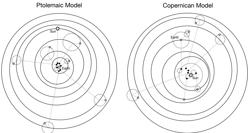
Figure 7.1. Ptolemaic (left) and Copernican (right) models of the solar system. Both models use epicycles (circles on circles), and both models produce exactly the same predictions. However, the Copernican model requires fewer circles. (Not all Ptolemaic epicycles are visible in the figure.)
So instead of Ockham’s razor, think of Ulysses’ compass. Ulysses was the hero of Homer’s Odyssey. During his voyage, Ulysses had to navigate a narrow straight between the manyheaded beast Scylla—who attacked from a cliff face and gobbled up sailors—and the sea monster Charybdis—who pulled boats and men down to a watery grave. Passing too close to either meant disaster. In the context of scientific models, you can think of these monsters as representing two fundamental kinds of statistical error:
- The many-headed beast of overfitting, which leads to poor prediction by learning too much from the data
- The whirlpool of underfitting, which leads to poor prediction by learning too little from the data
There is a third monster, the one you met in previous chapters—confounding. In this chapter you’ll see that confounded models can in fact produce better predictions than models that correctly measure a causal relationship. The consequence of this is that, when we design any particular statistical model, we must decide whether we want to understand causes or rather just predict. These are not the same goal, and different models are needed for each. However, to accurately measure a causal influence, we still have to deal with overfitting. The monsters of overfitting and underfitting are always lurking, no matter the goal.
Our job is to carefully navigate among these monsters. There are two common families of approaches. The first approach is to use a regularizing prior to tell the model not to get too excited by the data. This is the same device that non-Bayesian methods refer to as “penalized likelihood.” The second approach is to use some scoring device, like information criteria or cross-validation, to model the prediction task and estimate predictive accuracy. Both families of approaches are routinely used in the natural and social sciences. Furthermore, they can be—maybe should be—used in combination. So it’s worth understanding both, as you’re going to need both at some point.
In order to introduce information criteria, this chapter must also introduce information theory. If this is your first encounter with information theory, it’ll probably seem strange. But some understanding of it is needed. Once you start using information criteria this chapter describes AIC, DIC, WAIC, and PSIS—you’ll find that implementing them is much easier than understanding them. This is their curse. So most of this chapter aims to fight the curse, focusing on their conceptual foundations, with applications to follow.
It’s worth noting, before getting started, that this material is hard. If you find yourself confused at any point, you are normal. Any sense of confusion you feel is just your brain correctly calibrating to the subject matter. Over time, confusion is replaced by comprehension for how overfitting, regularization, and information criteria behave in familiar contexts.
Rethinking: Stargazing. The most common form of model selection among practicing scientists is to search for a model in which every coefficient is statistically significant. Statisticians sometimes call this stargazing, as it is embodied by scanning for asterisks (**) trailing after estimates. A colleague of mine once called this approach the “Space Odyssey,” in honor of A. C. Clarke’s novel and film. The model that is full of stars, the thinking goes, is best.
But such a model is not best. Whatever you think about null hypothesis significance testing in general, using it to select among structurally different models is a mistake—p-values are not designed to help you navigate between underfitting and overfitting. As you’ll see once you start using AIC and related measures, predictor variables that improve prediction are not always statistically significant. It is also possible for variables that are statistically significant to do nothing useful for prediction. Since the conventional 5% threshold is purely conventional, we shouldn’t expect it to optimize anything.
Rethinking: Is AIC Bayesian? AIC is not usually thought of as a Bayesian tool. There are both historical and statistical reasons for this. Historically, AIC was originally derived without reference to Bayesian probability. Statistically, AIC uses MAP estimates instead of the entire posterior, and it requires flat priors. So it doesn’t look particularly Bayesian. Reinforcing this impression is the existence of another model comparison metric, the Bayesian information criterion (BIC). However, BIC also requires flat priors and MAP estimates, although it’s not actually an “information criterion.”
Regardless, AIC has a clear and pragmatic interpretation under Bayesian probability, and Akaike and others have long argued for alternative Bayesian justifications of the procedure.99 And as you’ll see later in the book, more obviously Bayesian information criteria like WAIC provide almost exactly the same results as AIC, when AIC’s assumptions are met. In this light, we can fairly regard AIC as a special limit of a Bayesian criterion like WAIC, even if that isn’t how AIC was originally derived. All of this is an example of a common feature of statistical procedures: The same procedure can be derived and justified from multiple, sometimes philosophically incompatible, perspectives.
7.1. The problem with parameters
In the previous chapters, we saw how adding variables and parameters to a model can help to reveal hidden effects and improve estimates. You also saw that adding variables can hurt, in particular when we lack a trusted causal model. Colliders are real. But sometimes we don’t care about causal inference. Maybe we just want to make good predictions. Consider for example the grandparent-parent-child example from the previous chapter. Just adding all the variables to the model will give us a good predictive model in that case. That we don’t understand what is going on is irrelevant. So is just adding everything to the model okay?
The answer is “no.” There are two related problems with just adding variables. The first is that adding parameters—making the model more complex—nearly always improves the fit of a model to the data.100 By “fit” I mean a measure of how well the model can retrodict the data used to fit the model. There are many such measures, each with its own foibles. In the context of linear Gaussian models, R 2 is the most common measure of this kind. Often described as “variance explained,” R 2 is defined as:
\[R^2 = \frac{\text{var}(\text{outcome}) - \text{var}(\text{residuals})}{\text{var}(\text{outcome})} = 1 - \frac{\text{var}(\text{residuals})}{\text{var}(\text{outcome})}\]
Being easy to compute, R 2 is popular. Like other measures of fit to sample, R 2 increases as more predictor variables are added. This is true even when the variables you add to a model are just random numbers, with no relation to the outcome. So it’s no good to choose among models using only fit to the data.
Second, while more complex models fit the data better, they often predict new data worse. Models that have many parameters tend to overfit more than simpler models. This means that a complex model will be very sensitive to the exact sample used to fit it, leading to potentially large mistakes when future data is not exactly like the past data. But simple models, with too few parameters, tend instead to underfit, systematically over-predicting or under-predicting the data, regardless of how well future data resemble past data. So we can’t always favor either simple models or complex models.
Let’s examine both of these issues in the context of a simple example.
7.1.1. More parameters (almost) always improve fit. Overfitting occurs when a model learns too much from the sample. What this means is that there are both regular and irregular features in every sample. The regular features are the targets of our learning, because they generalize well or answer a question of interest. Regular features are useful, given an objective of our choice. The irregular features are instead aspects of the data that do not generalize and so may mislead us.
Overfitting happens automatically, unfortunately. In the kind of statistical models we’ve seen so far in this book, adding additional parameters will always improve the fit of a model to the sample. Later in the book, beginning with Chapter 13, you’ll meet models for which adding parameters does not necessarily improve fit to the sample, but may well improve predictive accuracy.
Here’s an example of overfitting. The data displayed in Figure 7.2 are average brain volumes and body masses for seven hominin species.101 Let’s get these data into R, so you can work with them. I’m going to build these data from direct input, rather than loading a pre-made data frame, just so you see an example of how to build a data frame from scratch.
R code
7.1 sppnames <- c( "afarensis","africanus","habilis","boisei",
        "rudolfensis","ergaster","sapiens")
    brainvolcc <- c( 438 , 452 , 612, 521, 752, 871, 1350 )
    masskg <- c( 37.0 , 35.5 , 34.5 , 41.5 , 55.5 , 61.0 , 53.5 )
    d <- data.frame( species=sppnames , brain=brainvolcc , mass=masskg )
Now you have a data frame, d, containing the brain size and body size values. It’s not unusual for data like this to be highly correlated—brain size is correlated with body size, across species. A standing question, however, is to what extent particular species have brains that are larger than we’d expect, after taking body size into account. A common solution is to fit a linear regression that models brain size as a linear function of body size. Then the remaining
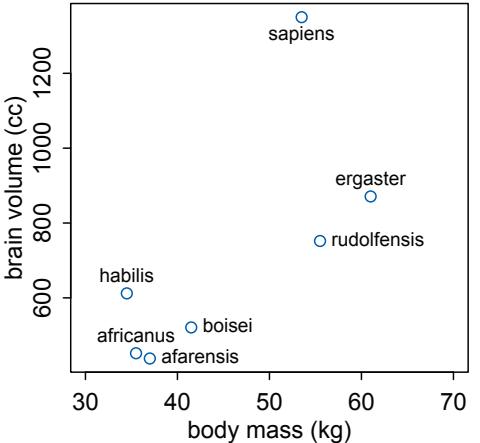
Figure 7.2. Average brain volume in cubic centimeters against body mass in kilograms, for six hominin species. What model best describes the relationship between brain size and body size?
variation in brain size can be modeled as a function of other variables, like ecology or diet. This is the same “statistical control” strategy explained in previous chapters.
Controlling for body size, however, depends upon having a good functional mapping of the association between body size and brain size. We’ve just used linear functions so far. But why use a line to relate body size to brain size? It’s not clear why nature demands that the relationship among species be a straight line. Why not consider a curved model, like a parabola? Indeed, why not a cubic function of body size, or even a spline? There’s no reason to suppose a priori that brain size scales only linearly with body size. Indeed, many readers will prefer to model a linear relationship between log brain volume and log body mass (an exponential relationship). But that’s not the direction I’m headed with this example. The lesson here will arise, no matter how we transform the data.
Let’s fit a series of increasingly complex model families and see which function fits the data best. We’ll use polynomial regressions, so review Section 4.5 (page 110) if necessary. Importantly, recall that polynomial regressions are common, but usually a bad idea. In this example, I will show you that they can be a very bad idea when used blindly. But the splines from Chapter 4 will suffer the same basic problem. In the practice problems at the end of the chapter, you will return to this example and try it with splines.
The simplest model that relates brain size to body size is the linear one. It will be the first model we consider. Before writing out the model, let’s rescale the variables. Recall from earlier chapters that rescaling predictor and outcome variables is often helpful in getting the model to fit and in specifying and understanding the priors. In this case, we want to standardize body mass—give it mean zero and standard deviation one—and rescale the outcome, brain volume, so that the largest observed value is 1. Why not standardize brain volume as well? Because we want to preserve zero as a reference point: No brain at all. You can’t have negative brain. I don’t think.
7.2 d$mass_std <- (d$mass - mean(d$mass))/sd(d$mass)
d$brain_std <- d$brain / max(d$brain)
Now here’s the mathematical version of the first linear model. The only trick to note is the log-normal prior on σ. This will make it easier to keep σ positive, as it should be.
bi ∼ Normal(µi
               , σ)
µi = α + βmi
α ∼ Normal(0.5, 1)
β ∼ Normal(0, 10)
σ ∼ Log-Normal(0, 1)
This simply says that the average brain volume bi of species i is a linear function of its body mass mi . Now consider what the priors imply. The prior for α is just centered on the mean brain volume (rescaled) in the data. So it says that the average species with an average body mass has a brain volume with an 89% credible interval from about −1 to 2. That is ridiculously wide and includes impossible (negative) values. The prior for β is very flat and centered on zero. It allows for absurdly large positive and negative relationships. These priors allow for absurd inferences, especially as the model gets more complex. And that’s part of the lesson, so let’s continue to fit the model now:
R code
  7.3 m7.1 <- quap(
           alist(
               brain_std ~ dnorm( mu , exp(log_sigma) ),
               mu <- a + b*mass_std,
               a ~ dnorm( 0.5 , 1 ),
               b ~ dnorm( 0 , 10 ),
               log_sigma ~ dnorm( 0 , 1 )
           ), data=d )
I’ve used exp(log_sigma) in the likelihood, so that the result is always greater than zero.
Rethinking: OLS and Bayesian anti-essentialism. It would be possible to use ordinary least squares (OLS) to get posterior distributions for these brain size models. For example, you could use R’s simple lm function to get the posterior distribution for m6.1. You won’t get a posterior for sigma however.
R code7.4 m7.1_OLS <- lm( brain_std ~ mass_std , data=d )
post <- extract.samples( m7.1_OLS )OLS is not considered a Bayesian algorithm. But as long as the priors are vague, minimizing the sum of squared deviations to the regression line is equivalent to finding the posterior mean. In fact, Carl Friedrich Gauss originally derived the OLS procedure in a Bayesian framework.102 Back then, nearly all probability was Bayesian, although the term “Bayesian” wouldn’t be used much until the twentieth century. In most cases, a non-Bayesian procedure will have an approximate Bayesian interpretation. This fact is powerful in both directions. The Bayesian interpretation of a non-Bayesian procedure recasts assumptions in terms of information, and this can be very useful for understanding why a procedure works. Likewise, a Bayesian model can be embodied in an efficient, but approximate, “non-Bayesian” procedure. Bayesian inference means approximating the posterior distribution. It does not specify how that approximation is done.
Before pausing to plot the posterior distribution, like we did in previous chapters, let’s focus on the R 2 , the proportion of variance “explained” by the model. What is really meant here is that the linear model retrodicts some proportion of the total variation in the outcome data it was fit to. The remaining variation is just the variation of the residuals(page 135).
The point of this example is not to praise R 2 but to bury it. But we still need to compute it before burial. This is thankfully easy. We just compute the posterior predictive distribution for each observation—you did this in earlier chapters with sim. Then we subtract each observation from its prediction to get a residual. Then we need the variance of both these residuals and the outcome variable. This means the actual empirical variance, not the variance that R returns with the var function, which is a frequentist estimator and therefore has the wrong denominator. So we’ll compute variance the old fashioned way: the average squared deviation from the mean. The rethinking package includes a function var2 for this purpose. In principle, the Bayesian approach mandates that we do this for each sample from the posterior. But R 2 is traditionally computed only at the mean prediction. So we’ll do that as well here. Later in the chapter you’ll learn a properly Bayesian score that uses the entire posterior distribution.
7.5 set.seed(12)
s <- sim( m7.1 )
r <- apply(s,2,mean) - d$brain_std
resid_var <- var2(r)
outcome_var <- var2( d$brain_std )
1 - resid_var/outcome_var
[1] 0.4774589
We’ll want to do this for the next several models, so let’s write a function to make it repeatable. If you find yourself writing code more than once, it is usually saner to write a function and call the function more than once instead.
7.6 R2_is_bad <- function( quap_fit ) {
   s <- sim( quap_fit , refresh=0 )
   r <- apply(s,2,mean) - d$brain_std
   1 - var2(r)/var2(d$brain_std)
}
Now for some other models to compare to m7.1. We’ll consider five more models, each more complex than the last. Each of these models will just be a polynomial of higher degree. For example, a second-degree polynomial that relates body size to brain size is a parabola. In math form, it is:
bi ∼ Normal(µi
               , σ)
µi = α + β1mi + β2m
                     2
                     i
α ∼ Normal(0.5, 1)
βj ∼ Normal(0, 10) for j = 1..2
σ ∼ Log-Normal(0, 1)
R code
This model family adds one more parameter, β2, but uses all of the same data as m7.1. To do this model in quap, we can define β as a vector. The only trick required is to tell quap how long that vector is by using a start list:
R code
  7.7 m7.2 <- quap(
           alist(
               brain_std ~ dnorm( mu , exp(log_sigma) ),
               mu <- a + b[1]*mass_std + b[2]*mass_std^2,
               a ~ dnorm( 0.5 , 1 ),
               b ~ dnorm( 0 , 10 ),
               log_sigma ~ dnorm( 0 , 1 )
           ), data=d , start=list(b=rep(0,2)) )
The next four models are constructed in similar fashion. The models m7.3 through m7.6 are just third-degree, fourth-degree, fifth-degree, and sixth-degree polynomials.
R code
  7.8 m7.3 <- quap(
           alist(
               brain_std ~ dnorm( mu , exp(log_sigma) ),
               mu <- a + b[1]*mass_std + b[2]*mass_std^2 +
                          b[3]*mass_std^3,
               a ~ dnorm( 0.5 , 1 ),
               b ~ dnorm( 0 , 10 ),
               log_sigma ~ dnorm( 0 , 1 )
           ), data=d , start=list(b=rep(0,3)) )
       m7.4 <- quap(
           alist(
               brain_std ~ dnorm( mu , exp(log_sigma) ),
               mu <- a + b[1]*mass_std + b[2]*mass_std^2 +
                          b[3]*mass_std^3 + b[4]*mass_std^4,
               a ~ dnorm( 0.5 , 1 ),
               b ~ dnorm( 0 , 10 ),
               log_sigma ~ dnorm( 0 , 1 )
           ), data=d , start=list(b=rep(0,4)) )
       m7.5 <- quap(
           alist(
               brain_std ~ dnorm( mu , exp(log_sigma) ),
               mu <- a + b[1]*mass_std + b[2]*mass_std^2 +
                          b[3]*mass_std^3 + b[4]*mass_std^4 +
                          b[5]*mass_std^5,
               a ~ dnorm( 0.5 , 1 ),
               b ~ dnorm( 0 , 10 ),
               log_sigma ~ dnorm( 0 , 1 )
           ), data=d , start=list(b=rep(0,5)) )
That last model, m7.6, has one trick in it. The standard deviation is replaced with a constant value 0.001. The model will not work otherwise, for a very important reason that will become clear as we plot these monsters. Here’s the last model:
7.9 m7.6 <- quap(
   alist(
      brain_std ~ dnorm( mu , 0.001 ),
      mu <- a + b[1]*mass_std + b[2]*mass_std^2 +
              b[3]*mass_std^3 + b[4]*mass_std^4 +
              b[5]*mass_std^5 + b[6]*mass_std^6,
      a ~ dnorm( 0.5 , 1 ),
      b ~ dnorm( 0 , 10 )
   ), data=d , start=list(b=rep(0,6)) )
Now to plot each model. We’ll follow the steps from earlier chapters: extract samples from the posterior, compute the posterior predictive distribution at each of several locations on the horizontal axis, summarize, and plot. For m7.1:
7.10 post <- extract.samples(m7.1)
mass_seq <- seq( from=min(d$mass_std) , to=max(d$mass_std) , length.out=100 )
l <- link( m7.1 , data=list( mass_std=mass_seq ) )
mu <- apply( l , 2 , mean )
ci <- apply( l , 2 , PI )
plot( brain_std ~ mass_std , data=d )
lines( mass_seq , mu )
shade( ci , mass_seq )
I show this plot and all the others, with some cosmetic improvements (see brain_plot for the code), in Figure 7.3. Each plot also displays R 2 . As the degree of the polynomial defining the mean increases, the R 2 always improves, indicating better retrodiction of the data. The fifth-degree polynomial has an R 2 value of 0.99. It almost passes exactly through each point. The sixth-degree polynomial actually does pass through every point, and it has no residual variance. It’s a perfect fit, R 2 = 1. That is why we had to fix the sigma value—if it were estimated, it would shrink to zero, because the residual variance is zero when the line passes right through the center of each point.
However, you can see from looking at the paths of the predicted means that the higherdegree polynomials are increasingly absurd. This absurdity is seen most easily in Figure 7.3, m7.6, the most complex model. The fit is perfect, but the model is ridiculous. Notice that there is a gap in the body mass data, because there are no fossil hominins with body mass between 55 kg and about 60 kg. In this region, the predicted mean brain size from the highdegree polynomial models has nothing to predict, and so the models pay no price for swinging around wildly in this interval. The swing is so extreme that I had to extend the range of the vertical axis to display the depth at which the predicted mean finally turns back around. At around 58 kg, the model predicts a negative brain size! The model pays no price (yet) for this absurdity, because there are no cases in the data with body mass near 58 kg.
Why does the sixth-degree polynomial fit perfectly? Because it has enough parameters to assign one to each point of data. The model’s equation for the mean has 7 parameters:
\[ \mu\_i = \alpha + \beta\_1 \mathfrak{m}\_i + \beta\_2 \mathfrak{m}\_i^2 + \beta\_3 \mathfrak{m}\_i^3 + \beta\_4 \mathfrak{m}\_i^4 + \beta\_5 \mathfrak{m}\_i^5 + \beta\_6 \mathfrak{m}\_i^6 \]
and there are 7 species to predict brain sizes for. So effectively, this model assigns a unique parameter to reiterate each observed brain size. This is a general phenomenon: If you adopt R code
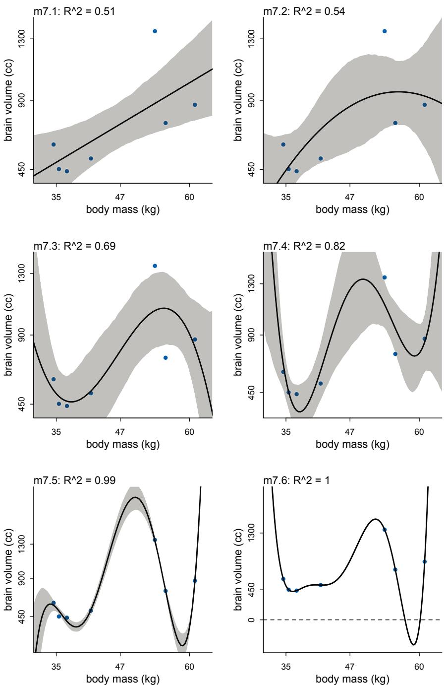
Figure 7.3. Polynomial linear models of increasing degree for the hominin data. Each plot shows the posterior mean in black, with 89% interval of the mean shaded. R 2 is displayed above each plot. In order from top-left: First-degree polynomial, second-degree, third-degree, fourth-degree, fifthdegree, and sixth-degree.
a model family with enough parameters, you can fit the data exactly. But such a model will make rather absurd predictions for yet-to-be-observed cases.
Rethinking: Model fitting as compression. Another perspective on the absurd model just above is to consider that model fitting can be considered a form of data compression. Parameters summarize relationships among the data. These summaries compress the data into a simpler form, although with loss of information (“lossy” compression) about the sample. The parameters can then be used to generate new data, effectively decompressing the data.
When a model has a parameter to correspond to each datum, such as m7.6, then there is actually no compression. The model just encodes the raw data in a different form, using parameters instead. As a result, we learn nothing about the data from such a model. Learning about the data requires using a simpler model that achieves some compression, but not too much. This view of model selection is often known as Minimum Description Length (MDL).103
7.1.2. Too few parameters hurts, too. The overfit polynomial models fit the data extremely well, but they suffer for this within-sample accuracy by making nonsensical out-of-sample predictions. In contrast, underfitting produces models that are inaccurate both within and out of sample. They learn too little, failing to recover regular features of the sample.
Another way to conceptualize an underfit model is to notice that it is insensitive to the sample. We could remove any one point from the sample and get almost the same regression line. In contrast, the most complex model, m7.6, is very sensitive to the sample. If we removed any one point, the mean would change a lot. You can see this sensitivity in Figure 7.4. In both plots what I’ve done is drop each row of the data, one at a time, and re-derive the posterior distribution. On the left, each line is a first-degree polynomial, m7.1, fit to one of the seven possible sets of data constructed from dropping one row. The curves on the right are instead different fourth-order polynomials, m7.4. Notice that the straight lines hardly vary, while the curves fly about wildly. This is a general contrast between underfit and overfit models: sensitivity to the exact composition of the sample used to fit the model.
Overthinking: Dropping rows. The calculations needed to produce Figure 7.4 are made easy by a trick of R’s index notation. To drop a row i from a data frame d, just use:
7.11 d_minus_i <- d[ -i , ]
This means drop the i-th row and keep all of the columns. Repeating the regression is then just a matter of looping over the rows. Look inside the function brain_loo_plot in the rethinking package to see how the figure was drawn and explore other models.
Rethinking: Bias and variance. The underfitting/overfitting dichotomy is often described as the bias-variance trade-off. 104 While not exactly the same distinction, the bias-variance trade-off addresses the same problem. “Bias” is related to underfitting, while “variance” is related to overfitting. These terms are confusing, because they are used in many different ways in different contexts, even within statistics. The term “bias” also sounds like a bad thing, even though increasing bias often leads to better predictions.
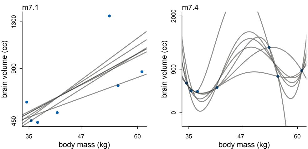
Figure 7.4. Underfitting and overfitting as under-sensitivity and oversensitivity to sample. In both plots, a regression is fit to the seven sets of data made by dropping one row from the original data. Left: An underfit model is insensitive to the sample, changing little as individual points are dropped. Right: An overfit model is sensitive to the sample, changing dramatically as points are dropped.
7.2. Entropy and accuracy
So how do we navigate between the hydra of overfitting and the vortex of underfitting? Whether you end up using regularization or information criteria or both, the first thing you must do is pick a criterion of model performance. What do you want the model to do well at? We’ll call this criterion the target, and in this section you’ll see how information theory provides a common and useful target.
The path to out-of-sample deviance is twisty, however. Here are the steps ahead. First, we need to establish a measurement scale for distance from perfect accuracy. This will require a little information theory, as it will provide a natural measurement scale for the distance between two probability distributions. Second, we need to establish deviance as an approximation of relative distance from perfect accuracy. Finally, we must establish that it is only deviance out-of-sample that is of interest. Once you have deviance in hand as a measure of model performance, in the sections to follow you’ll see how both regularizing priors and information criteria help you improve and estimate the out-of-sample deviance of a model.
This material is complicated. You don’t have to understand everything on the first pass.
7.2.1. Firing the weatherperson. Accuracy depends upon the definition of the target, and there is no universally best target. In defining a target, there are two major dimensions to worry about:
- Cost-benefit analysis. How much does it cost when we’re wrong? How much do we win when we’re right? Most scientists never ask these questions in any formal way, but applied scientists must routinely answer them.
(2) Accuracy in context. Some prediction tasks are inherently easier than others. So even if we ignore costs and benefits, we still need a way to judge “accuracy” that accounts for how much a model could possibly improve prediction.
It will help to explore these two dimensions in an example. Suppose in a certain city, a certain weatherperson issues uncertain predictions for rain or shine on each day of the year.105 The predictions are in the form of probabilities of rain. The currently employed weatherperson predicted these chances of rain over a 10-day sequence, with the actual outcomes shown below each prediction:
| Day | 1 | 2 | 3 | 4 | 5 | 6 | 7 | 8 | 9 | 10 |
|---|---|---|---|---|---|---|---|---|---|---|
| Prediction | 1 | 1 | 1 | 0.6 | 0.6 | 0.6 | 0.6 | 0.6 | 0.6 | 0.6 |
| Observed |
A newcomer rolls into town and boasts that he can best the current weatherperson by always predicting sunshine. Over the same 10-day period, the newcomer’s record would be:
| Day | 1 | 2 | 3 | 4 | 5 | 6 | 7 | 8 | 9 | 10 |
|---|---|---|---|---|---|---|---|---|---|---|
| Prediction | 0 | 0 | 0 | 0 | 0 | 0 | 0 | 0 | 0 | 0 |
| Observed |
“So by rate of correct prediction alone,” the newcomer announces, “I’m the best person for the job.”
The newcomer is right. Define hit rate as the average chance of a correct prediction. So for the current weatherperson, she gets 3 × 1 + 7 × 0.4 = 5.8 hits in 10 days, for a rate of 5.8/10 = 0.58 correct predictions per day. In contrast, the newcomer gets 3×0+7×1 = 7, for 7/10 = 0.7 hits per day. The newcomer wins.
7.2.1.1. Costs and benefits. But it’s not hard to find another criterion, other than rate of correct prediction, that makes the newcomer look foolish. Any consideration of costs and benefits will suffice. Suppose for example that you hate getting caught in the rain, but you also hate carrying an umbrella. Let’s define the cost of getting wet as −5 points of happiness and the cost of carrying an umbrella as −1 point of happiness. Suppose your chance of carrying an umbrella is equal to the forecast probability of rain. Your job is now to maximize your happiness by choosing a weatherperson. Here are your points, following either the current weatherperson or the newcomer:
| Day | 1 | 2 | 3 | 4 | 5 | 6 | 7 | 8 | 9 | 10 |
|---|---|---|---|---|---|---|---|---|---|---|
| Observed | ||||||||||
| Points | ||||||||||
| Current | −1 | −1 | −1 | −0.6 | −0.6 | −0.6 | −0.6 | −0.6 | −0.6 | −0.6 |
| Newcomer | −5 | −5 | −5 | 0 | 0 | 0 | 0 | 0 | 0 | 0 |
So the current weatherperson nets you 3 × (−1) + 7 × (−0.6) = −7.2 happiness, while the newcomer nets you −15 happiness. So the newcomer doesn’t look so clever now. You can play around with the costs and the decision rule, but since the newcomer always gets you caught unprepared in the rain, it’s not hard to beat his forecast.
204 7. ULYSSES’ COMPASS
7.2.1.2. Measuring accuracy. But even if we ignore costs and benefits of any actual decision based upon the forecasts, there’s still ambiguity about which measure of “accuracy” to adopt. There’s nothing special about “hit rate.” The question to focus on is: Which definition of “accuracy” is maximized by knowing the true model generating the data? Surely we can’t do better than that.
Consider computing the probability of predicting the exact sequence of days. This means computing the probability of a correct prediction for each day. Then multiply all of these probabilities together to get the joint probability of correctly predicting the observed sequence. This is the same thing as the joint likelihood, which you’ve been using up to this point to fit models with Bayes’ theorem. This is the definition of accuracy that is maximized by the correct model.
In this light, the newcomer looks even worse. The probability for the current weatherperson is 13 × 0.4 7 ≈ 0.005. For the newcomer, it’s 03 × 1 7 = 0. So the newcomer has zero probability of getting the sequence correct. This is because the newcomer’s predictions never expect rain. So even though the newcomer has a high average probability of being correct (hit rate), he has a terrible joint probability of being correct.
And the joint probability is the measure we want. Why? Because it appears in Bayes’ theorem as the likelihood. It’s the unique measure that correctly counts up the relative number of ways each event (sequence of rain and shine) could happen. Another way to think of this is to consider what happens when we maximize average probability or joint probability. The true data-generating model will not have the highest hit rate. You saw this already with the weatherperson: Assigning zero probability to rain improves hit rate, but it is clearly wrong. In contrast, the true model will have the highest joint probability.
In the statistics literature, you will sometimes see this measure of accuracy called the log scoring rule, because typically we compute the logarithm of the joint probability and report that. If you see an analysis using something else, either it is a special case of the log scoring rule or it is possibly much worse.
Rethinking: Calibration is overrated. It’s common for models to be judged by their calibration. If a model predicts a 40% chance of rain, then it is said to be “calibrated” if it actually rains on 40% of such predictions. The problem is that calibrated predictions do not have to be good. For example, if it rains on 40% of days, then a model that just predicts a 40% chance of rain on every day will be perfectly calibrated. But it will also be terribly inaccurate. Nor do good predictions have to be calibrated. Suppose a forecaster always has 100% confidence in each forecast and correctly predicts the weather on 80% of days. The forecaster is accurate, but he is not calibrated. He is overconfident.
Here’s a real example. The forecasting website www.fivethirtyeight.com makes many predictions. Their calibration for sporting events is almost perfect.106 But their accuracy is often barely better than guessing. In contrast, their political predictions are less calibrated, but more accurate on average.
Terms like “calibration” have various meanings. So it’s good to provide and ask for contextual definitions.107 The posterior predictive checks endorsed in this book, for example, are sometimes called “calibration checks.”
7.2.2. Information and uncertainty. So we want to use the log probability of the data to score the accuracy of competing models. The next problem is how to measure distance from perfect prediction. A perfect prediction would just report the true probabilities of rain on each day. So when either weatherperson provides a prediction that differs from the target, we can measure the distance of the prediction from the target. But what kind of distance should we adopt? It’s not obvious how to go about answering this question. But there turns out to be a unique and optimal answer.
Getting to the answer depends upon appreciating what an accuracy metric needs to do. It should appreciate that some targets are just easier to hit than other targets. For example, suppose we extend the weather forecast into the winter. Now there are three types of days: rain, sun, and snow. Now there are three ways to be wrong, instead of just two. This has to be reflected in any reasonable measure of distance from the target, because by adding another type of event, the target has gotten harder to hit.
It’s like taking a two-dimensional archery bullseye and forcing the archer to hit the target at the right time—a third dimension—as well. Now the possible distance between the best archer and the worst archer has grown, because there’s another way to miss. And with another way to miss, one might also say that there is another way for an archer to impress. As the potential distance between the target and the shot increases, so too does the potential improvement and ability of a talented archer to impress us.
The solution to the problem of how to measure distance of a model’s accuracy from a target was provided in the late 1940s.108 Originally applied to problems in communication of messages, such as telegraph, the field of information theory is now important across the basic and applied sciences, and it has deep connections to Bayesian inference. And like many successful fields, information theory has spawned many bogus applications, as well.109
The basic insight is to ask: How much is our uncertainty reduced by learning an outcome? Consider the weather forecasts again. Forecasts are issued in advance and the weather is uncertain. When the actual day arrives, the weather is no longer uncertain. The reduction in uncertainty is then a natural measure of how much we have learned, how much “information” we derive from observing the outcome. So if we can develop a precise definition of “uncertainty,” we can provide a baseline measure of how hard it is to predict, as well as how much improvement is possible. The measured decrease in uncertainty is the definition of information in this context.
Information: The reduction in uncertainty when we learn an outcome.
To use this definition, what we need is a principled way to quantify the uncertainty inherent in a probability distribution. So suppose again that there are two possible weather events on any particular day: Either it is sunny or it is rainy. Each of these events occurs with some probability, and these probabilities add up to one. What we want is a function that uses the probabilities of shine and rain and produces a measure of uncertainty.
There are many possible ways to measure uncertainty. The most common way begins by naming some properties a measure of uncertainty should possess. These are the three intuitive desiderata:
- The measure of uncertainty should be continuous. If it were not, then an arbitrarily small change in any of the probabilities, for example the probability of rain, would result in a massive change in uncertainty.
- The measure of uncertainty should increase as the number of possible events increases. For example, suppose there are two cities that need weather forecasts. In the first city, it rains on half of the days in the year and is sunny on the others. In the second, it rains, shines, and hails, each on 1 out of every 3 days in the year. We’d like our measure of uncertainty to be larger in the second city, where there is one more kind of event to predict.
(3) The measure of uncertainty should be additive. What this means is that if we first measure the uncertainty about rain or shine (2 possible events) and then the uncertainty about hot or cold (2 different possible events), the uncertainty over the four combinations of these events—rain/hot, rain/cold, shine/hot, shine/cold—should be the sum of the separate uncertainties.
There is only one function that satisfies these desiderata. This function is usually known as information entropy, and has a surprisingly simple definition. If there are n different possible events and each event i has probability pi , and we call the list of probabilities p, then the unique measure of uncertainty we seek is:
\[H(p) = -\operatorname{E}\log(p\_i) = -\sum\_{i=1}^{n} p\_i \log(p\_i) \tag{7.1}\]
In plainer words:
The uncertainty contained in a probability distribution is the average log-probability of an event.
“Event” here might refer to a type of weather, like rain or shine, or a particular species of bird or even a particular nucleotide in a DNA sequence.
While it’s not worth going into the details of the derivation of H, it is worth pointing out that nothing about this function is arbitrary. Every part of it derives from the three requirements above. Still, we accept H(p) as a useful measure of uncertainty not because of the premises that lead to it, but rather because it has turned out to be so useful and productive.
An example will help to demystify the function H(p). To compute the information entropy for the weather, suppose the true probabilities of rain and shine are p1 = 0.3 and p2 = 0.7, respectively. Then:
\[H(p) = -\left(p\_1 \log(p\_1) + p\_2 \log(p\_2)\right) \approx 0.611\]
As an R calculation:
R code
7.12 p <- c( 0.3 , 0.7 )
     -sum( p*log(p) )
[1] 0.6108643
Suppose instead we live in Abu Dhabi. Then the probabilities of rain and shine might be more like p1 = 0.01 and p2 = 0.99. Now the entropy would be approximately 0.06. Why has the uncertainty decreased? Because in Abu Dhabi it hardly ever rains. Therefore there’s much less uncertainty about any given day, compared to a place in which it rains 30% of the time. It’s in this way that information entropy measures the uncertainty inherent in a distribution of events. Similarly, if we add another kind of event to the distribution—forecasting into winter, so also predicting snow—entropy tends to increase, due to the added dimensionality of the prediction problem. For example, suppose probabilities of sun, rain, and snow are p1 = 0.7, p2 = 0.15, and p3 = 0.15, respectively. Then entropy is about 0.82.
These entropy values by themselves don’t mean much to us, though. Instead we can use them to build a measure of accuracy. That comes next.
Overthinking: More on entropy. Above I said that information entropy is the average log-probability. But there’s also a −1 in the definition. Multiplying the average log-probability by −1 just makes the entropy H increase from zero, rather than decrease from zero. It’s conventional, but not functional. The logarithms above are natural logs (base e), but changing the base rescales without any effect on inference. Binary logarithms, base 2, are just as common. As long as all of the entropies you compare use the same base, you’ll be fine.
The only trick in computing H is to deal with the inevitable question of what to do when pi = 0. The log(0) = −∞, which won’t do. However, L’Hôpital’s rule tells us that limpi→0 pi log(pi) = 0. So just assume that 0 log(0) = 0, when you compute H. In other words, events that never happen drop out. Just remember that when an event never happens, there’s no point in keeping it in the model.
Rethinking: The benefits of maximizing uncertainty. Information theory has many applications. A particularly important application is maximum entropy, also known as maxent. Maximum entropy is a family of techniques for finding probability distributions that are most consistent with states of knowledge. In other words, given what we know, what is the least surprising distribution? It turns out that one answer to this question maximizes the information entropy, using the prior knowledge as constraint.110 If you do this, you actually end up with the posterior distribution. So Bayesian updating is entropy maximization. Maximum entropy features prominently in Chapter 10, where it will help us build generalized linear models (GLMs).
7.2.3. From entropy to accuracy. It’s nice to have a way to quantify uncertainty. H provides this. So we can now say, in a precise way, how hard it is to hit the target. But how can we use information entropy to say how far a model is from the target? The key lies in divergence:
Divergence: The additional uncertainty induced by using probabilities from
one distribution to describe another distribution.
This is often known as Kullback-Leibler divergence or simply KL divergence, named after the people who introduced it for this purpose.111
Suppose for example that the true distribution of events is p1 = 0.3, p2 = 0.7. If we believe instead that these events happen with probabilities q1 = 0.25, q2 = 0.75, how much additional uncertainty have we introduced, as a consequence of using q = {q1, q2} to approximate p = {p1, p2}? The formal answer to this question is based upon H, and has a similarly simple formula:
\[D\_{\mathrm{KL}}(p,q) = \sum\_{i} p\_i \left( \log(p\_i) - \log(q\_i) \right) = \sum\_{i} p\_i \log \left( \frac{p\_i}{q\_i} \right)\]
In plainer language, the divergence is the average difference in log probability between the target (p) and model (q). This divergence is just the difference between two entropies: The entropy of the target distribution p and the cross entropy arising from using q to predict p (see the Overthinking box on the next page for some more detail). When p = q, we know the actual probabilities of the events. In that case:
\[D\_{\mathrm{KL}}(\mathfrak{p}, q) = D\_{\mathrm{KL}}(\mathfrak{p}, \mathfrak{p}) = \sum\_{i} \mathfrak{p}\_{i} (\log(\mathfrak{p}\_{i}) - \log(\mathfrak{p}\_{i})) = 0\]
There is no additional uncertainty induced when we use a probability distribution to represent itself. That’s somehow a comforting thought.
But more importantly, as q grows more different from p, the divergence DKL also grows. Figure 7.5 displays an example. Suppose the true target distribution is p = {0.3, 0.7}. Suppose the approximating distribution q can be anything from q = {0.01, 0.99} to q = {0.99, 0.01}. The first of these probabilities, q1, is displayed on the horizontal axis, and the
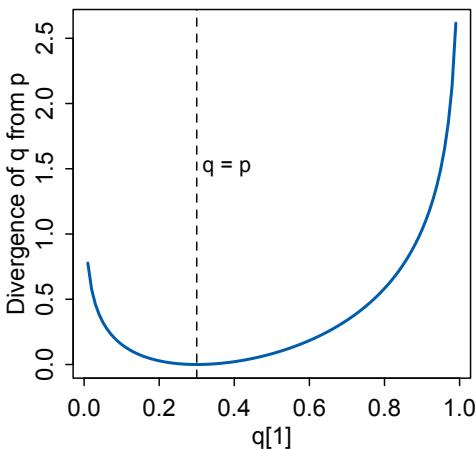
Figure 7.5. Information divergence of an approximating distribution q from a true distribution p. Divergence can only equal zero when q = p (dashed line). Otherwise, the divergence is positive and grows as q becomes more dissimilar from p. When we have more than one candidate approximation q, the q with the smallest divergence is the most accurate approximation, in the sense that it induces the least additional uncertainty.
vertical displays the divergence DKL(p, q). Only exactly where q = p, at q1 = 0.3, does the divergence achieve a value of zero. Everyplace else, it grows.
What divergence can do for us now is help us contrast different approximations to p. As an approximating function q becomes more accurate, DKL(p, q) will shrink. So if we have a pair of candidate distributions, then the candidate that minimizes the divergence will be closest to the target. Since predictive models specify probabilities of events (observations), we can use divergence to compare the accuracy of models.
Overthinking: Cross entropy and divergence. Deriving divergence is easier than you might think. The insight is in realizing that when we use a probability distribution q to predict events from another distribution p, this defines something known as cross entropy: H(p, q) = − P i pi log(qi). The notion is that events arise according the the p’s, but they are expected according to the q’s, so the entropy is inflated, depending upon how different p and q are. Divergence is defined as the additional entropy induced by using q. So it’s just the difference between H(p), the actual entropy of events, and H(p, q):
\[\begin{aligned} D\_{\text{KL}}(p,q) &= H(p,q) - H(p) \\ &= -\sum\_{i} p\_i \log(q\_i) - \left(-\sum\_{i} p\_i \log(p\_i)\right) = -\sum\_{i} p\_i \left(\log(q\_i) - \log(p\_i)\right), \end{aligned}\]
So divergence really is measuring how far q is from the target p, in units of entropy. Notice that which is the target matters: H(p, q) does not in general equal H(q, p). For more on that fact, see the Rethinking box that follows.
Rethinking: Divergence depends upon direction. In general, H(p, q) is not equal to H(q, p). The direction matters, when computing divergence. Understanding why this is true is of some value, so here’s a contrived teaching example.
Suppose we get in a rocket and head to Mars. But we have no control over our landing spot, once we reach Mars. Let’s try to predict whether we land in water or on dry land, using the Earth to provide a probability distribution q to approximate the actual distribution on Mars, p. For the Earth, q = {0.7, 0.3}, for probability of water and land, respectively. Mars is very dry, but let’s say for the sake of the example that there is 1% surface water, so p = {0.01, 0.99}. If we count the ice caps, that’s not too big a lie. Now compute the divergence going from Earth to Mars. It turns out to be DE→M = DKL(p, q) = 1.14. That’s the additional uncertainty induced by using the Earth to predict the Martian landing spot. Now consider going back the other direction. The numbers in p and q stay the same, but we swap their roles, and now DM→E = DKL(q, p) = 2.62. The divergence is more than double in this direction. This result seems to defy comprehension. How can the distance from Earth to Mars be shorter than the distance from Mars to Earth?
Divergence behaves this way as a feature, not a bug. There really is more additional uncertainty induced by using Mars to predict Earth than by using Earth to predict Mars. The reason is that, going from Mars to Earth, Mars has so little water on its surface that we will be very very surprised when we most likely land in water on Earth. In contrast, Earth has good amounts of both water and dry land. So when we use the Earth to predict Mars, we expect both water and land, to some extent, even though we do expect more water than land. So we won’t be nearly as surprised when we inevitably arrive on Martian dry land, because 30% of Earth is dry land.
An important practical consequence of this asymmetry, in a model fitting context, is that if we use a distribution with high entropy to approximate an unknown true distribution of events, we will reduce the distance to the truth and therefore the error. This fact will help us build generalized linear models, later on in Chapter 10.
7.2.4. Estimating divergence. At this point in the chapter, dear reader, you may be wondering where the chapter is headed. At the start, the goal was to deal with overfitting and underfitting. But now we’ve spent pages and pages on entropy and other fantasies. It’s as if I promised you a day at the beach, but now you find yourself at a dark cabin in the woods, wondering if this is a necessary detour or rather a sinister plot.
It is a necessary detour. The point of all the preceding material about information theory and divergence is to establish both:
- How to measure the distance of a model from our target. Information theory gives us the distance measure we need, the KL divergence.
- How to estimate the divergence. Having identified the right measure of distance, we now need a way to estimate it in real statistical modeling tasks.
Item (1) is accomplished. Item (2) remains for last. You’re going to see now that the divergence leads to using a measure of model fit known as deviance.
To use DKL to compare models, it seems like we would have to know p, the target probability distribution. In all of the examples so far, I’ve just assumed that p is known. But when we want to find a model q that is the best approximation to p, the “truth,” there is usually no way to access p directly. We wouldn’t be doing statistical inference, if we already knew p.
But there’s an amazing way out of this predicament. It helps that we are only interested in comparing the divergences of different candidates, say q and r. In that case, most of p just subtracts out, because there is a E log(pi) term in the divergence of both q and r. This term has no effect on the distance of q and r from one another. So while we don’t know where p is, we can estimate how far apart q and r are, and which is closer to the target. It’s as if we can’t tell how far any particular archer is from hitting the target, but we can tell which archer gets closer and by how much.
All of this also means that all we need to know is a model’s average log-probability: E log(qi) for q and E log(ri) for r. These expressions look a lot like log-probabilities of outcomes you’ve been using already to simulate implied predictions of a fit model. Indeed, just summing the log-probabilities of each observed case provides an approximation of E log(qi). We don’t have to know the p inside the expectation.
So we can compare the average log-probability from each model to get an estimate of the relative distance of each model from the target. This also means that the absolute magnitude of these values will not be interpretable—neither E log(qi) nor E log(ri) by itself suggests a good or bad model. Only the difference E log(qi)−E log(ri)informs us about the divergence of each model from the target p.
To put all this into practice, it is conventional to sum over all the observations i, yielding a total score for a model q:
\[\mathcal{S}(q) = \sum\_{i} \log(q\_i)\]
This kind of score is a log-probability score, and it is the gold standard way to compare the predictive accuracy of different models. It is an estimate of E log(qi), just without the final step of dividing by the number of observations.
To compute this score for a Bayesian model, we have to use the entire posterior distribution. Otherwise, vengeful angels will descend upon you. Why will they be angry? If we don’t use the entire posterior, we are throwing away information. Because the parameters have distributions, the predictions also have a distribution. How can we use the entire distribution of predictions? We need to find the log of the average probability for each observation i, where the average is taken over the posterior distribution. Doing this calculation correctly requires a little subtlety. The rethinking package has a function called lppd—log-pointwisepredictive-density—to do this calculation for quap models. If you are interested in the subtle details, however, see the box at the end of this section. To compute lppd for the first model we fit in this chapter:
R code7.13 set.seed(1)
lppd( m7.1 , n=1e4 )[1] 0.6098668 0.6483438 0.5496093 0.6234934 0.4648143 0.4347605 -0.8444633
Each of these values is the log-probability score for a specific observation. Recall that there were only 7 observations in those data. If you sum these values, you’ll have the total logprobability score for the model and data. What do these values mean? Larger values are better, because that indicates larger average accuracy. It is also quite common to see something called the deviance, which is like a lppd score, but multiplied by −2 so that smaller values are better. The 2 is there for historical reasons.112
Overthinking: Computing the lppd. The Bayesian version of the log-probability score is called the log-pointwise-predictive-density. For some data y and posterior distribution Θ:
\[\text{lppd}(\mathcal{y}, \Theta) = \sum\_{i} \log \frac{1}{\mathcal{S}} \sum\_{s} p(\mathcal{y}\_i | \Theta\_s)\]
where S is the number of samples and Θs is the s-th set of sampled parameter values in the posterior distribution. While in principle this is easy—you just need to compute the probability (density) of each observation i for each sample s, take the average, and then the logarithm—in practice it is not so easy. The reason is that doing arithmetic in a computer often requires some tricks to retain precision. In probability calculations, it is usually safest to do everything on the log-probability scale. Here’s the code we need, to repeat the calculation in the previous section:
7.14 set.seed(1)
logprob <- sim( m7.1 , ll=TRUE , n=1e4 )
n <- ncol(logprob)
ns <- nrow(logprob)
f <- function( i ) log_sum_exp( logprob[,i] ) - log(ns)
( lppd <- sapply( 1:n , f ) )You should see the same values as before. The code first calculates the log-probability of each observation, using sim. You used sim in Chapter 4 to simulate observations from the posterior. It can also just return the log-probability, using ll=TRUE. It returns a matrix with a row for each sample and a column for each observation. Then the function f does the hard work. log_sum_exp computes the log of the sum of exponentiated values. So it takes all the log-probabilities for a given observation, exponentiates each, sums them, then takes the log. But it does this in a way that is numerically stable. Then the function subtracts the log of the number of samples, which is the same as dividing the sum by the number of samples.
7.2.5. Scoring the right data. The log-probability score is a principled way to measure distance from the target. But the score as computed in the previous section has the same flaw as R 2 : It always improves as the model gets more complex, at least for the types of models we have considered so far. Just like R 2 , log-probability on training data is a measure of retrodictive accuracy, not predictive accuracy. Let’s compute the log-score for each of the models from earlier in this chapter:
R code
7.15 set.seed(1)
sapply( list(m7.1,m7.2,m7.3,m7.4,m7.5,m7.6) , function(m) sum(lppd(m)) )[1] 2.490390 2.565982 3.695910 5.380871 14.089261 39.445390
The more complex models have larger scores! But we already know that they are absurd. We simply cannot score models by their performance on training data. That way lies the monster Scylla, devourer of naive data scientists.
It is really the score on new data that interests us. So before looking at tools for improving and measuring out-of-sample score, let’s bring the problem into sharper focus by simulating the score both in and out of sample. When we usually have data and use it to fit a statistical model, the data comprise a training sample. Parameters are estimated from it, and then we can imagine using those estimates to predict outcomes in a new sample, called the test sample. R is going to do all of this for you. But here’s the full procedure, in outline:
- Suppose there’s a training sample of size N.
- Compute the posterior distribution of a model for the training sample, and compute the score on the training sample. Call this score Dtrain.
- Suppose another sample of size N from the same process. This is the test sample.
- Compute the score on the test sample, using the posterior trained on the training sample. Call this new score Dtest.
The above is a thought experiment. It allows us to explore the distinction between accuracy measured in and out of sample, using a simple prediction scenario.
To visualize the results of the thought experiment, what we’ll do now is conduct the above thought experiment 10,000 times, for each of five different linear regression models.
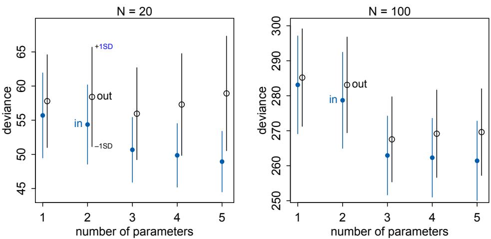
Figure 7.6. Deviance in and out of sample. In each plot, models with different numbers of predictor variables are shown on the horizontal axis. Deviance across 10,000 simulations is shown on the vertical. Blue shows deviance in-sample, the training data. Black shows deviance out-of-sample, the test data. Points show means, and the line segments show ±1 standard deviation.
The model that generates the data is:
\[\begin{aligned} \mathcal{Y}\_l &\sim \text{Normal}(\mu\_l, 1) \\ \mu\_l &= (0.15)\mathbb{x}\_{1,l} - (0.4)\mathbb{x}\_{2,l} \end{aligned}\]
This corresponds to a Gaussian outcome y for which the intercept is α = 0 and the slopes for each of two predictors are β1 = 0.15 and β2 = −0.4. The models for analyzing the data are linear regressions with between 1 and 5 free parameters. The first model, with 1 free parameter to estimate, is just a linear regression with an unknown mean and fixed σ = 1. Each parameter added to the model adds a predictor variable and its beta-coefficient. Since the “true” model has non-zero coefficients for only the first two predictors, we can say that the true model has 3 parameters. By fitting all five models, with between 1 and 5 parameters, to training samples from the same processes, we can get an impression for how the score behaves, both inside and outside the training sample.
Figure 7.6 shows the results of 10,000 simulations for each model type, at two different sample sizes. The function that conducts the simulations is sim_train_test in the rethinking package. If you want to conduct more simulations of this sort, see the Overthinking box on the next page for the full code. The vertical axis is scaled as −2 × lppd, “deviance,” so that larger values are worse. In the left-hand plot in Figure 7.6, both training and test samples contain 20 cases. Blue points and line segments show the mean plus-andminus one standard deviation of the deviance calculated on the training data. Moving left to right with increasing numbers of parameters, the average deviance declines. A smaller deviance means a better fit. So this decline with increasing model complexity is the same phenomenon you saw earlier in the chapter with R 2 .
But now inspect the open points and black line segments. These display the distribution of out-of-sample deviance at each number of parameters. While the training deviance always gets better with an additional parameter, the test deviance is smallest on average for 3 parameters, which is the data-generating model in this case. The deviance out-of-sample gets worse (increases) with the addition of each parameter after the third. These additional parameters fit the noise in the additional predictors. So while deviance keeps improving (declining) in the training sample, it gets worse on average in the test sample. The right-hand plot shows the same relationships for larger samples of N = 100 cases.
The size of the standard deviation bars may surprise you. While it is always true on average that deviance out-of-sample is worse than deviance in-sample, any individual pair of train and test samples may reverse the expectation. The reason is that any given training sample may be highly misleading. And any given testing sample may be unrepresentative. Keep this fact in mind as we develop devices for comparing models, because this fact should prevent you from placing too much confidence in analysis of any particular sample. Like all of statistical inference, there are no guarantees here.
On that note, there is also no guarantee that the “true” data-generating model will have the smallest average out-of-sample deviance. You can see a symptom of this fact in the deviance for the 2 parameter model. That model does worse in prediction than the model with only 1 parameter, even though the true model does include the additional predictor. This is because with only N = 20 cases, the imprecision of the estimate for the first predictor produces more error than just ignoring it. In the right-hand plot, in contrast, there is enough data to precisely estimate the association between the first predictor and the outcome. Now the deviance for the 2 parameter model is better than that of the 1 parameter model.
Deviance is an assessment of predictive accuracy, not of truth. The true model, in terms of which predictors are included, is not guaranteed to produce the best predictions. Likewise a false model, in terms of which predictors are included, is not guaranteed to produce poor predictions.
The point of this thought experiment is to demonstrate how deviance behaves, in theory. While deviance on training data always improves with additional predictor variables, deviance on future data may or may not, depending upon both the true data-generating process and how much data is available to precisely estimate the parameters. These facts form the basis for understanding both regularizing priors and information criteria.
Overthinking: Simulated training and testing. To reproduce Figure 7.6, sim.train.test is run 10,000 (1e4) times for each of the 5 models. This code is sufficient to run all of the simulations:
7.16 N <- 20
kseq <- 1:5
dev <- sapply( kseq , function(k) {
print(k);
r <- replicate( 1e4 , sim_train_test( N=N, k=k ) );
c( mean(r[1,]) , mean(r[2,]) , sd(r[1,]) , sd(r[2,]) )
} )If you use Mac OS or Linux, you can parallelize the simulations by replacing the replicate line with:
7.17 r <- mcreplicate( 1e4 , sim_train_test( N=N, k=k ) , mc.cores=4 )
R code
Set mc.cores to the number of processor cores you want to use for the simulations. Once the simulations complete, dev will be a 4-by-5 matrix of means and standard deviations. To reproduce the plot:
R code
7.18 plot( 1:5 , dev[1,] , ylim=c( min(dev[1:2,])-5 , max(dev[1:2,])+10 ) ,
xlim=c(1,5.1) , xlab="number of parameters" , ylab="deviance" ,
pch=16 , col=rangi2 )
mtext( concat( "N = ",N ) )
points( (1:5)+0.1 , dev[2,] )
for ( i in kseq ) {
pts_in <- dev[1,i] + c(-1,+1)*dev[3,i]
pts_out <- dev[2,i] + c(-1,+1)*dev[4,i]
lines( c(i,i) , pts_in , col=rangi2 )
lines( c(i,i)+0.1 , pts_out )
}By altering this code, you can simulate many different train-test scenarios. See ?sim_train_test for additional options.
7.3. Golem taming: regularization
What if I told you that one way to produce better predictions is to make the model worse at fitting the sample? Would you believe it? In this section, we’ll demonstrate it.
The root of overfitting is a model’s tendency to get overexcited by the training sample. When the priors are flat or nearly flat, the machine interprets this to mean that every parameter value is equally plausible. As a result, the model returns a posterior that encodes as much of the training sample—as represented by the likelihood function—as possible.
One way to prevent a model from getting too excited by the training sample is to use a skeptical prior. By “skeptical,” I mean a prior that slows the rate of learning from the sample. The most common skeptical prior is a regularizing prior. Such a prior, when tuned properly, reduces overfitting while still allowing the model to learn the regular features of a sample. If the prior is too skeptical, however, then regular features will be missed, resulting in underfitting. So the problem is really one of tuning. But as you’ll see, even mild skepticism can help a model do better, and doing better is all we can really hope for in the large world, where no model nor prior is optimal.
In previous chapters, I forced us to revise the priors until the prior predictive distribution produced only reasonable outcomes. As a consequence, those priors regularized inference. In very small samples, they would be a big help. Here I want to show you why, using some more simulations. Consider this Gaussian model:
yi ∼ Normal(µi , σ) µi = α + βxi α ∼ Normal(0, 100) β ∼ Normal(0, 1) σ ∼ Exponential(1)
Assume, as is good practice, that the predictor x is standardized so that its standard deviation is 1 and its mean is zero. Then the prior on α is a nearly flat prior that has no practical effect on inference, as you’ve seen in earlier chapters.
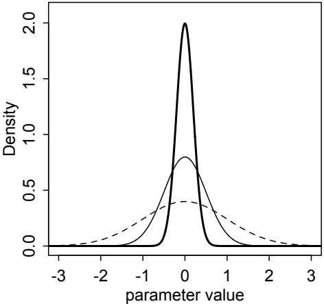
Figure 7.7. Regularizing priors, weak and strong. Three Gaussian priors of varying standard deviation. These priors reduce overfitting, but with different strength. Dashed: Normal(0, 1). Thin solid: Normal(0, 0.5). Thick solid: Normal(0, 0.2).
But the prior on β is narrower and is meant to regularize. The prior β ∼ Normal(0, 1) says that, before seeing the data, the machine should be very skeptical of values above 2 and below −2, as a Gaussian prior with a standard deviation of 1 assigns only 5% plausibility to values above and below 2 standard deviations. Because the predictor variable x is standardized, you can interpret this as meaning that a change of 1 standard deviation in x is very unlikely to produce 2 units of change in the outcome.
You can visualize this prior in Figure 7.7 as the dashed curve. Since more probability is massed up around zero, estimates are shrunk towards zero—they are conservative. The other curves are narrower priors that are even more skeptical of parameter values far from zero. The thin solid curve is a stronger Gaussian prior with a standard deviation of 0.5. The thick solid curve is even stronger, with a standard deviation of only 0.2.
How strong or weak these skeptical priors will be in practice depends upon the data and model. So let’s explore a train-test example, similar to what you saw in the previous section (Figure 7.6). This time we’ll use the regularizing priors pictured in Figure 7.7, instead of flat priors. For each of five different models, we simulate 10,000 times for each of the three regularizing priors above. Figure 7.8 shows the results. The points are the same flat-prior deviances as in the previous section: blue for training deviance and black for test deviance. The lines show the train and test deviances for the different priors. The blue lines are training deviance and the black lines test deviance. The style of the lines correspond to those in Figure 7.7.
Focus on the left-hand plot, where the sample size is N = 20, for the moment. The training deviance always increases—gets worse—with tighter priors. The thick blue trend is substantially larger than the others, and this is because the skeptical prior prevents the model from adapting completely to the sample. But the test deviances, out-of-sample, improve (get smaller) with the tighter priors. The model with three parameters is still the best model out-of-sample, and the regularizing priors have little impact on its deviance.
But also notice that as the prior gets more skeptical, the harm done by an overly complex model is greatly reduced. For the Normal(0, 0.2) prior (thick line), the models with 4 and 5 parameters are barely worse than the correct model with 3 parameters. If you can tune the regularizing prior right, then overfitting can be greatly reduced.
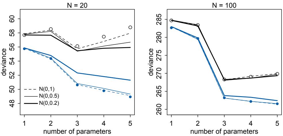
Figure 7.8. Regularizing priors and out-of-sample deviance. The points in both plots are the same as in Figure 7.6. The lines show training (blue) and testing (black) deviance for the three regularizing priors in Figure 7.7. Dashed: Each beta-coefficient is given a Normal(0, 1) prior. Thin solid: Normal(0, 0.5). Thick solid: Normal(0, 0.2).
Now focus on the right-hand plot, where sample size is N = 100. The priors have much less of an effect here, because there is so much more evidence. The priors do help. But overfitting was less of a concern to begin with, and there is enough information in the data to overwhelm even the Normal(0, 0.2) prior (thick line).
Regularizing priors are great, because they reduce overfitting. But if they are too skeptical, they prevent the model from learning from the data. When you encounter multilevel models in Chapter 13, you’ll see that their central device is to learn the strength of the prior from the data itself. So you can think of multilevel models as adaptive regularization, where the model itself tries to learn how skeptical it should be.
Rethinking: Ridge regression. Linear models in which the slope parameters use Gaussian priors, centered at zero, are sometimes known as ridge regression. Ridge regression typically takes as input a precision λ that essentially describes the narrowness of the prior. λ > 0 results in less overfitting. However, just as with the Bayesian version, if λ is too large, we risk underfitting. While not originally developed as Bayesian, ridge regression is another example of how a statistical procedure can be understood from both Bayesian and non-Bayesian perspectives. Ridge regression does not compute a posterior distribution. Instead it uses a modification of OLS that stitches λ into the usual matrix algebra formula for the estimates. The function lm.ridge, built into R’s MASS library, will fit linear models this way.
Despite how easy it is to use regularization, most traditional statistical methods use no regularization at all. Statisticians often make fun of machine learning for reinventing statistics under new names. But regularization is one area where machine learning is more mature. Introductory machine learning courses usually describe regularization. Most introductory statistics courses do not.
7.4. Predicting predictive accuracy
All of the preceding suggests one way to navigate overfitting and underfitting: Evaluate our models out-of-sample. But we do not have the out-of-sample, by definition, so how can we evaluate our models on it? There are two families of strategies: cross-validation and information criteria. These strategies try to guess how well models will perform, on average, in predicting new data. We’ll consider both approaches in more detail. Despite subtle differences in their mathematics, they produce extremely similar approximations.
7.4.1. Cross-validation. A popular strategy for estimating predictive accuracy is to actually test the model’s predictive accuracy on another sample. This is known as cross-validation, leaving out a small chunk of observations from our sample and evaluating the model on the observations that were left out. Of course we don’t want to leave out data. So what is usually done is to divide the sample in a number of chunks, called “folds.” The model is asked to predict each fold, after training on all the others. We then average over the score for each fold to get an estimate of out-of-sample accuracy. The minimum number of folds is 2. At the other extreme, you could make each point observation a fold and fit as many models as you have individual observations. You can perform cross-validation on quap models using the cv_quap function in the rethinking package.
How many folds should you use? This is an understudied question. A lot of advice states that both too few and too many folds produce less reliable approximations of out-of-sample performance. But simulation studies do not reliably find that this is the case.113 It is extremely common to use the maximum number of folds, resulting in leaving out one unique observation in each fold. This is called leave-one-out cross-validation (often abbreviated as LOOCV). Leave-one-out cross-validation is what we’ll consider in this chapter, and it is the default in cv_quap.
The key trouble with leave-one-out cross-validation is that, if we have 1000 observations, that means computing 1000 posterior distributions. That can be time consuming. Luckily, there are clever ways to approximate the cross-validation score without actually running the model over and over again. One approach is to use the “importance” of each observation to the posterior distribution. What “importance” means here is that some observations have a larger impact on the posterior distribution—if we remove an important observation, the posterior changes more. Other observations have less impact. It is a benign aspect of the universe that this importance can be estimated without refitting the model.114 The key intuition is that an observation that is relatively unlikely is more important than one that is relatively expected. When your expectations are violated, you should change your expectation more. Bayesian inference works the same way. This importance is often called a weight, and these weights can be used to estimate a model’s out-of-sample accuracy.
Smuggling a bunch of mathematical details under the carpet, this strategy results in a useful approximation of the cross-validation score. The approximation goes by the awkward name of Pareto-smoothed importance sampling cross-validation. 115 We’ll call it PSIS for short, and the PSIS function will compute it. PSIS uses importance sampling, which just means that it uses the importance weights approach described in the previous paragraph. The Pareto-smoothing is a technique for making the importance weights more reliable. Pareto is the name of a small town in northern Italy. But it is also the name of an Italian scientist, Vilfredo Pareto (1848–1923), who made many important contributions. One of these is known as the Pareto distribution. PSIS uses this distribution to derive
more reliable cross-validation score, without actually doing any cross-validation. If you want a little more detail, see the Overthinking box below.
The best feature of PSIS is that it provides feedback about its own reliability. It does this by noting particular observations with very high weights that could make the PSIS score inaccurate. We’ll look at this in much more detail both later in this chapter and in several examples in the remainder of the book.
Another nice feature of cross-validation and PSIS as an approximation is that it is computed point by point. This pointwise nature provides an approximate—sometimes very approximate—estimate of the standard error of our estimate of out-of-sample deviance. To compute this standard error, we calculate the CV or PSIS score for each observation and then exploit the central limit theorem to provide a measure of the standard error:
\[s\_{\text{psss}} = \sqrt{N \text{var}(\text{psis}\_i)}\]
where N is the number of observations and psisi is the PSIS estimate for observation i. If this doesn’t quite make sense, be sure to look at the code box at the end of this section(page 222).
Overthinking: Pareto-smoothed cross-validation. Cross-validation estimates the out-of-sample log-pointwise-predictive-density (lppd, page 210). If you have N observations and fit the model N times, dropping a single observation yi each time, then the out-of-sample lppd is the sum of the average accuracy for each omitted yi .
\[\text{lppd}\_{\text{CV}} = \sum\_{i=1}^{N} \frac{1}{S} \sum\_{s=1}^{S} \log \text{Pr}(y\_i | \theta\_{-i,s})\]
where s indexes samples from a Markov chain and θ−i,s is the s-th sample from the posterior distribution computed for observations omitting yi .
Importance sampling replaces the computation of N posterior distributions by using an estimate of the importance of each i to the posterior distribution. We draw samples from the full posterior distribution p(θ|y), but we want samples from the reduced leave-one-out posterior distribution p(θ|y−i). So we re-weight each sample s by the inverse of the probability of the omitted observation:116
\[r(\theta\_s) = \frac{1}{p(\mathcal{y}\_i|\theta\_s)}\]
This weight is only relative, but it is normalized inside the calculation like this:
\[\text{lppd}\_{\text{IS}} = \sum\_{i=1}^{N} \log \frac{\sum\_{s=1}^{S} r(\theta\_s) p(y\_i|\theta\_s)}{\sum\_{s=1}^{S} r(\theta\_s)}\]
And that is the importance sampling estimate of out-of-sample lppd.
We haven’t done any Pareto smoothing yet, however. The reason we need to is that the weights r(θs) can be unreliable. In particular, if any r(θs) is too relatively large, it can ruin the estimate of lppd by dominating it. One strategy is to truncate the weights so that none are larger than a theoretically derived limit. This helps, but it also biases the estimate. What PSIS does is more clever. It exploits the fact that the distribution of weights should have a particular shape, under some regular conditions. The largest weights should follow a generalized Pareto distribution:
\[p(r|\mu,\sigma,k) = \sigma^{-1} \left(1 + k(r-\mu)\sigma^{-1}\right)^{-\frac{1}{k}-1}\]
where u is the location parameter, σ is the scale, and k is the shape. For each observation yi , the largest weights are used to estimate a Pareto distribution and then smoothed using that Pareto distribution. This works quite well, both in theory and practice.117 The best thing about the approach however is that the estimates of k provide information about the reliability of the approximation. There will be one k value for each yi . Larger k values indicate more influential points, and if k > 0.5, then the Pareto distribution has infinite variance. A distribution with infinite variance has a very thick tail. Since we are trying to smooth the importance weights with the distribution’s tail, an infinite variance makes the weights harder to trust. Still, both theory and simulation suggest PSIS’s weights perform well as long as k < 0.7. When we start using PSIS, you’ll see warnings about large k values. These are very useful for identifying influential observations.
7.4.2. Information criteria. The second approach is the use of information criteria to compute an expected score out of sample. Information criteria construct a theoretical estimate of the relative out-of-sample KL divergence.
If you look back at Figure 7.8, there is a curious pattern in the distance between the points (showing the train-test pairs with flat priors): The difference is approximately twice the number of parameters in each model. The difference between training deviance and testing deviance is almost exactly 2 for the first model (with 1 parameter) and about 10 for the last (with 5 parameters). This is not a coincidence but rather one of the coolest results in machine learning: For ordinary linear regressions with flat priors, the expected overfitting penalty is about twice the number of parameters.
This is the phenomenon behind information criteria. The best known information criterion is the Akaike information criterion, abbreviated AIC. 118 AIC provides a surprisingly simple estimate of the average out-of-sample deviance:
\[\text{AIC} = D\_{\text{train}} + 2p = -2 \text{lppd} + 2p\]
where p is the number of free parameters in the posterior distribution. As the 2 is just there for scaling, what AIC tells us is that the dimensionality of the posterior distribution is a natural measure of the model’s overfitting tendency. More complex models tend to overfit more, directly in proportion to the number of parameters.
AIC is of mainly historical interest now. Newer and more general approximations exist that dominate AIC in every context. But Akaike deserves tremendous credit for the initial inspiration. See the box further down for more details. AIC is an approximation that is reliable only when:
- The priors are flat or overwhelmed by the likelihood.
- The posterior distribution is approximately multivariate Gaussian.
- The sample size N is much greater119 than the number of parameters k.
Since flat priors are hardly ever the best priors, we’ll want something more general. And when you get to multilevel models, the priors are never flat by definition. There is a more general criterion, the Deviance Information Criterion (DIC). DIC is okay with informative priors, but still assumes that the posterior is multivariate Gaussian and that N ≫ k. 120
Overthinking: The Akaike inspiration criterion. The Akaike Information Criterion is a truly elegant result. Hirotugu Akaike (赤池弘次, 1927–2009) explained how the insight came to him: “On the morning of March 16, 1971, while taking a seat in a commuter train, I suddenly realized that the parameters of the factor analysis model were estimated by maximizing the likelihood and that the mean value of the logarithmus of the likelihood was connected with the Kullback-Leibler information number.”121 Must have been some train. What was at the heart of Akaike’s realization? Mechanically, deriving AIC means writing down the goal, which is the expected KL divergence, and then making approximations. The expected bias turns out to be proportional to the number of parameters, provided a number of assumptions are approximately correct.
We’ll focus on a criterion that is more general than both AIC and DIC. Sumio Watanabe’s (渡辺澄夫) Widely Applicable Information Criterion (WAIC) makes no assumption about the shape of the posterior.122 It provides an approximation of the out-of-sample deviance that converges to the cross-validation approximation in a large sample. But in a finite sample, it can disagree. It can disagree because it has a different target—it isn’t trying to approximate the cross-validation score, but rather guess the out-of-sample KL divergence. In the large-sample limit, these tend to be the same.
How do we compute WAIC? Unfortunately, it’s generality comes at the expense of a more complicated formula. But really it just has two pieces, and you can compute both directly from samples from the posterior distribution. WAIC is just the log-posterior-predictivedensity (lppd, page 210) that we calculated earlier plus a penalty proportional to the variance in the posterior predictions:
\[\text{WAIC}(\boldsymbol{y}, \boldsymbol{\Theta}) = -2 \left( \mathbf{lppd} - \underbrace{\sum\_{i} \text{var}\_{\boldsymbol{\theta}} \log p(\boldsymbol{y}\_i | \boldsymbol{\theta})}\_{\text{penalty term}} \right)\]
where y is the observations and Θ is the posterior distribution. The penalty term means, “compute the variance in log-probabilities for each observation i, and then sum up these variances to get the total penalty.” So you can think of each observation as having its own personal penalty score. And since these scores measure overfitting risk, you can also assess overfitting risk at the level of each observation.
Because of the analogy to Akaike’s original criterion, the penalty term in WAIC is sometimes called the effective number of parameters, labeled pwaic. This label makes historical sense, but it doesn’t make much mathematical sense. As we’ll see as the book progresses, the overfitting risk of a model has less to do with the number of parameters than with how the parameters are related to one another. When we get to multilevel models, adding parameters to the model can actually reduce the “effective number of parameters.” Like English language spelling, the field of statistics is full of historical baggage that impedes learning. No one chose this situation. It’s just cultural evolution. I’ll try to call the penalty term “the overfitting penalty.” But if you see it called the effective number of parameters elsewhere, you’ll know it is the same thing.
The function WAIC in the rethinking package will compute WAIC for a model fit with quap or ulam or rstan (which we’ll use later in the book). If you want to see a didactic implementation of computing lppd and the penalty term, see the Overthinking box at the end of this section. Seeing the mathematical formula above as computer code may be what you need to understand it.
Like PSIS, WAIC is pointwise. Prediction is considered case-by-case, or point-by-point, in the data. Several things arise from this. First, WAIC also has an approximate standard error (see calculation in the Overthinking box on page 222). Second, since some observations have stronger influence on the posterior distribution, WAIC notes this in its pointwise penalty terms. Third, just like cross-validation and PSIS, because WAIC allows splitting up the data into independent observations, it is sometimes hard to define. Consider for example a model in which each prediction depends upon a previous observation. This happens, for example, in a time series. In a time series, a previous observation becomes a predictor variable for the next observation. So it’s not easy to think of each observation as independent or exchangeable. In such a case, you can of course compute WAIC as if each observation were independent of the others, but it’s not clear what the resulting value means.
This caution raises a more general issue with all strategies to guess out-of-sample accuracy: Their validity depends upon the predictive task you have in mind. And not all prediction can reasonably take the form that we’ve been assuming for the train-test simulations in this chapter. When we consider multilevel models, this issue will arise again.
Rethinking: Information criteria and consistency. As mentioned previously, information criteria like AIC and WAIC do not always assign the best expected Dtest to the “true” model. In statistical jargon, information criteria are not consistent for model identification. These criteria aim to nominate the model that will produce the best predictions, as judged by out-of-sample deviance, so it shouldn’t surprise us that they do not also do something that they aren’t designed to do. Other metrics for model comparison are however consistent. So are information criteria broken?
They are not broken, if you care about prediction.123 Issues like consistency are nearly always evaluated asymptotically. This means that we imagine the sample size N approaching infinity. Then we ask how a procedure behaves in this large-data limit. With practically infinite data, AIC and WAIC and cross-validation will often select a more complex model, so they are sometimes accused of “overfitting.” But at the large-data limit, the most complex model will make predictions identical to the true model (assuming it exists in the model set). The reason is that with so much data every parameter can be very precisely estimated. And so using an overly complex model will not hurt prediction. For example, as sample size N → ∞ the model with 5 parameters in Figure 7.8 will tell you that the coefficients for predictors after the second are almost exactly zero. Therefore failing to identify the “correct” model does not hurt us, at least not in this sense. Furthermore, in the natural and social sciences the models under consideration are almost never the data-generating models. It makes little sense to attempt to identify a “true” model.
Rethinking: What about BIC and Bayes factors? The Bayesian information criterion, abbreviated BIC and also known as the Schwarz criterion,124 is more commonly juxtaposed with AIC. The choice between BIC or AIC (or neither!) is not about being Bayesian or not. There are both Bayesian and non-Bayesian ways to motivate both, and depending upon how strict one wishes to be, neither is Bayesian. BIC is related to the logarithm of the average likelihood of a linear model. The average likelihood is the denominator in Bayes’ theorem, the likelihood averaged over the prior. There is a venerable tradition in Bayesian inference of comparing average likelihoods as a means to comparing models. A ratio of average likelihoods is called a Bayes factor. On the log scale, these ratios are differences, and so comparing differences in average likelihoods resembles comparing differences in information criteria. Since average likelihood is averaged over the prior, more parameters induce a natural penalty on complexity. This helps guard against overfitting, even though the exact penalty is not the same as with information criteria.
Many Bayesian statisticians dislike the Bayes factor approach,125 and all admit that there are technical obstacles to its use. One problem is that computing average likelihood is hard. Even when you can compute the posterior, you may not be able to estimate the average likelihood. Another problem is that, even when priors are weak and have little influence on posterior distributions within models, priors can have a huge impact on comparisons between models.
It’s important to realize, though, that the choice of Bayesian or not does not also decide between information criteria or Bayes factors. Moreover, there’s no need to choose, really. We can always use both and learn from the ways they agree and disagree. And both information criteria and Bayes factors are purely predictive criteria that will happily select confounded models. They know nothing about causation.
Overthinking: WAIC calculations. To see how the WAIC calculations actually work, consider a simple regression fit with quap:
R code
7.19 data(cars)
m <- quap(
alist(
dist ~ dnorm(mu,sigma),
mu <- a + b*speed,
a ~ dnorm(0,100),
b ~ dnorm(0,10),
sigma ~ dexp(1)
) , data=cars )
set.seed(94)
post <- extract.samples(m,n=1000)We’ll need the log-likelihood of each observation i at each sample s from the posterior:
R code
7.20 n_samples <- 1000
logprob <- sapply( 1:n_samples ,
function(s) {
mu <- post$a[s] + post$b[s]*cars$speed
dnorm( cars$dist , mu , post$sigma[s] , log=TRUE )
} )You end up with a 50-by-1000 matrix of log-likelihoods, with observations in rows and samples in columns. Now to compute lppd, the Bayesian deviance, we average the samples in each row, take the log, and add all of the logs together. However, to do this with precision, we need to do all of the averaging on the log scale. This is made easy with a function log_sum_exp, which computes the log of a sum of exponentiated terms. Then we can just subtract the log of the number of samples. This computes the log of the average.
R code7.21 n_cases <- nrow(cars)
lppd <- sapply( 1:n_cases , function(i) log_sum_exp(logprob[i,]) - log(n_samples) )Typing sum(lppd) will give you lppd, as defined in the main text. Now for the penalty term, pWAIC. This is more straightforward, as we just compute the variance across samples for each observation, then add these together:
R code
7.22 pWAIC <- sapply( 1:n_cases , function(i) var(logprob[i,]) )And sum(pWAIC) returns pWAIC, as defined in the main text. To compute WAIC:
R code
7.23 -2*( sum(lppd) - sum(pWAIC) )[1] 423.3154
Compare to the output of the WAIC function. There will be simulation variance, because of how the samples are drawn from the quap fit. But that variance remains much smaller than the standard error of WAIC itself. You can compute the standard error by computing the square root of number of cases multiplied by the variance over the individual observation terms in WAIC:
R code
7.24 waic_vec <- -2*( lppd - pWAIC )
sqrt( n_cases*var(waic_vec) )As models get more complicated, all that usually changes is how the log-probabilities, logprob, are computed.
Note that each individual observation has its own penalty term in the pWAIC vector we calculated above. This provides an interesting opportunity to study how different observations contribute to overfitting. You can get the same vectorized pointwise output from the WAIC function by using the pointwise=TRUE argument.
7.4.3. Comparing CV, PSIS, and WAIC. With definitions of cross-validation, PSIS, and WAIC in hand, let’s conduct another simulation exercise. This will let us visualize the estimates of out-of-sample deviance that these criteria provide, in the same familiar context as earlier sections. Our interest for now is in seeing how well the criteria approximate out-ofsample accuracy. Can they guess the overfitting risk?
Figure 7.9 shows the results of 1000 simulations each for the five familiar models with between 1 and 5 parameters, simulated under two different sets of priors and two different sample sizes. The plot is complicated. But taking it one piece at a time, all the parts are already familiar. Focus for now just on the top-left plot, where N = 20. The vertical axis is the out-of-sample deviance (−2 × lppd). The open points show the average out-of-sample deviance for models fit with flat priors. The filled points show the average out-of-sample deviance for models fit with regularizing priors with a standard deviation of 0.5. Notice that the regularizing priors overfit less, just as you saw in the previous section about regularizing priors. So that isn’t new.
We are interested now in how well CV, PSIS, and WAIC approximate these points. Still focusing on the top-left plot in Figure 7.9, there are trend lines for each criterion. Solid black trends show WAIC. Solid blue trends show full cross-validation, computed by fitting the model N times. The dashed blue trends are PSIS. Notice that all three criteria do a good job of guessing the average out-of-sample score, whether the models used flat (upper trends) or regularizing (lower trends) priors. Provided the process generating data remains the same, it really is possible to use a single sample to guess the accuracy of our predictions.
While all three criteria get the expected out-of-sample deviance approximately correct, it is also true that in any particular sample they usually miss it by some amount. So we should look at the average error as well. The upper-right plot makes the average error of each measure easier to see. Now the vertical axis is the average absolute difference between the out-of-sample deviance and each criterion. WAIC (black trend) is slightly better on average. The bottom row repeats these plots for a larger sample size, N = 100. With a sample this large, in a family of models this simple, all three criteria become identical.
PSIS and WAIC perform very similarly in the context of ordinary linear models.126 If there are important differences, they lie in other model types, where the posterior distribution is not approximately Gaussian or in the presence of observations that strongly influence the posterior. CV and PSIS have higher variance as estimators of the KL divergence, while WAIC has greater bias. So we should expect each to be slightly better in different contexts.127 However, in practice any advantage may be much smaller than the expected error. Watanabe recommends computing both WAIC and PSIS and contrasting them. If there are large differences, this implies one or both criteria are unreliable.
Estimation aside, PSIS has a distinct advantage in warning the user about when it is unreliable. The k values that PSIS computes for each observation indicate when the PSIS
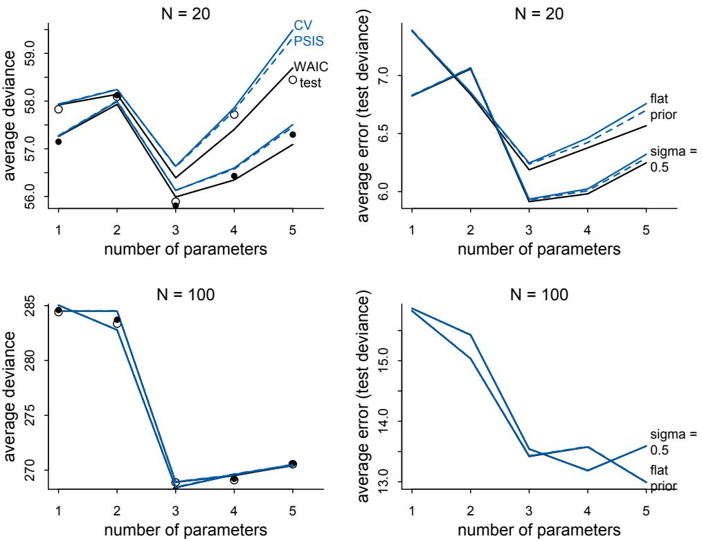
Figure 7.9. WAIC and cross-validation as estimates of the out-of-sample deviance. The top row displays 1000 train-test simulations with N = 20. The bottom row shows 1000 simulations with N = 1000. In each plot, there are two sets of trends. The open points are unregularized. The filled points are for regularizing σ = 0.5 priors. Left: The vertical axis is absolute deviance. Points are the average test deviance. The black line is the average WAIC estimate. Blue is the leave-one-out cross-validation (CV) score, and dashed blue is the PSIS approximation of the cross-validation score. Right: The same data, but now shown on the scale of average error in approximating the test deviance.
score may be unreliable, as well as identify which observations are at fault. We’ll see later how useful this can be.
Rethinking: Diverse prediction frameworks. The train-test gambit we’ve been using in this chapter entails predicting a test sample of the same size and nature as the training sample. This most certainly does not mean that information criteria can only be used when we plan to predict a sample of the same size as training. The same size just scales the out-of-sample deviance similarly. It is the distance between the models that is useful, not the absolute value of the deviance. Nor do cross-validation and information criteria require that the data generating model be one of the models being considered. That was true in our simulations. But it isn’t a requirement for them to help in identifying good models for prediction.
But the train-test prediction task is not representative of everything we might wish to do with models. For example, some statisticians prefer to evaluate predictions using a prequential framework, in which models are judged on their accumulated learning error over the training sample.128 And once you start using multilevel models, “prediction” is no longer uniquely defined, because the test sample can differ from the training sample in ways that forbid use of some the parameter estimates. We’ll worry about that issue in Chapter 13.
Perhaps a larger concern is that our train-test thought experiment pulls the test sample from exactly the same process as the training sample. This is a kind of uniformitarian assumption, in which future data are expected to come from the same process as past data and have the same rough range of values. This can cause problems. For example, suppose we fit a regression that predicts height using body weight. The training sample comes from a poor town, in which most people are pretty thin. The relationship between height and weight turns out to be positive and strong. Now also suppose our prediction goal is to guess the heights in another, much wealthier, town. Plugging the weights from the wealthy individuals into the model fit to the poor individuals will predict outrageously tall people. The reason is that, once weight becomes large enough, it has essentially no relationship with height. WAIC will not automatically recognize nor solve this problem. Nor will any other isolated procedure. But over repeated rounds of model fitting, attempts at prediction, and model criticism, it is possible to overcome this kind of limitation. As always, statistics is no substitute for science.
7.5. Model comparison
Let’s review the original problem and the road so far. When there are several plausible (and hopefully un-confounded) models for the same set of observations, how should we compare the accuracy of these models? Following the fit to the sample is no good, because fit will always favor more complex models. Information divergence is the right measure of model accuracy, but even it will just lead us to choose more and more complex and wrong models. We need to somehow evaluate models out-of-sample. How can we do that? A metamodel of forecasting tells us two important things. First, flat priors produce bad predictions. Regularizing priors—priors which are skeptical of extreme parameter values—reduce fit to sample but tend to improve predictive accuracy. Second, we can get a useful guess of predictive accuracy with the criteria CV, PSIS, and WAIC. Regularizing priors and CV/PSIS/WAIC are complementary. Regularization reduces overfitting, and predictive criteria measure it.
That’s the road so far, the conceptual journey. And that’s the hardest part. Using tools like PSIS and WAIC is much easier than understanding them. Which makes them quite dangerous. That is why this chapter has spent so much time on foundations, without doing any actual data analysis.
Now let’s do some analysis. How do we use regularizing priors and CV/PSIS/WAIC? A very common use of cross-validation and information criteria is to perform model selection, which means choosing the model with the lowest criterion value and then discarding the others. But you should never do this. This kind of selection procedure discards the information about relative model accuracy contained in the differences among the CV/PSIS/WAIC values. Why are the differences useful? Because sometimes the differences are large and sometimes they are small. Just as relative posterior probability provides advice about how confident we might be about parameters (conditional on the model), relative model accuracy provides advice about how confident we might be about models (conditional on the set of models compared).
Another reason to never select models based upon WAIC/CV/PSIS alone is that we might care about causal inference. Maximizing expected predictive accuracy is not the same as inferring causation. Highly confounded models can still make good predictions, at least in the short term. They won’t tell us the consequences of an intervention, but they might help us forecast. So we need to be clear about our goals and not just toss variables into the causal salad and let WAIC select our meal.
So what good are these criteria then? They measure expected predictive value of a variable on the right scale, accounting for overfitting. This helps in testing model implications, given a set of causal models. They also provide a way to measure the overfitting tendency of a model, and that helps us both design models and understand how statistical inference works. Finally, minimizing a criterion like WAIC can help in designing models, especially in tuning parameters in multilevel models.
So instead of model selection, we’ll focus on model comparison. This is a more general approach that uses multiple models to understand both how different variables influence predictions and, in combination with a causal model, implied conditional independencies among variables help us infer causal relationships.
We’ll work through two examples. The first emphasizes the distinction between comparing models for predictive performance versus comparing them in order to infer causation. The second emphasizes the pointwise nature of model comparison and what inspecting individual points can reveal about model performance and mis-specification. This second example also introduces a more robust alternative to Gaussian regression.
7.5.1. Model mis-selection. We must keep in mind the lessons of the previous chapters: Inferring cause and making predictions are different tasks. Cross-validation and WAIC aim to find models that make good predictions. They don’t solve any causal inference problem. If you select a model based only on expected predictive accuracy, you could easily be confounded. The reason is that backdoor paths do give us valid information about statistical associations in the data. So they can improve prediction, as long as we don’t intervene in the system and the future is like the past. But recall that our working definition of knowing a cause is that we can predict the consequences of an intervention. So a good PSIS or WAIC score does not in general indicate a good causal model.
For example, recall the plant growth example from the previous chapter. The model that conditions on fungus will make better predictions than the model that omits it. If you return to that section (page 171) and run models m6.6, m6.7, and m6.8 again, we can compare their WAIC values. To remind you, m6.6 is the model with just an intercept, m6.7 is the model that includes both treatment and fungus (the post-treatment variable), and m6.8 is the model that includes treatment but omits fungus. It’s m6.8 that allows us to correctly infer the causal influence of treatment.
To begin, let’s use the WAIC convenience function to calculate WAIC for m6.7:
R code7.25 set.seed(11) WAIC( m6.7 )
WAIC lppd penalty std_err 1 361.4511 -177.1724 3.5532 14.17035
The first value is the guess for the out-of-sample deviance. The other values are (in order): lppd, the effective number of parameters penalty, and the standard error of theWAIC value. The Overthinking box in the previous section shows how to calculate these numbers from
R code
scratch. To make it easier to compare multiple models, the rethinking package provides a convenience function, compare:
7.26 set.seed(77)
compare( m6.6 , m6.7 , m6.8 , func=WAIC )WAIC SE dWAIC dSE pWAIC weight m6.7 361.9 14.26 0.0 NA 3.8 1 m6.8 402.8 11.28 40.9 10.48 2.6 0 m6.6 405.9 11.66 44.0 12.23 1.6 0
PSIS will give you almost identical values. You can add func=PSIS to the compare call to check. What do all of these numbers mean? Each row is a model. Columns from left to right are: WAIC, standard error (SE) of WAIC, difference of each WAIC from the best model, standard error (dSE) of this difference, prediction penalty (pWAIC), and finally the Akaike weight. Each of these needs a lot more explanation.
The first column contains the WAIC values. Smaller values are better, and the models are ordered by WAIC, from best to worst. The model that includes the fungus variable has the smallest WAIC, as promised. The pWAIC column is the penalty term of WAIC. These values are close to, but slightly below, the number of dimensions in the posterior of each model, which is to be expected in linear regressions with regularizing priors. These penalties are more interesting later on in the book.
The dWAIC column is the difference between each model’s WAIC and the best WAIC in the set. So it’s zero for the best model and then the differences with the other models tell you how far apart each is from the top model. So m6.7 is about 40 units of deviance smaller than both other models. The intercept model, m6.6, is 3 units worse than m6.8. Are these big differences or small differences? One way to answer that is to ask a clearer question: Are the models easily distinguished by their expected out-of-sample accuracy? To answer that question, we need to consider the error in the WAIC estimates. Since we don’t have the target sample, these are just guesses, and we know from the simulations that there is a lot of variation in WAIC’s error.
That is what the two standard error columns, SE and dSE, are there to help us with. SE is the approximate standard error of each WAIC. In a very approximate sense, we expect the uncertainty in out-of-sample accuracy to be normally distributed with mean equal to the reported WAIC value and a standard deviation equal to the standard error. When the sample is small, this approximation tends to dramatically underestimate the uncertainty. But it is still better than older criteria like AIC, which provide no way to gauge their uncertainty.
Now to judge whether two models are easy to distinguish, we don’t use their standard errors but rather the standard error of their difference. What does that mean? Just like each WAIC value, each difference in WAIC values also has a standard error. To compute the standard error of the difference between models m6.7 and m6.8, we just need the pointwise breakdown of the WAIC values:
7.27 set.seed(91)
waic_m6.7 <- WAIC( m6.7 , pointwise=TRUE )$WAIC
waic_m6.8 <- WAIC( m6.8 , pointwise=TRUE )$WAIC
n <- length(waic_m6.7)
diff_m6.7_m6.8 <- waic_m6.7 - waic_m6.8sqrt( n*var( diff_m6.7_m6.8 ) )[1] 10.35785
This is the value in the second row of the compare table. It’s slightly different, only because of simulation variance. The difference between the models is 40.9 and the standard error is about 10.4. If we imagine the 99% (corresponding to a z-score of about 2.6) interval of the difference, it’ll be about:
R code 7.28 40.0 + c(-1,1)*10.4*2.6
[1] 12.96 67.04So yes, these models are very easy to distinguish by expected out-of-sample accuracy. Model m6.7 is a lot better. You might be able to see all of this better, if we plot the compare table:
R code
7.29 plot( compare( m6.6 , m6.7 , m6.8 ) )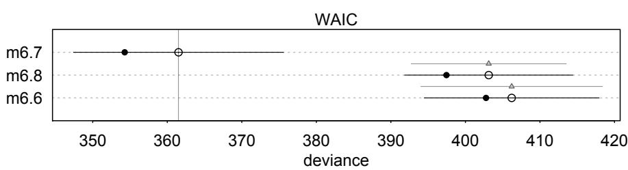
The filled points are the in-sample deviance values. The open points are the WAIC values. Notice that naturally each model does better in-sample than it is expected to do out-ofsample. The line segments show the standard error of each WAIC. These are the values in the column labeled SE in the table above. So you can probably see how much better m6.7 is than m6.8. What we really want however is the standard error of the difference in WAIC between the two models. That is shown by the lighter line segment with the triangle on it, between m6.7 and m6.8.
What does all of this mean? It means that WAIC cannot be used to infer causation. We know, because we simulated these data, that the treatment matters. But because fungus mediates treatment—it is on a pipe between treatment and the outcome—once we condition on fungus, treatment provides no additional information. And since fungus is more highly correlated with the outcome, a model using it is likely to predict better. WAIC did its job. Its job is not to infer causation. Its job is to guess predictive accuracy.
That doesn’t mean that WAIC (or CV or PSIS) is useless here. It does provide a useful measure of the expected improvement in prediction that comes from conditioning on the fungus. Although the treatment works, it isn’t 100% effective, and so knowing the treatment is no substitute for knowing whether fungus is present.
Similarly, we can ask about the difference between models m6.8, the model with treatment only, and model m6.6, the intercept model. Model m6.8 provides pretty good evidence that the treatment works. You can inspect the posterior again, if you have forgotten. But WAIC thinks these two models are quite similar. Their difference is only 3 units of deviance. Let’s calculate the standard error of the difference, to highlight the issue:
7.30 set.seed(92)
waic_m6.6 <- WAIC( m6.6 , pointwise=TRUE )$WAIC
diff_m6.6_m6.8 <- waic_m6.6 - waic_m6.8
sqrt( n*var( diff_m6.6_m6.8 ) )[1] 4.858914
The compare table doesn’t show this value, but it did calculate it. To see it, you need the dSE slot of the return:
7.31 set.seed(93)
compare( m6.6 , m6.7 , m6.8 )@dSE| m6.6 | m6.7 | m6.8 | |
|---|---|---|---|
| m6.6 | NA | 12.20638 | 4.934353 |
| m6.7 | 12.206380 | NA | 10.426576 |
| m6.8 | 4.934353 | 10.42658 | NA |
This matrix contains all of the pairwise difference standard errors for the models you compared. Notice that the standard error of the difference for m6.6 and m6.8 is bigger than the difference itself. We really cannot easily distinguish these models on the basis of WAIC. Note that these contrasts are possibly less reliable than the standard errors on each model. There isn’t much analytical work on these contrasts yet, but before long there should be.129
Does this mean that the treatment doesn’t work? Of course not. We know that it works. We simulated the data. And the posterior distribution of the treatment effect, bt in m6.8, is reliably positive. But it isn’t especially large. So it doesn’t do much alone to improve prediction of plant height. There are just too many other sources of variation. This result just echoes the core fact about WAIC (and CV and PSIS): It guesses predictive accuracy, not causal truth. A variable can be causally related to an outcome, but have little relative impact on it, and WAIC will tell you that. That is what is happening in this case. We can use WAIC/CV/PSIS to measure how big a difference some variable makes in prediction. But we cannot use these criteria to decide whether or not some effect exists. We need the posterior distributions of multiple models, maybe examining the implied conditional independencies of a relevant causal graph, to do that.
The last element of the compare table is the column we skipped over, weight. These values are a traditional way to summarize relative support for each model. They always sum to 1, within a set of compared models. The weight of a model i is computed as:
\[w\_{l} = \frac{\exp(-0.5\Delta\_{l})}{\sum\_{j} \exp(-0.5\Delta\_{j})}\]
where ∆i is the difference between model i’s WAIC value and the best WAIC in the set. These are the dWAIC values in the table. These weights can be a quick way to see how big the differences are among models. But you still have to inspect the standard errors. Since the weights don’t reflect the standard errors, they are simply not sufficient for model comparison. Weights are also used in model averaging. Model averaging is a family of methods for combining the predictions of multiple models. For the sake of space, we won’t cover it in this book. But see the endnote for some places to start.130
R code
Rethinking: WAIC metaphors. Here are two metaphors to help explain the concepts behind using WAIC (or another information criterion) to compare models.
Think of models as race horses. In any particular race, the best horse may not win. But it’s more likely to win than is the worst horse. And when the winning horse finishes in half the time of the second-place horse, you can be pretty sure the winning horse is also the best. But if instead it’s a photofinish, with a near tie between first and second place, then it is much harder to be confident about which is the best horse. WAIC values are analogous to these race times—smaller values are better, and the distances between the horses/models are informative. Akaike weights transform differences in finishing time into probabilities of being the best model/horse on future data/races. But if the track conditions or jockey changes, these probabilities may mislead. Forecasting future racing/prediction based upon a single race/fit carries no guarantees.
Think of models as stones thrown to skip on a pond. No stone will ever reach the other side (perfect prediction), but some sorts of stones make it farther than others, on average (make better test predictions). But on any individual throw, lots of unique conditions avail—the wind might pick up or change direction, a duck could surface to intercept the stone, or the thrower’s grip might slip. So which stone will go farthest is not certain. Still, the relative distances reached by each stone therefore provide information about which stone will do best on average. But we can’t be too confident about any individual stone, unless the distances between stones is very large.
Of course neither metaphor is perfect. Metaphors never are. But many people find these to be helpful in interpreting information criteria.
7.5.2. Outliers and other illusions. In the divorce example from Chapter 5, we saw in the posterior predictions that a few States were very hard for the model to retrodict. The State of Idaho in particular was something of an outlier (page 5.5). Individual points like Idaho tend to be very influential in ordinary regression models. Let’s see how PSIS and WAIC represent that importance. Begin by refitting the three divorce models from Chapter 5.
R code7.32 library(rethinking)
data(WaffleDivorce)
d <- WaffleDivorce
d$A <- standardize( d$MedianAgeMarriage )
d$D <- standardize( d$Divorce )
d$M <- standardize( d$Marriage )
m5.1 <- quap(
alist(
D ~ dnorm( mu , sigma ) ,
mu <- a + bA * A ,
a ~ dnorm( 0 , 0.2 ) ,
bA ~ dnorm( 0 , 0.5 ) ,
sigma ~ dexp( 1 )
) , data = d )
m5.2 <- quap(
alist(
D ~ dnorm( mu , sigma ) ,
mu <- a + bM * M ,
a ~ dnorm( 0 , 0.2 ) ,bM ~ dnorm( 0 , 0.5 ) ,
sigma ~ dexp( 1 )
) , data = d )
m5.3 <- quap(
alist(
D ~ dnorm( mu , sigma ) ,
mu <- a + bM*M + bA*A ,
a ~ dnorm( 0 , 0.2 ) ,
bM ~ dnorm( 0 , 0.5 ) ,
bA ~ dnorm( 0 , 0.5 ) ,
sigma ~ dexp( 1 )
) , data = d )Look at the posterior summaries, just to remind yourself that marriage rate (M) has little association with divorce rate (D), once age at marriage (A) is included in m5.3. Now let’s compare these models using PSIS:
7.33 set.seed(24071847)
compare( m5.1 , m5.2 , m5.3 , func=PSIS )
PSIS SE dPSIS dSE pPSIS weightm5.1 127.6 14.69 0.0 NA 4.7 0.71 m5.3 129.4 15.10 1.8 0.90 5.9 0.29 m5.2 140.6 11.21 13.1 10.82 3.8 0.00
There are two important things to consider here. First note that the model that omits marriage rate, m5.1, lands on top. This is because marriage rate has very little association with the outcome. So the model that omits it has slightly better expected out-of-sample performance, even though it actually fits the sample slightly worse than m5.3, the model with both predictors. The difference between the top two models is only 1.8, with a standard error of 0.9, so the models make very similar predictions. This is the typical pattern, whenever some predictor has a very small association with the outcome.
Second, in addition to the table above, you should also receive a message:
Some Pareto k values are very high (>1).This means that the smoothing approximation that PSIS uses is unreliable for some points. Recall from the section on PSIS that when a point’s Pareto k value is above 0.5, the importance weight can be unreliable. Furthermore, these points tend to be outliers with unlikely values, according to the model. As a result, they are highly influential and make it difficult to estimate out-of-sample predictive accuracy. Why? Because any new sample is unlikely to contain these same outliers, and since these outliers were highly influential, they could make out-of-sample predictions worse than expected. WAIC is vulnerable to outliers as well. It doesn’t have an automatic warning. But it does have a way to measure this risk, through the estimate of the overfitting penalty.
Let’s look at the individual States, to see which are causing the problem. We can do this by adding pointwise=TRUE to PSIS. When you do this, you get a matrix with each observation on a row and the PSIS information, including individual Pareto k values, in columns. I’ll also
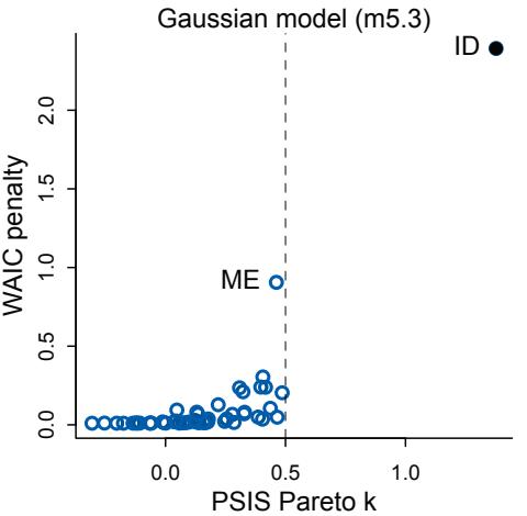
Figure 7.10. Highly influential points and out-of-sample prediction. The horizontal axis is Pareto k from PSIS. The vertical axis is WAIC’s penalty term. The State of Idaho (ID) has an extremely unlikely value, according to the model. As a result it has both a very high Pareto k and a large WAIC penalty. Points like these are highly influential and potentially hurt prediction.
plot the individual “penalty” values from WAIC, to show the relationship between Pareto k and the information theoretic prediction penalty.
R code
7.34 set.seed(24071847)
PSIS_m5.3 <- PSIS(m5.3,pointwise=TRUE)
set.seed(24071847)
WAIC_m5.3 <- WAIC(m5.3,pointwise=TRUE)
plot( PSIS_m5.3$k , WAIC_m5.3$penalty , xlab="PSIS Pareto k" ,
ylab="WAIC penalty" , col=rangi2 , lwd=2 )This plot is shown in Figure 7.10. Individual points are individual States, with Pareto k on the horizontal axis and WAIC’s penalty term. The State of Idaho (ID, upper-right corner) has both a very high Pareto k value (above 1) and a large penalty term (over 2). As you saw back in Chapter 5, Idaho has a very low divorce rate for its age at marriage. As a result, it is highly influential—it exerts more influence on the posterior distribution than other States do. The Pareto k value is double the theoretical point at which the variance becomes infinite (shown by the dashed line). Likewise, WAIC assigns Idaho a penalty over 2. This penalty term is sometimes called the “effective number of parameters,” because in ordinary linear regressions the sum of all penalty terms from all points tends to be equal to the number of free parameters in the model. But in this case there are 4 parameters and the total penalty is closer to 6—check WAIC(m5.3). The outlier Idaho is causing this additional overfitting risk.
What can be done about this? There is a tradition of dropping outliers. People sometimes drop outliers even before a model is fit, based only on standard deviations from the mean outcome value. You should never do that—a point can only be unexpected and highly influential in light of a model. After you fit a model, the picture changes. If there are only a few outliers, and you are sure to report results both with and without them, dropping outliers might be okay. But if there are several outliers and we really need to model them, what then?
A basic problem here is that the Gaussian error model is easily surprised. Gaussian distributions (introduced at the start of Chapter 4) have very thin tails. This means that very little probability mass is given to observations far from the mean. Many natural phenomena do have very thin tails like this. Human height is a good example. But many phenomena do
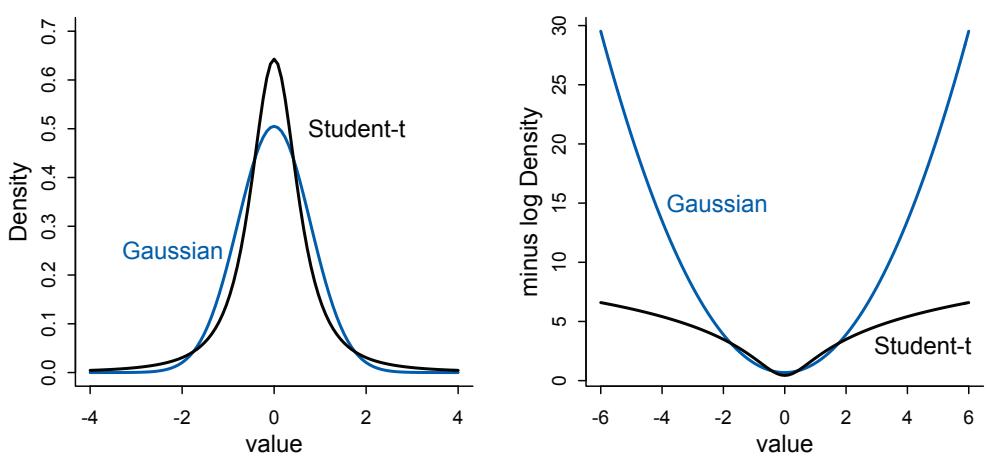
Figure 7.11. Thin tails and influential observations. The Gaussian distribution (blue) assigns very little probability to extreme observations. It has thin tails. The Student-t distribution with shape ν = 2 (black) assigns more probability to extreme events. These distributions are compared on the probability (left) and log-probability (right) scales.
not. Instead many phenomena have thicker tails with rare, extreme observations. These are not measurement errors, but real events containing information about natural process.
One way to both use these extreme observations and reduce their influence is to employ some kind of robust regression. A “robust regression” can mean many different things, but usually it indicates a linear model in which the influence of extreme observations is reduced. A common and useful kind of robust regression is to replace the Gaussian model with a thicker-tailed distribution like Student’s t (or “Student-t”) distribution.131 This distribution has nothing to do with students. The Student-t distribution arises from a mixture of Gaussian distributions with different variances.132 If the variances are diverse, then the tails can be quite thick.
The generalized Student-t distribution has the same mean µ and scale σ parameters as the Gaussian, but it also has an extra shape parameter ν that controls how thick the tails are. The rethinking package provides Student-t as dstudent. When ν is large, the tails are thin, converging in the limit ν = ∞ to a Gaussian distribution. But as ν approaches 1, the tails get thicker and rare extreme observations occur more often. Figure 7.11 compares a Gaussian distribution (in blue) to a corresponding Student-t distribution (in black) with ν = 2. The Student-t distribution has thicker tails, and this is most obvious on the log scale (right), where the Gaussian tails shrink quadratically—a normal distribution is just an exponentiated parabola remember—while the Student-t tails shrink much more slowly.
If you have a very large data set with such events, you could estimate ν. Financial time series, taken over very long periods, are one example. But when using robust regression, we don’t usually try to estimate ν, because there aren’t enough extreme observations to do so. Instead we assume ν is small (thick tails) in order to reduce the influence of outliers. For example, if we use the severity of wars since 1950 to estimate a trend, the estimate is likely biased by the fact that big conflicts like the first and second World Wars are rare. They reside in the thick tail of war casualties.133 A reasonable estimate depends upon either a longer time series or judicious use of a thick tailed distribution.
Let’s re-estimate the divorce model using a Student-t distribution with ν = 2.
R code
7.35 m5.3t <- quap(
alist(
D ~ dstudent( 2 , mu , sigma ) ,
mu <- a + bM*M + bA*A ,
a ~ dnorm( 0 , 0.2 ) ,
bM ~ dnorm( 0 , 0.5 ) ,
bA ~ dnorm( 0 , 0.5 ) ,
sigma ~ dexp( 1 )
) , data = d )When you compute PSIS now, PSIS(m5.3t), you won’t get any warnings about Pareto k values. The relative influence of Idaho has been much reduced. How does this impact the posterior distribution of the association between age at marriage and divorce? If you compare models m5.3t and m5.3, you’ll see that the coefficient bA has gotten farther from zero when we introduce the Student-t distribution. This is because Idaho has a low divorce rate and a low median age at marriage. When it was influential, it reduced the association between age at marriage and divorce. Now it is less influential, so the association is estimated to be slightly larger. But the consequence of using robust regression is not always to increase an association. It depends upon the details.
Another thing that thick-tailed distributions make possible is control over how conflict between prior and data is handled. We’ll revisit this point in a later chapter, once you have started using Markov chains and can derive non-Gaussian posterior distributions.
Rethinking: The Curse of Tippecanoe. One concern with model comparison is, if we try enough combinations and transformations of predictors, we might eventually find a model that fits any sample very well. But this fit will be badly overfit, unlikely to generalize. And WAIC and similar metrics will be fooled. Consider by analogy the Curse of Tippecanoe. 134 From the year 1840 until 1960, every United States president who was elected in a year ending in the digit 0 (which happens every 20 years) has died in office. William Henry Harrison was the first, elected in 1840 and died of pneumonia the next year. John F. Kennedy was the last, elected in 1960 and assassinated in 1963. Seven American presidents died in sequence in this pattern. Ronald Reagan was elected in 1980, but despite at least one attempt on his life, he managed to live long after his term, breaking the curse. Given enough time and data, a pattern like this can be found for almost any body of data. If we search hard enough, we are bound to find a Curse of Tippecanoe.
Fiddling with and constructing many predictor variables is a great way to find coincidences, but not necessarily a great way to evaluate hypotheses. However, fitting many possible models isn’t always a dangerous idea, provided some judgment is exercised in weeding down the list of variables at the start. There are two scenarios in which this strategy appears defensible. First, sometimes all one wants to do is explore a set of data, because there are no clear hypotheses to evaluate. This is rightly labeled pejoratively as data dredging, when one does not admit to it. But when used together with model averaging, and freely admitted, it can be a way to stimulate future investigation. Second, sometimes we need to convince an audience that we have tried all of the combinations of predictors, because none of the variables seem to help much in prediction.
7.6. Summary
This chapter has been a marathon. It began with the problem of overfitting, a universal phenomenon by which models with more parameters fit a sample better, even when the additional parameters are meaningless. Two common tools were introduced to address overfitting: regularizing priors and estimates of out-of-sample accuracy (WAIC and PSIS). Regularizing priors reduce overfitting during estimation, and WAIC and PSIS help estimate the degree of overfitting. Practical functions compare in the rethinking package were introduced to help analyze collections of models fit to the same data. If you are after causal estimates, then these tools will mislead you. So models must be designed through some other method, not selected on the basis of out-of-sample predictive accuracy. But any causal estimate will still overfit the sample. So you always have to worry about overfitting, measuring it with WAIC/PSIS and reducing it with regularization.
7.7. Practice
Problems are labeled Easy (E), Medium (M), and Hard (H).
7E1. State the three motivating criteria that define information entropy. Try to express each in your own words.
7E2. Suppose a coin is weighted such that, when it is tossed and lands on a table, it comes up heads 70% of the time. What is the entropy of this coin?
7E3. Suppose a four-sided die is loaded such that, when tossed onto a table, it shows “1” 20%, “2” 25%, “3” 25%, and “4” 30% of the time. What is the entropy of this die?
7E4. Suppose another four-sided die is loaded such that it never shows “4”. The other three sides show equally often. What is the entropy of this die?
7M1. Write down and compare the definitions of AIC and WAIC. Which of these criteria is most general? Which assumptions are required to transform the more general criterion into a less general one?
7M2. Explain the difference between model selection and model comparison. What information is lost under model selection?
7M3. When comparing models with an information criterion, why must all models be fit to exactly the same observations? What would happen to the information criterion values, if the models were fit to different numbers of observations? Perform some experiments, if you are not sure.
7M4. What happens to the effective number of parameters, as measured by PSIS or WAIC, as a prior becomes more concentrated? Why? Perform some experiments, if you are not sure.
7M5. Provide an informal explanation of why informative priors reduce overfitting.
7M6. Provide an informal explanation of why overly informative priors result in underfitting.
7H1. In 2007, The Wall Street Journal published an editorial (“We’re Number One, Alas”) with a graph of corporate tax rates in 29 countries plotted against tax revenue. A badly fit curve was drawn in (reconstructed at right), seemingly by hand, to make the argument that the relationship between tax rate and tax revenue increases and then declines, such that higher tax rates can actually produce less tax revenue. I want you to actually fit a curve to these data, found in data(Laffer). Consider models that use tax rate to predict tax revenue. Compare, using WAIC or PSIS, a straight-line model to any curved models you like. What do you conclude about the relationship between tax rate and tax revenue?
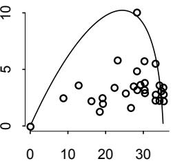
7H2. In the Laffer data, there is one country with a high tax revenue that is an outlier. Use PSIS and WAIC to measure the importance of this outlier in the models you fit in the previous problem. Then use robust regression with a Student’s t distribution to revisit the curve fitting problem. How much does a curved relationship depend upon the outlier point?
7H3. Consider three fictional Polynesian islands. On each there is a Royal Ornithologist charged by the king with surveying the bird population. They have each found the following proportions of 5 important bird species:
| Species A | Species B | Species C | Species D | Species E | |
|---|---|---|---|---|---|
| Island 1 | 0.2 | 0.2 | 0.2 | 0.2 | 0.2 |
| Island 2 | 0.8 | 0.1 | 0.05 | 0.025 | 0.025 |
| Island 3 | 0.05 | 0.15 | 0.7 | 0.05 | 0.05 |
Notice that each row sums to 1, all the birds. This problem has two parts. It is not computationally complicated. But it is conceptually tricky. First, compute the entropy of each island’s bird distribution. Interpret these entropy values. Second, use each island’s bird distribution to predict the other two. This means to compute the KL divergence of each island from the others, treating each island as if it were a statistical model of the other islands. You should end up with 6 different KL divergence values. Which island predicts the others best? Why?
7H4. Recall the marriage, age, and happiness collider bias example from Chapter 6. Run models m6.9 and m6.10 again(page 178). Compare these two models usingWAIC (or PSIS, they will produce identical results). Which model is expected to make better predictions? Which model provides the correct causal inference about the influence of age on happiness? Can you explain why the answers to these two questions disagree?
7H5. Revisit the urban fox data, data(foxes), from the previous chapter’s practice problems. Use WAIC or PSIS based model comparison on five different models, each using weight as the outcome, and containing these sets of predictor variables:
- avgfood + groupsize + area
- avgfood + groupsize
- groupsize + area
- avgfood
- area
Can you explain the relative differences in WAIC scores, using the fox DAG from the previous chapter? Be sure to pay attention to the standard error of the score differences (dSE).
8 Conditional Manatees
The manatee (Trichechus manatus) is a slow-moving, aquatic mammal that lives in warm, shallow water. Manatees have no natural predators, but they do share their waters with motor boats. And motor boats have propellers. While manatees are related to elephants and have very thick skins, propeller blades can and do kill them. A majority of adult manatees bear some kind of scar earned in a collision with a boat(Figure 8.1, top).135
The Armstrong Whitworth A.W.38 Whitley was a frontline Royal Air Force bomber. During the second World War, the A.W.38 carried bombs and pamphlets into German territory. Unlike the manatee, the A.W.38 has fierce natural enemies: artillery and interceptor fire. Many planes never returned from their missions. And those that survived had the scars to prove it (Figure 8.1, bottom).
How is a manatee like an A.W.38 bomber? In both cases—manatee propeller scars and bomber bullet holes—we’d like to do something to improve the odds, to help manatees and bombers survive. Most observers intuit that helping manatees or bombers means reducing the kind of damage we see on them. For manatees, this might mean requiring propeller guards (on the boats, not the manatees). For bombers, it’d mean adding armor to the parts of the plane that show the most damage.
But in both cases, the evidence misleads us. Propellers do not cause most of the injury and death caused to manatees. Rather autopsies confirm that collisions with blunt parts of the boat, like the keel, do far more damage. Similarly, up-armoring the damaged portions of returning bombers did little good. Instead, improving the A.W.38 bomber meant armoring the undamaged sections.136 The evidence from surviving manatees and bombers is misleading, because it isconditional on survival. Manatees and bombers that perished look different. A manatee struck by a keel is less likely to live than another grazed by a propeller. So among the survivors, propeller scars are common. Similarly, bombers that returned home conspicuously lacked damage to the cockpit and engines. They got lucky. Bombers that never returned home were less so. To get the right answer, in either context, we have to realize that the kind of damage seen is conditional on survival.
Conditioning is one of the most important principles of statistical inference. Data, like the manatee scars and bomber damage, are conditional on how they get into our sample. Posterior distributions are conditional on the data. All model-based inference is conditional on the model. Every inference is conditional on something, whether we notice it or not.
And a large part of the power of statistical modeling comes from creating devices that allow probability to be conditional of aspects of each case. The linear models you’ve grown to love are just crude devices that allow each outcome yi to be conditional on a set of predictors for each case i. Like the epicycles of the Ptolemaic and Kopernikan models (Chapters 4 and 7), linear models give us a way to describe conditionality.
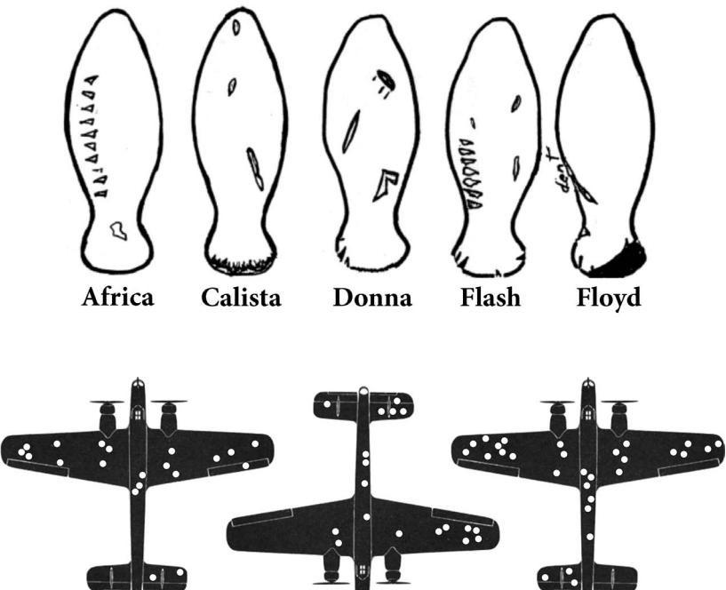
Figure 8.1. top: Dorsal scars for 5 adult Florida manatees. Rows of short scars, for example on the individuals Africa and Flash, are indicative of propeller laceration. bottom: Three exemplars of damage on A.W.38 bombers returning from missions.
Simple linear models frequently fail to provide enough conditioning, however. Every model so far in this book has assumed that each predictor has an independent association with the mean of the outcome. What if we want to allow the association to be conditional? For example, in the primate milk data from the previous chapters, suppose the relationship between milk energy and brain size varies by taxonomic group (ape, monkey, prosimian). This is the same as suggesting that the influence of brain size on milk energy is conditional on taxonomic group. The linear models of previous chapters cannot address this question.
To model deeper conditionality—where the importance of one predictor depends upon another predictor—we need interaction (also known as moderation). Interaction is a kind of conditioning, a way of allowing parameters (really their posterior distributions) to be conditional on further aspects of the data. The simplest kind of interaction, a linear interaction, is built by extending the linear modeling strategy to parameters within the linear model. So it is akin to placing epicycles on epicycles in the Ptolemaic and Kopernikan models. It is descriptive, but very powerful.
More generally, interactions are central to most statistical models beyond the cozy world of Gaussian outcomes and linear models of the mean. In generalized linear models (GLMs, Chapter 10 and onwards), even when one does not explicitly define variables as interacting, they will always interact to some degree. Multilevel models induce similar effects. Common sorts of multilevel models are essentially massive interaction models, in which estimates (intercepts and slopes) are conditional on clusters (person, genus, village, city, galaxy) in the data. Multilevel interaction effects are complex. They’re not just allowing the impact of a
predictor variable to change depending upon some other variable, but they are also estimating aspects of the distribution of those changes. This may sound like genius, or madness, or both. Regardless, you can’t have the power of multilevel modeling without it.
Models that allow for complex interactions are easy to fit to data. But they can be considerably harder to understand. And so I spend this chapter reviewing simple interaction effects: how to specify them, how to interpret them, and how to plot them. The chapter starts with a case of an interaction between a single categorical (indicator) variable and a single continuous variable. In this context, it is easy to appreciate the sort of hypothesis that an interaction allows for. Then the chapter moves on to more complex interactions between multiple continuous predictor variables. These are harder. In every section of this chapter, the model predictions are visualized, averaging over uncertainty in parameters.
Interactions are common, but they are not easy. My hope is that this chapter lays a solid foundation for interpreting generalized linear and multilevel models in later chapters.
Rethinking: Statistics all-star, Abraham Wald. The World War II bombers story is the work of Abraham Wald (1902–1950). Wald was born in what is now Romania, but immigrated to the United States after the Nazi invasion of Austria. Wald made many contributions over his short life. Perhaps most germane to the current material, Wald proved that for many types of rules for making statistical decisions, there will exist a Bayesian rule that is at least as good as any non-Bayesian one. Wald proved this, remarkably, beginning with non-Bayesian premises, and so anti-Bayesians could not ignore it. This work was summarized in Wald’s 1950 book, published just before his death.137 Wald died much too young, from a plane crash while touring India.
8.1. Building an interaction
Africa is special. The second largest continent, it is the most culturally and genetically diverse. Africa has about 3 billion fewer people than Asia, but it has just as many living languages. Africa is so genetically diverse that most of the genetic variation outside of Africa is just a subset of the variation within Africa. Africa is also geographically special, in a puzzling way: Bad geography tends to be related to bad economies outside of Africa, but African economies may actually benefit from bad geography.
To appreciate the puzzle, look at regressions of terrain ruggedness—a particular kind of bad geography—against economic performance (log GDP138 per capita in the year 2000), both inside and outside of Africa (Figure 8.2). The variable rugged is a Terrain Ruggedness Index139 that quantifies the topographic heterogeneity of a landscape. The outcome variable here is the logarithm of real gross domestic product per capita, from the year 2000, rgdppc_2000. We use the logarithm of it, because the logarithm of GDP is the magnitude of GDP. Since wealth generates wealth, it tends to be exponentially related to anything that increases it. This is like saying that the absolute distances in wealth grow increasingly large, as nations become wealthier. So when we work with logarithms instead, we can work on a more evenly spaced scale of magnitudes. Regardless, keep in mind that a log transform loses no information. It just changes what the model assumes about the shape of the association between variables. In this case, raw GDP is not linearly associated with anything, because of its exponential pattern. But log GDP is linearly associated with lots of things.
What is going on in this figure? It makes sense that ruggedness is associated with poorer countries, in most of the world. Rugged terrain means transport is difficult. Which means market access is hampered. Which means reduced gross domestic product. So the reversed
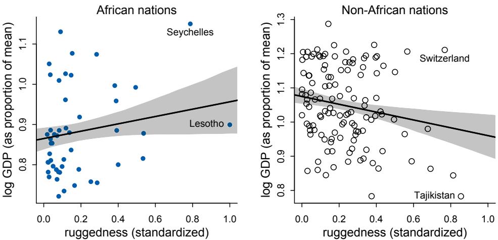
Figure 8.2. Separate linear regressions inside and outside of Africa, for log-GDP against terrain ruggedness. The slope is positive inside Africa, but negative outside. How can we recover this reversal of the slope, using the combined data?
relationship within Africa is puzzling. Why should difficult terrain be associated with higher GDP per capita?
If this relationship is at all causal, it may be because rugged regions of Africa were protected against the Atlantic and Indian Ocean slave trades. Slavers preferred to raid easily accessed settlements, with easy routes to the sea. Those regions that suffered under the slave trade understandably continue to suffer economically, long after the decline of slave-trading markets. However, an outcome like GDP has many influences, and is furthermore a strange measure of economic activity. And ruggedness is correlated with other geographic features, like coastlines, that also influence the economy. So it is hard to be sure what’s going on here.
The causal hypothesis, in DAG form, might be (but see the Overthinking box at the end of this section):
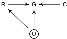
where R is terrain ruggedness, G is GDP, C is continent, and U is some set of unobserved confounds (like distance to coast). Let’s ignore U for now. You’ll consider some confounds in the practice problems at the end. Focus instead on the implication that R and C both influenceG. This could mean that they are independent influences or rather that they interact (one moderates the influence of the other). The DAG does not display an interaction. That’s because DAGs do not specify how variables combine to influence other variables. The DAG above implies only that there is some function that uses R and C to generate G. In typical notation, G = f(R, C).
So we need a statistical approach to judge different propositions for f(R, C). How do we make a model that produces the conditionality in Figure 8.2? We could cheat by splitting the data into two data frames, one for Africa and one for all the other continents. But it’s not a good idea to split the data in this way. Here are four reasons.
First, there are usually some parameters, such as σ, that the model says do not depend in any way upon continent. By splitting the data table, you are hurting the accuracy of the estimates for these parameters, because you are essentially making two less-accurate estimates instead of pooling all of the evidence into one estimate. In effect, you have accidentally assumed that variance differs between African and non-African nations. Now, there’s nothing wrong with that sort of assumption. But you want to avoid accidental assumptions.
Second, in order to acquire probability statements about the variable you used to split the data, cont_africa in this case, you need to include it in the model. Otherwise, you have a weak statistical argument. Isn’t there uncertainty about the predictive value of distinguishing between African and non-African nations? Of course there is. Unless you analyze all of the data in a single model, you can’t easily quantify that uncertainty. If you just let the posterior distribution do the work for you, you’ll have a useful measure of that uncertainty.
Third, we may want to use information criteria or another method to compare models. In order to compare a model that treats all continents the same way to a model that allows different slopes in different continents, we need models that use all of the same data (as explained in Chapter 7). This means we can’t split the data for two separate models. We have to let a single model internally split the data.
Fourth, once you begin using multilevel models(Chapter 13), you’ll see that there are advantages to borrowing information across categories like “Africa” and “not Africa.” This is especially true when sample sizes vary across categories, such that overfitting risk is higher within some categories. In other words, what we learn about ruggedness outside of Africa should have some effect on our estimate within Africa, and visa versa. Multilevel models (Chapter 13) borrow information in this way, in order to improve estimates in all categories. When we split the data, this borrowing is impossible.
Overthinking: Not so simple causation. The terrain ruggedness DAG in the preceding section is simple. But the truth isn’t so simple. Continent isn’t really the cause of interest. Rather there are hypothetical historical exposures to colonialism and the slave trade that have persistent influences on economic performance. Terrain features, like ruggedness, that causally reduced those historical factors may indirectly influence economy. Like this:
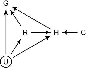
H stands for historical factors like exposure to slave trade. The total causal influence of R contains both a direct path R → G (this is presumably always negative) and an indirect path R → H → G. The second path is the one that covaries with continent C, because H is strongly associated with C. Note that the confounds U could influence any of these variables (except for C). If for example distance to coast is really what influenced H in the past, not terrain ruggedness, then the association of terrain ruggedness with GDP is non-causal. The data contain a large number of potential confounds that you might consider. Natural systems like this are terrifyingly complex.
8.1.1. Making a rugged model. Let’s see how to recover the reversal of slope, within a single model. We’ll begin by fitting a single model to all the data, ignoring continent. This will let us think through the model structure and priors before facing the devil of interaction. To get started, load the data and preform some pre-processing:
R code
8.1 library(rethinking)
data(rugged)
d <- rugged
# make log version of outcome
d$log_gdp <- log( d$rgdppc_2000 )
# extract countries with GDP data
dd <- d[ complete.cases(d$rgdppc_2000) , ]
# rescale variables
dd$log_gdp_std <- dd$log_gdp / mean(dd$log_gdp)
dd$rugged_std <- dd$rugged / max(dd$rugged)Each row in these data is a country, and the various columns are economic, geographic, and historical features.140 Raw magnitudes of GDP and terrain ruggedness aren’t meaningful to humans. So I’ve scaled the variables to make the units easier to work with. The usual standardization is to subtract the mean and divide by the standard deviation. This makes a variable into z-scores. We don’t want to do that here, because zero ruggedness is meaningful. So instead terrain ruggedness is divided by the maximum value observed. This means it ends up scaled from totally flat (zero) to the maximum in the sample at 1 (Lesotho, a very rugged and beautiful place). Similarly, log GDP is divided by the average value. So it is rescaled as a proportion of the international average. 1 means average, 0.8 means 80% of the average, and 1.1 means 10% more than average.
To build a Bayesian model for this relationship, we’ll again use our geocentric skeleton:
\[\log(y\_i) \sim \text{Normal}(\mu\_i, \sigma)\]
\[\mu\_i = \alpha + \beta(r\_i - \bar{r})\]
where yi is GDP for nation i, ri is terrain ruggedness for nation i, and ¯r is the average ruggedness in the whole sample. Its value is 0.215—most nations aren’t that rugged. Remember that using ¯r just makes it easier to assign a prior to the intercept α.
The hard thinking here comes when we specify priors. If you are like me, you don’t have much scientific information about plausible associations between log GDP and terrain ruggedness. But even when we don’t know much about the context, the measurements themselves constrain the priors in useful ways. The scaled outcome and predictor will make this easier. Consider first the intercept, α, defined as the log GDP when ruggedness is at the sample mean. So it must be close to 1, because we scaled the outcome so that the mean is 1. Let’s start with a guess at:
α ∼ Normal(1, 1)Now for β, the slope. If we center it on zero, that indicates no bias for positive or negative, which makes sense. But what about the standard deviation? Let’s start with a guess at 1:
\[\beta \sim \text{Normal}(0, 1)\]
We’ll evaluate this guess by simulating prior predictive distributions. The last thing we need is a prior for σ. Let’s assign something very broad, σ ∼ Exponential(1). In the problems at the end of the chapter, I’ll ask you to confront this prior as well. But we’ll ignore it for the rest of this example.
All together, we have our first candidate model for the terrain ruggedness data:
8.2 m8.1 <- quap(
alist(
log_gdp_std ~ dnorm( mu , sigma ) ,
mu <- a + b*( rugged_std - 0.215 ) ,
a ~ dnorm( 1 , 1 ) ,
b ~ dnorm( 0 , 1 ) ,
sigma ~ dexp( 1 )
) , data=dd )We’re not going to look at the posterior predictions yet, but rather at the prior predictions. Let’s extract the prior and plot the implied lines. We’ll do this using link.
8.3 set.seed(7)
prior <- extract.prior( m8.1 )
# set up the plot dimensions
plot( NULL , xlim=c(0,1) , ylim=c(0.5,1.5) ,
xlab="ruggedness" , ylab="log GDP" )
abline( h=min(dd$log_gdp_std) , lty=2 )
abline( h=max(dd$log_gdp_std) , lty=2 )
# draw 50 lines from the prior
rugged_seq <- seq( from=-0.1 , to=1.1 , length.out=30 )
mu <- link( m8.1 , post=prior , data=data.frame(rugged_std=rugged_seq) )
for ( i in 1:50 ) lines( rugged_seq , mu[i,] , col=col.alpha("black",0.3) )The result is displayed on the left side of Figure 8.3. The horizontal dashed lines show the maximum and minimum observed log GDP values. The regression lines trend both positive and negative, as they should, but many of these lines are in impossible territory. Considering only the measurement scales, the lines have to pass closer to the point where ruggedness is average (0.215 on the horizontal axis) and proportional log GDP is 1. Instead there are lots of lines that expect average GDP outside observed ranges. So we need a tighter standard deviation on the α prior. Something like α ∼ Normal(0, 0.1) will put most of the plausibility within the observed GDP values. Remember: 95% of the Gaussian mass is within 2 standard deviations. So a Normal(0, 0.1) prior assigns 95% of the plausibility between 0.8 and 1.2. That is still very vague, but at least it isn’t ridiculous.
At the same time, the slopes are too variable. It is not plausible that terrain ruggedness explains most of the observed variation in log GDP. An implausibly strong association would be, for example, a line that goes from minimum ruggedness and extreme GDP on one end to maximum ruggedness and the opposite extreme of GDP on the other end. I’ve highlighted such a line in blue. The slope of such a line must be about 1.3 − 0.7 = 0.6, the difference between the maximum and minimum observed proportional log GDP. But very many lines
R code
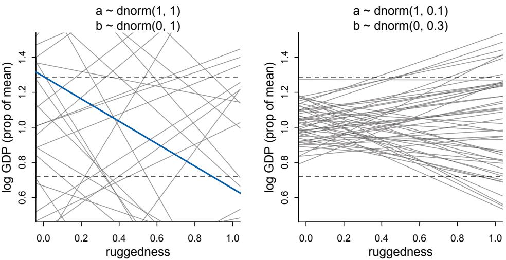
Figure 8.3. Simulating in search of reasonable priors for the terrain ruggedness example. The dashed horizontal lines indicate the minimum and maximum observed GDP values. Left: The first guess with very vague priors. Right: The improved model with much more plausible priors.
in the prior have much more extreme slopes than this. Under the β ∼ Normal(0, 1) prior, more than half of all slopes will have absolute value greater than 0.6.
R code
8.4 sum( abs(prior$b) > 0.6 ) / length(prior$b)[1] 0.545
Let’s try instead β ∼ Normal(0, 0.3). This prior makes a slope of 0.6 two standard deviations out. That is still a bit too plausible, but it’s a lot better than before.
With these two changes, now the model is:
R code
8.5 m8.1 <- quap(
alist(
log_gdp_std ~ dnorm( mu , sigma ) ,
mu <- a + b*( rugged_std - 0.215 ) ,
a ~ dnorm( 1 , 0.1 ) ,
b ~ dnorm( 0 , 0.3 ) ,
sigma ~ dexp(1)
) , data=dd )You can extract the prior and plot the implied lines using the same code as before. The result is shown on the right side of Figure 8.3. Some of these slopes are still implausibly strong. But in the main, this is a much better set of priors. Let’s look at the posterior now:
R code
8.6 precis( m8.1 )
mean sd 5.5% 94.5%
a 1.00 0.01 0.98 1.02b 0.00 0.05 -0.09 0.09 sigma 0.14 0.01 0.12 0.15
Really no overall association between terrain ruggedness and log GDP. Next we’ll see how to split apart the continents.
Rethinking: Practicing for when it matters. The exercise in Figure 8.3 is really not necessary in this example, because there is enough data, and the model is simple enough, that even awful priors get washed out. You could even use completely flat priors (don’t!), and it would all be fine. But we practice doing things right not because it always matters. Rather, we practice doing things right so that we are ready when it matters. No one would say that wearing a seat belt was a mistake, just because you didn’t get into an accident.
8.1.2. Adding an indicator variable isn’t enough. The first thing to realize is that just including an indicator variable for African nations, cont_africa here, won’t reveal the reversed slope. It’s worth fitting this model to prove it to yourself, though. I’m going to walk through this as a simple model comparison exercise, just so you begin to get some applied examples of concepts you’ve accumulated from earlier chapters. Note that model comparison here is not about selecting a model. Scientific considerations already select the relevant model. Instead it is about measuring the impact of model differences while accounting for overfitting risk.
To build a model that allows nations inside and outside Africa to have different intercepts, we need to modify the model for µi so that the mean is conditional on continent. The conventional way to do this would be to just add another term to the linear model:
\[\mu\_{\bar{l}} = \alpha + \beta(r\_{\bar{l}} - \bar{r}) + \gamma A\_{\bar{l}}\]
where Ai is cont_africa, a 0/1 indicator variable. But let’s not follow this convention. In fact, this convention is often a bad idea. It took me years to figure this out, and I’m trying to save you from the horrors I’ve seen. The problem here, and in general, is that we need a prior for γ. Okay, we can do priors. But what that prior will necessarily do is tell the model that µi for a nation in Africa is more uncertain, before seeing the data, than µi outside Africa. And that makes no sense. This is the same issue we confronted back in Chapter 4, when I introduced categorical variables.
There is a simple solution: Nations in Africa will get one intercept and those outside Africa another. This is what µi looks like now:
\[ \mu\_{\bar{\imath}} = \alpha\_{\text{cup}[\bar{\imath}]} + \beta (r\_{\bar{\imath}} - \bar{r}), \]
where cid is an index variable, continent ID. It takes the value 1 for African nations and 2 for all other nations. This means there are two parameters, α1 and α2, one for each unique index value. The notation cid[i] just means the value of cid on row i. I use the bracket notation with index variables, because it is easier to read than adding a second level of subscript, αcidi . We can build this index ourselves:
8.7 # make variable to index Africa (1) or not (2)
dd$cid <- ifelse( dd$cont_africa==1 , 1 , 2 )Using this approach, instead of the conventional approach of adding another term with the 0/1 indicator variable, doesn’t force us to say that the mean for Africa is inherently less certain than the mean for all other continents. We can just reuse the same prior as before. After all,
whatever Africa’s average log GDP, it is surely within plus-or-minus 0.2 of 1. But keep in mind that this is structurally the same model you’d get in the conventional approach. It is just much easier this way to assign sensible priors. You could easily assign different priors to the different continents, if you thought that was the right thing to do.
To define the model in quap, we add brackets in the linear model and the prior:
R code
8.8 m8.2 <- quap(
alist(
log_gdp_std ~ dnorm( mu , sigma ) ,
mu <- a[cid] + b*( rugged_std - 0.215 ) ,
a[cid] ~ dnorm( 1 , 0.1 ) ,
b ~ dnorm( 0 , 0.3 ) ,
sigma ~ dexp( 1 )
) , data=dd )Now to compare these models, using WAIC:
R code
8.9 compare( m8.1 , m8.2 )WAIC SE dWAIC dSE pWAIC weight m8.2 -252.4 15.38 0.0 NA 4.2 1 m8.1 -188.6 13.20 63.9 15.13 2.8 0
m8.2 gets all the model weight. And while the standard error of the difference in WAIC is 15, the difference itself is 64. So the continent variable seems to be picking up some important association in the sample. The precis output gives a good hint. Note that we need to use depth=2 to display the vector parameter a. With only two parameters in a, it wouldn’t be bad to display it by default. But often a vector like this has hundreds of values, and you don’t want to see each one in a table.
R code8.10 precis( m8.2 , depth=2 )mean sd 5.5% 94.5%
a[1] 0.88 0.02 0.85 0.91
a[2] 1.05 0.01 1.03 1.07
b -0.05 0.05 -0.12 0.03
sigma 0.11 0.01 0.10 0.12The parameter a[1] is the intercept for African nations. It seems reliably lower than a[2]. The posterior contrast between the two intercepts is:
R code
8.11 post <- extract.samples(m8.2)
diff_a1_a2 <- post$a[,1] - post$a[,2]
PI( diff_a1_a2 )5% 94% -0.1990056 -0.1378378
The difference is reliably below zero. Let’s plot the posterior predictions for m8.2, so you can see how, despite its predictive superiority to m8.1, it still doesn’t manage different slopes
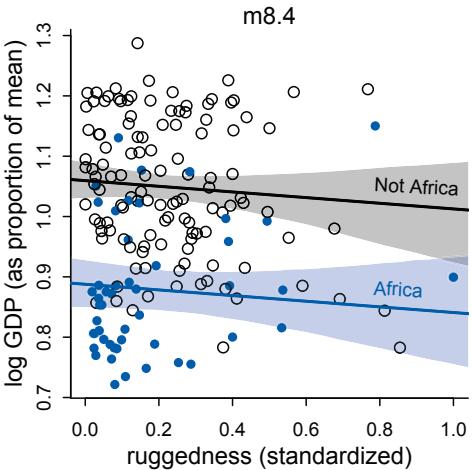
Figure 8.4. Including an indicator for African nations has no effect on the slope. African nations are shown in blue. Non-African nations are shown in black. Regression means for each subset of nations are shown in corresponding colors, along with 97% intervals shown by shading.
inside and outside of Africa. To sample from the posterior and compute the predicted means and intervals for both African and non-African nations:
R code
8.12 rugged.seq <- seq( from=-0.1 , to=1.1 , length.out=30 )
# compute mu over samples, fixing cid=2 and then cid=1
mu.NotAfrica <- link( m8.2 ,
data=data.frame( cid=2 , rugged_std=rugged.seq ) )
mu.Africa <- link( m8.2 ,
data=data.frame( cid=1 , rugged_std=rugged.seq ) )
# summarize to means and intervals
mu.NotAfrica_mu <- apply( mu.NotAfrica , 2 , mean )
mu.NotAfrica_ci <- apply( mu.NotAfrica , 2 , PI , prob=0.97 )
mu.Africa_mu <- apply( mu.Africa , 2 , mean )
mu.Africa_ci <- apply( mu.Africa , 2 , PI , prob=0.97 )I show these posterior predictions (retrodictions) in Figure 8.4. African nations are shown in blue, while nations outside Africa are shown in gray. What you’ve ended up with here is a rather weak negative relationship between economic development and ruggedness. The African nations do have lower overall economic development, and so the blue regression line is below, but parallel to, the black line. All including a dummy variable for African nations has done is allow the model to predict a lower mean for African nations. It can’t do anything to the slope of the line. The fact that WAIC tells you that the model with the dummy variable is hugely better only indicates that African nations on average do have lower GDP.
Rethinking: Why 97%? In the code block just above, and therefore also in Figure 8.4, I used 97% intervals of the expected mean. This is a rather non-standard percentile interval. So why use 97%? In this book, I use non-standard percents to constantly remind the reader that conventions like 95% and 5% are arbitrary. Furthermore, boundaries are meaningless. There is continuous change in probability as we move away from the expected value. So one side of the boundary is almost equally probable as the other side. Also, 97 is a prime number. That doesn’t mean it is a better choice than any other number here, but it’s no less silly than using a multiple of 5, just because we have five digits on each hand. Resist the tyranny of the Tetrapoda.
8.1.3. Adding an interaction does work. How can you recover the change in slope you saw at the start of this section? You need a proper interaction effect. This just means we also make the slope conditional on continent. The definition of µi in the model you just plotted, in math form, is:
\[ \mu\_{\bar{\imath}} = \alpha\_{\text{cup}[\bar{\imath}]} + \beta (r\_{\bar{\imath}} - \bar{r}), \]
And now we’ll double-down on our indexing to make the slope conditional as well:
\[ \mu\_{\bar{l}} = \alpha\_{\text{cup}[\bar{l}]} + \beta\_{\text{cup}[\bar{l}]} (r\_{\bar{l}} - \bar{r}), \]
And again, there is a conventional approach to specifying an interaction that uses an indicator variable and a new interaction parameter. It would look like this:
\[\mu\_{\bar{l}} = \alpha\_{\text{cup}[\bar{l}]} + (\beta + \gamma A\_{\bar{l}})(r\_{\bar{l}} - \bar{r})\]
where Ai is a 0/1 indicator for African nations. This is equivalent to our index approach, but it is much harder to state sensible priors. Any prior we put on γ makes the slope inside Africa more uncertain than the slope outside Africa. And again that makes no sense. But in the indexing approach, we can easily assign the same prior to the slope, no matter which continent.
To approximate the posterior of this new model, you can just use quap as before. Here’s the code that includes an interaction between ruggedness and being in Africa:
R code
8.13 m8.3 <- quap(
alist(
log_gdp_std ~ dnorm( mu , sigma ) ,
mu <- a[cid] + b[cid]*( rugged_std - 0.215 ) ,
a[cid] ~ dnorm( 1 , 0.1 ) ,
b[cid] ~ dnorm( 0 , 0.3 ) ,
sigma ~ dexp( 1 )
) , data=dd )Let’s inspect the marginal posterior distributions:
R code
8.14 precis( m8.5 , depth=2 )mean sd 5.5% 94.5% a[1] 0.89 0.02 0.86 0.91 a[2] 1.05 0.01 1.03 1.07 b[1] 0.13 0.07 0.01 0.25 b[2] -0.14 0.05 -0.23 -0.06 sigma 0.11 0.01 0.10 0.12
The slope is essentially reversed inside Africa, 0.13 instead of −0.14.
How much does allowing the slope to vary improve expected prediction? Let’s use PSIS to compare this new model to the previous two. You could use WAIC here as well. It’ll give almost identical results. But it won’t give us a sweet Pareto k warning.
R code
8.15 compare( m8.1 , m8.2 , m8.3 , func=PSIS )
Some Pareto k values are high (>0.5).PSIS SE dPSIS dSE pPSIS weight
| m8.3 | -258.7 | 15.33 | 0.0 | NA | 5.3 | 0.97 |
|---|---|---|---|---|---|---|
| m8.2 | -251.8 | 15.43 | 6.9 | 6.81 | 4.5 | 0.03 |
| m8.1 | -188.7 | 13.31 | 70.0 | 15.52 | 2.7 | 0.00 |
Model family m8.3 has more than 95% of the weight. That’s very strong support for including the interaction effect, if prediction is our goal. But the modicum of weight given to m8.2 suggests that the posterior means for the slopes in m8.3 are a little overfit. And the standard error of the difference in PSIS between the top two models is almost the same as the difference itself. If you plot PSIS Pareto k values for m8.3, you’ll notice some influential countries.
8.16 plot( PSIS( m8.3 , pointwise=TRUE )$k )
You’ll explore this in the practice problems at the end of the chapter. This is possibly a good context for robust regression, like the Student-t regression we did in Chapter 7.
Remember that these comparisons are not reliable guides to causal inference. They just suggest how important features are for prediction. Real causal effects may not be important for overall prediction in any given sample. Prediction and inference are just different questions. Still, overfitting always happens. So anticipating and measuring it matters for inference as well.
8.1.4. Plotting the interaction. Plotting this model doesn’t really require any new tricks. The goal is to make two plots. In the first, we’ll display nations in Africa and overlay the posterior mean regression line and the 97% interval of that line. In the second, we’ll display nations outside of Africa instead.
R code
8.17 # plot Africa - cid=1
d.A1 <- dd[ dd$cid==1 , ]
plot( d.A1$rugged_std , d.A1$log_gdp_std , pch=16 , col=rangi2 ,
xlab="ruggedness (standardized)" , ylab="log GDP (as proportion of mean)" ,
xlim=c(0,1) )
mu <- link( m8.3 , data=data.frame( cid=1 , rugged_std=rugged_seq ) )
mu_mean <- apply( mu , 2 , mean )
mu_ci <- apply( mu , 2 , PI , prob=0.97 )
lines( rugged_seq , mu_mean , lwd=2 )
shade( mu_ci , rugged_seq , col=col.alpha(rangi2,0.3) )Rethinking: All Greek to me. We use these Greek symbols α and β because it is conventional. They don’t have special meanings. If you prefer some other Greek symbol like ω—why should α get all the attention?—feel free to use that instead. It is conventional to use Greek letters for unobserved variables (parameters) and Roman letters for observed variables (data). That convention does have some value, because it helps others read your models. But breaking the convention is not an error, and sometimes it is better to use a familiar Roman symbol than an unfamiliar Greek one like ξ or ζ. If your readers cannot say the symbol’s name, it could make understanding the model harder.
A core problem with the convention of using Greek for unobserved and Roman for observed variables is that in many models the same variable can be both observed and unobserved. This happens, for example, when data are missing for some cases. It also happens in “occupancy” detection models, where specific values of the outcome (usually zero) cannot be trusted. We will deal with these issues explicitly in Chapter 15.
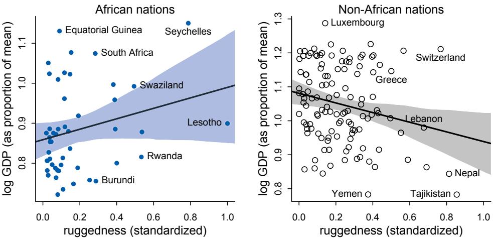
Figure 8.5. Posterior predictions for the terrain ruggedness model, including the interaction between Africa and ruggedness. Shaded regions are 97% posterior intervals of the mean.
mtext("African nations")
# plot non-Africa - cid=2
d.A0 <- dd[ dd$cid==2 , ]
plot( d.A0$rugged_std , d.A0$log_gdp_std , pch=1 , col="black" ,
xlab="ruggedness (standardized)" , ylab="log GDP (as proportion of mean)" ,
xlim=c(0,1) )
mu <- link( m8.3 , data=data.frame( cid=2 , rugged_std=rugged_seq ) )
mu_mean <- apply( mu , 2 , mean )
mu_ci <- apply( mu , 2 , PI , prob=0.97 )
lines( rugged_seq , mu_mean , lwd=2 )
shade( mu_ci , rugged_seq )
mtext("Non-African nations")And the result is shown in Figure 8.5. Finally, the slope reverses direction inside and outside of Africa. And because we achieved this inside a single model, we could statistically evaluate the value of this reversal.
8.2. Symmetry of interactions
Buridan’s ass is a toy philosophical problem in which an ass who always moves towards the closest pile of food will starve to death when he finds himself equidistant between two identical piles. The basic problem is one of symmetry: How can the ass decide between two identical options? Like many toy problems, you can’t take this one too seriously. Of course the ass will not starve. But thinking about how the symmetry is broken can be productive.
Interactions are like Buridan’s ass. Like the two piles of identical food, a simple interaction model contains two symmetrical interpretations. Absent some other information, outside the model, there’s no logical basis for preferring one over the other. Consider for
example the GDP and terrain ruggedness problem. The interaction there has two equally valid phrasings.
- How much does the association between ruggedness and log GDP depend upon whether the nation is in Africa?
- How much does the association of Africa with log GDP depend upon ruggedness?
While these two possibilities sound different to most humans, your golem thinks they are identical. In this section, we’ll examine this fact, first mathematically. Then we’ll plot the ruggedness and GDP example again, but with the reverse phrasing—the association between Africa and GDP depends upon ruggedness.
Consider yet again the model for µi :
\[ \mu\_{\bar{l}} = \alpha\_{\text{cup}[\bar{l}]} + \beta\_{\text{cup}[\bar{l}]} (r\_{\bar{l}} - \bar{r}), \]
The interpretation previously has been that the slope is conditional on continent. But it’s also fine to say that the intercept is conditional on ruggedness. It’s easier to see this if we write the above expression another way:
\[\mu\_{i} = \underbrace{(2 - \text{cnp}\_{i})(\alpha\_{1} + \beta\_{1}(r\_{i} - \bar{r}))}\_{\text{cnp}[i] = 1} + \underbrace{(\text{cnp}\_{i} - 1)(\alpha\_{2} + \beta\_{2}(r\_{i} - \bar{r}))}\_{\text{cnp}[i] = 2}\]
This looks weird, but it’s the same model. When cidi = 1, only the first term, the Africa parameters, remains. The second term vanishes to zero. When instead cidi = 2, the first term vanishes to zero and only the second term remains. Now if we imagine switching a nation to Africa, in order to know what this does for the prediction, we have to know the ruggedness (unless we are exactly at the average ruggedness, ¯r).
It’ll be helpful to plot the reverse interpretation: The association of being in Africa with log GDP depends upon terrain ruggedness. What we’ll do is compute the difference between a nation in Africa and outside Africa, holding its ruggedness constant. To do this, you can just run link twice and then subtract the second result from the first:
R code
8.18 rugged_seq <- seq(from=-0.2,to=1.2,length.out=30)
muA <- link( m8.3 , data=data.frame(cid=1,rugged_std=rugged_seq) )
muN <- link( m8.3 , data=data.frame(cid=2,rugged_std=rugged_seq) )
delta <- muA - muNThen you can summarize and plot the difference in expected log GDP contained in delta.
The result is shown in Figure 8.6. This plot is counter-factual. There is no raw data here. Instead we are seeing through the model’s eyes and imagining comparisons between identical nations inside and outside Africa, as if we could independently manipulate continent and also terrain ruggedness. Below the horizontal dashed line, African nations have lower expected GDP. This is the case for most terrain ruggedness values. But at the highest ruggedness values, a nation is possibly better off inside Africa than outside it. Really it is hard to find any reliable difference inside and outside Africa, at high ruggedness values. It is only in smooth nations that being in Africa is a liability for the economy.
This perspective on the GDP and terrain ruggedness is completely consistent with the previous perspective. It’s simultaneously true in these data (and with this model) that (1) the influence of ruggedness depends upon continent and (2) the influence of continent depends upon ruggedness. Indeed, something is gained by looking at the data in this symmetrical
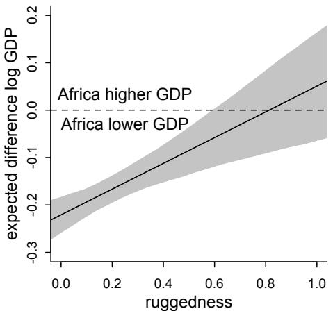
Figure 8.6. The other side of the interaction between ruggedness and continent. The vertical axis is the difference in expected proportional log GDP for a nation in Africa and one outside Africa. At low ruggedness, we expect “moving” a nation to Africa to hurt its economy. But at high ruggedness, the opposite is true. The association between continent and economy depends upon ruggedness, just as much as the association between ruggedness and economy depends upon continent.
perspective. Just inspecting the first view of the interaction, back on page 250, it’s not obvious that African nations are on average nearly always worse off. It’s just at very high values of rugged that nations inside and outside of Africa have the same expected log GDP. This second way of plotting the interaction makes this clearer.
Simple interactions are symmetric, just like the choice facing Buridan’s ass. Within the model, there’s no basis to prefer one interpretation over the other, because in fact they are the same interpretation. But when we reason causally about models, our minds tend to prefer one interpretation over the other, because it’s usually easier to imagine manipulating one of the predictor variables instead of the other. In this case, it’s hard to imagine manipulating which continent a nation is on. But it’s easy to imagine manipulating terrain ruggedness, by flattening hills or blasting tunnels through mountains.141 If in fact the explanation for Africa’s unusually positive relationship with terrain ruggedness is due to historical causes, not contemporary terrain, then tunnels might improve economies in the present. At the same time, continent is not really a cause of economic activity. Rather there are historical and political factors associated with continents, and we use the continent variable as a proxy for those factors. It is manipulation of those other factors that would matter.
8.3. Continuous interactions
I want to convince the reader that interaction effects are difficult to interpret. They are nearly impossible to interpret, using only posterior means and standard deviations. Once interactions exist, multiple parameters are in play at the same time. It is hard enough with the simple, categorical interactions from the terrain ruggedness example. Once we start modeling interactions among continuous variables, it gets much harder. It’s one thing to make a slope conditional upon a category. In such a context, the model reduces to estimating a different slope for each category. But it’s quite a lot harder to understand that a slope varies in a continuous fashion with a continuous variable. Interpretation is much harder in this case, even though the mathematics of the model are essentially the same.
In pursuit of clarifying the construction and interpretation of continuous interactions among two or more continuous predictor variables, in this section I develop a simple regression example and show you a way to plot the two-way interaction between two continuous variables. The method I present for plotting this interaction is a triptych plot, a panel of
three complementary figures that comprise a whole picture of the regression results. There’s nothing magic about having three figures—in other cases you might want more or less. Instead, the utility lies in making multiple figures that allow one to see how the interaction alters a slope, across changes in a chosen variable.
8.3.1. A winter flower. The data in this example are sizes of blooms from beds of tulips grown in greenhouses, under different soil and light conditions.142 Load the data with:
8.19 library(rethinking)
data(tulips)
d <- tulips
str(d)
'data.frame': 27 obs. of 4 variables:
$ bed : Factor w/ 3 levels "a","b","c": 1 1 1 1 1 1 1 1 1 2 ...
$ water : int 1 1 1 2 2 2 3 3 3 1 ...
$ shade : int 1 2 3 1 2 3 1 2 3 1 ...
$ blooms: num 0 0 111 183.5 59.2 ...The blooms column will be our outcome—what we wish to predict. The water and shade columns will be our predictor variables. water indicates one of three ordered levels of soil moisture, from low (1) to high (3). shade indicates one of three ordered levels of light exposure, from high (1) to low (3). The last column, bed, indicates a cluster of plants from the same section of the greenhouse.
Since both light and water help plants grow and produce blooms, it stands to reason that the independent effect of each will be to produce bigger blooms. But we’ll also be interested in the interaction between these two variables. In the absence of light, for example, it’s hard to see how water will help a plant—photosynthesis depends upon both light and water. Likewise, in the absence of water, sunlight does a plant little good. One way to model such an interdependency is to use an interaction effect. In the absence of a good mechanistic model of the interaction, one that uses a theory about the plant’s physiology to hypothesize the functional relationship between light and water, then a simple linear two-way interaction is a good start. But ultimately it’s not close to the best that we could do.
8.3.2. The models. I’m going to focus on just two models: (1) the model with both water and shade but no interaction and (2) the model that also contains the interaction of water with shade. You could also inspect models that contain only one of these variables, water or shade, and I encourage the reader to try that at the end and make sure you understand the full ensemble of models.
The causal scenario is simply that water (W) and shade (S) both influence blooms (B): W → B ← S. As before, this DAG doesn’t tell us the function through which W and S jointly influence B, B = f(W, S). In principle, every unique combination of W and S could have a different mean B. The convention is to do something much simpler. We’ll start simple.
The first model, containing no interaction at all (only “main effects”), begins this way:
\[\begin{aligned} B\_i &\sim \text{Normal}(\mu\_i, \sigma) \\ \mu\_i &= \alpha + \beta\_W (W\_i - \bar{W}) + \beta\_S (\mathbb{S}\_i - \bar{\mathbb{S}}) \end{aligned}\]
where Bi is the value of blooms on row i, Wi is the value of water, and Si is the value of shade. The symbols W¯ and ¯S are the means of water and shade, respectively. All together, this is just a linear regression with two predictors, each centered by subtracting its mean.
To make estimation easier, let’s center W and S and scale B by its maximum:
R code
8.20 d$blooms_std <- d$blooms / max(d$blooms)
d$water_cent <- d$water - mean(d$water)
d$shade_cent <- d$shade - mean(d$shade)Now blooms_std ranges from 0 to 1, and both water_cent and shade_cent range from −1 to 1. I’ve scaled blooms by its maximum observed value, for three reasons. First, the large values on the raw scale will make optimization difficult. Second, it will be easier to assign a reasonable prior this way. Third, we don’t want to standardize blooms, because zero is a meaningful boundary we want to preserve.
When rescaling variables, a good goal is to create focal points that you have prior information about, prior to seeing the actual data. That way we can assign priors that are not obviously crazy. And in thinking about those priors, we might realize that the model makes no sense. But this is only possible if we think about the relationship between measurements and parameters. The exercise of rescaling and assigning priors helps. Even when there are enough data that choice of priors is not crucial, this thought exercise is useful.
There are three parameters (aside from σ) in this model, so we need three priors. As a first, vague guess:
α ∼ Normal(0.5, 1) βW ∼ Normal(0, 1) βS ∼ Normal(0, 1)
Centering the prior for α at 0.5 implies that, when both water and shade are at their mean values, the model expects blooms to be halfway to the observed maximum. The two slopes are centered on zero, implying no prior information about direction. This is obviously less information than we have—basic botany informs us that water should have a positive slope and shade a negative slope. But these priors allow us to see which trend the sample shows, while still bounding the slopes to reasonable values. In the practice problems at the end of the chapter, I’ll ask you to use your botany instead.
The prior bounds on the parameters come from the prior standard deviations, all set to 1 here. These are surely too broad. The intercept α must be greater than zero and less than one, for example. But this prior assigns most of the probability outside that range:
R code
8.21 a <- rnorm( 1e4 , 0.5 , 1 ); sum( a < 0 | a > 1 ) / length( a )[1] 0.6126
If it’s 0.5 units from the mean to zero, then a standard deviation of 0.25 should put only 5% of the mass outside the valid internal. Let’s see:
R code
8.22 a <- rnorm( 1e4 , 0.5 , 0.25 ); sum( a < 0 | a > 1 ) / length( a )
[1] 0.0486
Much better. What about those slopes? What would a very strong effect of water and shade look like? How big could those slopes be in theory? The range of both water and shade is 2 from −1 to 1 is 2 units. To take us from the theoretical minimum of zero blooms on one end to the observed maximum of 1—a range of 1 unit—on the other would require a slope of 0.5 from either variable—0.5 × 2 = 1. So if we assign a standard deviation of 0.25 to each, then 95% of the prior slopes are from −0.5 to 0.5, so either variable could in principle account for the entire range, but it would be unlikely. Remember, the goals here are to assign weakly informative priors to discourage overfitting—impossibly large effects should be assigned low prior probability—and also to force ourselves to think about what the model means.
All together now, in code form:
8.23 m8.4 <- quap(
alist(
blooms_std ~ dnorm( mu , sigma ) ,
mu <- a + bw*water_cent + bs*shade_cent ,
a ~ dnorm( 0.5 , 0.25 ) ,
bw ~ dnorm( 0 , 0.25 ) ,
bs ~ dnorm( 0 , 0.25 ) ,
sigma ~ dexp( 1 )
) , data=d )It’s a good idea at this point to simulate lines from the prior. But before doing that, let’s define the interaction model as well. Then we can talk about how to plot predictions from interactions and see both prior and posterior predictions together.
To build an interaction between water and shade, we need to construct µ so that the impact of changing either water or shade depends upon the value of the other variable. For example, if water is low, then decreasing the shade can’t help as much as when water is high. We want the slope of water, βW, to be conditional on shade. Likewise for shade being conditional on water (remember Buridan’s interaction, page 250). How can we do this?
In the previous example, terrain ruggedness, we made a slope conditional on the value of a category. When there are, in principle, an infinite number of categories, then it’s harder. In this case, the “categories” of shade and water are, in principle, infinite and ordered. We only observed three levels of water, but the model should be able to make a prediction with a water level intermediate between any two of the observed ones. With continuous interactions, the problem isn’t so much the infinite part but rather the ordered part. Even if we only cared about the three observed values, we’d still need to preserve the ordering, which is bigger than which. So what to do?
The conventional answer is to reapply the original geocentrism that justifies a linear regression. When we have two variable, an outcome and a predictor, and we wish to model the mean of the outcome such that it is conditional on the value of a continuous predictor x, we can use a linear model: µi = α + βxi . Now in order to make the slope β conditional on yet another variable, we can just recursively apply the same trick.
For brevity, let Wi and Si be the centered variables. Then if we define the slope βW with its own linear model γW:
\[\begin{aligned} \mu\_i &= \alpha + \gamma\_{W,i} W\_i + \beta\_{\text{S}} \mathbf{S}\_i \\ \gamma\_{W,i} &= \beta\_W + \beta\_{W \text{S}} \mathbf{S}\_i \end{aligned}\]
Now γW,i is the slope defining how quickly blooms change with water level. The parameter βW is the rate of change, when shade is at its mean value. And βWS is the rate change in γW,i as shade changes—the slope for shade on the slope of water. Remember, it’s turtles all the way down. Note the i in γW,i—it depends upon the row i, because it has Si in it.
We also want to allow the association with shade, βS, to depend upon water. Luckily, because of the symmetry of simple interactions, we get this for free. There is just no way to specify a simple, linear interaction in which you can say the effect of some variable x depends upon z but the effect of z does not depend upon x. I explain this in more detail in the Overthinking box at the end of this section. The impact of this is that it is conventional to substitute γW,i into the equation for µi and just state:
\[\mu\_{l} = \alpha + \underbrace{\left(\beta\_{W} + \beta\_{\text{WS}}\mathbb{S}\_{l}\right)}\_{\gamma\text{w},\iota}W\_{l} + \beta\_{\text{S}}\mathbb{S}\_{l} = \alpha + \beta\_{W}W\_{l} + \beta\_{\text{S}}\mathbb{S}\_{l} + \beta\_{\text{WS}}\mathbb{S}\_{l}W\_{l}\]
I just distributed theWi and then placed the SiWi term at the end. And that’s the conventional form of a continuous interaction, with the extra term on the far right end holding the product of the two variables.
Let’s put this to work on the tulips. The interaction model is:
\[\begin{aligned} B\_i &\sim \text{Normal}(\mu\_i, \sigma) \\ \mu\_i &= \alpha + \beta\_W W\_i + \beta\_\mathcal{S} \mathcal{S}\_i + \beta\_{W \mathcal{S}} W\_i \mathcal{S}\_i \end{aligned}\]
The last thing we need is a prior for this new interaction parameter, βWS. This is hard, because these epicycle parameters don’t have clear natural meaning. Still, implied predictions help. Suppose the strongest plausible interaction is one in which high enough shade makes water have zero effect. That implies:
\[ \gamma\_{W,i} = \beta\_\mathbf{w} + \beta\_{\mathbf{W}\mathbf{S}} \mathbf{S}\_i = \mathbf{0} \]
If we set Si = 1 (the maximum in the sample), then this means the interaction needs to be the same magnitude as the main effect, but reversed: βWS = −βW. That is the largest conceivable interaction. So if we set the prior for βWS to have the same standard deviation as βW, maybe that isn’t ridiculous. All together now, in code form:
R code8.24 m8.5 <- quap(
alist(
blooms_std ~ dnorm( mu , sigma ) ,
mu <- a + bw*water_cent + bs*shade_cent + bws*water_cent*shade_cent ,
a ~ dnorm( 0.5 , 0.25 ) ,
bw ~ dnorm( 0 , 0.25 ) ,
bs ~ dnorm( 0 , 0.25 ) ,
bws ~ dnorm( 0 , 0.25 ) ,
sigma ~ dexp( 1 )
) , data=d )And that’s the structure of a simple, continuous interaction. You can inspect the precis output. You’ll see that bws is negative. What does that imply, on the outcome scale? It’s really not easy to imagine from the parameters alone, especially since the values in the predictors are both negative and positive.
So next, let’s figure out how to plot these creatures.
Overthinking: How is interaction formed? As in the main text, if you substitute γW,i into µi above and expand:
\[\mu\_{\mathbf{i}} = \alpha + (\beta\_{\mathbf{W}} + \beta\_{\mathbf{W}\mathbf{S}}\mathbf{S}\_{\mathbf{i}})\mathbf{W}\_{\mathbf{i}} + \beta\_{\mathbf{S}}\mathbf{S}\_{\mathbf{i}} = \alpha + \beta\_{\mathbf{W}}\mathbf{W}\_{\mathbf{i}} + \beta\_{\mathbf{S}}\mathbf{S}\_{\mathbf{i}} + \beta\_{\mathbf{W}\mathbf{S}}\mathbf{S}\_{\mathbf{i}}\mathbf{W}\_{\mathbf{i}}\]
Now it’s possible to refactor this to construct a γS,i that makes the association of shade with blooms depend upon water:
\[\begin{aligned} \mu\_i &= \alpha + \beta\_W W\_i + \gamma\_{\mathcal{S},i} \mathcal{S}\_i \\ \gamma\_{\mathcal{S},i} &= \beta\_{\mathcal{S}} + \beta\_{SW} W\_i \end{aligned}\]
So both interpretations are simultaneously true. You could even put both γ definitions into µ at the same time:
\[\begin{aligned} \mu\_i &= \alpha + \gamma\_{W,i} W\_i + \gamma\_{\mathcal{S},i} \mathcal{S}\_i \\ \gamma\_{W,i} &= \beta\_W + \beta\_{W \mathcal{S}\_i} \mathcal{S}\_i \\ \gamma\_{\mathcal{S},i} &= \beta\_{\mathcal{S}} + \beta\_{\mathcal{S} \mathcal{W}} \mathcal{W}\_i \end{aligned}\]
Note that I defined two different interaction parameters: βWS and βSW. Now let’s substitute the γ definitions into µ and start factoring:
\[\begin{aligned} \mu\_i &= \alpha + \left(\beta\_W + \beta\_{W \mathbf{S}} \mathbf{S}\_i\right) W\_i + \left(\beta\_{\mathbf{S}} + \beta\_{\mathbf{S} W} W\_i\right) \mathbf{S}\_i \\ &= \alpha + \beta\_W W\_i + \beta\_{\mathbf{S}} \mathbf{S}\_i + \left(\beta\_{W \mathbf{S}} + \beta\_{\mathbf{S} W}\right) W\_i \mathbf{S}\_i \end{aligned}\]
The only thing we can identify in such a model is the sum βWS + βSW, so really the sum is a single parameter (dimension in the posterior). It’s the same interaction model all over again. We just cannot tell the difference between water depending upon shade and shade depending upon water.
A more principled way to construct µi is to start with the derivatives ∂µi/∂Wi = βW + βWSSi and ∂µi/∂Si = βS + βWSWi . Finding a function µi that satisfies both yields the traditional model. By including boundary conditions and other prior knowledge, you can use the same strategy to find fancier functions. But the derivation could be harder. So you might want to consult a friendly neighborhood mathematician in that case.
8.3.3. Plotting posterior predictions. Golems (models) have awesome powers of reason, but terrible people skills. The golem provides a posterior distribution of plausibility for combinations of parameter values. But for us humans to understand its implications, we need to decode the posterior into something else. Centered predictors or not, plotting posterior predictions always tells you what the golem is thinking, on the scale of the outcome. That’s why we’ve emphasized plotting so much. But in previous chapters, there were no interactions. As a result, when plotting model predictions as a function of any one predictor, you could hold the other predictors constant at any value you liked. So the choice of which values to set the un-viewed predictor variables to hardly mattered.
Now that’ll be different. Once there are interactions in a model, the effect of changing a predictor depends upon the values of the other predictors. Maybe the simplest way to go about plotting such interdependency is to make a frame of multiple bivariate plots. In each plot, you choose different values for the un-viewed variables. Then by comparing the plots to one another, you can see how big of a difference the changes make.
That’s what we did for the terrain ruggedness example. But there we needed only two plots, one for Africa and one for everyplace else. Now we’ll need more. Here’s how you might accomplish this visualization, for the tulip data. I’m going to make three plots in a single panel. Such a panel of three plots that are meant to be viewed together is a triptych, and triptych plots are very handy for understanding the impact of interactions. Here’s the strategy. We want each plot to show the bivariate relationship between water and blooms,
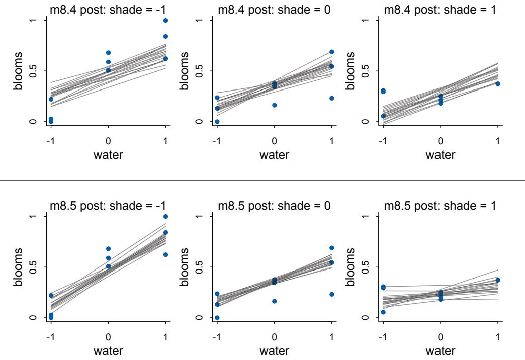
Figure 8.7. Triptych plots of posterior predicted blooms across water and shade treatments. Top row: Without an interaction between water and shade. Bottom row: With an interaction between water and shade. Each plot shows 20 posterior lines for each level of shade.
as predicted by the model. Each plot will plot predictions for a different value of shade. For this example, it is easy to pick which three values of shade to use, because there are only three values: −1, 0, and 1. But more generally, you might use a representative low value, the median, and a representative high value.
Here’s the code to draw posterior predictions for m8.4, the non-interaction model. This will loop over three values for shade, compute posterior predictions, then draw 20 lines from the posterior.
R code
8.25 par(mfrow=c(1,3)) # 3 plots in 1 row
for ( s in -1:1 ) {
idx <- which( d$shade_cent==s )
plot( d$water_cent[idx] , d$blooms_std[idx] , xlim=c(-1,1) , ylim=c(0,1) ,
xlab="water" , ylab="blooms" , pch=16 , col=rangi2 )
mu <- link( m8.4 , data=data.frame( shade_cent=s , water_cent=-1:1 ) )
for ( i in 1:20 ) lines( -1:1 , mu[i,] , col=col.alpha("black",0.3) )
}The result is shown in Figure 8.7, along with the same type of plot for the interaction model, m8.5. Notice that the top model believes that water helps—there is a positive slope in each plot—and that shade hurts—the lines sink lower moving from left to right. But the slope
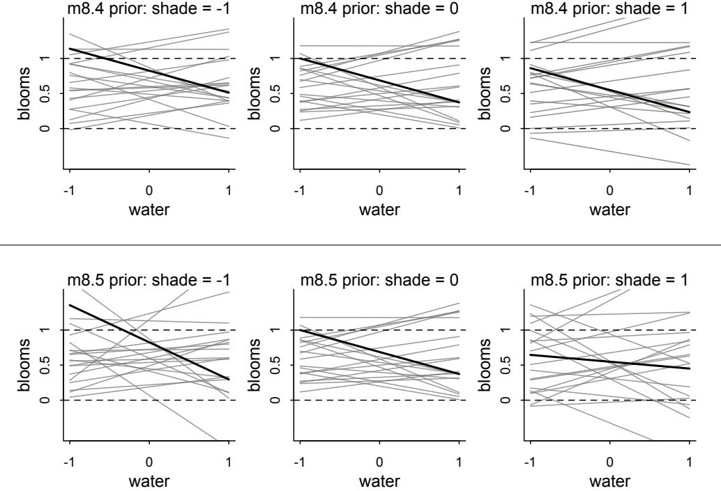
Figure 8.8. Triptych plots of prior predicted blooms across water and shade treatments. Top row: Without an interaction between water and shade. Bottom row: With an interaction between water and shade. Each plot shows 20 prior lines for each level of shade.
with water doesn’t vary across shade levels. Without the interaction, it cannot vary. In the bottom row, the interaction is turned on. Now the model believes that the effect of water decreases as shade increases. The lines get flat.
What is going on here? The likely explanation for these results is that tulips need both water and light to produce blooms. At low light levels, water can’t have much of an effect, because the tulips don’t have enough light to produce blooms. At higher light levels, water can matter more, because the tulips have enough light to produce blooms. At very high light levels, light is no longer limiting the blooms, and so water can have a much more dramatic impact on the outcome. The same explanation works symmetrically for shade. If there isn’t enough light, then more water hardly helps. You could remake Figure 8.7 with shade on the horizontal axes and water level varied from left to right, if you’d like to visualize the model predictions that way.
8.3.4. Plotting prior predictions. And we can use the same technique to finally plot prior predictive simulations as well. This will let us evaluate my guesses from earlier. To produce the prior predictions, all that’s need is to extract the prior:
8.26 set.seed(7)
prior <- extract.prior(m8.5)And then add post=prior as an argument to the link call in the previous code. I’ve also adjusted the vertical range of the prior plots, so we can see more easily the lines that fall outside the valid outcome range.
The result is displayed as Figure 8.8. Since the lines are so scattered in the prior—the prior not very informative—it is hard to see that the lines from the same set of samples actually go together in meaningful ways. So I’ve bolded three lines in the top and in the bottom rows. The three bolded lines in the top row come from the same parameter values. Notice that all three have the same slope. This is what we expect from a model without an interaction. So while the lines in the prior have lots of different slopes, the slopes for water don’t depend upon shade. In the bottom row, the three bolded lines again come from a single prior sample. But now the interaction makes the slope systematically change as shade changes.
What can we say about these priors, overall? They are harmless, but only weakly realistic. Most of the lines stay within the valid outcome space. But silly trends are not rare. We could do better. We could also do a lot worse, such as flat priors which would consider plausible that even a tiny increase in shade would kill all the tulips. If you displayed these priors to your colleagues, a reasonable summary might be, “These priors contain no bias towards positive or negative effects, and at the same time they very weakly bound the effects to realistic ranges.”
8.4. Summary
This chapter introduced interactions, which allow for the association between a predictor and an outcome to depend upon the value of another predictor. While you can’t see them in a DAG, interactions can be important for making accurate inferences. Interactions can be difficult to interpret, and so the chapter also introduced triptych plots that help in visualizing the effect of an interaction. No new coding skills were introduced, but the statistical models considered were among the most complicated so far in the book. To go any further, we’re going to need a more capable conditioning engine to fit our models to data. That’s the topic of the next chapter.
8.5. Practice
Problems are labeled Easy (E), Medium (M), and Hard (H).
8E1. For each of the causal relationships below, name a hypothetical third variable that would lead to an interaction effect.
- Bread dough rises because of yeast.
- Education leads to higher income.
- Gasoline makes a car go.
8E2. Which of the following explanations invokes an interaction?
- Caramelizing onions requires cooking over low heat and making sure the onions do not dry out.
- A car will go faster when it has more cylinders or when it has a better fuel injector.
- Most people acquire their political beliefs from their parents, unless they get them instead from their friends.
- Intelligent animal species tend to be either highly social or have manipulative appendages (hands, tentacles, etc.).
8E3. For each of the explanations in 8E2, write a linear model that expresses the stated relationship.
8M1. Recall the tulips example from the chapter. Suppose another set of treatments adjusted the temperature in the greenhouse over two levels: cold and hot. The data in the chapter were collected at the cold temperature. You find none of the plants grown under the hot temperature developed any blooms at all, regardless of the water and shade levels. Can you explain this result in terms of interactions between water, shade, and temperature?
8M2. Can you invent a regression equation that would make the bloom size zero, whenever the temperature is hot?
8M3. In parts of North America, ravens depend upon wolves for their food. This is because ravens are carnivorous but cannot usually kill or open carcasses of prey. Wolves however can and do kill and tear open animals, and they tolerate ravens co-feeding at their kills. This species relationship is generally described as a “species interaction.” Can you invent a hypothetical set of data on raven population size in which this relationship would manifest as a statistical interaction? Do you think the biological interaction could be linear? Why or why not?
8M4. Repeat the tulips analysis, but this time use priors that constrain the effect of water to be positive and the effect of shade to be negative. Use prior predictive simulation. What do these prior assumptions mean for the interaction prior, if anything?
8H1. Return to the data(tulips) example in the chapter. Now include the bed variable as a predictor in the interaction model. Don’t interact bed with the other predictors; just include it as a main effect. Note that bed is categorical. So to use it properly, you will need to either construct dummy variables or rather an index variable, as explained in Chapter 5.
8H2. Use WAIC to compare the model from 8H1 to a model that omits bed. What do you infer from this comparison? Can you reconcile the WAIC results with the posterior distribution of the bed coefficients?
8H3. Consider again the data(rugged) data on economic development and terrain ruggedness, examined in this chapter. One of the African countries in that example, Seychelles, is far outside the cloud of other nations, being a rare country with both relatively high GDP and high ruggedness. Seychelles is also unusual, in that it is a group of islands far from the coast of mainland Africa, and its main economic activity is tourism.
Focus on model m8.5 from the chapter. Use WAIC pointwise penalties and PSIS Pareto k values to measure relative influence of each country. By these criteria, is Seychelles influencing the results? Are there other nations that are relatively influential? If so, can you explain why?
Now use robust regression, as described in the previous chapter. Modify m8.5 to use a Student-t distribution with ν = 2. Does this change the results in a substantial way?
8H4. The values in data(nettle) are data on language diversity in 74 nations.143 The meaning of each column is given below.
- country: Name of the country
- num.lang: Number of recognized languages spoken
- area: Area in square kilometers
- k.pop: Population, in thousands
- num.stations: Number of weather stations that provided data for the next two columns
- mean.growing.season: Average length of growing season, in months
- sd.growing.season: Standard deviation of length of growing season, in months
Use these data to evaluate the hypothesis that language diversity is partly a product of food security. The notion is that, in productive ecologies, people don’t need large social networks to buffer them against risk of food shortfalls. This means cultural groups can be smaller and more self-sufficient, leading to more languages per capita. Use the number of languages per capita as the outcome:
Use the logarithm of this new variable as your regression outcome. (A count model would be better here, but you’ll learn those later, in Chapter 11.) This problem is open ended, allowing you to decide how you address the hypotheses and the uncertain advice the modeling provides. If you think you need to use WAIC anyplace, please do. If you think you need certain priors, argue for them. If you think you need to plot predictions in a certain way, please do. Just try to honestly evaluate the main effects of both mean.growing.season and sd.growing.season, as well as their two-way interaction. Here are three parts to help. (a) Evaluate the hypothesis that language diversity, as measured by log(lang.per.cap), is positively associated with the average length of the growing season, mean.growing.season. Consider log(area) in your regression(s) as a covariate (not an interaction). Interpret your results. (b) Now evaluate the hypothesis that language diversity is negatively associated with the standard deviation of length of growing season, sd.growing.season. This hypothesis follows from uncertainty in harvest favoring social insurance through larger social networks and therefore fewer languages. Again, consider log(area) as a covariate (not an interaction). Interpret your results. (c) Finally, evaluate the hypothesis that mean.growing.season and sd.growing.season interact to synergistically reduce language diversity. The idea is that, in nations with longer average growing seasons, high variance makes storage and redistribution even more important than it would be otherwise. That way, people can cooperate to preserve and protect windfalls to be used during the droughts.
8H5. Consider the data(Wines2012) data table. These data are expert ratings of 20 different French and American wines by 9 different French and American judges. Your goal is to model score, the subjective rating assigned by each judge to each wine. I recommend standardizing it. In this problem, consider only variation among judges and wines. Construct index variables of judge and wine and then use these index variables to construct a linear regression model. Justify your priors. You should end up with 9 judge parameters and 20 wine parameters. How do you interpret the variation among individual judges and individual wines? Do you notice any patterns, just by plotting the differences? Which judges gave the highest/lowest ratings? Which wines were rated worst/best on average?
8H6. Now consider three features of the wines and judges:
- flight: Whether the wine is red or white.
- wine.amer: Indicator variable for American wines.
- judge.amer: Indicator variable for American judges.
Use indicator or index variables to model the influence of these features on the scores. Omit the individual judge and wine index variables from Problem 1. Do not include interaction effects yet. Again justify your priors. What do you conclude about the differences among the wines and judges? Try to relate the results to the inferences in the previous problem.
8H7. Now consider two-way interactions among the three features. You should end up with three different interaction terms in your model. These will be easier to build, if you use indicator variables. Again justify your priors. Explain what each interaction means. Be sure to interpret the model’s predictions on the outcome scale (mu, the expected score), not on the scale of individual parameters. You can use link to help with this, or just use your knowledge of the linear model instead. What do you conclude about the features and the scores? Can you relate the results of your model(s) to the individual judge and wine inferences from 8H5?
9 Markov Chain Monte Carlo
In the twentieth century, scientists and engineers began publishing books of random numbers(Figure 9.1). For scientists from previous centuries, these books would have looked like madness. For most of Western history, chance has been a villain. In classical Rome, chance was personified by Fortuna, goddess of cruel fate, with her spinning wheel of (mis)fortune. Opposed to her sat Minerva, goddess of wisdom and understanding. Only the desperate would pray to Fortuna, while everyone implored Minerva for aid. Certainly science was the domain of Minerva, a realm with no useful role for Fortuna to play.
But by the twentieth century, Fortuna and Minerva had become collaborators. Now few of us are bewildered by the notion that an understanding of chance could help us acquire wisdom. Everything from weather forecasting to finance to evolutionary biology is dominated by the study of stochastic processes.144 Researchers rely upon random numbers for the proper design of experiments. And mathematicians routinely make use of random inputs to compute specific outputs.
This chapter introduces one commonplace example of Fortuna and Minerva’s cooperation: the estimation of posterior probability distributions using a stochastic process known as Markov chain Monte Carlo (MCMC). Unlike earlier chapters in this book, here we’ll produce samples from the joint posterior without maximizing anything. Instead of having to lean on quadratic and other approximations of the shape of the posterior, now we’ll be able to sample directly from the posterior without assuming a Gaussian, or any other, shape.
The cost of this power is that it may take much longer for our estimation to complete, and usually more work is required to specify the model as well. But the benefit is escaping the awkwardness of assuming multivariate normality. Equally important is the ability to directly estimate models, such as the generalized linear and multilevel models of later chapters. Such models routinely produce non-Gaussian posterior distributions, and sometimes they cannot be estimated at all with the techniques of earlier chapters.
The good news is that tools for building and inspecting MCMC estimates are getting better all the time. In this chapter you’ll meet a convenient way to convert the quap formulas you’ve used so far into Markov chains. The engine that makes this possible is Stan (free and online at: mc-stan.org). Stan’s creators describe it as “a probabilistic programming language implementing statistical inference.” You won’t be working directly in Stan to begin with the rethinking package provides tools that hide it from you for now. But as you move on to more advanced techniques, you’ll be able to generate Stan versions of the models you already understand. Then you can tinker with them and witness the power of a fully armed and operational Stan.
| 00000 | 10097 32533 | 76520 13586 | 34673 54876 | 80959 09117 39292 74945 | |||||
|---|---|---|---|---|---|---|---|---|---|
| 00001 | 37542 04805 | 64894 74296 24805 24037 | 20636 10402 00822 91665 | ||||||
| 00002 | 08422 68953 | 19645 09303 | 23209 02560 | 15953 | 34764 | 35080 33606 | |||
| 00003 | 99019 02529 | 09376 70715 | 38311 31165 | 88676 74397 | 04436 27659 | ||||
| 00004 | 12807 99970 | 80157 36147 | 64032 36653 | 98951 16877 | 12171 76833 | ||||
| 00005 | 66065 74717 | 34072 76850 | 36697 36170 | 65813 39885 | 11199 29170 | ||||
| 00006 | 31060 10805 | 45571 82406 | 35303 42614 | 86799 07439 | 23403 09732 | ||||
| 00007 | 85269 77602 | 02051 65692 | 68665 74818 | 73053 85247 | 18623 88579 | ||||
| 00008 | 63573 32135 | 05325 47048 | 90553 57548 | 28468 28709 | 83491 25624 | ||||
| 00009 | 73796 45753 | 03529 64778 | 35808 34282 | 60935 20344 | 35273 88435 | ||||
| 00010 | 98520 17767 | 14905 68607 | 22109 40558 | 60970 93433 | 50500 73998 | ||||
| 00011 | 11805 05431 | 39808 27732 | 50725 68248 | 29405 24201 | 52775 67851 | ||||
| 00012 | 83452 99634 | 06288 98083 | 13746 70078 | 18475 40610 | 68711 77817 | ||||
| 00013 | 88685 40200 | 86507 58401 | 36766 67951 | 90364 76493 | 29609 11062 | ||||
| 00014 | 99594 67348 | 87517 64969 | 91826 08928 | 93785 61368 | 23478 34113 | ||||
| 00015 | 65481 17674 | 17468 50950 | 58047 76974 | 73039 57186 | 40218 16544 | ||||
| 00016 | 80124 35635 | 17727 08015 | 45318 22374 | 21115 78253 | 14385 53763 | ||||
| 00017 | 74350 99817 | 77402 77214 | 43236 00210 45521 64237 | 96286 02655 | |||||
| 00018 | 69916 26803 | 66252 29148 | 36936 87203 | 76621 13990 | 94400 56418 | ||||
| 00019 | 09893 20505 | 14225 68514 | 46427 56788 | 96297 78822 | 54382 14598 | ||||
| 00020 | 91499 14523 | 68479 27686 | 46162 83554 94750 89923 | 37089 20048 | |||||
| 00021 | 80336 94598 | 26940 36858 | 70297 34135 53140 33340 | 42050 82341 | |||||
| 00022 | 44104 81949 | 85157 47954 | 32979 26575 | 57600 40881 | 22222 06413 | ||||
| 00023 | 12550 73742 | 11100 02040 | 12860 74697 | 96644 89439 | 28707 25815 | ||||
Figure 9.1. A page from A Million Random Digits, a book consisting of nothing but random numbers.
Rethinking: Stan was a man. The Stan programming language is not an abbreviation or acronym. Rather, it is named after Stanisław Ulam (1909–1984). Ulam is credited as one of the inventors of Markov chain Monte Carlo. Together with Ed Teller, Ulam applied it to designing fusion bombs. But he and others soon applied the general Monte Carlo method to diverse problems of less monstrous nature. Ulam made important contributions in pure mathematics, chaos theory, and molecular and theoretical biology, as well.
9.1. Good King Markov and his island kingdom
For the moment, forget about posterior densities and MCMC. Consider instead the tale of Good King Markov.145 King Markov was a benevolent autocrat of an island kingdom, a circular archipelago, with 10 islands. Each island was neighbored by two others, and the entire archipelago formed a ring. The islands were of different sizes, and so had different sized populations living on them. The second island was about twice as populous as the first, the third about three times as populous as the first, and so on, up to the largest island, which was 10 times as populous as the smallest.
The Good King was an autocrat, but he did have a number of obligations to his people. Among these obligations, King Markov agreed to visit each island in his kingdom from time to time. Since the people loved their king, each island preferred that he visit them more often. And so everyone agreed that the king should visit each island in proportion to its population size, visiting the largest island 10 times as often as the smallest, for example.
The Good King Markov, however, wasn’t one for schedules or bookkeeping, and so he wanted a way to fulfill his obligation without planning his travels months ahead of time. Also, since the archipelago was a ring, the King insisted that he only move among adjacent islands, to minimize time spent on the water—like many citizens of his kingdom, the king believed there were sea monsters in the middle of the archipelago.
The king’s advisor, a Mr Metropolis, engineered a clever solution to these demands. We’ll call this solution the Metropolis algorithm. Here’s how it works.
- Wherever the King is, each week he decides between staying put for another week or moving to one of the two adjacent islands. To decide, he flips a coin.
- If the coin turns up heads, the King considers moving to the adjacent island clockwise around the archipelago. If the coin turns up tails, he considers instead moving counterclockwise. Call the island the coin nominates the proposal island.
- Now, to see whether or not he moves to the proposal island, King Markov counts out a number of seashells equal to the relative population size of the proposal island. So for example, if the proposal island is number 9, then he counts out 9 seashells. Then he also counts out a number of stones equal to the relative population of the current island. So for example, if the current island is number 10, then King Markov ends up holding 10 stones, in addition to the 9 seashells.
- When there are more seashells than stones, King Markov always moves to the proposal island. But if there are fewer shells than stones, he discards a number of stones equal to the number of shells. So for example, if there are 4 shells and 6 stones, he ends up with 4 shells and 6 − 4 = 2 stones. Then he places the shells and the remaining stones in a bag. He reaches in and randomly pulls out one object. If it is a shell, he moves to the proposal island. Otherwise, he stays put another week. As a result, the probability that he moves is equal to the number of shells divided by the original number of stones.
This procedure may seem baroque and, honestly, a bit crazy. But it does work. The king will appear to move around the islands randomly, sometimes staying on one island for weeks, other times bouncing around without apparent pattern. But in the long run, this procedure guarantees that the king will be found on each island in proportion to its population size.
You can prove this to yourself, by simulating King Markov’s journey. Here’s a short piece of code to do this, storing the history of the king’s journey in the vector positions:
9.1 num_weeks <- 1e5
positions <- rep(0,num_weeks)
current <- 10
for ( i in 1:num_weeks ) {
## record current position
positions[i] <- current
## flip coin to generate proposal
proposal <- current + sample( c(-1,1) , size=1 )
## now make sure he loops around the archipelago
if ( proposal < 1 ) proposal <- 10
if ( proposal > 10 ) proposal <- 1
## move?
prob_move <- proposal/current
current <- ifelse( runif(1) < prob_move , proposal , current )
}I’ve added comments to this code, to help you decipher it. The first three lines just define the number of weeks to simulate, an empty history vector, and a starting island position (the
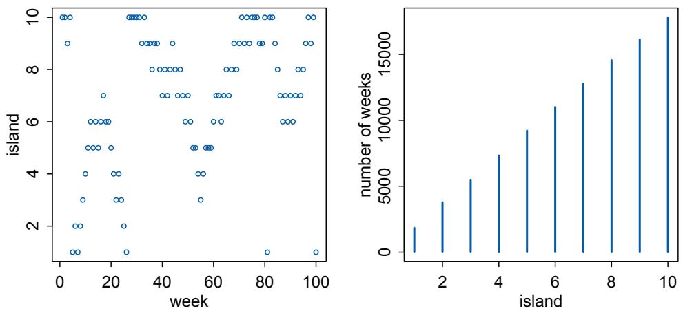
Figure 9.2. Results of the king following the Metropolis algorithm. The left-hand plot shows the king’s position (vertical axis) across weeks (horizontal axis). In any particular week, it’s nearly impossible to say where the king will be. The right-hand plot shows the long-run behavior of the algorithm, as the time spent on each island turns out to be proportional to its population size.
biggest island, number 10). Then the for loop steps through the weeks. Each week, it records the king’s current position. Then it simulates a coin flip to nominate a proposal island. The only trick here lies in making sure that a proposal of “11” loops around to island 1 and a proposal of “0” loops around to island 10. Finally, a random number between zero and one is generated (runif(1)), and the king moves, if this random number is less than the ratio of the proposal island’s population to the current island’s population (proposal/current).
You can see the results of this simulation in Figure 9.2. The left-hand plot shows the king’s location across the first 100 weeks of his simulated travels.
R code
9.2 plot( 1:100 , positions[1:100] )As you move from the left to the right in this plot, the points show the king’s location through time. The king travels among islands, or sometimes stays in place for a few weeks. This plot demonstrates the seemingly pointless path the Metropolis algorithm sends the king on. The right-hand plot shows that the path is far from pointless, however.
R code
9.3 plot( table( positions ) )The horizontal axis is now islands (and their relative populations), while the vertical is the number of weeks the king is found on each. After the entire 100,000 weeks (almost 2000 years) of the simulation, you can see that the proportion of time spent on each island converges to be almost exactly proportional to the relative populations of the islands.
The algorithm will still work in this way, even if we allow the king to be equally likely to propose a move to any island from any island, not just among neighbors. As long as King Markov still uses the ratio of the proposal island’s population to the current island’s population as his probability of moving, in the long run, he will spend the right amount of time on each island. The algorithm would also work for any size archipelago, even if the king didn’t know how many islands were in it. All he needs to know at any point in time is the population of the current island and the population of the proposal island. Then, without any forward planning or backwards record keeping, King Markov can satisfy his royal obligation to visit his people proportionally.
9.2. Metropolis algorithms
The precise algorithm King Markov used is a special case of the general Metropolis algorithm from the real world.146 And this algorithm is an example of Markov chain Monte Carlo. In real applications, the goal is of course not to help an autocrat schedule his journeys, but instead to draw samples from an unknown and usually complex target distribution, like a posterior probability distribution.
- • The “islands” in our objective are parameter values, and they need not be discrete, but can instead take on a continuous range of values as usual.
- • The “population sizes” in our objective are the posterior probabilities at each parameter value.
- • The “weeks” in our objective are samples taken from the joint posterior of the parameters in the model.
Provided the way we choose our proposed parameter values at each step is symmetric—so that there is an equal chance of proposing from A to B and from B to A—then the Metropolis algorithm will eventually give us a collection of samples from the joint posterior. We can then use these samples just like all the samples you’ve already used in this book.
The Metropolis algorithm is the grandparent of several different strategies for getting samples from unknown posterior distributions. In the remainder of this section, I briefly explain the concept behind Gibbs sampling. Gibbs sampling is much better than plain Metropolis, and it continues to be common in applied Bayesian statistics. But it is rapidly being replaced by other algorithms.
9.2.1. Gibbs sampling. The Metropolis algorithm works whenever the probability of proposing a jump to B from A is equal to the probability of proposing A from B, when the proposal distribution is symmetric. There is a more general method, known as Metropolis-Hastings,147 that allows asymmetric proposals. This would mean, in the context of King Markov’s fable, that the King’s coin were biased to lead him clockwise on average.
Why would we want an algorithm that allows asymmetric proposals? One reason is that it makes it easier to handle parameters, like standard deviations, that have boundaries at zero. A better reason, however, is that it allows us to generate savvy proposals that explore the posterior distribution more efficiently. By “more efficiently,” I mean that we can acquire an equally good image of the posterior distribution in fewer steps.
The most common way to generate savvy proposals is a technique known as Gibbs sampling. 148 Gibbs sampling is a variant of the Metropolis-Hastings algorithm that uses clever proposals and is therefore more efficient. By “efficient,” I mean that you can get a good estimate of the posterior from Gibbs sampling with many fewer samples than a comparable Metropolis approach. The improvement arises from adaptive proposals in which the distribution of proposed parameter values adjusts itself intelligently, depending upon the parameter values at the moment.
How Gibbs sampling computes these adaptive proposals depends upon using particular combinations of prior distributions and likelihoods known as conjugate pairs. Conjugate pairs have analytical solutions for the posterior distribution of an individual parameter. And these solutions are what allow Gibbs sampling to make smart jumps around the joint posterior distribution of all parameters.
In practice, Gibbs sampling can be very efficient, and it’s the basis of popular Bayesian model fitting software like BUGS (Bayesian inference Using Gibbs Sampling) and JAGS (Just Another Gibbs Sampler). In these programs, you compose your statistical model using definitions very similar to what you’ve been doing so far in this book. The software automates the rest, to the best of its ability.
9.2.2. High-dimensional problems. But there are some severe limitations to Gibbs sampling. First, maybe you don’t want to use conjugate priors. Some conjugate priors are actually pathological in shape, once you start building multilevel models and need priors for entire covariance matrixes. This will be something to discuss once we reach Chapter 14.
Second, as models become more complex and contain hundreds or thousands or tens of thousands of parameters, both Metropolis and Gibbs sampling become shockingly inefficient. The reason is that they tend to get stuck in small regions of the posterior for potentially a long time. The high number of parameters isn’t the problem so much as the fact that models with many parameters nearly always have regions of high correlation in the posterior. This means that two or more parameters are highly correlated with one another in the posterior samples. You’ve seen this before with, for example, the two legs example in Chapter 6. Why is this a problem? Because high correlation means a narrow ridge of high probability combinations, and both Metropolis and Gibbs make too many dumb proposals of where to go next. So they get stuck.
A picture will help to make this clearer. Figure 9.3 shows an ordinary Metropolis algorithm trying to explore a 2-dimensional posterior with a strong negative correlation of −0.9. The region of high-probability parameter values forms a narrow valley. Focus on the left-hand plot for now. The chain starts in the upper-left of the valley. Filled points are accepted proposals. Open points are rejected proposals. Proposals are generated by adding random Gaussian noise to each parameter, using a standard deviation of 0.01, the step size. 50 proposals are shown. The acceptance rate is only 60%, because when the valley is narrow like this, proposals can easily fall outside it. But the chain does manage to move slowly down the valley. It moves slow, because even when a proposal is accepted, it is still close to the previous point.
What happens then if we increase the step size, for more distant proposals? Now look on the right in Figure 9.3. Only 30% of proposals are accepted now. A bigger step size means more silly proposals outside the valley. The accepted proposals do move faster along the length of the valley, however. In practice, it is hard to win this tradeoff. Both Metropolis and Gibbs get stuck like this, because their proposals don’t know enough about the global shape of the posterior. They don’t know where they are going.
The high correlation example illustrates the problem. But the actual problem is more severe and more interesting. Any Markov chain approach that samples individual parameters in individual steps is going to get stuck, once the number of parameters grows sufficiently large. The reason goes by the name concentration of measure. This is an awkward name for the amazing fact that most of the probability mass of a high-dimension distribution is always very far from the mode of the distribution. It is hard to visualize. We can’t see in 100
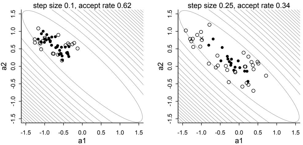
Figure 9.3. Metropolis chains under high correlation. Filled points indicate accepted proposals. Open points are rejected proposals. Both plots show 50 proposals under different proposal distribution step sizes. Left: With a small step size, the chain very slowly makes its way down the valley. It rejects 40% of the proposals in the process, because most of the proposals are in silly places. Right: With a larger step size, the chain moves faster, but it now rejects 70% of the proposals, because they tend to be even sillier. In higher dimensions, it is essentially impossible to tune Metropolis or Gibbs to be efficient.
dimensions, on most days. But if we think about the 2D and 3D versions, we can understand the basic phenomenon. In two dimensions, a Gaussian distribution is a hill. The highest point is in the middle, at the mode. But if we imagine this hill is filled with dirt—what else are hills filled with?—then we can ask: Where is most of the dirt? As we move away from the peak in any direction, the altitude declines, so there is less dirt directly under our feet. But in the ring around the hill at the same distance, there is more dirt than there is at the peak. The area increases as we move away from the peak, even though the height goes down. So the total dirt, um probability, increases as we move away from the peak. Eventually the total dirt (probability) declines again, as the hill slopes down to zero. So at some radial distance from the peak, dirt (probability mass) is maximized. In three dimensions, it isn’t a hill, but now a fuzzy sphere. The sphere is densest at the core, its “peak.” But again the volume increases as we move away from the core. So there is more total sphere-stuff in a shell around the core.
Back to thinking of probability distributions, all of this means that the combination of parameter values that maximizes posterior probability, the mode, is not actually in a region of parameter values that are highly plausible. This means in turn that when we properly sample from a high dimensional distribution, we won’t get any points near the mode. You can demonstrate this for yourself very easily. Just sample randomly from a high-dimension distribution—10 dimensions is enough—and plot the radial distances of the points. Here’s some code to do this:
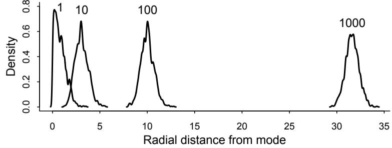
Figure 9.4. Concentration of measure and the curse of high dimensions. The horizontal axis shows radial distance from the mode in parameter space. Each density is a random sample of 1000 points. The number above each density is the number of dimensions. As the number of parameters increases, the mode is further away from the values we want to sample.
R code
9.4 D <- 10
T <- 1e3
Y <- rmvnorm(T,rep(0,D),diag(D))
rad_dist <- function( Y ) sqrt( sum(Y^2) )
Rd <- sapply( 1:T , function(i) rad_dist( Y[i,] ) )
dens( Rd )I display this density, as well as the corresponding densities for distributions with 1, 100, and 1000 dimensions, in Figure 9.4. The horizontal axis here is radial distance of the point from the mode. So the value 0 is the peak of probability. You can see that an ordinary Gaussian distribution with only 1 dimension, on the left, samples most of its points right next to this peak, as you’d expect. But with 10 dimensions, already there are no samples next to the peak at zero. With 100 dimensions, we’ve moved very far from the peak. And with 1000 dimensions, even further. The sampled points are in a thin, high-dimensional shell very far from the mode. This shell can create very hard paths for a sampler to follow.
This is why we need MCMC algorithms that focus on the entire posterior at once, instead of one or a few dimensions at a time like Metropolis and Gibbs. Otherwise we get stuck in a narrow, highly curving region of parameter space.
9.3. Hamiltonian Monte Carlo
It appears to be a quite general principle that, whenever there is a randomized way of doing something, then there is a nonrandomized way that delivers better performance but requires more thought. —E. T. Jaynes
The Metropolis algorithm and Gibbs sampling are highly random procedures. They try out new parameter values—proposals—and see how good they are, compared to the current values. Gibbs sampling gains efficiency by reducing the randomness of proposals by exploiting knowledge of the target distribution. This seems to fit Jaynes’ suggestion, quoted above, that when there is a random way of accomplishing some calculation, there is probably a less
random way that is better.149 This less random way may require a lot more thought. The Gibbs strategy has limitations, but it gets its improvement over plain Metropolis by being less random, not more.
Hamiltonian Monte Carlo (or Hybrid Monte Carlo, HMC) pushes Jaynes’ principle much further. HMC is more computationally costly than Metropolis or Gibbs sampling. But its proposals are also much more efficient. As a result, HMC doesn’t need as many samples to describe the posterior distribution. You need less computer time in total, even though each sample needs more. And as models become more complex—thousands or tens of thousands of parameters—HMC can really outshine other algorithms, because the other algorithms just won’t work. The Earth would be swallowed by the Sun before your chain produces a reliable approximation of the posterior.
We’re going to be using HMC on and off for the remainder of this book. You won’t have to implement it yourself. But understanding some of the concept behind it will help you grasp how it outperforms Metropolis and Gibbs sampling and also how it encounters its own, unique problems.
9.3.1. Another parable. Suppose King Markov’s cousin Monty is King on the mainland. Monty’s kingdom is not a discrete set of islands. Instead, it is a continuous territory stretched out along a narrow valley, running north-south. But the King has a similar obligation: to visit his citizens in proportion to their local population density. Within the valley, people distribute themselves inversely proportional to elevation—most people live in the middle of the valley, fewer up the mountainside. How can King Monty fulfill his royal obligation?
Like Markov, Monty doesn’t wish to bother with schedules and calculations. Also like Markov, Monty has a highly educated and mathematically gifted advisor, named Hamilton. Hamilton designed an odd, but highly efficient, method. And this method solves one of Metropolis’ flaws—the king hardly ever stays in the same place, but keeps moving on to visit new locations.
Here’s how it works. The king’s vehicle picks a random direction, either north or south, and drives off at a random momentum. As the vehicle goes uphill, it slows down and turns around when its declining momentum forces it to. Then it picks up speed again on the way down. After a fixed period of time, they stop the vehicle, get out, and start shaking hands and kissing babies. Then they get back in the vehicle and begin again. Amazingly, Hamilton can prove mathematically that this procedure guarantees that, in the long run, the locations visited will be inversely proportional to their relative elevations, which are also inversely proportional to the population densities. Not only does this keep the king moving, but it also spaces the locations apart better—unlike the other king, Monty does not only visit neighboring locations.
This mad plan is illustrated, and simulated, in Figure 9.5. The horizontal axis is time. The vertical axis is location. The king’s journey starts on the far left, in the middle of the valley. The vehicle begins by heading south. The width of the curve indicates the momentum at each time. The vehicle climbs uphill but slows and briefly turns around before stopping at the first location. Then again and again new locations are chosen in the same way, but with different random directions and momentums, departing from the most recent location. When the initial momentum is small, the vehicle starts to turn around earlier. But when the initial momentum is large, like in the big swing around time 300, the king can traverse the entire valley before stopping.
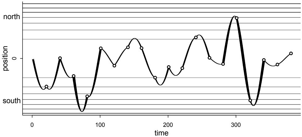
Figure 9.5. King Monty’s Royal Drive. The journey begins at time 1 on the far left. The vehicle is given a random momentum and a random direction, either north (top) or south (bottom). The thickness of the path shows momentum at each moment. The vehicle travels, losing momentum uphill or gaining it downhill. After a fixed amount of time, they stop and make a visit, as shown by the points. Then a new random direction and momentum is chosen. In the long run, positions are visited in proportion to their population density.
The autocorrelation between locations visited is very low under this strategy. This means that adjacent locations have a very low, almost zero correlation. The king can move from one end of the valley to another. This stands in contrast to the highly autocorrelated movement under the Metropolis plan (Figure 9.2). King Markov of the Islands might wish to adopt this Hamiltonian strategy, but he cannot: The islands are not continuous. Hamilton’s approach only works when all the locations are connected by dry land, because it requires that the vehicle be capable of stopping at any point.
Rethinking: Hamiltonians. The Hamilton who gives his name to Hamiltonian Monte Carlo had nothing to do with the development of the method. Sir William Rowan Hamilton (1805–1865) was an Irish mathematician, arguably the greatest mathematician of his generation. Hamilton accomplished great things in pure mathematics, but he also dabbled in physics and reformulated Newton’s laws of motion into a new system that we now call Hamiltonian mechanics (or dynamics). Hamiltonian Monte Carlo was originally called Hybrid Monte Carlo, but is now usually referred to by the Hamiltonian differential equations that drive it.
9.3.2. Particles in space. This story of King Monty is analogous to how the actual Hamiltonian Monte Carlo algorithm works. In statistical applications, the royal vehicle is the current vector of parameter values. Let’s consider the single parameter case, just to keep things simple. In that case, the log-posterior is like a bowl, with the point of highest posterior probability at its nadir, in the center of the valley. Then we give the particle a random flick—give
it some momentum—and simulate its path. It must obey the physics, gliding along until we stop the clock and take a sample.
This is not another metaphor. HMC really does run a physics simulation, pretending the vector of parameters gives the position of a little frictionless particle. The log-posterior provides a surface for this particle to glide across. When the log-posterior is very flat, because there isn’t much information in the likelihood and the priors are rather flat, then the particle can glide for a long time before the slope (gradient) makes it turn around. When instead the log-posterior is very steep, because either the likelihood or the priors are very concentrated, then the particle doesn’t get far before turning around.
In principle, HMC will always accept every proposal, because it only makes intelligent proposals. In practice, HMC uses a rejection criterion, because it is only approximating the smooth path of a particle. It isn’t unusual to see acceptance rates over 95% with HMC. Making smart proposals pays. What is the rejection criterion? Because HMC runs a physics simulation, certain things have to be conserved, like total energy of the system. When the total energy changes during the simulation, that means the numerical approximation is bad. When the approximation isn’t good, it might reject the proposal.
All of this sounds, and is, complex. But what is gained from all of this complexity is very efficient sampling of complex models. In cases where ordinary Metropolis or Gibbs sampling wander slowly through parameter space, Hamiltonian Monte Carlo remains efficient. This is especially true when working with multilevel models with hundreds or thousands of parameters. A particle in 1000-dimension space sounds crazy, but it’s not harder for your compute to imagine than a particle in 3-dimensions.
To take some of the magic out of this, let’s do a two-dimensional simulation, for a simple posterior distribution with two parameters, the mean and standard deviation of a Gaussian. I’m going to show just the most minimal mathematical details. You don’t need to grasp all the mathematics to make use of HMC. But having some intuition about how it works will help you appreciate why it works so much better than other approaches, as well as why it sometimes doesn’t work. If you want much more mathematical detail, follow the endnote.150
Suppose the data are 100 x and 100 y values, all sampled from Normal(0, 1). We’ll use this statistical model:
\[\begin{aligned} \mathfrak{x}\_{i} &\sim \text{Normal}(\mu\_{\mathfrak{x}}, 1) \\ \mathfrak{y}\_{i} &\sim \text{Normal}(\mu\_{\mathfrak{y}}, 1) \\ \mu\_{\mathfrak{x}} &\sim \text{Normal}(0, 0.5) \\ \mu\_{\mathfrak{y}} &\sim \text{Normal}(0, 0.5) \end{aligned}\]
What HMC needs to drive are two functions and two settings. The first function computes the log-probability of the data and parameters. This is just the top part of Bayes’ formula, and every MCMC strategy requires this. It tells the algorithm the “elevation” of any set of parameter values. For the model above, it is just:
\[\sum\_{i} \log p(y\_i|\mu\_j, 1) + \sum\_{i} \log p(\mathbf{x}\_i|\mu\_x, 1) + \log p(\mu\_j|0, 0.5) + \log p(\mu\_x, 0, 0.5)\]
where p(x|a, b) here means the Gaussian density of x at mean a and standard deviation b. The second thing HMC needs is the gradient, which just means the slope in all directions at the current position. In this case, that means just two derivatives. If you take the expression above and differentiate it with respect to µx and then µy, you have what you need. I’ve placed these derivatives, in code form, in the Overthinking box further down, where you’ll find a complete R implementation of this example.
The two settings that HMC needs are a choice of number of leapfrog steps and a choice of step size for each. This part is strange. And usually your machine will pick these values for you. But having some idea of them will be useful for understanding some of the newer features of HMC algorithms. Each path in the simulation—each curve for example between visits in Figure 9.5—is divided up into a number of leapfrog steps. If you choose many steps, the paths will be long. If you choose few, they will be short. The size of each step is determined by, you guessed it, the step size. The step size determines how fine grained the simulation is. If the step size is small, then the particle can turn sharply. If the step size is large, then each leap will be large and could even overshoot the point where the simulation would want to turn around.
Let’s put it all together in Figure 9.6. The code to reproduce this figure is in the Overthinking box below. The left simulation uses L = 11 leapfrog steps, each with a step size of ϵ = 0.03. The contours show the log-posterior. It’s a symmetric bowl in this example. Only 4 samples from the posterior distribution are shown. The chain begins at the ×. The first simulation gets flicked to the right and rolls downhill and then uphill again, stopping on the other side and taking a sample at the point labeled 1. The width of the path shows the total momentum, the kinetic energy, at each point.151 Each leapfrog step is indicated by the white dots along the path. The process repeats, with random direction and momentum in both dimensions each time. You could take 100 samples here and get an excellent approximation with very low autocorrelation.
However, that low autocorrelation is not automatic. The right-hand plot in Figure 9.6 shows the same code but with L = 28 leapfrog steps. Now because of the combination of leapfrog steps and step size, the paths tend to land close to where they started. Instead of independent samples from the posterior, we get correlated samples, like in a Metropolis chain. This problem is called the U-turn problem—the simulations turn around and return to the same neighborhood. The U-turn problem looks especially bad in this example, because the posterior is a perfect 2-dimensional Gaussian bowl. So the parabolic paths always loop back onto themselves. In most models, this won’t be the case. But you’ll still get paths returning close to where they started. This just shows that the efficiency of HMC comes with the expense of having to tune the leapfrog steps and step size in each application.
Fancy HMC samplers, like Stan and its rstan package, have two ways to deal with Uturns. First, they will choose the leapfrog steps and step size for you. They can do this by conducting a warmup phase in which they try to figure out which step size explores the posterior efficiently. If you are familiar with older algorithms like Gibbs sampling, which use a burn-in phase, warmup is not like burn-in. Technically, burn-in samples are just samples. They are part of the posterior. But Stan’s warmup phase, for example, does not produce useful samples. It is just tuning the simulation. The warmup phase tends to be slower than the sampling phase. So when you start using Stan, and warmup seems to be slow, in most cases it will speed up a lot as time goes on.
The second thing fancy HMC samplers do is use a clever algorithm to adaptively set the number of leapfrog steps. The type of algorithm is a no-U-turn sampler, or NUTS. A no-U-turn sampler uses the shape of the posterior to infer when the path is turning around. Then it stops the simulation. The details are both complicated and amazing.152 Stan currently (since version 2.0) uses a second-generation NUTS2 sampler. See the Stan manual for more.
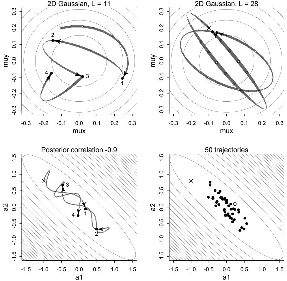
Figure 9.6. Hamiltonian Monte Carlo trajectories follow physical paths determined by the curvature of the posterior distribution. Top-left: With the right combination of leapfrog steps and step size, the individual paths produce independent samples from the posterior. The simulation begins at the × and then moves in order to the points labeled 1 though 4. Top-right: With the wrong combination, sequential samples can end up very close to one another. The chain in the top-right will still work. It’ll just be much less efficient. Bottom-left: HMC really shines when the posterior contains high correlations, as here. Bottom-right: 50 samples from the same high correlation posterior, showing only one rejected sample (the open point). A low rate of rejected proposals and lower autocorrelation between samples means fewer samples are needed to approximate the posterior.
Overthinking: Hamiltonian Monte Carlo in the raw. The HMC algorithm needs five things to go: (1) a function U that returns the negative log-probability of the data at the current position (parameter values), (2) a function grad_U that returns the gradient of the negative log-probability at the current position, (3) a step size epsilon, (4) a count of leapfrog steps L, and (5) a starting position current_q. Keep in mind that the position is a vector of parameter values and that the gradient also needs to return a vector of the same length. So that these U and grad_U functions make more sense, let’s present them first, built custom for the 2D Gaussian example. The U function just expresses the logposterior, as stated before in the main text:
\[\sum\_{i} \log p(y\_i|\mu\_{\mathcal{V}}, 1) + \sum\_{i} \log p(\mathbf{x}\_i|\mu\_{\mathbf{x}}, 1) + \log p(\mu\_{\mathcal{V}}|0, 0.5) + \log p(\mu\_{\mathbf{x}}, 0, 0.5)\]
So it’s just four calls to dnorm really:
R code
9.5 # U needs to return neg-log-probability
U <- function( q , a=0 , b=1 , k=0 , d=1 ) {
muy <- q[1]
mux <- q[2]
U <- sum( dnorm(y,muy,1,log=TRUE) ) + sum( dnorm(x,mux,1,log=TRUE) ) +
dnorm(muy,a,b,log=TRUE) + dnorm(mux,k,d,log=TRUE)
return( -U )
}Now the gradient function requires two partial derivatives. Luckily, Gaussian derivatives are very clean. The derivative of the logarithm of any univariate Gaussian with mean a and standard deviation b with respect to a is:
\[\frac{\partial \log \mathcal{N}(y|a,b)}{\partial a} = \frac{y-a}{b^2}\]
And since the derivative of a sum is a sum of derivatives, this is all we need to write the gradients:
\[\frac{\partial U}{\partial \mu\_{\mathbf{x}}} = \frac{\partial \log \mathcal{N}(\mathbf{x}|\mu\_{\mathbf{x}}, 1)}{\partial \mu\_{\mathbf{x}}} + \frac{\partial \log \mathcal{N}(\mu\_{\mathbf{x}}|0, 0.5)}{\partial \mu\_{\mathbf{x}}} = \sum\_{i} \frac{\mathbf{x}\_{i} - \mu\_{\mathbf{x}}}{1^{2}} + \frac{\mathbf{0} - \mu\_{\mathbf{x}}}{0.5^{2}}\]
And the gradient for µy has the same form. Now in code form:
R code
9.6 # gradient function
# need vector of partial derivatives of U with respect to vector q
U_gradient <- function( q , a=0 , b=1 , k=0 , d=1 ) {
muy <- q[1]
mux <- q[2]
G1 <- sum( y - muy ) + (a - muy)/b^2 #dU/dmuy
G2 <- sum( x - mux ) + (k - mux)/d^2 #dU/dmux
return( c( -G1 , -G2 ) ) # negative bc energy is neg-log-prob
}
# test data
set.seed(7)
y <- rnorm(50)
x <- rnorm(50)
x <- as.numeric(scale(x))
y <- as.numeric(scale(y))The gradient function above isn’t too bad for this model. But it can be terrifying for a reasonably complex model. That is why tools like Stan build the gradients dynamically, using the model definition. Now we are ready to visit the heart. To understand some of the details here, you should read Radford Neal’s chapter in the Handbook of Markov Chain Monte Carlo. Armed with the log-posterior and gradient functions, here’s the code to produce Figure 9.6:
9.7 library(shape) # for fancy arrows
Q <- list()
Q$q <- c(-0.1,0.2)
pr <- 0.3
plot( NULL , ylab="muy" , xlab="mux" , xlim=c(-pr,pr) , ylim=c(-pr,pr) )
step <- 0.03
L <- 11 # 0.03/28 for U-turns --- 11 for working example
n_samples <- 4
path_col <- col.alpha("black",0.5)
points( Q$q[1] , Q$q[2] , pch=4 , col="black" )
for ( i in 1:n_samples ) {
Q <- HMC2( U , U_gradient , step , L , Q$q )
if ( n_samples < 10 ) {
for ( j in 1:L ) {
K0 <- sum(Q$ptraj[j,]^2)/2 # kinetic energy
lines( Q$traj[j:(j+1),1] , Q$traj[j:(j+1),2] , col=path_col , lwd=1+2*K0 )
}
points( Q$traj[1:L+1,] , pch=16 , col="white" , cex=0.35 )
Arrows( Q$traj[L,1] , Q$traj[L,2] , Q$traj[L+1,1] , Q$traj[L+1,2] ,
arr.length=0.35 , arr.adj = 0.7 )
text( Q$traj[L+1,1] , Q$traj[L+1,2] , i , cex=0.8 , pos=4 , offset=0.4 )
}
points( Q$traj[L+1,1] , Q$traj[L+1,2] , pch=ifelse( Q$accept==1 , 16 , 1 ) ,
col=ifelse( abs(Q$dH)>0.1 , "red" , "black" ) )
}The function HMC2 is built into rethinking. It is based upon one of Radford Neal’s example scripts.153 It isn’t actually too complicated. Let’s tour through it, one step at a time, to take the magic away. This function runs a single trajectory, and so produces a single sample. You need to use it repeatedly to build a chain. That’s what the loop above does. The first chunk of the function chooses random momentum—the flick of the particle—and initializes the trajectory.
9.8 HMC2 <- function (U, grad_U, epsilon, L, current_q) {
q = current_q
p = rnorm(length(q),0,1) # random flick - p is momentum.
current_p = p
# Make a half step for momentum at the beginning
p = p - epsilon * grad_U(q) / 2
# initialize bookkeeping - saves trajectory
qtraj <- matrix(NA,nrow=L+1,ncol=length(q))
ptraj <- qtraj
qtraj[1,] <- current_q
ptraj[1,] <- pThen the action comes in a loop over leapfrog steps. L steps are taken, using the gradient to compute a linear approximation of the log-posterior surface at each point.
9.9 # Alternate full steps for position and momentum
for ( i in 1:L ) {
q = q + epsilon * p # Full step for the position
# Make a full step for the momentum, except at end of trajectory
if ( i!=L ) {
p = p - epsilon * grad_U(q)
ptraj[i+1,] <- p
}R code
R code
qtraj[i+1,] <- q }
Notice how the step size epsilon is added to the position and momentum vectors. It is in this way that the path is only an approximation, because it is a series of linear jumps, not an actual smooth curve. This can have important consequences, if the log-posterior bends sharply and the simulation jumps over a bend. All that remains is clean up: ensure the proposal is symmetric so the Markov chain is valid and decide whether to accept or reject the proposal.
R code
9.10 # Make a half step for momentum at the end
p = p - epsilon * grad_U(q) / 2
ptraj[L+1,] <- p
# Negate momentum at end of trajectory to make the proposal symmetric
p = -p
# Evaluate potential and kinetic energies at start and end of trajectory
current_U = U(current_q)
current_K = sum(current_p^2) / 2
proposed_U = U(q)
proposed_K = sum(p^2) / 2
# Accept or reject the state at end of trajectory, returning either
# the position at the end of the trajectory or the initial position
accept <- 0
if (runif(1) < exp(current_U-proposed_U+current_K-proposed_K)) {
new_q <- q # accept
accept <- 1
} else new_q <- current_q # reject
return(list( q=new_q, traj=qtraj, ptraj=ptraj, accept=accept ))
}The accept/reject decision at the bottom uses the fact that in Hamiltonian dynamics, the total energy of the system must be constant. So if the energy at the start of the trajectory differs substantially from the energy at the end, something has gone wrong. This is known as a divergent transition, and we’ll talk more about these in a later chapter.
9.3.3. Limitations. As always, there are some limitations. HMC requires continuous parameters. It can’t glide through a discrete parameter. In practice, this means that certain techniques, like the imputation of discrete missing data, have to be done differently with HMC. HMC can certainly sample from such models, often much more efficiently than a Gibbs sampler could. But you have to change how you code them. There will be examples in Chapter 15 and Chapter 16.
It is also important to keep in mind that HMC is not magic. Some posterior distributions are just very difficult to sample from, for any algorithm. We’ll see examples in later chapters. In these cases, HMC will encounter something called a divergent transition. We’ll talk a lot about these, what causes them, and how to fix them, later on.
Rethinking: The MCMC horizon. While the ideas behind Markov chain Monte Carlo are not new, widespread use dates only to the last decade of the twentieth century.154 New variants of and improvements to MCMC algorithms arise all the time. We might anticipate that interesting advances are coming, and that the current crop of tools—Gibbs sampling and first-generation HMC for example—will look rather pedestrian in another 20 years. At least we can hope.
9.4. Easy HMC: ulam
The rethinking package provides a convenient interface, ulam, to compile lists of formulas, like the lists you’ve been using so far to construct quap estimates, into Stan HMC code. A little more housekeeping is needed to use ulam: You should preprocess any variable transformations, and you should construct a clean data list with only the variables you will use. But otherwise installing Stan on your computer is the hardest part. And once you get comfortable with interpreting samples produced in this way, you go peek inside and see exactly how the model formulas you already understand correspond to the code that drives the Markov chain. When you use ulam, you can also use the same helper functions as quap: extract.samples, extract.prior, link, sim, and others.
There are other R packages that make using Stan even easier, because they don’t require the full formulas that quap and ulam do. At the time of printing, the best are brms and rstanarm for multilevel models and blavaan for structural equation models. For learning about Bayesian modeling, I recommend you stick with the full and explicit formulas of ulam for now. The reason is that an interface that hides the model structure makes it hard to learn the model structure. But there is nothing wrong with moving on to simplified interfaces later, once you gain experience.
To see how ulam works, let’s revisit the terrain ruggedness example from Chapter 8. This code will load the data and reduce it down to cases (nations) that have the outcome variable of interest:
9.11 library(rethinking)
data(rugged)
d <- rugged
d$log_gdp <- log(d$rgdppc_2000)
dd <- d[ complete.cases(d$rgdppc_2000) , ]
dd$log_gdp_std <- dd$log_gdp / mean(dd$log_gdp)
dd$rugged_std <- dd$rugged / max(dd$rugged)
dd$cid <- ifelse( dd$cont_africa==1 , 1 , 2 )So you remember the old way, we’re going to repeat the procedure for fitting the interaction model. This model aims to predict log GDP with terrain ruggedness, continent, and the interaction of the two. Here’s the way to do it with quap, just like before.
9.12 m8.3 <- quap(
alist(
log_gdp_std ~ dnorm( mu , sigma ) ,
mu <- a[cid] + b[cid]*( rugged_std - 0.215 ) ,
a[cid] ~ dnorm( 1 , 0.1 ) ,
b[cid] ~ dnorm( 0 , 0.3 ) ,
sigma ~ dexp( 1 )
) , data=dd )
precis( m8.3 , depth=2 )mean sd 5.5% 94.5% a[1] 0.89 0.02 0.86 0.91 a[2] 1.05 0.01 1.03 1.07 b[1] 0.13 0.07 0.01 0.25 R code
b[2] -0.14 0.05 -0.23 -0.06 sigma 0.11 0.01 0.10 0.12 Just as you saw in the previous chapter.
9.4.1. Preparation. But now we’ll also fit this model using Hamiltonian Monte Carlo. This means there will be no more quadratic approximation—if the posterior distribution is non-Gaussian, then we’ll get whatever non-Gaussian shape it has. You can use exactly the same formula list as before, but you should do two additional things.
- Preprocess all variable transformations. If the outcome is transformed somehow, like by taking the logarithm, then do this before fitting the model by constructing a new variable in the data frame. Likewise, if any predictor variables are transformed, including squaring and cubing and such to build polynomial models, then compute these transformed values before fitting the model. It’s a waste of computing power to do these transformations repeatedly in every step of the Markov chain.
- Once you’ve got all the variables ready, make a new trimmed down data frame that contains only the variables you will actually use to fit the model. Technically, you don’t have to do this. But doing so avoids common problems. For example, if any of the unused variables have missing values, NA, then Stan will refuse to work.
We’ve already pre-transformed all the variables. Now we need a slim list of the variables we will use:
R code
9.13 dat_slim <- list(
log_gdp_std = dd$log_gdp_std,
rugged_std = dd$rugged_std,
cid = as.integer( dd$cid )
)
str(dat_slim)
List of 3
$ log_gdp_std: num [1:170] 0.88 0.965 1.166 1.104 0.915 ...
$ rugged_std : num [1:170] 0.138 0.553 0.124 0.125 0.433 ...
$ cid : int [1:170] 1 2 2 2 2 2 2 2 2 1 ...It is better to use a list than a data.frame, because the elements in a list can be any length. In a data.frame, all the elements must be the same length. With some models to come later, like multilevel models, it isn’t unusual to have variables of different lengths.
9.4.2. Sampling from the posterior. Now provided you have the rstan package installed (mc-stan.org), you can get samples from the posterior distribution with this code:
R code
9.14 m9.1 <- ulam(
alist(
log_gdp_std ~ dnorm( mu , sigma ) ,
mu <- a[cid] + b[cid]*( rugged_std - 0.215 ) ,
a[cid] ~ dnorm( 1 , 0.1 ) ,
b[cid] ~ dnorm( 0 , 0.3 ) ,
sigma ~ dexp( 1 )
) , data=dat_slim , chains=1 )All that ulam does is translate the formula above into a Stan model, and then Stan defines the sampler and does the hard part. Stan models look very similar, but require some more explicit definitions. This also makes them much more flexible. If you’d rather start working directly with Stan code, I’ll present this same model in raw Stan a bit later. You can always extract the Stan code with stancode(m9.1).
After messages about compiling, and sampling, ulam returns an object that contains a bunch of summary information, as well as samples from the posterior distribution. You can summarize just like a quap model:
9.15 precis( m9.1 , depth=2 )| mean | sd | 5.5% | 94.5% | n_eff | Rhat4 | |
|---|---|---|---|---|---|---|
| a[1] | 0.89 | 0.02 | 0.86 | 0.91 | 739 | 1 |
| a[2] | 1.05 | 0.01 | 1.03 | 1.07 | 714 | 1 |
| b[1] | 0.13 | 0.08 | 0.01 | 0.26 | 793 | 1 |
| b[2] | -0.14 | 0.05 | -0.23 | -0.06 | 799 | 1 |
| sigma | 0.11 | 0.01 | 0.10 | 0.12 | 785 | 1 |
These estimates are very similar to the quadratic approximation. But note that there are two new columns, n_eff and Rhat4. These columns provide MCMC diagnostic criteria, to help you tell how well the sampling worked. We’ll discuss them in detail later in the chapter. For now, it’s enough to know that n_eff is a crude estimate of the number of independent samples you managed to get. Rhat (Rˆ) is an indicator of the convergence of the Markov chains to the target distribution. It should approach 1.00 from above, when all is well. There are several different ways to compute it. The “4” on the end indicates the fourth generation version of Rhat, not the original 1992 version that you usually see cited in papers. In the future, this will increase to Rhat5, the 5th generation. See the details and citations in ?precis.
9.4.3. Sampling again, in parallel. The example so far is a very easy problem for MCMC. So even the default 1000 samples is enough for accurate inference. In fact, as few as 200 effective samples is usually plenty for a good approximation of the posterior. But we also want to run multiple chains, for reasons we’ll discuss in more depth in the next sections. There will be specific advice in Section 9.5 (page 287).
For now, it’s worth noting that you can easily parallelize those chains, as well. They can all run at the same time, instead of in sequence. So as long as your computer has four cores (it probably does), it won’t take longer to run four chains than one chain. To run four independent Markov chains for the model above, and to distribute them across separate cores in your computer, just increase the number of chains and add a cores argument:
9.16 m9.1 <- ulam(
alist(
log_gdp_std ~ dnorm( mu , sigma ) ,
mu <- a[cid] + b[cid]*( rugged_std - 0.215 ) ,
a[cid] ~ dnorm( 1 , 0.1 ) ,
b[cid] ~ dnorm( 0 , 0.3 ) ,
sigma ~ dexp( 1 )
) , data=dat_slim , chains=4 , cores=4 )R code
There are a bunch of optional arguments that allow us to tune and customize the process. We’ll bring them up as they are needed. For now, keep in mind that show will remind you of the model formula and also how long each chain took to run:
R code
9.17 show( m9.1 )
Hamiltonian Monte Carlo approximation
2000 samples from 4 chains
Sampling durations (seconds):
warmup sample total
chain:1 0.06 0.03 0.09
chain:2 0.05 0.03 0.09
chain:3 0.05 0.03 0.08
chain:4 0.05 0.04 0.10
Formula:
log_gdp_std ~ dnorm(mu, sigma)
mu <- a[cid] + b[cid] * (rugged_std - 0.215)
a[cid] ~ dnorm(1, 0.1)
b[cid] ~ dnorm(0, 0.3)
sigma ~ dexp(1)There were 2000 samples from all 4 chains, because each 1000 sample chain uses by default the first half of the samples to adapt. Something curious happens when we look at the summary:
R code
9.18 precis( m9.1 , 2 )| mean | sd | 5.5% | 94.5% | n_eff | Rhat4 | |
|---|---|---|---|---|---|---|
| a[1] | 0.89 | 0.02 | 0.86 | 0.91 | 2490 | 1 |
| a[2] | 1.05 | 0.01 | 1.03 | 1.07 | 3020 | 1 |
| b[1] | 0.13 | 0.08 | 0.01 | 0.25 | 2729 | 1 |
| b[2] | -0.14 | 0.06 | -0.23 | -0.06 | 2867 | 1 |
| sigma | 0.11 | 0.01 | 0.10 | 0.12 | 2368 | 1 |
If there were only 2000 samples in total, how can we have more than 2000 effective samples for each parameter? It’s no mistake. The adaptive sampler that Stan uses is so good, it can actually produce sequential samples that are better than uncorrelated. They are anti-correlated. This means it can explore the posterior distribution so efficiently that it can beat random. It’s Jaynes’ principle(page 270) in action.
9.4.4. Visualization. By plotting the samples, you can get a direct appreciation for how Gaussian (quadratic) the actual posterior density has turned out to be. Use pairs directly on the model object, so that R knows to display parameter names and parameter correlations:
R code 9.19 pairs( m9.1 )
Figure 9.7 shows the resulting plot. This is a pairs plot, so it’s still a matrix of bivariate scatter plots. But now along the diagonal the smoothed histogram of each parameter is shown, along
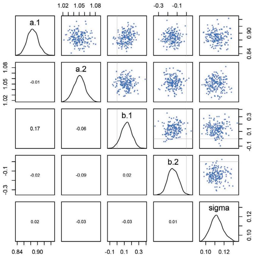
Figure 9.7. Pairs plot of the samples produced by ulam. The diagonal shows a density estimate for each parameter. Below the diagonal, correlations between parameters are shown.
with its name. And in the lower triangle of the matrix, the correlation between each pair of parameters is shown, with stronger correlations indicated by relative size.
For this model and these data, the resulting posterior distribution is quite nearly multivariate Gaussian. The density for sigma is certainly skewed in the expected direction. But otherwise the quadratic approximation does almost as well as Hamiltonian Monte Carlo. This is a very simple kind of model structure of course, with Gaussian priors, so an approximately quadratic posterior should be no surprise. Later, we’ll see some more exotic posterior distributions.
9.4.5. Checking the chain. Provided the Markov chain is defined correctly, then it is guaranteed to converge in the long run to the answer we want, the posterior distribution. But some posterior distributions are hard to explore—there will be examples—and the time it would take for them to provide an unbiased approximation is very long indeed. Such problems are rarer for HMC than other algorithms, but they still exist. In fact, one of the virtues
of HMC is that it tells us when things are going wrong. Other algorithms, like Metropolis-Hastings, can remain silent about major problems. In the next major section, we’ll dwell on causes of and solutions to malfunction.
For now, let’s look at two chain visualizations that can often, but not always, spot problems. The first is called a trace plot. A trace plot merely plots the samples in sequential order, joined by a line. It’s King Markov’s path through the islands, in the metaphor at the start of the chapter. Looking at the trace plot of each parameter is often the best thing for diagnosing common problems. And once you come to recognize a healthy, functioning Markov chain, quick checks of trace plots provide a lot of peace of mind. A trace plot isn’t the last thing analysts do to inspect MCMC output. But it’s often the first.
In the terrain ruggedness example, the trace plot shows a very healthy chain.
R code 9.20 traceplot( m9.1 )
The result is shown in Figure 9.8 (top). Actually, the figure shows the trace of just the first chain. You can get this by adding chains=1 to the call. You can think of the zig-zagging trace of each parameter as the path the chain took through each dimension of parameter space. The gray region in each plot, the first 500 samples, marks the adaptation samples. During adaptation, the Markov chain is learning to more efficiently sample from the posterior distribution. So these samples are not reliable to use for inference. They are automatically discarded by extract.samples, which returns only the samples shown in the white regions of Figure 9.8.
Now, how is this chain a healthy one? Typically we look for three things in these trace plots: (1) stationarity, (2) good mixing, and (3) convergence. Stationarity refers to the path of each chain staying within the same high-probability portion of the posterior distribution. Notice that these traces, for example, all stick around a very stable central tendency, the center of gravity of each dimension of the posterior. Another way to think of this is that the mean value of the chain is quite stable from beginning to end. Good mixing means that the chain rapidly explores the full region. It doesn’t slowly wander, but rather rapidly zig-zags around, as a good Hamiltonian chain should. Convergence means that multiple, independent chains stick around the same region of high probability.
Trace plots are a natural way to view a chain, but they are often hard to read, because once you start plotting lots of chains over one another, the plot can look very confusing and hide pathologies in some chains. A second way to visualize the chains is a plot of the distribution of the ranked samples, a trace rank plot, or trank plot. 155 What this means is to take all the samples for each individual parameter and rank them. The lowest sample gets rank 1. The largest gets the maximum rank (the number of samples across all chains). Then we draw a histogram of these ranks for each individual chain. Why do this? Because if the chains are exploring the same space efficiently, the histograms should be similar to one another and largely overlapping. The rethinking package provides a function to produce these:
R code 9.21 trankplot( m9.1 )
The result is reproduced in Figure 9.8 (bottom). The axes are not labeled in these plots, to reduce clutter. But the horizontal is rank, from 1 to the number of samples across all chains (2000 in this example). The vertical axis is the frequency of ranks in each bin of the
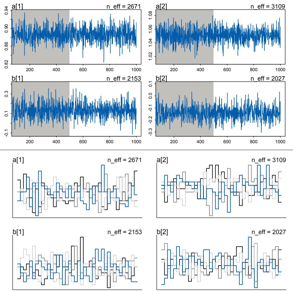
Figure 9.8. Trace (top) and trank (bottom) plots of the Markov chain from the ruggedness model, m9.1. sigma not shown. This is a healthy Markov chain, both stationary and well-mixing. Top: Gray region is warmup.
histogram. This trank plot is what we hope for: Histograms that overlap and stay within the same range.
To really understand the value of these plots, you’ll have to see some trace and trank plots for unhealthy chains. That’s the project of the next section.
Overthinking: Raw Stan model code. All ulam does is translate a list of formulas into Stan’s modeling language. Then Stan does the rest. Learning how to write Stan code is not necessary for most of the models in this book. But other models do require some direct interaction with Stan, because it is capable of much more than ulam allows you to express. And even for simple models, you’ll gain additional comprehension and control, if you peek into the machine. You can always access the raw Stan code that ulam produces by using the function stancode. For example, stancode(m9.1) prints out the Stan code for the ruggedness model. Before you’re familiar with Stan’s language, it’ll look long
and weird. But let’s take it one piece at a time. It’s actually just stuff you’ve already learned, expressed a little differently.
data{
vector[170] log_gdp_std;
vector[170] rugged_std;
int cid[170];
}
parameters{
vector[2] a;
vector[2] b;
real<lower=0> sigma;
}
model{
vector[170] mu;
sigma ~ exponential( 1 );
b ~ normal( 0 , 0.3 );
a ~ normal( 1 , 0.1 );
for ( i in 1:170 ) {
mu[i] = a[cid[i]] + b[cid[i]] * (rugged_std[i] - 0.215);
}
log_gdp_std ~ normal( mu , sigma );
}This is Stan code, not R code. It is essentially the formula list you provided to ulam, with the implied definitions of the variables made explicit. There are three “blocks.”
The first block is the data block, at the top. This is where observed variables are named and their types and sizes are declared. int cid[170] just means an integer variable named cid with 170 values. That’s our continent index. The other two are vectors of real values, continuous ruggedness and log GDP variables. Each line in Stan ends in a semicolon. Don’t ask why. Just do it. You probably aren’t using enough semicolons in your life, anyway.
The next block is parameters. These, you can probably guess, are the unobserved variables. They are described just like the observed ones. The new elements here are the <lower=0> for sigma and those vector[2] things. <lower=0> tells Stan that sigma must be positive. It is constrained. This constraint corresponds to the exponential prior we assign it, which is only defined on the positive reals. The vector[2] types are lists of real numbers of length 2. These are our 2 intercepts a and our 2 slopes b.
If you haven’t used explicit and static typed languages before, these first two blocks must seem weird. Why does Stan force the user to say explicitly what R and ulam figure out automatically? One reason is that the code doesn’t have to do as much checking of conditions, when the types of the variables are already there and unchanging. So it can be faster. But from our perspective, a major advantage is that explicit types help us avoid a large class of programming mistakes. The kinds of runtime shenanigans common to languages like R and Python are impossible in C++. In my experience, people who have studied compiled languages see static typing as a welcome feature. People who have only worked in interpreted languages like R see it as a bother. Both groups are correct.
Finally, the model block is where the action is. This block computes the log-probability of the data. It runs from top to bottom, like R code does, adding mathematical terms to the log-probability. So when Stan sees sigma ~ exponential( 1 ), it doesn’t do any sampling at that moment. Instead, it adds a probability term to the log-probability. This term is just dexp( sigma , 1 ). The same goes for the other lines with ~ in them. Note that the last line, for log_gdp_std, is vectorized just like R code. There are 170 outcomes values and 170 corresponding mu values. That last statement processes all of them.
Stan then uses the analytical gradient—derivative—of all these terms to define the physics simulation under Hamiltonian Monte Carlo. How does Stan do this? It uses a technique called automatic differentiation, or simply “autodiff,” to build an analytical gradient. If you know much about machine learning, you may have also heard about backpropagation. It’s the same thing as autodiff. This is much more accurate than a gradient approximated numerically. If you know some calculus,
really all that is going on is ruthless application of the chain rule. But the algorithm is actually quite clever. See the Stan manual for more details.
That’s all there is to a Stan program, in the basic case. I’ll break out into boxes like this in later chapters, to show more of the raw Stan code. Tools like ulam are bridges. They can do a lot of useful work, but the extra control you get from working directly in Stan is worthwhile. Especially since it won’t tie you to R or any other specific scripting language.
9.5. Care and feeding of your Markov chain
Markov chain Monte Carlo is a highly technical and usually automated procedure. You might write your own MCMC code, for the sake of learning. But it is very easy to introduce subtle biases. A package like Stan, in contrast, is continuously tested against expected output. Most people who use Stan don’t really understand what it is doing, under the hood. That’s okay. Science requires division of labor, and if every one of us had to write our own Markov chains from scratch, a lot less research would get done in the aggregate.
But as with many technical and powerful procedures, it’s natural to feel uneasy about MCMC and maybe even a little superstitious. Something magical is happening inside the computer, and unless we make the right sacrifices and say the right words, an ancient evil might awake. So we do need to understand enough to know when the evil stirs. The good news is that HMC, unlike Gibbs sampling and ordinary Metropolis, makes it easy to tell when the magic goes wrong. Its best feature is not how efficient it is. Rather the best feature is that it complains loudly when things aren’t right. Let’s look at some complaints and along the way establish some guidelines for running chains.
9.5.1. How many samples do you need? You can control the number of samples from the chain by using the iter and warmup parameters. The defaults are 1000 for iter and warmup is set to iter/2, which gives you 500 warmup samples and 500 real samples to use for inference. But these defaults are just meant to get you started, to make sure the chain gets started okay. Then you can decide on other values for iter and warmup.
So how many samples do we need for accurate inference about the posterior distribution? It depends. First, what really matters is the effective number of samples, not the raw number. The effective number of samples is an estimate of the number of independent samples from the posterior distribution, in terms of estimating some function like the posterior mean. Markov chains are typically autocorrelated, so that sequential samples are not entirely independent. This happens when chains explore the posterior slowly, like in a Metropolis algorithm. Autocorrelation reduces the effective number of samples. Stan provides an estimate of effective number of samples, for the purpose of estimating the posterior mean, as n_eff. You can think of n_eff as the length of a Markov chain with no autocorrelation that would provide the same quality of estimate as your chain. One consequence of this definition, as you saw earlier in the chapter, is that n_eff can be larger than the length of your chain, provided sequential samples are anti-correlated in the right way. While n_eff is only an estimate, it is usually better than the raw number of samples, which can be very misleading.
Second, what do you want to know? If all you want are posterior means, it doesn’t take many samples at all to get very good estimates. Even a couple hundred samples will do. But if you care about the exact shape in the extreme tails of the posterior, the 99th percentile or so, then you’ll need many more. So there is no universally useful number of samples to aim for. In most typical regression applications, you can get a very good estimate of the posterior mean with as few as 200 effective samples. And if the posterior is approximately Gaussian, then all you need in addition is a good estimate of the variance, which can be had with one order of magnitude more, in most cases. For highly skewed posteriors, you’ll have to think more about which region of the distribution interests you. Stan will sometimes warn you about “tail ESS,” the effective sample size (similar to n_eff) in the tails of the posterior. In those cases, it is nervous about the quality of extreme intervals, like 95%. Sampling more usually helps.
The warmup setting is more subtle. On the one hand, you want to have the shortest warmup period necessary, so you can get on with real sampling. But on the other hand, more warmup can mean more efficient sampling. With Stan models, typically you can devote as much as half of your total samples, the iter value, to warmup and come out very well. But for simple models like those you’ve fit so far, much less warmup is really needed. Models can vary a lot in the shape of their posterior distributions, so again there is no universally best answer. But if you are having trouble, you might try increasing the warmup. If not, you might try reducing it. There’s a practice problem at the end of the chapter that guides you in experimenting with the amount of warmup.
Rethinking: Warmup is not burn-in. Other MCMC algorithms and software often discuss burnin. With a sampling strategy like ordinary Metropolis, it is conventional and useful to trim off the front of the chain, the “burn-in” phase. This is done because it is unlikely that the chain has reached stationarity within the first few samples. Trimming off the front of the chain hopefully removes any influence of which starting value you chose for a parameter.156
But Stan’s sampling algorithms use a different approach. What Stan does during warmup is quite different from what it does after warmup. The warmup samples are used to adapt sampling, to find good values for the step size and the number of steps. Warmup samples are not representative of the target posterior distribution, no matter how long warmup continues. They are not burning in, but rather more like cycling the motor to heat things up and get ready for sampling. When real sampling begins, the samples will be immediately from the target distribution, assuming adaptation was successful.
9.5.2. How many chains do you need? It is very common to run more than one Markov chain, when estimating a single model. To do this with ulam or stan itself, the chains argument specifies the number of independent Markov chains to sample from. And the optional cores argument lets you distribute the chains across different processors, so they can run simultaneously, rather than sequentially. All of the non-warmup samples from each chain will be automatically combined in the resulting inferences.
So the question naturally arises: How many chains do we need? There are three answers to this question. First, when initially debugging a model, use a single chain. There are some error messages that don’t display unless you use only one chain. The chain will fail with more than one chain, but the reason may not be displayed. This is why the ulam default is chains=1. Second, when deciding whether the chains are valid, you need more than one chain. Third, when you begin the final run that you’ll make inferences from, you only really need one chain. But using more than one chain is fine, as well. It just doesn’t matter, once you’re sure it’s working. I’ll briefly explain these answers.
The first time you try to sample from a chain, you might not be sure whether the chain is working right. So of course you will check the trace plot or trank plot. Having more than one chain during these checks helps to make sure that the Markov chains are all converging to the same distribution. Sometimes, individual chains look like they’ve settled down to a stable
distribution, but if you run the chain again, it might settle down to a different distribution. When you run multiple Markov chains, each with different starting positions, and see that all of them end up in the same region of parameter space, it provides a check that the machine is working correctly. Using 3 or 4 chains is often enough to reassure us that the sampling is working properly.
But once you’ve verified that the sampling is working well, and you have a good idea of how many warmup samples you need, it’s perfectly safe to just run one long chain. For example, suppose we learn that we need 1000 warmup samples and about 9000 real samples in total. Should we run one chain, with warmup=1000 and iter=10000, or rather 3 chains, with warmup=1000 and iter=4000? It doesn’t really matter, in terms of inference. But it might matter in efficiency, because the 3 chains duplicate warmup effect that just gets thrown away. And since warmup is typically the slowest part of the chain, these extra warmup samples cost a disproportionate amount of your computer’s time. On the other hand, if you run the chains on different processor cores, then you might prefer 3 chains, because you can spread the load and finish the whole job faster. My institute uses shared computing servers with 64 or more available cores. We run a lot of parallel chains.
There are exotic situations in which all of the advice above must be modified. But for typical regression models, you can live by the motto one short chain to debug, four chains for verification and inference.
Things may still go wrong. One of the perks of using HMC and Stan is that when sampling isn’t working right, it’s usually very obvious. As you’ll see in the sections to follow, bad chains tend to have conspicuous behavior. Other methods of MCMC sampling, like Gibbs sampling and ordinary Metropolis, aren’t so easy to diagnose.
Rethinking: Convergence diagnostics. The default diagnostic output from Stan includes two metrics, n_eff and Rhat. The first is a measure of the effective number of samples. The second is the Gelman-Rubin convergence diagnostic, Rˆ. 157 When n_eff is much lower than the actual number of iterations (minus warmup) of your chains, it means the chains are inefficient, but possibly still okay. When Rhat is above 1.00, it usually indicates that the chain has not yet converged, and probably you shouldn’t trust the samples. If you draw more iterations, it could be fine, or it could never converge. See the Stan user manual for more details. It’s important however not to rely too much on these diagnostics. Like all heuristics, there are cases in which they provide poor advice. For example, Rhat can reach 1.00 even for an invalid chain. So view it perhaps as a signal of danger, but never of safety. For conventional models, these metrics typically work well.
9.5.3. Taming a wild chain. One common problem with some models is that there are broad, flat regions of the posterior density. This happens most often, as you might guess, when one uses flat priors. The problem this can generate is a wild, wandering Markov chain that erratically samples extremely positive and extremely negative parameter values.
Let’s look at a simple example. The code below tries to estimate the mean and standard deviation of the two Gaussian observations −1 and 1. But it uses totally flat priors.
9.22 y <- c(-1,1)
set.seed(11)
m9.2 <- ulam(
alist(
y ~ dnorm( mu , sigma ) ,mu <- alpha ,
alpha ~ dnorm( 0 , 1000 ) ,
sigma ~ dexp( 0.0001 )
) , data=list(y=y) , chains=3 )Now let’s look at the precis output:
R code
9.23 precis( m9.2 )mean sd 5.5% 94.5% n_eff Rhat alpha 69.38 393.89 -363.57 739.53 116 1.03 sigma 568.53 1247.18 6.81 2563.38 179 1.02
Whoa! This posterior can’t be right. The mean of −1 and 1 is zero, so we’re hoping to get a mean value for alpha around zero. Instead we get crazy values and implausibly wide intervals. Inference for sigma is no better. The n_eff and Rhat diagnostics don’t look good either. We drew 1500 samples total, but the estimated effective sample sizes are 116 and 179. You might get different numbers, but they will qualitatively be just as bad.
You should also see several warning messages, including:
Warning messages:
1: There were 67 divergent transitions after warmup. Increasing adapt_delta
above 0.95 may help. Seehttp://mc-stan.org/misc/warnings.html#divergent-transitions-after-warmupThere is useful advice at the URL. The quick version is that Stan detected problems in exploring all of the posterior. These are divergent transitions. I’ll give a more thorough explanation in a later chapter. Think of them as Stan’s way of telling you there are problems with the chains. For simple models, increasing the adapt_delta control parameter will usually remove the divergent transitions. This is explained more in the Overthinking box at the end of this section. You can try adding control=list(adapt_delta=0.99) to the ulam call—ulam’s default is 0.95. But it won’t help much in this specific case. This problem runs deeper, with the model itself.
You should also see a second warning:
2: Examine the pairs() plot to diagnose sampling problems
This refers to Stan’s pairs method, not ulam’s. To use it, try pairs( m9.2@stanfit ). This is like ulam’s pairs plot, but divergent transitions are colored in red. For that reason, the plot won’t reproduce in this book. So be sure to inspect it on your own machine. The shape of the posterior alone should shake your confidence.
Now take a look at the trace plot for this fit, traceplot(m9.2). It’s shown in the top row of Figure 9.9. The reason for the weird estimates is that the Markov chains seem to drift around and spike occasionally to extreme values. This is not a healthy pair of chains, and they do not provide useful samples. The trankplot(m9.2) is also shown. The rank histograms spend long periods with one chain above or below the others. This indicates poor exploration of the posterior.
It’s easy to tame this particular chain by using weakly informative priors. The reason the model above drifts wildly in both dimensions is that there is very little data, just two observations, and flat priors. The flat priors say that every possible value of the parameter is equally plausible, a priori. For parameters that can take a potentially infinite number of
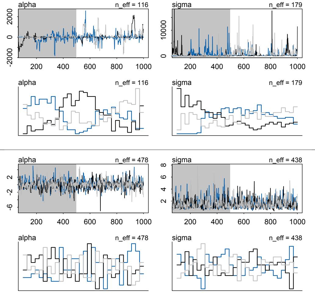
Figure 9.9. Diagnosing and healing a sick Markov chain. Top two rows: Trace and trank plots from three chains defined by model m9.2. These chains are not healthy. Bottom two rows: Adding weakly informative priors in m9.3 clears up the condition right away.
values, like alpha, this means the Markov chain needs to occasionally sample some pretty extreme and implausible values, like negative 30 million. These extreme drifts overwhelm the chain. If the likelihood were stronger, then the chain would be fine, because it would stick closer to zero.
But it doesn’t take much information in the prior to stop this foolishness, even without more data. Let’s use this model:
\[\begin{aligned} y\_i &\sim \text{Normal}(\mu, \sigma) \\ \mu &= \alpha \\ \alpha &\sim \text{Normal}(1, 10) \\ \sigma &\sim \text{Exponential}(1) \end{aligned}\]
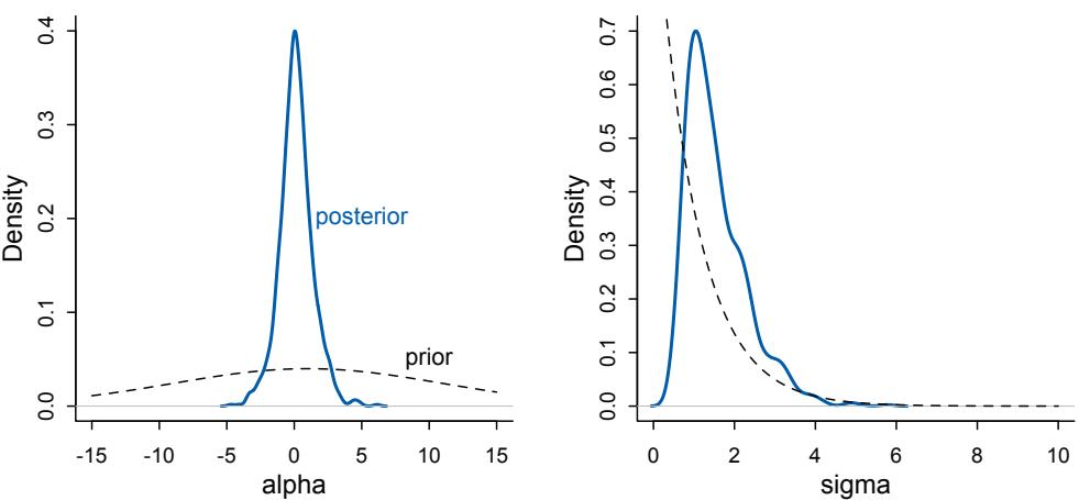
Figure 9.10. Prior (dashed) and posterior (blue) for the model with weakly informative priors, m9.3. Even with only two observations, the likelihood easily overcomes these priors. Yet the posterior cannot be successfully approximated without them.
I’ve just added weakly informative priors for α and σ. We’ll plot these priors in a moment, so you will be able to see just how weak they are. But let’s re-approximate the posterior first:
R code
9.24 set.seed(11)
m9.3 <- ulam(
alist(
y ~ dnorm( mu , sigma ) ,
mu <- alpha ,
alpha ~ dnorm( 1 , 10 ) ,
sigma ~ dexp( 1 )
) , data=list(y=y) , chains=3 )
precis( m9.3 )mean sd 5.5% 94.5% n_eff Rhat4 alpha 0.10 1.13 -1.60 1.97 478 1 sigma 1.52 0.72 0.67 2.86 438 1
That’s much better. Take a look at the bottom portion of Figure 9.9. The trace and trank plots look healthy. Both chains are stationary around the same values, and mixing is good. No more wild detours into the thousands. And those divergent transitions are gone.
To appreciate what has happened, take a look at the priors (dashed) and posteriors (blue) in Figure 9.10. Both the Gaussian prior for α and the exponential prior for σ contain very gradual downhill slopes. They are so gradual, that even with only two observations, as in this example, the likelihood almost completely overcomes them. The mean of the prior for α is 1, but the mean of the posterior is zero, just as the likelihood says it should be.
These weakly informative priors have helped by providing a very gentle nudge towards reasonable values of the parameters. Now values like 30 million are no longer equally plausible as small values like 1 or 2. Lots of problematic chains want subtle priors like these,
designed to tune estimation by assuming a tiny bit of prior information about each parameter. And even though the priors end up getting washed out right away—two observations were enough here—they still have a big effect on inference, by allowing us to get an answer. That answer is also a good answer. This point will be even more important for non-Gaussian models to come.
Rethinking: The folk theorem of statistical computing. The example above illustrates Andrew Gelman’s folk theorem of statistical computing: When you have computational problems, often there’s a problem with your model.158 Before we begin to tune the software and pour more computer power into a problem, it can be useful to go over the model specification again, and the data itself, to make sure the problem isn’t in the pre-sampling stage. It’s very common when working with Bayesian models that slow or clunky sampling is due to something as simple as having entirely omitted one or more prior distributions.
Overthinking: Divergent transitions are your friend. You’ll see divergent transition warnings often in using ulam and Stan. They are your friend, providing a helpful warning. These warnings arise when the numerical simulation that HMC uses is inaccurate. HMC can detect these inaccuracies. That is one of its major advantages over other sampling approaches, most of which provide few automatic ways to discover bad chains. We’ll examine these divergent transitions in much more detail in a later chapter. We’ll also see some clever ways to work around them.
9.5.4. Non-identifiable parameters. Back in Chapter 6, you met the problem of highly correlated predictors and the non-identifiable parameters they can create. Here you’ll see what such parameters look like inside of a Markov chain. You’ll also see how you can identify them, in principle, by using a little prior information. Most importantly, the badly behaving chains produced in this example will exhibit characteristic bad behavior, so when you see the same pattern in your own models, you’ll have a hunch about the cause.
To construct a non-identifiable model, we first simulate 100 observations from a Gaussian distribution with mean zero and standard deviation 1.
9.25 set.seed(41)
y <- rnorm( 100 , mean=0 , sd=1 )By simulating the data, we know the right answer. Then we fit this model:
yi ∼ Normal(µ, σ)
µ = α1 + α2
α1 ∼ Normal(0, 1000)
α2 ∼ Normal(0, 1000)
σ ∼ Exponential(1)The linear model contains two parameters, α1 and α2, which cannot be identified. Only their sum can be identified, and it should be about zero, after estimation.
Let’s run the Markov chain and see what happens. This chain is going to take much longer than the previous ones. But it should still finish after a few minutes.
R code
9.26 set.seed(384)
m9.4 <- ulam(
alist(
y ~ dnorm( mu , sigma ) ,
mu <- a1 + a2 ,
a1 ~ dnorm( 0 , 1000 ),
a2 ~ dnorm( 0 , 1000 ),
sigma ~ dexp( 1 )
) , data=list(y=y) , chains=3 )
precis( m9.4 )| mean | sd | 5.5% | 94.5% | n_eff | Rhat4 | |
|---|---|---|---|---|---|---|
| a1 | -364.81 | 318.57 | -792.82 | 240.50 | 2 | 2.80 |
| a2 | 365.00 | 318.57 | -240.26 | 792.98 | 2 | 2.80 |
| sigma | 1.05 | 0.10 | 0.90 | 1.19 | 2 | 2.02 |
Those estimates look suspicious, and the n_eff and Rhat values are terrible. The means for a1 and a2 are about the same distance from zero, but on opposite sides of zero. And the standard deviations are massive. This is a result of the fact that we cannot simultaneously estimate a1 and a2, but only their sum. You should also see a warning:
Warning messages:1: There were 1199 transitions after warmup that exceeded the maximum treedepth. Increase max_treedepth above 10. See
http://mc-stan.org/misc/warnings.html#maximum-treedepth-exceeded
This is confusing. If you visit the URL, you’ll see that this means the chains are inefficient, because some internal limit was reached. These treedepth warnings usually indicate inefficient chains, but not necessarily broken chains. To increase the treedepth, you can add control=list(max_treedepth=15) to the ulam call. But it won’t help much. There is something else seriously wrong here.
Looking at the trace plot reveals more. The left column in Figure 9.11 shows two Markov chains from the model above. These chains do not look like they are stationary, nor do they seem to be mixing very well. Indeed, when you see a pattern like this, it is reason to worry. Don’t use these samples.
Again, weakly regularizing priors can rescue us. Now the model fitting code is:
R code
9.27 m9.5 <- ulam(
alist(
y ~ dnorm( mu , sigma ) ,
mu <- a1 + a2 ,
a1 ~ dnorm( 0 , 10 ),
a2 ~ dnorm( 0 , 10 ),
sigma ~ dexp( 1 )
) , data=list(y=y) , chains=3 )
precis( m9.5 )mean sd 5.5% 94.5% n_eff Rhat4
a1 0.01 7.16 -11.43 11.54 389 1
a2 0.18 7.15 -11.41 11.57 389 1
sigma 1.03 0.08 0.92 1.17 448 1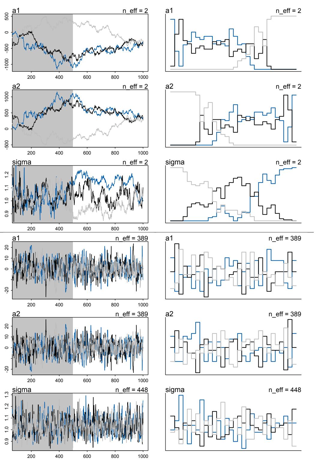
Figure 9.11. Top panel, m9.4. A chain with wandering parameters, a1 and a2. Bottom panel, m9.5. Same model but with weakly informative priors.
The estimates for a1 and a2 are better identified now. Well, they still aren’t individually identified. But their sum is identified. Compare the trace and trank plots in Figure 9.11. Notice also that the model sampled a lot faster. With flat priors, m9.4, sampling may take 3 times as long as it does for m9.5. Often, a model that is very slow to sample is underidentified. This is an aspect of the folk theorem of statistical computing (page 293).
In the end, adding some weakly informative priors saves this model. You might think you’d never accidentally try to fit an unidentified model. But you’d be wrong. Even if you don’t make obvious mistakes, complex models can easily become unidentified or nearly so. With many predictors, and especially with interactions, correlations among parameters can be large. Just a little prior information telling the model “none of these parameters can be 30 million” often helps, and it has no effect on estimates. A flat prior really is flat, all the way to infinity. Unless you believe infinity is a reasonable estimate, don’t use a flat prior.
Additionally, adding weak priors can speed up sampling, because the Markov chain won’t feel that it has to run out to extreme values that you, but not your model, already know are highly implausible.
Rethinking: Hamiltonian warnings and Gibbs overconfidence. When people start using Stan, or some other Hamiltonian sampler, they often find that models they used to fit in Metropolis-Hastings and Gibbs samplers like BUGS, JAGS, and MCMCglmm no longer work well. The chains are slow. There are lots of warnings. Stan is really something of a nag. Is something wrong with Stan?
No. Those problems were probably always there, even in the other tools. But since Gibbs doesn’t use gradients, it doesn’t notice some issues that a Hamiltonian engine will. A culture has evolved in applied statistics of running bad chains for a very long time—for millions of iterations—and then thinning aggressively, praying, and publishing. Phylogenetic analyses may be particularly prone to this, since tree spaces are very difficult to explore.159 Tools like Stan and other Hamiltonian engines are so important for reliable research precisely because they provide more diagnostic criteria for the accuracy of the Monte Carlo approximation. Don’t resent the nagging.
9.6. Summary
This chapter has been an informal introduction to Markov chain Monte Carlo (MCMC) estimation. The goal has been to introduce the purpose and approach MCMC algorithms. The major algorithms introduced were the Metropolis, Gibbs sampling, and Hamiltonian Monte Carlo algorithms. Each has its advantages and disadvantages. The ulam function in the rethinking package was introduced. It uses the Stan (mc-stan.org) Hamiltonian Monte Carlo engine to fit models as they are defined in this book. General advice about diagnosing poor MCMC fits was introduced by the use of a couple of pathological examples. In the next chapters, we use this new power to learn new kinds of models.
9.7. Practice
Problems are labeled Easy (E), Medium (M), and Hard (H).
9E1. Which of the following is a requirement of the simple Metropolis algorithm?
- The parameters must be discrete.
- The likelihood function must be Gaussian.
- The proposal distribution must be symmetric.
9E2. Gibbs sampling is more efficient than the Metropolis algorithm. How does it achieve this extra efficiency? Are there any limitations to the Gibbs sampling strategy?
9E3. Which sort of parameters can Hamiltonian Monte Carlo not handle? Can you explain why?
9E4. Explain the difference between the effective number of samples, n_eff as calculated by Stan, and the actual number of samples.
9E5. Which value should Rhat approach, when a chain is sampling the posterior distribution correctly?
9E6. Sketch a good trace plot for a Markov chain, one that is effectively sampling from the posterior distribution. What is good about its shape? Then sketch a trace plot for a malfunctioning Markov chain. What about its shape indicates malfunction?
9E7. Repeat the problem above, but now for a trace rank plot.
9M1. Re-estimate the terrain ruggedness model from the chapter, but now using a uniform prior for the standard deviation, sigma. The uniform prior should be dunif(0,1). Use ulam to estimate the posterior. Does the different prior have any detectible influence on the posterior distribution of sigma? Why or why not?
9M2. Modify the terrain ruggedness model again. This time, change the prior for b[cid] to dexp(0.3). What does this do to the posterior distribution? Can you explain it?
9M3. Re-estimate one of the Stan models from the chapter, but at different numbers of warmup iterations. Be sure to use the same number of sampling iterations in each case. Compare the n_eff values. How much warmup is enough?
9H1. Run the model below and then inspect the posterior distribution and explain what it is accomplishing.
9.28 mp <- ulam(
alist(
a ~ dnorm(0,1),
b ~ dcauchy(0,1)
), data=list(y=1) , chains=1 )Compare the samples for the parameters a and b. Can you explain the different trace plots? If you are unfamiliar with the Cauchy distribution, you should look it up. The key feature to attend to is that it has no expected value. Can you connect this fact to the trace plot?
9H2. Recall the divorce rate example from Chapter 5. Repeat that analysis, using ulam this time, fitting models m5.1, m5.2, and m5.3. Use compare to compare the models on the basis of WAIC or PSIS. To use WAIC or PSIS with ulam, you need add the argument log_log=TRUE. Explain the model comparison results.
9H3. Sometimes changing a prior for one parameter has unanticipated effects on other parameters. This is because when a parameter is highly correlated with another parameter in the posterior, the prior influences both parameters. Here’s an example to work and think through.
Go back to the leg length example in Chapter 6 and use the code there to simulate height and leg lengths for 100 imagined individuals. Below is the model you fit before, resulting in a highly correlated posterior for the two beta parameters. This time, fit the model using ulam:
m5.8s <- ulam(
alist(
height ~ dnorm( mu , sigma ) ,
mu <- a + bl*leg_left + br*leg_right ,
a ~ dnorm( 10 , 100 ) ,
bl ~ dnorm( 2 , 10 ) ,
br ~ dnorm( 2 , 10 ) ,
sigma ~ dexp( 1 )
) , data=d, chains=4,
start=list(a=10,bl=0,br=0.1,sigma=1) )Compare the posterior distribution produced by the code above to the posterior distribution produced when you change the prior for br so that it is strictly positive:
R code
9.30 m5.8s2 <- ulam(
alist(
height ~ dnorm( mu , sigma ) ,
mu <- a + bl*leg_left + br*leg_right ,
a ~ dnorm( 10 , 100 ) ,
bl ~ dnorm( 2 , 10 ) ,
br ~ dnorm( 2 , 10 ) ,
sigma ~ dexp( 1 )
) , data=d, chains=4,
constraints=list(br="lower=0"),
start=list(a=10,bl=0,br=0.1,sigma=1) )Note the constraints list. What this does is constrain the prior distribution of br so that it has positive probability only above zero. In other words, that prior ensures that the posterior distribution for br will have no probability mass below zero. Compare the two posterior distributions for m5.8s and m5.8s2. What has changed in the posterior distribution of both beta parameters? Can you explain the change induced by the change in prior?
9H4. For the two models fit in the previous problem, use WAIC or PSIS to compare the effective numbers of parameters for each model. You will need to use log_lik=TRUE to instruct ulam to compute the terms that both WAIC and PSIS need. Which model has more effective parameters? Why?
9H5. Modify the Metropolis algorithm code from the chapter to handle the case that the island populations have a different distribution than the island labels. This means the island’s number will not be the same as its population.
9H6. Modify the Metropolis algorithm code from the chapter to write your own simple MCMC estimator for globe tossing data and model from Chapter 2.
9H7. Can you write your own Hamiltonian Monte Carlo algorithm for the globe tossing data, using the R code in the chapter? You will have to write your own functions for the likelihood and gradient, but you can use the HMC2 function.
10 Big Entropy and the Generalized Linear Model
Most readers of this book will share the experience of fighting with tangled electrical cords. Whether behind a desk or stuffed in a box, cords and cables tend toward tying themselves in knots. Why is this? There is of course real physics at work. But at a descriptive level, the reason is entropy: There are vastly more ways for cords to end up in a knot than for them to remain untied.160 So if I were to carefully lay a dozen cords in a box and then seal the box and shake it, we should bet that at least some of the cords will be tangled together when I again open the box. We don’t need to know anything about the physics of cords or knots. We just have to bet on entropy. Events that can happen vastly more ways are more likely.
Exploiting entropy is not going to untie your cords. But it will help you solve some problems in choosing distributions. Statistical models force many choices upon us. Some of these choices are distributions that represent uncertainty. We must choose, for each parameter, a prior distribution. And we must choose a likelihood function, which serves as a distribution of data. There are conventional choices, such as wide Gaussian priors and the Gaussian likelihood of linear regression. These conventional choices work unreasonably well in many circumstances. But very often the conventional choices are not the best choices. Inference can be more powerful when we use all of the information, and doing so usually requires going beyond convention.
To go beyond convention, it helps to have some principles to guide choice. When an engineer wants to make an unconventional bridge, engineering principles help guide choice. When a researcher wants to build an unconventional model, entropy provides one useful principle to guide choice of probability distributions: Bet on the distribution with the biggest entropy. Why? There are three sorts of justifications.
First, the distribution with the biggest entropy is the widest and least informative distribution. Choosing the distribution with the largest entropy means spreading probability as evenly as possible, while still remaining consistent with anything we think we know about a process. In the context of choosing a prior, it means choosing the least informative distribution consistent with any partial scientific knowledge we have about a parameter. In the context of choosing a likelihood, it means selecting the distribution we’d get by counting up all the ways outcomes could arise, consistent with the constraints on the outcome variable. In both cases, the resulting distribution embodies the least information while remaining true to the information we’ve provided.
Second, nature tends to produce empirical distributions that have high entropy. Back in Chapter 4, I introduced the Gaussian distribution by demonstrating how any process that repeatedly adds together fluctuations will tend towards an empirical distribution with the distinctive Gaussian shape. That shape is the one that contains no information about the underlying process except its location and variance. As a result, it has maximum entropy. Natural processes other than addition also tend to produce maximum entropy distributions. But they are not Gaussian. They retain different information about the underlying process.
Third, regardless of why it works, it tends to work. Mathematical procedures are effective even when we don’t understand them. There are no guarantees that any logic in the small world (Chapter 2) will be useful in the large world. We use logic in science because it has a strong record of effectiveness in addressing real world problems. This is the historical justification: The approach has solved difficult problems in the past. This is no guarantee that it will work on your problem. But no approach can guarantee that.
This chapter serves as a conceptual introduction to generalized linear models and the principle of maximum entropy. A generalized linear model (GLM) is much like the linear regressions of previous chapters. It is a model that replaces a parameter of a likelihood function with a linear model. But GLMs need not use Gaussian likelihoods. Any likelihood function can be used, and linear models can be attached to any or all of the parameters that describe its shape. The principle of maximum entropy helps us choose likelihood functions, by providing a way to use stated assumptions about constraints on the outcome variable to choose the likelihood function that is the most conservative distribution compatible with the known constraints. Using this principle recovers all the most common likelihood functions of many statistical approaches, Bayesian or not, while simultaneously providing a clear rationale for choice among them.
The chapters to follow this one build computational skills for working with different flavors of GLM. Chapter 11 addresses models for count variables. Chapter 12 explores more complicated models, such as ordinal outcomes and mixtures. Portions of these chapters are specialized by model type. So you can skip sections that don’t interest you at the moment. The multilevel chapters, beginning with Chapter 13, make use of binomial count models, however. So some familiarity with the material in Chapter 11 will be helpful.
Rethinking: Bayesian updating is entropy maximization. Another kind of probability distribution, the posterior distribution deduced by Bayesian updating, is also a case of maximizing entropy. The posterior distribution has the greatest entropy relative to the prior (the smallest cross entropy) among all distributions consistent with the assumed constraints and the observed data.161 This fact won’t change how you calculate. But it should provide a deeper appreciation of the fundamental connections between Bayesian inference and information theory. Notably, Bayesian updating is just like maximum entropy in that it produces the least informative distribution that is still consistent with our assumptions. Or you might say that the posterior distribution has the smallest divergence from the prior that is possible while remaining consistent with the constraints and data.
10.1. Maximum entropy
In Chapter 7, you met the basics of information theory. In brief, we seek a measure of uncertainty that satisfies three criteria: (1) the measure should be continuous; (2) it should increase as the number of possible events increases; and (3) it should be additive. The resulting unique measure of the uncertainty of a probability distribution p with probabilities pi for each possible event i turns out to be just the average log-probability:
\[H(p) = -\sum\_{i} p\_i \log p\_i\]
This function is known as information entropy.
The principle of maximum entropy applies this measure of uncertainty to the problem of choosing among probability distributions. Perhaps the simplest way to state the maximum entropy principle is:
The distribution that can happen the most ways is also the distribution with the biggest information entropy. The distribution with the biggest entropy is the most conservative distribution that obeys its constraints.
There’s nothing intuitive about this idea, so if it seems weird, you are normal.
To begin to understand maximum entropy, forget about information and probability theory for the moment. Imagine instead 5 buckets and a pile of 10 individually numbered pebbles. You stand and toss all 10 pebbles such that each pebble is equally likely to land in any of the 5 buckets. This means that every particular arrangement of the 10 individual pebbles is equally likely—it’s just as likely to get all 10 in bucket 3 as it is to get pebble 1 in bucket 2, pebbles 2–9 in bucket 3, and pebble 10 in bucket 4.
But some kinds of arrangements are much more likely. Some arrangements look the same, because they show the same number of pebbles in the same individual buckets. These are distributions of pebbles. Figure 10.1 illustrates 5 such distributions. So for example there is only 1 way to arrange the individual pebbles so that all of them are in bucket 3 (plot A). But there are 90 ways to arrange the individual pebbles so that 2 of them are in bucket 2, 8 in bucket 3, and 2 in bucket 4 (plot B). Plots C, D, and E show that the number of unique arrangements corresponding to a distribution grows very rapidly as the distribution places a more equal number of pebbles in each bucket. By the time there are 2 pebbles in each bucket (plot E), there are 113400 ways to realize this distribution. There is no other distribution of the pebbles that can be realized a greater number of ways.
Let’s put each distribution of pebbles in a list:
10.1 p <- list()
p$A <- c(0,0,10,0,0)
p$B <- c(0,1,8,1,0)
p$C <- c(0,2,6,2,0)
p$D <- c(1,2,4,2,1)
p$E <- c(2,2,2,2,2)And let’s normalize each such that it is a probability distribution. This means we just divide each count of pebbles by the total number of pebbles:
| R code | ||||
|---|---|---|---|---|
| p_norm <- |
lapply( p , |
function(q) | q/sum(q)) | 10.2 |
Since these are now probability distributions, we can compute the information entropy of each. The only trick here is to remember L’Hôpital’s rule (see page 207):
| ( H <- sapply( p_norm , |
function(q) | -sum(ifelse(q==0,0,q*log(q))) ) ) |
R code 10.3 |
|---|---|---|---|
| —————————————- | ————- | —————————————– | —————- |
A B C D E 0.0000000 0.6390319 0.9502705 1.4708085 1.6094379
So distribution E, which can realized by far the greatest number of ways, also has the biggest entropy. This is no coincidence. To see why, let’s compute the logarithm of number of ways
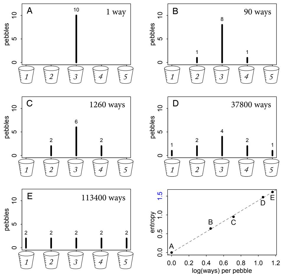
Figure 10.1. Entropy as a measure of the number of unique arrangements of a system that produce the same distribution. Plots A through E show the numbers of unique ways to arrange 10 pebbles into each of 5 different distributions. Bottom-right: The entropy of each distribution plotted against the log number of ways per pebble to produce it.
each distribution can be realized, then divide that logarithm by 10, the number of pebbles. This gives us the log ways per pebble for each distribution:
R code 10.4 ways <- c(1,90,1260,37800,113400) logwayspp <- log(ways)/10
The bottom-right plot in Figure 10.1 displays these logwayspp values against the information entropies H. These two sets of values contain the same information, as information entropy is an approximation of the log ways per pebble (see the Overthinking box at the end for details). As the number of pebbles grows larger, the approximation gets better. It’s
already extremely good, for just 10 pebbles. Information entropy is a way of counting how many unique arrangements correspond to a distribution.
This is useful, because the distribution that can happen the greatest number of ways is the most plausible distribution. Call this distribution the maximum entropy distribution. As you might guess from the pebble example, the number of ways corresponding to the maximum entropy distribution eclipses that of any other distribution. And the numbers of ways for each distribution most similar to the maximum entropy distribution eclipse those of less similar distributions. And so on, such that the vast majority of unique arrangements of pebbles produce either the maximum entropy distribution or rather a distribution very similar to it. And that is why it’s often effective to bet on maximum entropy: It’s the center of gravity for the highly plausible distributions.
Its high plausibility is conditional on our assumptions, of course. To grasp the role of assumptions—constraints and data—in maximum entropy, we’ll explore two examples. First, we’ll derive the Gaussian distribution as the solution to an entropy maximization problem. Second, we’ll derive the binomial distribution, which we used way back in Chapter 2 to draw marbles and toss globes, as the solution to a different entropy maximization problem. These derivations will not be mathematically rigorous. Rather, they will be graphical and aim to deliver a conceptual appreciation for what this thing called entropy is doing. The Overthinking boxes in this section provide connections to the mathematics, for those who are interested.
But the most important thing is to be patient with yourself. Understanding of and intuition for probability theory comes with experience. You can usefully apply the principle of maximum entropy before you fully understand it. Indeed, it may be that no one fully understands it. Over time, and within the contexts that you find it useful, the principle will become more intuitive.
Rethinking: What good is intuition? Like many aspects of information theory, maximum entropy is not very intuitive. But note that intuition is just a guide to developing methods. When a method works, it hardly matters whether our intuition agrees. This point is important, because some people still debate statistical approaches on the basis of philosophical principles and intuitive appeal. Philosophy does matter, because it influences development and application. But it is a poor way to judge whether or not an approach is useful. Results are what matter. For example, the three criteria used to derive information entropy, back in Chapter 7, are not also the justification for using information entropy. The justification is rather that it has worked so well on so many problems where other methods have failed.
Overthinking: The Wallis derivation. Intuitively, we can justify maximum entropy just based upon the definition of information entropy. But there’s another derivation, attributed to Graham Wallis,162 that doesn’t invoke “information” at all. Here’s a short version of the argument. Suppose there are M observable events, and we wish to assign a plausibility to each. We know some constraints about the process that produces these events, such as its expected value or variance. Now imagine setting up M buckets and tossing a large number N of individual stones into them at random, in such a way that each stone is equally likely to land in any of the M buckets. After all the stones have landed, we count up the number of stones in each bucket i and use these counts ni to construct a candidate probability distribution defined by pi = ni/N. If this candidate distribution is consistent with our constraints, we add it to a list. If not, we empty the buckets and try again. After many rounds of this, the distribution that has occurred the most times is the fairest—in the sense that no bias was involved in tossing the stones into buckets—that still obeys the constraints that we imposed.
If we could employ the population of a large country in tossing stones every day for years on end, we could do this empirically. Luckily, the procedure can be studied mathematically. The probability of any particular candidate distribution is just its multinomial probability, the probability of the observed stone counts under uniform chances of landing in each bucket:
\[\Pr(n\_1, n\_2, \dots, n\_m) = \frac{N!}{n\_1! n\_2! \dots n\_m!} \prod\_{i=1}^M \left(\frac{1}{M}\right)^{n\_i} = \frac{N!}{n\_1! n\_2! \dots n\_m!} \left(\frac{1}{M}\right)^N = W\left(\frac{1}{M}\right)^N\]
The distribution that is realized most often will have the largest value of that ugly fraction W with the factorials in it. Call W the multiplicity, because it states the number of different ways a particular set of counts could be realized. For example, landing all stones in the first bucket can happen only one way, by getting all the stones into that bucket and none in any of the other buckets. But there are many more ways to evenly distribute the stones in the buckets, because order does not matter. We care about this multiplicity, because we are seeking the distribution that would happen most often. So by selecting the distribution that maximizes this multiplicity, we can accomplish that goal.
We’re almost at entropy. It’s easier to work with 1 N log(W), which will be maximized by the same distribution as W. Also note that ni = Npi . These changes give us:
\[\frac{1}{N}\log W = \frac{1}{N}(\log N! - \sum\_{i} \log[(Np\_i)!])\]
Now since N is very large, we can approximate log N! with Stirling’s approximation, N log N − N:
\[\frac{1}{N}\log W \approx \frac{1}{N}\left(N\log N - N - \sum\_{i} \left(Np\_i \log(Np\_i) - Np\_i\right)\right) = -\sum\_{i} p\_i \log p\_i\]
And that’s the exact same formula as Shannon’s information entropy. Among distributions that satisfy our constraints, the distribution that maximizes the expression above is the distribution that spreads out probability as evenly as possible, while still obeying the constraints.
This result generalizes easily to the case in which there is not an equal chance of each stone landing in each bucket.163 If we have prior information specified as a probability qi that a stone lands in bucket i, then the quantity to maximize is instead:
\[\frac{1}{N}\log\Pr(n\_1, n\_2, \dots, n\_m) \approx -\sum\_{i} p\_i \log(p\_i/q\_i)\]
You may recognize this as KL divergence from Chapter 7, just with a negative in front. This reveals that the distribution that maximizes entropy is also the distribution that minimizes the information distance from the prior, among distributions consistent with the constraints. When the prior is flat, maximum entropy gives the flattest distribution possible. When the prior is not flat, maximum entropy updates the prior and returns the distribution that is most like the prior but still consistent with the constraints. This procedure is often called minimum cross-entropy. Furthermore, Bayesian updating itself can be expressed as the solution to a maximum entropy problem in which the data represent constraints.164 Therefore Bayesian inference can be seen as producing a posterior distribution that is most similar to the prior distribution as possible, while remaining logically consistent with the stated information.
10.1.1. Gaussian. When I introduced the Gaussian distribution in Chapter 4 (page 72), it emerged from a generative process in which 1000 people repeatedly flipped coins and took steps left (heads) or right (tails) with each flip. The addition of steps led inevitably to a distribution of positions resembling the Gaussian bell curve. This process represents the most basic generative dynamic that leads to Gaussian distributions in nature. When many small factors add up, the ensemble of sums tends towards Gaussian.
But obviously many other distributions are possible. The coin-flipping dynamic could place all 1000 people on the same side of the soccer field, for example. So why don’t we see
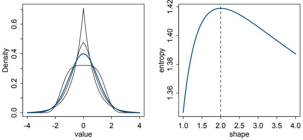
Figure 10.2. Maximum entropy and the Gaussian distribution. Left: Comparison of Gaussian (blue) and several other continuous distributions with the same variance. Right: Entropy is maximized when curvature of a generalized normal distribution matches the Gaussian, where shape is equal to 2.
those other distributions in nature? Because for every sequence of coin flips that can produce such an imbalanced outcome, there are vastly many more that can produce an approximately balanced outcome. The bell curve emerges, empirically, because there are so many different detailed states of the physical system that can produce it. Whatever does happen, it’s bound to produce an ensemble that is approximately Gaussian. So if all you know about a collection of continuous values is its variance (or that it has a finite variance, even if you don’t know it yet), the safest bet is that the collection ends up in one of these vastly many bell-shaped configurations.165
And maximum entropy just seeks the distribution that can arise the largest number of ways, so it does a good job of finding limiting distributions like this. But since entropy is maximized when probability is spread out as evenly as possible, maximum entropy also seeks the distribution that is most even, while still obeying its constraints. In order to visualize how the Gaussian is the most even distribution for any given variance, let’s consider a family of generalized distributions with equal variance. A generalized normal distribution is defined by the probability density:
\[\Pr(\mathcal{y}|\mu,\alpha,\beta) = \frac{\beta}{2\alpha\Gamma(1/\beta)}e^{-\left(\frac{|\mathcal{y}-\mu|}{\alpha}\right)^{\beta}}\]
We want to compare a regular Gaussian distribution with variance σ 2 to several generalized normals with the same variance.166
The left-hand plot in Figure 10.2 presents one Gaussian distribution, in blue, together with three generalized normal distributions with the same variance. All four distributions have variance σ 2 = 1. Two of the generalized distributions are more peaked, and have thicker tails, than the Gaussian. Probability has been redistributed from the middle to the tails, keeping the variance constant. The third generalized distribution is instead thicker in the middle and thinner in the tails. It again keeps the variance constant, this time by redistributing probability from the tails to the center. The blue Gaussian distribution sits between these extremes.
In the right-hand plot of Figure 10.2, β is called “shape” and varies from 1 to 4, and entropy is plotted on the vertical axis. The generalized normal is perfectly Gaussian where β = 2, and that’s exactly where entropy is maximized. All of these distributions are symmetrical, but that doesn’t affect the result. There are other generalized families of distributions that can be skewed as well, and even then the bell curve has maximum entropy. See the Overthinking box at the bottom of this page, if you want a more satisfying proof.
To appreciate why the Gaussian shape has the biggest entropy for any continuous distribution with this variance, consider that entropy increases as we make a distribution flatter. So we could easily make up a probability distribution with larger entropy than the blue distribution in Figure 10.2: Just take probability from the center and put it in the tails. The more uniform the distribution looks, the higher its entropy will be. But there are limits on how much of this we can do and maintain the same variance, σ 2 = 1. A perfectly uniform distribution would have infinite variance, in fact. So the variance constraint is actually a severe constraint, forcing the high-probability portion of the distribution to a small area around the mean. Then the Gaussian distribution gets its shape by being as spread out as possible for a distribution with fixed variance.
The take-home lesson from all of this is that, if all we are willing to assume about a collection of measurements is that they have a finite variance, then the Gaussian distribution represents the most conservative probability distribution to assign to those measurements. But very often we are comfortable assuming something more. And in those cases, provided our assumptions are good ones, the principle of maximum entropy leads to distributions other than the Gaussian.
Overthinking: Proof of Gaussian maximum entropy. Proving that the Gaussian has the largest entropy of any distribution with a given variance is easier than you might think. Here’s the shortest proof I know.167 Let p(x) = (2πσ2 ) −1/2 exp(−(x − µ) 2/(2σ 2 )) stand for the Gaussian probability density function. Let q(x) be some other probability density function with the same variance σ 2 . The mean µ doesn’t matter here, because entropy doesn’t depend upon location, just shape.
The entropy of the Gaussian is H(p) = − R p(x)log p(x)dx = 1 2 log(2πeσ 2 ). We seek to prove that no distribution q(x) can have higher entropy than this, provided they have the same variance and are both defined on the entire real number line, from −∞ to +∞. We can accomplish this by using our old friend, from Chapter 7, KL divergence:
\[D\_{\mathrm{KL}}(q,p) = \int\_{-\infty}^{\infty} q(\mathbf{x}) \log \left( \frac{q(\mathbf{x})}{p(\mathbf{x})} \right) d\mathbf{x} = -H(q,p) - H(q)\]
H(q) = − R q(x)log q(x)dx is the entropy of q(x) and H(q, p) = R q(x)log p(x)dx is the crossentropy of the two. Why use DKL here? Because it is always positive (or zero), which guarantees that −H(q, p) ≥ H(q). So while we can’t compute H(q), it turns out that we can compute H(q, p). And as you’ll see, that solves the whole problem. So let’s compute H(q, p). It’s defined as:
\[H(q,p) = \int\_{-\infty}^{\infty} q(\mathbf{x}) \log p(\mathbf{x}) d\mathbf{x} = \int\_{-\infty}^{\infty} q(\mathbf{x}) \log \left[ (2\pi\sigma^2)^{-1/2} \exp\left(-\frac{(\mathbf{x}-\mu)^2}{2\sigma^2}\right) \right] d\mathbf{x}\]
This will be conceptually easier if we remember that the integral above just takes the average over x. So we can rewrite the above as:
\[H(q, p) = \mathrm{E} \log \left[ \left( 2\pi \sigma^2 \right)^{-1/2} \exp \left( -\frac{(\mathbf{x} - \boldsymbol{\mu})^2}{2\sigma^2} \right) \right] = -\frac{1}{2} \log(2\pi \sigma^2) - \frac{1}{2\sigma^2} \mathrm{E} \left( (\mathbf{x} - \boldsymbol{\mu})^2 \right),\]
\[H(q, p) = -\frac{1}{2}\log(2\pi\sigma^2) - \frac{1}{2\sigma^2}\sigma^2 = -\frac{1}{2}(\log(2\pi\sigma^2) + 1) = -\frac{1}{2}\log(2\pi e\sigma^2)\]
And that is exactly −H(p). So since −H(q, p) ≥ H(q) by definition, and since H(p) = −H(q, p), it follows that H(p) ≥ H(q). The Gaussian has the highest entropy possible for any continuous distribution with variance σ 2 .
10.1.2. Binomial. Way back in Chapter 2, I introduced Bayesian updating by drawing blue and white marbles from a bag. I showed that the likelihood—the relative plausibility of an observation—arises from counting the numbers of ways that a given observation could arise, according to our assumptions. The resulting distribution is known as the binomial distribution. If only two things can happen (blue or white marble, for example), and there’s a constant chance p of each across n trials, then the probability of observing y events of type 1 and n − y events of type 2 is:
\[\Pr(\jmath|n,p) = \frac{n!}{\jmath!(n-\jmath)!}p^{\jmath}(1-p)^{n-\jmath}\]
It may help to note that the fraction with the factorials is just saying how many different ordered sequences of n outcomes have a count y. So a more elementary view is that the probability of any unique sequence of binary events y1 through yn is just:
\[\Pr(\mathcal{y}\_1, \mathcal{y}\_2, \dots, \mathcal{y}\_n | n, p) = p^\nu (1 - p)^{n - \nu}\]
For the moment, we’ll work with this elementary form, because it will make it easier to appreciate the basis for treating all sequences with the same count y as the same outcome.
Now we want to demonstrate that this same distribution has the largest entropy of any distribution that satisfies these constraints: (1) only two unordered events, and (2) constant expected value. To develop some intuition for the result, let’s explore two examples in which we fix the expected value. In both examples, we have to assign probability to each possible outcome, while keeping the expected value of the distribution constant. And in both examples, the unique distribution that maximizes entropy is the binomial distribution with the same expected value.
Here’s the first example. Suppose again, like in Chapter 2, that we have a bag with an unknown number of blue and white marbles within it. We draw two marbles from the bag, with replacement. There are therefore four possible sequences: (1) two white marbles, (2) one blue and then one white, (3) one white and then one blue, and (4) two blue marbles. Our task is to assign probabilities to each of these possible outcomes. Suppose we know that the expected number of blue marbles over two draws is exactly 1. This is the expected value constraint on the distributions we’ll consider.
We seek the distribution with the biggest entropy. Let’s consider four candidate distributions, shown in Figure 10.3. Here are the probabilities that define each distribution:
| Distribution | ww | bw | wb | bb |
|---|---|---|---|---|
| A | 1/4 | 1/4 | 1/4 | 1/4 |
| B | 2/6 | 1/6 | 1/6 | 2/6 |
| C | 1/6 | 2/6 | 2/6 | 1/6 |
| D | 1/8 | 4/8 | 2/8 | 1/8 |
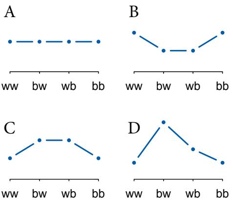
Figure 10.3. Four different distributions with the same expected value, 1 blue marble in 2 draws. The outcomes on the horizontal axes correspond to 2 white marbles (ww), 1 blue and then 1 white (bw), 1 white and then 1 blue (wb), and 2 blue marbles (bb).
Distribution A is the binomial distribution with n = 2 and p = 0.5. The outcomes bw and wb are usually collapsed into the same outcome type. But in principle they are different outcomes, whether we care about the order of outcomes or not. So the corresponding binomial probabilities are Pr(ww) = (1 − p) 2 , Pr(bw) = p(1 − p), Pr(wb) = (1 − p)p, and Pr(bb) = p 2 . Since p = 0.5 in this example, all four probabilities evaluate to 1/4.
The other distributions—B, C, and D—have the same expected value, but none of them is binomial. We can expediently verify this by placing them inside a list and passing each to an expected value formula:
R code
10.5 # build list of the candidate distributions
p <- list()
p[[1]] <- c(1/4,1/4,1/4,1/4)
p[[2]] <- c(2/6,1/6,1/6,2/6)
p[[3]] <- c(1/6,2/6,2/6,1/6)
p[[4]] <- c(1/8,4/8,2/8,1/8)
# compute expected value of each
sapply( p , function(p) sum(p*c(0,1,1,2)) )[1] 1 1 1 1
And likewise we can quickly compute the entropy of each distribution:
R code
10.6 # compute entropy of each distribution
sapply( p , function(p) -sum( p*log(p) ) )[1] 1.386294 1.329661 1.329661 1.213008
Distribution A, the binomial distribution, has the largest entropy among the four. To appreciate why, consider that information entropy increases as a probability distribution becomes more even. Distribution A is a flat line, as you can see in Figure 10.3. It can’t be made any more even, and each of the other distributions is clearly less even. That’s why they have smaller entropies. And since distribution A is consistent with the constraint that the expected value be 1, it follows that distribution A, which is binomial, has the maximum entropy of any distribution with these constraints.
This example is too special to demonstrate the general case, however. It’s special because when the expected value is 1, the distribution over outcomes can be flat and remain consistent with the constraint. But what about when the expected value constraint is not 1? Suppose for our second example that the expected value must be instead 1.4 blue marbles in two draws. This corresponds to p = 0.7. So you can think of this as 7 blue marbles and 3 white marbles hidden inside the bag. The binomial distribution with this expected value is:
10.7 p <- 0.7
( A <- c( (1-p)^2 , p*(1-p) , (1-p)*p , p^2 ) )[1] 0.09 0.21 0.21 0.49
This distribution is definitely not flat. So to appreciate how this distribution has maximum entropy—is the flattest distribution with expected value 1.4—we’ll simulate a bunch of distributions with the same expected value and then compare entropies. The entropy of the distribution above is just:
| R code | |
|---|---|
| -sum( A*log(A) ) |
10.8 |
[1] 1.221729
So if we randomly generate thousands of distributions with expected value 1.4, we expect that none will have a larger entropy than this.
We can use a short R function to simulate random probability distributions that have any specified expected value. The code below will do the job. Don’t worry about how it works (unless you want to168).
10.9 sim.p <- function(G=1.4) {
x123 <- runif(3)
x4 <- ( (G)*sum(x123)-x123[2]-x123[3] )/(2-G)
z <- sum( c(x123,x4) )
p <- c( x123 , x4 )/z
list( H=-sum( p*log(p) ) , p=p )
}This function generates a random distribution with expected value G and then returns its entropy along with the distribution. We want to invoke this function a large number of times. Here is how to call it 100000 times and then plot the distribution of resulting entropies:
10.10 H <- replicate( 1e5 , sim.p(1.4) ) dens( as.numeric(H[1,]) , adj=0.1 )
The list H now holds 100,000 distributions and their entropies. The distribution of entropies is shown in the left-hand plot in Figure 10.4. The letters A, B, C, and D mark different example entropies. The distributions corresponding to each are shown in the right-hand part of the figure. The distribution A with the largest observed entropy is nearly identical to the binomial we calculated earlier. And its entropy is nearly identical as well.
You don’t have to take my word for it. Let’s split out the entropies and distributions, so that it’s easier to work with them:
R code
R code
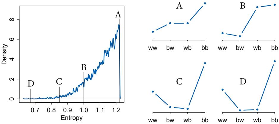
Figure 10.4. Left: Distribution of entropies from randomly simulated distributions with expected value 1.4. The letters A, B, C, and D mark the entropies of individual distributions shown on the right. Right: Individual probability distributions. As entropy decreases, going from A to D, the distribution becomes more uneven. The distribution marked A is the binomial distribution with np = 1.4.
R code
10.11 entropies <- as.numeric(H[1,])
distributions <- H[2,]Now we can ask what the largest observed entropy was:
R code 10.12 max(entropies)
[1] 1.221728
That value is nearly identical to the entropy of the binomial distribution we calculated before. And the distribution with that entropy is:
R code
10.13 distributions[ which.max(entropies) ][[1]]
[1] 0.08981599 0.21043116 0.20993686 0.48981599
And that’s almost exactly {0.09, 0.21, 0.21, 0.49}, the distribution we calculated earlier.
The other distributions in Figure 10.4—B, C, and D—are all less even than A. They demonstrate how as entropy declines the probability distributions become progressively less even. All four of these distributions really do have expected value 1.4. But among the infinite distributions that satisfy this constraint, it is only the most even distribution, the exact one nominated by the binomial distribution, that has greatest entropy.
So what? There are a few conceptual lessons to take away from this example. First, hopefully it reinforces the maximum entropy nature of the binomial distribution. When only two un-ordered outcomes are possible—such as blue and white marbles—and the expected
numbers of each type of event are assumed to be constant, then the distribution that is most consistent with these constraints is the binomial distribution. This distribution spreads probability out as evenly and conservatively as possible.
Second, of course usually we do not know the expected value, but wish to estimate it. But this is actually the same problem, because assuming the distribution has a constant expected value leads to the binomial distribution as well, but with unknown expected value np, which must be estimated from the data. (You’ll learn how to do this in Chapter 11.) If only two un-ordered outcomes are possible and you think the process generating them is invariant in time—so that the expected value remains constant at each combination of predictor values then the distribution that is most conservative is the binomial. This is analogous to how the Gaussian distribution is the most conservative distribution for a continuous outcome variable with finite variance. Variables with different constraints get different maximum entropy distributions, but the underlying principle remains the same.
Third, back in Chapter 2, we derived the binomial distribution just by counting how many paths through the garden of forking data were consistent with our assumptions. For each possible composition of the bag of marbles—which corresponds here to each possible expected value—there is a unique number of ways to realize any possible sequence of data. The likelihoods derived in that way turn out to be exactly the same as the likelihoods we get by maximizing entropy. This is not a coincidence. Entropy counts up the number of different ways a process can produce a particular result, according to our assumptions. The garden of forking data did only the same thing—count up the numbers of ways a sequence could arise, given assumptions.
Entropy maximization, like so much in probability theory, is really just counting. But it’s abbreviated counting that allows us to generalize lessons learned in one context to new problems in new contexts. Instead of having to tediously draw out a garden of forking data, we can instead map constraints on an outcome to a probability distribution. There is no guarantee that this is the best probability distribution for the real problem you are analyzing. But there is a guarantee that no other distribution more conservatively reflects your assumptions.
That’s not everything, but nor is it nothing. Any other distribution implies hidden constraints that are unknown to us, reflecting phantom assumptions. A full and honest accounting of assumptions is helpful, because it aids in understanding how a model misbehaves. And since all models misbehave sometimes, it’s good to be able to anticipate those times before they happen, as well as to learn from those times when they inevitably do.
Rethinking: Conditional independence. All this talk of constant expected value brings up an important question: Do these distributions necessarily assume that each observation is uncorrelated with every other observation? Not really. What is usually meant by “independence” in a probability distribution is just that each observation is uncorrelated with the others, once we know the corresponding predictor values. This is usually known as conditional independence, the claim that observations are independent after accounting for differences in predictors, through the model. It’s a modeling assumption. What this assumption doesn’t cover is a situation in which an observed event directly causes the next observed event. For example, if you buy the next Nick Cave album because I buy the next Nick Cave album, then your behavior is not independent of mine, even after conditioning on the fact that we both like that sort of music.
Overthinking: Binomial maximum entropy. The usual way to derive a maximum entropy distribution is to state the constraints and then use a mathematical device called the Lagrangian to solve for the probability assignments that maximize entropy. But instead we’ll extend the strategy used in the Overthinking box on page 306. As a bonus, this strategy will allow us to derive the constraints that are necessary for a distribution, in this case the binomial, to be a maximum entropy distribution.
Let p be the binomial distribution, and let pi be the probability of a sequence of observations i with number of successes xi and number of failures n − xi . Let q be some other discrete distribution defined over the same set of observable sequences. As before, KL divergence tells us that:
\[-H(q, p) \ge H(q) \implies -\sum\_{i} q\_i \log p\_i \ge -\sum\_{i} q\_i \log q\_i\]
What we’re going to do now is work with H(q, p) and simplify it until we can isolate the constraint that defines the class of distributions for which p has maximum entropy. Let λ = P i pixi be the expected value of p. Then from the definition of H(q, p):
\[-H(q,p) = -\sum\_{i} q\_i \log \left[ \left(\frac{\lambda}{n}\right)^{x\_i} \left(1 - \frac{\lambda}{n}\right)^{n-x\_i} \right] = -\sum\_{i} q\_i \left(\mathbf{x}\_i \log \left[\frac{\lambda}{n}\right] + (n-x\_i)\log \left[1 - \frac{\lambda}{n}\right] \right),\] \(\text{a.e. } \mathbf{x}\_i = \mathbf{x}\_i \text{ a.e. } \mathbf{x}\_i\)
After some algebra:
\[-H(q,p) = -\sum\_{i} q\_i \left( x\_i \log \left[ \frac{\lambda}{n-\lambda} \right] + n \log \left[ \frac{n-\lambda}{n} \right] \right) = -n \log \left[ \frac{n-\lambda}{n} \right] - \log \left[ \frac{\lambda}{n-\lambda} \right] \underbrace{\sum\_{i} q\_i x\_i}\_{\stackrel{\!}{\rightarrow}}\]
The term on the far right labeled ¯q is the expected value of the distribution q. If we knew it, we could complete the calculation, because no other term depends upon qi . This means that expected value is the constraint that defines the class of distributions for which the binomial p has maximum entropy. If we now set the expected value of q equal to λ, then H(q) = H(p). For any other expected value of q, H(p) > H(q).
Finally, notice the term log[λ/(n − λ)]. This term is the log of the ratio of the expected number of successes to the expected number of failures. That ratio is the “odds” of a success, and its logarithm is called “log odds.” This quantity will feature prominently in models we construct from the binomial distribution, in Chapter 11.
10.2. Generalized linear models
The Gaussian models of previous chapters worked by first assuming a Gaussian distribution over outcomes. Then, we replaced the parameter that defines the mean of that distribution, µ, with a linear model. This resulted in likelihood definitions of the sort:
\[\begin{aligned} \mathcal{Y}\_{l} &\sim \text{Normal}(\mu\_{l}, \sigma) \\ \mu\_{l} &= \alpha + \beta \mathbf{x}\_{l} \end{aligned}\]
For an outcome variable that is continuous and far from any theoretical maximum or minimum, this sort of Gaussian model has maximum entropy.
But when the outcome variable is either discrete or bounded, a Gaussian likelihood is not the most powerful choice. Consider for example a count outcome, such as the number of blue marbles pulled from a bag. Such a variable is constrained to be zero or a positive integer. Using a Gaussian model with such a variable won’t result in a terrifying explosion. But it can’t be trusted to do much more than estimate the average count. It certainly can’t be trusted to produce sensible predictions, because while you and I know that counts can’t
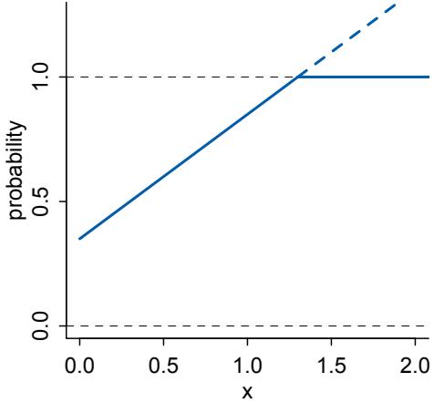
Figure 10.5. Why we need link functions. The solid blue line is a linear model of a probability mass. It increases linearly with a predictor, x, on the horizontal axis. But when it reaches the maximum probability mass of 1, at the dashed boundary, it will happily continue upwards, as shown by the dashed blue line. In reality, further increases in x could not further increase probability, as indicated by the horizontal continuation of the solid trend.
be negative, a linear regression model does not. So it would happily predict negative values, whenever the mean count is close to zero.
Luckily, it’s easy to do better. By using all of our prior knowledge about the outcome variable, usually in the form of constraints on the possible values it can take, we can appeal to maximum entropy for the choice of distribution. Then all we have to do is generalize the linear regression strategy—replace a parameter describing the shape of the likelihood with a linear model—to probability distributions other than the Gaussian.
This is the essence of a generalized linear model. 169 And it results in models that look like this:
\[\begin{aligned} \boldsymbol{\wp\_i} &\sim \text{Binomial}(\boldsymbol{n}, \boldsymbol{p\_i}), \\ \boldsymbol{f(p\_i)} &= \boldsymbol{\alpha} + \beta(\boldsymbol{\varkappa\_i} - \bar{\boldsymbol{\varkappa}}) \end{aligned}\]
There are only two changes here from the familiar Gaussian model. The first is principled the principle of maximum entropy. The second is an epicycle—a modeling trick that works descriptively but not causally—but a quite successful one. I’ll briefly explain each, before moving on in the remainder of the section to describe all of the most common distributions used to construct generalized linear models. Later chapters show you how to implement them.
First, the likelihood is binomial instead of Gaussian. For a count outcome y for which each observation arises from n trials and with constant expected value np, the binomial distribution has maximum entropy. So it’s the least informative distribution that satisfies our prior knowledge of the outcomes y. If the outcome variable had different constraints, it could be a different maximum entropy distribution.
Second, there is now a funny little f at the start of the second line of the model. This represents a link function, to be determined separately from the choice of distribution. Generalized linear models need a link function, because rarely is there a “µ”, a parameter describing the average outcome, and rarely are parameters unbounded in both directions, like µ is. For example, the shape of the binomial distribution is determined, like the Gaussian, by two parameters. But unlike the Gaussian, neither of these parameters is the mean. Instead, the mean outcome is np, which is a function of both parameters. Since n is usually known (but not always), it is most common to attach a linear model to the unknown part, p. But p is a probability mass, so pi must lie between zero and one. But there’s nothing to stop the linear model α+βxi from falling below zero or exceeding one. Figure 10.5 plots an example. The link function f provides a solution to this common problem. This chapter will introduce the two most common link functions. You’ll see how to use them in the chapters that follow.
Rethinking: The scourge of Histomancy. One strategy for choosing an outcome distribution is to plot the histogram of the outcome variable and, by gazing into its soul, decide what sort of distribution function to use. Call this strategy Histomancy, the ancient art of divining likelihood functions from empirical histograms. This sorcery is used, for example, when testing for normality before deciding whether or not to use a non-parametric procedure. Histomancy is a false god, because even perfectly good Gaussian variables may not look Gaussian when displayed as a histogram. Why? Because at most what a Gaussian likelihood assumes is not that the aggregated data look Gaussian, but rather that the residuals, after fitting the model, look Gaussian. So for example the combined histogram of male and female body weights is certainly not Gaussian. But it is (approximately) a mixture of Gaussian distributions. So after conditioning on sex, the residuals may be quite normal. Other times, people decide not to use a Poisson model, because the variance of the aggregate outcome exceeds its mean (see Chapter 11). But again, at most what a Poisson likelihood assumes is that the variance equals the mean after conditioning on predictors. It may very well be that a Gaussian or Poisson likelihood is a poor assumption in any particular context. But this can’t easily be decided via Histomancy. This is why we need principles, whether maximum entropy or otherwise.
10.2.1. Meet the family. The most common distributions used in statistical modeling are members of a family known as the exponential family. Every member of this family is a maximum entropy distribution, for some set of constraints. And conveniently, just about every other statistical modeling tradition employs the exact same distributions, even though they arrive at them via justifications other than maximum entropy.
Figure 10.6 illustrates the representative shapes of the most common exponential family distributions used in GLMs. The horizontal axis in each plot represents values of a variable, and the vertical axis represents probability density (for the continuous distributions) or probability mass (for the discrete distributions). For each distribution, the figure also provides the notation (above each density plot) and the name of R’s corresponding built-in distribution function (below each density plot). The gray arrows in Figure 10.6 indicate some of the ways that these distributions are dynamically related to one another. These relationships arise from generative processes that can convert one distribution to another. You do not need to know these relationships in order to successfully use these distributions in your modeling. But the generative relationships do help to demystify these distributions, by tying them to causation and measurement.
Two of these distributions, the Gaussian and binomial, are already familiar to you. Together, they comprise the most commonly used outcome distributions in applied statistics, through the procedures of linear regression(Chapter 4) and logistic regression(Chapter 11). There are also three new distributions that deserve some commentary.
The exponential distribution (center) is constrained to be zero or positive. It is a fundamental distribution of distance and duration, kinds of measurements that represent displacement from some point of reference, either in time or space. If the probability of an event is constant in time or across space, then the distribution of events tends towards exponential. The exponential distribution has maximum entropy among all non-negative continuous distributions with the same average displacement. Its shape is described by a
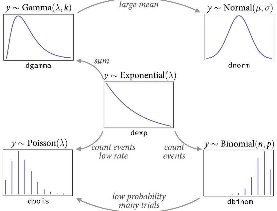
Figure 10.6. Some of the exponential family distributions, their notation, and some of their relationships. Center: exponential distribution. Clockwise, from top-left: gamma, normal (Gaussian), binomial and Poisson distributions.
single parameter, the rate of events λ, or the average displacement λ −1 . This distribution is the core of survival and event history analysis, which is not covered in this book.
The gamma distribution (top-left) is also constrained to be zero or positive. It too is a fundamental distribution of distance and duration. But unlike the exponential distribution, the gamma distribution can have a peak above zero. If an event can only happen after two or more exponentially distributed events happen, the resulting waiting times will be gamma distributed. For example, age of cancer onset is approximately gamma distributed, since multiple events are necessary for onset.170 The gamma distribution has maximum entropy among all distributions with the same mean and same average logarithm. Its shape is described by two parameters, but there are at least three different common descriptions of these parameters, so some care is required when working with it. The gamma distribution is common in survival and event history analysis, as well as some contexts in which a continuous measurement is constrained to be positive.
The Poisson distribution (bottom-left) is a count distribution like the binomial. It is actually a special case of the binomial, mathematically. If the number of trials n is very large (and usually unknown) and the probability of a success p is very small, then a binomial distribution converges to a Poisson distribution with an expected rate of events per unit time of λ = np. Practically, the Poisson distribution is used for counts that never get close to any theoretical maximum. As a special case of the binomial, it has maximum entropy under exactly the same constraints. Its shape is described by a single parameter, the rate of events λ. Poisson GLMs are detailed in the next chapter.
There are many other exponential family distributions, and many of them are useful. But don’t worry that you need to memorize them all. You can pick up new distributions, and the sorts of generative processes they correspond to, as needed. It’s also not important that an outcome distribution be a member of the exponential family—if you think you have good reasons to use some other distribution, then use it. But you should also check its performance, just like you would any modeling assumption.
Rethinking: A likelihood is a prior. In traditional statistics, likelihood functions are “objective” and prior distributions “subjective.” In Bayesian statistics, likelihoods are deeply related to prior probability distributions: They are priors for the data, conditional on the parameters. And just like with other priors, there is no correct likelihood. But there are better and worse likelihoods, depending upon the context. Useful inference does not require that the data (or residuals) be actually distributed according to the likelihood anymore than it requires the posterior distribution to be like the prior. The duality between likelihoods and priors will become quite explicit in Chapter 15.
10.2.2. Linking linear models to distributions. To build a regression model from any of the exponential family distributions is just a matter of attaching one or more linear models to one or more of the parameters that describe the distribution’s shape. But as hinted at earlier, usually we require a link function to prevent mathematical accidents like negative distances or probability masses that exceed 1. So for any outcome distribution, say for example the exotic “Zaphod” distribution,171 we write:
\[\begin{aligned} \mathcal{y}\_i &\sim \text{Zaphod}(\theta\_i, \phi) \\ f(\theta\_i) &= \alpha + \beta(\mathfrak{x}\_i - \bar{\mathfrak{x}}) \end{aligned}\]
where f is a link function.
But what function should f be? A link function’s job is to map the linear space of a model like α + β(xi − ¯x) onto the non-linear space of a parameter like θ. So f is chosen with that goal in mind. Most of the time, for most GLMs, you can use one of two exceedingly common links, a logit link or a log link. Let’s introduce each, and you’ll work with both in later chapters.
The logit link maps a parameter that is defined as a probability mass, and therefore constrained to lie between zero and one, onto a linear model that can take on any real value. This link is extremely common when working with binomial GLMs. In the context of a model definition, it looks like this:
\[\begin{aligned} \boldsymbol{\wp\_i} &\sim \text{Binomial}(n, \boldsymbol{p\_i}),\\ \text{logit}(\boldsymbol{p\_i}) &= \boldsymbol{\alpha} + \beta \boldsymbol{\varkappa\_i} \end{aligned}\]
And the logit function itself is defined as the log-odds:
\[\text{logit}(p\_i) = \log \frac{p\_i}{1 - p\_i}\]
The “odds” of an event are just the probability it happens divided by the probability it does not happen. So really all that is being stated here is:
\[\log \frac{p\_i}{1 - p\_i} = \alpha + \beta \mathbf{x}\_i\]
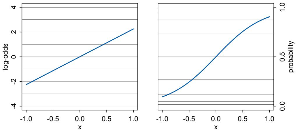
Figure 10.7. The logit link transforms a linear model (left) into a probability (right). This transformation compresses the geometry far from zero, such that a unit change on the linear scale (left) means less and less change on the probability scale (right).
So to figure out the definition of pi implied here, just do a little algebra and solve the above equation for pi :
\[p\_{l} = \frac{\exp(\alpha + \beta \mathbf{x}\_{l})}{1 + \exp(\alpha + \beta \mathbf{x}\_{l})}\]
The above function is usually called the logistic. In this context, it is also commonly called the inverse-logit, because it inverts the logit transform.
What all of this means is that when you use a logit link for a parameter, you are defining the parameter’s value to be the logistic transform of the linear model. Figure 10.7 illustrates the transformation that takes place when using a logit link. On the left, the geometry of the linear model is shown, with horizontal lines indicating unit changes in the value of the linear model as the value of a predictor x changes. This is the log-odds space, which extends continuously in both positive and negative directions. On the right, the linear space is transformed and is now constrained entirely between zero and one. The horizontal lines have been compressed near the boundaries, in order to make the linear space fit within the probability space. This compression produces the characteristic logistic shape of the transformed linear model shown in the right-hand plot.
This compression does affect interpretation of parameter estimates, because no longer does a unit change in a predictor variable produce a constant change in the mean of the outcome variable. Instead, a unit change in xi may produce a larger or smaller change in the probability pi , depending upon how far from zero the log-odds are. For example, in Figure 10.7, when x = 0 the linear model has a value of zero on the log-odds scale. A halfunit increase in x results in about a 0.25 increase in probability. But each addition half-unit will produce less and less of an increase in probability, until any increase is vanishingly small. And if you think about it, a good model of probability needs to behave this way. When an
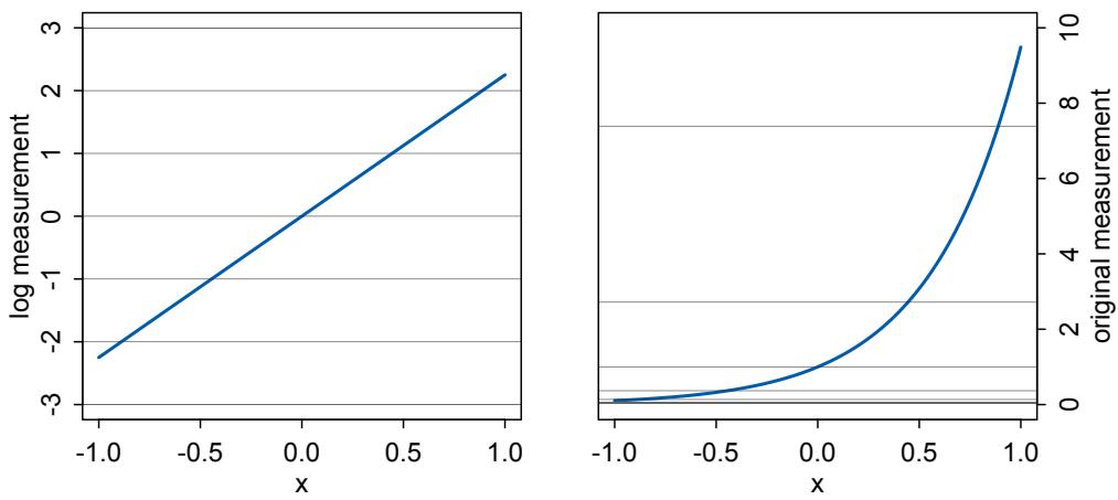
Figure 10.8. The log link transforms a linear model (left) into a strictly positive measurement (right). This transform results in an exponential scaling of the linear model, with a unit change on the linear scale mapping onto increasingly larger changes on the outcome scale.
event is almost guaranteed to happen, its probability cannot increase very much, no matter how important the predictor may be.
You’ll find examples of this compression phenomenon in later chapters. The key lesson for now is just that no regression coefficient, such as β, from a GLM ever produces a constant change on the outcome scale. Recall that we defined interaction (Chapter 8) as a situation in which the effect of a predictor depends upon the value of another predictor. Well now every predictor essentially interacts with itself, because the impact of a change in a predictor depends upon the value of the predictor before the change. More generally, every predictor variable effectively interacts with every other predictor variable, whether you explicitly model them as interactions or not. This fact makes the visualization of counter-factual predictions even more important for understanding what the model is telling you.
The second very common link function is the log link. This link function maps a parameter that is defined over only positive real values onto a linear model. For example, suppose we want to model the standard deviation σ of a Gaussian distribution so it is a function of a predictor variable x. The parameter σ must be positive, because a standard deviation cannot be negative nor can it be zero. The model might look like:
\[\begin{aligned} \mathfrak{y}\_i &\sim \text{Normal}(\mu, \sigma\_i) \\ \log(\sigma\_i) &= \alpha + \beta \mathfrak{x}\_i \end{aligned}\]
In this model, the mean µ is constant, but the standard deviation scales with the value xi . A log link is both conventional and useful in this situation. It prevents σ from taking on a negative value.
What the log link effectively assumes is that the parameter’s value is the exponentiation of the linear model. Solving log(σi) = α + βxi for σi yields the inverse link:
\[ \sigma\_l = \exp(\alpha + \beta \mathbf{x}\_l), \]
The impact of this assumption can be seen in Figure 10.8. Using a log link for a linear model (left) implies an exponential scaling of the outcome with the predictor variable (right). Another way to think of this relationship is to remember that logarithms are magnitudes. An increase of one unit on the log scale means an increase of an order of magnitude on the untransformed scale. And this fact is reflected in the widening intervals between the horizontal lines in the right-hand plot of Figure 10.8.
While using a log link does solve the problem of constraining the parameter to be positive, it may also create a problem when the model is asked to predict well outside the range of data used to fit it. Exponential relationships grow, well, exponentially. Just like a linear model cannot be linear forever, an exponential model cannot be exponential forever. Human height cannot be linearly related to weight forever, because very heavy people stop getting taller and start getting wider. Likewise, the property damage caused by a hurricane may be approximately exponentially related to wind speed for smaller storms. But for very big storms, damage may be capped by the fact that everything gets destroyed.
Rethinking: When in doubt, play with assumptions. Link functions are assumptions. And like all assumptions, they are useful in different contexts. The conventional logit and log links are widely useful, but they can sometimes distort inference. If you ever have doubts, and want to reassure yourself that your conclusions are not sensitive to choice of link function, then you can use sensitivity analysis. A sensitivity analysis explores how changes in assumptions influence inference. If none of the alternative assumptions you consider have much impact on inference, that’s worth reporting. Likewise, if the alternatives you consider do have an important impact on inference, that’s also worth reporting. The same sort of advice follows for other modeling assumptions: likelihoods, linear models, priors, and even how the model is fit to data.
Some people are nervous about sensitivity analysis, because it feels like fishing for results, or “phacking.”172 The goal of sensitivity analysis is really the opposite of p-hacking. In p-hacking, many justifiable analyses are tried, and the one that attains statistical significance is reported. In sensitivity analysis, many justifiable analyses are tried, and all of them are described.
Overthinking: Parameters interacting with themselves. We can find some clarity on how GLMs force every predictor variable to interact with itself by deriving the rate of change in the outcome for a given change in the value of the predictor. In a classic Gaussian model the mean is modeled as µ = α + βx. So the rate of change in µ with respect to x is just ∂µ/∂x = β. And that’s constant. It doesn’t matter what value x has. Now consider the rate of change in a binomial probability p with respect to x. The probability p is defined by:
\[p = \frac{\exp(\alpha + \beta x)}{1 + \exp(\alpha + \beta x)}\]
And now taking the derivative with respect to x yields:
\[\frac{\partial p}{\partial \mathbf{x}} = \frac{\beta}{2\left(1 + \cosh(\alpha + \beta \mathbf{x})\right)}\]
Since x appears in this answer, the impact of a change in x depends upon x. That’s an interaction with itself. The rate of change in the odds is a little nicer:
\[\frac{\partial \mathfrak{p}/(1-\mathfrak{p})}{\partial \mathfrak{x}} = \beta \exp(\alpha + \beta \mathfrak{x})\]
but it still contains the entire linear model. Sometimes people avoid non-linear models because they don’t like having to interpret non-linear effects. But if the actual phenomenon contains nonlinearities, this solves only a small world problem.
10.2.3. Omitted variable bias again. Back in Chapters 5 and 6, you saw some examples of omitted variable bias, where leaving a causally important variable out of a model leads to biased inference. The same thing can of course happen in GLMs. But it can be worse in GLMs, because even a variable that isn’t technically a confounder can bias inference, once we have a link function. The reason is that the ceiling and floor effects described above can distort estimates by suppressing the causal influence of a variable.
Suppose for example that two variables X and Z independently influence a binary outcome Y. If either X and Z is large enough, then Y = 1. Both variables are sufficient causes of Y. Now if we don’t measure Z but only X, we might consistently underestimate the causal effect of X. Why? Because Z is sufficient for Y to equal 1, and we didn’t measure Z. So there are cases in the data where X is small but Y = 1. These cases imply X does not influence Y very strongly, but only because we are ignoring Z. This phenomenon doesn’t occur in ordinary linear regression, because independent causes just contribute to the mean. There are no ceiling or floor effects (in theory).
There is no avoiding this problem. Falling back on a linear, rather than generalized linear, model won’t change the reality of omitted variable bias. It will just statistically disguise it. That may be a good publication strategy, but it’s not a good inferential strategy.
10.2.4. Absolute and relative differences. There is an important practical consequence of the way that a link function compresses and expands different portions of the linear model’s range: Parameter estimates do not by themselves tell you the importance of a predictor on the outcome. The reason is that each parameter represents a relative difference on the scale of the linear model, ignoring other parameters, while we are really interested in absolute differences in outcomes that must incorporate all parameters.
This point will come up again in the context of data examples in later chapters, when it will be easier to illustrate its importance. For now, just keep in mind that a big beta-coefficient may not correspond to a big effect on the outcome.
10.2.5. GLMs and information criteria. What you learned in Chapter 7 about information criteria and regularizing priors applies also to GLMs. But with all these new outcome distributions at your command, it is tempting to use information criteria to compare models with different likelihood functions. Is a Gaussian or binomial better? Can’t we just let WAIC or cross-validation sort it out?
Unfortunately, WAIC (or any other predictive criterion) cannot sort it out. The problem is that deviance is part normalizing constant. The constant affects the absolute magnitude of the deviance, but it doesn’t affect fit to data. Since information criteria are all based on deviance, their magnitude also depends upon these constants. That is fine, as long as all of the models you compare use the same outcome distribution type—Gaussian, binomial, exponential, gamma, Poisson, or another. In that case, the constants subtract out when you compare models by their differences. But if two models have different outcome distributions, the constants don’t subtract out, and you can be misled by a difference in AIC/WAIC/PSIS.
Really all you have to remember is to only compare models that all use the same type of likelihood. Of course it is possible to compare models that use different likelihoods, just not with information criteria. Luckily, the principle of maximum entropy ordinarily motivates an easy choice of likelihood, at least for ordinary regression models. So there is no need to lean on model comparison for this modeling choice.
There are a few nuances with WAIC/PSIS and individual GLM types. These nuances will arise as examples of each GLM are worked, in later chapters.
10.3. Maximum entropy priors
The principle of maximum entropy helps us to make modeling choices. When pressed to choose an outcome distribution—a likelihood—maximum entropy nominates the least informative distribution consistent with the constraints on the outcome variable. Applying the principle in this way leads to many of the same distributional choices that are commonly regarded as just convenient assumptions or useful conventions.
Another way that the principle of maximum entropy helps with choosing distributions arises when choosing priors. GLMs are easy to use with conventional weakly informative priors of the sort you’ve been using up to this point in the book. Such priors are nice, because they allow the data to dominate inference while also taming some of the pathologies of unconstrained estimation. There were some examples of their “soft power” in Chapter 9.
But sometimes, rarely, some of the parameters in a GLM refer to things we might actually have background information about. When that’s true, maximum entropy provides a way to generate a prior that embodies the background information, while assuming as little else as possible. This makes them appealing, conservative choices.
We won’t be using maximum entropy to choose priors in this book, but when you come across an analysis that does, you can interpret the principle in the same way as you do with likelihoods and understand the approach as an attempt to include relevant background information about parameters, while introducing no other assumptions by accident.
10.4. Summary
This chapter has been a conceptual, not practical, introduction to maximum entropy and generalized linear models. The principle of maximum entropy provides an empirically successful way to choose likelihood functions. Information entropy is essentially a measure of the number of ways a distribution can arise, according to stated assumptions. By choosing the distribution with the biggest information entropy, we thereby choose a distribution that obeys the constraints on outcome variables, without importing additional assumptions. Generalized linear models arise naturally from this approach, as extensions of the linear models in previous chapters. The necessity of choosing a link function to bind the linear model to the generalized outcome introduces new complexities in model specification, estimation, and interpretation. You’ll become comfortable with these complexities through examples in later chapters.

11 God Spiked the Integers
The cold of space is named Kelvin, about 3 degrees Kelvin, or 3 degrees centigrade above absolute zero. Kelvin is also the name of a river in Scotland, near Glasgow. The same river gave its name to William Thomson, the Lord Kelvin (1824–1907), the first scientist in the United Kingdom to be granted a noble title. Thomson studied thermodynamics in his laboratory in Glasgow, and now the cold of space bears the name of a Scottish river.
Lord Kelvin befittingly also researched water. He invented several tide prediction engines. These were essentially mechanical computers that calculated the tides(Figure 11.1). All the gears and cables comprised a set of oscillators that produced accurate tide predictions. But when you look at such a machine, most of it is internal states, not the predictions. It would be quite hard to inspect any one of the gears at the bottom and know when to expect the tide, because the predictions emerge from the combination of internal states.
Generalized linear models (GLMs) are a lot like these early mechanical computers. The moving pieces within them, the parameters, interact to produce non-obvious predictions. But we can’t read the parameters directly to understand the predictions. This is quite different than the Gaussian linear models of previous chapters, where individual parameters had clear meanings on the prediction scale. Mastering GLMs requires a little more attention. They are always confusing, when you first try to grasp how they operate.
The most common and useful generalized linear models are models for counts. Counts are non-negative integers—0, 1, 2, and so on. They are the basis of all mathematics, the first bits that children learn. But they are also intoxicatingly complicated to model—hence the apocryphal slogan that titles this chapter173. The essential problem is this: When what we wish to predict is a count, the scale of the parameters is never the same as the scale of the outcome. A count golem, like a tide prediction engine, has a whirring machinery underneath that doesn’t resemble the output. Keeping the tide engine in mind, you can master these models and use them responsibly.
We will engineer complete examples of the two most common types of count model. Binomial regression is the name we’ll use for a family of related procedures that all model a binary classification—alive/dead, accept/reject, left/right—for which the total of both categories is known. This is like the marble and globe tossing examples from Chapter 2. But now you get to incorporate predictor variables. Poisson regression is a GLM that models a count with an unknown maximum—number of elephants in Kenya, number of applications to a PhD program, number of significance tests in an issue of Psychological Science. As described in Chapter 10, the Poisson model is a special case of binomial. At the end, the chapter describes some other count regressions.
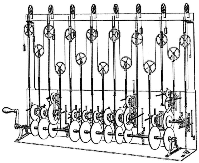
Figure 11.1. William Thomson’s third tide prediction design. (Image source: https://en.wikipedia.org/wiki/Tide-predicting\_machine)
All of the examples in this chapter, and the chapters to come, use all of the tools introduced in previous chapters. Regularizing priors, information criteria, and MCMC estimation are woven into the data analysis examples. So as you work through the examples that introduced each new type of GLM, you’ll also get to practice and better understand previous lessons.
11.1. Binomial regression
Think back to the early chapters, the globe tossing model. That model was a binomial model. The outcome was a count of water samples. But it wasn’t yet a generalized linear model, because there were no predictor variables to relate to the outcome. That’s our work now—to mate observed counts to variables that are associated with different average counts.
The binomial distribution is denoted:
\[\mathcal{Y} \sim \text{Binomial}(n, p)\]
where y is a count (zero or a positive whole number), p is the probability any particular “trial” is a success, and n is the number of trials. As proved in the previous chapter, as the basis for a generalized linear model, the binomial distribution has maximum entropy when each trial must result in one of two events and the expected value is constant. There is no other preobservation probability assumption for such a variable that will have higher entropy. It is the flattest data prior we can use, given the known constraints on the values.
There are two common flavors of GLM that use binomial probability functions, and they are really the same model, just with the data organized in different ways.
- (1) Logistic regression is the common name when the data are organized into single-trial cases, such that the outcome variable can only take values 0 and 1.
- When individual trials with the same covariate values are instead aggregated together, it is common to speak of an aggregated binomial regression. In this case, the outcome can take the value zero or any positive integer up to n, the number of trials.
Both flavors use the same logit link function(page 316), so both may sometimes be called “logistic” regression, as the inverse of the logit function is the logistic. Either form of binomial regression can be converted into the other by aggregating (logistic to aggregated) or exploding (aggregated to logistic) the outcome variable. We’ll fully work an example of each.
Like other GLMs, binomial regression is never guaranteed to produce a nice multivariate Gaussian posterior distribution. So quadratic approximation is not always satisfactory. We’ll work some examples using quap, but we’ll also check the inferences against MCMC sampling, using ulam. The reason to do it both ways is so you can get a sense of both how often quadratic approximation works, even when in principle it should not, and why it fails in particular contexts. This is useful, because even if you never use quadratic approximation again, your Frequentist colleagues use it all the time, and you might want to be skeptical of their estimates.
11.1.1. Logistic regression: Prosocial chimpanzees. The data for this example come from an experiment174 aimed at evaluating the prosocial tendencies of chimpanzees (Pan troglodytes). The experimental structure mimics many common experiments conducted on human students (Homo sapiens studiensis) by economists and psychologists. A focal chimpanzee sits at one end of a long table with two levers, one on the left and one on the right in Figure 11.2. On the table are four dishes which may contain desirable food items. The two dishes on the right side of the table are attached by a mechanism to the right-hand lever. The two dishes on the left side are similarly attached to the left-hand lever.
When either the left or right lever is pulled by the focal animal, the two dishes on the same side slide towards opposite ends of the table. This delivers whatever is in those dishes to the opposite ends. In all experimental trials, both dishes on the focal animal’s side contain food items. But only one of the dishes on the other side of the table contains a food item. Therefore while both levers deliver food to the focal animal, only one of the levers delivers food to the other side of the table.
There are two experimental conditions. In the partner condition, another chimpanzee is seated at the opposite end of the table, as pictured in Figure 11.2. In the control condition, the other side of the table is empty. Finally, two counterbalancing treatments alternate which side, left or right, has a food item for the other side of the table. This helps detect any handedness preferences for individual focal animals.
When human students participate in an experiment like this, they nearly always choose the lever linked to two pieces of food, the prosocial option, but only when another student sits on the opposite side of the table. The motivating question is whether a focal chimpanzee behaves similarly, choosing the prosocial option more often when another animal is present. In terms of linear models, we want to estimate the interaction between condition (presence or absence of another animal) and option (which side is prosocial).
Load the data from the rethinking package:
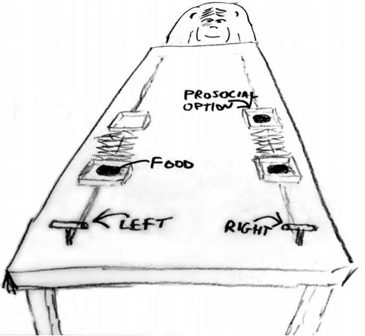
Figure 11.2. Chimpanzee prosociality experiment, as seen from the perspective of the focal animal. The left and right levers are indicated in the foreground. Pulling either expands an accordion device in the center, pushing the food trays towards both ends of the table. Both food trays close to the focal animal have food in them. Only one of the food trays on the other side contains food. The partner condition means another animal, as pictured, sits on the other end of the table. Otherwise, the other end was empty.
R code
11.1 library(rethinking) data(chimpanzees) d <- chimpanzees
Take a look at the built-in help, ?chimpanzees, for details on all of the available variables. We’re going to focus on pulled_left as the outcome to predict, with prosoc_left and condition as predictor variables. The outcome pulled_left is a 0 or 1 indicator that the focal animal pulled the left-hand lever. The predictor prosoc_left is a 0/1 indicator that the left-hand lever was (1) or was not (0) attached to the prosocial option, the side with two pieces of food. The condition predictor is another 0/1 indicator, with value 1 for the partner condition and value 0 for the control condition.
We’ll want to infer what happens in each combination of prosoc_left and condition. There are four combinations:
- prosoc_left= 0 and condition= 0: Two food items on right and no partner.
- prosoc_left= 1 and condition= 0: Two food items on left and no partner.
- prosoc_left= 0 and condition= 1: Two food items on right and partner present.
- prosoc_left= 1 and condition= 1: Two food items on left and partner present.
The conventional thing to do here is use these dummy variables to build a linear interaction model. We aren’t going to do that, for the reason discussed back in Chapter 5: Using dummy variables makes it hard to construct sensible priors. So instead let’s build an index variable containing the values 1 through 4, to index the combinations above. A very quick way to do this is:
R code
11.2 d$treatment <- 1 + d$prosoc_left + 2*d$conditionNow treatment contains the values 1 through 4, matching the numbers in the list above. You can verify by using cross-tabs:
R code
11.3 xtabs( ~ treatment + prosoc_left + condition , d )The output isn’t shown. There are many ways to construct new variables like this, including mutant helper functions. But often all you need is a little arithmetic.
Now for our target model. Since this is an experiment, the structure tells us the model relevant to inference. The model implied by the research question is, in mathematical form:
\[\begin{aligned} L\_i &\sim \text{Binomial}(1, p\_i) \\ \text{logit}(p\_i) &= \alpha\_{\text{ACTR}[i]} + \beta\_{\text{TRUEMENr}[i]} \\ \alpha\_j &\sim \text{to be determined} \\ \beta\_k &\sim \text{to be determined} \end{aligned}\]
Here L indicates the 0/1 variable pulled_left. Since the outcome counts are just 0 or 1, you might see the same type of model defined using a Bernoulli distribution:
\[L\_i \sim \text{Bernoulli}(p\_i)\]
This is just another way of saying Binomial(1, pi). Either way, the model above implies 7 α parameters, one for each chimpanzee, and 4 treatment parameters, one for each unique combination of the position of the prosocial option and the presence of a partner. In principle, we could specify a model that allows every chimpanzee to have their own 4 unique treatment parameters. If that sounds fun to you, I have good news. We’ll do exactly that, in a later chapter.
I’ve left the priors above “to be determined.” Let’s determine them. I was trying to warm you up for prior predictive simulation earlier in the book. Now with GLMs, it is really going to pay off. Let’s consider a runt of a logistic regression, with just a single α parameter in the linear model:
\[\begin{aligned} L\_i &\sim \text{Binomial}(1, p\_i) \\ \text{logit}(p\_i) &= \alpha \\ \alpha &\sim \text{Normal}(0, \omega) \end{aligned}\]
We need to pick a value for ω. To emphasize the madness of conventional flat priors, let’s start with something rather flat, like ω = 10.
11.4 m11.1 <- quap(
alist(
pulled_left ~ dbinom( 1 , p ) ,
logit(p) <- a ,
a ~ dnorm( 0 , 10 )
) , data=d )Now let’s sample from the prior:
11.5 set.seed(1999)
prior <- extract.prior( m11.1 , n=1e4 )One step remains. We need to convert the parameter to the outcome scale. This means using the inverse-link function, as discussed in the previous chapter. In this case, the link function is logit, so the inverse link is inv_logit.
R code
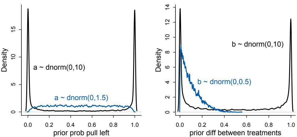
Figure 11.3. Prior predictive simulations for the most basic logistic regression. Black density: A flat Normal(0,10) prior on the intercept produces a very non-flat prior distribution on the outcome scale. Blue density: A more concentrated Normal(0,1.5) prior produces something more reasonable.
R code
11.6 p <- inv_logit( prior$a )
dens( p , adj=0.1 )I’ve displayed the resulting prior distribution in the left-hand plot of Figure 11.3. Notice that most of the probability mass is piled up near zero and one. The model thinks, before it sees the data, that chimpanzees either never or always pull the left lever. This is clearly silly, and will generate unnecessary inference error. A flat prior in the logit space is not a flat prior in the outcome probability space. The blue distribution in the same plot shows the same model but now with ω = 1.5. You can modify the code above to reproduce this. Now the prior probability on the outcome scale is rather flat. This is probably much flatter than is optimal, since probabilities near the center are more plausible. But this is better than the default priors most people use most of the time. We’ll use it.
Now we need to determine a prior for the treatment effects, the β parameters. We could default to using the same Normal(0,1.5) prior for the treatment effects, on the reasoning that they are also just intercepts, one intercept for each treatment. But to drive home the weirdness of conventionally flat priors, let’s see what Normal(0,10) looks like.
R code
11.7 m11.2 <- quap(
alist(
pulled_left ~ dbinom( 1 , p ) ,
logit(p) <- a + b[treatment] ,
a ~ dnorm( 0 , 1.5 ),
b[treatment] ~ dnorm( 0 , 10 )
) , data=d )
set.seed(1999)prior <- extract.prior( m11.2 , n=1e4 )
p <- sapply( 1:4 , function(k) inv_logit( prior$a + prior$b[,k] ) )The code just above computes the prior probability of pulling left for each treatment. We are interested in what the priors imply about the prior differences among treatments. So let’s plot the absolute prior difference between the first two treatments.
11.8 dens( abs( p[,1] - p[,2] ) , adj=0.1 )I show this distribution on the right in Figure 11.3. Just like with α, a flat prior on the logit scale piles up nearly all of the prior probability on zero and one—the model believes, before it sees that data, that the treatments are either completely alike or completely different. Maybe there are contexts in which such a prior makes sense. But they don’t make sense here. Typical behavioral treatments have modest effects on chimpanzees and humans alike.
The blue distribution in the same figure shows the code above repeated using a Normal(0,0.5) prior instead. This prior is now concentrated on low absolute differences. While a difference of zero has the highest prior probability, the average prior difference is:
11.9 m11.3 <- quap(
alist(
pulled_left ~ dbinom( 1 , p ) ,
logit(p) <- a + b[treatment] ,
a ~ dnorm( 0 , 1.5 ),
b[treatment] ~ dnorm( 0 , 0.5 )
) , data=d )
set.seed(1999)
prior <- extract.prior( m11.3 , n=1e4 )
p <- sapply( 1:4 , function(k) inv_logit( prior$a + prior$b[,k] ) )
mean( abs( p[,1] - p[,2] ) )[1] 0.09838663
About 10%. Extremely large differences are less plausible. However this is not a strong prior. If the data contain evidence of large differences, they will shine through. And keep in mind the lessons of Chapter 7: We want our priors to be skeptical of large differences, so that we reduce overfitting. Good priors hurt fit to sample but are expected to improve prediction.
Finally, we have our complete model and are ready to add in all the individual chimpanzee parameters. Let’s turn to Hamiltonian Monte Carlo to approximate the posterior, so you can get some practice with it. quap will actually do a fine job with this posterior, but only because the priors are sufficiently regularizing. In the practice problems at the end of the chapter, you’ll compare the two engines on less regularized models. First prepare the data list:
11.10 # trimmed data list
dat_list <- list(
pulled_left = d$pulled_left,
actor = d$actor,
treatment = as.integer(d$treatment) )R code
Now we can start the Markov chain. I’ll add log_lik=TRUE to the call, so that ulam computes the values necessary for PSIS and WAIC. There is an Overthinking box at the end that explains this in great detail.
R code
11.11 m11.4 <- ulam(
alist(
pulled_left ~ dbinom( 1 , p ) ,
logit(p) <- a[actor] + b[treatment] ,
a[actor] ~ dnorm( 0 , 1.5 ),
b[treatment] ~ dnorm( 0 , 0.5 )
) , data=dat_list , chains=4 , log_lik=TRUE )
precis( m11.4 , depth=2 )mean sd 5.5% 94.5% n_eff Rhat
a[1] -0.45 0.32 -0.95 0.04 690 1
a[2] 3.86 0.73 2.78 5.09 1417 1
a[3] -0.75 0.33 -1.28 -0.23 765 1
a[4] -0.74 0.33 -1.26 -0.21 887 1
a[5] -0.44 0.32 -0.94 0.10 743 1
a[6] 0.48 0.32 -0.02 1.00 894 1
a[7] 1.95 0.40 1.32 2.63 882 1
b[1] -0.04 0.28 -0.51 0.40 669 1
b[2] 0.48 0.28 0.04 0.92 675 1
b[3] -0.38 0.28 -0.83 0.06 768 1
b[4] 0.37 0.27 -0.07 0.79 666 1This is the guts of the tide prediction engine. We’ll need to do a little work to interpret it. The first 7 parameters are the intercepts unique to each chimpanzee. Each of these expresses the tendency of each individual to pull the left lever. Let’s look at these on the outcome scale:
R code
11.12 post <- extract.samples(m11.4)
p_left <- inv_logit( post$a )
plot( precis( as.data.frame(p_left) ) , xlim=c(0,1) )
Each row is a chimpanzee, the numbers corresponding to the values in actor. Four of the individuals—numbers 1, 3, 4, and 5—show a preference for the right lever. Two individuals numbers 2 and 7—show the opposite preference. Number 2’s preference is very strong indeed. If you inspect the data, you’ll see that actor 2 never once pulled the right lever in any trial or treatment. There are substantial differences among the actors in their baseline tendencies. This is exactly the kind of effect that makes pure experiments difficult in the
behavioral sciences. Having repeat measurements, like in this experiment, and measuring them is very useful.
Now let’s consider the treatment effects, hopefully estimated more precisely because the model could subtract out the handedness variation among actors. On the logit scale:
11.13 labs <- c("R/N","L/N","R/P","L/P")
plot( precis( m11.4 , depth=2 , pars="b" ) , labels=labs )
I’ve added treatment labels in place of the parameter names. L/N means “prosocial on left / no partner.” R/P means “prosocial on right / partner.” To understand these distributions, it’ll help to consider our expectations. What we are looking for is evidence that the chimpanzees choose the prosocial option more when a partner is present. This implies comparing the first row with the third row and the second row with the fourth row. You can probably see already that there isn’t much evidence of prosocial intention in these data. But let’s calculate the differences between no-partner/partner and make sure.
11.14 diffs <- list(
db13 = post$b[,1] - post$b[,3],
db24 = post$b[,2] - post$b[,4] )
plot( precis(diffs) )
These are the constrasts between the no-partner/partner treatments. The scale is logodds of pulling the left lever still. Remember the tide engine! db13 is the difference between no-partner/partner treatments when the prosocial option was on the right. So if there is evidence of more prosocial choice when partner is present, this will show up here as a larger difference, consistent with pulling right more when partner is present. There is indeed weak evidence that individuals pulled left more when the partner was absent, but the compatibility interval is quite wide. db24 is the same difference, but for when the prosocial option was on the left. Now negative differences would be consistent with more prosocial choice when partner is present. Clearly that is not the case. If anything, individuals chose prosocial more when partner was absent. Overall, there isn’t any compelling evidence of prosocial choice in this experiment.
Now let’s consider a posterior prediction check. Let’s summarize the proportions of left pulls for each actor in each treatment and then plot against the posterior predictions. First, to calculate the proportion in each combination of actor and treatment:
R code
11.15 pl <- by( d$pulled_left , list( d$actor , d$treatment ) , mean )
pl[1,]1 2 3 4 0.3333333 0.5000000 0.2777778 0.5555556
The result pl is a matrix with 7 rows and 4 columns. Each row is an individual chimpanzee. Each column is a treatment. And the cells contain proportions of pulls that were of the left lever. Above is the first row, showing the proportions for the first actor. The model will make predictions for these values, so we can see how the posterior predictions look against the raw data. Remember that we don’t want an exact match—that would mean overfitting. But we would like to understand how the model sees the data and learn from any anomalies.
I’ve displayed these values, against the posterior predictions, in Figure 11.4. The top plot is just the raw data. You can reproduce it with this code:
R code
11.16 plot( NULL , xlim=c(1,28) , ylim=c(0,1) , xlab="" ,
ylab="proportion left lever" , xaxt="n" , yaxt="n" )
axis( 2 , at=c(0,0.5,1) , labels=c(0,0.5,1) )
abline( h=0.5 , lty=2 )
for ( j in 1:7 ) abline( v=(j-1)*4+4.5 , lwd=0.5 )
for ( j in 1:7 ) text( (j-1)*4+2.5 , 1.1 , concat("actor ",j) , xpd=TRUE )
for ( j in (1:7)[-2] ) {
lines( (j-1)*4+c(1,3) , pl[j,c(1,3)] , lwd=2 , col=rangi2 )
lines( (j-1)*4+c(2,4) , pl[j,c(2,4)] , lwd=2 , col=rangi2 )
}
points( 1:28 , t(pl) , pch=16 , col="white" , cex=1.7 )
points( 1:28 , t(pl) , pch=c(1,1,16,16) , col=rangi2 , lwd=2 )
yoff <- 0.01
text( 1 , pl[1,1]-yoff , "R/N" , pos=1 , cex=0.8 )
text( 2 , pl[1,2]+yoff , "L/N" , pos=3 , cex=0.8 )
text( 3 , pl[1,3]-yoff , "R/P" , pos=1 , cex=0.8 )
text( 4 , pl[1,4]+yoff , "L/P" , pos=3 , cex=0.8 )
mtext( "observed proportions\n" )There are a lot of visual embellishments in this plot, so the code is longer than it really needs to be. It is just plotting the points in pl and then dressing them up. The open points are the non-partner treatments. The filled points are the partner treatments. Then the first point in each open/filled pair is prosocial on the right. The second is prosocial on the left. Each group of four point is an individual actor, labeled at the top.
The bottom plot in Figure 11.4 shows the posterior predictions. We can compute these using link, just like you would with a quap model in earlier chapters:
R code
11.17 dat <- list( actor=rep(1:7,each=4) , treatment=rep(1:4,times=7) )
p_post <- link( m11.4 , data=dat )
p_mu <- apply( p_post , 2 , mean )
Figure 11.4. Observed data (top) and posterior predictions (bottom) for the chimpanzee data. Data are grouped by actor. Open points are nopartner treatments. Filled points are partner treatments. The right R and left L sides of the prosocial option are labeled in the top figure. Both left treatments and both right treatments are connected by a line segment, within each actor. The bottom plot shows 89% compatibility intervals for each proportion for each actor.
p_ci <- apply( p_post , 2 , PI )The model expects almost no change when adding a partner. Most of the variation in predictions comes from the actor intercepts. Handedness seems to be the big story of this experiment.
The data themselves show additional variation—some of the actors possibly respond more to the treatments than others do. We might consider a model that allows each unique actor to have unique treatment parameters. But we’ll leave such a model until we arrive at multilevel models, because we’ll need some additional tricks to do the model well.
We haven’t considered a model that splits into separate index variables the location of the prosocial option and the presence of a partner. Why not? Because the driving hypothesis of the experiment is that the prosocial option will be chosen more when the partner is present. That is an interaction effect—the effect of the prosocial option depends upon a partner being present. But we could build a model without the interaction and use PSIS or WAIC to compare it to m11.4. You can guess from the posterior distribution of m11.4 what would happen: The simpler model will do just fine, because there doesn’t seem to be any evidence of an interaction between location of the prosocial option and the presence of the partner.
To confirm this guess, here are the new index variables we need:
R code
11.18 d$side <- d$prosoc_left + 1 # right 1, left 2
d$cond <- d$condition + 1 # no partner 1, partner 2And now the model. Again, we add log_lik=TRUE to the call, so we can compare the two models with PSIS or WAIC.
R code
11.19 dat_list2 <- list(
pulled_left = d$pulled_left,
actor = d$actor,
side = d$side,
cond = d$cond )
m11.5 <- ulam(
alist(
pulled_left ~ dbinom( 1 , p ) ,
logit(p) <- a[actor] + bs[side] + bc[cond] ,
a[actor] ~ dnorm( 0 , 1.5 ),
bs[side] ~ dnorm( 0 , 0.5 ),
bc[cond] ~ dnorm( 0 , 0.5 )
) , data=dat_list2 , chains=4 , log_lik=TRUE )Comparing the two models with PSIS:
R code 11.20 compare( m11.5 , m11.4 , func=PSIS )
PSIS SE dPSIS dSE pPSIS weight m11.5 530.6 19.13 0.0 NA 7.6 0.68 m11.4 532.1 18.97 1.5 1.29 8.5 0.32
WAIC produces almost identical results. As we guessed, the model without the interaction is really no worse, in expected predictive accuracy, than the model with it. You should inspect the posterior distribution for m11.5 to make sure you can relate its parameters to those of m11.4. They tell the same story.
Do note that model comparison here is for the sake of understanding how it works. We don’t need the model comparison for inference in this example. The experiment and hypothesis tell us which model to use (m11.4). Then the posterior distribution is sufficient for inference.
Overthinking: Adding log-probability calculations to a Stan model. When we add log_lik=TRUE to an ulam model, we are adding a block of code to the Stan model that calculates for each observed outcome the log-probability. These calculations are returned as samples in the posterior—there will be one log-probability for each observation and each sample. So we end up with a matrix of logprobabilities that has a column for each observation and a row for each sample. You won’t see this matrix by default in precis or extract.samples. You can extract it by telling extract.samples that clean=FALSE:
R code
11.21 post <- extract.samples( m11.4 , clean=FALSE )
str(post)List of 4
$ log_lik: num [1:2000, 1:504] -0.53 -0.381 -0.441 -0.475 -0.548 ...
$ a : num [1:2000, 1:7] -0.3675 0.0123 -0.8544 -0.2473 -0.762 ...
$ b : num [1:2000, 1:4] 0.00915 -0.78079 0.26441 -0.25036 0.44651 ...
$ lp__ : num [1:2000(1d)] -270 -273 -270 -268 -268 ...The log_lik matrix at the top contains all of the log-probabilities needed to calculate WAIC and PSIS. You can see the code that produces them by calling stancode(m11.4). Let’s review each piece of the model, so you can relate it to the ulam formula. First, there is the data block, naming and defining the size of each observed variable:
data{
int pulled_left[504];
int treatment[504];
int actor[504];
}Next comes the parameters block, which does the same for unobserved variables:
parameters{
vector[7] a;
vector[4] b;
}Now the model block, which calculates the log-posterior. The log-posterior is used in turn to compute the shape of the surface that the Hamiltonian simulations glide around on. Note that this block executes in order, from top to bottom. The values of p must be computed before they are used in binomial( 1 , p ). This is unlike BUGS or JAGS where the lines can be in any order.
model{
vector[504] p;
b ~ normal( 0 , 0.5 );
a ~ normal( 0 , 1.5 );
for ( i in 1:504 ) {
p[i] = a[actor[i]] + b[treatment[i]];
p[i] = inv_logit(p[i]);
}
pulled_left ~ binomial( 1 , p );
}Finally, the reason we are here, the generated quantities block. This is an optional block that lets us compute anything we’d like returned in the posterior. It executes only after a sample is accepted, so it doesn’t slow down sampling much. This is unlike the model block, which is executed many times during each path needed to produce a sample.
generated quantities{
vector[504] log_lik;
vector[504] p;
for ( i in 1:504 ) {
p[i] = a[actor[i]] + b[treatment[i]];
p[i] = inv_logit(p[i]);
}
for ( i in 1:504 ) log_lik[i] = binomial_lpmf( pulled_left[i] | 1 , p[i] );
}The log-probabilities are stored in a vector of the same length as the number of observations—504 here. The linear model needs to be calculated again, because while the parameters are available in this block, any variables declared inside the model block, like p, are not. So we do all of that again. There is a trick for writing the p code only once, using another optional block called transformed parameters, but let’s not make things too complicated yet. Finally, we loop over the observations and calculate the binomial probability of each, conditional on the parameters. The helper functions PSIS and WAIC expect to see this log_lik matrix in the posterior samples. You can write a raw Stan model, include these calculations, and still use PSIS and WAIC as before. To run this model without using ulam, you just need to put the Stan model code above into a character vector and then call stan:
R code11.22 m11.4_stan_code <- stancode(m11.4) m11.4_stan <- stan( model_code=m11.4_stan_code , data=dat_list , chains=4 ) compare( m11.4_stan , m11.4 )
WAIC SE dWAIC dSE pWAIC weight m11.4 531.6 18.87 0.0 NA 8.2 0.66 m11.4_stan 532.9 18.92 1.3 0.15 8.7 0.34 Warning message: In compare(m11.4_stan, m11.4) : Not all model fits of same class. This is usually a bad idea, because it implies they were fit by different algorithms. Check yourself, before you wreck yourself.
They are the same model, as indicated by the identical (within sampling error) WAIC values. Note also the warning message. The compare function checks the types of the model objects. If there is more than one class, it carries on but with this warning. In this case, it is a false alarm—both models used the same algorithm. Model m11.4 is of class ulam, which is just a wrapper for a stanfit class object. In general, it is a bad idea to compare models that approximate the posterior using different algorithms. Any difference could just be a product of the difference in algorithms. In the often quoted words of the American philosopher O’Shea Jackson, check yourself before you wreck yourself.
11.1.2. Relative shark and absolute deer. In the analysis above, I mostly focused on changes in predictions on the outcome scale—how much difference does the treatment make in the probability of pulling a lever? This view of posterior prediction focuses on absolute effects, the difference a counter-factual change in a variable might make on an absolute scale of measurement, like the probability of an event.
It is more common to see logistic regressions interpreted through relative effects. Relative effects are proportional changes in the odds of an outcome. If we change a variable and say the odds of an outcome double, then we are discussing relative effects. You can calculate these proportional odds relative effect sizes by simply exponentiating the parameter of interest. For example, to calculate the proportional odds of switching from treatment 2 to treatment 4 (adding a partner):
R code11.23 post <- extract.samples(m11.4)
mean( exp(post$b[,4]-post$b[,2]) )[1] 0.9206479
On average, the switch multiplies the odds of pulling the left lever by 0.92, an 8% reduction in odds. This is what is meant by proportional odds. The new odds are calculated by taking the old odds and multiplying them by the proportional odds, which is 0.92 in this example.
The risk of focusing on relative effects, such as proportional odds, is that they aren’t enough to tell us whether a variable is important or not. If the other parameters in the model make the outcome very unlikely, then even a large proportional odds like 5.0 would not make the outcome frequent. Consider for example a rare disease which occurs in 1 per 10-million people. Suppose also that reading this textbook increased the odds of the disease 5-fold. That would mean approximately 4 more cases of the disease per 10-million people. So only 5-in-10-million chance now. The book is safe.
But we also shouldn’t forget about relative effects. Relative effects are needed to make causal inferences, and they can be conditionally very important, when other baseline rates change. Consider for example the parable of relative shark and absolute deer. People are very afraid of sharks, but not so afraid of deer. But each year, deer kill many more people than sharks do. In this comparison, absolute risks are being compared: The lifetime risk of death from deer vastly exceeds the lifetime risk of death from shark bite.
However, this comparison is irrelevant in nearly all circumstances, because deer and sharks don’t live in the same places. When you are in the water, you want to know instead the relative risk of dying from a shark attack. Conditional on being in the ocean, sharks are much more dangerous than deer. The relative shark risk is what we want to know, for those rare times when we are in the ocean.
Neither absolute nor relative risk is sufficient for all purposes. Relative risk can make a mostly irrelevant threat, like death from deer, seem deadly. For general advice, absolute risk often makes more sense. But to make general predictions, conditional on specific circumstances, we still need relative risk. Sharks are absolutely safe, while deer are relatively safe. Both are important truths.
Overthinking: Proportional odds and relative risk. Why does exponentiating a logistic regression coefficient compute the proportional odds? Consider the formula for the odds in a logistic regression:
\[p\_i/(1-p\_i) = \exp(\alpha + \beta \varkappa\_i).\]
The proportional odds of the event is the number we need to multiply the odds by when we increase xi by 1 unit. Let q stand for the proportional odds. Then it is defined by:
\[q = \frac{\exp(\alpha + \beta(\mathbf{x}\_i + 1))}{\exp(\alpha + \beta \mathbf{x}\_i)} = \frac{\exp(\alpha)\exp(\beta \mathbf{x}\_i)\exp(\beta)}{\exp(\alpha)\exp(\beta \mathbf{x}\_i)} = \exp(\beta)\]
It’s really that simple. So if q = 2, that means a unit increase in xi generates a doubling of the odds. This a relative risk, because if the intercept α, or any combination of other predictors, makes the event very unlikely or almost certain, then a doubling of the odds might not change the probability pi much. Suppose for example that the odds are pi/(1 − pi) = 1/100. Doubling this to 2/99 moves pi from approximately 0.01 to approximately 0.02. Similarly, if the odds are pi/(1−pi) = 100/1, the doubling moves pi from about 0.99 to 0.995.
11.1.3. Aggregated binomial: Chimpanzees again, condensed. In the chimpanzees data context, the models all calculated the likelihood of observing either zero or one pulls of the left-hand lever. The models did so, because the data were organized such that each row describes the outcome of a single pull. But in principle the same data could be organized differently. As long as we don’t care about the order of the individual pulls, the same information is contained in a count of how many times each individual pulled the left-hand lever, for each combination of predictor variables.
For example, to calculate the number of times each chimpanzee pulled the left-hand lever, for each combination of predictor values:
11.24 data(chimpanzees)
d <- chimpanzees
d$treatment <- 1 + d$prosoc_left + 2*d$condition
d$side <- d$prosoc_left + 1 # right 1, left 2
d$cond <- d$condition + 1 # no partner 1, partner 2d_aggregated <- aggregate(
d$pulled_left ,
list( treatment=d$treatment , actor=d$actor ,
side=d$side , cond=d$cond ) ,
sum )
colnames(d_aggregated)[5] <- "left_pulls"Here are the results for the first two chimpanzees:
| treatment | actor | side | cond | left_pulls | |
|---|---|---|---|---|---|
| 1 | 1 | 1 | 1 | 1 | 6 |
| 2 | 1 | 2 | 1 | 1 | 18 |
| 3 | 1 | 3 | 1 | 1 | 5 |
| 4 | 1 | 4 | 1 | 1 | 6 |
| 5 | 1 | 5 | 1 | 1 | 6 |
| 6 | 1 | 6 | 1 | 1 | 14 |
| 7 | 1 | 7 | 1 | 1 | 14 |
| 8 | 2 | 1 | 2 | 1 | 9 |
The left_pulls column on the right is the count of times each actor pulled the left-hand lever for trials in each treatment. Recall that actor number 2 always pulled the left-hand lever. As a result, the counts for actor 2 are all 18—there were 18 trials for each animal for each treatment. Now we can get exactly the same inferences as before, just by defining the following model:
R code11.25 dat <- with( d_aggregated , list(
left_pulls = left_pulls,
treatment = treatment,
actor = actor,
side = side,
cond = cond ) )
m11.6 <- ulam(
alist(
left_pulls ~ dbinom( 18 , p ) ,
logit(p) <- a[actor] + b[treatment] ,
a[actor] ~ dnorm( 0 , 1.5 ) ,
b[treatment] ~ dnorm( 0 , 0.5 )
) , data=dat , chains=4 , log_lik=TRUE )Take note of the 18 in the spot where a 1 used to be. Now there are 18 trials on each row, and the likelihood defines the probability of each count left_pulls out of 18 trials. Inspect the precis output. You’ll see that the posterior distribution is the same as in model m11.4.
However, the PSIS (and WAIC) scores are very different between the 0/1 and aggregated models. Let’s compare them:
R code
11.26 compare( m11.6 , m11.4 , func=PSIS )
Some Pareto k values are high (>0.5).PSIS SE dPSIS dSE pPSIS weight
m11.6 113.5 8.41 0.0 NA 8.1 1
m11.4 532.1 18.97 418.6 9.44 8.5 0
Warning message:
In compare(m11.6, m11.4, func = PSIS) :
Different numbers of observations found for at least two models.
Model comparison is valid only for models fit to exactly the same observations.
Number of observations for each model:
m11.6 28
m11.4 504There’s a lot of output here. But let’s take it slowly, top to bottom. First, the PSIS summary table shows very different scores for the two models, even though they have the same posterior distribution. Why is this? The major reason is the aggregated model, m11.6, contains an extra factor in its log-probabilities, because of the way the data are organized. When calculating dbinom(6,9,0.2), for example, the dbinom function contains a term for all the orders the 6 successes could appear in 9 trials. You’ve seen this term before:
\[\Pr(6|9,p) = \frac{6!}{6!(9-6)!}p^6(1-p)^{9-6}\]
That ugly fraction in front is the multiplicity that was so important in the first half of the previous chapter. It just counts all the ways you could see 6 successes in 9 trials. When we instead split the 6 successes apart into 9 different 0/1 trials, like in a logistic regression, there is no multiplicity term to compute. So the joint probably of all 9 trials is instead:
\[\Pr(1,1,1,1,1,1,0,0,0|p) = p^6(1-p)^{9-6}\]
This makes the aggregated probabilities larger—there are more ways to see the data. So the PSIS/WAIC scores end up being smaller. Go ahead and try it with the simple example here:
11.27 # deviance of aggregated 6-in-9
-2*dbinom(6,9,0.2,log=TRUE)
# deviance of dis-aggregated
-2*sum(dbern(c(1,1,1,1,1,1,0,0,0),0.2,log=TRUE))[1] 11.79048 [1] 20.65212
But this difference is entirely meaningless. It is just a side effect of how we organized the data. The posterior distribution for the probability of success on each trial will end up the same, either way.
Continuing with the compare output, there are two warnings. The first is just to flag the fact that the two models have different numbers of observations. Never compare models fit to different sets of observations. The other warning is the Pareto k message at the top:
Some Pareto k values are high (>0.5).This is the Pareto k warning you met way back in Chapter 7. The value in these warnings is more that they inform us about the presence of highly influential observations. Observations with these high Pareto k values are usually influential—the posterior changes a lot when they are dropped from the sample. As with the example from Chapter 7, looking at individual points is very helpful for understanding why the model behaves as it does. And the penalty terms from WAIC contain similar information about relative influence of each observation.
Before looking at the Pareto k values, you might have noticed already that we didn’t get a similar warning before in the disaggregated logistic models of the same data. Why not? Because when we aggregated the data by actor-treatment, we forced PSIS (and WAIC) to imagine cross-validation that leaves out all 18 observations in each actor-treatment combination. So instead of leave-one-out cross-validation, it is more like leave-eighteen-out. This makes some observations more influential, because they are really now 18 observations.
What’s the bottom line? If you want to calculate WAIC or PSIS, you should use a logistic regression data format, not an aggregated format. Otherwise you are implicitly assuming that only large chunks of the data are separable. There are times when this makes sense, like with multilevel models. But it doesn’t in most ordinary binomial regressions. If you dig into the Stan code that computes the individual log-likelihood terms, you can aggregate at any level you like, computing effect scores that are relevant to the level you want to predict at, whether that is 0/1 events or rather new individuals with many 0/1 events.
11.1.4. Aggregated binomial: Graduate school admissions. In the aggregated binomial example above, the number of trials was always 18 on every row. This is often not the case. The way to handle this is to insert a variable from the data in place of the “18”. Let’s work through an example. First, load the data:
R code
11.28 library(rethinking)
data(UCBadmit)
d <- UCBadmitThis data table only has 12 rows, so let’s look at the entire thing:
| dept | applicant.gender | admit | reject | applications | |
|---|---|---|---|---|---|
| 1 | A | male | 512 | 313 | 825 |
| 2 | A | female | 89 | 19 | 108 |
| 3 | B | male | 353 | 207 | 560 |
| 4 | B | female | 17 | 8 | 25 |
| 5 | C | male | 120 | 205 | 325 |
| 6 | C | female | 202 | 391 | 593 |
| 7 | D | male | 138 | 279 | 417 |
| 8 | D | female | 131 | 244 | 375 |
| 9 | E | male | 53 | 138 | 191 |
| 10 | E | female | 94 | 299 | 393 |
| 11 | F | male | 22 | 351 | 373 |
| 12 | F | female | 24 | 317 | 341 |
These are graduate school applications to 6 different academic departments at UC Berkeley.175 The admit column indicates the number offered admission. The reject column indicates the opposite decision. The applications column is just the sum of admit and reject. Each application has a 0 or 1 outcome for admission, but since these outcomes have been aggregated by department and gender, there are only 12 rows. These 12 rows however represent 4526 applications, the sum of the applications column. So there is a lot of data here—counting the rows in the data table is no longer a sensible way to assess sample size. We could split these data apart into 0/1 Bernoulli trials, like in the original chimpanzees data. Then there would be 4526 rows in the data.
Our job is to evaluate whether these data contain evidence of gender bias in admissions. We will model the admission decisions, focusing on applicant gender as a predictor variable. So we want to fit a binomial regression that models admit as a function of each applicant’s gender. This will estimate the association between gender and probability of admission. This is what the model looks like, in mathematical form:
Ai ∼ Binomial(Ni
, pi)
logit(pi) = αgid[i]
αj ∼ Normal(0, 1.5)The variable Ni indicates applications[i], the number of applications on row i. The index variable gid[i] indexes gender of an applicant. 1 indicates male, and 2 indicates female. We’ll construct it just before fitting the model, like this:
11.29 dat_list <- list(
admit = d$admit,
applications = d$applications,
gid = ifelse( d$applicant.gender=="male" , 1 , 2 )
)
m11.7 <- ulam(
alist(
admit ~ dbinom( applications , p ) ,
logit(p) <- a[gid] ,
a[gid] ~ dnorm( 0 , 1.5 )
) , data=dat_list , chains=4 )
precis( m11.7 , depth=2 )mean sd 5.5% 94.5% n_eff Rhat
a[1] -0.22 0.04 -0.29 -0.16 1232 1
a[2] -0.83 0.05 -0.91 -0.75 1323 1The posterior for male applicants, a[1], is higher than that of female applicants. How much higher? We need to compute the contrast. Let’s calculate the contrast on the logit scale (shark) as well as the contrast on the outcome scale (absolute deer):
11.30 post <- extract.samples(m11.7)
diff_a <- post$a[,1] - post$a[,2]
diff_p <- inv_logit(post$a[,1]) - inv_logit(post$a[,2])
precis( list( diff_a=diff_a , diff_p=diff_p ) )‘data.frame’: 2000 obs. of 2 variables: mean sd 5.5% 94.5% histogram diff_a 0.61 0.07 0.50 0.71 ▁▁▁▁▃▇▇▃▂▁▁▁ diff_p 0.14 0.01 0.12 0.16 ▁▁▁▂▃▇▇▅▂▁▁▁
The log-odds difference is certainly positive, corresponding to a higher probability of admission for male applicants. On the probability scale itself, the difference is somewhere between 12% and 16%.
Before moving on to speculate on the cause of the male advantage, let’s plot posterior predictions for the model. We’ll use the default posterior validation check function, postcheck, and then dress it up a little by adding lines to connect data points from the same department.
R code
Figure 11.5. Posterior check for model m11.7. Blue points are observed proportions admitted for each row in the data, with points from the same department connected by a blue line. Open points, the tiny vertical black lines within them, and the crosses are expected proportions, 89% intervals of the expectation, and 89% interval of simulated samples, respectively.
R code
11.31 postcheck( m11.7 )
# draw lines connecting points from same dept
for ( i in 1:6 ) {
x <- 1 + 2*(i-1)
y1 <- d$admit[x]/d$applications[x]
y2 <- d$admit[x+1]/d$applications[x+1]
lines( c(x,x+1) , c(y1,y2) , col=rangi2 , lwd=2 )
text( x+0.5 , (y1+y2)/2 + 0.05 , d$dept[x] , cex=0.8 , col=rangi2 )
}The result is shown as Figure 11.5. Those are pretty terrible predictions. There are only two departments in which women had a lower rate of admission than men (C and E), and yet the model says that women should expect to have a 14% lower chance of admission.
Sometimes a fit this bad is the result of a coding mistake. In this case, it is not. The model did correctly answer the question we asked of it: What are the average probabilities of admission for women and men, across all departments? The problem in this case is that men and women did not apply to the same departments, and departments vary in their rates of admission. This makes the answer misleading. You can see the steady decline in admission probability for both men and women from department A to department F. Women in these data tended not to apply to departments like A and B, which had high overall admission rates. Instead they applied in large numbers to departments like F, which admitted less than 10% of applicants.
So while it is true overall that women had a lower probability of admission in these data, it is clearly not true within most departments. And note that just inspecting the posterior distribution alone would never have revealed that fact to us. We had to appeal to something outside the fit model. In this case, it was a simple posterior validation check.
Instead of asking “What are the average probabilities of admission for women and men across all departments?” we want to ask ”What is the average difference in probability of admission between women and men within departments?“ In order to ask the second question, we estimate unique female and male admission rates in each department. Here’s a model that asks this new question:
\[\begin{aligned} A\_i &\sim \text{Binomial}(N\_i, p\_i) \\ \text{logit}(p\_i) &= \alpha\_{\text{exp}[i]} + \delta\_{\text{PEPT}[i]} \\ \alpha\_j &\sim \text{Normal}(0, 1.5) \\ \delta\_k &\sim \text{Normal}(0, 1.5) \end{aligned}\]
where dept indexes department in k = 1..6. So now each department k gets its own log-odds of admission, δk , but the model still estimates universal adjustments, which are the same in all departments, for male and female applications.
Fitting this model is straightforward. We’ll use the indexing notation again to construct an intercept for each department. But first, we also need to construct a numerical index that numbers the departments 1 through 6. The function coerce_index can do this for us, using the dept factor as input. Here’s the code to construct the index and fit both models:
11.32 dat_list$dept_id <- rep(1:6,each=2)
m11.8 <- ulam(
alist(
admit ~ dbinom( applications , p ) ,
logit(p) <- a[gid] + delta[dept_id] ,
a[gid] ~ dnorm( 0 , 1.5 ) ,
delta[dept_id] ~ dnorm( 0 , 1.5 )
) , data=dat_list , chains=4 , iter=4000 )
precis( m11.8 , depth=2 )| mean | sd | 5.5% | 94.5% | n_eff | Rhat | |
|---|---|---|---|---|---|---|
| a[1] | -0.54 | 0.52 | -1.40 | 0.27 | 763 | 1 |
| a[2] | -0.44 | 0.53 | -1.29 | 0.38 | 768 | 1 |
| delta[1] | 1.12 | 0.53 | 0.31 | 1.98 | 772 | 1 |
| delta[2] | 1.08 | 0.53 | 0.25 | 1.94 | 782 | 1 |
| delta[3] | -0.14 | 0.53 | -0.97 | 0.72 | 767 | 1 |
| delta[4] | -0.17 | 0.53 | -0.99 | 0.69 | 767 | 1 |
| delta[5] | -0.62 | 0.53 | -1.44 | 0.25 | 789 | 1 |
| delta[6] | -2.17 | 0.54 | -3.03 | -1.30 | 812 | 1 |
The intercept for male applicants, a[1], is now a little smaller on average than the one for female applicants. Let’s calculate the contrasts against, both on relative (shark) and absolute (deer) scales:
11.33 post <- extract.samples(m11.8)
diff_a <- post$a[,1] - post$a[,2]
diff_p <- inv_logit(post$a[,1]) - inv_logit(post$a[,2])
precis( list( diff_a=diff_a , diff_p=diff_p ) )‘data.frame’: 10000 obs. of 2 variables: mean sd 5.5% 94.5% histogram diff_a -0.10 0.08 -0.22 0.03 ▁▁▁▁▂▅▇▇▅▂▁▁▁▁ diff_p -0.02 0.02 -0.05 0.01 ▁▁▁▂▇▇▂▁▁
If male applicants have it worse, it is only by a very small amount, about 2% on average.
Why did adding departments to the model change the inference about gender so much? The earlier figure gives you a hint—the rates of admission vary a lot across departments. Furthermore, women and men applied to different departments. Let’s do a quick tabulation to show that:
R code
11.34 pg <- with( dat_list , sapply( 1:6 , function(k)
applications[dept_id==k]/sum(applications[dept_id==k]) ) )
rownames(pg) <- c("male","female")
colnames(pg) <- unique(d$dept)
round( pg , 2 )
A B C D E F
male 0.88 0.96 0.35 0.53 0.33 0.52
female 0.12 0.04 0.65 0.47 0.67 0.48These are the proportions of all applications in each department that are from either men (top row) or women (bottom row). Department A receives 88% of its applications from men. Department E receives 33% from men. Now look back at the delta posterior means in the precis output from m11.8. The departments with a larger proportion of women applicants are also those with lower overall admissions rates.
Department is probably a confound, in the sense that it misleads us about the direct causal effect. But it is not a confound, in the sense that it is probably a genuine causal path through gender influences admission. Gender influences choice of department, and department influences chance of admission. Controlling for department reveals a more plausible direct causal influence of gender. In DAG form:
The variable G is gender, D is department, and A is acceptance. There is an indirect causal path G → D → A from gender to acceptance. So to infer the direct effect G → A, we need to condition on D and close the indirect path. Model m11.8 does that. If you inspect postcheck(m11.8), you’ll see that the model lines up much better now with the variation among departments. This is another example of a mediation analysis.
Don’t get too excited however that conditioning on department is sufficient to estimate the direct causal effect of gender on admissions. What if there are unobserved confounds influencing both department and admissions? Like this:
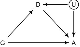
What could U be? How about academic ability. Ability could influence choice of department and probability of admission. In that case, conditioning on department is conditioning on a collider, and it opens a non-causal path between gender and admissions, G → D ← U → A. I’ll ask you to explore some possibilities like this in the practice problems at the end.
As a final note, you might have noticed that model m11.8 is over-parameterized. We don’t actually need one of the parameters, either a[1] or a[2]. Why? Because the individual delta parameters can stand for the acceptance rate of one of the genders in each department. Then we just need an average deviation across departments. If this were a non-Bayesian model, it wouldn’t work. But this kind of model is perfectly fine for us. The standard deviations are inflated, because there are many combinations of the a and delta parameters that can match the data. If you look at pairs(m11.8), you’ll see high posterior correlations among all of the parameters. But on the outcome scale, the predictions are much tighter, as you can see if you invoke postcheck(m11.8). It’s all good.
Why might we want to over-parameterize the model? Because it makes it easier to assign priors. If we made one of the genders baseline and measured the other as a deviation from it, we would stumble into the issue of assuming that the acceptance rate for one of the genders is pre-data more uncertain than the other. This isn’t to say that over-parameterizing a model is always a good idea. But it isn’t a violation of any statistical principle. You can always convert the posterior, post sampling, to any alternative parameterization. The only limitation is whether the algorithm we use to approximate the posterior can handle the high correlations. In this case, it can, and I bumped up the number of iterations to make sure.
Rethinking: Simpson’s paradox is not a paradox. This empirical example is a famous one in statistical teaching. It is often used to illustrate a phenomenon known as Simpson’s paradox. 176 Like most paradoxes, there is no violation of logic, just of intuition. And since different people have different intuition, Simpson’s paradox means different things to different people. The poor intuition being violated in this case is that a positive association in the entire population should also hold within each department. Overall, females in these data did have a harder time getting admitted to graduate school. But that arose because females applied to the hardest departments for anyone, male or female, to gain admission to.
Perhaps a little more paradoxical is that this phenomenon can repeat itself indefinitely within a sample. Any association between an outcome and a predictor can be nullified or reversed when another predictor is added to the model. And the reversal can reveal a true causal influence or rather just be a confound, as occurred in the grandparents example in Chapter 6. All that we can do about this is to remain skeptical of models and try to imagine ways they might be deceiving us. Thinking causally about these settings usually helps.177
11.2. Poisson regression
Binomial GLMs are appropriate when the outcome is a count from zero to some known upper bound. If you can analogize the data to the globe tossing model, then you should use a binomial GLM. But often the upper bound isn’t known. Instead the counts never get close to any upper limit. For example, if we go fishing and return with 17 fish, what was the theoretical maximum? Whatever it is, it isn’t in our data. How do we model the fish counts?
It turns out that the binomial model works here, provided we squint at it the right way. When a binomial distribution has a very small probability of an event p and a very large number of trials N, then it takes on a special shape. The expected value of a binomial distribution is just Np, and its variance is Np(1 − p). But when N is very large and p is very small, then these are approximately the same.
For example, suppose you own a monastery that is in the business, like many monasteries before the invention of the printing press, of copying manuscripts. You employ 1000 monks, and on any particular day about 1 of them finishes a manuscript. Since the monks are working independently of one another, and manuscripts vary in length, some days produce 3 or more manuscripts, and many days produce none. Since this is a binomial process, you can calculate the variance across days as Np(1−p) = 1000(0.001)(1−0.001) ≈ 1. You can simulate this, for example over 10,000 (1e5) days:
R code
11.35 y <- rbinom(1e5,1000,1/1000)
c( mean(y) , var(y) )[1] 0.9968400 0.9928199
The mean and the variance are nearly identical. This is a special shape of the binomial. This special shape is known as the Poisson distribution, and it is useful because it allows us to model binomial events for which the number of trials N is unknown or uncountably large. Suppose for example that you come to own, through imperial drama, another monastery. You don’t know how many monks toil within it, but your advisors tell you that it produces, on average, 2 manuscripts per day. With this information alone, you can infer the entire distribution of numbers of manuscripts completed each day.
To build models with a Poisson distribution, the model form is even simpler than it is for a binomial or Gaussian model. This simplicity arises from the Poisson’s having only one parameter that describes its shape, resulting in a data probability definition like this:
yi ∼ Poisson(λ)
The parameter λ is the expected value of the outcome y. It is also the expected variance of the counts y.
We also need a link function. The conventional link function for a Poisson model is the log link, as introduced in the previous chapter(page 318). To embed a linear model, we use:
\[\begin{aligned} \mathfrak{y}\_i &\sim \text{Poisson}(\lambda\_i) \\ \log(\lambda\_i) &= \alpha + \beta(\mathfrak{x}\_i - \bar{\mathfrak{x}}) \end{aligned}\]
The log link ensures that λi is always positive, which is required of the expected value of a count outcome. But as mentioned in the previous chapter, it also implies an exponential relationship between predictors and the expected value. Exponential relationships grow very quickly, and few natural phenomena remain exponential for long. So one thing to always check with a log link is whether it makes sense at all ranges of the predictor variables. Priors on the log scale also scale in surprising ways. So prior predictive simulation is again helpful.
11.2.1. Example: Oceanic tool complexity. The island societies of Oceania provide a natural experiment in technological evolution. Different historical island populations possessed tool kits of different size. These kits include fish hooks, axes, boats, hand plows, and many
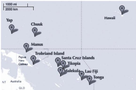
Figure 11.6. Locations of societies in the Kline data. The Equator and International Date Line are shown.
other types of tools. A number of theories predict that larger populations will both develop and sustain more complex tool kits. So the natural variation in population size induced by natural variation in island size in Oceania provides a natural experiment to test these ideas. It’s also suggested that contact rates among populations effectively increase population size, as it’s relevant to technological evolution. So variation in contact rates among Oceanic societies is also relevant.
We’ll use this topic to develop a standard Poisson GLM analysis. And then I’ll pivot at the end and also do a non-standard, but more theoretically motivated, Poisson model. The data we’ll work with are counts of unique tool types for 10 historical Oceanic societies:178
11.36 library(rethinking)
data(Kline)
d <- Kline
d| culture | population | contact | total_tools | mean_TU | |
|---|---|---|---|---|---|
| 1 | Malekula | 1100 | low | 13 | 3.2 |
| 2 | Tikopia | 1500 | low | 22 | 4.7 |
| 3 | Santa Cruz |
3600 | low | 24 | 4.0 |
| 4 | Yap | 4791 | high | 43 | 5.0 |
| 5 | Lau Fiji |
7400 | high | 33 | 5.0 |
| 6 | Trobriand | 8000 | high | 19 | 4.0 |
| 7 | Chuuk | 9200 | high | 40 | 3.8 |
| 8 | Manus | 13000 | low | 28 | 6.6 |
| 9 | Tonga | 17500 | high | 55 | 5.4 |
| 10 | Hawaii | 275000 | low | 71 | 6.6 |
That’s the entire data set. You can see the location of these societies in the Pacific Ocean in Figure 11.6. Keep in mind that the number of rows is not clearly the same as the “sample size” in a count model. The relationship between parameters and “degrees of freedom” is not simple, outside of simple linear regressions. Still, there isn’t a lot of data here, because there just aren’t that many historic Oceanic societies for which reliable data can be gathered. We’ll want to use regularization to damp down overfitting, as always. But as you’ll see, a lot can still be learned from these data. Any rules you’ve been taught about minimum sample sizes for inference are just non-Bayesian superstitions. If you get the prior back, then the data aren’t enough. It’s that simple.
The total_tools variable will be the outcome variable. We’ll model the idea that:
R code- The number of tools increases with the log population size. Why log? Because that’s what the theory says, that it is the order of magnitude of the population that matters, not the absolute size of it. So we’ll look for a positive association between total_tools and log population. You can get some intuition for why a linear impact of population size can’t be right by thinking about mechanism. We’ll think about mechanism more at the end.
- The number of tools increases with the contact rate among islands. No nation is an island, even when it is an island. Islands that are better networked may acquire or sustain more tool types.
- The impact of population on tool counts is moderated by high contact. This is to say that the association between total_tools and log population depends upon contact. So we will look for a positive interaction between log population and contact rate.
Let’s build now. First, we make some new columns with the standardized log of population and an index variable for contact:
R code
11.37 d$P <- scale( log(d$population) )
d$contact_id <- ifelse( d$contact=="high" , 2 , 1 )The model that conforms to the research hypothesis includes an interaction between logpopulation and contact rate. In math form, this is:
\[\begin{aligned} T\_i &\sim \text{Poisson}(\lambda\_i) \\ \log \lambda\_i &= \alpha\_{\text{cnp}[i]} + \beta\_{\text{cnp}[i]} \log P\_i \\ \alpha\_j &\sim \text{to be determined} \\ \beta\_j &\sim \text{to be determined} \end{aligned}\]
where P is population and cid is contact_id.
We need to figure out some sensible priors. As with binomial models, the transformation of scale between the scale of the linear model and the count scale of the outcome means that something flat on the linear model scale will not be flat on the outcome scale. Let’s consider for example just a model with an intercept and a vague Normal(0,10) prior on it:
\[\begin{aligned} T\_i &\sim \text{Poisson}(\lambda\_i) \\ \log \lambda\_i &= \alpha \\ \alpha &\sim \text{Normal}(0, 10) \end{aligned}\]
What does this prior look like on the outcome scale, λ? If α has a normal distribution, then λ has a log-normal distribution. So let’s plot a log-normal with these values for the (normal) mean and standard deviation:
R code
11.38 curve( dlnorm( x , 0 , 10 ) , from=0 , to=100 , n=200 )The distribution is shown in Figure 11.7 as the black curve. I’ve used a range from 0 to 100 on the horizontal axis, reflecting the notion that we know all historical tool kits in the Pacific were in this range. For the α ∼ Normal(0, 10) prior, there is a huge spike right around zero—that means zero tools on average—and a very long tail. How long? Well the mean of
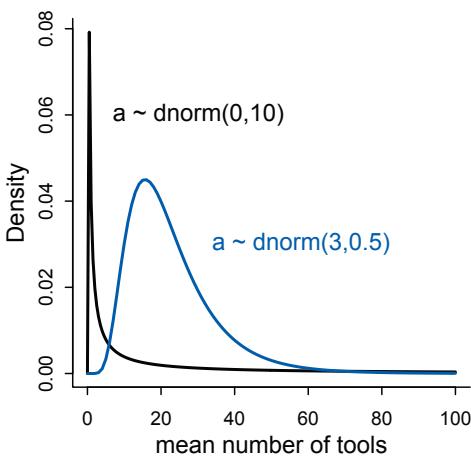
Figure 11.7. Prior predictive distribution of the mean λ of a simple Poisson GLM, considering only the intercept α. A flat conventional prior (black) creates absurd expectations on the outcome scale. The mean of this distribution is exp(50) ≈ stupidly large. It is easy to do better by shifting prior mass above zero (blue).
a log-normal distribution is exp(µ+σ 2/2), which evaluates to exp(50), which is impossibly large. If you doubt this, just simulate it:
| R code | |
|---|---|
| a <- rnorm(1e4,0,10) |
11.39 |
| lambda <- exp(a) |
|
| mean( lambda ) |
[1] 9.622994e+12
That’s a lot of tools, enough to cover an entire island. We can do better than this.
I encourage you to play around with the curve code above, trying different means and standard deviations. The fact to appreciate is that a log link puts half of the real numbers the negative numbers—between 0 and 1 on the outcome scale. So if your prior puts half its mass below zero, then half the mass will end up between 0 and 1 on the outcome scale. For Poisson models, flat priors make no sense and can wreck Prague. Here’s my weakly informative suggestion:
R code
11.40 curve( dlnorm( x , 3 , 0.5 ) , from=0 , to=100 , n=200 )I’ve displayed this distribution as well in Figure 11.7, as the blue curve. The mean is now exp(3 + 0.5 2/2) ≈ 20. We haven’t looked at the mean of the total_tools column, and we don’t want to. This is supposed to be a prior. We want the prior predictive distribution to live in the plausible outcome space, not fit the sample.
Now we need a prior for β, the coefficient of log population. Again for dramatic effect, let’s consider first a conventional flat prior like β ∼ Normal(0, 10). Conventional priors are even flatter. We’ll simulate together with the intercept and plot 100 prior trends of standardized log population against total tools:
11.41 N <- 100
a <- rnorm( N , 3 , 0.5 )
b <- rnorm( N , 0 , 10 )
plot( NULL , xlim=c(-2,2) , ylim=c(0,100) )for ( i in 1:N ) curve( exp( a[i] + b[i]*x ) , add=TRUE , col=grau() )
I display this prior predictive distribution as the top-left plot of Figure 11.8. The pivoting around zero makes sense—that’s just the average log population. The values on the horizontal axis are z-scores, because the variable is standardized. So you can see that this prior thinks that the vast majority of prior relationships between log population and total tools embody either explosive growth just above the mean log population size or rather catastrophic decline right before the mean. This prior is terrible. Of course you will be able to confirm, once we start fitting models, that even 10 observations can overcome these terrible priors. But please remember that we are practicing for when it does matter. And in any particular application, it could matter.
So let’s try something much tighter. I’m tempted actually to force the prior for β to be positive. But I’ll resist that temptation and let the data prove that to you. Instead let’s just dampen the prior’s enthusiasm for impossibly explosive relationships. After some experimentation, I’ve settled on β ∼ Normal(0, 0.2):
R code
11.42 set.seed(10)
N <- 100
a <- rnorm( N , 3 , 0.5 )
b <- rnorm( N , 0 , 0.2 )
plot( NULL , xlim=c(-2,2) , ylim=c(0,100) )
for ( i in 1:N ) curve( exp( a[i] + b[i]*x ) , add=TRUE , col=grau() )This plot is displayed in the top-right of Figure 11.8. Strong relationships are still possible, but most of the mass is for rather flat relationships between total tools and log population.
It will also help to view these priors on more natural outcome scales. The standardized log population variable is good for fitting. But it is bad for thinking. Population size has a natural zero, and we want to keep that in sight. Standardizing the variable destroys that. First, here are 100 prior predictive trends between total tools and un-standardized log population:
R code
11.43 x_seq <- seq( from=log(100) , to=log(200000) , length.out=100 )
lambda <- sapply( x_seq , function(x) exp( a + b*x ) )
plot( NULL , xlim=range(x_seq) , ylim=c(0,500) , xlab="log population" ,
ylab="total tools" )
for ( i in 1:N ) lines( x_seq , lambda[i,] , col=grau() , lwd=1.5 )This plot appears in the bottom-left of Figure 11.8. Notice that 100 total tools is probably the most we expect to ever see in these data. While most the of trends are in that range, some explosive options remain. And finally let’s also view these same curves on the natural population scale:
R code 11.44 plot( NULL , xlim=range(exp(x_seq)) , ylim=c(0,500) , xlab=“population” , ylab=“total tools” ) for ( i in 1:N ) lines( exp(x_seq) , lambda[i,] , col=grau() , lwd=1.5 )
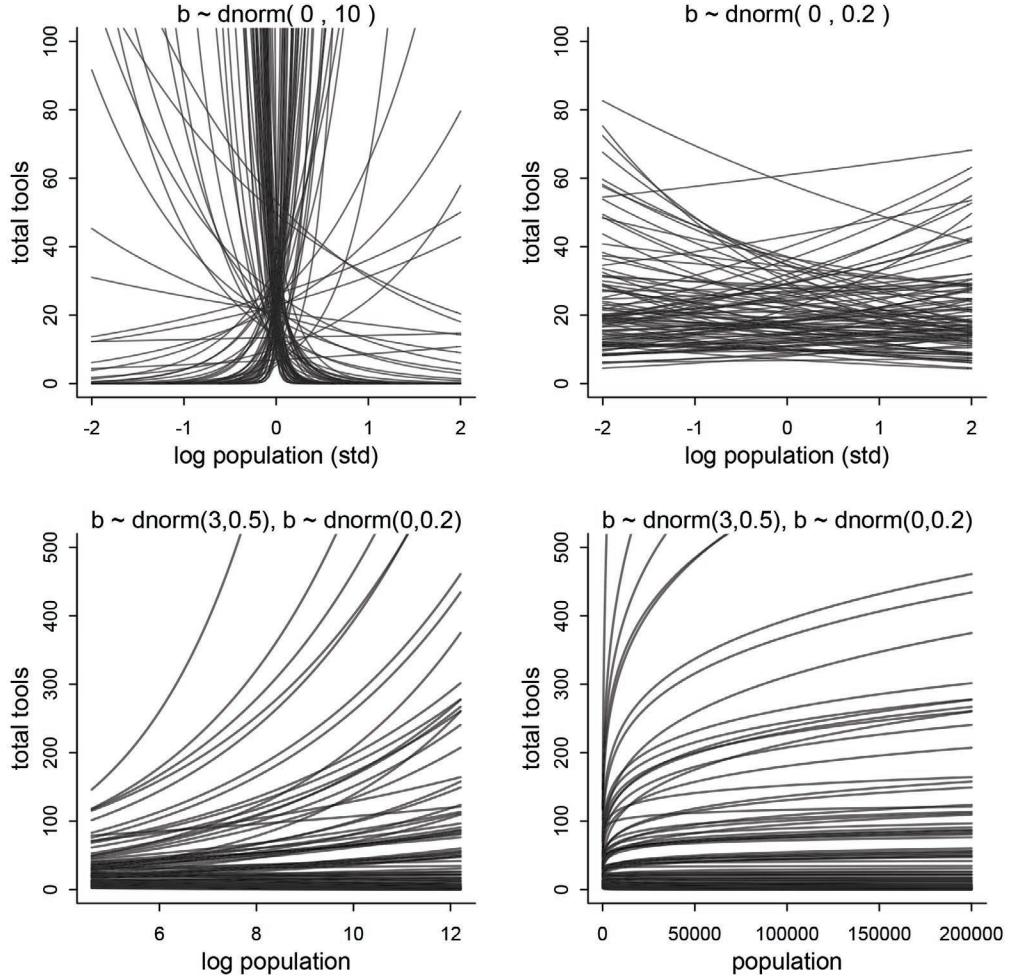
Figure 11.8. Struggling with slope priors in a Poisson GLM. Top-left: A flat prior produces explosive trends on the outcome scale. Top-right: A regularizing prior remains mostly within the space of outcomes. Bottom-left: Horizontal axis now on unstandardized scale. Bottom-right: Horizontal axis on natural scale (raw population size).
This plot lies in the bottom-right of Figure 11.8. On the raw population scale, these curves bend the other direction. This is the natural consequence of putting the log of population inside the linear model. Poisson models with log links create log-linear relationships with their predictor variables. When a predictor variable is itself logged, this means we are assuming diminishing returns for the raw variable. You can see this by comparing the two plots in the bottom of Figure 11.8. The curves on the left would be linear if you log them. On the natural population scale, the model imposes diminishing returns on population: Each additional person contributes a smaller increase in the expected number of tools. The curves bend down and level off. Many predictor variables are better used as logarithms, for this reason. Simulating prior predictive distributions is a useful way to think through these issues.
Okay, finally we can approximate some posterior distributions. I’m going to code both the interaction model presented above as well as a very simple intercept-only model. The intercept-only model is here because I want to show you something interesting about Poisson models and how parameters relate to model complexity. Here’s the code for both models:
R code
11.45 dat <- list(
T = d$total_tools ,
P = d$P ,
cid = d$contact_id )
# intercept only
m11.9 <- ulam(
alist(
T ~ dpois( lambda ),
log(lambda) <- a,
a ~ dnorm( 3 , 0.5 )
), data=dat , chains=4 , log_lik=TRUE )
# interaction model
m11.10 <- ulam(
alist(
T ~ dpois( lambda ),
log(lambda) <- a[cid] + b[cid]*P,
a[cid] ~ dnorm( 3 , 0.5 ),
b[cid] ~ dnorm( 0 , 0.2 )
), data=dat , chains=4 , log_lik=TRUE )Let’s look at the PSIS model comparison quickly, just to flag two important facts.
R code
11.46 compare( m11.9 , m11.10 , func=PSIS )
Some Pareto k values are high (>0.5).
PSIS SE dPSIS dSE pPSIS weightm11.10 84.6 13.24 0.0 NA 6.6 1 m11.9 141.8 33.78 57.2 33.68 8.5 0
First, note that we get the Pareto k warning again. This indicates some highly influential points. That shouldn’t be surprising—this is a small data set. But it means we’ll want to take a look at the posterior predictions with that in mind. Second, while it’s no surprise that the intercept-only model m11.9 has a worse score than the interaction model m11.10, it might be very surprising that the “effective number of parameters” pPSIS is actually larger for the model with fewer parameters. Model m11.9 has only one parameter. Model m11.10 has four parameters. This isn’t some weird thing about PSIS—WAIC tells you the same story. What is going on here?
The only place that model complexity—a model’s tendency to overfit—and parameter count have a clear relationship is in a simple linear regression with flat priors. Once a distribution is bounded, for example, then parameter values near the boundary produce less overfitting than those far from the boundary. The same principle applies to data distributions. Any count near zero is harder to overfit. So overfitting risk depends both upon structural details of the model and the composition of the sample.
In this sample, a major source of overfitting risk is the highly influential point flagged by PSIS. Let’s plot the posterior predictions now, and I’ll scale and label the highly influential points with their Pareto k values. Here’s the code to plot the data and superimpose posterior predictions for the expected number of tools at each population size and contact rate:
11.47 k <- PSIS( m11.10 , pointwise=TRUE )$k
plot( dat$P , dat$T , xlab="log population (std)" , ylab="total tools" ,
col=rangi2 , pch=ifelse( dat$cid==1 , 1 , 16 ) , lwd=2 ,
ylim=c(0,75) , cex=1+normalize(k) )
# set up the horizontal axis values to compute predictions at
ns <- 100
P_seq <- seq( from=-1.4 , to=3 , length.out=ns )
# predictions for cid=1 (low contact)
lambda <- link( m11.10 , data=data.frame( P=P_seq , cid=1 ) )
lmu <- apply( lambda , 2 , mean )
lci <- apply( lambda , 2 , PI )
lines( P_seq , lmu , lty=2 , lwd=1.5 )
shade( lci , P_seq , xpd=TRUE )
# predictions for cid=2 (high contact)
lambda <- link( m11.10 , data=data.frame( P=P_seq , cid=2 ) )
lmu <- apply( lambda , 2 , mean )
lci <- apply( lambda , 2 , PI )
lines( P_seq , lmu , lty=1 , lwd=1.5 )
shade( lci , P_seq , xpd=TRUE )The result is shown in Figure 11.9. Open points are low contact societies. Filled points are high contact societies. The points are scaled by their Pareto k values. The dashed curve is the low contact posterior mean. The solid curve is the high contact posterior mean.
This plot is joined on its right by the same predictions shown on the natural scale, with raw population sizes on the horizontal. The code to do that is very similar, but you need to convert the P_seq to the natural scale, by reversing the standardization, and then you can just replace P_seq with the converted sequence in the lines and shade commands.
R code
11.48 plot( d$population , d$total_tools , xlab="population" , ylab="total tools" ,
col=rangi2 , pch=ifelse( dat$cid==1 , 1 , 16 ) , lwd=2 ,
ylim=c(0,75) , cex=1+normalize(k) )
ns <- 100
P_seq <- seq( from=-5 , to=3 , length.out=ns )
# 1.53 is sd of log(population)
# 9 is mean of log(population)
pop_seq <- exp( P_seq*1.53 + 9 )
lambda <- link( m11.10 , data=data.frame( P=P_seq , cid=1 ) )
lmu <- apply( lambda , 2 , mean )
lci <- apply( lambda , 2 , PI )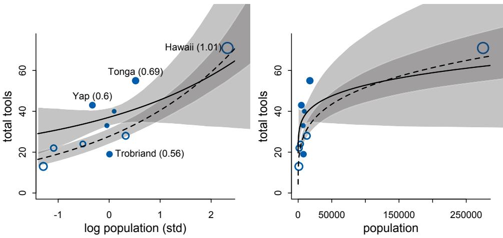
Figure 11.9. Posterior predictions for the Oceanic tools model. Filled points are societies with historically high contact. Open points are those with low contact. Point size is scaled by relative PSIS Pareto k values. Larger points are more influential. The solid curve is the posterior mean for high contact societies. The dashed curve is the same for low contact societies. 89% compatibility intervals are shown by the shaded regions. Left: Standardized log population scale, as in the model code. Right: Same predictions on the natural population scale.
lines( pop_seq , lmu , lty=2 , lwd=1.5 )
shade( lci , pop_seq , xpd=TRUE )
lambda <- link( m11.10 , data=data.frame( P=P_seq , cid=2 ) )
lmu <- apply( lambda , 2 , mean )
lci <- apply( lambda , 2 , PI )
lines( pop_seq , lmu , lty=1 , lwd=1.5 )
shade( lci , pop_seq , xpd=TRUE )Hawaii (k = 1.01), Tonga (k = 0.69), Tap (k = 0.6), and the Trobriand Islands (k = 0.56) are highly influential points. Most are not too influential, but Hawaii is very influential. You can see why in the figure: It has extreme population size and the most tools. This is most obvious on the natural scale. This doesn’t mean Hawaii is some “outlier” that should be dropped from the data. But it does mean that Hawaii strongly influences the posterior distribution. In the practice problems at the end of the chapter, I’ll ask you to drop Hawaii and see what changes. For now, let’s do something much more interesting.
Look at the posterior predictions in Figure 11.9. Notice that the trend for societies with high contact (solid) is higher than the trend for societies with low contact (dashed) when population size is low, but then the model allows it to actually be smaller. The means cross one another at high population sizes. Of course the model is actually saying it has no idea where the trend for high contact societies goes at high population sizes, because there are no high population size societies with high contact. There is only low-contact Hawaii. But it is still a silly pattern that we know shouldn’t happen. A counter-factual Hawaii with the same
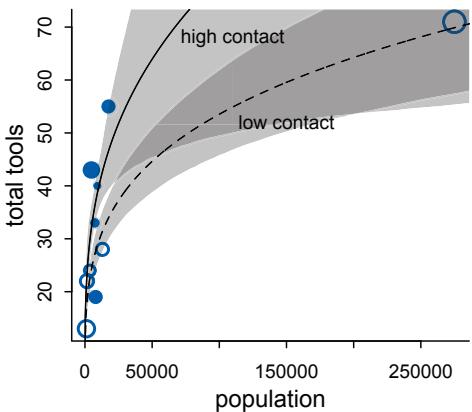
Figure 11.10. Posterior predictions for the scientific model of the Oceanic tool counts. Compare to the right-hand plot in Figure 11.9. Since this model forces the trends to pass through the origin, as it must, its behavior is more sensible, in addition to having parameters with meaning outside a linear model.
population size but high contact should theoretically have at least as many tools as the real Hawaii. It shouldn’t have fewer.
The model can produce this silly pattern, because it lets the intercept be a free parameter. Why is this bad? Because it means there is no guarantee that the trend for λ will pass through the origin where total tools equals zero and the population size equals zero. When there are zero people, there are also zero tools! As population increases, tools increase. So we get the intercept for free, if we stop and think.
Let’s stop and think. Instead of the conventional GLM above, we could use the predictions of an actual model of the relationship between population size and tool kit complexity. By “actual model,” I mean a model constructed specifically from scientific knowledge and hypothetical causal effects. The downside of this is that it will feel less like statistics—suddenly domain-specific skills are relevant. The upside is that it will feel more like science.
What we want is a dynamic model of the cultural evolution of tools. Tools aren’t created all at once. Instead they develop over time. Innovation adds them to a population. Processes of loss remove them. The simplest model assumes that innovation is proportional to population size, but with diminishing returns. Each additional person adds less innovation than the previous. It also assumes that tool loss is proportional to the number of tools, without diminishing returns. These forces balance to produce a tool kit of some size.
The Overthinking box below presents the mathematical version of this model and shows you the code to build it in ulam. The model ends up in m11.11. Let’s call this the scientific model and the previous m11.10 the geocentric model. Figure 11.10 shows the posterior predictions for the scientific model, on the natural scale of population size. Comparing it with the analogous plot in Figure 11.9, notice that the trend for high contact societies always trends above the trend for low contact societies. Both trends always pass through the origin now, as they must. The scientific model is still far from perfect. But it provides a better foundation to learn from. The parameters have clearer meanings now. They aren’t just bits of machinery in the bottom of a tide prediction engine.
You might ask how the scientific model compares to the geocentric model. The expected accuracy out of sample, whether you use PSIS or WAIC, is a few points better than the geocentric model. It is still tugged around by Hawaii and Tonga. We’ll return to these data in a later chapter and approach contact rate a different way, by taking account of how close these societies are to one another.
Overthinking: Modeling tool innovation. Taking the verbal model in the main text above, we can write that the change in the expected number of tools in one time step is:
\[ \Delta T = \alpha P^{\beta} - \gamma T \]
where P is the population size, T is the number of tools, andα, β, and γ are parameters to be estimated. To find an equilibrium number of tools T, just set ∆T = 0 and solve for T. This yields:
\[ \hat{T} = \frac{\alpha P^{\beta}}{\gamma} \]
We’re going to use this inside a Poisson model now. The noise around the outcome will still be Poisson, because that is still the maximum entropy distribution in this context—total_tools is a count with no clear upper bound. But the linear model is gone:
\[T\_i \sim \text{Poisson}(\lambda\_i)\]
\[\lambda\_i = \alpha P\_i^{\beta} / \gamma\]
Notice that there is no link function! All we have to do to ensure that λ remains positive is to make sure the parameters are positive. In the code below, I’ll use exponential priors for β and γ and a log-Normal for α. Then they all have to be positive. In building the model, we also want to allow some or all of the parameters to vary by contact rate. Since contact rate is supposed to mediate the influence of population size, let’s allow α and β. It could also influence γ, because trade networks might prevent tools from vanishing over time. But we’ll leave that as an exercise for the reader. Here’s the code:
R code
11.49 dat2 <- list( T=d$total_tools, P=d$population, cid=d$contact_id )
m11.11 <- ulam(
alist(
T ~ dpois( lambda ),
lambda <- exp(a[cid])*P^b[cid]/g,
a[cid] ~ dnorm(1,1),
b[cid] ~ dexp(1),
g ~ dexp(1)
), data=dat2 , chains=4 , log_lik=TRUE )I’ve invented the exact priors behind the scenes. Let’s not get distracted with those. I encourage you to play around. The lesson here is in how we build in the predictor variables. Using prior simulations to design the priors is the same, although easier now that the parameters mean something. Finally, the code to produce posterior predictions is no different than the code in the main text used to plot predictions for m11.10.
11.2.2. Negative binomial (gamma-Poisson) models. Typically there is a lot of unexplained variation in Poisson models. Presumably this additional variation arises from unobserved influences that vary from case to case, generating variation in the true λ’s. Ignoring this variation, or rate heterogeneity, can cause confounds just like it can for binomial models. So a very common extension of Poisson GLMs is to swap the Poisson distribution for something called the negative binomial distribution. This is really a Poisson distribution in disguise, and it is also sometimes called the gamma-Poisson distribution for this reason. It is a Poisson in disguise, because it is a mixture of different Poisson distributions. This is the Poisson analogue of the Student-t model, which is a mixture of different normal distributions. We’ll work with mixtures in the next chapter.
11.2.3. Example: Exposure and the offset. The parameter λ is the expected value of a Poisson model, but it’s also commonly thought of as a rate. Both interpretations are correct, and realizing this allows us to make Poisson models for which the exposure varies across cases i. Suppose for example that a neighboring monastery performs weekly totals of completed manuscripts while your monastery does daily totals. If you come into possession of both sets of records, how could you analyze both in the same model, given that the counts are aggregated over different amounts of time, different exposures?
Here’s how. Implicitly, λ is equal to an expected number of events, µ, per unit time or distance, τ . This implies that λ = µ/τ , which lets us redefine the link:
\[\begin{aligned} \mathfrak{y}\_i &\sim \text{Poisson}(\lambda\_i) \\ \log \lambda\_i &= \log \frac{\mu\_i}{\tau\_i} = \alpha + \beta \mathfrak{x}\_i \end{aligned}\]
Since the logarithm of a ratio is the same as a difference of logarithms, we can also write:
\[ \log \lambda\_l = \log \mu\_l - \log \tau\_l = \alpha + \beta \mathbf{x}\_l \]
These τ values are the “exposures.” So if different observations i have different exposures, then this implies that the expected value on row i is given by:
\[ \log \mu\_{\bar{\iota}} = \log \tau\_{\bar{\iota}} + \alpha + \beta \mathfrak{x}\_{\bar{\iota}} \]
When τi = 1, then log τi = 0 and we’re back where we started. But when the exposure varies across cases, then τi does the important work of correctly scaling the expected number of events for each case i. So you can model cases with different exposures just by writing a model like:
\[\begin{aligned} \mathcal{Y}\_{\boldsymbol{i}} &\sim \text{Poisson}(\mu\_{\boldsymbol{i}}) \\ \log \mu\_{\boldsymbol{i}} &= \log \tau\_{\boldsymbol{i}} + \alpha + \beta \mathbf{x}\_{\boldsymbol{i}} \end{aligned}\]
where τ is a column in the data. So this is just like adding a predictor, the logarithm of the exposure, without adding a parameter for it. There will be an example later in this section. You can also put a parameter in front of log τi , which is one way to model the hypothesis that the rate is not constant with time.
For the last Poisson example, we’ll look at a case where the exposure varies across observations. When the length of observation, area of sampling, or intensity of sampling varies, the counts we observe also naturally vary. Since a Poisson distribution assumes that the rate of events is constant in time (or space), it’s easy to handle this. All we need to do, as explained above, is to add the logarithm of the exposure to the linear model. The term we add is typically called an offset.
We’ll simulate for this example, both to provide another example of dummy-data simulation as well as to ensure we get the right answer from the offset approach. Suppose, as we did earlier, that you own a monastery. The data available to you about the rate at which manuscripts are completed is totaled up each day. Suppose the true rate is λ = 1.5 manuscripts per day. We can simulate a month of daily counts:
11.50 num_days <- 30
y <- rpois( num_days , 1.5 )So now y holds 30 days of simulated counts of completed manuscripts.
Also suppose that your monastery is turning a tidy profit, so you are considering purchasing another monastery. Before purchasing, you’d like to know how productive the new monastery might be. Unfortunately, the current owners don’t keep daily records, so a headto-head comparison of the daily totals isn’t possible. Instead, the owners keep weekly totals. Suppose the daily rate at the new monastery is actually λ = 0.5 manuscripts per day. To simulate data on a weekly basis, we just multiply this average by 7, the exposure:
R code11.51 num_weeks <- 4
y_new <- rpois( num_weeks , 0.5*7 )And new y_new holds four weeks of counts of completed manuscripts.
To analyze both y, totaled up daily, and y_new, totaled up weekly, we just add the logarithm of the exposure to linear model. First, let’s build a data frame to organize the counts and help you see the exposure for each case:
R code11.52 y_all <- c( y , y_new )
exposure <- c( rep(1,30) , rep(7,4) )
monastery <- c( rep(0,30) , rep(1,4) )
d <- data.frame( y=y_all , days=exposure , monastery=monastery )Take a look at d and confirm that there are three columns: The observed counts are in y, the number of days each count was totaled over are in days, and the new monastery is indicated by monastery.
To fit the model, and estimate the rate of manuscript production at each monastery, we just compute the log of each exposure and then include that variable in linear model. This code will do the job:
R code
11.53 # compute the offset
d$log_days <- log( d$days )
# fit the model
m11.12 <- quap(
alist(
y ~ dpois( lambda ),
log(lambda) <- log_days + a + b*monastery,
a ~ dnorm( 0 , 1 ),
b ~ dnorm( 0 , 1 )
), data=d )To compute the posterior distributions of λ in each monastery, we sample from the posterior and then just use the linear model, but without the offset now. We don’t use the offset again, when computing predictions, because the parameters are already on the daily scale, for both monasteries.
11.54 post <- extract.samples( m11.12 )
lambda_old <- exp( post$a )
lambda_new <- exp( post$a + post$b )
precis( data.frame( lambda_old , lambda_new ) )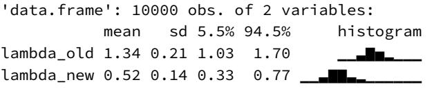
The new monastery produces about half as many manuscripts per day. So you aren’t going to pay that much for it.
11.3. Multinomial and categorical models
The binomial distribution is relevant when there are only two things that can happen, and we count those things. In general, more than two things can happen. For example, recall the bag of marbles from way back in Chapter 2. It contained only blue and white marbles. But suppose we introduce red marbles as well. Now each draw from the bag can be one of three categories, and the count that accumulates is across all three categories. So we end up with a count of blue, white, and red marbles.
When more than two types of unordered events are possible, and the probability of each type of event is constant across trials, then the maximum entropy distribution is the multinomial distribution. You already met the multinomial, implicitly, in Chapter 10 when we tossed pebbles into buckets as an introduction to maximum entropy. The binomial is really a special case of this distribution. And so its distribution formula resembles the binomial, just extrapolated out to three or more types of events. If there are K types of events with probabilities p1, …, pK, then the probability of observing y1, …, yK events of each type out of n total trials is:
\[\Pr(\boldsymbol{\jmath}\_1, \dots, \boldsymbol{\jmath}\_K | n, p\_1, \dots, p\_K) = \frac{n!}{\prod\_i \boldsymbol{\jmath}\_i!} \prod\_{i=1}^K p\_i^{\boldsymbol{\jmath}\_i}\]
The fraction with n! on top just expresses the number of different orderings that give the same counts y1, …, yK. It’s the famous multiplicity from the previous chapter.
A model built on a multinomial distribution may also be called a categorical regression, usually when each event is isolated on a single row, like with logistic regression. In machine learning, this model type is sometimes known as the maximum entropy classifier. Building a generalized linear model from a multinomial likelihood is complicated, because as the event types multiply, so too do your modeling choices. And there are two different approaches to constructing the likelihoods, as well. The first is based directly on the multinomial likelihood and uses a generalization of the logit link. I’ll show you an example of this approach, which I’ll call the explicit approach. The second approach transforms the multinomial likelihood into a series of Poisson likelihoods, oddly enough. I’ll introduce that approach after I introduce Poisson GLMs.
The conventional and natural link in this context is the multinomial logit, also known as the softmax function. This link function takes a vector of scores, one for each of K event types, and computes the probability of a particular type of event k as:
\[\Pr(k|s\_1, s\_2, \dots, s\_K) = \frac{\exp(s\_k)}{\sum\_{l=1}^{K} \exp(s\_l)}\]
The rethinking package provides this link as the softmax function. Combined with this conventional link, this type of GLM may be called multinomial logistic regression.
The biggest issue is what to do with the multiple linear models. In a binomial GLM, you can pick either of the two possible events and build a single linear model for its log odds. The other event is handled automatically. But in a multinomial (or categorical) GLM, you need K − 1 linear models for K types of events. One of the outcome values is chosen as a “pivot” and the others are modeled relative to it. In each of the K − 1 linear models, you can use any predictors and parameters you like—they don’t have to be the same, and there are often good reasons for them to be different. In the special case of two types of events, none of these choices arise, because there is only one linear model. And that’s why the binomial GLM is so much easier.
There are two basic cases: (1) predictors have different values for different values of the outcome, and (2) parameters are distinct for each value of the outcome. The first case is useful when each type of event has its own quantitative traits, and you want to estimate the association between those traits and the probability each type of event appears in the data. The second case is useful when you are interested instead in features of some entity that produces each event, whatever type it turns out to be. Let’s consider each case separately and talk through an empirically motivated example of each. You can mix both cases in the same model. But it’ll be easier to grasp the distinction in pure examples of each.
I’m going to build the models in this section with pure Stan code. We could make the models with quap or ulam. But using Stan directly will provide some additional clarity about the data structures needed to manage multiple, simultaneous linear models. It will also make it easier for you to modify these models for your purposes, including adding varying effects and other gizmos later on.179
11.3.1. Predictors matched to outcomes. For example, suppose you are modeling choice of career for a number of young adults. One of the relevant predictor variables is expected income. In that case, the same parameter βincome appears in each linear model, in order to estimate the impact of the income trait on the probability a career is chosen. But a different income value multiplies the parameter in each linear model.
Here’s a simulated example in R code. This code simulates career choice from three different careers, each with its own income trait. These traits are used to assign a score to each type of event. Then when the model is fit to the data, one of these scores is held constant, and the other two scores are estimated, using the known income traits. It is a little confusing. Step through the implementation, and it’ll make more sense. First, we simulate career choices:
R code11.55 # simulate career choices among 500 individuals
N <- 500 # number of individuals
income <- c(1,2,5) # expected income of each career
score <- 0.5*income # scores for each career, based on income
# next line converts scores to probabilities
p <- softmax(score[1],score[2],score[3])
# now simulate choice
# outcome career holds event type values, not counts
career <- rep(NA,N) # empty vector of choices for each individual
# sample chosen career for each individual
set.seed(34302)
for ( i in 1:N ) career[i] <- sample( 1:3 , size=1 , prob=p )To fit the model to these fake data, we use the dcategorical likelihood, which is the multinomial logistic regression distribution. It works when each value in the outcome variable,
here career, contains the individual event types on each row. To convert all the scores to probabilities, we’ll use the multinomial logit link, which is called softmax. Then each possible career gets its own linear model with its own features. There are no intercepts in the simulation above. But if income doesn’t predict career choice, you still want an intercept to account for differences in frequency. Here’s the code:
11.56 code_m11.13 <- "
data{
int N; // number of individuals
int K; // number of possible careers
int career[N]; // outcome
vector[K] career_income;
}
parameters{
vector[K-1] a; // intercepts
real<lower=0> b; // association of income with choice
}
model{
vector[K] p;
vector[K] s;
a ~ normal( 0 , 1 );
b ~ normal( 0 , 0.5 );
s[1] = a[1] + b*career_income[1];
s[2] = a[2] + b*career_income[2];
s[3] = 0; // pivot
p = softmax( s );
career ~ categorical( p );
}
"Then we set up the data list and invoke stan:
11.57 dat_list <- list( N=N , K=3 , career=career , career_income=income )
m11.13 <- stan( model_code=code_m11.13 , data=dat_list , chains=4 )
precis( m11.13 , 2 )R code
mean sd 5.5% 94.5% n_eff Rhat a[1] 0.06 0.21 -0.31 0.37 423 1 a[2] -0.49 0.38 -1.19 0.04 435 1 b 0.27 0.19 0.02 0.61 460 1
You might have gotten some divergent transitions above. Can you figure out why?
Be aware that the estimates you get from these models are extraordinarily difficult to interpret. Since the parameters are relative to the pivot outcome value, they could end up positive or negative, depending upon the context. In the example above, I chose the last outcome type, the third career. If you choose another, you’ll get different estimates, but the same predictions on the outcome scale. It really is a tide prediction engine. So you absolutely must convert them to a vector of probabilities to make much sense of them. However, in this case, it’s clear that the coefficient on career income b is positive. It’s just not clear at all how big the effect is.
To conduct a counterfactual simulation, we can extract the samples and make our own. The goal is to compare a counterfactual career in which the income is changed. How much does the probability change, in the presence of these competing careers? This is a subtle kind of question, because the probability change always depends upon the other choices. So let’s imagine doubling the income of career 2 above:
R code
11.58 post <- extract.samples( m11.13 )
# set up logit scores
s1 <- with( post , a[,1] + b*income[1] )
s2_orig <- with( post , a[,2] + b*income[2] )
s2_new <- with( post , a[,2] + b*income[2]*2 )
# compute probabilities for original and counterfactual
p_orig <- sapply( 1:length(post$b) , function(i)
softmax( c(s1[i],s2_orig[i],0) ) )
p_new <- sapply( 1:length(post$b) , function(i)
softmax( c(s1[i],s2_new[i],0) ) )
# summarize
p_diff <- p_new[2,] - p_orig[2,]
precis( p_diff )
'data.frame': 4000 obs. of 1 variables:
mean sd 5.5% 94.5% histogram
p_diff 0.13 0.09 0.01 0.29 ▇▇▅▅▃▂▁▁▁▁So on average a 13% increase in probability of choosing the career, when the income is doubled. Note that value is conditional on comparing to the other careers in the calculation. These models do not produce predictions independent of a specific set of options. That’s not a bug. That’s just how choice works.
11.3.2. Predictors matched to observations. Now consider an example in which each observed outcome has unique predictor values. Suppose you are still modeling career choice. But now you want to estimate the association between each person’s family income and which career they choose. So the predictor variable must have the same value in each linear model, for each row in the data. But now there is a unique parameter multiplying it in each linear model. This provides an estimate of the impact of family income on choice, for each type of career.
R code11.59 N <- 500
# simulate family incomes for each individual
family_income <- runif(N)
# assign a unique coefficient for each type of event
b <- c(-2,0,2)
career <- rep(NA,N) # empty vector of choices for each individual
for ( i in 1:N ) {
score <- 0.5*(1:3) + b*family_income[i]
p <- softmax(score[1],score[2],score[3])
career[i] <- sample( 1:3 , size=1 , prob=p )}
code_m11.14 <- "
data{
int N; // number of observations
int K; // number of outcome values
int career[N]; // outcome
real family_income[N];
}
parameters{
vector[K-1] a; // intercepts
vector[K-1] b; // coefficients on family income
}
model{
vector[K] p;
vector[K] s;
a ~ normal(0,1.5);
b ~ normal(0,1);
for ( i in 1:N ) {
for ( j in 1:(K-1) ) s[j] = a[j] + b[j]*family_income[i];
s[K] = 0; // the pivot
p = softmax( s );
career[i] ~ categorical( p );
}
}
"
dat_list <- list( N=N , K=3 , career=career , family_income=family_income )
m11.14 <- stan( model_code=code_m11.14 , data=dat_list , chains=4 )
precis( m11.14 , 2 )
mean sd 5.5% 94.5% n_eff Rhat
a[1] -1.41 0.28 -1.88 -0.97 2263 1
a[2] -0.64 0.20 -0.96 -0.33 2163 1
b[1] -2.72 0.60 -3.69 -1.79 2128 1
b[2] -1.72 0.39 -2.32 -1.10 2183 1Again, computing implied predictions is the safest way to interpret these models. They do a great job of classifying discrete, unordered events. But the parameters are on a scale that is very hard to interpret. In this case, b[2] ended up negative, because it is relative to the pivot, for which family income has a positive effect. If you produce posterior predictions on the probability scale, you’ll see this.
11.3.3. Multinomial in disguise as Poisson. Another way to fit a multinomial/categorical model is to refactor it into a series of Poisson likelihoods.180 That should sound a bit crazy. But it’s actually both principled and commonplace to model multinomial outcomes this way. It’s principled, because the mathematics justifies it. And it’s commonplace, because it is usually computationally easier to use Poisson rather than multinomial likelihoods. Here I’ll give an example of an implementation. For the mathematical details of the transformation, see the Overthinking box at the end.
I appreciate that this kind of thing—modeling the same data different ways but getting the same inferences—is exactly the kind of thing that makes statistics maddening for scientists. So I’ll begin by taking a binomial example from earlier in the chapter and doing it over as a Poisson regression. Since the binomial is just a special case of the multinomial, the approach extrapolates to any number of event types. Think again of the UC Berkeley admissions data. Let’s load it again:
R code
11.60 library(rethinking)
data(UCBadmit)
d <- UCBadmitNow let’s use a Poisson regression to model both the rate of admission and the rate of rejection. And we’ll compare the inference to the binomial model’s probability of admission. Here are both the binomial and Poisson models:
R code
11.61 # binomial model of overall admission probability
m_binom <- quap(
alist(
admit ~ dbinom(applications,p),
logit(p) <- a,
a ~ dnorm( 0 , 1.5 )
), data=d )
# Poisson model of overall admission rate and rejection rate
# 'reject' is a reserved word in Stan, cannot use as variable name
dat <- list( admit=d$admit , rej=d$reject )
m_pois <- ulam(
alist(
admit ~ dpois(lambda1),
rej ~ dpois(lambda2),
log(lambda1) <- a1,
log(lambda2) <- a2,
c(a1,a2) ~ dnorm(0,1.5)
), data=dat , chains=3 , cores=3 )Let’s consider just the posterior means, for the sake of simplicity. But keep in mind that the entire posterior is what matters. First, the inferred binomial probability of admission, across the entire data set, is:
R code
11.62 inv_logit(coef(m_binom))a 0.3877596
And in the Poisson model, the implied probability of admission is given by:
\[p\_{\text{ADMIT}} = \frac{\lambda\_1}{\lambda\_1 + \lambda\_2} = \frac{\exp(a\_1)}{\exp(a\_1) + \exp(a\_2)}\]
In code form:
11.63 k <- coef(m_pois) a1 <- k[‘a1’]; a2 <- k[‘a2’] exp(a1)/(exp(a1)+exp(a2))
[1] 0.3872366
That’s the same inference as in the binomial model. These days, you can just as easily use a categorical distribution, as in the previous section. But sometimes this Poisson factorization is easier. And you might encounter it elsewhere. So it’s good to know that it’s not insane.
Overthinking: Multinomial-Poisson transformation. The Poisson distribution was introduced earlier in this chapter. The Poisson probability of y1 events of type 1, assuming a rate λ1, is given by:
\[\Pr(y\_1|\lambda\_1) = \frac{e^{-\lambda\_1}\lambda\_1^{y\_1}}{\lambda\_1!}\]
I’ll show you a magic trick for extracting this expression from the multinomial probability expression. The multinomial probability is just an extrapolation of the binomial to more than two types of events. So we’ll work here with the binomial distribution, but in multinomial form, just to make the derivation a little easier. The probability of counts y1 and y2 for event types 1 and 2 with probabilities p1 and p2, respectively, out of n trials, is:
\[\Pr(\mathcal{y}\_1, \mathcal{y}\_2 | n, p\_1, p\_2) = \frac{n!}{\mathcal{y}\_1! \mathcal{y}\_2!} p\_1^{\mathcal{y}\_1} p\_2^{\mathcal{y}\_2}\]
We need some definitions now. Let Λ = λ1 +λ2, p1 = λ1/Λ, and p2 = λ2/Λ. Substituting these into the binomial probability:
\[\Pr(y\_1, y\_2 | n, \lambda\_1, \lambda\_2) = \frac{n!}{\chi\_1! \chi\_2!} \left(\frac{\lambda\_1}{\Lambda}\right)^{\nu\_1} \left(\frac{\lambda\_2}{\Lambda}\right)^{\nu\_2} = \frac{n!}{\Lambda^{\nu\_1} \Lambda^{\nu\_2}} \frac{\lambda\_1^{\nu\_1}}{\chi\_1!} \frac{\lambda\_2^{\nu\_2}}{\chi\_2!} = \frac{n!}{\Lambda^{\nu}} \frac{\lambda\_1^{\nu\_1}}{\chi\_1!} \frac{\lambda\_2^{\nu\_2}}{\chi\_2!}\]
Now we simultaneously multiply and divide by both e −λ1 and e −λ2 , then perform some strategic rearrangement:
\[\begin{split} \Pr(\boldsymbol{y}\_{1},\boldsymbol{y}\_{2}|\boldsymbol{n},\boldsymbol{\lambda}\_{1},\boldsymbol{\lambda}\_{2}) &= \frac{n!}{\Lambda^{n}} \frac{e^{-\lambda\_{1}}}{e^{-\lambda\_{1}}} \frac{\lambda\_{1}^{\boldsymbol{y}\_{1}}}{\boldsymbol{y}\_{1}!} \frac{e^{-\lambda\_{2}}}{e^{-\lambda\_{2}}} \frac{\lambda\_{2}^{\boldsymbol{y}\_{2}}}{\boldsymbol{y}\_{2}!} = \frac{n!}{\Lambda^{n}e^{-\lambda\_{1}}e^{-\lambda\_{2}}} \frac{e^{-\lambda\_{1}}\lambda\_{1}^{\boldsymbol{y}\_{1}}}{\boldsymbol{y}\_{1}!} \frac{e^{-\lambda\_{2}}\lambda\_{2}^{\boldsymbol{y}\_{2}}}{\boldsymbol{y}\_{2}!} \\ &= \underbrace{\frac{n!}{e^{-\lambda\_{1}}\Lambda^{n}}}\_{\Pr(\boldsymbol{n})^{-1}} \underbrace{\frac{e^{-\lambda\_{1}}\lambda\_{1}^{\boldsymbol{y}\_{1}}}{\Pr(\boldsymbol{y}\_{1})}}\_{\Pr(\boldsymbol{y}\_{1})} \underbrace{\frac{e^{-\lambda\_{2}}\lambda\_{2}^{\boldsymbol{y}\_{2}}}{\boldsymbol{y}\_{2}!}}\_{\Pr(\boldsymbol{y}\_{2})} \end{split}\]
The final expression is the product of the Poisson probabilities Pr(y1) and Pr(y2), divided by the Poisson probability of n, Pr(n). It makes sense that the product is divided by Pr(n), because this is a conditional probability for y1 and y2. All of this means that if there are k event types, you can model multinomial probabilities p1, …, pk using Poisson rate parameters λ1, …, λk. And you can recover the multinomial probabilities using the definition pi = λi/ P j λj .
11.4. Summary
This chapter described some of the most common generalized linear models, those used to model counts. It is important to never convert counts to proportions before analysis, because doing so destroys information about sample size. A fundamental difficulty with these models is that parameters are on a different scale, typically log-odds (for binomial) or log-rate (for Poisson), than the outcome variable they describe. Therefore computing implied predictions is even more important than before.
11.5. Practice
Problems are labeled Easy (E), Medium (M), and Hard (H).
11E1. If an event has probability 0.35, what are the log-odds of this event?
11E2. If an event has log-odds 3.2, what is the probability of this event?
11E3. Suppose that a coefficient in a logistic regression has value 1.7. What does this imply about the proportional change in odds of the outcome?
11E4. Why do Poisson regressions sometimes require the use of an offset? Provide an example.
11M1. As explained in the chapter, binomial data can be organized in aggregated and disaggregated forms, without any impact on inference. But the likelihood of the data does change when the data are converted between the two formats. Can you explain why?
11M2. If a coefficient in a Poisson regression has value 1.7, what does this imply about the change in the outcome?
11M3. Explain why the logit link is appropriate for a binomial generalized linear model.
11M4. Explain why the log link is appropriate for a Poisson generalized linear model.
11M5. What would it imply to use a logit link for the mean of a Poisson generalized linear model? Can you think of a real research problem for which this would make sense?
11M6. State the constraints for which the binomial and Poisson distributions have maximum entropy. Are the constraints different at all for binomial and Poisson? Why or why not?
11M7. Use quap to construct a quadratic approximate posterior distribution for the chimpanzee model that includes a unique intercept for each actor, m11.4 (page 330). Compare the quadratic approximation to the posterior distribution produced instead from MCMC. Can you explain both the differences and the similarities between the approximate and the MCMC distributions? Relax the prior on the actor intercepts to Normal(0,10). Re-estimate the posterior using both ulam and quap. Do the differences increase or decrease? Why?
11M8. Revisit the data(Kline) islands example. This time drop Hawaii from the sample and refit the models. What changes do you observe?
11H1. Use WAIC or PSIS to compare the chimpanzee model that includes a unique intercept for each actor, m11.4 (page 330), to the simpler models fit in the same section. Interpret the results.
11H2. The data contained in library(MASS);data(eagles) are records of salmon pirating attempts by Bald Eagles in Washington State. See ?eagles for details. While one eagle feeds, sometimes another will swoop in and try to steal the salmon from it. Call the feeding eagle the “victim” and the thief the “pirate.” Use the available data to build a binomial GLM of successful pirating attempts.
- Consider the following model:
\[\begin{aligned} \wp\_i &\sim \text{Binomial}(n\_i, \wp\_i) \\ \text{logit}(\wp\_i) &= \alpha + \beta\_P P\_i + \beta\_V V\_i + \beta\_A A\_i \\ \alpha &\sim \text{Normal}(0, 1.5) \\ \beta\_P, \beta\_V, \beta\_A &\sim \text{Normal}(0, 0.5) \end{aligned}\]
where y is the number of successful attempts, n is the total number of attempts, P is a dummy variable indicating whether or not the pirate had large body size, V is a dummy variable indicating whether or not the victim had large body size, and finally A is a dummy variable indicating whether or not the pirate was an adult. Fit the model above to the eagles data, using both quap and ulam. Is the quadratic approximation okay?
Now interpret the estimates. If the quadratic approximation turned out okay, then it’s okay to use the quap estimates. Otherwise stick to ulam estimates. Then plot the posterior predictions. Compute and display both (1) the predicted probability of success and its 89% interval for each row (i) in the data, as well as (2) the predicted success count and its 89% interval. What different information does each type of posterior prediction provide?
Now try to improve the model. Consider an interaction between the pirate’s size and age (immature or adult). Compare this model to the previous one, using WAIC. Interpret.
11H3. The data contained in data(salamanders) are counts of salamanders (Plethodon elongatus) from 47 different 49-m2 plots in northern California.181 The column SALAMAN is the count in each plot, and the columns PCTCOVER and FORESTAGE are percent of ground cover and age of trees in the plot, respectively. You will model SALAMAN as a Poisson variable.
Model the relationship between density and percent cover, using a log-link (same as the example in the book and lecture). Use weakly informative priors of your choosing. Check the quadratic approximation again, by comparing quap to ulam. Then plot the expected counts and their 89% interval against percent cover. In which ways does the model do a good job? A bad job?
Can you improve the model by using the other predictor, FORESTAGE? Try any models you think useful. Can you explain why FORESTAGE helps or does not help with prediction?
11H4. The data in data(NWOGrants) are outcomes for scientific funding applications for the Netherlands Organization for Scientific Research (NWO) from 2010–2012 (see van der Lee and Ellemers (2015) for data and context). These data have a very similar structure to the UCBAdmit data discussed in the chapter. I want you to consider a similar question: What are the total and indirect causal effects of gender on grant awards? Consider a mediation path (a pipe) through discipline. Draw the corresponding DAG and then use one or more binomial GLMs to answer the question. What is your causal interpretation? If NWO’s goal is to equalize rates of funding between men and women, what type of intervention would be most effective?
11H5. Suppose that the NWO Grants sample has an unobserved confound that influences both choice of discipline and the probability of an award. One example of such a confound could be the career stage of each applicant. Suppose that in some disciplines, junior scholars apply for most of the grants. In other disciplines, scholars from all career stages compete. As a result, career stage influences discipline as well as the probability of being awarded a grant. Add these influences to your DAG from the previous problem. What happens now when you condition on discipline? Does it provide an un-confounded estimate of the direct path from gender to an award? Why or why not? Justify your answer with the backdoor criterion. If you have trouble thinking this though, try simulating fake data, assuming your DAG is true. Then analyze it using the model from the previous problem. What do you conclude? Is it possible for gender to have a real direct causal influence but for a regression conditioning on both gender and discipline to suggest zero influence?
11H6. The data in data(Primates301) are 301 primate species and associated measures. In this problem, you will consider how brain size is associated with social learning. There are three parts.
- Model the number of observations of social_learning for each species as a function of the log brain size. Use a Poisson distribution for the social_learning outcome variable. Interpret the resulting posterior. (b) Some species are studied much more than others. So the number of reported instances of social_learning could be a product of research effort. Use the research_effort variable, specifically its logarithm, as an additional predictor variable. Interpret the coefficient for log research_effort. How does this model differ from the previous one? (c) Draw a DAG to represent how you think the variables social_learning, brain, and research_effort interact. Justify the DAG with the measured associations in the two models above (and any other models you used).

12 Monsters and Mixtures
In Hawaiian legend, Nanaue was the son of a shark who fell in love with a human. He grew into a murderous man with a shark mouth in the middle of his back. In Greek legend, the minotaur was a man with the head of a bull. He was the spawn of a human mother and a bull father. The gryphon is a legendary monster that is part eagle and part lion. Maori legends speak of Taniwha, monsters with features of serpents and birds and even sharks, much like the dragons of Chinese and European mythology.
By piecing together parts of different creatures, it’s easy to make a monster. Many monsters are hybrids. Many statistical models are too. This chapter is about constructing likelihood and link functions by piecing together the simpler components of previous chapters. Like legendary monsters, these hybrid likelihoods contain pieces of other model types. Endowed with some properties of each piece, they help us model outcome variables with inconvenient, but common, properties. Being monsters, these models are both powerful and dangerous. They are often harder to estimate and to understand. But with some knowledge and caution, they are important tools.
We’ll consider three common and useful examples. The first are models for handling over-dispersion. These models extend the binomial and Poisson models of the previous chapter to cope a bit with unmeasured sources of variation. The second type is a family of zero-inflated and zero-augmented models, each of which mixes a binary event with an ordinary GLM likelihood like a Poisson or binomial. The third type is the ordered categorical model, useful for categorical outcomes with a fixed ordering. This model is built by merging a categorical likelihood function with a special kind of link function, usually a cumulative link. We’ll also learn how to construct ordered categorical predictors.
These model types help us transform our modeling to cope with the inconvenient realities of measurement, rather than transforming measurements to cope with the constraints of our models. There are lots of other model types that arise for this purpose and in this way, by mixing bits of simpler models together. We can’t possibly cover them all. But when you encounter a new type, at least you’ll have a framework in which to understand it. And if you ever need to construct your own unique monster, feel free to do so. Just be sure to validate it by simulating dummy data and then recovering the data-generating process through fitting the model to the dummy data.
12.1. Over-dispersed counts
In an earlier chapter(Chapter 7), I argued that models based on normal distributions can be overly sensitive to extreme observations. The problem isn’t necessarily that “outliers” are bad data. Rather processes are often variable mixtures and this results in thicker tails. Models that assume a thin tail, like a pure Gaussian model, can be easily excited. Using something like a Student-t instead can produce better inference and out-of-sample predictions.
The same goes for count models. When counts arise from a mixture of different processes, then there may be more variation—thicker tails—than a pure count model expects. This can again lead to overly excited models. When counts are more variable than a pure process, they exhibit over-dispersion. The variance of a variable is sometimes called its dispersion. For a counting process like a binomial, the variance is a function of the same parameters as the expected value. For example, the expected value of a binomial is Np and its variance is Np(1 − p). When the observed variance exceeds this amount—after conditioning on all the predictor variables—this implies that some omitted variable is producing additional dispersion in the observed counts.
That isn’t necessarily bad. Such a model could still produce perfectly good inferences. But ignoring over-dispersion can also lead to all of the same problems as ignoring any predictor variable. Heterogeneity in counts can be a confound, hiding effects of interest or producing spurious inferences. So it’s worth trying grappling with over-dispersion. The best solution would of course be to discover the omitted source of dispersion and include it in the model. But even when no additional variables are available, it is possible to mitigate the effects of over-dispersion. We’ll consider two common and useful strategies.
In this chapter, we’ll consider continuous mixture models in which a linear model is attached not to the observations themselves but rather to a distribution of observations. We’ll spend the rest of this section outlining this kind of model, using the common betabinomial and gamma-Poisson (negative-binomial) models of this type. These models were mentioned at the end of the previous chapter, but now we’ll actually define them.
In the next chapters, we’ll see how to employ multilevel models that estimate both the residuals of each observation and the distribution of those residuals. In practice, it is often easier to use multilevel models (GLMMs, Chapter 13) in place of continuous mixtures. The reason is that multilevel models are much more flexible. They can handle over-dispersion and other kinds of heterogeneity at the same time.
12.1.1. Beta-binomial. A beta-binomial model is a mixture of binomial distributions. It assumes that each binomial count observation has its own probability of success.182 We estimate the distribution of probabilities of success instead of a single probability of success. Any predictor variables describe the shape of this distribution.
This will be easier to understand in the context of an example. For example, the UCBadmit data that you met last chapter is quite over-dispersed, as long as we ignore department. This is because the departments vary a lot in baseline admission rates. You’ve already seen that ignoring this variation leads to an incorrect inference about applicant gender. Now let’s fit a beta-binomial model, ignoring department, and see how it picks up on the variation that arises from the omitted variable.
What a beta-binomial model of these data will assume is that each observed count on each row of the data table has its own unique, unobserved probability of admission. These probabilities of admission themselves have a common distribution. This distribution is described using a beta distribution, which is a probability distribution for probabilities. Why use a beta distribution? Because it makes the mathematics easy. When we use a beta, it is mathematically possible to solve for a closed form likelihood function that averages over the unknown probabilities for each observation. See the Overthinking box at the end of this section (page 375) for details.
A beta distribution has two parameters, an average probability ¯p and a shape parameter θ. 183 The shape parameter θ describes how spread out the distribution is. When θ = 2, every probability from zero to 1 is equally likely. As θ increases above 2, the distribution of probabilities grows more concentrated. When θ < 2, the distribution is so dispersed that extreme probabilities near zero and 1 are more likely than the mean. You can play around with the parameters to get a feel for the shapes this distribution can take:
12.1 pbar <- 0.5
theta <- 5
curve( dbeta2(x,pbar,theta) , from=0 , to=1 ,
xlab="probability" , ylab="Density" )Explore different values for pbar and theta in the code above. Remember, this is a distribution for probabilities, so the horizontal axis you’ll see represents different possible probability values, and the vertical axis is the density with which each probability on the horizontal is sampled from the distribution. It’s weird, but you’ll get used to it.
We’re going to bind our linear model to ¯p, so that changes in predictor variables change the central tendency of the distribution. In mathematical form, the model is:
Ai ∼ BetaBinomial(Ni
, ¯pi
, θ)
logit(¯pi) = αgid[i]
αj ∼ Normal(0, 1.5)
θ = ϕ + 2
ϕ ∼ Exponential(1)where the outcome A is admit, the size N is applications, and gid[i] is gender index, 1 for male and 2 for female. I’ve introduced a trick with the prior on θ. We want to assume that the dispersion is at least 2, which means flat. Less than 2 would be piling up probability on zero and 1. Greater than 2 is increasingly heaped on a single value. Which distribution has a minimum of 2? We can make one. The exponential has a minimum of zero. But if we add 2 to any exponentially distribution variable, then the minimum of the new variable is 2. So the model above defines ϕ with an exponential distribution.
The code below will load the data and then fit, using ulam, the beta-binomial model:
12.2 library(rethinking)
data(UCBadmit)
d <- UCBadmit
d$gid <- ifelse( d$applicant.gender=="male" , 1L , 2L )
dat <- list( A=d$admit , N=d$applications , gid=d$gid )
m12.1 <- ulam(
alist(
A ~ dbetabinom( N , pbar , theta ),
logit(pbar) <- a[gid],
a[gid] ~ dnorm( 0 , 1.5 ),
transpars> theta <<- phi + 2.0,
phi ~ dexp(1)
), data=dat , chains=4 )R code
I tagged theta with transpars> (transformed parameters) so that Stan will return it in the samples. Let’s take a quick look at the posterior means. But let’s also go ahead and compute the constrast between the two genders first:
R code12.3 post <- extract.samples( m12.1 ) post$da <- post$a[,1] - post$a[,2] precis( post , depth=2 )
ulam posterior: 2000 samples from m12.1
mean sd 5.5% 94.5% histogram
a[1] -0.45 0.41 -1.1 0.21 ▁▁▇▇▂▁
a[2] -0.34 0.40 -1.0 0.27 ▁▁▃▇▂▁
phi 1.05 0.78 0.1 2.44 ▇▇▅▃▂▁▁▁▁▁▁
theta 3.05 0.78 2.1 4.44 ▇▇▅▃▂▁▁▁▁▁▁
da -0.11 0.57 -1.0 0.76 ▁▁▁▃▇▇▂▁▁▁The parameter a[1] is the log-odds of admission for male applicants. It is lower than a[2], the log-odds for female applicants. But the difference between the two, da, is highly uncertain. There isn’t much evidence here of a difference between male and female admission rates. Recall that in the previous chapter, a binomial model of these data that omitted department ended up being misleading, because there is an indirect path from gender through department to admission. That confound resulted in a spurious indication that female applicants had lower odds of admission. But the model above is not confounded, despite not containing the department variable. How is this?
The beta-binomial model allows each row in the data—each combination of department and gender—to have its own unobserved intercept. These unobserved intercepts are sampled from a beta distribution with mean ¯pi and dispersion θ. To see what this beta distribution looks like, we can just plot it.
R code12.4 gid <- 2
# draw posterior mean beta distribution
curve( dbeta2(x,mean(logistic(post$a[,gid])),mean(post$theta)) , from=0 , to=1 ,
ylab="Density" , xlab="probability admit", ylim=c(0,3) , lwd=2 )
# draw 50 beta distributions sampled from posterior
for ( i in 1:50 ) {
p <- logistic( post$a[i,gid] )
theta <- post$theta[i]
curve( dbeta2(x,p,theta) , add=TRUE , col=col.alpha("black",0.2) )
}
mtext( "distribution of female admission rates" )The result is shown on the left in Figure 12.1. Remember that a posterior distribution simultaneously scores the plausibility of every combination of parameter values. This plot shows 50 combinations of ¯p and θ, sampled from the posterior. The thick curve is the beta distribution corresponding the posterior mean. The central tendency is for low probabilities of admission, less than 0.5. But the most plausible distributions allow for departments that admit most applicants. What the model has done is accommodate the variation among departments—there is a lot of variation! As a result, it is no longer tricked by department variation into a false inference about gender.
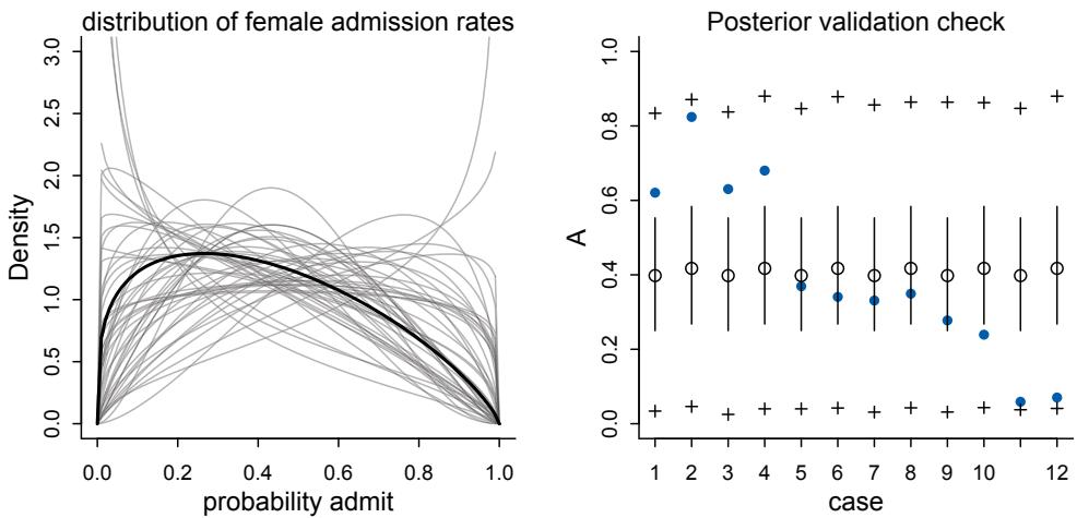
Figure 12.1. Left: Posterior distribution of beta distributions for m12.1. The thick curve is the posterior mean beta distribution. The lighter curves represent 100 combinations of ¯p and θ sampled from the posterior. Right: Posterior validation check for m12.1. As a result of the widely dispersed beta distributions on the left, the raw data (blue) is contained within the prediction intervals.
To get a sense of how the beta distribution of probabilities of admission influences predicted counts of applications admitted, let’s look at the posterior validation check:
| R code | |
|---|---|
| postcheck( m12.1 ) |
12.5 |
This plot is shown on the right in Figure 12.1. The vertical axis shows the predicted proportion admitted, for each case on the horizontal. The blue points show the empirical proportion admitted on each row of the data. The open circles are the posterior mean ¯p, with 89% percentile interval, and the + symbols mark the 89% interval of predicted counts of admission. There is a lot of dispersion expected here. The model can’t see departments, because we didn’t tell it about them. But it does see heterogeneity across rows, and it uses the beta distribution to estimate and anticipate that heterogeneity.
12.1.2. Negative-binomial or gamma-Poisson. A negative-binomial model, more usefully called a gamma-Poisson model, assumes that each Poisson count observation has its own rate.184 It estimates the shape of a gamma distribution to describe the Poisson rates across cases. Predictor variables adjust the shape of this distribution, not the expected value of each observation. The gamma-Poisson model is very much like a beta-binomial model, with the gamma distribution of rates (or expected values) replacing the beta distribution of probabilities of success. Why gamma? Because it makes the mathematics easy—there is a simple analytical expression for Poisson probabilities that are mixed together with gamma distributed rates. These gamma-Poisson models are very useful. The reason is that Poisson distributions are very narrow. The variance must equal the mean, recall.
The gamma-Poisson distribution has two parameters, one for the mean (rate) and another for the dispersion (scale) of the rates across cases.
yi ∼ Gamma-Poisson(λi , ϕ)
The λ parameter can be treated like the rate of an ordinary Poisson. The ϕ parameter must be positive and controls the variance. The variance of the gamma-Poisson is λ + λ 2/ϕ. So larger ϕ values mean the distribution is more similar to a pure Poisson process.
Let’s see how this works with the Oceanic tools example from the previous chapter. There was a highly influential point, Hawaii, that will become much less influential in the equivalent gamma-Poisson model. Why? Because gamma-Poisson expects more variation around the mean rate. As a result, Hawaii ends up pulling the regression trend less.
R code12.6 library(rethinking)
data(Kline)
d <- Kline
d$P <- standardize( log(d$population) )
d$contact_id <- ifelse( d$contact=="high" , 2L , 1L )
dat2 <- list(
T = d$total_tools,
P = d$population,
cid = d$contact_id )
m12.2 <- ulam(
alist(
T ~ dgampois( lambda , phi ),
lambda <- exp(a[cid])*P^b[cid] / g,
a[cid] ~ dnorm(1,1),
b[cid] ~ dexp(1),
g ~ dexp(1),
phi ~ dexp(1)
), data=dat2 , chains=4 , log_lik=TRUE )The posterior predictions are displayed against the data in Figure 12.2. The pure Poisson model from the previous chapter, m11.11, is shown next to it. Recall that Hawaii was a highly influential point in the pure Poisson model. It does all the work of pulling the low-contact trend down. In this new model, Hawaii is still influential, but it exerts a lot less influence on the trends. Now the high and low contact trends are much more similar, very hard to reliably distinguish. This is because the gamma-Poisson model expects rate variation, and the estimated amount of variation is quite large. Population is still strongly related to the total tools, but the influence of contact rate has greatly diminished.
12.1.3. Over-dispersion, entropy, and information criteria. Both the beta-binomial and gamma-Poisson models are maximum entropy for the same constraints as the regular binomial and Poisson. They just try to account for unobserved heterogeneity in probabilities and rates. So while they can be a lot harder to fit to data, they can be usefully conceptualized much like ordinary binomial and Poisson GLMs. So in terms of model comparison using information criteria, a beta-binomial model is a binomial model, and a gamma-Poisson (negative-binomial) is a Poisson model.
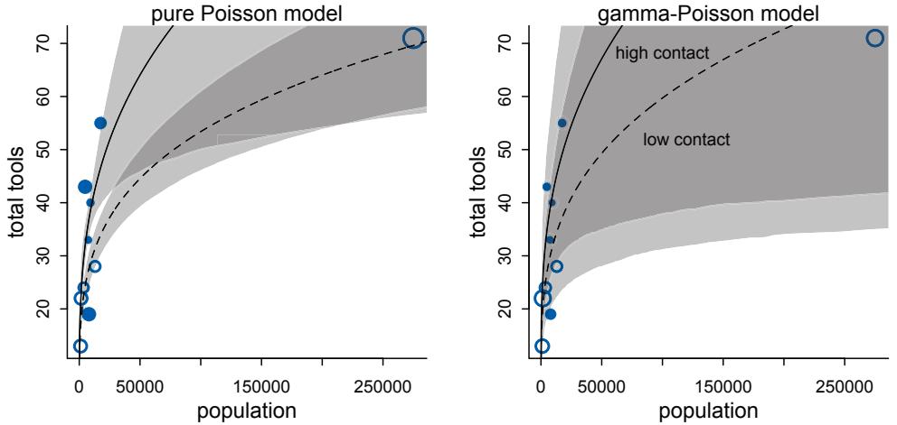
Figure 12.2. The Poisson model of Oceanic tools (left) is highly influenced by Hawaii. The equivalent gamma-Poisson model (right) is much less influenced by Hawaii, because the model expects more variation. And you can see the increased variation in the size of the shaded regions.
You should not use WAIC and PSIS with these models, however, unless you are very sure of what you are doing. The reason is that while ordinary binomial and Poisson models can be aggregated and disaggregated across rows in the data, without changing any causal assumptions, the same is not true of beta-binomial and gamma-Poisson models. The reason is that a beta-binomial or gamma-Poisson likelihood applies an unobserved parameter to each row in the data. When we then go to calculate log-likelihoods, how the data are structured will determine how the beta-distributed or gamma-distributed variation enters the model.
For example, a beta-binomial model like the one examined earlier in this chapter has counts on each row. The rows were combinations of departments and gender in that case, and all of the applications for each department/gender combination were assumed to have the same unknown baseline probability of acceptance. What we’d like to do is treat each application as an observation, calculating WAIC over applications, so we get an estimate of accuracy for a new application to a known department/gender. We could disaggregate the data so each row is a single application. But if we do that, then we lose the fact that the betabinomial model implies the same latent probability for all of the applicants from the same row in the data. This is a huge bother.
What to do? Once you see how to incorporate over-dispersion with multilevel models, in the next chapter, this obstacle will be reduced. Why? Because a multilevel model can assign heterogeneity in probabilities or rates at any level of aggregation.
Overthinking: Continuous mixtures. A distribution like the beta-binomial is called a continuous mixture, because every binomial count is assumed to have its own independent beta-distributed probability of success, and the beta distribution is continuous rather than discrete. So the parameters of the beta-binomial are just the number of draws in each case (the same as the “size” n of the ordinary binomial distribution) and the two parameters that describe the shape of the beta distribution. This
implies that the probability of observing a number of successes y from a beta-binomial process is:
\[f(\boldsymbol{y}|n,\bar{p},\boldsymbol{\theta}) = \int\_0^1 \mathbf{g}(\boldsymbol{y}|n,\boldsymbol{p}) h(\boldsymbol{p}|\bar{p},\boldsymbol{\theta}) d\boldsymbol{p}\]
where f is the beta-binomial density, g is the binomial distribution, and h is the beta density. The integral above, like most integrals in applied probability, just computes an average: the probability of y, averaged over all values of p. The p values are drawn from the beta distribution with mean ¯p and scale θ. The probability of a success p is no longer a free parameter, as it is produced by the beta distribution. The gamma-Poisson density has a similar form, but averaging a Poisson probability over a gamma distribution of rates.
In the case of the beta-binomial, as well as the gamma-Poisson, it is possible to close the integral above. You can look up the closed-form expressions anytime you need the analytic forms. The R functions dbetabinom and dgampois provide computations from them.
12.2. Zero-inflated outcomes
Very often, the things we can measure are not emissions from any pure process. Instead, they are mixtures of multiple processes. Whenever there are different causes for the same observation, then a mixture model may be useful. A mixture model uses more than one simple probability distribution to model a mixture of causes. In effect, these models use more than one likelihood for the same outcome variable.
Count variables are especially prone to needing a mixture treatment. The reason is that a count of zero can often arise more than one way. A “zero” means that nothing happened, and nothing can happen either because the rate of events is low or rather because the process that generates events failed to get started. If we are counting scrub jays in the woods, we might record a zero because there were no scrub jays in the woods or rather because we scared them all off before we started looking. Either way, the data contains a zero.
So in this section you’ll see how to construct simple zero-inflated models. You’ll be able to use the same components from earlier models, but they’ll be assembled in a different way. So even if you never need to use or interpret a zero-inflated model, seeing how they are constructed should expand your modeling imagination.
Rethinking: Breaking the law. In the sciences, there is sometimes a culture of anxiety surrounding statistical inference. It used to be that researchers couldn’t easily construct and study their own custom models, because they had to rely upon statisticians to properly study the models first. This led to concerns about unconventional models, concerns about breaking the laws of statistics. But statistical computing is much more capable now. Now you can imagine your own generative process, simulate data from it, write the model, and verify that it recovers the true parameter values. You don’t have to wait for a mathematician to legalize the model you need.
12.2.1. Example: Zero-inflated Poisson. Back in Chapter 11, I introduced Poisson GLMs by using the example of a monastery producing manuscripts. Each day, a large number of monks finish copying a small number of manuscripts. The process is binomial, but with a large number of trials and very low probability, so the distribution tends towards Poisson.
Now imagine that the monks take breaks on some days. On those days, no manuscripts are completed. Instead, the wine cellar is opened and more earthly delights are practiced. As the monastery owner, you’d like to know how often the monks drink. The obstacle for
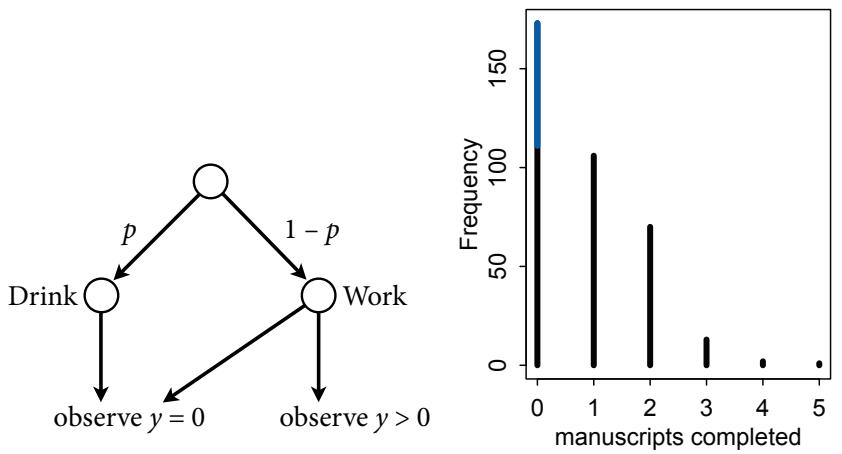
Figure 12.3. Left: Structure of the zero-inflated likelihood calculation. Beginning at the top, the monks drink p of the time or instead work 1 − p of the time. Drinking monks always produce an observation y = 0. Working monks may produce either y = 0 or y > 0. Right: Frequency distribution of zero-inflated observations. The blue line segment over zero shows the y = 0 observations that arose from drinking. In real data, we typically cannot see which zeros come from which process.
inference is that there will be zeros on honest non-drinking days, as well, just by chance. So how can you estimate the number of days spent drinking?
Let’s make a mixture to solve this problem.185 We want to consider that any zero in the data can arise from two processes: (1) the monks spent the day drinking and (2) they worked that day but nevertheless failed to complete any manuscripts. Let p be the probability the monks spend the day drinking. Let λ be the mean number of manuscripts completed, when the monks work.
To get this model going, we need to define a likelihood function that mixes these two processes. To grasp how we can construct such a monster, think of the monks’ drinking as resulting from a coin flip (Figure 12.3). The “coin” shows a cask of wine on one side and a quill on the other. The probability the wine cask shows is p, which could be any value from 0 to 1. Depending upon the outcome of the coin flip, the monks either begin drinking or rather begin copying. Drinking monks always produce zero completed manuscripts. Working monks produce a Poisson number of completed manuscripts with some average rate λ. So it is possible still to observe a zero, even when the monks work.
With these assumptions, the likelihood of observing a zero is:
\[\begin{aligned} \Pr(0|p,\lambda) &= \Pr(\text{dink}|p) + \Pr(\text{work}|p) \times \Pr(0|\lambda) \\ &= p + (1-p)\exp(-\lambda) \end{aligned}\]
Since the Poisson likelihood of y is Pr(y|λ) = λ y exp(−λ)/y!, the likelihood of y = 0 is just exp(−λ). The above is just the mathematics for:
The probability of observing a zero is the probability that the monks didn’t drink OR (+) the probability that the monks worked AND (×) failed to finish anything.
And the likelihood of a non-zero value y is:
\[\Pr(y|y>0, p, \lambda) = \Pr(\text{drink}|p)(0) + \Pr(\text{work}|p)\Pr(y|\lambda) = (1-p)\frac{\lambda^y \exp(-\lambda)}{y!}\]
Since drinking monks never produce y > 0, the expression above is just the chance the monks both work, 1 − p, and finish y manuscripts.
Define ZIPoisson as the distribution above, with parameters p (probability of a zero) and λ (mean of Poisson) to describe its shape. Then a zero-inflated Poisson regression takes the form:
\[\begin{aligned} \boldsymbol{\wp\_i} &\sim \text{ZIPoisson}(\boldsymbol{p\_i}, \lambda\_i) \\ \text{logit}(\boldsymbol{p\_i}) &= \boldsymbol{\alpha\_p} + \beta\_p \boldsymbol{\mathfrak{x}\_i} \\ \log(\lambda\_i) &= \boldsymbol{\alpha\_\lambda} + \beta\_\lambda \boldsymbol{\mathfrak{x}\_i} \end{aligned}\]
Notice that there are two linear models and two link functions, one for each process in the ZIPoisson. The parameters of the linear models differ, because any predictor such as x may be associated differently with each part of the mixture. In fact, you don’t even have to use the same predictors in both models—you can construct the two linear models however you wish, depending upon your hypothesis.
We have everything we need now, except for some data. So let’s simulate the monks’ drinking and working. Then you’ll see the code used to recover the parameter values used in the simulation.
R code12.7 # define parameters
prob_drink <- 0.2 # 20% of days
rate_work <- 1 # average 1 manuscript per day
# sample one year of production
N <- 365
# simulate days monks drink
set.seed(365)
drink <- rbinom( N , 1 , prob_drink )
# simulate manuscripts completed
y <- (1-drink)*rpois( N , rate_work )The outcome variable we get to observe is y, which is just a list of counts of completed manuscripts, one count for each day of the year. Take a look at the outcome variable:
R code
12.8 simplehist( y , xlab="manuscripts completed" , lwd=4 )
zeros_drink <- sum(drink)
zeros_work <- sum(y==0 & drink==0)
zeros_total <- sum(y==0)
lines( c(0,0) , c(zeros_work,zeros_total) , lwd=4 , col=rangi2 )This plot is shown on the right-hand side of Figure 12.3. The zeros produced by drinking are shown in blue. Those from work are shown in black. The total number of zeros is inflated, relative to a typical Poisson distribution.
And to fit the model, the rethinking package provides the zero-inflated Poisson likelihood as dzipois. For more detail on how it relates to the mathematics above, see the Overthinking box at the end of this section. Using dzipois is straightforward. I’m also going to nudge the prior for the probability of drinking so that there is more mass below 0.5 than above it—the monks probably do not drink more often than not.
12.9 m12.3 <- ulam(
alist(
y ~ dzipois( p , lambda ),
logit(p) <- ap,
log(lambda) <- al,
ap ~ dnorm( -1.5 , 1 ),
al ~ dnorm( 1 , 0.5 )
) , data=list(y=y) , chains=4 )
precis( m12.3 )mean sd 5.5% 94.5% n_eff Rhat ap -1.28 0.35 -1.89 -0.79 657 1 al 0.01 0.09 -0.14 0.16 759 1
On the natural scale, those posterior means are:
R code
12.10 post <- extract.samples( m12.3 )
mean( inv_logit( post$ap ) ) # probability drink
mean( exp( post$al ) ) # rate finish manuscripts, when not drinking[1] 0.2241255
[1] 1.017643Notice that we can get an accurate estimate of the proportion of days the monks drink, even though we can’t say for any particular day whether or not they drank.
This example is the simplest possible. In real problems, you might have predictor variables that are associated with one or both processes inside the zero-inflated Poisson mixture. In that case, you add those variables and their parameters to either or both linear models.
Overthinking: Zero-inflated Poisson calculations in Stan. The function dzipois is implemented in a way that guards against some kinds of numerical error. So its code looks confusing—just type “dzipois” at the R prompt and see. But really all it’s doing is implementing the likelihood formula defined in the section above. Let’s focus on how this is implemented in Stan. When you tell ulam to use dzipois, it understands it like this:
12.11 m12.3_alt <- ulam(
alist(
y|y>0 ~ custom( log1m(p) + poisson_lpmf(y|lambda) ),
y|y==0 ~ custom( log_mix( p , 0 , poisson_lpmf(0|lambda) ) ),
logit(p) <- ap,
log(lambda) <- al,
ap ~ dnorm(-1.5,1),al ~ dnorm(1,0.5)
) , data=list(y=as.integer(y)) , chains=4 )That is the same model, but with explicit mixtures and some raw Stan code inside the custom lines. If you look at stancode(m12.3_alt), you’ll see the corresponding lines:
if ( y[i] > 0 ) target += log1m(p) + poisson_lpmf(y[i] | lambda);
if ( y[i] == 0 ) target += log_mix(p, 0, poisson_lpmf(0 | lambda));That target thing is a chain of terms for calculating the log-posterior. When we use it with +=, we add another term to the stack. Stan will later use this stack to figure out the gradient, through aggressive and systematic use of the chain rule from calculus. Then there are some important tricks for doing this calculation. The log1m function computes the log of one-minus a value. We need log(1−p), but if p is very close to 1, then this can round catastrophically to zero and then the log will be negative infinity. Using log1m makes this much less likely. The function log_mix mixes together two logprobabilities, which is what we need for the probability of a zero. But it also uses clever techniques to avoid rounding error. It’s equivalent in this case to:
if ( y[i] == 0 ) target += log( p + (1-p)*exp(-lambda) );but more stable under extreme values of p. In this case, it makes no difference—the less fancy direct approach works fine. But it’s good to know the better approach. More complex models won’t work right otherwise. Finally, note that I coerced y to integer in the data list. When you use ulam’s built-in distributions, it will try to coerce variables into the correct Stan type. But if you build your own, you need to do this yourself.
12.3. Ordered categorical outcomes
It is very common in the social sciences, and occasional in the natural sciences, to have an outcome variable that is discrete, like a count, but in which the values merely indicate different ordered levels along some dimension. For example, if I were to ask you how much you like to eat fish, on a scale from 1 to 7, you might say 5. If I were to ask 100 people the same question, I’d end up with 100 values between 1 and 7. In modeling each outcome value, I’d have to keep in mind that these values are ordered, because 7 is greater than 6, which is greater than 5, and so on. The result is a set of ordered categories. Unlike a count, the differences in value are not necessarily equal. It might be much harder to move someone’s preference for fish from 1 to 2 than it is to move it from 5 to 6. Just treating ordered categories as continuous measures is not a good idea.186
Luckily, there is a standard and accessible solution. In principle, an ordered categorical variable is just a multinomial prediction problem(page 359). But the constraint that the categories be ordered demands a special treatment. What we’d like is for any associated predictor variable, as it increases, to move predictions progressively through the categories in sequence. So for example if preference for ice cream is positively associated with years of age, then the model should sequentially move predictions upwards as age increases: 3 to 4, 4 to 5, 5 to 6, etc. This presents a challenge: how to ensure that the linear model maps onto the outcomes in the right order.
The conventional solution is to use a cumulative link function.187 The cumulative probability of a value is the probability of that value or any smaller value. In the context of ordered categories, the cumulative probability of 3 is the sum of the probabilities of 3, 2, and 1. Ordered categories by convention begin at 1, so a result less than 1 has no probability at all. By linking a linear model to cumulative probability, it is possible to guarantee the ordering of the outcomes.
I’ll explain why in two steps. Step 1 is to explain how to parameterize a distribution of outcomes on the scale of log-cumulative-odds. Step 2 is to introduce a predictor (or more than one predictor) to these log-cumulative-odds values, allowing you to model associations between predictors and the outcome while obeying the ordered nature of prediction.
Both steps will unfold in context of a data example, to make the discussion more concrete. So next you meet some data.
12.3.1. Example: Moral intuition. The data for this example come from a series of experiments conducted by philosophers.188 Yes, philosophers do sometimes conduct experiments. In this case, the experiments aim to collect empirical evidence relevant to debates about moral intuition, the forms of reasoning through which people develop judgments about the moral goodness and badness of actions. These debates are relevant to all of the social sciences, because they touch on broader issues of reasoning, the role of emotions in decision making, and theories of moral development, both in individuals and groups.
These experiments get measurements of moral judgment by using scenarios known as “trolley problems.” The classic version invokes a runaway trolley, but what these scenarios share is that they have proved vexing or paradoxical to moral philosophers. Here’s a traditional example, using a “boxcar” in place of a “trolley”:
Standing by the railroad tracks, Dennis sees an empty, out-of-control boxcar about to hit five people. Next to Dennis is a lever that can be pulled, sending the boxcar down a side track and away from the five people. But pulling the lever will also lower the railing on a footbridge spanning the side track, causing one person to fall off the footbridge and onto the side track, where he will be hit by the boxcar. If Dennis pulls the lever the boxcar will switch tracks and not hit the five people, and the one person to fall and be hit by the boxcar. If Dennis does not pull the lever the boxcar will continue down the tracks and hit five people, and the one person will remain safe above the side track.
How morally permissible is it for Dennis to pull the lever?
The reason these scenarios can be philosophically vexing is that the analytical content of two scenarios can be identical, and yet people reliably reach different judgments about the moral permissibility of the same action in the different scenarios. Before you jump to the conclusion that this stuff is silly, the moral intuitions people have in these experiments are similar to the reactions they have to laws and how behavior is classified as criminal or not. The law is full of moral paradoxes. We need to understand them.
Previous research has led to at least three important principles of unconscious reasoning that may explain variations in judgment. These principles are:
- The action principle: Harm caused by action is morally worse than equivalent harm caused by omission.
- The intention principle: Harm intended as the means to a goal is morally worse than equivalent harm foreseen as the side effect of a goal.
- The contact principle: Using physical contact to cause harm to a victim is morally worse than causing equivalent harm to a victim without using physical contact.
The experimental context within which we’ll explore these principles comprises stories that vary the principles, while keeping many of the basic objects and actors the same. For example, the version of the boxcar story quoted just above implies the action principle, but not the others. Since the actor (Dennis) had to do something to create the outcome, rather than remain passive, this is an action scenario. However, the harm caused to the one man who will fall is not necessary, or intended, in order to save the five. Thus it is not an example of the intention principle. And there is no direct contact, so it is also not an example of the contact principle.
You can construct a boxcar story with the same outline, but now with both the action principle and the intention principle. That is, in this version, the actor both does something to change the outcome and the action must cause harm to the one person in order to save the other five:
Standing by the railroad tracks, Evan sees an empty, out-of-control boxcar about to hit five people. Next to Evan is a lever that can be pulled, lowering the railing on a footbridge that spans the main track, and causing one person to fall off the footbridge and onto the main track, where he will be hit by the boxcar. The boxcar will slow down because of the one person, therefore preventing the five from being hit. If Evan pulls the lever the one person will fall and be hit by the boxcar, and therefore the boxcar will slow down and not hit the five people. If Evan does not pull the lever the boxcar will continue down the tracks and hit the five people, and the one person will remain safe above the main track.
Most people judge that, if Evan pulls the lever, it is worse (less permissible) than when Dennis pulls the lever. You’ll see by how much, as we analyze these data. Load the data:
R code
12.12 library(rethinking)
data(Trolley)
d <- TrolleyThere are 12 columns and 9930 rows, comprising data for 331 unique individuals. The outcome we’ll be interested in is response, which is an integer from 1 to 7 indicating how morally permissible the participant found the action to be taken (or not) in the story. Since this type of rating is categorical and ordered, it’s exactly the right type of problem for our ordered model.
12.3.2. Describing an ordered distribution with intercepts. First, let’s see how to describe a distribution of discrete ordered values. Take a look at the overall distribution, the histogram, of the outcome variable.
R code
12.13 simplehist( d$response , xlim=c(1,7) , xlab="response" )The result is shown in the left-hand plot in Figure 12.4.
Our goal is to re-describe this histogram on the log-cumulative-odds scale. This just means constructing the odds of a cumulative probability and then taking a logarithm. Why do this arcane thing? Because this is the cumulative analog of the logit link we used in previous chapters. The logit is log-odds, and cumulative logit is log-cumulative-odds. Both are designed to constrain the probabilities to the 0/1 interval. Then when we decide to add predictor variables, we can safely do so on the cumulative logit scale. The link function takes care of converting the parameter estimates to the proper probability scale.
The first step in the conversion is to compute cumulative probabilities:
R code
12.14 # discrete proportion of each response value
pr_k <- table( d$response ) / nrow(d)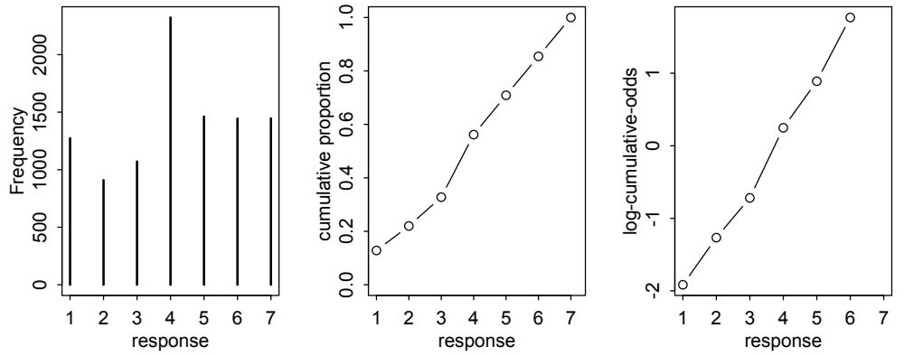
Figure 12.4. Re-describing a discrete distribution using log-cumulativeodds. Left: Histogram of discrete response in the sample. Middle: Cumulative proportion of each response. Right: Logarithm of cumulative odds of each response. Note that the log-cumulative-odds of response value 7 is infinity, so it is not shown.
# cumsum converts to cumulative proportions
cum_pr_k <- cumsum( pr_k )
# plot
plot( 1:7 , cum_pr_k , type="b" , xlab="response" ,
ylab="cumulative proportion" , ylim=c(0,1) )And the result is shown as the middle plot in Figure 12.4.
Then to re-describe the histogram as log-cumulative odds, we’ll need a series of intercept parameters. Each intercept will be on the log-cumulative-odds scale and stand in for the cumulative probability of each outcome. So this is just the application of the link function. The log-cumulative-odds that a response value yi is equal-to-or-less-than some possible outcome value k is:
\[\log \frac{\Pr(y\_i \le k)}{1 - \Pr(y\_i \le k)} = \alpha\_k \tag{12.1}\]
where αk is an “intercept” unique to each possible outcome value k. We can compute these intercept parameters directly:
R code 12.15 logit <- function(x) log(x/(1-x)) # convenience function round( lco <- logit( cum_pr_k ) , 2 )
1 2 3 4 5 6 7 -1.92 -1.27 -0.72 0.25 0.89 1.77 Inf
These values are plotted in the right-hand panel of Figure 12.4. Notice that the cumulative logit of the largest response, 7, is infinity. This is because log(1/(1 − 1)) = ∞. Since the largest response value always has a cumulative probability of 1, we effectively do not need a
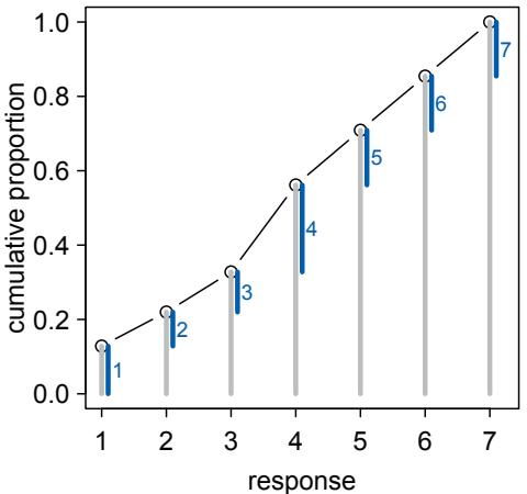
Figure 12.5. Cumulative probability and ordered likelihood. The horizontal axis displays possible observable outcomes, from 1 through 7. The vertical axis displays cumulative probability. The gray bars over each outcome show cumulative probability. These keep growing with each successive outcome value. The blue line segments show the discrete probability of each individual outcome. These are the likelihoods that go into Bayes’ theorem.
parameter for it. We get it for free, from the law of total probability. So for K = 7 possible response values, we only need K − 1 = 6 intercepts.
All of the above is very nice, but what we really want is the posterior distribution of these intercepts. This will allow us to take into account sample size and prior information, as well as insert predictor variables (in the next section). To use Bayes’ theorem to compute the posterior distribution of these intercepts, we’ll need to compute the likelihood of each possible response value. So the last step in constructing the basic model fitting engine for ordered categorical outcomes is to use the cumulative probabilities, Pr(yi ≤ k), to compute likelihood, Pr(yi = k).
Figure 12.5 illustrates how this is done. Each intercept αk implies a cumulative probability for each k. You just use the inverse link to translate from log-cumulative-odds back to cumulative probability. So when we observe k and need its likelihood, we can get the likelihood by subtraction:
\[p\_k = \Pr(y\_i = k) = \Pr(y\_i \le k) - \Pr(y\_i \le k - 1) \tag{12.2}\]
The blue line segments in Figure 12.5 are these likelihoods, computed by subtraction. With these in hand, the posterior distribution is computed the usual way.
Let’s go ahead and see how it’s done as a model. Conventions for writing mathematical forms of the ordered logit vary a lot. We’ll use this convention:
\[\begin{aligned} \label{eq:K} R\_i &\sim \text{Ordered-logit}(\phi\_i, \kappa) & \text{[probability of data]}\\ \phi\_i &= 0 & \text{[linear model]}\\ \kappa\_k &\sim \text{Normal}(0, 1.5) & \text{[common prior for each intercept]} \end{aligned}\]
But we can express the model more literally as well. It starts with a categorical distribution:
\[R\_l \sim \text{Categorical}(\mathbf{p}) \tag{\text{probability of data}}\]
And then all the conversions needed to build the vector of probabilities p:
| = p1 q1 |
[probabilities of each value k] |
|---|---|
| = − > > pk qk qk−1 for K k 1 |
|
| = − pK 1 qk−1 |
|
| logit(qk) = κk ϕi − |
[cumulative logit link] |
| ϕi = terms of linear model |
[linear model] |
| κk ∼ Normal(0, 1.5) |
[common prior for each intercept] |
This second form is cruel, but it exposes that an ordered-logit distribution is really just a categorical distribution that takes a vector p = {p1, p2, p3, p4, p5, p6} of probabilities of each response value below the maximum response (7 in this example). Each response value k in this vector is defined by its link to an intercept parameter, αk . Finally, some weakly regularizing priors are placed on these intercepts. In this example, there is a lot of data, so just about any prior will be overwhelmed. As always, in small sample contexts, you’ll have to think much harder about priors. Consider for example that we know α1 < α2, before we even see the data.
In code form for either quap and ulam, the link function will be embedded in the likelihood function already. This makes the calculations more efficient and avoids forcing you to code all the routine intermediate calculations above. So to fit the basic model, incorporating no predictor variables:
12.16 m12.4 <- ulam(
alist(
R ~ dordlogit( 0 , cutpoints ),
cutpoints ~ dnorm( 0 , 1.5 )
) , data=list( R=d$response ), chains=4 , cores=4 )That zero in the dordlogit is a placeholder for the linear model that we’ll construct later. If you want to use this model in quap instead, you’ll need to specify the start values for the cutpoints. Otherwise it’ll have a very hard time getting started. The exact values aren’t important, but their ordering is. This code will work:
12.17 m12.4q <- quap(
alist(
response ~ dordlogit( 0 , c(a1,a2,a3,a4,a5,a6) ),
c(a1,a2,a3,a4,a5,a6) ~ dnorm( 0 , 1.5 )
) , data=d , start=list(a1=-2,a2=-1,a3=0,a4=1,a5=2,a6=2.5) )The posterior distribution of the cutpoints is on the log-cumulative-odds scale:
R code
12.18 precis( m12.4 , depth=2 )mean sd 5.5% 94.5% n_eff Rhat
cutpoints[1] -1.92 0.03 -1.96 -1.87 1460 1
cutpoints[2] -1.27 0.02 -1.31 -1.23 2091 1
cutpoints[3] -0.72 0.02 -0.75 -0.68 2480 1
cutpoints[4] 0.25 0.02 0.22 0.28 2701 1R code
cutpoints[5] 0.89 0.02 0.85 0.92 2373 1
cutpoints[6] 1.77 0.03 1.72 1.81 2345 1Since there is a lot of data here, the posterior for each intercept is quite precisely estimated, as you can see from the tiny standard deviations. To get cumulative probabilities back:
R code12.19 round( inv_logit(coef(m12.4)) , 3 )cutpoints[1] cutpoints[2] cutpoints[3] cutpoints[4] cutpoints[5] cutpoints[6]
0.128 0.220 0.328 0.562 0.709 0.854And of course those are the same as the values in cum_pr_k that we computed earlier. But now we also have a posterior distribution around these values, which provides a measure of uncertainty. And we’re ready to add predictor variables in the next section.
12.3.3. Adding predictor variables. This flurry of computation has gotten us very little so far, aside from a Bayesian representation of a histogram. But all of it has been necessary in order to prepare the model for the addition of predictor variables that obey the ordered constraint on the outcomes.
To include predictor variables, we define the log-cumulative-odds of each response k as a sum of its intercept αk and a typical linear model. Suppose for example we want to add a predictor x to the model. We’ll do this by defining a linear model ϕi = βxi . Then each cumulative logit becomes:
\[\log \frac{\Pr(y\_i \le k)}{1 - \Pr(y\_i \le k)} = \alpha\_k - \phi\_i\]
\[\phi\_i = \beta x\_i\]
This form automatically ensures the correct ordering of the outcome values, while still morphing the likelihood of each individual value as the predictor xi changes value. Why is the linear model ϕ subtracted from each intercept? Because if we decrease the log-cumulativeodds of every outcome value k below the maximum, this necessarily shifts probability mass upwards towards higher outcome values. So then positive values of β mean increasing x also increases the mean y. You could add ϕ instead like αk + ϕi . But then β > 0 would indicate increasing x decreases the mean.
For example, suppose we take the posterior means from m12.4 and subtract 0.5 from each. The function dordlogit makes the calculation of the probabilities straightforward:
R code
12.20 round( pk <- dordlogit( 1:7 , 0 , coef(m12.4) ) , 2 )[1] 0.13 0.09 0.11 0.23 0.15 0.15 0.15
These probabilities imply an average outcome value of:
R code 12.21 sum( pk*(1:7) )
[1] 4.198989
And now subtracting 0.5 from each:
R code
12.22 round( pk <- dordlogit( 1:7 , 0 , coef(m12.4)-0.5 ) , 2 )[1] 0.08 0.06 0.08 0.21 0.16 0.18 0.22
Compare these to the probabilities just above and notice that the values on the left have diminished while the values on the right have increased. The expected value is now:
12.23 sum( pk*(1:7) )
[1] 4.729394
And that’s why we subtract ϕ, the linear model βxi , from each intercept, rather than add it. This way, a positive β value indicates that an increase in the predictor variable x results in an increase in the average response.
Now we can turn back to our “trolley” data and include predictor variables to help explain variation in responses. The predictor variables of interest are going to be action, intention, and contact, each an indicator variable corresponding to each principle outlined earlier. There are several ways we could code these indicator variables into treatments. Consider that contact always implies action. The way that contact is coded here, it excludes action, treating the two features as mutually exclusive. But each can be combined with intention. This gives us 6 possible story combinations:
- No action, contact, or intention
- Action
- Contact
- Intention
- Action and intention
- Contact and intention
The last two represent interactions—the influence of intention may depend upon the simultaneous presence of action or contact. I’ll use the indicator variables directly this time, instead of an index variable. This will let me show you a useful trick for defining interactions that can make your models easier to read and debug.
The log-cumulative-odds of each response k will now be:
\[\begin{aligned} \log \frac{\Pr(y\_i \le k)}{1 - \Pr(y\_i \le k)} &= \alpha\_k - \phi\_i\\ \phi\_i &= \beta\_A A\_i + \beta\_C \mathbf{C}\_i + \mathbf{B}\_{I,i} \mathbf{I}\_i\\ \mathbf{B}\_{I,i} &= \beta\_I + \beta\_{IA} \mathbf{A}\_i + \beta\_{IC} \mathbf{C}\_i \end{aligned}\]
where Ai indicates the value of action on row i, Ii indicates the value of intention on row i, and Ci indicates the value of contact on row i. What we’ve done here is define the log-odds of each possible response to be an additive model of the features of the story corresponding to each response. For the interactions of intention with action and contact, I used an accessory linear model, BI . This just makes the notation clearer, by defining the relationship between intention and response as a function of the other variables. You could substitute BI into ϕi without changing anything.
You fit this model just as you’d expect, by adding the slopes and predictor variables to the phi parameter inside dordlogit. Here’s a working model:
12.24 dat <- list(
R = d$response,
A = d$action,
I = d$intention,R code
C = d$contact )
m12.5 <- ulam(
alist(
R ~ dordlogit( phi , cutpoints ),
phi <- bA*A + bC*C + BI*I ,
BI <- bI + bIA*A + bIC*C ,
c(bA,bI,bC,bIA,bIC) ~ dnorm( 0 , 0.5 ),
cutpoints ~ dnorm( 0 , 1.5 )
) , data=dat , chains=4 , cores=4 )
precis( m12.5 )
6 vector or matrix parameters omitted in display. Use depth=2 to show them.
mean sd 5.5% 94.5% n_eff Rhat
bIC -1.23 0.09 -1.38 -1.09 1245 1
bIA -0.43 0.08 -0.55 -0.31 1132 1
bC -0.35 0.07 -0.45 -0.24 1229 1
bI -0.29 0.06 -0.38 -0.20 1025 1
bA -0.47 0.05 -0.56 -0.39 1064 1I’ve suppressed the cutpoints. They aren’t of much interest at the moment. But look at the posterior distributions of the slopes. They are all reliably negative. Each of these story features reduces the rating—the acceptability of the story. Plotting the marginal posterior distributions makes the relative effect sizes much clearer:
R code 12.25 plot( precis(m12.5) , xlim=c(-1.4,0) )
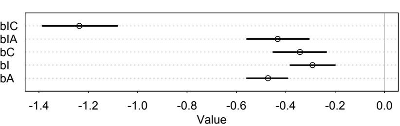
The combination of intention and contact is the worst. This is curious, because it seems that neither intention nor contact by itself has a large impact on ratings.
As always, this will all be easier to see if we plot the posterior predictions. There is no perfect way to plot the predictions of these log-cumulative-odds models. Why? Because each prediction is really a vector of probabilities, one for each possible outcome value. So as a predictor variable changes value, the entire vector changes. This kind of thing can be visualized in several different ways.
One common and useful way is to use the horizontal axis for a predictor variable and the vertical axis for cumulative probability. Then you can plot a curve for each response value, as it changes across values of the predictor variable. After plotting a curve for each response value, you’ll end up mapping the distribution of responses, as it changes across values of the predictor variable.
So let’s do that. First, let’s make an empty plot:
12.26 plot( NULL , type="n" , xlab="intention" , ylab="probability" ,
xlim=c(0,1) , ylim=c(0,1) , xaxp=c(0,1,1) , yaxp=c(0,1,2) )Now we’ll set up a data list that contains the different combinations of predictor values. Then we pass it to link to get phi samples for each combination: Now loop over the first 100 samples in post and plot their predictions, across values of intention:
12.27 kA <- 0 # value for action
kC <- 0 # value for contact
kI <- 0:1 # values of intention to calculate over
pdat <- data.frame(A=kA,C=kC,I=kI)
phi <- link( m12.5 , data=pdat )$phiFinally loop over the first 50 samples in and plot their predictions, across values of intention. The trick here is to use pordlogit to compute the cumulative probability for each possible outcome value, from 1 to 7, using the samples in phi and the cutpoints.
12.28 post <- extract.samples( m12.5 )
for ( s in 1:50 ) {
pk <- pordlogit( 1:6 , phi[s,] , post$cutpoints[s,] )
for ( i in 1:6 ) lines( kI , pk[,i] , col=grau(0.1) )
}By modifying the above code to change the values in kA and kC, you can make a triptych (page 252) for model m12.5. The results are shown in the top row of Figure 12.6, with a little extra decoration, to show the raw data as points on the margins. In each plot, the black lines indicate the boundaries between response values, numbered 1 through 7, bottom to top. The thickness of the lines corresponds to the variation in predictions due to variation in samples from the posterior. Since there is so much data in this example, the path of the predicted boundaries is quite certain. The horizontal axis represents values of intention, either zero or one. The change in height of each boundary going from left to right in each plot indicates the predicted impact of changing a story from non-intention to intention. Finally, each plot sets the other two predictor variables, action and contact, to either zero or one. In the upper-left, both are set to zero. This plot shows the predicted effect of taking a story with no-action, no-contact, and no-intention and adding intention to it. In the upperright, action is now set to one. This plot shows the predicted impact of taking a story with action and no-intention (action and contact never go together in this experiment, recall) and adding intention. This upper-right plot demonstrates the interaction between action and intention. Finally, in the lower-left, contact is set to one. This plot shows the predicted impact of taking a story with contact and no-intention and adding intention to it. This plot shows the large interaction effect between contact and intention, the largest estimated effect in the model.
Another plotting option is to show the implied histogram of outcomes. All we have to do is use sim to simulate posterior outcomes:
R code
R code
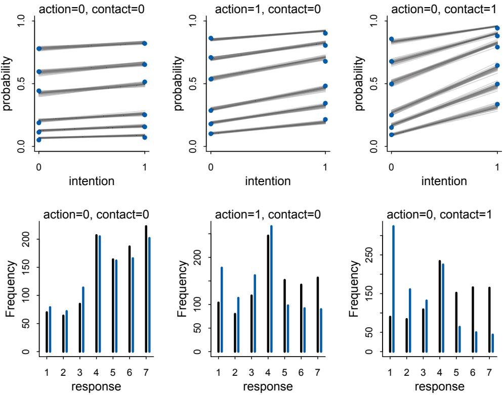
Figure 12.6. Posterior predictions of the ordered categorical model with interactions, m12.5. Each plot shows how the distribution of predicted responses varies by intention. The top row shows the distribution of posterior probabilities of each outcome across values of intention for different values of the other predictors. The bottom row shows the same interactions, but visualized as histograms of simulated outcomes. The black line segments are intention equal to 0. The blue segments are when intention is equal to 1.
R code12.29 kA <- 0 # value for action
kC <- 1 # value for contact
kI <- 0:1 # values of intention to calculate over
pdat <- data.frame(A=kA,C=kC,I=kI)
s <- sim( m12.5 , data=pdat )
simplehist( s , xlab="response" )I’ve included these histograms in the bottom row of Figure 12.6. The black line segments are the simulated frequencies when intention is 0. The blue segments are the frequencies when intention is 1. Notice the weight given to the middle response, 5, and the end responses in each case. You can see this fact as well in the top-row plots, but the histograms make it much more obvious. This is a general feature of ordered categories—some of the values are much more salient than others. This is one of the reasons they are better than treating the outcome as an ordinary metric variable.
Rethinking: Staring into the abyss. The plotting code for ordered logistic models is complicated, compared to that of models from previous chapters. But as models become more monstrous, so too does the code needed to compute predictions and display them. With power comes hardship. It’s better to see the guts of the machine than to live in awe or fear of it. Software can be and often is written to hide all the monstrosity from us. But this doesn’t make it go away. Instead, it just makes the models forever mysterious. For some users, mystery translates into awe. For others, it translates into skepticism. Neither condition is necessary, as long as we’re willing to learn the structure of the models we are using. And if you aren’t willing to learn the structure of the models, then don’t do your own statistics. Instead, collaborate with or hire a statistician.
12.4. Ordered categorical predictors
We can handle ordered outcome variables using a categorical model with a cumulative link. That was the previous section. What about ordered predictor variables? We could just include them as continuous predictors like in any linear model. But this isn’t ideal. Just like with ordered outcomes, we don’t really want to assume that the distance between each ordinal value is the same. Luckily, we don’t have to. We can construct ordered effects as well as ordered outcomes.189
The Trolley data from the previous section contains a good example. Let’s look at the edu variable, which contains levels of completed education for each individual:
12.30 library(rethinking)
data(Trolley)
d <- Trolley
levels(d$edu)[1] "Bachelor's Degree" "Elementary School" "Graduate Degree"
[4] "High School Graduate" "Master's Degree" "Middle School"
[7] "Some College" "Some High School"There are 8 different levels of completed education in the sample. Unfortunately, they aren’t actually in order, from lowest to highest. This is typical with R, when it constructs a factor variable from character data. So the first step is to code these into an ordered variable, with the lowest level being 1 and the highest 8. Then we’ll think about constructing ordered effects out of it. The proper order is: [2] Elementary School, [6] Middle School, [8] Some High School, [4] High School Graduate, [7] Some College, [1] Bachelor’s Degree, [5] Master’s Degree, and [3] Graduate Degree. We can just make a vector of new values to map onto those, like this:
12.31 edu_levels <- c( 6 , 1 , 8 , 4 , 7 , 2 , 5 , 3 )
d$edu_new <- edu_levels[ d$edu ]Now edu_new contains values from 1 to 8 in the right order of ascending education.
Now for the fun part. The notion with ordered predictor variables is that each step up in value comes with its own incremental, or marginal, effect on the outcome. So that implies we want to infer, using a parameter, each of those incremental effects. With 8 education R code
levels, we’ll need 7 parameters. The first level (Elementary School) will be absorbed into the intercept. Then the first increment comes from moving from Elementary School to Middle School. In that case we’ll add the first effect to the linear model:
\[\phi\_{\mathbf{i}} = \delta\_{\mathbf{l}} + \text{other stuff}\]
where the parameter δ1 is the effect of completing Middle School and “other stuff” is all of the other terms you want in your linear model. Another individual goes on to finish the third level, Some High School, and that individual’s linear model is:
\[\phi\_{\mathbf{i}} = \delta\_{\mathbf{i}} + \delta\_{\mathbf{2}} + \text{other stuff}\]
where δ2 is the incremental effect of finishing some (but not all) High School. It goes on like this, adding another incremental effect for each completed level. An individual with a Graduate Degree, level 8, gets the linear model:
\[\phi\_{\delta} = \sum\_{j=1}^{7} \delta\_{j} + \text{other stuff}\]
And this sum of all the δ parameters is the maximum education effect. It will be very convenient for interpretation if we call this maximum sum an ordinary coefficient like βE and then let the δ parameters be fractions of it. If we also make a dummy δ0 = 0 then we can write it all very compactly. Like this:
\[\phi\_l = \beta\_E \sum\_{j=0}^{E\_l - 1} \delta\_j + \text{other stuff}\]
where Ei is the completed education level of individual i. Now the sum of every δj is 1, and we can interpret the maximum education effect by looking at βE. In the case of an individual with Ei = 1, βE does’t appear in the linear model, because βEδ0 = 0.
This βE move also helps us define priors. If the prior expectation is that all of the levels have the same incremental effect, then we want all the δj ’s to have the same prior. We can do that now and still set a separate prior for maximum effect on βE. βE can be negative as well, in which case all of the incremental effects are incrementally negative.
I appreciate that all of this is rather bizarre. We are deep inside the tide prediction engine (Chapter 11) now. Understanding always comes with use and practice. So let’s build education into the ordered logit model as an ordered predictor. First, here’s a mathematical version of the full model. The probability of the outcome and the linear model are:
\[\begin{aligned} \mathcal{R}\_i &\sim \text{Ordered-logit}(\phi\_i, \kappa) \\ \phi\_i &= \beta\_E \sum\_{j=0}^{E\_i - 1} \delta\_j + \beta\_A A\_I + \beta\_I I\_i + \beta\_C C\_i \end{aligned}\]
And so we need a bunch of priors. The priors for the cutpoints are on the logit scale, so we’ll use our regular(-izing) prior with standard deviation 1.5. The slopes get narrower priors each of these is a log-odds difference.
\[\begin{aligned} \kappa\_{\boldsymbol{k}} & \sim \text{Normal}(\boldsymbol{0}, 1.5) \\ \beta\_{\boldsymbol{A}}, \beta\_{\boldsymbol{I}}, \beta\_{\boldsymbol{C}}, \beta\_{\boldsymbol{E}} & \sim \text{Normal}(\boldsymbol{0}, 1) \\ \delta & \sim \text{Dirichlet}(\boldsymbol{\alpha}) \end{aligned}\]
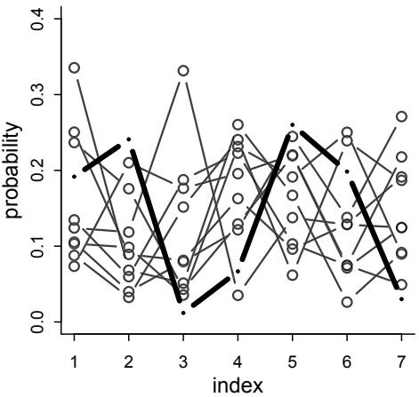
Figure 12.7. Simulated draws from a Dirichlet prior with α = {2, 2, 2, 2, 2, 2, 2}. The highlighted vector isn’t special but just serves to show how much variation can exist in a single vector. This prior doesn’t expect all the probabilities to be equal. Instead it expects that any of the probabilities could be bigger or smaller than the others.
The last line is the new part. The prior for the δ vector is a Dirichlet distribution. 190 The Dirichlet distribution is the multivariate extension of the beta distribution. We met the beta distribution earlier in this chapter. Like the beta, the Dirichlet is a distribution for probabilities, values between zero and one that all sum to one. The beta is a distribution for two probabilities. The Dirichlet is a distribution for any number. And just like the beta, the Dirichlet is parameterized by pseudo-counts of observations. In the beta, these were the parameters α and β, the prior counts of success and failures, respectively. In the Dirichlet, there is a just a long vector α with pseudo-counts for each possibility. If we assign the same value to each, it is a uniform prior. The larger the α values, the more prior information that the probabilities are all the same.
We’ll use a very weak prior with each value inside α being 2. Let’s simulate from this prior and visualize the implications for prior vectors of δ values.
12.32 library(gtools)
set.seed(1805)
delta <- rdirichlet( 10 , alpha=rep(2,7) )
str(delta)num [1:10, 1:7] 0.1053 0.2504 0.1917 0.1241 0.0877 … We end up with 10 vectors of 7 probabilities, each summing to 1. Let’s plot these vectors:
R code
12.33 h <- 3
plot( NULL , xlim=c(1,7) , ylim=c(0,0.4) , xlab="index" , ylab="probability" )
for ( i in 1:nrow(delta) ) lines( 1:7 , delta[i,] , type="b" ,
pch=ifelse(i==h,16,1) , lwd=ifelse(i==h,4,1.5) ,
col=ifelse(i==h,"black",col.alpha("black",0.7)) )Figure 12.7 displays the result. I’ve highlighted one of the vectors to show the variation in a single vector. The prior doesn’t expect all of the probabilities to be the same so much as it doesn’t expect any particular value to be bigger or smaller than the others.
In coding this model, we need some variable fiddling to handle the δ0 = 0 bit. Let me show you the model code and then explain.
R code
12.34 dat <- list(
R = d$response ,
action = d$action,
intention = d$intention,
contact = d$contact,
E = as.integer( d$edu_new ), # edu_new as an index
alpha = rep( 2 , 7 ) ) # delta prior
m12.6 <- ulam(
alist(
R ~ ordered_logistic( phi , kappa ),
phi <- bE*sum( delta_j[1:E] ) + bA*action + bI*intention + bC*contact,
kappa ~ normal( 0 , 1.5 ),
c(bA,bI,bC,bE) ~ normal( 0 , 1 ),
vector[8]: delta_j <<- append_row( 0 , delta ),
simplex[7]: delta ~ dirichlet( alpha )
), data=dat , chains=4 , cores=4 )The top part just builds the data list. This is familiar to you by now. Notice that the data list contains the alpha prior. We’re passing it in as “data,” but it is just the definition of the Dirichlet prior in the formula. The model itself is just like the models in the previous section, except for the bE term in the linear model and the last two lines of the formula, defining delta_j and delta. I’m also using some more advanced syntax in the model. But we can take this one piece at a time.
In order to sum over the δ parameters, the linear model contains the term bE*sum( delta_j[1:E] ).This bit of code computes the expression βE PEi−1 j=0 δj . The vector delta_j has 8 values in it. The first one is δ0 = 0. The other 7 values are the other δ parameters. The [1:E] pulls out the first E values, where E is the education level of each individual.
The code builds the delta_j vector by appending the actual delta parameter vector onto a zero: delta_j <<- append_row( 0 , delta ). The append_row function is not an R function, but rather a Stan function. It just glues together two vectors into one longer vector. It’s like doing c(0,delta) in R. Notice the vector[8]: in front of this line. That is an explicit type and dimension declaration. I’m telling Stan to make delta_j a vector of length 8. This kind of index fiddling is the joyless reality of statistical programming. You do have to be careful and keep track of what is going where. It gets easier the more you do it.
Finally, we reach the prior distribution for the δ/delta parameters themselves. Recall that these delta values must sum to one. This kind of vector, in which all the values sum to one (or any other constant), has a special name, a simplex. Stan kindly provides a special variable type, simplex, which enforces the sum-to-one constraint for you. And then we can assign the delta vector the Dirichlet prior.
And it runs. This model samples more slowly than the other models so far in the book. But it still won’t take that long. On my most ancient 2013 edition laptop, it took 20 minutes total. If you don’t have 4 cores so that the 4 chains can run in parallel, it’ll take longer. Regardless, it is important to get comfortable with waiting for a good approximation of the posterior, instead of using some terrible-but-fast approximation.
Let’s look at the marginal posterior distributions, leaving out the kappa cutpoints:
12.35 precis( m12.6 , depth=2 , omit="kappa" )| mean | sd | 5.5% | 94.5% | n_eff | Rhat | |
|---|---|---|---|---|---|---|
| bE | -0.32 | 0.17 | -0.61 | -0.07 | 1062 | 1 |
| bC | -0.96 | 0.05 | -1.03 | -0.88 | 1716 | 1 |
| bI | -0.72 | 0.04 | -0.78 | -0.66 | 2588 | 1 |
| bA | -0.70 | 0.04 | -0.76 | -0.64 | 2089 | 1 |
| delta[1] | 0.23 | 0.13 | 0.05 | 0.47 | 1422 | 1 |
| delta[2] | 0.14 | 0.09 | 0.03 | 0.30 | 2611 | 1 |
| delta[3] | 0.19 | 0.11 | 0.05 | 0.38 | 2388 | 1 |
| delta[4] | 0.17 | 0.10 | 0.04 | 0.35 | 2234 | 1 |
| delta[5] | 0.04 | 0.05 | 0.01 | 0.11 | 1111 | 1 |
| delta[6] | 0.10 | 0.07 | 0.02 | 0.23 | 2305 | 1 |
| delta[7] | 0.12 | 0.08 | 0.03 | 0.26 | 2118 | 1 |
The overall association of education bE is negative—more educated individuals disapproved more of everything. The association is smaller than the treatment effects—at the posterior mean, the most educated individuals in the sample disapprove of everything by about −0.3, while adding action to a story reduces approval by about 0.7. Careful not to think of this association causally yet. Education is not a randomized treatment variable!
To see what’s going on with the incremental effects, the delta parameters, we’ll have to look at them as a multivariate distribution. The easiest way to do this is the use pairs:
R code
12.36 delta_labels <- c("Elem","MidSch","SHS","HSG","SCol","Bach","Mast","Grad")
pairs( m12.6 , pars="delta" , labels=delta_labels )This is displayed as Figure 12.8. First notice that all of these parameters are negatively correlated with one another. This is a result of the constraint that they sum to one. If one gets larger, the others have to get smaller. Next notice that all but one level of education produces some modest increment on average. Is it is only Some College (SCol) that seems to have only a tiny, if any, incremental effect.
It’ll be instructive to compare the posterior above to the inference we get from a more conventional model with education entered as an ordinary continuous variable. We’ll normalize education level first, so that it ranges from 0 to 1. This will make the resulting parameter comparable to the one in the model above.
12.37 dat$edu_norm <- normalize( d$edu_new )
m12.7 <- ulam(
alist(
R ~ ordered_logistic( mu , cutpoints ),
mu <- bE*edu_norm + bA*action + bI*intention + bC*contact,
c(bA,bI,bC,bE) ~ normal( 0 , 1 ),
cutpoints ~ normal( 0 , 1.5 )
), data=dat , chains=4 , cores=4 )
precis( m12.7 )
6 vector or matrix parameters hidden. Use depth=2 to show them.
mean sd 5.5% 94.5% n_eff RhatbE -0.10 0.09 -0.24 0.04 2224 1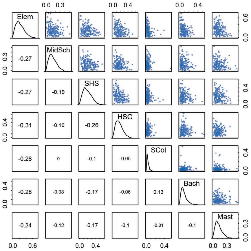
Figure 12.8. Posterior distribution of incremental education effects. Every additional level of education tends to add a little more disapproval, except for Some College (SCol), which adds very little, if anything.
| bC | -0.96 | 0.05 | -1.04 | -0.88 | 2237 | 1 |
|---|---|---|---|---|---|---|
| bI | -0.72 | 0.04 | -0.78 | -0.66 | 2051 | 1 |
| bA | -0.70 | 0.04 | -0.77 | -0.64 | 1995 | 1 |
This model seems to think that education is much more weakly associated with rating. This is possibly because the effect isn’t actually linear. Different levels have different incremental associations.
This example has been fine for teaching how to build ordered predictors. But from a causal perspective, a lurking concern must be whether the association with education is spurious. Education is highly correlated with age, because age causes (for lack of a better word) the completion of levels of education. So there is plausibly a backdoor from education through age to rating. In the practice problems at the end of the chapter, I’ll ask you to draw the DAG that this implies and investigate it with some new modeling.
12.5. Summary
This chapter introduced several new types of regression, all of which are generalizations of generalized linear models (GLMs). Ordered logistic models are useful for categorical outcomes with a strict ordering. They are built by attaching a cumulative link function to a categorical outcome distribution. Zero-inflated models mix together two different outcome distributions, allowing us to model outcomes with an excess of zeros. Models for overdispersion, such as beta-binomial and gamma-Poisson, draw the expected value of each observation from a distribution that changes shape as a function of a linear model. The next chapter further generalizes these model types by introducing multilevel models.
12.6. Practice
Problems are labeled Easy (E), Medium (M), and Hard (H).
12E1. What is the difference between an ordered categorical variable and an unordered one? Define and then give an example of each.
12E2. What kind of link function does an ordered logistic regression employ? How does it differ from an ordinary logit link?
12E3. When count data are zero-inflated, using a model that ignores zero-inflation will tend to induce which kind of inferential error?
12E4. Over-dispersion is common in count data. Give an example of a natural process that might produce over-dispersed counts. Can you also give an example of a process that might produce underdispersed counts?
12M1. At a certain university, employees are annually rated from 1 to 4 on their productivity, with 1 being least productive and 4 most productive. In a certain department at this certain university in a certain year, the numbers of employees receiving each rating were (from 1 to 4): 12, 36, 7, 41. Compute the log cumulative odds of each rating.
12M2. Make a version of Figure 12.5 for the employee ratings data given just above.
12M3. Can you modify the derivation of the zero-inflated Poisson distribution (ZIPoisson) from the chapter to construct a zero-inflated binomial distribution?
12H1. In 2014, a paper was published that was entitled “Female hurricanes are deadlier than male hurricanes.”191 As the title suggests, the paper claimed that hurricanes with female names have caused greater loss of life, and the explanation given is that people unconsciously rate female hurricanes as less dangerous and so are less likely to evacuate. Statisticians severely criticized the paper after publication. Here, you’ll explore the complete data used in the paper and consider the hypothesis that hurricanes with female names are deadlier. Load the data with:
12.38 library(rethinking)
data(Hurricanes)R code
Acquaint yourself with the columns by inspecting the help ?Hurricanes. In this problem, you’ll focus on predicting deaths using femininity of each hurricane’s name. Fit and interpret the simplest possible model, a Poisson model of deaths using femininity as a predictor. You can use quap or ulam. Compare the model to an intercept-only Poisson model of deaths. How strong is the association between femininity of name and deaths? Which storms does the model fit (retrodict) well? Which storms does it fit poorly?
12H2. Counts are nearly always over-dispersed relative to Poisson. So fit a gamma-Poisson (aka negative-binomial) model to predict deaths using femininity. Show that the over-dispersed model no longer shows as precise a positive association between femininity and deaths, with an 89% interval that overlaps zero. Can you explain why the association diminished in strength?
12H3. In the data, there are two measures of a hurricane’s potential to cause death: damage_norm and min_pressure. Consult ?Hurricanes for their meanings. It makes some sense to imagine that femininity of a name matters more when the hurricane is itself deadly. This implies an interaction between femininity and either or both of damage_norm and min_pressure. Fit a series of models evaluating these interactions. Interpret and compare the models. In interpreting the estimates, it may help to generate counterfactual predictions contrasting hurricanes with masculine and feminine names. Are the effect sizes plausible?
12H4. In the original hurricanes paper, storm damage (damage_norm) was used directly. This assumption implies that mortality increases exponentially with a linear increase in storm strength, because a Poisson regression uses a log link. So it’s worth exploring an alternative hypothesis: that the logarithm of storm strength is what matters. Explore this by using the logarithm of damage_norm as a predictor. Using the best model structure from the previous problem, compare a model that uses log(damage_norm) to a model that uses damage_norm directly. Compare their PSIS/WAIC values as well as their implied predictions. What do you conclude?
12H5. One hypothesis from developmental psychology, usually attributed to Carol Gilligan, proposes that women and men have different average tendencies in moral reasoning. Like most hypotheses in social psychology, it is descriptive, not causal. The notion is that women are more concerned with care (avoiding harm), while men are more concerned with justice and rights. Evaluate this hypothesis, using the Trolley data, supposing that contact provides a proxy for physical harm. Are women more or less bothered by contact than are men, in these data? Figure out the model(s) that is needed to address this question.
12H6. The data in data(Fish) are records of visits to a national park. See ?Fish for details. The question of interest is how many fish an average visitor takes per hour, when fishing. The problem is that not everyone tried to fish, so the fish_caught numbers are zero-inflated. As with the monks example in the chapter, there is a process that determines who is fishing (working) and another process that determines fish per hour (manuscripts per day), conditional on fishing (working). We want to model both. Otherwise we’ll end up with an underestimate of rate of fish extraction from the park.
You will model these data using zero-inflated Poisson GLMs. Predict fish_caught as a function of any of the other variables you think are relevant. One thing you must do, however, is use a proper Poisson offset/exposure in the Poisson portion of the zero-inflated model. Then use the hours variable to construct the offset. This will adjust the model for the differing amount of time individuals spent in the park.
12H7. In the trolley data—data(Trolley)—we saw how education level (modeled as an ordered category) is associated with responses. But is this association causal? One plausible confound is that education is also associated with age, through a causal process: People are older when they finish school than when they begin it. Reconsider the Trolley data in this light. Draw a DAG that represents hypothetical causal relationships among response, education, and age. Which statical model or models do you need to evaluate the causal influence of education on responses? Fit these models to the trolley data. What do you conclude about the causal relationships among these three variables?
12H8. Consider one more variable in the trolley data: Gender. Suppose that gender might influence education as well as response directly. Draw the DAG now that includes response, education, age, and gender. Using only the DAG, is it possible that the inferences from 12H7 above are confounded by gender? If so, define any additional models you need to infer the causal influence of education on response. What do you conclude?
13 Models With Memory
In the year 1985, Clive Wearing lost his mind, but not his music.192 Wearing was a musicologist and accomplished musician, but the same virus that causes cold sores, Herpes simplex, snuck into his brain and ate his hippocampus. The result was chronic anterograde amnesia—he cannot form new long-term memories. He remembers how to play the piano, though he cannot remember that he played it 5 minutes ago. Wearing now lives moment to moment, unaware of anything more than a few minutes into the past. Every cup of coffee is the first he has ever had.
Many statistical models also have anterograde amnesia. As the models move from one cluster—individual, group, location—in the data to another, estimating parameters for each cluster, they forget everything about the previous clusters. They behave this way, because the assumptions force them to. Any of the models from previous chapters that used dummy variables(page 153) to handle categories are programmed for amnesia. These models implicitly assume that nothing learned about any one category informs estimates for the other categories—the parameters are independent of one another and learn from completely separate portions of the data. This would be like forgetting you had ever been in a café, each time you go to a new café. Cafés do differ, but they are also alike.
Anterograde amnesia is bad for learning about the world. We want models that instead use all of the information in savvy ways. This does not mean treating all clusters as if they were the same. Instead it means learning simultaneously about each cluster while learning about the population of clusters. Doing both estimation tasks at the same time allows us to transfer information across clusters, and that transfer improves accuracy. That is the value of remembering.
Consider cafés again. Suppose we program a robot to visit two cafés, order coffee, and estimate the waiting times at each. The robot begins with a vague prior for the waiting times, say with a mean of 5 minutes and a standard deviation of 1. After ordering a cup of coffee at the first café, the robot observes a waiting time of 4 minutes. It updates its prior, using Bayes’ theorem of course, with this information. This gives it a posterior distribution for the waiting time at the first café.
Now the robot moves on to a second café. When this robot arrives at the next café, what is its prior? It could just use the posterior distribution from the first café as its prior for the second café. But that implicitly assumes that the two cafés have the same average waiting time. Cafés are all pretty much the same, but they aren’t identical. Likewise, it doesn’t make much sense to ignore the observation from the first café. That would be anterograde amnesia.
So how can the coffee robot do better? It needs to represent the population of cafés and learn about that population. The distribution of waiting times in the population becomes the prior for each café. But unlike priors in previous chapters, this prior is actually learned from the data. This means the robot tracks a parameter for each café as well as at least two parameters to describe the population of cafés: an average and a standard deviation. As the robot observes waiting times, it updates everything: the estimates for each café as well as the estimates for the population. If the population seems highly variable, then the prior is flat and uninformative and, as a consequence, the observations at any one café do very little to the estimate at another. If instead the population seems to contain little variation, then the prior is narrow and highly informative. An observation at any one café will have a big impact on estimates at any other café.
In this chapter, you’ll see the formal version of this argument and how it leads us to multilevel models. These models remember features of each cluster in the data as they learn about all of the clusters. Depending upon the variation among clusters, which is learned from the data as well, the model pools information across clusters. This pooling tends to improve estimates about each cluster. This improved estimation leads to several, more pragmatic sounding, benefits of the multilevel approach. I mentioned them in Chapter 1. They are worth repeating.
- Improved estimates for repeat sampling. When more than one observation arises from the same individual, location, or time, then traditional, single-level models either maximally underfit or overfit the data.
- Improved estimates for imbalance in sampling. When some individuals, locations, or times are sampled more than others, multilevel models automatically cope with differing uncertainty across these clusters. This prevents over-sampled clusters from unfairly dominating inference.
- Estimates of variation. If our research questions include variation among individuals or other groups within the data, then multilevel models are a big help, because they model variation explicitly.
- Avoid averaging, retain variation. Frequently, scholars pre-average some data to construct variables. This can be dangerous, because averaging removes variation, and there are also typically several different ways to perform the averaging. Averaging therefore both manufactures false confidence and introduces arbitrary data transformations. Multilevel models allow us to preserve the uncertainty and avoid data transformations.
All of these benefits flow out of the same strategy and model structure. You learn one basic design and you get all of this for free.
When it comes to regression, multilevel regression deserves to be the default approach. There are certainly contexts in which it would be better to use an old-fashioned single-level model. But the contexts in which multilevel models are superior are much more numerous. It is better to begin to build a multilevel analysis, and then realize it’s unnecessary, than to overlook it. And once you grasp the basic multilevel strategy, it becomes much easier to incorporate related tricks such as allowing for measurement error in the data and even modeling missing data itself (Chapter 15).
There are costs of the multilevel approach. The first is that we have to make some new assumptions. We have to define the distributions from which the characteristics of the clusters arise. Luckily, conservative maximum entropy distributions do an excellent job in this context. Second, there are new estimation challenges that come with the full multilevel approach. These challenges lead us headfirst into MCMC estimation. Third, multilevel models can be hard to understand, because they make predictions at different levels of the data. In
many cases, we are interested in only one or a few of those levels, and as a consequence, model comparison using metrics like DIC and WAIC becomes more subtle. The basic logic remains unchanged, but now we have to make more decisions about which parameters in the model we wish to focus on.
This chapter has the following progression. First, we’ll work through an extended example of building and fitting a multilevel model for clustered data. Then we’ll simulate clustered data, to demonstrate the improved accuracy the approach delivers. This improved accuracy arises from the same underfitting and overfitting trade-off you met in Chapter 7. Then we’ll finish by looking at contexts in which there is more than one type of clustering. All of this work lays a foundation for more advanced multilevel examples in the next two chapters.
Rethinking: A model by any other name. Multilevel models go by many different names, and some statisticians use the same names for different specialized variants, while others use them all interchangeably. The most common synonyms for “multilevel” are hierarchical and mixed effects. The type of parameters that appear in multilevel models are most commonly known as random effects, which itself can mean very different things to different analysts and in different contexts.193 And even the innocent term “level” can mean different things to different people. There’s really no cure for this swamp of vocabulary aside from demanding a mathematical or algorithmic definition of the model. Otherwise, there will always be ambiguity.
13.1. Example: Multilevel tadpoles
The heartwarming focus of this example are experiments exploring Reed frog (Hyperolius spinigularis) tadpole mortality.194 The natural history background to these data is very interesting. Take a look at the full paper, if amphibian life history dynamics interests you. But even if it doesn’t, load the data and acquaint yourself with the variables:
13.1 library(rethinking)
data(reedfrogs)
d <- reedfrogs
str(d)‘data.frame’: 48 obs. of 5 variables: $ density : int 10 10 10 10 10 10 10 10 10 10 … $ pred : Factor w/ 2 levels “no”,“pred”: 1 1 1 1 1 1 1 1 2 2 … $ size : Factor w/ 2 levels “big”,“small”: 1 1 1 1 2 2 2 2 1 1 … $ surv : int 9 10 7 10 9 9 10 9 4 9 … $ propsurv: num 0.9 1 0.7 1 0.9 0.9 1 0.9 0.4 0.9 …
For now, we’ll only be interested in number surviving, surv, out of an initial count, density. In the practice at the end of the chapter, you’ll consider the other variables, which are experimental manipulations.
There is a lot of variation in these data. Some of the variation comes from experimental treatment. But a lot of it comes from other sources. Think of each row as a “tank,” an experimental environment that contains tadpoles. There are lots of unmeasured things peculiar to each tank, and these unmeasured factors create variation in survival across tanks, even when all the predictor variables have the same value. These tanks are an example of a cluster variable. Multiple observations, the tadpoles in this case, are made within each cluster.
So we have repeat measures and heterogeneity across clusters. If we ignore the clusters, assigning the same intercept to each of them, then we risk ignoring important variation in baseline survival. This variation could mask association with other variables. If we instead estimate a unique intercept for each cluster, using a dummy variable for each tank, we instead practice anterograde amnesia. After all, tanks are different but each tank does help us estimate survival in the other tanks. So it doesn’t make sense to forget entirely, moving from one tank to another.
A multilevel model, in which we simultaneously estimate both an intercept for each tank and the variation among tanks, is what we want. This will be a varying intercepts model. Varying intercepts are the simplest kind of varying effects. 195 For each cluster in the data, we use a unique intercept parameter. This is no different than the categorical variable examples from previous chapters, except now we also adaptively learn the prior that is common to all of these intercepts. This adaptive learning is the absence of amnesia discussed at the start of the chapter. When what we learn about each cluster informs all the other clusters, we learn the prior simultaneous to learning the intercepts.
Here is a model for predicting tadpole mortality in each tank, using the regularizing priors of earlier chapters:
\[\begin{aligned} \mathbb{S}\_{l} &\sim \text{Binomial}(N\_{l}, p\_{l}) \\ \text{logit}(p\_{l}) &= \alpha\_{\text{raNx}[l]} \\ \alpha\_{j} &\sim \text{Normal}(\mathbf{0}, 1.5) \quad \text{for } j = 1..48 \end{aligned} \quad \text{[uniqueness log-odds for each tank]}\]
And you can approximate this posterior using ulam as in previous chapters:
R code
13.2 # make the tank cluster variable
d$tank <- 1:nrow(d)
dat <- list(
S = d$surv,
N = d$density,
tank = d$tank )
# approximate posterior
m13.1 <- ulam(
alist(
S ~ dbinom( N , p ) ,
logit(p) <- a[tank] ,
a[tank] ~ dnorm( 0 , 1.5 )
), data=dat , chains=4 , log_lik=TRUE )If you inspect the posterior, precis(m13.1,depth=2), you’ll see 48 different intercepts, one for each tank. To get each tank’s expected survival probability, just take one of the a values and then use the logistic transform. So far there is nothing new here.
Now let’s do the multilevel model, which adaptively pools information across tanks. All that is required to enable adaptive pooling is to make the prior for the a parameters a function of some new parameters. Here is the multilevel model, in mathematical form, with the
changes from the previous model highlighted in blue:
\[\begin{aligned} \text{S}\_{l} & \sim \text{Binomial}(\text{N}\_{l}, p\_{l}) \\ \text{logit}(p\_{l}) &= \alpha\_{\text{Tank}[l} \\ \alpha\_{j} & \sim \text{Normal}(\bar{\alpha}, \sigma) \\ \bar{\alpha} & \sim \text{Normal}(0, 1.5) \\ \sigma & \sim \text{Exponential}(1) \end{aligned} \tag{\text{quadripies prior}}\]
\[\sigma \sim \text{Exponential}(1) \text{ ( $\text{prior for standard deviation of tanks}$ )}\]
Notice that the prior for the tank intercepts is now a function of two parameters, α¯ and σ. You can say α¯ like “bar alpha.” The bar means average. These two parameters inside the prior is where the “multi” in multilevel arises.196 The Gaussian distribution with mean α¯ and standard deviation σ is the prior for each tank’s intercept. But that prior itself has priors for α¯ and σ. So there are two levels in the model, each resembling a simpler model. In the top level, the outcome is S, the parameters are the vector α, and the prior is αj ∼ Normal(¯α, σ). In the second level, the “outcome” variable is the vector of intercept parameters, α. The parameters are α¯ and σ, and their priors are α¯ ∼ Normal(0, 1.5) and σ ∼ Exponential(1).
These two parameters, α¯ and σ, are often referred to as hyperparameters. They are parameters for parameters. And their priors are often called hyperpriors. In principle, there is no limit to how many “hyper” levels you can install in a model. For example, different populations of tanks could be embedded within different regions of habitat. But in practice there are limits, both because of computation and our ability to understand the model.
Rethinking: Why Gaussian tanks? In the multilevel tadpole model, the population of tanks is assumed to be Gaussian. Why? The least satisfying answer is “convention.” The Gaussian assumption is extremely common. A more satisfying answer is “pragmatism.” The Gaussian assumption is easy to work with, and it generalizes easily to more than one dimension. This generalization will be important for handling varying slopes in the next chapter. But my preferred answer is instead “entropy.” If all we are willing to say about a distribution is the mean and variance, then the Gaussian is the most conservative assumption(Chapter 10). Using a Gaussian here does not force the resulting posterior distribution of α parameters to be symmetric or have a Gaussian shape. The only information in a Gaussian prior (or likelihood) is finite variance. The distribution looks symmetric, because if you don’t say how it is skewed, then symmetric is the maximum entropy shape. Above all, there is no rule requiring the Gaussian distribution of varying effects. So if you have a good reason to use another distribution, then do so. The practice problems at the end of the chapter provide an example.
Computing the posterior computes both levels simultaneously, in the same way that our robot at the start of the chapter learned both about each café and the variation among cafés. But you cannot fit this model with quap. Why? Because the probability of the data must now average over the level 2 parameters α¯ and σ. But quap just hill climbs, using static values for all of the parameters. It can’t see the levels. For more explanation, see the Overthinking box further down. You can however fit this model with ulam:
13.3 m13.2 <- ulam(
alist(
S ~ dbinom( N , p ) ,
logit(p) <- a[tank] ,
a[tank] ~ dnorm( a_bar , sigma ) ,
a_bar ~ dnorm( 0 , 1.5 ) ,sigma ~ dexp( 1 )
), data=dat , chains=4 , log_lik=TRUE )This model provides posterior distributions for 50 parameters: one overall sample intercept α¯, the standard deviation among tanks σ, and then 48 per-tank intercepts. Let’s check WAIC though to see the effective number of parameters. We’ll compare the earlier model, m13.1, with the new multilevel model:
R code
13.4 compare( m13.1 , m13.2 )WAIC SE dWAIC dSE pWAIC weight
m13.2 200.0 7.19 0.0 NA 20.9 1
m13.1 215.9 4.43 15.9 4.03 26.2 0There are two facts to note here. First, the multilevel model has only 21 effective parameters. There are 28 fewer effective parameters than actual parameters, because the prior assigned to each intercept shrinks them all towards the mean α¯. In this case, the prior is reasonably strong. Check the mean of sigma with precis and you’ll see it’s around 1.6. This is a regularizing prior, like you’ve used in previous chapters, but now the amount of regularization has been learned from the data itself.197 Second, notice that the multilevel model m13.2 has fewer effective parameters than the ordinary fixed model m13.1. This is despite the fact that the ordinary model has fewer actual parameters, only 48 instead of 50. The extra two parameters in the multilevel model allowed it to learn a more aggressive regularizing prior, to adaptively regularize. This resulted in a less flexible posterior and therefore fewer effective parameters.
Overthinking: QUAP fails, MCMC succeeds. Why doesn’t simple quadratic approximation, using for example quap, work with multilevel models? When a prior is itself a function of parameters, there are two levels of uncertainty. This means that the probability of the data, conditional on the parameters, must average over each level. Ordinary quadratic approximation cannot handle the averaging in the likelihood, because in general it’s not possible to derive an analytical solution. That means there is no unified function for calculating the log-posterior. So your computer cannot directly find its minimum (the maximum of the posterior). Some other computational approach is needed. It is possible to extend the mode-finding optimization strategy to these models, but we don’t want to be stuck with optimization in general. One reason is that the posterior of these models is routinely non-Gaussian. Another is that optimization tends to be fragile in high dimensions.
Stan actually does optimization. See ?optimizing. This is sometimes useful for getting an initial estimate or verifying that your model compiles and runs.
To appreciate the impact of this adaptive regularization, let’s plot and compare the posterior means from models m13.1 and m13.2. The code that follows is long, only because it decorates the plot with informative labels. The basic code is just the first part, which extracts samples and computes means.
R code13.5 # extract Stan samples
post <- extract.samples(m13.2)
# compute mean intercept for each tank# also transform to probability with logistic
d$propsurv.est <- logistic( apply( post$a , 2 , mean ) )
# display raw proportions surviving in each tank
plot( d$propsurv , ylim=c(0,1) , pch=16 , xaxt="n" ,
xlab="tank" , ylab="proportion survival" , col=rangi2 )
axis( 1 , at=c(1,16,32,48) , labels=c(1,16,32,48) )
# overlay posterior means
points( d$propsurv.est )
# mark posterior mean probability across tanks
abline( h=mean(inv_logit(post$a_bar)) , lty=2 )
# draw vertical dividers between tank densities
abline( v=16.5 , lwd=0.5 )
abline( v=32.5 , lwd=0.5 )
text( 8 , 0 , "small tanks" )
text( 16+8 , 0 , "medium tanks" )
text( 32+8 , 0 , "large tanks" )You can see the result in Figure 13.1. The horizontal axis is tank index, from 1 to 48. The vertical is proportion of survivors in a tank. The filled blue points show the raw proportions, computed from the observed counts. These values are already present in the data frame, in the propsurv column. The black circles are instead the varying intercepts. The horizontal dashed line at about 0.8 is the estimated median survival proportion in the population of tanks, α. It is not the same as the empirical mean survival. The vertical lines divide tanks with different initial counts of tadpoles—10 (left), 25 (middle), and 35 (right).
First, notice that in every case, the multilevel estimate is closer to the dashed line than the raw empirical estimate is. It’s as if the entire distribution of black circles has been shrunk towards the dashed line at the center of the data, leaving the blue points behind on the outside. This phenomenon is sometimes called shrinkage, and it results from regularization (as in Chapter 7). Second, notice that the estimates for the smaller tanks have shrunk farther from the blue points. As you move from left to right in the figure, the initial densities of tadpoles increase from 10 to 25 to 35, as indicated by the vertical dividers. In the smallest tanks, it is easy to see differences between the open estimates and empirical blue points. But in the largest tanks, there is little difference between the blue points and open circles. Varying intercepts for the smaller tanks, with smaller sample sizes, shrink more. Third, note that the farther a blue point is from the dashed line, the greater the distance between it and the corresponding multilevel estimate. Shrinkage is stronger, the further a tank’s empirical proportion is from the global average α.
All three of these phenomena arise from a common cause: pooling information across clusters (tanks) to improve estimates. What pooling means here is that each tank provides information that can be used to improve the estimates for all of the other tanks. Each tank helps in this way, because we made an assumption about how the varying log-odds in each tank related to all of the others. We assumed a distribution, the normal distribution in this case. Once we have a distributional assumption, we can use Bayes’ theorem to optimally (in the small world only) share information among the clusters.
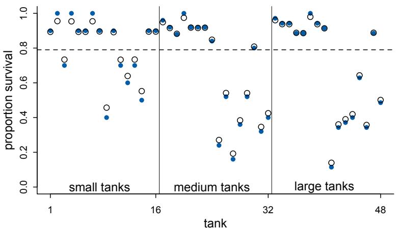
Figure 13.1. Empirical proportions of survivors in each tadpole tank, shown by the filled blue points, plotted with the 48 per-tank parameters from the multilevel model, shown by the black circles. The dashed line locates the average proportion of survivors across all tanks. The vertical lines divide tanks with different initial densities of tadpoles: small tanks (10 tadpoles), medium tanks (25), and large tanks (35). In every tank, the posterior mean from the multilevel model is closer to the dashed line than the empirical proportion is. This reflects the pooling of information across tanks, to help with inference about each tank.
What does the inferred population distribution of survival look like? We can visualize it by sampling from the posterior distribution, as usual. First we’ll plot 100 Gaussian distributions, one for each of the first 100 samples from the posterior distribution of both α and σ. Then we’ll sample 8000 new log-odds of survival for individual tanks. The result will be a posterior distribution of variation in survival in the population of tanks. Before we do the sampling though, remember that “sampling” from a posterior distribution is not a simulation of empirical sampling. It’s just a convenient way to characterize and work with the uncertainty in the distribution. Now the sampling:
R code
13.6 # show first 100 populations in the posterior
plot( NULL , xlim=c(-3,4) , ylim=c(0,0.35) ,
xlab="log-odds survive" , ylab="Density" )
for ( i in 1:100 )
curve( dnorm(x,post$a_bar[i],post$sigma[i]) , add=TRUE ,
col=col.alpha("black",0.2) )
# sample 8000 imaginary tanks from the posterior distribution
sim_tanks <- rnorm( 8000 , post$a_bar , post$sigma )
# transform to probability and visualize
dens( inv_logit(sim_tanks) , lwd=2 , adj=0.1 )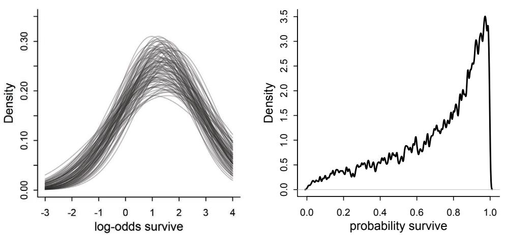
Figure 13.2. The inferred population of survival across tanks. Left: 100 Gaussian distributions of the log-odds of survival, sampled from the posterior of m13.2. Right: Survival probabilities for 8000 new simulated tanks, averaging over the posterior distribution on the left.
The results are displayed in Figure 13.2. Notice that there is uncertainty about both the location, α, and scale, σ, of the population distribution of log-odds of survival. All of this uncertainty is propagated into the simulated probabilities of survival.
Rethinking: Varying intercepts as over-dispersion. In the previous chapter (page 369), the betabinomial and gamma-Poisson models were presented as ways for coping with over-dispersion of count data. Varying intercepts accomplish the same thing, allowing count outcomes to be overdispersed. They accomplish this, because when each observed count gets its own unique intercept, but these intercepts are pooled through a common distribution, the predictions expect over-dispersion just like a beta-binomial or gamma-Poisson model would. Multilevel models are also mixtures. Compared to a beta-binomial or gamma-Poisson model, a binomial or Poisson model with a varying intercept on every observed outcome will often be easier to estimate and easier to extend. There will be an example of this approach, later in this chapter.
Overthinking: Priors for variance components. The examples in this book use weakly regularizing exponential priors for variance components, the σ parameters that estimate the variation across clusters in the data. These exponential priors work very well in routine multilevel modeling. They express only a rough notion of an average standard deviation and regularize towards zero. But there are two common contexts in which they can be problematic. First, sometimes there isn’t much information in the data with which to estimate the variance. For example, if you only have 5 clusters, then that’s something like trying to estimate a variance with 5 data points. In that case, you might need something much more informative. Second, in non-linear models with logit and log links, floor and ceiling effects sometimes render extreme values of the variance equally plausible as more realistic values. In such cases, the trace plot for the variance parameters may swing around over very large values. It can do this, because the exponential prior has a long tail. Such large values are typically a priori impossible. Often, the chain will still sample validly, but it might be highly inefficient, exhibiting small n_eff values and possibly many divergent transitions.
To improve such a model, instead of using exponential priors for the variance components, you can use half-Normal priors or some other prior with a thin tail. A half-Normal is a Normal distribution with all mass above zero. It is just cut off below zero. For example:
\[\begin{aligned} \mathsf{S}\_{i} &\sim \text{Binomial}(N\_{i}, p\_{i}) \\ \mathsf{logit}(p\_{i}) &= \alpha\_{\text{TANK}[i]} \\ \alpha\_{j} &\sim \text{Normal}(\bar{\alpha}, \sigma) \\ \alpha &\sim \text{Normal}(0, 1.5) \\ \sigma &\sim \text{Half-Normal}(0, 1) \end{aligned}\]
Inside an ulam formula, you’d use dhalfnorm. Inside a Stan model, you just assign a lower bound to the parameter of lower=0.
13.2. Varying effects and the underfitting/overfitting trade-off
Varying intercepts are just regularized estimates, but adaptively regularized by estimating how diverse the clusters are while estimating the features of each cluster. This fact is not easy to grasp, so if it still seems mysterious, this section aims to further relate the properties of multilevel estimates to the foundational underfitting/overfitting dilemma from Chapter 7.
A major benefit of using varying effects estimates, instead of the empirical raw estimates, is that they provide more accurate estimates of the individual cluster (tank) intercepts.198 On average, the varying effects actually provide a better estimate of the individual tank (cluster) means. The reason that the varying intercepts provide better estimates is that they do a better job of trading off underfitting and overfitting.
To understand this in the context of the reed frog example, suppose that instead of experimental tanks we had natural ponds, so that we might be concerned with making predictions for the same clusters in the future. We’ll approach the problem of predicting future survival in these ponds, from three perspectives:
- Complete pooling. This means we assume that the population of ponds is invariant, the same as estimating a common intercept for all ponds.
- No pooling. This means we assume that each pond tells us nothing about any other pond. This is the model with amnesia.
- Partial pooling. This means using an adaptive regularizing prior, as in the previous section.
First, suppose you ignore the varying intercepts and just use the overall mean across all ponds, α, to make your predictions for each pond. A lot of data contributes to your estimate of α, and so it can be quite precise. However, your estimate of α is unlikely to exactly match the mean of any particular pond. As a result, the total sample mean underfits the data. This is the complete pooling approach, pooling the data from all ponds to produce a single estimate that is applied to every pond. This sort of model is equivalent to assuming that the variation among ponds is zero—all ponds are identical.
Second, suppose you use the survival proportions for each pond to make predictions. This means using a separate intercept for each pond. The blue points in Figure 13.1 are this same kind of estimate. In each particular pond, quite little data contributes to each estimate, and so these estimates are rather imprecise. This is particularly true of the smaller ponds, where less data goes into producing the estimates. As a consequence, the error of these estimates is high, and they are rather overfit to the data. Standard errors for each intercept can
be very large, and in extreme cases, even infinite. These are sometimes called the no pooling estimates. No information is shared across ponds. It’s like assuming that the variation among ponds is infinite, so nothing you learn from one pond helps you predict another.
Third, when you estimate varying intercepts, you use partial pooling of information to produce estimates for each cluster that are less underfit than the grand mean and less overfit than the no-pooling estimates. As a consequence, they tend to be better estimates of the true per-cluster (per-pond) means. This will be especially true when ponds have few tadpoles in them, because then the no pooling estimates will be especially overfit. When a lot of data goes into each pond, then there will be less difference between the varying effect estimates and the no pooling estimates.
To demonstrate this fact, we’ll simulate some tadpole data. That way, we’ll know the true per-pond survival probabilities. Then we can compare the no-pooling estimates to the partial pooling estimates, by computing how close each gets to the true values they are trying to estimate. The rest of this section shows how to do such a simulation.
Learning to simulate and validate models and model fitting in this way is extremely valuable. Once you start using more complex models, you will want to ensure that your code is working and that you understand the model. You can help in this project by simulating data from the model, with specified parameter values, and then making sure that your method of estimation can recover the parameters within tolerable ranges of precision. Even just simulating data from a model structure has a huge impact on understanding.
13.2.1. The model. The first step is to define the model we’ll be using. I’ll use the same basic multilevel binomial model as before, but now with “ponds” instead of “tanks”:
Si ∼ Binomial(Ni , pi) logit(pi) = αpond[i] αj ∼ Normal(¯α, σ) α¯ ∼ Normal(0, 1.5) σ ∼ Exponential(1)
So to simulate data from this process, we need to assign values to:
- • α¯, the average log-odds of survival in the entire population of ponds
- • σ, the standard deviation of the distribution of log-odds of survival among ponds
- • α, a vector of individual pond intercepts, one for each pond
We’ll also need to assign sample sizes, Ni , to each pond. But once we’ve made all of those choices, we can easily simulate counts of surviving tadpoles, straight from the top-level binomial process, using rbinom. We’ll do it all one step at a time.
Note that the priors are part of the model when we estimate, but not when we simulate. Why? Because priors are epistemology, not ontology. They represent the initial state of information of our robot, not a statement about how nature chooses parameter values.
13.2.2. Assign values to the parameters. I’m going to assign specific values representative of the actual tadpole data, to make the upcoming plot that demonstrates the increased accuracy of the varying effects estimates. But you can come back to this step later and change them to whatever you want.
Here’s the code to initialize the values of α, σ, the number of ponds, and the sample size ni in each pond.
R code
13.7 a_bar <- 1.5
sigma <- 1.5
nponds <- 60
Ni <- as.integer( rep( c(5,10,25,35) , each=15 ) )I’ve chosen 60 ponds, with 15 each of initial tadpole density 5, 10, 25, and 35. I’ve chosen these densities to illustrate how the error in prediction varies with sample size. The use of as.integer in the last line arises from a subtle issue with how Stan, and therefore ulam, works. See the Overthinking box at the bottom of the page for an explanation.
The values α¯ = 1.4 and σ = 1.5 define a Gaussian distribution of individual pond logodds of survival. So now we need to simulate all 60 of these intercept values from the implied Gaussian distribution with mean α¯ and standard deviation σ:
R code13.8 set.seed(5005)
a_pond <- rnorm( nponds , mean=a_bar , sd=sigma )Go ahead and inspect the contents of a_pond. It should contain 60 log-odds values, one for each simulated pond.
Finally, let’s bundle some of this information in a data frame, just to keep it organized.
R code
13.9 dsim <- data.frame( pond=1:nponds , Ni=Ni , true_a=a_pond )Go ahead and inspect the contents of dsim, the simulated data. The first column is the pond index, 1 through 60. The second column is the initial tadpole count in each pond. The third column is the true log-odds survival for each pond.
Overthinking: Data types and Stan models. There are two basic types of numerical data in R, integers and real values. A number like “3” could be either. Inside your computer, integers and real (“numeric”) values are represented differently. For example, here is the same vector of values generated as both:
R code
13.10 class(1:3)
class(c(1,2,3))[1] “integer” [1] “numeric”
Usually, you don’t have to manage these types, because R manages them for you. But when you pass values to Stan, or another external program, often the internal representation does matter. In particular, Stan and ulam sometimes require explicit integers. For example, in a binomial model, the “size” variable that specifies the number of trials must be of integer type. Stan may provide a mysterious warning message about a function not being found, when the size variable is instead of “real” type, or what R calls numeric. Using as.integer before passing the data to Stan or ulam will resolve the issue.
13.2.3. Simulate survivors. Now we’re ready to simulate the binomial survival process. Each pond i has ni potential survivors, and nature flips each tadpole’s coin, so to speak, with probability of survival pi . This probability pi is implied by the model definition, and is equal to:
\[p\_i = \frac{\exp(\alpha\_i)}{1 + \exp(\alpha\_i)}\]
The model uses a logit link, and so the probability is defined by the logistic function.
Putting the logistic into the random binomial function, we can generate a simulated survivor count for each pond:
\[\text{R-disin\ $}\$ \text{i } \leftarrow \text{ r\`brinon}(\text{ } n\text{pounds }\text{ }, \text{ prob\` } \text{\"Logistic\` } (\text{d\`sin\ $}\text{\`true\` }, \text{a}) \quad , \text{ s\`ize\`=d\$ } \text{\`in\ $}\$ \text{\`if } \text{\`l} \quad \quad \quad \quad \quad \quad \quad \quad \quad \quad \quad \quad \quad \quad \quad \quad \quad \quad \quad \quad \quad \quad \quad \quad \quad \quad \quad \quad \quad \quad \quad \quad \quad \quad \quad \quad \quad \quad \quad \quad \quad \quad \quad \quad \quad \quad \quad \quad \quad \quad \quad \quad \quad \quad \quad \quad \quad \quad \quad \quad \quad \quad \quad \quad \quad \quad \quad \quad \quad \quad \quad \quad \quad \quad \quad \quad \quad \quad \quad \quad \quad \quad \quad \quad \quad \quad \quad \quad \quad \quad \quad \quad \quad \quad \quad \quad \quad \quad \quad \quad \quad \quad \quad \quad \quad \quad \quad \quad \quad \quad \quad \quad \quad \quad \quad \quad \quad \quad \quad \quad \quad \quad \quad \quad \quad \quad \quad \quad \quad \quad \quad \quad \quad \quad \quad \quad \quad \quad \quad \quad \quad \quad \quad \quad \quad \quad \quad \quad \quad \quad \quad \quad \quad \quad \quad \quad \quad \quad \quad \quad \quad \quad \quad \quad \quad \quad \quad \quad \quad \quad \quad \quad \quad \quad \quad \quad \quad \quad \quad \quad \quad \quad \quad \quad \quad \quad \quad \quad \quad \quad \quad \quad \quad \quad \quad \quad \quad \quad \quad \quad \quad \quad \quad\]
As usual with R, if you give it a list of values, it returns a new list of the same length. In the above, each paired αi (dsim$true_a) and Ni (dsim$Ni) is used to generate a random survivor count with the appropriate probability of survival and maximum count. These counts are stored in a new column in dsim.
13.2.4. Compute the no-pooling estimates. We’re ready to start analyzing the simulated data now. The easiest task is to just compute the no-pooling estimates. We can accomplish this straight from the empirical data, just by calculating the proportion of survivors in each pond. I’ll keep these estimates on the probability scale, instead of translating them to the log-odds scale, because we’ll want to compare the quality of the estimates on the probability scale later.
| dsim$p_nopool <- dsim$Si / dsim$Ni |
R code 13.12 |
|
|---|---|---|
| ————————————————— | – | —————– |
Now there’s another column in dsim, containing the empirical proportions of survivors in each pond. These are the same no-pooling estimates you’d get by fitting a model with a dummy variable for each pond and flat priors that induce no regularization.
13.2.5. Compute the partial-pooling estimates. Now to fit the model to the simulated data, using ulam. I’ll use a single long chain in this example, but keep in mind that you need to use multiple chains to check convergence to the right posterior distribution. In this case, it’s safe. But don’t get cocky.
13.13 dat <- list( Si=dsim$Si , Ni=dsim$Ni , pond=dsim$pond )
m13.3 <- ulam(
alist(
Si ~ dbinom( Ni , p ),
logit(p) <- a_pond[pond],
a_pond[pond] ~ dnorm( a_bar , sigma ),
a_bar ~ dnorm( 0 , 1.5 ),
sigma ~ dexp( 1 )
), data=dat , chains=4 )We’ve fit the basic varying intercept model above. You can take a look at the estimates for α¯ and σ with the usual precis approach:
R code
13.14 precis( m13.3 , depth=2 )mean sd 5.5% 94.5% n_eff Rhat
a_pond[1] 0.29 0.81 -0.97 1.59 3225 1.00
a_pond[2] 2.76 1.15 1.13 4.78 2050 1.00
...
a_pond[59] 1.87 0.46 1.17 2.66 3579 1.00
a_pond[60] 2.38 0.55 1.58 3.32 2829 1.00
a_bar 1.82 0.22 1.48 2.19 1706 1.00
sigma 1.41 0.21 1.11 1.78 708 1.01I’ve abbreviated the output, since there are 60 intercept parameters, one for each pond.
Now let’s compute the predicted survival proportions and add those proportions to our growing simulation data frame. To indicate that it contains the partial pooling estimates, I’ll call the column p_partpool.
R code13.15 post <- extract.samples( m13.3 )
dsim$p_partpool <- apply( inv_logit(post$a_pond) , 2 , mean )If we want to compare to the true per-pond survival probabilities used to generate the data, then we’ll also need to compute those, using the true_a column:
R code
13.16 dsim$p_true <- inv_logit( dsim$true_a )The last thing we need to do, before we can plot the results and realize the point of this lesson, is to compute the absolute error between the estimates and the true varying effects. This is easy enough, using the existing columns:
R code
13.17 nopool_error <- abs( dsim$p_nopool - dsim$p_true )
partpool_error <- abs( dsim$p_partpool - dsim$p_true )Now we’re ready to plot. This is enough to get the basic display:
R code
13.18 plot( 1:60 , nopool_error , xlab="pond" , ylab="absolute error" ,
col=rangi2 , pch=16 )
points( 1:60 , partpool_error )I’ve decorated this plot with some additional information, displayed in Figure 13.3. The filled blue points in Figure 13.3 display the no-pooling estimates. The black circles show the varying effect estimates. The horizontal axis is the pond index, from 1 through 60. The vertical axis is the distance between the mean estimated probability of survival and the actual probability of survival. So points close to the bottom had low error, while those near the top had a large error, more than 20% off in some cases. The vertical lines divide the groups of ponds with different initial densities of tadpoles. And finally, the horizontal blue and black line segments show the average error of the no-pooling and partial pooling estimates, respectively, for each group of ponds with the same initial size. You can calculate these average error rates using aggregate:
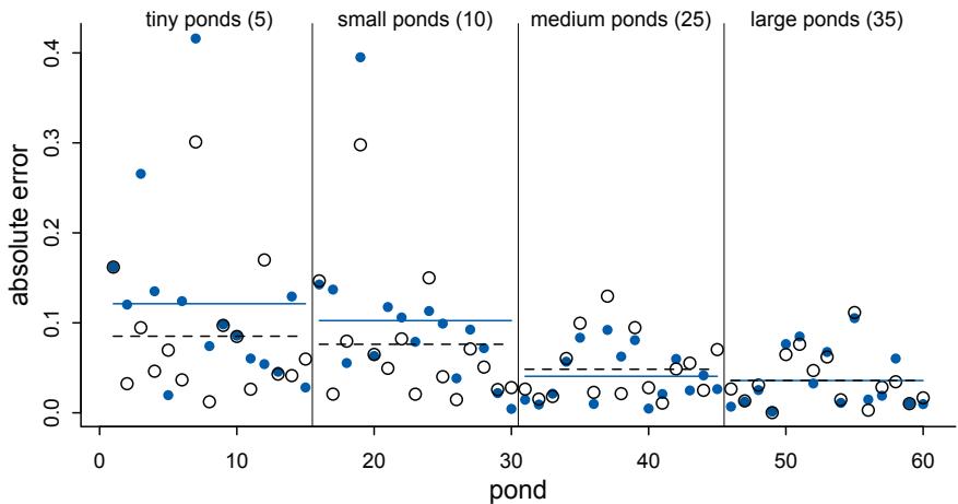
Figure 13.3. Error of no-pooling and partial pooling estimates, for the simulated tadpole ponds. The horizontal axis displays pond number. The vertical axis measures the absolute error in the predicted proportion of survivors, compared to the true value used in the simulation. The higher the point, the worse the estimate. No-pooling shown in blue. Partial pooling shown in black. The blue and dashed black lines show the average error for each kind of estimate, across each initial density of tadpoles (pond size). Smaller ponds produce more error, but the partial pooling estimates are better on average, especially in smaller ponds.
R code
13.19 nopool_avg <- aggregate(nopool_error,list(dsim$Ni),mean)
partpool_avg <- aggregate(partpool_error,list(dsim$Ni),mean)The first thing to notice about Figure 13.3 plot is that both kinds of estimates are much more accurate for larger ponds, on the right side. This arises because more data means better estimates, assuming there is no confounding. If there is confounding, more data may just makes things worse. But there is no confounding in this simulated example. In the small ponds, sample size is small, and neither no-pooling nor partial-pooling can work magic. Therefore, prediction suffers on the left side of the plot. Second, note that the blue line is always above or very close to the black dashed line. This indicates that the no-pool estimates, shown by the blue points, have higher average error in each group of ponds, except for the medium ponds. Partial pooling isn’t always better. It’s just better on average in the long run. Even though both kinds of estimates get worse as sample size decreases, the varying effect estimates have the advantage, on average. Third, the distance between the blue line and the black dashed line grows as ponds get smaller. So while both kinds of estimates suffer from reduced sample size, the partial pooling estimates suffer less.
The pattern displayed in the figure is representative, but only one random simulation. To see how to quickly re-run the model on newly simulated data, without re-compiling the model, see the Overthinking box at the end of this section.
Okay, so what are we to make of all of this? Remember, back in Figure 13.1 (page 406), the smaller tanks demonstrated more shrinkage towards the mean. Here, the ponds with the smallest sample size show the greatest improvement over the naive no-pooling estimates. This is no coincidence. Shrinkage towards the mean results from trying to negotiate the underfitting and overfitting risks of the grand mean on one end and the individual means of each pond on the other. The smaller tanks/ponds contain less information, and so their varying estimates are influenced more by the pooled information from the other ponds. In other words, small ponds are prone to overfitting, and so they receive a bigger dose of the underfit grand mean. Likewise, the larger ponds shrink much less, because they contain more information and are prone to less overfitting. Therefore they need less correcting. When individual ponds are very large, pooling in this way does hardly anything to improve estimates, because the estimates don’t have far to go. But in that case, they also don’t do any harm, and the information pooled from them can substantially help prediction in smaller ponds.
The partially pooled estimates are better on average. They adjust individual cluster (pond) estimates to negotiate the trade-off between underfitting and overfitting. This is a form of regularization, just like in Chapter 7, but now with an amount of regularization that is learned from the data itself.
But there are some cases in which the no-pooling estimates are better. These exceptions often result from ponds with extreme probabilities of survival. The partial pooling estimates shrink such extreme ponds towards the mean, because few ponds exhibit such extreme behavior. But sometimes outliers really are outliers.
Overthinking: Repeating the pond simulation. This model samples pretty quickly. Compiling the model takes up most of the execution time. Luckily the compilation only has to be done once. Then you can pass new data to the compiled model and get new estimates. Once you’ve compiled m13.3 once, you can use this code to re-simulate ponds and sample from the new posterior, without waiting for the model to compile again:
R code13.20 a <- 1.5
sigma <- 1.5
nponds <- 60
Ni <- as.integer( rep( c(5,10,25,35) , each=15 ) )
a_pond <- rnorm( nponds , mean=a , sd=sigma )
dsim <- data.frame( pond=1:nponds , Ni=Ni , true_a=a_pond )
dsim$Si <- rbinom( nponds,prob=inv_logit( dsim$true_a ),size=dsim$Ni )
dsim$p_nopool <- dsim$Si / dsim$Ni
newdat <- list(Si=dsim$Si,Ni=dsim$Ni,pond=1:nponds)
m13.3new <- stan( fit=m13.3@stanfit , data=newdat , chains=4 )
post <- extract.samples( m13.3new )
dsim$p_partpool <- apply( inv_logit(post$a_pond) , 2 , mean )
dsim$p_true <- inv_logit( dsim$true_a )
nopool_error <- abs( dsim$p_nopool - dsim$p_true )
partpool_error <- abs( dsim$p_partpool - dsim$p_true )
plot( 1:60 , nopool_error , xlab="pond" , ylab="absolute error" , col=rangi2 , pch=16 )
points( 1:60 , partpool_error )The stan function reuses the compiled model in m13.3, which is stored in the stanfit slot, passes it the new data, and returns the new samples in m13.3new. This is a useful trick, in case you want to perform a simulation study of a particular model structure.
13.3. More than one type of cluster
We can use and often should use more than one type of cluster in the same model. For example, the observations in data(chimpanzees), which you met back in Chapter 11, are lever pulls. Each pull is within a cluster of pulls belonging to an individual chimpanzee. But each pull is also within an experimental block, which represents a collection of observations that happened on the same day. So each observed pull belongs to both an actor (1 to 7) and a block (1 to 6). There may be unique intercepts for each actor as well as for each block.
So in this section we’ll reconsider the chimpanzees data, using both types of clusters simultaneously. This will allow us to use partial pooling on both categorical variables, actor and block, at the same time. We’ll also get estimates of the variation among actors and among blocks.
Rethinking: Cross-classification and hierarchy. The kind of data structure in data(chimpanzees) is usually called a cross-classified multilevel model. It is cross-classified, because actors are not nested within unique blocks. If each chimpanzee had instead done all of his or her pulls on a single day, within a single block, then the data structure would instead be hierarchical. However, the model specification would typically be the same. So the model structure and code you’ll see below will apply both to cross-classified designs and hierarchical designs. Other software sometimes forces you to treat these differently, on account of using a conditioning engine substantially less capable than MCMC. There are other types of “hierarchical” multilevel models, types that make adaptive priors for adaptive priors. It’s turtles all the way down, recall(page 14). You’ll see an example in the next chapter. But for the most part, people (or their software) nearly always use the same kind of model in both cases.
13.3.1. Multilevel chimpanzees. Let’s proceed by taking the chimpanzees model from Chapter 11 (m11.4, page 330) and add varying intercepts. To add varying intercepts to this model, we just replace the fixed regularizing prior with an adaptive prior. We’ll also add a second cluster type. To add the second cluster type, block, we merely replicate the structure for the actor cluster. This means the linear model gets yet another varying intercept, αblock[i] , and the model gets another adaptive prior and yet another standard deviation parameter.
Here is the mathematical form of the model, with the new pieces of the machine highlighted in blue:
\[\begin{aligned} L\_i &\sim \text{Binomial}(1, p\_i) \\ \text{logit}(p\_i) &= \alpha\_{\text{ACTOR}[i]} + \gamma\_{\text{BLOG}[i]} + \beta\_{\text{TEACTMIN}[i]} \\ \beta\_j &\sim \text{Normal}(0, 0.5) \\ \alpha\_j &\sim \text{Normal}(\bar{\alpha}, \sigma\_\alpha) \\ \gamma\_j &\sim \text{Normal}(0, \sigma\_\gamma) \\ \bar{\alpha} &\sim \text{Normal}(0, 1.5) \\ \sigma\_\alpha &\sim \text{Exponential}(1) \\ \sigma\_\gamma &\sim \text{Exponential}(1) \end{aligned}\]
Each cluster gets its own vector of parameters. For actors, the vector is α, and it has length 7, because there are 7 chimpanzees in the sample. For blocks, the vector is γ, and it has length 6, because there are 6 blocks. Each cluster variable needs its own standard deviation parameter that adapts the amount of pooling across units, be they actors or blocks. These are σα and σγ, respectively. Finally, note that there is only one global mean parameter α¯. We can’t identify a separate mean for each varying intercept type, because both intercepts are added to the same linear prediction. If you do include a mean for each cluster type, it won’t be the end of the world, however. It’ll be like the right leg and left leg example from Chapter 6.
Now to run the model that uses both actor and block:
R code
13.21 library(rethinking)
data(chimpanzees)
d <- chimpanzees
d$treatment <- 1 + d$prosoc_left + 2*d$condition
dat_list <- list(
pulled_left = d$pulled_left,
actor = d$actor,
block_id = d$block,
treatment = as.integer(d$treatment) )
set.seed(13)
m13.4 <- ulam(
alist(
pulled_left ~ dbinom( 1 , p ) ,
logit(p) <- a[actor] + g[block_id] + b[treatment] ,
b[treatment] ~ dnorm( 0 , 0.5 ),
## adaptive priors
a[actor] ~ dnorm( a_bar , sigma_a ),
g[block_id] ~ dnorm( 0 , sigma_g ),
## hyper-priors
a_bar ~ dnorm( 0 , 1.5 ),
sigma_a ~ dexp(1),
sigma_g ~ dexp(1)
) , data=dat_list , chains=4 , cores=4 , log_lik=TRUE )You’ll end up with 2000 samples from 4 independent chains. As always, be sure to inspect the trace plots and the diagnostics. As soon as you start trusting the machine, the machine will betray your trust. In this case, you should see a warning about divergent transitions:
Warning messages: 1: There were 22 divergent transitions after warmup.
The model did actually sample fine. But these warnings indicate that it had some trouble efficiently exploring the posterior. In the next section, I’ll show you how to fix this. For now, we can keep moving and interpret the posterior.
This is easily the most complicated model we’ve used in the book so far. So let’s look at the posterior and take note of a few important features:
R code
13.22 precis( m13.4 , depth=2 )
plot( precis(m13.4,depth=2) ) # also plot
mean sd 5.5% 94.5% n_eff Rhatb[1] -0.12 0.30 -0.59 0.39 158 1.03| b[2] | 0.40 | 0.30 | -0.07 | 0.88 | 310 | 1.02 |
|---|---|---|---|---|---|---|
| b[3] | -0.48 | 0.30 | -0.96 | 0.00 | 515 | 1.01 |
| b[4] | 0.30 | 0.31 | -0.17 | 0.80 | 186 | 1.02 |
| a[1] | -0.37 | 0.36 | -0.94 | 0.24 | 446 | 1.01 |
| a[2] | 4.61 | 1.20 | 2.98 | 6.83 | 915 | 1.01 |
| a[3] | -0.67 | 0.36 | -1.24 | -0.08 | 709 | 1.01 |
| a[4] | -0.68 | 0.37 | -1.26 | -0.09 | 235 | 1.02 |
| a[5] | -0.37 | 0.36 | -0.93 | 0.19 | 338 | 1.01 |
| a[6] | 0.57 | 0.35 | 0.01 | 1.12 | 560 | 1.01 |
| a[7] | 2.09 | 0.45 | 1.41 | 2.82 | 721 | 1.01 |
| g[1] | -0.17 | 0.22 | -0.57 | 0.07 | 426 | 1.01 |
| g[2] | 0.05 | 0.18 | -0.19 | 0.36 | 921 | 1.01 |
| g[3] | 0.05 | 0.19 | -0.22 | 0.39 | 1062 | 1.01 |
| g[4] | 0.02 | 0.18 | -0.25 | 0.31 | 939 | 1.01 |
| g[5] | -0.02 | 0.18 | -0.31 | 0.24 | 873 | 1.00 |
| g[6] | 0.12 | 0.19 | -0.11 | 0.49 | 533 | 1.01 |
| a_bar | 0.58 | 0.74 | -0.58 | 1.79 | 800 | 1.00 |
| sigma_a | 2.00 | 0.66 | 1.17 | 3.16 | 1106 | 1.00 |
| sigma_g | 0.21 | 0.17 | 0.03 | 0.52 | 229 | 1.02 |
The precis plot is shown in the left-hand part of Figure 13.4 (page 418).
First, notice that the number of effective samples, n_eff, varies quite a lot across parameters. This is common in complex models. Why? There are many reasons for this. But in this sort of model a common reason is that some parameter spends a lot of time near a boundary. Here, that parameter is sigma_g. It spends a lot of time near its minimum of zero. Some Rhat values are also slightly above 1.00 now. All of this is a sign of inefficient sampling, which we’ll fix in the next section.
Second, compare sigma_a to sigma_g and notice that the estimated variation among actors is a lot larger than the estimated variation among blocks. This is easy to appreciate, if we plot the marginal posterior distributions of these two parameters. I’ve shown this on the right in Figure 13.4. While there’s uncertainty about the variation among actors, this model is confident that actors vary more than blocks. You can easily see this variation in the varying intercept distributions: the a distributions are much more scattered than are the g distributions. The chimpanzees vary, but the blocks are all the same.
As a consequence, adding block to this model hasn’t added a lot of overfitting risk. Let’s compare the model with only varying intercepts on actor to the model with both kinds of varying intercepts. The model that ignores block is:
13.23 set.seed(14)
m13.5 <- ulam(
alist(
pulled_left ~ dbinom( 1 , p ) ,
logit(p) <- a[actor] + b[treatment] ,
b[treatment] ~ dnorm( 0 , 0.5 ),
a[actor] ~ dnorm( a_bar , sigma_a ),
a_bar ~ dnorm( 0 , 1.5 ),
sigma_a ~ dexp(1)
) , data=dat_list , chains=4 , cores=4 , log_lik=TRUE )Comparing to the model with both clusters:
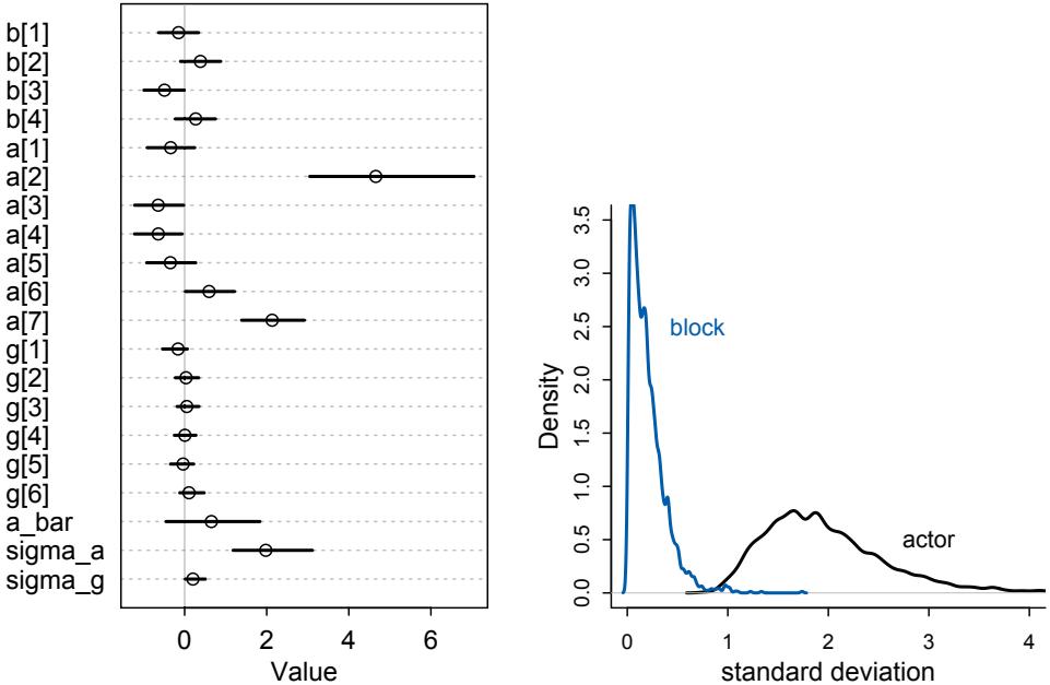
Figure 13.4. Left: Posterior means and 89% compatibility intervals for m13.4. The greater variation across actors than blocks can be seen immediately in the a and g distributions. Right: Posterior distributions of the standard deviations of varying intercepts by actor (black) and block (blue).
R code
13.24 compare( m13.4 , m13.5 )| WAIC | SE | dWAIC | dSE | pWAIC | weight | |
|---|---|---|---|---|---|---|
| m13.5 | 531.3 | 19.25 | 0 | NA | 8.6 | 0.63 |
| m13.4 | 532.3 | 19.33 | 1 | 1.71 | 10.7 | 0.37 |
Look at the pWAIC column, which reports the “effective number of parameters.” While m13.4 has 7 more parameters than m13.5 does, it has only 2 more effective parameters. Why? Because the posterior distribution for sigma_g ended up close to zero. This means each of the 6 g parameters is strongly shrunk towards zero—they are relatively inflexible. In contrast, the a parameters are shrunk towards zero much less, because the estimated variation across actors is much larger, resulting in less shrinkage. But as a consequence, each of the a parameters contributes much more to the pWAIC value.
You might also notice that the difference in WAIC between these models is small, only about 1. This is especially small compared to the standard error of the difference. These two models imply nearly identical predictions, and so their expected out-of-sample accuracy is nearly identical. The block parameters have been shrunk so much towards zero that they do very little work in the model.
If you are feeling the urge to “select” m13.4 as the best model, pause for a moment. There is nothing to gain here by selecting either model. The comparison of the two models tells a richer story—whether we include block or not hardly matters, and the g and sigma_g estimates tell us why. By retaining and reporting both models, we and our readers learn more about the experiment. Model comparison is of value. To select a model, we’d rather want to test conditional independencies of different causal models. Since this is an experiment, there is nothing to really select. The experimental design tells us the relevant causal model to inspect.
13.3.2. Even more clusters. You might notice that the treatment effects, the b parameters, look a lot like the a and g parameters. Could we also use partial pooling on the treatment effects? Yes, we could. Some people will scream “No!” at this suggestion, because they have been taught that varying effects are only for variables that were not experimentally controlled. Since treatment was “fixed” by the experiment, the thinking goes, we should use un-pooled “fixed” effects.
This is all wrong. The reason to use varying effects is because they provide better inferences. It doesn’t matter how the clusters arise. If the individual units are exchangable the index values could be reassigned without changing the meaning of the model—then partial pooling could help.
In this case, there are only four treatments and there is a lot of data on each treatment. So partial pooling isn’t going to make any difference anyway. Here is m13.4 but now with partial pooling on the treatments:
13.25 set.seed(15)
m13.6 <- ulam(
alist(
pulled_left ~ dbinom( 1 , p ) ,
logit(p) <- a[actor] + g[block_id] + b[treatment] ,
b[treatment] ~ dnorm( 0 , sigma_b ),
a[actor] ~ dnorm( a_bar , sigma_a ),
g[block_id] ~ dnorm( 0 , sigma_g ),
a_bar ~ dnorm( 0 , 1.5 ),
sigma_a ~ dexp(1),
sigma_g ~ dexp(1),
sigma_b ~ dexp(1)
) , data=dat_list , chains=4 , cores=4 , log_lik=TRUE )
coeftab( m13.4 , m13.6 )m13.4 m13.6 b[1] -0.13 -0.14 b[2] 0.39 0.35 b[3] -0.48 -0.47 b[4] 0.28 0.24
I cut off the rest of the coeftab output. We’re only interested in the b parameters right now. These are not identical, but they are very close. If you look at sigma_b, you’ll see that it is small. The treatments don’t vary a lot, on the logit scale, because they don’t make much difference in the first place. And there is a lot of data in each treatment, so they don’t get pooled much in any event. If you compare model m13.6 with m13.4, using either WAIC or PSIS, you’ll see they are no different on purely predictive criteria. This is the typical result, when each cluster (each treatment here) has a lot of data to inform its parameters.
What you do get from m13.6 are more divergent transitions. So in the next section, let’s finally deal with those.
13.4. Divergent transitions and non-centered priors
With the models in the previous section, Stan reported warnings about divergent transitions. You first heard about these back in Chapter 9, and I promised to explain them later. Now is the time to learn what these things are and a few useful ways to fix them. When you work with multilevel models, divergent transitions are commonplace. So you need to know how to fix them, and that requires knowing something about what causes them.
One of the best things about Hamiltonian Monte Carlo is that it provides internal checks of efficiency and accuracy. One of these checks comes free, arising from the constraints on the physics simulation. Recall that HMC simulates the frictionless flow of a particle on a surface. In any given transition, which is just a single flick of the particle, the total energy at the start should be equal to the total energy at the end. That’s how energy in a closed system works. And in a purely mathematical system, the energy is always conserved correctly. It’s just a fact about the physics.
But in a numerical system, it might not be. Sometimes the total energy is not the same at the end as it was at the start. In these cases, the energy is divergent. How can this happen? It tends to happen when the posterior distribution is very steep in some region of parameter space. Steep changes in probability are hard for a discrete physics simulation to follow. When that happens, the algorithm notices by comparing the energy at the start to the energy at the end. When they don’t match, it indicates numerical problems exploring that part of the posterior distribution.
Divergent transitions are rejected. They don’t directly damage your approximation of the posterior distribution. But they do hurt it indirectly, because the region where divergent transitions happen is hard to explore correctly. And even when there aren’t any divergent transitions, distributions with steep regions are hard to explore. The chains will be less efficient. And unfortunately this happens quite often in multilevel models.
There are two easy tricks for reducing the impact of divergent transitions. The first is to tune the simulation so that it doesn’t overshoot the valley wall. This means doing more warmup with a higher target acceptance rate, Stan’s adapt_delta. But for many models, you can never tune the sampler enough to remove the divergent transitions. The second trick is to write the statistical model in a new way, to reparameterize it. For any given statistical model, it can be written in several forms that are mathematically identical but numerically different. Switching a model from one form to another is called reparameterization. Let’s work through two examples.
Rethinking: No free samples. When Hamiltonian Monte Carlo complains about divergent transitions, it is tempting to fall back on some other sampler that complains less. This is a mistake. A Gibbs sampler, for example, will never complain. It will just silently fail. It is true that Gibbs sampling doesn’t have the same problem with steep curvature that HMC has. But Gibbs still has problems with the same posterior distributions. It just provides no warnings.
The general issue—warnings of unreliable approximations—arises in all parts of statistics. The R package lme4 is a nice package for fitting multilevel models. It isn’t Bayesian, but instead uses a clever non-Bayesian algorithm. Sometimes that algorithm is unreliable, and lme4 is very good about warning the user. Alternative packages that try to fit the same multilevel models may not produce warnings nearly as often. But those packages are no more reliable. They are just less cautious.
13.4.1. The Devil’s Funnel. You don’t need a fancy model to experience divergent transitions. Suppose we have this joint distribution of two variables, v and x:
v ∼ Normal(0, 3)
x ∼ Normal(0, exp(v))There are no data here, just a joint distribution to sample from. This distribution might seem weird, but it represents a typical multilevel distribution, in which the scale of one variable (here x) depends upon another variable (here v). We’ll visualize it on the next page. You can try this in ulam():
13.26 m13.7 <- ulam(
alist(
v ~ normal(0,3),
x ~ normal(0,exp(v))
), data=list(N=1) , chains=4 )
precis( m13.7 )mean sd 5.5% 94.5% n_eff Rhat v 1.90 2.08 -1.49 5.42 39 1.06 x 18.12 135.97 -31.78 123.84 102 1.04
This looks like an easy problem—only two parameters—but it’s a disaster. You should see lots of divergent transitions. And the n_eff and Rhat values are very poor. Take a glance at the trace plot, traceplot(m13.7), too.
This example is The Devil’s Funnel.199 In the left panel of Figure 13.5, I show the distribution’s contours. At low values of v, the distribution of x contracts around zero. This forms a very steep valley that the Hamiltonian particle needs to explore. Steep surfaces are hard to simulate, because the simulation is not actually continuous. It happens in discrete steps. If the steps are too big, the simulation will overshoot. This error effectively changes the total energy in the system. What happens next is unpredictable.
As in the examples in Chapter 9, the simulation in Figure 13.5 (left panel) starts at the ×. The simulation finds the valley. But then it misses its turn and careens into space. The open point is a divergent transition, a proposal for which the energy at the start of the transition is not the same as the energy at the end of the transition. When you try to sample from this distribution, you get lots of these divergent transitions and a very unreliable approximation of the posterior distribution. We can prove that in this case, because it is a very simple distribution that we can compute with grid approximation.
We can fix this problem by reparameterizing the funnel. There are two general ways to parameterize models in which the distribution of one parameter is a function of another parameter. In this example, the distribution of x is a function of v:
x ∼ Normal(0, exp(v))
This is the source of the funnel: As v changes, the distribution of x changes in a very inconvenient way. This parameterization is known as the centered parameterization. This is not a very intuitive name. It just indicates that the distribution of x is conditional on one or more other parameters.
The alternative is a non-centered parameterization. A non-centered parameterization moves the embedded parameter, v in this case, out of the definition of the other
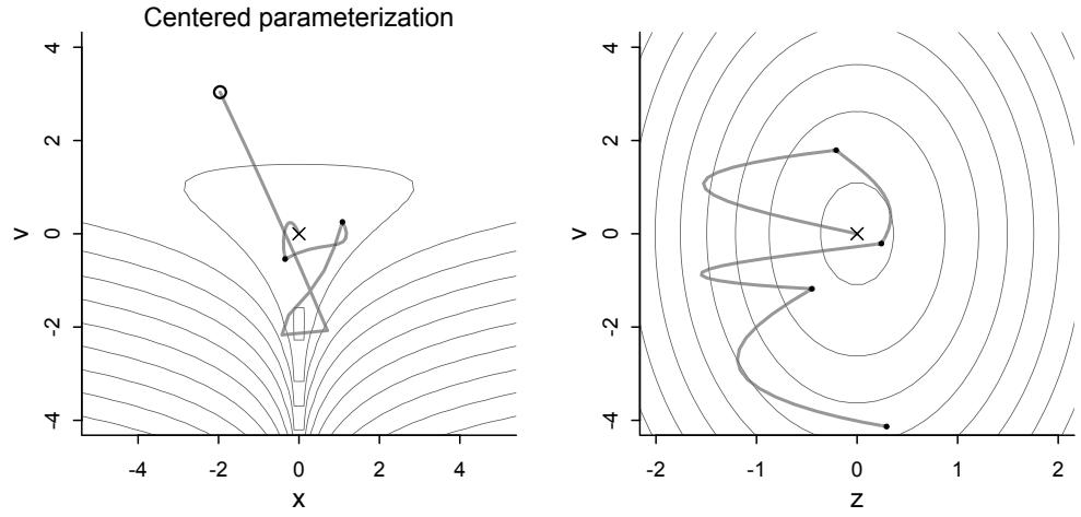
Figure 13.5. Divergent transitions happen when the posterior is steep and the HMC simulation is too coarse to follow it. These numerical errors are detected automatically. Left: The posterior distribution here is a steep valley around x = 0 when v is small. The divergent transition (open point) overshoots the wall of the valley and then careens wildly into space. Right: The same model, but with a non-centered parameterization that flattens the valley. See the model definitions in the text. See examples in ?HMC_2D_sample for code to reproduce these figures.
parameter. For The Devil’s Funnel, we can accomplish that like this:
\[\begin{aligned} \nu &\sim \text{Normal}(0, 3) \\ z &\sim \text{Normal}(0, 1) \\ x &= z \exp(\nu) \end{aligned}\]
This looks crazy. So to understand what just happened, consider the common procedure of standardizing a variable. Many times so far in this book, we’ve standardized data before running a model. The procedure is to subtract the mean and then divide by the standard deviation. The new, standardized variable has mean zero and standard deviation one. To get the original variable back, you would perform these steps in reverse. First you’d multiply the standardized variable by the original standard deviation. Then you’d add the original mean.
The reparameterization above has just defined z as the standardized x. Since it is standardized, it has mean zero and standard deviation one. Then to compute x, we reverse the standardization by multiplying z by the standard deviation, exp(v). There is no mean to add back, because the mean in both cases is zero. But if there were a different mean, we’d add it back in this step as well. The result is that x in the non-centered version has the same distribution as x in the original, centered version. It’s the same joint distribution of v and x.
But when we run the Markov chain, it’s rather different. We don’t sample x directly now. Instead we sample z. The right-hand panel of Figure 13.5 shows the non-centered distribution’s contours—it’s just a bivariate Gaussian now—and the HMC simulation on top. Let’s run the model again in ulam:
13.27 m13.7nc <- ulam(
alist(
v ~ normal(0,3),
z ~ normal(0,1),
gq> real[1]:x <<- z*exp(v)
), data=list(N=1) , chains=4 )
precis( m13.7nc )| mean | sd | 5.5% | 94.5% | n_eff | Rhat | |
|---|---|---|---|---|---|---|
| v | -0.04 | 2.88 | -4.63 | 4.58 | 1612 | 1 |
| z | 0.01 | 0.99 | -1.57 | 1.62 | 1555 | 1 |
| x | -3.70 | 260.03 | -25.35 | 23.12 | 1511 | 1 |
All is well. If you plot x against v, you will see the funnel. We managed to sample it by sampling a different variable and then transforming it. That is the non-centered parameterization. It’s used often when working with multilevel models. However, there are times when the centered prior is better. So it pays to be comfortable with both.
13.4.2. Non-centered chimpanzees. For a real example, let’s return to the chimpanzees. In model m13.4, the adaptive priors that make it a multilevel model have parameters inside them. These are causing regions of steep curvature and generating divergent transitions. We can fix that though.
Before reparameterizing, the first thing you can try is to increase Stan’s target acceptance rate. This is controlled by the adapt_delta control parameter. The ulam default is 0.95, which means that it aims to attain a 95% acceptance rate. It tries this during the warmup phase, adjusting the step size of each leapfrog step (go back to Chapter 9 if these terms aren’t familiar). When adapt_delta is set high, it results in a smaller step size, which means a more accurate approximation of the curved surface. It can also mean slower exploration of the distribution.
Increasing adapt_delta will often, but not always, help with divergent transitions. For example, model m13.4 in the previous section presented a few divergent transitions. We can re-run the model, using a higher target acceptance rate, with:
13.28 set.seed(13)
m13.4b <- ulam( m13.4 , chains=4 , cores=4 , control=list(adapt_delta=0.99) )
divergent(m13.4b)[1] 2
So that did help. But sometimes this won’t be enough. And while the divergent transitions are gone, the chain still isn’t very efficient—look at the precis output and notice that many of the n_eff values are still far below the true number of samples (2000 in this case: 4 chains, 500 from each).
We can do much better with the non-centered version of the model. What we want is a version of m13.4 (page 415) in which we get the parameters out of the adaptive priors and instead into the linear model. There are two adaptive priors to transform:
| αj Normal(¯α, σα) ∼ |
[Intercepts for actors] |
|---|---|
| γj Normal(0, σγ) ∼ |
[Intercepts for blocks] |
There are three embedded (“centered”) parameters to smuggle out of these priors: α¯, σα, σγ. As before with the funnel, we’ll define some new variables that are given standard Normal distributions, and then we’ll reconstruct the original variables by undoing the transformation. This time, we’ll do that reconstruction in the linear model. The completed non-centered model looks like this (with altered bits in blue):
\[\begin{aligned} \text{I}\_{l} & \sim \text{Binomial}(1, p\_{l}) \\ \text{logit}(p\_{l}) &= \overset{\cdot}{\alpha} + z\_{\text{acrow}[l]} \sigma\_{\alpha} + \underbrace{x\_{\text{nuc}[l]} \sigma\_{\gamma}}\_{\gamma\_{\text{nuc}[l]}} + \beta\_{\text{TEACTMEM}} [t] \\ \beta\_{j} & \sim \text{Normal}(0, 0.5) \\ z\_{j} & \sim \text{Normal}(0, 1) \\ x\_{j} & \sim \text{Normal}(0, 1) \\ \bar{\alpha} & \sim \text{Normal}(0, 1.5) \\ \sigma\_{\alpha} & \sim \text{Exponential}(1) \\ \sigma\_{\alpha} & \sim \text{Exponential}(1) \end{aligned} \qquad \text{[Standardized actor intercepts]}\]
The vector z gives the standardized intercept for each actor, and the vector x gives the standardized intercept for each block. Inside the linear model logit(pi), all of the previously embedded parameters reappear. Each actor intercept is defined by
\[ \alpha\_{\dot{\jmath}} = \bar{\alpha} + z\_{\dot{\jmath}} \sigma\_{\alpha}, \]
and each block intercept by
\[ \gamma\_{\dot{l}} = \mathfrak{x}\_{\dot{l}} \sigma\_{\gamma} \]
So these expressions appear now in the linear model.
Let’s sample from this posterior now and see what the reparameterization gains us.
R code
13.29 set.seed(13)
m13.4nc <- ulam(
alist(
pulled_left ~ dbinom( 1 , p ) ,
logit(p) <- a_bar + z[actor]*sigma_a + # actor intercepts
x[block_id]*sigma_g + # block intercepts
b[treatment] ,
b[treatment] ~ dnorm( 0 , 0.5 ),
z[actor] ~ dnorm( 0 , 1 ),
x[block_id] ~ dnorm( 0 , 1 ),
a_bar ~ dnorm( 0 , 1.5 ),
sigma_a ~ dexp(1),
sigma_g ~ dexp(1),
gq> vector[actor]:a <<- a_bar + z*sigma_a,
gq> vector[block_id]:g <<- x*sigma_g
) , data=dat_list , chains=4 , cores=4 )Now let’s compare the n_eff, numbers of effective samples, for these two forms. To do this fairly, we should ignore the z and x parameters and instead compare a and g parameters. That is why I added those gq> lines at the bottom of the formula above, so that Stan would
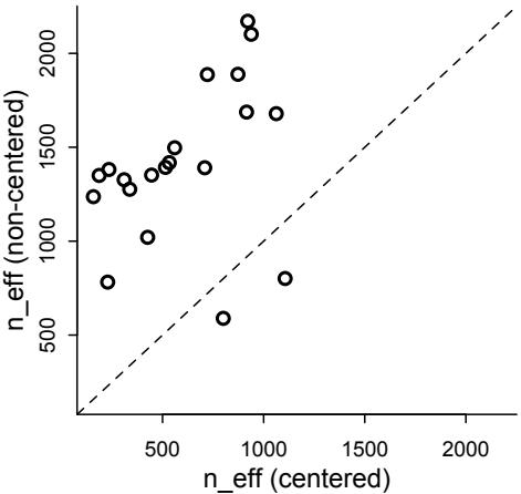
Figure 13.6. Comparing the centered (horizonal) and non-centered (vertical) parameterizations of the multilevel chimpanzees model, m13.4. Each point is a parameter. All but two parameters lie above the diagonal, indicating better sampling for the non-centered parameterization.
do the calculations for us while it ran. The code below pulls the matching n_eff values out of the precis tables for both models. Then it plots them against one another.
13.30 precis_c <- precis( m13.4 , depth=2 )
precis_nc <- precis( m13.4nc , depth=2 )
pars <- c( paste("a[",1:7,"]",sep="") , paste("g[",1:6,"]",sep="") ,
paste("b[",1:4,"]",sep="") , "a_bar" , "sigma_a" , "sigma_g" )
neff_table <- cbind( precis_c[pars,"n_eff"] , precis_nc[pars,"n_eff"] )
plot( neff_table , xlim=range(neff_table) , ylim=range(neff_table) ,
xlab="n_eff (centered)" , ylab="n_eff (non-centered)" , lwd=2 )
abline( a=0 , b=1 , lty=2 )The result is displayed in Figure 13.6. The diagonal shows where both models produce the same effective number of samples. For all but two parameters, the non-centered parameterization performs much better.
So should we always use the non-centered parameterization? No. Sometimes the centered form is better. It could even be true that the centered form is better for one cluster in a model while the non-centered form is better for another cluster in the same model. It all depends upon the details. Typically, a cluster with low variation, like the blocks in m13.4, will sample better with a non-centered prior. And if you have a large number of units inside a cluster, but not much data for each unit, then the non-centered is also usually better. But being able to switch back and forth as needed is very useful.
We can reparameterize distributions other than the Gaussian. For example, an exponential distribution has a single scale parameter, usually called λ, that can be factored out and smuggled into a linear model:
x = zλ
z ∼ Exponential(1)This is the same as x ∼ Exponential(λ). And in the next chapter, I’ll show you how to reparameterize multivariate distributions so to place an entire correlation matrix inside a linear model. Algebra makes many things possible.
13.5. Multilevel posterior predictions
Way back in Chapter 3 (page 63), I commented on the importance of model checking. Software does not always work as expected, and one robust way to discover mistakes is to compare the sample to the posterior predictions of a fit model. The same procedure, producing implied predictions from a fit model, is very helpful for understanding what the model means. Every model is a merger of sense and nonsense. When we understand a model, we can find its sense and control its nonsense. But as models get more complex, it is very difficult to impossible to understand them just by inspecting tables of posterior means and intervals. Exploring implied posterior predictions helps much more.
Once you believe the posterior is correct, implied predictions are needed to consider the causal effects. What is the estimated effect of intervening on one or more variables? We need counterfactual posterior predictions for this question. We saw an example of this in Chapter 5.
Another role for constructing implied predictions is in computing information criteria, like AIC and WAIC. These criteria provide simple estimates of out-of-sample model accuracy, the KL divergence. In practical terms, information criteria provide a rough measure of a model’s flexibility and therefore overfitting risk. This was the big conceptual mission of Chapter 7.
All of this advice applies to multilevel models as well. We still often need model checks, counterfactual predictions for understanding, and information criteria. The introduction of varying effects does introduce nuance, however.
First, we should no longer expect the model to exactly retrodict the sample, because adaptive regularization has as its goal to trade off poorer fit in sample for better inference and hopefully better fit out of sample. That is what shrinkage does for us. Of course, we should never be trying to really retrodict the sample. But now you have to expect that even a perfectly good model fit will differ from the raw data in a systematic way.
Second, “prediction” in the context of a multilevel model requires additional choices. If we wish to validate a model against the specific clusters used to fit the model, that is one thing. But if we instead wish to compute predictions for new clusters, other than the ones observed in the sample, that is quite another. We’ll consider each of these in turn, continuing to use the chimpanzees model from the previous section.
13.5.1. Posterior prediction for same clusters. When working with the same clusters as you used to fit a model, varying intercepts are just parameters. The only trick is to ensure that you use the right intercept for each case in the data. If you use link and sim to do your work for you, this is handled automatically. Otherwise, you just use the model definition.
For example, in data(chimpanzees), there are 7 unique actors. These are the clusters. The varying intercepts model, m13.4, estimated an intercept for each, in addition to two parameters to describe the mean and standard deviation of the population of actors. We’ll construct posterior predictions (retrodictions), using both the automated link approach and doing it from scratch, so there is no confusion.
Before computing predictions, note again that we should no longer expect the posterior predictive distribution to match the raw data, even when the model worked correctly. Why? The whole point of partial pooling is to shrink estimates towards the grand mean. So the estimates should not necessarily match up with the raw data, once you use pooling.
The code needed to compute posterior predictions is just like the code from Chapter 11. Here it is again, computing posterior predictions for actor number 2:
13.31 chimp <- 2
d_pred <- list(
actor = rep(chimp,4),
treatment = 1:4,
block_id = rep(1,4)
)
p <- link( m13.4 , data=d_pred )
p_mu <- apply( p , 2 , mean )
p_ci <- apply( p , 2 , PI )To construct the same calculations without using link, we just have to remember the model. The only difficulty is that when we work with the samples from the posterior, the varying intercepts will be a matrix of samples. Let’s take a look:
13.32 post <- extract.samples(m13.4)
str(post)List of 6
| $ b |
: | num | [1:2000, 1:4] -0.107 -0.491 -0.644 -0.368 0.105 |
|---|---|---|---|
| $ a |
: | num | [1:2000, 1:7] -0.0166 -0.2078 0.3102 0.1337 -0.191 |
| $ g |
: | num | [1:2000, 1:6] -0.7116 -0.1728 -0.5689 -0.0299 0.0133 |
| $ a_bar |
: | num | [1:2000(1d)] 1.2031 -0.0998 1.3569 0.6167 -0.0248 |
| $ sigma_a: |
num | [1:2000(1d)] 3.1 3.57 2.92 2.15 2.19 |
|
| $ sigma_g: |
num | [1:2000(1d)] 0.393 0.287 0.418 0.119 0.13 |
The a matrix has samples on the rows and actors on the columns. So to plot, for example, the density for actor 5:
13.33 dens( post$a[,5] )The [,5] means “all samples for actor 5.”
To construct posterior predictions, we build our own link function. I’ll use the with function here, so we don’t have to keep typing post$ before every parameter name:
R code
13.34 p_link <- function( treatment , actor=1 , block_id=1 ) {
logodds <- with( post ,
a[,actor] + g[,block_id] + b[,treatment] )
return( inv_logit(logodds) )
}The linear model is identical to the one used to define the model, but with a single comma added inside the brackets after a. Now to compute predictions:
R code
13.35 p_raw <- sapply( 1:4 , function(i) p_link( i , actor=2 , block_id=1 ) )
p_mu <- apply( p_raw , 2 , mean )
p_ci <- apply( p_raw , 2 , PI )At some point, you will have to work with a model that link will mangle. At that time, you can return to this section and peer hard at the code above and still make progress. No matter R code
R code
what the model is, if it is a Bayesian model, then it is generative. This means that predictions are made by pushing samples up through the model to get distributions of predictions. Then you summarize the distributions to summarize the predictions.
13.5.2. Posterior prediction for new clusters. The problem of making predictions for new clusters is really a problem of generalizing from the sample. In general, there is no unique procedure for generalizing predictions outside of a sample. The right thing to do depends upon the causal model, the statistical model, and your goals. But if you have a generative model, then you can often think your way through it. The key idea is to use the posterior to parameterize a simulation that embodies the target generalization.
Let’s consider some simple examples.
Suppose you want to predict how chimpanzees in another population would respond to our lever pulling experiment. The particular 7 chimpanzees in the sample allowed us to estimate 7 unique intercepts. But these individual actor intercepts aren’t of interest, because none of these 7 individuals is in the new population.
One way to grasp the task of constructing posterior predictions for new clusters is to imagine leaving out one of the clusters when you fit the model to the data. For example, suppose we leave out actor number 7 when we fit the chimpanzees model. Now how can we assess the model’s accuracy for predicting actor number 7’s behavior? We can’t use any of the a parameter estimates, because those apply to other individuals. But we can make good use of the a_bar and sigma_a parameters. These parameters describe a statistical population of actors, and we can simulate new actors from it.
First, let’s see how to construct posterior predictions for a new, previously unobserved average actor. By “average,” I mean an individual chimpanzee with an intercept exactly at a_bar (α¯), the population mean. Since there is uncertainty about the population mean, there is still uncertainty about this average individual’s intercept. But as you’ll see, the uncertainty is much smaller than it really should be, if we wish to honestly represent the problem of what to expect from a new individual.
What we need is our own link function, but now with a twist:
R code
13.36 p_link_abar <- function( treatment ) {
logodds <- with( post , a_bar + b[,treatment] )
return( inv_logit(logodds) )
}Notice that the function ignores block. This is because we are extrapolating to new blocks, so we assume the average block effect is about zero (which it was in the sample). Call this function and summarize just as before:
13.37 post <- extract.samples(m13.4)
p_raw <- sapply( 1:4 , function(i) p_link_abar( i ) )
p_mu <- apply( p_raw , 2 , mean )
p_ci <- apply( p_raw , 2 , PI )
plot( NULL , xlab="treatment" , ylab="proportion pulled left" ,
ylim=c(0,1) , xaxt="n" , xlim=c(1,4) )
axis( 1 , at=1:4 , labels=c("R/N","L/N","R/P","L/P") )
lines( 1:4 , p_mu )shade( p_ci , 1:4 )
The result is displayed in Figure 13.7, on the left. The gray region shows the 89% compatibility interval for an actor with an average intercept. This kind of calculation makes it easy to see the impact of prosoc_left, as well as uncertainty about where the average is, but it doesn’t show the variation among actors.
To show the variation among actors, we’ll need to use sigma_a in the calculation. First we simply use rnorm to sample some random chimpanzees, using mean a_bar and standard deviation sigma_a. Then we write a link function that references those simulated chimpanzees, not the ones in the posterior. It’s important to do the chimpanzee sampling outside the link function, because we want to reference the same simulate chimpanzee, whichever treatment we consider. This is the code:
13.38 a_sim <- with( post , rnorm( length(post$a_bar) , a_bar , sigma_a ) )
p_link_asim <- function( treatment ) {
logodds <- with( post , a_sim + b[,treatment] )
return( inv_logit(logodds) )
}
p_raw_asim <- sapply( 1:4 , function(i) p_link_asim( i ) )Summarizing and plotting is exactly as before, and the result is displayed in the middle of Figure 13.7. These posterior predictions are marginal of actor, which means that they average over the uncertainty among actors. In contrast, the predictions on the left just set the actor to the average, ignoring variation among actors.
At this point, students usually ask, “So which one should I use?” The answer is, “It depends.” Both are useful, depending upon the question. The predictions for an average actor help to visualize the impact of treatment. The predictions that are marginal of actor illustrate how variable different chimpanzees are, according to the model. You probably want to compute both for yourself, when trying to understand a model. But which you include in a report will depend upon context.
In this case, we can do better by making a plot that displays both the treatment effect and the variation among actors. We can do this by forgetting about intervals and instead simulating a series of new actors in each of the four treatments. By drawing a line for each actor across all four treatments, we’ll be able to visualize both the zig-zag impact of prosoc_left as well as the variation among individuals.
We don’t really need new code here. We just need to use the rows in p_raw_asim from above. Each row contains a single trend, a single simulated chimpanzee. So instead of summarizing with mean and PI, we can just loop over rows and plot:
R code
13.39 plot( NULL , xlab="treatment" , ylab="proportion pulled left" ,
ylim=c(0,1) , xaxt="n" , xlim=c(1,4) )
axis( 1 , at=1:4 , labels=c("R/N","L/N","R/P","L/P") )
for ( i in 1:100 ) lines( 1:4 , p_raw_asim[i,] , col=grau(0.25) , lwd=2 )The result is shown in the right-hand plot of Figure 13.7. Each trend is a simulated actor, across all four treatments on the horizontal axis. It is much easier in this plot to see both the
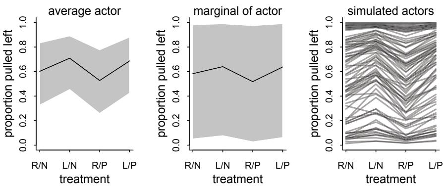
Figure 13.7. Posterior predictive distributions for the chimpanzees varying intercept model, m13.4. The solid lines are posterior means and the shaded regions are 80% percentile intervals. Left: Setting the varying intercept a to the mean a_bar produces predictions for an average actor. These predictions ignore uncertainty arising from variation among actors. Middle: Simulating varying intercepts using the posterior standard deviation among actors, sigma_a, produces predictions that account for variation among actors. Right: 100 simulated actors with unique intercepts sampled from the posterior. Each simulation maintains the same parameter values across all four treatments.
zig-zag impact of treatment and the variation among actors that is induced by the posterior distribution of sigma_a.
Also note the interaction of treatment and the variation among actors. Because this is a binomial model, in principle all parameters interact, due to ceiling and floor effects. For actors with very large intercepts, near the top of the plot, treatment has very little effect. These actors have strong handedness preferences. But actors with intercepts nearer the mean are influenced by treatment.
13.5.3. Post-stratification. A common problem is how to use a non-representative sample of a population to generate representative predictions for the same population. For example, we might survey potential voters, asking about their voting intentions. Such samples are biased—different groups respond to such surveys at different rates. So if we just use the survey average, we’ll make the wrong prediction about the election. How can we do better?
One technique is post-stratification. 200 The idea is to fit a model in which each demographic slice of the population—a specific combination of age, economic, and educational variables for example—has its own voting intention. Then the estimates of these intentions are re-weighted using general census information about the full voting population. Because there are usually many demographic categories, and samples can be small in some of them, post-stratification is often combined with multilevel modeling, in which case it is called MRP, pronounced “Mister P,” for multilevel regression and post-stratification.
How does it work? Supposing you have estimates pi for each demographic category i, then the post-stratified prediction for the whole population (not the sample) just re-weights these estimates using the number of individuals Ni in each category:
\[\frac{\sum\_{i} N\_{i} p\_{i}}{\sum\_{i} N\_{i}}\]
Compute this for each sample in the posterior distribution, then you’ll have a posterior distribution of predictions as usual.
Post-stratification does not always work. It is not justified, for example, when selection bias is itself caused by the outcome of interest. Suppose that responding to the survey R is influenced by age A, and that age A influences voting intention V: R ← A → V. In that case it is possible to estimate the influence of A on V. But if V → R, then there is little hope. Suppose for example that only supporters respond. Then V = 1 for everyone who responds. Selection on the outcome variable is one of the worst things that can happen in statistics.
A general framework for generalizability is transportability. 201 Post-stratification is a special case of this framework, as are meta-analyses and the application of estimates across populations. The details are complicated. But acquainting yourself with the framework is worthwhile, even if only to recognize special cases and connections among them.
13.6. Summary
This chapter has been an introduction to the motivation, implementation, and interpretation of basic multilevel models. It focused on varying intercepts, which achieve better estimates of baseline differences among clusters in the data. They achieve better estimates, because they simultaneously model the population of clusters and use inferences about the population to pool information among parameters. From another perspective, varying intercepts are adaptively regularized parameters, relying upon a prior that is itself learned from the data. All of this is a foundation for the next chapter, which extends these concepts to additional types of parameters and models.
13.7. Practice
Problems are labeled Easy (E), Medium (M), and Hard (H).
13E1. Which of the following priors will produce more shrinkage in the estimates? (a) αtank ∼ Normal(0, 1); (b) αtank ∼ Normal(0, 2).
13E2. Rewrite the following model as a multilevel model.
\[\begin{aligned} \mathcal{y}\_i &\sim \text{Binomial}(1, p\_i) \\ \text{logit}(p\_i) &= \alpha\_{\text{cnoup}[i]} + \beta \mathbf{x}\_i \\ \alpha\_{\text{cnoup}} &\sim \text{Normal}(0, 1.5) \\ \beta &\sim \text{Normal}(0, 0.5) \end{aligned}\]
13E3. Rewrite the following model as a multilevel model.
yi ∼ Normal(µi
, σ)
µi = αgroup[i] + βxi
αgroup ∼ Normal(0, 5)
β ∼ Normal(0, 1)
σ ∼ Exponential(1)13E4. Write a mathematical model formula for a Poisson regression with varying intercepts.
13E5. Write a mathematical model formula for a Poisson regression with two different kinds of varying intercepts, a cross-classified model.
13M1. Revisit the Reed frog survival data, data(reedfrogs), and add the predation and size treatment variables to the varying intercepts model. Consider models with either main effect alone, both main effects, as well as a model including both and their interaction. Instead of focusing on inferences about these two predictor variables, focus on the inferred variation across tanks. Explain why it changes as it does across models.
13M2. Compare the models you fit just above, using WAIC. Can you reconcile the differences in WAIC with the posterior distributions of the models?
13M3. Re-estimate the basic Reed frog varying intercept model, but now using a Cauchy distribution in place of the Gaussian distribution for the varying intercepts. That is, fit this model:
\[s\_i \sim \text{Binomial}(n\_i, p\_i)\]
\[\text{logit}(p\_i) = \alpha\_{\text{TANK}[i]}\]
\[\alpha\_{\text{TANK}} \sim \text{Cauchy}(\alpha, \sigma)\]
\[\alpha \sim \text{Normal}(0, 1)\]
\[\sigma \sim \text{Exponential}(1)\]
(You are likely to see many divergent transitions for this model. Can you figure out why? Can you fix them?) Compare the posterior means of the intercepts, αtank, to the posterior means produced in the chapter, using the customary Gaussian prior. Can you explain the pattern of differences? Take note of any change in the mean α as well.
13M4. Now use a Student-t distribution with ν = 2 for the intercepts:
αtank ∼ Student(2, α, σ)
Refer back to the Student-t example in Chapter 7 (page 234), if necessary. Compare the resulting posterior to both the original model and the Cauchy model in 13M3. Can you explain the differences and similarities in shrinkage in terms of the properties of these distributions?
13M5. Modify the cross-classified chimpanzees model m13.4 so that the adaptive prior for blocks contains a parameter γ¯ for its mean:
\[\begin{aligned} \gamma\_j &\sim \text{Normal}(\bar{\gamma}, \sigma\_\gamma) \\ \bar{\gamma} &\sim \text{Normal}(0, 1.5) \end{aligned}\]
Compare this model to m13.4. What has including γ¯ done?
13M6. Sometimes the prior and the data (through the likelihood) are in conflict, because they concentrate around different regions of parameter space. What happens in these cases depends a lot upon the shape of the tails of the distributions.202 Likewise, the tails of distributions strongly influence can outliers are shrunk or not towards the mean. I want you to consider four different models to fit to one observation at y = 0. The models differ only in the distributions assigned to the likelihood and prior. Here are the four models:
\[\begin{aligned} \text{Model NN:} & \quad y \sim \text{Normal}(\mu, 1) & \quad \text{Model TN:} & \quad y \sim \text{Student}(2, \mu, 1) \\ & \quad \mu \sim \text{Normal}(10, 1) & \quad \mu \sim \text{Normal}(10, 1) \\ \text{Model NT:} & \quad y \sim \text{Normal}(\mu, 1) & \quad \text{Model TT:} & \quad y \sim \text{Student}(2, \mu, 1) \\ & \quad \mu \sim \text{Student}(2, 10, 1) & \quad \mu \sim \text{Student}(2, 10, 1) \\ \end{aligned}\]
Estimate the posterior distributions for these models and compare them. Can you explain the results, using the properties of the distributions?
13H1. In 1980, a typical Bengali woman could have 5 or more children in her lifetime. By the year 2000, a typical Bengali woman had only 2 or 3. You’re going to look at a historical set of data, when contraception was widely available but many families chose not to use it. These data reside in data(bangladesh) and come from the 1988 Bangladesh Fertility Survey. Each row is one of 1934 women. There are six variables, but you can focus on two of them for this practice problem:
district: ID number of administrative district each woman resided in
use.contraception: An indicator (0/1) of whether the woman was using contraception
The first thing to do is ensure that the cluster variable, district, is a contiguous set of integers. Recall that these values will be index values inside the model. If there are gaps, you’ll have parameters for which there is no data to inform them. Worse, the model probably won’t run. Look at the unique values of the district variable:
13.40 sort(unique(d$district))
[1] 1 2 3 4 5 6 7 8 9 10 11 12 13 14 15 16 17 18 19 20 21 22 23 24 25 [26] 26 27 28 29 30 31 32 33 34 35 36 37 38 39 40 41 42 43 44 45 46 47 48 49 50 [51] 51 52 53 55 56 57 58 59 60 61
District 54 is absent. So district isn’t yet a good index variable, because it’s not contiguous. This is easy to fix. Just make a new variable that is contiguous. This is enough to do it:
13.41 d$district_id <- as.integer(as.factor(d$district))
sort(unique(d$district_id))[1] 1 2 3 4 5 6 7 8 9 10 11 12 13 14 15 16 17 18 19 20 21 22 23 24 25 [26] 26 27 28 29 30 31 32 33 34 35 36 37 38 39 40 41 42 43 44 45 46 47 48 49 50 [51] 51 52 53 54 55 56 57 58 59 60
Now there are 60 values, contiguous integers 1 to 60. Now, focus on predicting use.contraception, clustered by district_id. Fit both (1) a traditional fixed-effects model that uses an index variable for district and (2) a multilevel model with varying intercepts for district. Plot the predicted proportions of women in each district using contraception, for both the fixed-effects model and the varying-effects model. That is, make a plot in which district ID is on the horizontal axis and expected proportion using contraception is on the vertical. Make one plot for each model, or layer them on the same plot, as you prefer. How do the models disagree? Can you explain the pattern of disagreement? In particular, can you explain the most extreme cases of disagreement, both why they happen where they do and why the models reach different inferences?
13H2. Return to data(Trolley) from Chapter 12. Define and fit a varying intercepts model for these data. Cluster intercepts on individual participants, as indicated by the unique values in the id variable. Include action, intention, and contact as ordinary terms. Compare the varying intercepts model and a model that ignores individuals, using both WAIC and posterior predictions. What is the impact of individual variation in these data?
13H3. The Trolley data are also clustered by story, which indicates a unique narrative for each vignette. Define and fit a cross-classified varying intercepts model with both id and story. Use the same ordinary terms as in the previous problem. Compare this model to the previous models. What do you infer about the impact of different stories on responses?
13H4. Revisit the Reed frog survival data, data(reedfrogs), and add the predation and size treatment variables to the varying intercepts model. Consider models with either predictor alone, both predictors, as well as a model including their interaction. What do you infer about the causal influence of these predictor variables? Also focus on the inferred variation across tanks (the σ across tanks). Explain why it changes as it does across models with different predictors included.

14 Adventures in Covariance
Recall the coffee robot from the introduction to the previous chapter(page 399). This robot is programmed to move among cafés, order coffee, and record the waiting time. The previous chapter focused on the fact that the robot learns more efficiently when it pools information among the cafés. Varying intercepts are a mechanism for achieving that pooling.
Now suppose that the robot also records the time of day, morning or afternoon. The average wait time in the morning tends to be longer than the average wait time in the afternoon. This is because cafés are busier in the morning. But just like cafés vary in their average wait times, they also vary in their differences between morning and afternoon. In conventional regression, these differences in wait time between morning and afternoon are slopes, since they express the change in expectation when an indictor (or dummy, page 154) variable for time of day changes value. The linear model might look like this:
\[ \mu\_{\boldsymbol{i}} = \alpha\_{\mathbf{c}\mathbf{A}\mathbf{F}\mathbf{\dot{i}}[\boldsymbol{i}]} + \beta\_{\mathbf{c}\mathbf{A}\mathbf{F}\mathbf{\dot{i}}[\boldsymbol{i}]} \mathbf{A}\_{\boldsymbol{i}} \]
where Ai is a 0/1 indicator for afternoon and βcafé[i] is a parameter for the expected difference between afternoon and morning for each café.
Since the robot more efficiently learns about the intercepts, αcafé[i] above, when it pools information about intercepts, it likewise learns more efficiently about the slopes when it also pools information about slopes. And the pooling is achieved in the same way, by estimating the population distribution of slopes at the same time the robot estimates each slope. The distributions assigned to both intercepts and slopes enable pooling for both, as the model (robot) learns the prior from the data.
This is the essence of the general varying effects strategy: Any batch of parameters with exchangeable index values can and probably should be pooled. Exchangeable just means the index values have no true ordering, because they are arbitrary labels. There’s nothing special about intercepts; slopes can also vary by unit in the data, and pooling information among them makes better use of the data. So our coffee robot should be programmed to model both the population of intercepts and the population of slopes. Then it can use pooling for both and squeeze more information out of the data.
But here’s a fact that will help us to squeeze even more information out of the data: Cafés covary in their intercepts and slopes. Why? At a popular café, wait times are on average long in the morning, because staff are very busy (Figure 14.1). But the same café will be much less busy in the afternoon, leading to a large difference between morning and afternoon wait times. At such a popular café, the intercept is high and the slope is far from zero, because the difference between morning and afternoon waits is large. But at a less popular café, the difference will be small. Such an unpopular café makes you wait less in the morning—because
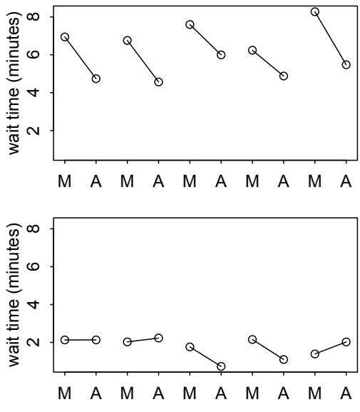
Figure 14.1. Waiting times at two cafés. Top: A busy café at which wait times nearly always improve in the afternoon. Bottom: An unpopular café where wait times are nearly always short. In a population of cafés like these, long morning waits (intercepts) covary with larger differences between morning and afternoon (slopes).
it’s not busy—but there isn’t much improvement in the afternoon. In the entire population of cafés, including both the popular and the unpopular, intercepts and slopes covary.
This covariation is information that the robot can use. If we can figure out a way to pool information across parameter types—intercepts and slopes—what the robot learns in the morning can improve learning about afternoons, and vice versa. Suppose for example that the robot arrives at a new café in the morning. It observes a long wait for its coffee. Even before it orders a coffee at the same café in the afternoon, it can update its expectation for how long it will wait. In the population of cafés, a long wait in the morning is associated with a shorter wait in the afternoon.
In this chapter, you’ll see how to really do this, to specify varying slopes in combination with the varying intercepts of the previous chapter. This will enable pooling that will improve estimates of how different units respond to or are influenced by predictor variables. It will also improve estimates of intercepts, by borrowing information across parameter types. Essentially, varying slopes models are massive interaction machines. They allow every unit in the data to have its own response to any treatment or exposure or event, while also improving estimates via pooling. When the variation in slopes is large, the average slope is of less interest. Sometimes, the pattern of variation in slopes provides hints about omitted variables that explain why some units respond more or less. We’ll see an example in this chapter.
The machinery that makes such complex varying effects possible will be used later in the chapter to extend the varying effects strategy to more subtle model types, including the use of continuous categories, using Gaussian processes. Ordinary varying effects work only with discrete, unordered categories, such as individuals, countries, or ponds. In these cases, each category is equally different from all of the others. But it is possible to use pooling with categories such as age or location. In these cases, some ages and some locations are more similar than others. You’ll see how to model covariation among continuous categories of this kind, as well as how to generalize the strategy to seemingly unrelated types of models such as phylogenetic and network regressions. Finally, we’ll circle back to causal inference and use our new powers over covariance to go beyond the tools of Chapter 6, introducing instrumental variables. Instruments are ways of inferring cause without closing backdoor paths. However they are very tricky both in design and estimation.
The material in this chapter is difficult. So if it suddenly seems both conceptually and computationally much more difficult, that only means you are paying attention. Material like this requires repetition, discussion, and learning from mistakes. The struggle is definitely worth it. You don’t have to understand it all at once.
14.1. Varying slopes by construction
How should the robot pool information across intercepts and slopes? By modeling the joint population of intercepts and slopes, which means by modeling their covariance. In conventional multilevel models, the device that makes this possible is a joint multivariate Gaussian distribution for all of the varying effects, both intercepts and slopes. So instead of having two independent Gaussian distributions of intercepts and of slopes, the robot can do better by assigning a two-dimensional Gaussian distribution to both the intercepts (first dimension) and the slopes (second dimension).
You’ve been working with multivariate Gaussian distributions ever sinceChapter 4, when you began using the quadratic approximation for the posterior distribution. The variancecovariance matrix, vcov, for a fit model describes how each parameter’s posterior probability is associated with each other parameter’s posterior probability. Now we’ll use the same kind of distribution to describe the variation within and covariation among different kinds of varying effects. Varying intercepts have variation, and varying slopes have variation. Intercepts and slopes covary.
In order to see how this works and how varying slopes are specified and interpreted, let’s simulate the coffee robot from the introduction. Like previous simulation exercises, this will simultaneously help you see how to conduct your own prospective power analyses, in addition to reemphasizing the generative nature of Bayesian statistical models.
Rethinking: Why Gaussian? There is no reason the multivariate distribution of intercepts and slopes must be Gaussian. But there are both practical and epistemological justifications. On the practical side, there aren’t many multivariate distributions that are easy to work with. The only common ones are multivariate Gaussian and multivariate Student-t distributions. On the epistemological side, if all we want to say about these intercepts and slopes is their means, variances, and covariances, then the maximum entropy distribution is multivariate Gaussian. But thin Gaussian tails can still be risky.
14.1.1. Simulate the population. Begin by defining the population of cafés that the robot might visit. This means we’ll define the average wait time in the morning and the afternoon, as well as the correlation between them. These numbers are sufficient to define the average properties of the cafés. Let’s define these properties, then we’ll sample cafés from them.
| a <- 3.5 |
# | average morning wait time |
R code 14.1 |
|---|---|---|---|
| b <- (-1) |
# | average difference afternoon wait time |
|
| sigma_a <- 1 |
# | std dev in intercepts |
|
| sigma_b <- 0.5 |
# | std dev in slopes |
|
| rho <- (-0.7) |
# | correlation between intercepts and slopes |
These values define the entire population of cafés. To use these values to simulate a sample of cafés for the robot, we’ll need to build them into a 2-dimensional multivariate Gaussian distribution. This means we need a vector of two means and 2-by-2 matrix of variances and covariances. The means are easiest. The vector we need is just:
R code 14.2 Mu <- c( a , b )
That’s it. The value in a is the mean intercept, the wait in the morning. And the value in b is the mean slope, the difference in wait between afternoon and morning.
The matrix of variances and covariances is arranged like this:
variance of intercepts covariance of intercepts & slopes
covariance of intercepts & slopes variance of slopes
And now in mathematical form:
\[ \begin{pmatrix} \sigma\_\alpha^2 & \sigma\_\alpha \sigma\_\beta \rho \\ \sigma\_\alpha \sigma\_\beta \rho & \sigma\_\beta^2 \end{pmatrix}, \]
The variance in intercepts is σ 2 α, and the variance in slopes is σ 2 β . These are found along the diagonal of the matrix. The other two elements of the matrix are the same, σασβρ. This is the covariance between intercepts and slopes. It’s just the product of the two standard deviations and the correlation. It might help to imagine an ordinary variance as the covariance of a variable with itself. If you are rusty on the definition of a covariance—it’s okay, most people are—then see the Overthinking box further down.
To build this matrix with R code, there are several options. I’ll show you two, both very common. The first is to just use matrix to build the entire covariance matrix directly:
R code
14.3 cov_ab <- sigma_a*sigma_b*rho
Sigma <- matrix( c(sigma_a^2,cov_ab,cov_ab,sigma_b^2) , ncol=2 )The awkward thing is that R matrices defined this way fill down each column before moving to the next row over. So the order inside the code above looks odd, but works. To see what I mean by “fill down each column,” try this:
R code
14.4 matrix( c(1,2,3,4) , nrow=2 , ncol=2 )
[,1] [,2]
[1,] 1 3[2,] 2 4
The first column filled, and then R started over at the top of the second column.
The other common way to build the covariance matrix is conceptually very useful, because it treats the standard deviations and correlations separately. Then it matrix multiplies them to produce the covariance matrix. We’re going to use this approach later on, to define priors, so it’s worth seeing it now. Here’s how it’s done:
R code
14.5 sigmas <- c(sigma_a,sigma_b) # standard deviations Rho <- matrix( c(1,rho,rho,1) , nrow=2 ) # correlation matrix
# now matrix multiply to get covariance matrix
Sigma <- diag(sigmas) %*% Rho %*% diag(sigmas)If you are not sure what diag(sigmas) accomplishes, then try typing just diag(sigmas) at the R prompt.
Now we’re ready to simulate some cafés, each with its own intercept and slope. Let’s define the number of cafés:
14.6 N_cafes <- 20
And to simulate their properties, we just sample randomly from the multivariate Gaussian distribution defined by Mu and Sigma:
| library(MASS) | |
|---|---|
| set.seed(5) # used to replicate example |
14.7 |
| vary_effects <- mvrnorm( N_cafes , Mu , Sigma ) |
Note the set.seed(5) line above. That’s there so you can replicate the precise results in the example figures. The particular number, 5, produces a particular sequence of random numbers. Each unique number generates a unique sequence. Including a set.seed line like this in your code allows others to exactly replicate your analyses. Later you’ll want to repeat the example without repeating the set.seed call, or with a different number, so you can appreciate the variation across simulations.
Look at the contents of vary_effects now. It should be a matrix with 20 rows and 2 columns. Each row is a café. The first column contains intercepts. The second column contains slopes. For transparency, let’s split these columns apart into nicely named vectors:
14.8 a_cafe <- vary_effects[,1] b_cafe <- vary_effects[,2]
To visualize these intercepts and slopes, go ahead and plot them against one another. This code will also show the distribution’s contours:
14.9 plot( a_cafe , b_cafe , col=rangi2 ,
xlab="intercepts (a_cafe)" , ylab="slopes (b_cafe)" )
# overlay population distribution
library(ellipse)
for ( l in c(0.1,0.3,0.5,0.8,0.99) )
lines(ellipse(Sigma,centre=Mu,level=l),col=col.alpha("black",0.2))Figure 14.2 displays a typical result. In any particular simulation, the correlation may not be as obvious. But on average, the intercepts in a_cafe and the slopes in b_cafe will have a correlation of −0.7, and you’ll be able to see this in the scatterplot. The contour lines in the plot, produced by the ellipse package (make sure you install it), display the multivariate Gaussian population of intercepts and slopes that the 20 cafés were sampled from.
R code
R code
R code
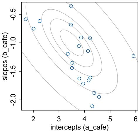
Figure 14.2. 20 cafés sampled from a statistical population. The horizontal axis is the intercept (average morning wait) for each cafe. The vertical axis is the slope (average difference between afternoon and morning wait) for each café. The gray ellipses illustrate the multivariate Gaussian population of intercepts and slopes.
Overthinking: Variance, covariance, correlation. In typical statistical usage, we define covariance using three parameters: (1) the standard deviation of the first variable (σα for example), (2) the standard deviation of the second variable (σβ for example), and (3) the correlation between the two variables (ραβ for example). Why is the covariance equal to σασβραβ?
The usual definition of the covariance between two variables x and y is cov(x, y) = E(xy) − E(x) E(y). You can say this as “the covariance is the difference between the average product and the product of the averages.” The variance is just a special case of this, the covariance of a variable with itself: var(x) = cov(x, x) = E(x 2 ) − E(x) 2 . If we consider only random variables with expectation zero—no harm done, since we can recenter at will—then these are just cov(x, y) = E(xy) and var(x) = E(x 2 ).
A correlation is just a rescaled covariance, so that the minimum is −1 and the maximum is 1. We can standardize a covariance this way by dividing it by the maximum possible covariance, which turns out to be p var(x) var(y), the product of the standard deviations. Now to show you that this is the largest that cov(x, y) = E(xy) can ever be. A covariance will be largest when the second variable y is just a rescaled copy of x. For example, let yi = pxi , where p is some proportion like 0.5 or 1.5. So y = px is just a stretched x. The covariance is now cov(x, y) = E(px2 ) = p E(x 2 ). The variances are var(x) = E(x 2 ) and var(y) = E(y 2 ) = E(p 2 x 2 ) = p 2 E(x 2 ). Having fun yet? Here comes the end. var(x) var(y) = p 2 E(x 2 ) 2 and so p var(x) var(y) = p E(x 2 ) = cov(x, y). That’s the largest the covariance can get. So if we want a standardized measure of association, the correlation, we divide the covariance by this maximum value, which gives us the usual definition of a correlation coefficient, ρxy = cov(x, y)/ p var(x) var(y). Solve this equation for cov(x, y) and you get cov(x, y) = p var(x) var(y)ρxy. Whew. All of this is just to show that the applied statistics usage of covariance as cov(x, y) = σxσyρxy is as justified as it is convenient.
14.1.2. Simulate observations. We’re almost done simulating. What we did above was simulate individual cafés and their average properties. Now all that remains is to simulate our robot visiting these cafés and collecting data. The code below simulates 10 visits to each café, 5 in the morning and 5 in the afternoon. The robot records the wait time during each visit. Then it combines all of the visits into a common data frame.
14.10 set.seed(22)
N_visits <- 10
afternoon <- rep(0:1,N_visits*N_cafes/2)
cafe_id <- rep( 1:N_cafes , each=N_visits )
mu <- a_cafe[cafe_id] + b_cafe[cafe_id]*afternoon
sigma <- 0.5 # std dev within cafes
wait <- rnorm( N_visits*N_cafes , mu , sigma )
d <- data.frame( cafe=cafe_id , afternoon=afternoon , wait=wait )Go ahead and look inside the data frame d now. You’ll find exactly the sort of data that is well-suited to a varying slopes model. There are multiple clusters in the data. These are the cafés. And each cluster is observed under different conditions. So it’s possible to estimate both an individual intercept for each cluster, as well as an individual slope.
In this example, everything is balanced: Each café has been observed exactly 10 times, and the time of day is always balanced as well, with 5 morning and 5 afternoon observations for each café. But in general the data do not need to be balanced. Just like the tadpoles example from the previous chapter, lack of balance can really favor the varying effects analysis, because partial pooling uses information about the population where it is needed most.
Rethinking: Simulation and misspecification. In this exercise, we are simulating data from a generative process and then analyzing that data with a model that reflects exactly the correct structure of that process. But in the real world, we’re never so lucky. Instead we are always forced to analyze data with a model that is misspecified: The true data-generating process is different than the model. Simulation can be used however to explore misspecification. Just simulate data from a process and then see how a number of models, none of which match exactly the data-generating process, perform. And always remember that Bayesian inference does not depend upon data-generating assumptions, such as the likelihood, being true. Non-Bayesian approaches may depend upon sampling distributions for their inferences, but this is not the case for a Bayesian model. In a Bayesian model, a likelihood is a prior for the data, and inference about parameters can be surprisingly insensitive to its details.
14.1.3. The varying slopes model. Now we’re ready to play the process in reverse. We just generated data from a set of 20 cafés, and those cafés were themselves generated from a statistical population of cafés. Now we’ll use that data to learn about the data-generating process, through a model.
The model is much like the varying intercepts models from the previous chapter. But now the joint population of intercepts and slopes appears, instead of just a distribution of varying intercepts. This is the varying slopes model, with explanation to follow. First we have the probability of the data and the linear model:
\[\begin{aligned} \mathcal{W}\_{l} & \sim \text{Normal}(\mu\_{l}, \sigma) \\ \mu\_{l} &= \alpha\_{\text{cAF}[l]} + \beta\_{\text{cAF}[l]} A\_{l} \end{aligned} \tag{\text{[lízelítmod]}}\]
Then comes the matrix of varying intercepts and slopes, with it’s covariance matrix:
αcafé βcafé ∼ MVNormalα β , S [population of varying effects] S = σα 0 0 σβ R σα 0 0 σβ [construct covariance matrix]
These lines state that each café has an intercept αcafé and slope βcafé with a prior distribution defined by the two-dimensional Gaussian distribution with means α and β and covariance matrix S. This statement of prior will adaptively regularize the individual intercepts, slopes, and the correlation among them. The second line above defines how we’re constructing the covariance matrix S, by factoring it into separate standard deviations, σα and σβ, and a correlation matrix R. There are other ways to go about this, but by splitting the covariance up into standard deviations and correlations, it’ll be easier to later understand the inferred structure of the varying effects.
And then come the hyper-priors, the priors that define the adaptive varying effects prior:
| α Normal(5, 2) ∼ |
[prior for average intercept] |
|---|---|
| β Normal(−1, 0.5) ∼ |
[prior for average slope] |
| σ Exponential(1) ∼ |
[prior stddev within cafés] |
| σα ∼ Exponential(1) |
[prior stddev among intercepts] |
| σβ ∼ Exponential(1) |
[prior stddev among slopes] |
| ∼ LKJcorr(2) R |
[prior for correlation matrix] |
The final line probably looks unfamiliar. The correlation matrix R needs a prior. It isn’t easy to conceptualize what a distribution of matrices means. But in this introductory case, it isn’t so hard. This particular correlation matrix is only 2-by-2 in size. So it looks like this:
\[\mathbf{R} = \begin{pmatrix} 1 & \rho \\ \rho & 1 \end{pmatrix}.\]
where ρ is the correlation between intercepts and slopes. So there’s just one parameter to define a prior for. In larger matrices, with additional varying slopes, it gets more complicated.
So whatever is the LKJcorr distribution? What LKJcorr(2) does is define a weakly informative prior on ρ that is skeptical of extreme correlations near −1 or 1.203 You can think of it as a regularizing prior for correlation matrices. This distribution has a single parameter, η, that controls how skeptical the prior is of large correlations in the matrix. When we use LKJcorr(1), the prior is flat over all valid correlation matrices. When the value is greater than 1, such as the 2 we used above, then extreme correlations are less likely. To visualize this family of priors, it will help to sample random matrices from it:
R code14.11 R <- rlkjcorr( 1e4 , K=2 , eta=2 )
dens( R[,1,2] , xlab="correlation" )This is shown in Figure 14.3, along with two other η values. When the matrix is larger, there are more correlations inside it, but the nature of the distribution remains the same. There is an example density for a 3-by-3 matrix in the help page examples, ?rlkjcorr.
To fit the model, we use a list of formulas that closely mirrors the model definition above. Note the use of c() to combine parameters into a vector.
R code
14.12 set.seed(867530)
m14.1 <- ulam(
alist(
wait ~ normal( mu , sigma ),
mu <- a_cafe[cafe] + b_cafe[cafe]*afternoon,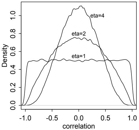
Figure 14.3. LKJcorr(η) probability density. The plot shows the distribution of correlation coefficients extracted from random 2-by-2 correlation matrices, for three values of η. When η = 1, all correlations are equally plausible. As η increases, extreme correlations become less plausible.
c(a_cafe,b_cafe)[cafe] ~ multi_normal( c(a,b) , Rho , sigma_cafe ),
a ~ normal(5,2),
b ~ normal(-1,0.5),
sigma_cafe ~ exponential(1),
sigma ~ exponential(1),
Rho ~ lkj_corr(2)
) , data=d , chains=4 , cores=4 )The distribution multi_normal is a multivariate Gaussian notation that takes a vector of means, c(a,b), a correlation matrix, Rho, and a vector of standard deviations, sigma_cafe. It constructs the covariance matrix internally. If you are interested in the details, you can peek at the raw Stan code with stancode(m14.1). The name multi_normal is what Stan uses in its raw code. The similar R functions are dmvnorm and dmvnorm2.
Now instead of looking at the marginal posterior distributions in the precis output, let’s go straight to inspecting the posterior distribution of varying effects. First, let’s examine the posterior correlation between intercepts and slopes.
14.13 post <- extract.samples(m14.1)
dens( post$Rho[,1,2] , xlim=c(-1,1) ) # posterior
R <- rlkjcorr( 1e4 , K=2 , eta=2 ) # prior
dens( R[,1,2] , add=TRUE , lty=2 )The result is shown in Figure 14.4, with some additional decoration and the addition of the prior for comparison. The blue density is the posterior distribution of the correlation between intercepts and slopes. The posterior is concentrated on negative values, because the model has learned the negative correlation you can see in Figure 14.2. Keep in mind that the model did not get to see the true intercepts and slopes. All it had to work from was the observed wait times in morning and afternoon.
If you are curious about the impact of the prior, then you should change the prior and repeat the analysis. I suggest trying a flat prior, LKJcorr(1), and then a more strongly regularizing prior like LKJcorr(4) or LKJcorr(5).
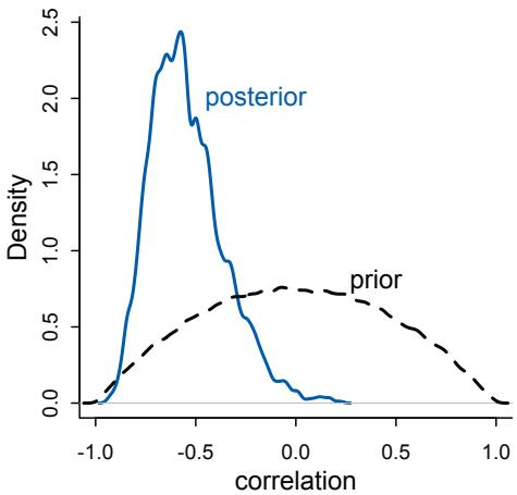
Figure 14.4. Posterior distribution of the correlation between intercepts and slopes. Blue: Posterior distribution of the correlation, reliably below zero. Dashed: Prior distribution, the LKJcorr(2) density.
Next, consider the shrinkage. The multilevel model estimates posterior distributions for intercepts and slopes of each café. The inferred correlation between these varying effects was used to pool information across them. This is just as the inferred variation among intercepts pools information among them, as well as how the inferred variation among slopes pools information among them. All together, the variances and correlation define an inferred multivariate Gaussian prior for the varying effects. And this prior, learned from the data, adaptively regularizes both the intercepts and slopes.
To see the consequence of this adaptive regularization, shrinkage, let’s plot the posterior mean varying effects. Then we can compare them to raw, unpooled estimates. We’ll also show the contours of the inferred prior—the population of intercepts and slopes—and this will help us visualize the shrinkage. Here’s code to plot the unpooled estimates and posterior means.
R code
14.14 # compute unpooled estimates directly from data
a1 <- sapply( 1:N_cafes ,
function(i) mean(wait[cafe_id==i & afternoon==0]) )
b1 <- sapply( 1:N_cafes ,
function(i) mean(wait[cafe_id==i & afternoon==1]) ) - a1
# extract posterior means of partially pooled estimates
post <- extract.samples(m14.1)
a2 <- apply( post$a_cafe , 2 , mean )
b2 <- apply( post$b_cafe , 2 , mean )
# plot both and connect with lines
plot( a1 , b1 , xlab="intercept" , ylab="slope" ,
pch=16 , col=rangi2 , ylim=c( min(b1)-0.1 , max(b1)+0.1 ) ,
xlim=c( min(a1)-0.1 , max(a1)+0.1 ) )
points( a2 , b2 , pch=1 )
for ( i in 1:N_cafes ) lines( c(a1[i],a2[i]) , c(b1[i],b2[i]) )And to superimpose the contours of the population:
14.15 # compute posterior mean bivariate Gaussian
Mu_est <- c( mean(post$a) , mean(post$b) )
rho_est <- mean( post$Rho[,1,2] )
sa_est <- mean( post$sigma_cafe[,1] )
sb_est <- mean( post$sigma_cafe[,2] )
cov_ab <- sa_est*sb_est*rho_est
Sigma_est <- matrix( c(sa_est^2,cov_ab,cov_ab,sb_est^2) , ncol=2 )
# draw contours
library(ellipse)
for ( l in c(0.1,0.3,0.5,0.8,0.99) )
lines(ellipse(Sigma_est,centre=Mu_est,level=l),
col=col.alpha("black",0.2))The result appears on the left in Figure 14.5. The blue points are the unpooled estimates for each café. The open points are the posterior means from the varying effects model. A line connects the points that belong to the same café. Each open point is displaced from the blue towards the center of the contours, as a result of shrinkage in both dimensions. Blue points farther from the center experience more shrinkage, because they are less plausible, given the inferred population.
But notice too that shrinkage is not in direct lines towards the center. This is most obvious for the café that appears in the top-middle of the plot. That particular café had an average intercept, so it lies in the middle of the horizontal axis. But it also had an unusually high slope, so it lies at the top of the vertical axis. Pooled information from the other cafés results in skepticism about the slope. But since intercepts and slopes are correlated in the population as a whole, shrinking the slope down also shrinks the intercept. So all those angled shrinkage lines reflect the negative correlation between intercepts and slopes.
The right-hand plot in Figure 14.5 displays the same information, but now on the outcome scale. You can compute these average outcomes from knowledge of the linear model:
14.16 # convert varying effects to waiting times
wait_morning_1 <- (a1)
wait_afternoon_1 <- (a1 + b1)
wait_morning_2 <- (a2)
wait_afternoon_2 <- (a2 + b2)
# plot both and connect with lines
plot( wait_morning_1 , wait_afternoon_1 , xlab="morning wait" ,
ylab="afternoon wait" , pch=16 , col=rangi2 ,
ylim=c( min(wait_afternoon_1)-0.1 , max(wait_afternoon_1)+0.1 ) ,
xlim=c( min(wait_morning_1)-0.1 , max(wait_morning_1)+0.1 ) )
points( wait_morning_2 , wait_afternoon_2 , pch=1 )
for ( i in 1:N_cafes )
lines( c(wait_morning_1[i],wait_morning_2[i]) ,
c(wait_afternoon_1[i],wait_afternoon_2[i]) )
abline( a=0 , b=1 , lty=2 )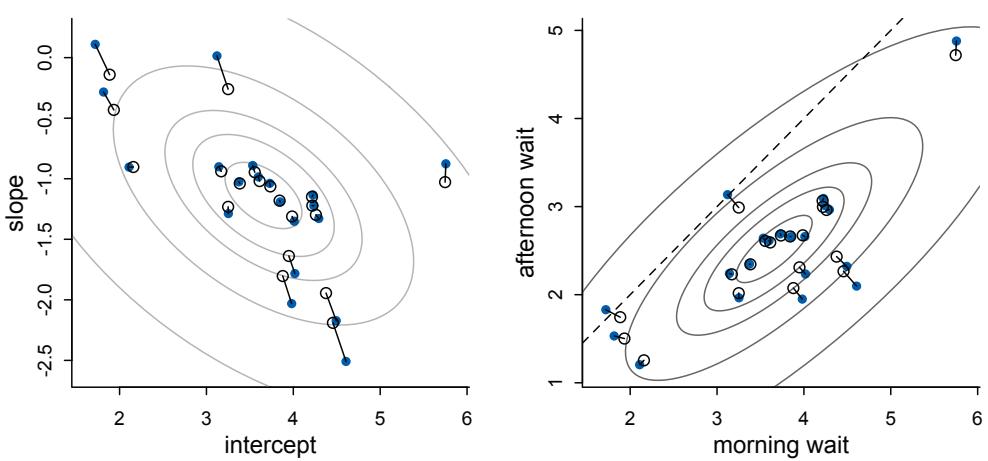
Figure 14.5. Shrinkage in two dimensions. Left: Raw unpooled intercepts and slopes (filled blue) compared to partially pooled posterior means (open circles). The gray contours show the inferred population of varying effects. Right: The same estimates on the outcome scale.
To add the contour, we need the variances and covariance. We could use a formula—there are some simple relations among Gaussian random variables. But to make this lesson more general, let’s simulate instead, so you can see how to compute anything of interest.
R code
14.17 # now shrinkage distribution by simulation
v <- mvrnorm( 1e4 , Mu_est , Sigma_est )
v[,2] <- v[,1] + v[,2] # calculate afternoon wait
Sigma_est2 <- cov(v)
Mu_est2 <- Mu_est
Mu_est2[2] <- Mu_est[1]+Mu_est[2]
# draw contours
library(ellipse)
for ( l in c(0.1,0.3,0.5,0.8,0.99) )
lines(ellipse(Sigma_est2,centre=Mu_est2,level=l),
col=col.alpha("black",0.5))The horizontal axis in the plot shows the expected morning wait, in minutes, for each café. The vertical axis shows the expected afternoon wait. Again the blue points are unpooled empirical estimates from the data. The open points are posterior predictions, using the pooled estimates. The diagonal dashed line shows where morning wait is equal to afternoon wait. What I want you to appreciate in this plot is that shrinkage on the parameter scale naturally produces shrinkage where we actually care about it: on the outcome scale. And it also implies a population of wait times, shown by the gray contours. That population is now positively correlated—cafés with longer morning waits also tend to have longer afternoon waits. They are popular, after all. But the population lies mostly below the dashed line where the waits are equal. You’ll wait less in the afternoon, on average.
14.2. Advanced varying slopes
To see how to construct a model with more than two varying effects—varying intercepts plus more than one varying slope—as well as with more than one type of cluster, we’ll return to the chimpanzee experiment data that was introduced in Chapter 11. In these data, there are two types of clusters: actors and blocks. We explored cross-classification with two kinds of varying intercepts back on page 415. We also modeled the experiment with two different slopes: one for the effect of the prosocial option (the side of the table with two pieces of food) and one for the interaction between the prosocial option and the presence of another chimpanzee. Now we’ll model both types of clusters and place varying effects on the intercepts and both slopes. All of this machinery is not always necessary. But sometimes it is, and this is a relatively simple example to lay it all out.
I’ll also use this example to emphasize the importance of non-centered parameterization for some multilevel models. For any given multilevel model, there are several different ways to write it down. These ways are called “parameterizations.” Mathematically, these alternative parameterizations are equivalent, but inside the MCMC engine they are not. Remember, how you fit the model is part of the model. Choosing a better parameterization is an awesome way to improve sampling for your MCMC model fit, and the non-centered parameterization tends to help a lot with complex varying effect models like the one you’ll work with in this section. I’ll hide the details of the technique in the main text. But as usual, there is an Overthinking box at the end that provides some detail.
Okay, let’s construct a cross-classified varying slopes model. To maintain some sanity with this complicated model, we’ll use more than one linear model in the formulas. This will allow us to compartmentalize sub-models for the intercepts and each slope. Here’s what the likelihood and its linear model looks like:
\[\begin{aligned} L\_i &\sim \text{Binomial}(1, p\_i) \\ \text{logit}(p\_i) &= \gamma\_{\text{TID}[i]} + \alpha\_{\text{ACTOR}[i], \text{TID}[i]} + \beta\_{\text{BLOG}[i], \text{TID}[i]} \end{aligned}\]
The linear model for logit(pi) contains an average log-odds for each treatment, γtid[i] , an effect for each actor in each treatment, αactor[i],tid[i] , and finally an effect for each block in each treatment, βblock[i],tid[i] . This is essentially an interaction model that allows the effect of each treatment to vary by each actor and each block. This is to say that the average treatment effect can vary by block, and each individual chimpanzee can also respond (across blocks) to each treatment differently. This yields a total of 4 + 7 × 4 + 6 × 4 = 56 parameters. Pooling is really needed here.
So let’s do some pooling. The next part of the model are the adaptive priors. Since there are two cluster types, actors and blocks, there are two multivariate Gaussian priors. The multivariate Gaussian priors are both 4-dimensional, in this example, because there are 4 treatments. But in general, you can choose to have different varying effects in different cluster types. Here are the two priors in this case:
\[ \begin{bmatrix} \alpha\_{j,1} \\ \alpha\_{j,2} \\ \alpha\_{j,3} \\ \alpha\_{j,4} \end{bmatrix} \sim \text{MVNormal}\left( \begin{bmatrix} 0 \\ 0 \\ 0 \\ 0 \end{bmatrix}, \mathbf{S}\_{\text{ACTOR}} \right), \]
\[ \begin{bmatrix} \beta\_{j,1} \\ \beta\_{j,2} \\ \beta\_{j,3} \\ \beta\_{j,4} \end{bmatrix} \sim \text{MVNormal}\left(\begin{bmatrix}0\\0\\0\\0\end{bmatrix}, \mathbf{S}\_{\text{BLOCK}}\right) \]
What these priors state is that actors and blocks come from two different statistical populations. Within each, the 4 features of each actor or block are related through a covariance matrix S specific to that population. There are no means in these priors, just because we already placed the average treatment effects—γ—in the linear model.
And the ulam code for this model looks as you’d expect, given previous examples. To define the multiple linear models, just write each into the formula list in order. I’ll add some white space and comments to this formula list, to make it easier to read.
R code
14.18 library(rethinking)
data(chimpanzees)
d <- chimpanzees
d$block_id <- d$block
d$treatment <- 1L + d$prosoc_left + 2L*d$condition
dat <- list(
L = d$pulled_left,
tid = d$treatment,
actor = d$actor,
block_id = as.integer(d$block_id) )
set.seed(4387510)
m14.2 <- ulam(
alist(
L ~ dbinom(1,p),
logit(p) <- g[tid] + alpha[actor,tid] + beta[block_id,tid],
# adaptive priors
vector[4]:alpha[actor] ~ multi_normal(0,Rho_actor,sigma_actor),
vector[4]:beta[block_id] ~ multi_normal(0,Rho_block,sigma_block),
# fixed priors
g[tid] ~ dnorm(0,1),
sigma_actor ~ dexp(1),
Rho_actor ~ dlkjcorr(4),
sigma_block ~ dexp(1),
Rho_block ~ dlkjcorr(4)
) , data=dat , chains=4 , cores=4 )When sampling from this model, you will notice many “divergent transitions”:
Warning messages:
1: There were 154 divergent transitions after warmup.
We first discussed these back in Chapter 9. If you look at the diagnostics and the trankplot, you see that the chains are not mixing quite right. In the previous chapter, we saw how reparameterizing the model can help. We’ll do that again here. Our goal is to factor all the
parameters out of the adaptive priors and place them instead in the linear model. But now that we have covariance matrixes in the priors, how are we going to do that?
The basic strategy is the same, just extrapolated to matrixes. What we’ll do is again make some z-scores for each random effect. But now we need matrixes of z-scores, just like we had matrixes of random effects in the previous model. Then we’ll want to multiply those z-scores into a covariance matrix so that we get back the random effects on the right scale for the linear model. There is a special matrix algebra trick for this, and ulam has a function compose_noncentered for performing this trick. The Overthinking box at the end of the section explains in more detail. This is how the non-centered version of the model looks:
14.19 set.seed(4387510)
m14.3 <- ulam(
alist(
L ~ binomial(1,p),
logit(p) <- g[tid] + alpha[actor,tid] + beta[block_id,tid],
# adaptive priors - non-centered
transpars> matrix[actor,4]:alpha <-
compose_noncentered( sigma_actor , L_Rho_actor , z_actor ),
transpars> matrix[block_id,4]:beta <-
compose_noncentered( sigma_block , L_Rho_block , z_block ),
matrix[4,actor]:z_actor ~ normal( 0 , 1 ),
matrix[4,block_id]:z_block ~ normal( 0 , 1 ),
# fixed priors
g[tid] ~ normal(0,1),
vector[4]:sigma_actor ~ dexp(1),
cholesky_factor_corr[4]:L_Rho_actor ~ lkj_corr_cholesky( 2 ),
vector[4]:sigma_block ~ dexp(1),
cholesky_factor_corr[4]:L_Rho_block ~ lkj_corr_cholesky( 2 ),
# compute ordinary correlation matrixes from Cholesky factors
gq> matrix[4,4]:Rho_actor <<- Chol_to_Corr(L_Rho_actor),
gq> matrix[4,4]:Rho_block <<- Chol_to_Corr(L_Rho_block)
) , data=dat , chains=4 , cores=4 , log_lik=TRUE )No more divergent transitions! There are several advanced features of ulam on display above. One important bit to note is the last two lines. These compute the ordinary correlation matrixes from those Cholesky factors. This will help you interpret the correlations, if you want. That gq> tag in front of each line tells Stan to do this calculation only at the end of each transition. This is more efficient. If you are still curious about the details, see the Overthinking box further down for the raw Stan version of this model.
How has the non-centered parameterization helped here? If you compare the precis output of the two models, you’ll see that they arrive at roughly the same inferences. But the n_eff values for m14.2 are much larger, and it sampled more quickly in real time. Let’s show the difference in effective samples visually, using a simple scatterplot:
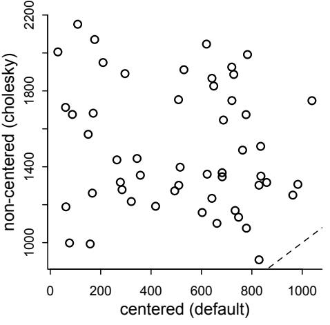
Figure 14.6. Distributions of effective samples, n_eff, for the centered and non-centered parameterizations of the crossclassified varying slopes model, m14.2 and m14.3, respectively. Both models arrive at equivalent inferences, but the non-centered version samples much more efficiently.
R code14.20 # extract n_eff values for each model
neff_nc <- precis(m14.3,3,pars=c("alpha","beta"))$n_eff
neff_c <- precis(m14.2,3,pars=c("alpha","beta"))$n_eff
plot( neff_c , neff_nc , xlab="centered (default)" ,
ylab="non-centered (cholesky)" , lwd=1.5 )
abline(a=0,b=1,lty=2)Figure 14.6 displays the result. The non-centered version of the model samples much more efficiently, producing more effective samples per parameter. In practice, this means you don’t need as many actual iterations, iter, to arrive at an equally good portrait of the posterior distribution. For larger data sets, the savings can mean hours of time. And in some problems, the centered version of the model just won’t give you a useful posterior.
This model has 76 parameters: 4 average treatment effects, 4×7 varying effects on actor, 4×6 varying effects on block, 8 standard deviations, and 12 free correlation parameters. You can check them all for yourself with precis(m14.3,depth=3). But effectively the model has only about 27 parameters—check WAIC(m14.3). The two varying effects populations, one for actors and one for blocks, regularize the varying effects themselves. So as usual, each varying intercept or slope counts less than one effective parameter.
We can inspect the standard deviation parameters to get a sense of how aggressively the varying effects are being regularized:
R code
14.21 precis( m14.3 , depth=2 , pars=c("sigma_actor","sigma_block") )mean sd 5.5% 94.5% n_eff Rhat
sigma_actor[1] 1.37 0.47 0.77 2.20 832 1
sigma_actor[2] 0.91 0.40 0.42 1.62 1108 1
sigma_actor[3] 1.85 0.55 1.12 2.82 961 1
sigma_actor[4] 1.58 0.58 0.87 2.58 1109 1
sigma_block[1] 0.40 0.32 0.04 0.98 1112 1
sigma_block[2] 0.42 0.33 0.03 1.03 903 1
sigma_block[3] 0.31 0.28 0.02 0.80 1740 1sigma_block[4] 0.48 0.37 0.04 1.16 942 1While these are just posterior means, and the amount of shrinkage averages over the entire posterior, you can get a sense from the small values that shrinkage is pretty aggressive here, especially in the case of the blocks. This is what takes the model from 76 actual parameters to 27 effective parameters, as measured by WAIC (or PSIS—it agrees in this case).
This is a good example of how varying effects adapt to the data. The overfitting risk is much milder here than it would be with ordinary fixed effects. It can of course be challenging to define and fit these models. But if you don’t check for variation in slopes, you may never notice it. And even if the average slope is almost zero, there might still be substantial variation in slopes across clusters.
Before leaving this example behind, let’s look at the posterior predictions against the average for each actor and each treatment, as we did back in Chapter 11. This is going to be a big chunk of code, just like it was back in the earlier chapter. But there is nothing new here really. I’ll use block number 5 in these predictions, because it had almost zero effect, and we want to average over blocks in this visualization.
14.22 # compute mean for each actor in each treatment
pl <- by( d$pulled_left , list( d$actor , d$treatment ) , mean )
# generate posterior predictions using link
datp <- list(
actor=rep(1:7,each=4) ,
tid=rep(1:4,times=7) ,
block_id=rep(5,times=4*7) )
p_post <- link( m14.3 , data=datp )
p_mu <- apply( p_post , 2 , mean )
p_ci <- apply( p_post , 2 , PI )
# set up plot
plot( NULL , xlim=c(1,28) , ylim=c(0,1) , xlab="" ,
ylab="proportion left lever" , xaxt="n" , yaxt="n" )
axis( 2 , at=c(0,0.5,1) , labels=c(0,0.5,1) )
abline( h=0.5 , lty=2 )
for ( j in 1:7 ) abline( v=(j-1)*4+4.5 , lwd=0.5 )
for ( j in 1:7 ) text( (j-1)*4+2.5 , 1.1 , concat("actor ",j) , xpd=TRUE )
xo <- 0.1 # offset distance to stagger raw data and predictions
# raw data
for ( j in (1:7)[-2] ) {
lines( (j-1)*4+c(1,3)-xo , pl[j,c(1,3)] , lwd=2 , col=rangi2 )
lines( (j-1)*4+c(2,4)-xo , pl[j,c(2,4)] , lwd=2 , col=rangi2 )
}
points( 1:28-xo , t(pl) , pch=16 , col="white" , cex=1.7 )
points( 1:28-xo , t(pl) , pch=c(1,1,16,16) , col=rangi2 , lwd=2 )
yoff <- 0.175
text( 1-xo , pl[1,1]-yoff , "R/N" , pos=1 , cex=0.8 )
text( 2-xo , pl[1,2]+yoff , "L/N" , pos=3 , cex=0.8 )
text( 3-xo , pl[1,3]-yoff , "R/P" , pos=1 , cex=0.8 )
text( 4-xo , pl[1,4]+yoff , "L/P" , pos=3 , cex=0.8 )
# posterior predictionsR code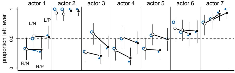
Figure 14.7. Posterior predictions, in black, against the raw data, in blue, for model m14.3, the cross-classified varying effects model. The line segments are 89% compatibility intervals. Open circles are treatments without a partner. Filled circles are treatments with a partner. The prosocial location alternates right-left-right-left, as labeled in actor 1.
for ( j in (1:7)[-2] ) {
lines( (j-1)*4+c(1,3)+xo , p_mu[(j-1)*4+c(1,3)] , lwd=2 )
lines( (j-1)*4+c(2,4)+xo , p_mu[(j-1)*4+c(2,4)] , lwd=2 )
}
for ( i in 1:28 ) lines( c(i,i)+xo , p_ci[,i] , lwd=1 )
points( 1:28+xo , p_mu , pch=16 , col="white" , cex=1.3 )
points( 1:28+xo , p_mu , pch=c(1,1,16,16) )The result appears as Figure 14.7. The raw data are shown in blue. The posterior means and 89% compatibility intervals are shown in black. As in the earlier chapter, open circles are treatments without a partner. Filled circles are those with a partner. The prosocial treatments alternate right-left-right-left, as labeled in actor 1. The most obvious difference from earlier is that the model accommodates a lot more variation among individuals. Letting each actor have his or her own parameters allows this, at least when there is sufficient data for each actor. Notice however that the posterior does not just repeat the data—there is shrinkage in several places. Actor 2 is the most obvious. Recall that actor 2 always, in every treatment and block, pulled the left lever. The blue points cling to the top. But the posterior predictions shrink inward. Why do they shrink inward more for some treatments, like 1 and 2, than others? Because those treatments had less variation among actors. Look back at the precis output on the previous page. The less variation among actors in a treatment, the more shrinkage among actors in that same treatment.
Our interpretation of this experiment has not changed. These chimpanzees simply did not behave in any consistently different way in the partner treatments. The model we’ve used here does have some advantages, though. Since it allows for some individuals to differ in how they respond to the treatments, it could reveal a situation in which a treatment has no effect on average, even though some of the individuals respond strongly. That wasn’t the case here. But often we are more interested in the distribution of responses than in the average response, so a model that estimates the distribution of treatment effects is very useful.
Suppose for example that we are testing a pain reliever, like aspirin. For many medications, only some people benefit. The average treatment effect is not really as interesting as the distribution of treatment effects, in such cases.
Overthinking: Non-centered parameterization of the multilevel model. When there are inefficient chains, often running the chains long enough will produce reliable samples from the posterior. This was the case with m14.2 in the main text. But this is both inefficient and unreliable. The chains could still be biased in subtle ways that are hard to detect. Better to re-parameterize, as explained in the preceding section.204 How does this work in the case of covariance matrixes?
Model m14.3 uses a trick known as the Cholesky decomposition to smuggle the covariance matrix out of the prior. The top part of the model is the same as the centered version, m14.2. The changes are the extra lines that construct the adaptive priors:
# adaptive priors - non-centered
transpars> matrix[actor,4]:alpha <-
compose_noncentered( sigma_actor , L_Rho_actor , z_actor ),
transpars> matrix[block_id,4]:beta <-
compose_noncentered( sigma_block , L_Rho_block , z_block ),
matrix[4,actor]:z_actor ~ normal( 0 , 1 ),
matrix[4,block_id]:z_block ~ normal( 0 , 1 ),These two lines that begin with transpars> define the matrixes of varying effects alpha and beta. Each is a matrix with a row for each actor/block and a column for each effect. As a convenience, compose_noncentered mixes the vector of standard deviations, the correlation matrix, and the zscores together to make a matrix of parameters on the correct scale for the linear model. This means that the matrixes of z-scores—the third and fourth lines above—can just be normal(0,1). The other change to the model, to make it non-centered, is that the correlation matrixes have been replaced with something called a Cholesky factor, cholesky_factor_corr to be precise.
So what is compose_concentered doing? And what are these mysterious Cholesky factors? A Cholesky decomposition L is a way to represent a square, symmetric matrix like a correlation matrix R such that R = LL⊺ . It is a marvelous fact that you can multiply L by a matrix of uncorrelated samples (z-scores) and end up with a matrix of correlated samples (the varying effects). This is the trick that lets us take the covariance matrix out of the prior. We just sample a matrix of uncorrelated z-scores and then multiply those by the Cholesky factor and the standard deviations to get the varying effects with the correct scale and correlation. It would be magic, except that it is just algebra.
Let’s look at the raw Stan code, to demystify all of this and help you transition to building models directly in Stan, where you will have more control. Those transpars> flags in the ulam code define the matrixes alpha and beta as transformed parameters, which means that Stan will include them in the posterior, even though they are just functions of parameters. So if you look at stancode(m14.3), you’ll see a new block above the model block:
transformed parameters{
matrix[7,4] alpha;
matrix[6,4] beta;
beta = (diag_pre_multiply(sigma_block, L_Rho_block) * z_block)';
alpha = (diag_pre_multiply(sigma_actor, L_Rho_actor) * z_actor)';
}These are the calculations that merge vectors of standard deviations, sigma_actor and sigma_block, with Cholesky correlation factors, L_Rho_actor and L_Rho_block. The function diag_pre_multiply does this—all it does is make a diagonal matrix from the sigma vector and then multiply, producing a Cholesky factor for the right covariance matrix. Finally, that Cholesky covariance factor is matrix multiplied by the matrix of z-scores. For convenience, the thing is transposed—that ’ on the end of each line—so we can index it as alpha[actor,effect] instead of alpha[effect,actor]. But really that step isn’t necessary.
Then down in the model block, the matrixes alpha and beta are just available as parameters, so the linear model part looks the same:
model{
vector[504] p;
L_Rho_block ~ lkj_corr_cholesky( 2 );
sigma_block ~ exponential( 1 );
L_Rho_actor ~ lkj_corr_cholesky( 2 );
sigma_actor ~ exponential( 1 );
g ~ normal( 0 , 1 );
to_vector( z_block ) ~ normal( 0 , 1 );
to_vector( z_actor ) ~ normal( 0 , 1 );
for ( i in 1:504 ) {
p[i] = g[tid[i]] + alpha[actor[i], tid[i]] + beta[block_id[i], tid[i]];
p[i] = inv_logit(p[i]);
}
L ~ binomial( 1 , p );
}From top to bottom: The vector p is declared to hold our linear model calculations for each case, then the priors are defined in terms of Cholesky correlation factors and vectors of standard deviations. The z-score matrixes are assigned their prior using to_vector, because normal(0,1) applies to vectors, not matrixes. The z-scores are still stored in matrix format—this to_vector stuff is just needed to force the same normal(0,1) prior on each cell in the matrix. Finally the linear model is computed, using the alpha and beta matrixes from the transformed parameters block, and then the probability of the data is defined as usual.
The last bit is generated quantities, where variables that are functions of each sample can be calculated. This block is used here to transform the Cholesky factors into ordinary correlation matrixes, so they can be interpreted as such, as well as to compute the log-probabilities needed to calculate WAIC or PSIS.
generated quantities{
vector[504] log_lik;
vector[504] p;
matrix[4,4] Rho_actor;
matrix[4,4] Rho_block;
Rho_block = multiply_lower_tri_self_transpose(L_Rho_block);
Rho_actor = multiply_lower_tri_self_transpose(L_Rho_actor);
for ( i in 1:504 ) {
p[i] = g[tid[i]] + alpha[actor[i], tid[i]] + beta[block_id[i], tid[i]];
p[i] = inv_logit(p[i]);
}
for ( i in 1:504 ) log_lik[i] = binomial_lpmf( L[i] | 1 , p[i] );
}The function multiply_lower_tri_self_transpose is just a compact and efficient way to perform the matrix algebra needed to turn the Cholesky factor L into the corresponding matrix R = LL⊺ .
There is an obvious cost to these non-centered forms: They look a lot more confusing. Hardto-read models and model code limit our ability to share implementations with our colleagues, and sharing is a principal goal of scientific computation.
Finally, not all combinations of model structure and data benefit from the non-centered parameterization. Sometimes the centered version—putting the means and standard deviations in the prior is better. So you might try the form that is most natural for you personally. If it gives you trouble, try an alternative form. With some experience, different forms of the same model become familiar. There is a practice problem at the end of this chapter that may help.
14.3. Instruments and causal designs
Back in Chapter 6, you met a framework for deciding which variables to use in a regression. The key idea is that, in a graphic model like a DAG, many paths may connect a variable to an outcome. Some of those paths are causal, so we want to leave them open. Other paths are non-causal, for example backdoor paths. We want to close those, as well as not accidentally open them by including the wrong variables in the model.
Of course sometimes it won’t be possible to close all of the non-causal paths or rule of unobserved confounds. What can be done in that case? More than nothing. If you are lucky, there are ways to exploit a combination of natural experiments and clever modeling that allow causal inference even when non-causal paths cannot be closed.
We’ll start with the most famous, and possibly least intuitive, example. Then we’ll move on to describe some other approaches.
14.3.1. Instrumental variables. What is the impact of education E on wages W? Does more school improve future wages? If we just regress wages on achieved education, we expect the inference to be biased by factors that influence both wages and education. For example, industrious people may both complete more education and earn higher wages, generating a correlation between education and wages. But that doesn’t necessarily mean that education causes higher wages. It is often difficult to measure, or even imagine, all of the possible confounds of this kind. We end up with a DAG like this:
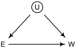
The backdoor path E ← U → W ruins our day.
Even though we cannot condition on U, since we haven’t observed it, there might be something we can do. If we can find a suitable instrumental variable. In causal terms, an instrumental variable is a variable that acts like a natural experiment on the exposure E. In technical terms, an instrumental variable Q is a variable that satisfies these criteria:
- Independent of U (Q ⊥⊥ U)
- Not independent of E (Q ̸⊥⊥ E)
- Q cannot influence W except through E
This last line is sometimes called the exclusion restriction. It cannot be strictly tested, and it is often implausible. Similarly, the first line above cannot be tested. But if you have a strong understanding of the system, so that you believe these criteria, then magic can happen. Also, while we can’t test independence implications for instruments, there may be other implications in the form of inequality constraints.205
It is much easier to understand instruments with a DAG. In our education and wages example, the simplest instrument for education looks like this:
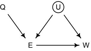
The instrument here is Q. Given this DAG, Q satisfies all of the criteria for a valid instrumental variable. Note that valid instruments can be embedded in much more complicated graphs. If you can condition on other variables, in order to satisfy the criteria listed above, then you have an instrument.
How do we use Q in a model? You cannot just add it to a regression like any other predictor variable. Why not? Suppose we regress W on E. This is the relationship we’d like to know. The association is however confounded by the backdoor path through U. What happens if we then add Q to the model as another predictor? Bad stuff happens. There is no backdoor path through Q, as you can see. But there is a non-causal path from Q to W through U: Q → E ← U → W. This is a non-causal path, because changing Q doesn’t result in any change in W through this path. But since we are conditioning on E in the same model, and E is a collider of Q and U, the non-causal path is open. This confounds the coefficient on Q. It won’t be zero, because it’ll pick up the association between U and W. And then, as a result, the coefficient on E can get even more confounded. Used this way, an instrument like Q might be called a bias amplifier. 206
This is all very confusing. Consider this example. Suppose Q indicates which quarter of the year—winter, spring, summer, fall—a person was born in. Why might this influence education? Because people born earlier in the year tend to get less schooling. This is both because they are biologically older when they start school and because they become eligible to drop out of school earlier. Now, if it is true that Q influences W only through E, and Q is also not influenced by confounds U, then Q is one of these mysterious instrumental variables. This means we can use it in a special way to make a valid causal inference about E → W without measuring U.
This example is based on a real study,207 but let’s simulate the data, both to keep it simple and to be sure what the right answer is. Remember: With real data, you never know what the right answer is. That is why studying simulated examples is so important, both for verifying that algorithms work and for schooling our intuition. Here are 500 simulated people:
R code
14.23 set.seed(73)
N <- 500
U_sim <- rnorm( N )
Q_sim <- sample( 1:4 , size=N , replace=TRUE )
E_sim <- rnorm( N , U_sim + Q_sim )
W_sim <- rnorm( N , U_sim + 0*E_sim )
dat_sim <- list(
W=standardize(W_sim) ,
E=standardize(E_sim) ,
Q=standardize(Q_sim) )The instrument Q varies from 1 to 4. Largest values are associated with more education, through the addition of Q_sim to the mean of E_sim. I’ve assumed that the true influence of education on wages is zero. This is just for the sake of the example. But the instrument Q does influence education, so it can serve as an instrument for discovering E → W.
Let’s consider three models. First, if we naively regress wages on education, the model will be confident that education causes higher wages:
14.24 m14.4 <- ulam(
alist(
W ~ dnorm( mu , sigma ),
mu <- aW + bEW*E,
aW ~ dnorm( 0 , 0.2 ),
bEW ~ dnorm( 0 , 0.5 ),
sigma ~ dexp( 1 )
) , data=dat_sim , chains=4 , cores=4 )
precis( m14.4 )mean sd 5.5% 94.5% n_eff Rhat
aW 0.00 0.04 -0.06 0.06 2024 1
bEW 0.40 0.04 0.33 0.46 1996 1
sigma 0.92 0.03 0.87 0.97 1861 1This is just an ordinary confound, where the unmeasured U is ruining our inference. If you have incentives to believe that education enhances wages, you might report this inference as is. But even if E does increase W, the estimate from this model will be biased upwards. It’s not enough to just know that E positively influences W. Accuracy matters.
Next let’s consider what happens when we add Q as an ordinary predictor. Modifying the model above:
14.25 m14.5 <- ulam(
alist(
W ~ dnorm( mu , sigma ),
mu <- aW + bEW*E + bQW*Q,
aW ~ dnorm( 0 , 0.2 ),
bEW ~ dnorm( 0 , 0.5 ),
bQW ~ dnorm( 0 , 0.5 ),
sigma ~ dexp( 1 )
) , data=dat_sim , chains=4 , cores=4 )
precis( m14.5 )mean sd 5.5% 94.5% n_eff Rhat aW 0.00 0.04 -0.06 0.06 1526 1 bEW 0.64 0.05 0.56 0.71 1381 1 bQW -0.41 0.05 -0.48 -0.33 1416 1 sigma 0.86 0.03 0.82 0.90 1823 1
This is a disaster. As expected from study of the DAG, bQW picks up an association from U. And bEW is even further from the truth now. It was 0.4 above. Now it’s 0.64. That is bias amplification in action.
Now we’re ready to see how to correctly use Q. The answer is actually pretty simple. We just use the generative model. Let’s write a simple generative version of the DAG. It really has four sub-models. First, there is model for how wages W are caused by education E and the unobserved confound U. In mathematical notation:
Wi ∼ Normal(µw,i , σw) µw,i = αw + βewEi + Ui
Second, there is a model for how education levels E are caused by quarter of birth Q—this is our instrument recall—and the same unobserved confound U.
\[\begin{aligned} E\_i &\sim \text{Normal}(\mu\_{\mathbb{E},i}, \sigma\_{\mathbb{E}})\\ \mu\_{\mathbb{E},i} &= \alpha\_{\mathbb{E}} + \beta\_{\text{QE}} Q\_i + U\_i \end{aligned}\]
The third model is for Q. The model just says that one-quarter of all people are born in each quarter of the year.
\[Q\_i \sim \text{Categorical}([0.25, 0.25, 0.25, 0.25])\]
The fourth model says that the unobserved confound U is normally distributed with mean zero and standard deviation one.
\[U\_i \sim \text{Normal}(0, 1)\]
U could have some other distribution. But this is the generative model at the moment.
Now we translate this generative model into a statistical model. We could do it by brute force, just treating the Ui values as missing data and imputing them. But you won’t see how to do that until the next chapter. Besides, it is much more efficient to average over them and estimate instead the covariance between W and E. That’s what we’ll do: Define W and E as coming from a common multivariate normal distribution. Like this:
\[\begin{aligned} \begin{pmatrix} W\_i \\ E\_i \end{pmatrix} &\sim \text{MVNormal}\left(\begin{pmatrix} \mu\_{\le i} \\ \mu\_{\ge i} \end{pmatrix}, \mathbf{S}\right) \\\ \mu\_{\le i} &= \alpha\_{\le} + \beta\_{\text{EW}} E\_i \\\ \mu\_{\ge, i} &= \alpha\_{\ge} + \beta\_{\text{QE}} Q\_i \end{aligned} \qquad\qquad \text{[Join wage 8 reduction model]}\]
The matrix S in the first line is the error covariance between wages and education. It’s not the descriptive covariance between these variables, but rather the matrix equivalent of the typical σ we stick in a Gaussian regression. The above is a multivariate linear model, a regression with multiple simultaneous outcomes, all modeled with a joint error structure. Each variable gets its own linear model, yielding the two µ definitions. It might bother you to see education E as both an outcome and a predictor inside the mean for W. But this statistical relationship is an implication of the DAG. There is nothing illegal about it. All it says is that E might influence W and that also pairs of W, E values might have some residual correlation. That correlation arises, presuming the DAG, through the unobserved confound U.
The full model also needs priors, of course. We standardized the variables, so we can use our default priors for standardized linear regression. Here’s the ulam code:
R code
14.26 m14.6 <- ulam(
alist(
c(W,E) ~ multi_normal( c(muW,muE) , Rho , Sigma ),
muW <- aW + bEW*E,
muE <- aE + bQE*Q,
c(aW,aE) ~ normal( 0 , 0.2 ),
c(bEW,bQE) ~ normal( 0 , 0.5 ),
Rho ~ lkj_corr( 2 ),
Sigma ~ exponential( 1 )
), data=dat_sim , chains=4 , cores=4 )
precis( m14.6 , depth=3 )
| mean | sd | 5.5% | 94.5% | n_eff | Rhat | |
|---|---|---|---|---|---|---|
| aE | 0.00 | 0.03 | -0.06 | 0.05 | 1351 | 1 |
| aW | 0.00 | 0.04 | -0.07 | 0.07 | 1432 | 1 |
| bQE | 0.59 | 0.04 | 0.53 | 0.64 | 1321 | 1 |
| bEW | -0.05 | 0.08 | -0.18 | 0.07 | 1024 | 1 |
| Rho[1,1] | 1.00 | 0.00 | 1.00 | 1.00 | NaN | NaN |
| Rho[1,2] | 0.54 | 0.05 | 0.46 | 0.62 | 1080 | 1 |
| Rho[2,1] | 0.54 | 0.05 | 0.46 | 0.62 | 1080 | 1 |
| Rho[2,2] | 1.00 | 0.00 | 1.00 | 1.00 | 1361 | 1 |
| Sigma[1] | 1.02 | 0.05 | 0.95 | 1.10 | 1085 | 1 |
| Sigma[2] | 0.81 | 0.02 | 0.77 | 0.85 | 1768 | 1 |
There is a lot going on here. But we can take it one piece at a time. First look at bEW, the estimated influence of education on wages. It is small and straddles both sides of zero. That is the correct causal inference. Second, the correlation Rho[1,2] between the two outcomes, wages and education, is reliably positive. That reflects the common influence of U. Remember: This correlation is conditional on E (for W) and Q (for E). It isn’t the raw empirical correlation, but rather the residual correlation.
It’s a good idea to adjust the simulation and try other scenarios. To speed up your play, you can avoid re-compiling the models as long as you keep N=500 and run these lines to sample from the posterior distributions:
R code
14.27 m14.4x <- ulam( m14.4 , data=dat_sim , chains=4 , cores=4 )
m14.6x <- ulam( m14.6 , data=dat_sim , chains=4 , cores=4 )To begin, you might try a scenario in which education has a positive influence but the confound hides it:
14.28 set.seed(73)
N <- 500
U_sim <- rnorm( N )
Q_sim <- sample( 1:4 , size=N , replace=TRUE )
E_sim <- rnorm( N , U_sim + Q_sim )
W_sim <- rnorm( N , -U_sim + 0.2*E_sim )
dat_sim <- list(
W=standardize(W_sim) ,
E=standardize(E_sim) ,
Q=standardize(Q_sim) )You should find that E and W have a negative correlation in their residual variance, because the confound positively influences one and negatively influences the other.
Instrumental variables are hard to understand. But there are some excellent tools to help you. For example, the dagitty package contains a function instrumentalVariables that will find instruments, if they are present in a DAG. In this example, we could define the DAG and query the instrument this way:
14.29 library(dagitty)
dagIV <- dagitty( "dag{ Q -> E <- U -> W <- E }" )
instrumentalVariables( dagIV , exposure="E" , outcome="W" )R code
This is no substitute for understanding. But it can help you develop understanding.
The hardest thing about instrumental variables is believing in any particular instrument. If you believe in your DAG, they are easy to believe. But should you believe in your DAG? As an example, a study of islands employed wind direction as an instrument for inferring the impact of colonialism on economic development.208 Colonial history and economic performance are confounded by many things, like the natural resources of an island. If however wind direction influences date of colonization—because when ships used sails, trade winds made some islands easier to reach—but not economic performance directly, then it could serve as an instrument. This is a very clever idea. But it is easy to imagine that wind influences many things about an island, including its pre-colonial history of contact and its ecology, and that these variables will influence current economies.
A much more common type of instrument is distance to some service. If for example we want to estimate the influence of health care on the wellbeing of mothers, we cannot easily randomize health care among mothers. It would be unethical, for starters. But if mothers naturally vary in distance to care centers, and these distances are random with respect to pre-existing health variables, then distance might be an instrument that influences use of health care but does not influence health directly. However, it’s not hard to think of ways that distance from a hospital could be associated with factors influencing health, violating the exclusion restriction.209
In general, it is not possible to statistically prove whether a variable is a good instrument. As always, we need scientific knowledge outside of the data to make sense of the data.
Rethinking: Two-stage worst squares. The instrumental variable model is often discussed with an estimation procedure known as two-stage least squares (2SLS). This procedure involves two linear regressions. The predicted values of the first regression are fed into the second as data, with adjustments so that the standard errors make sense. Amazingly, when the weather is nice, this procedure works. It relies upon large-sample approximations and has well-known problems.210 Like all golems, you just have to use it responsibly. Sometimes people mistake 2SLS for the model of instrumental variables. They are not the same thing. Any model can be estimated through a number of different procedures, each with its own benefits and costs. If we have count outcomes, measurement errors, missing values, or need varying effects, 2SLS is unreliable. Now that more capable procedures exist, it is easier to fit instrumental variable models. But it can still be difficult. There are no guarantees that an effect can be estimated, just because the DAG says it is possible. Another issue that will always remain, no matter how you approximate the posterior, is that it is very hard to be sure the instrumental variable is any good.
14.3.2. Other designs. Instrumental variables are natural experiments that impersonate randomized experiments. In the example in the previous section, quarter of birth Q is like an external manipulation of education E. That external shock to education is like an experimental manipulation, in the sense that it allows us to estimate the impact of that external shock and thereby derive a causal estimate.
There are potentially many ways to find natural experiments. Not all of them are strictly instrumental variables. But they can provide theoretically correct designs for causal inference, if you can believe the assumptions. Let’s consider two more.
In addition to the backdoor criterion you met in Chapter 6, there is something called the front-door criterion. It is relevant in a DAG like this:
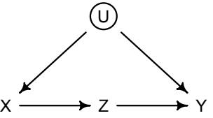
We are interested, as usual, in the causal influence of X on Y. But there is an unobserved confound U, again as usual. It turns out that, if we can find a perfect mediator Z, then we can possibly estimate the causal effect of X on Y. It isn’t crazy to think that causes are mediated by other causes. Everything has a mechanism. Z in the DAG above is such a mechanism. If you have a believable Z variable, then the causal effect of X on Y is estimated by expressing the generative model as a statistical model, similar to the instrumental variable example before. In special cases, such as when everything is linear and Gaussian, there is a formula. But we don’t need formulas. We just need to think generatively and use Bayes.
The front-door criterion isn’t used much. This may be because it is relatively new or rather that believable Z variables are rare. A possible example is the influence of social ties formed in college on voting behavior in the United States Senate.211 The question is whether senators who went to the same college vote more similarly, because their social ties produce coordinated votes. The pure association between attending the same college and voting the same way is obviously confounded by lots of things. The front-door trick is to find some mechanism through which social ties must act. In the case of the United States Senate, a mechanism could be who sits next to who. It is easier to talk to and coordinate with people sitting nearby. And since junior members are often assigned seats effectively at random, seating is unlikely to share the same confounds as college attendance. Now consider some senators who attended UCLA. Some of them end up seated near one another. Others end up seated next to rival UC Berkeley alums. If the ones seated near one another vote more similarly to one another than to the UCLA alums seated elsewhere, that could be causal evidence that social ties influence voting, as mediated by proximity on the Senate floor.
A more common design is regression discontinuity (or RDD). Suppose that we want to estimate the effect of winning an academic award on future success.212 This is confounded by unobserved factors, like ability, that influence both the award and later success. But if we compare individuals who were just below the cutoff for the award to those who were just above the cutoff, these individuals should be similar in the unobserved factors. It’s as if the award were applied at random, for individuals close to the cutoff. This is the idea behind regression discontinuity. In practice, one trend is fit for individuals above the cutoff and another to those below the cutoff. Then an estimate of the causal effect is the average difference between individuals just above and just below the cutoff. While the difference near the cutoff is of interest, the entire function influences this difference. So some care is needed in choosing functions for the overall relationship between the exposure and the outcome.213
Rethinking: Inevitable confounds. Much of the time, it is not possible to rule out confounding, even if you have found a clever instrument or RDD. Reviewers or readers sometimes ignore estimates in these cases. This is a mistake. In these cases, it is still helpful to report estimates, because such estimates provide information about the possible magnitude of the confounds. Combined with some structural assumptions, it is possible to calculate the influence that hypothetical confounding has on your estimates. This kind of sensitivity analysis is very useful, both for designing better studies and for interpreting published ones.214 Of course all of this requires being honest about likely confounding, not eagerly interpreting every causal salad estimate as a causal effect.
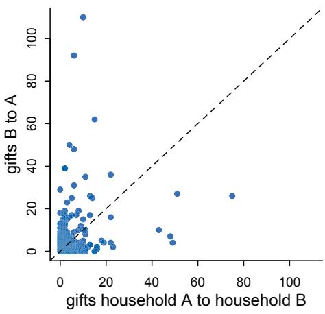
Figure 14.8. Distribution of dyadic gifts in data(KosterLeckie). 25 households present 300 dyads, with an overall correlation of 0.24. But to get a sensible measure of balance of gift giving, we need to make a model that deals with the repeat presence of specific households across dyads.
14.5. Continuous categories and the Gaussian process
All of the varying effects so far, whether they were intercepts or slopes, have been defined over discrete, unordered categories. For example, cafés are unique places, and there is no sense in which café 1 comes before café 2. The “1” and “2” are just labels for unique things. The same goes for tadpole ponds, academic departments, or individual chimpanzees. By estimating unique parameters for each cluster of this kind, we can quantify some of the unique features that generate variation across clusters and covariation among the observations within each cluster. Pooling across the clusters improves accuracy and simultaneously provides a picture of the variation.
R code
But what about continuous dimensions of variation like age or income or stature? Individuals of the same age share some of the same exposures. They listened to some of the same music, heard about the same politicians, and experienced the same weather events. And individuals of similar ages also experienced some of these same exposures, but to a lesser extent than individuals of the same age. The covariation falls off as any two individuals become increasingly dissimilar in age or income or stature or any other dimension that indexes background similarity. It doesn’t make sense to estimate a unique varying intercept for all individuals of the same age, ignoring the fact that individuals of similar ages should have more similar intercepts. And of course, it’s likely that every individual in your sample has a unique age. So then continuous differences in similarity are all you have to work with.
Luckily, there is a way to apply the varying effects approach to continuous categories of this kind. This will allow us to estimate a unique intercept (or slope) for any age, while still regarding age as a continuous dimension in which similar ages have more similar intercepts (or slopes). The general approach is known as Gaussian process regression. 216 This name is unfortunately wholly uninformative about what it is for and how it works.
We’ll proceed to work through a basic example that demonstrates both what it is for and how it works. The general purpose is to define some dimension along which cases differ. This might be individual differences in age. Or it could be differences in location. Then we measure the distance between each pair of cases. What the model then does is estimate a function for the covariance between pairs of cases at different distances. This covariance function provides one continuous category generalization of the varying effects approach.
14.5.1. Example: Spatial autocorrelation in Oceanic tools. When we looked at the complexity of tool kits among historic Oceanic societies, back in Chapter 11 (page 346), we used a crude binary contact predictor as a proxy for possible exchange among societies. But that variable is pretty unsatisfying. First, it takes no note of which other societies each had contact (or not) with. If all of your neighbors are small islands, then high rate of contact with them may not do much at all to tool complexity. Second, if indeed tools were exchanged among societies—and we know they were—then the total number of tools for each are truly not independent of one another, even after we condition on all of the predictors. Instead we expect close geographic neighbors to have more similar tool counts, because of exchange. Third, closer islands may share unmeasured geographic features like sources of stone or shell that lead to similar technological industries. So space could matter in multiple ways.
This is a classic setting in which to use Gaussian process regression. We’ll define a distance matrix among the societies. Then we can estimate how similarity in tool counts depends upon geographic distance. You’ll see how to simultaneously incorporate ordinary predictors, so that the covariation among societies with distance will both control for and be controlled by other factors that influence technology.
Let’s begin by loading the data and inspecting the geographic distance matrix. I’ve already gone ahead and looked up the as-the-crow-flies navigation distance between each pair of societies. These distances are measured in thousands of kilometers, and the matrix of them is in the rethinking package:
R code14.37 # load the distance matrix
library(rethinking)
data(islandsDistMatrix)# display (measured in thousands of km)
Dmat <- islandsDistMatrix
colnames(Dmat) <- c("Ml","Ti","SC","Ya","Fi","Tr","Ch","Mn","To","Ha")
round(Dmat,1)| Ml | Ti | SC | Ya | Fi | Tr | Ch | Mn | To | Ha | |
|---|---|---|---|---|---|---|---|---|---|---|
| Malekula | 0.0 | 0.5 | 0.6 | 4.4 | 1.2 | 2.0 | 3.2 | 2.8 | 1.9 | 5.7 |
| Tikopia | 0.5 | 0.0 | 0.3 | 4.2 | 1.2 | 2.0 | 2.9 | 2.7 | 2.0 | 5.3 |
| Santa Cruz |
0.6 | 0.3 | 0.0 | 3.9 | 1.6 | 1.7 | 2.6 | 2.4 | 2.3 | 5.4 |
| Yap | 4.4 | 4.2 | 3.9 | 0.0 | 5.4 | 2.5 | 1.6 | 1.6 | 6.1 | 7.2 |
| Lau Fiji |
1.2 | 1.2 | 1.6 | 5.4 | 0.0 | 3.2 | 4.0 | 3.9 | 0.8 | 4.9 |
| Trobriand | 2.0 | 2.0 | 1.7 | 2.5 | 3.2 | 0.0 | 1.8 | 0.8 | 3.9 | 6.7 |
| Chuuk | 3.2 | 2.9 | 2.6 | 1.6 | 4.0 | 1.8 | 0.0 | 1.2 | 4.8 | 5.8 |
| Manus | 2.8 | 2.7 | 2.4 | 1.6 | 3.9 | 0.8 | 1.2 | 0.0 | 4.6 | 6.7 |
| Tonga | 1.9 | 2.0 | 2.3 | 6.1 | 0.8 | 3.9 | 4.8 | 4.6 | 0.0 | 5.0 |
| Hawaii | 5.7 | 5.3 | 5.4 | 7.2 | 4.9 | 6.7 | 5.8 | 6.7 | 5.0 | 0.0 |
Notice that the diagonal is all zeros, because each society is zero kilometers from itself. Also notice that the matrix is symmetric around the diagonal, because the distance between two societies is the same whichever society we measure from.
We’ll use these distances as a measure of similarity in technology exposure. This will allow us to estimate varying intercepts for each society that account for non-independence in tools as a function of their geographical similarly. The notion is that the expected number of tools for each society gets a varying intercept, based on a continuous distance measure, that makes it correlated with the tool counts of its neighbors.
We’ll use the “scientific” tool model from Chapter 11. In that model, the first part of the model is a familiar Poisson probably of the outcome variable. Then there is a model-derived expected number of tools:
\[T\_i \sim \text{Poisson}(\lambda\_i)\]
\[\lambda\_i = \alpha P\_i^{\beta} / \gamma\]
We’d like to have these λ values adjusted by a varying intercept parameter. We could just add the intercept to the expression above, but then λi might end up negative. So instead let’s make the varying intercepts multiplicative:
\[\begin{aligned} T\_i &\sim \text{Poisson}(\lambda\_i) \\ \lambda\_i &= \exp(k\_{\text{socuffSY}[i]}) \alpha P\_i^{\beta} / \gamma \end{aligned}\]
where ksociety[i] is the varying intercept. But unlike typical varying intercepts, it will be estimated in light of geographic distance, not distinct category membership.
The heart of the Gaussian process is the multivariate prior for these intercepts:
\[\begin{pmatrix} k\_1 \\ k\_2 \\ k\_3 \\ \dots \\ k\_{10} \end{pmatrix} \sim \text{MVNormal} \left( \begin{pmatrix} 0 \\ 0 \\ 0 \\ \dots \\ 0 \end{pmatrix}, \mathbf{K} \right) \tag{\text{prior for interscripts}}\]
\[\mathbf{K}\_{\vec{\eta}\rangle} = \eta^2 \exp(-\rho^2 D\_{\vec{\eta}\vec{\eta}}^2) + \delta\_{\vec{\eta}\vec{\eta}} \sigma^2 \tag{\text{before covariance matrix}}\]
The first line is the 10-dimensional Gaussian prior for the intercepts. It has 10 dimensions, because there are 10 societies in the distance matrix. The vector of means is all zeros, which means that inside the linear model the average society will multiply λ by exp(0) = 1. So the average doesn’t change the expectation. Negative k values will reduce λ, and positive k values will increase it.
The covariance matrix for these intercepts is named K, and the covariance between any pair of societies i and j is Kij. This covariance is defined by the formula on the second line above. This formula uses three parameters—η, ρ, and σ—to model how covariance among societies changes with distances among them. It probably looks very unfamiliar. I’ll walk you through it in pieces.
The part of the formula for K that gives the covariance model its shape is exp(−ρ 2D 2 ij). Dij is the distance between the i-th and j-th societies. So what this function says is that the covariance between any two societiesi and j declines exponentially with the squared distance between them. The parameter ρ determines the rate of decline. If it is large, then covariance declines rapidly with squared distance.
Why square the distance? You don’t have to. This is just a model. But the squared distance is the most common assumption, both because it is easy to fit to data and has the often-realistic property of allowing covariance to decline more quickly as distance grows. This will be easy to appreciate, if we plot this function under the linear-decline alternative, exp(−ρ 2Dij), and compare. We’ll use a value ρ 2 = 1, just for the example.
R code14.38 # linear
curve( exp(-1*x) , from=0 , to=4 , lty=2 )
# squared
curve( exp(-1*x^2) , add=TRUE )The result is shown in Figure 14.10. The vertical axis here is just part of the total covariance function. You can think of it as the proportion of the maximum correlation between two societies i and j. The dashed curve is the linear distance function. It produces an exact exponential shape. The solid curve is the squared distance function. It produces a half-Gaussian decline that is initially slower than the exponential but rapidly accelerates and then becomes faster than exponential.
The last two pieces of Kij are simpler. η 2 is the maximum covariance between any two societies i and j. The term on the end, δijσ 2 , provides for extra covariance beyond η 2 when i = j. It does this because the function δij is equal to 1 when i = j but is zero otherwise. In the Oceanic societies data, this term will not matter, because we only have one observation for each society. But if we had more than one observation per society, σ here describes how these observations covary.
The model computes the posterior distribution of ρ, η, and σ. But it also needs priors for them. We’ll define priors for the square of each, and estimate them on the same scale, because that’s computationally easier. We don’t need σ in this model, so we’ll instead just fix it at an irrelevant constant.
To finish the model, we need priors for the covariance function:
\[ \begin{aligned} \eta^2 &\sim \text{Exponential}(2) \\ \rho^2 &\sim \text{Exponential}(0.5) \end{aligned} \]
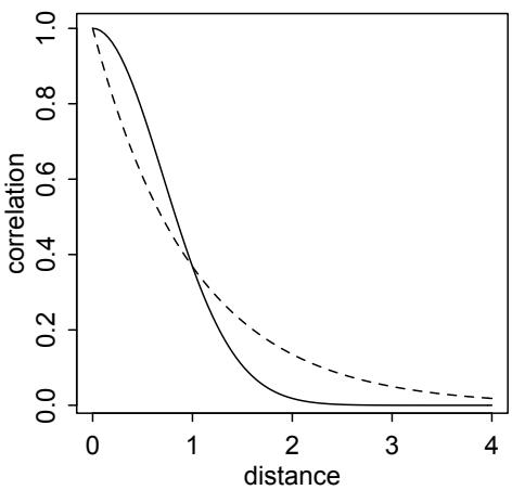
Figure 14.10. Shape of the function relating distance to the covariance Kij. The horizontal axis is distance. The vertical is the correlation, relative to maximum, between any two societies i and j. The dashed curve is the linear distance function. The solid curve is the squared distance function.
Note that ρ 2 and η 2 must be positive, so we place exponential priors on them. A little knowledge of Pacific navigation would probably allow us a smart, informative prior on ρ 2 at least. We will inspect the prior predictive simulations in a moment.
We’re finally ready to fit the model. The distribution to use, to signal to ulam that you want the squared distance Gaussian process prior, is GPL2. The rest should be familiar.
14.39 data(Kline2) # load the ordinary data, now with coordinates
d <- Kline2
d$society <- 1:10 # index observations
dat_list <- list(
T = d$total_tools,
P = d$population,
society = d$society,
Dmat=islandsDistMatrix )
m14.8 <- ulam(
alist(
T ~ dpois(lambda),
lambda <- (a*P^b/g)*exp(k[society]),
vector[10]:k ~ multi_normal( 0 , SIGMA ),
matrix[10,10]:SIGMA <- cov_GPL2( Dmat , etasq , rhosq , 0.01 ),
c(a,b,g) ~ dexp( 1 ),
etasq ~ dexp( 2 ),
rhosq ~ dexp( 0.5 )
), data=dat_list , chains=4 , cores=4 , iter=2000 )Be sure to check the chains. They should sample well, but we could also improve sampling by de-centering the prior for k. We’ll do that in a box at the end of this section. Let’s check the posterior:
R code
14.40 precis( m14.8 , depth=3 )mean sd 5.5% 94.5% n_eff Rhat
k[1] -0.17 0.30 -0.65 0.29 714 1.00
k[2] -0.03 0.29 -0.48 0.43 538 1.01
k[3] -0.08 0.28 -0.51 0.35 527 1.01
k[4] 0.34 0.26 -0.04 0.74 593 1.01
k[5] 0.07 0.25 -0.32 0.46 590 1.01
k[6] -0.39 0.27 -0.84 0.00 789 1.00
k[7] 0.13 0.25 -0.26 0.53 606 1.01
k[8] -0.22 0.26 -0.64 0.16 726 1.01
k[9] 0.26 0.25 -0.11 0.64 668 1.01
k[10] -0.18 0.35 -0.75 0.35 868 1.01
g 0.60 0.56 0.08 1.68 1536 1.00
b 0.28 0.08 0.15 0.41 1107 1.00
a 1.41 1.08 0.24 3.39 1811 1.00
etasq 0.20 0.20 0.03 0.56 863 1.00
rhosq 1.31 1.60 0.08 4.41 1931 1.00First, note that the coefficient for log population, bp, is very much as it was before we added all this Gaussian process stuff. This suggests that it’s hard to explain all of the association between tool counts and population as a side effect of geographic contact. Second, those g parameters are the Gaussian process varying intercepts for each society. Like a and bp, they are on the log-count scale, so they are hard to interpret raw.
In order to understand the parameters that describe the covariance with distance, rhosq and etasq, we’ll want to plot the function they imply. Actually the joint posterior distribution of these two parameters defines a posterior distribution of covariance functions. We can get a sense of this distribution of functions—I know, this is rather meta—by plotting a bunch of them. Here we’ll sample 50 from the posterior and display them along with the posterior mean. But as always, it is the entire distribution that matters. Be careful: The uncertainty of the function is not the same as the uncertainty of the mean function.
R code
14.41 post <- extract.samples(m14.8)
# plot the posterior median covariance function
plot( NULL , xlab="distance (thousand km)" , ylab="covariance" ,
xlim=c(0,10) , ylim=c(0,2) )
# compute posterior mean covariance
x_seq <- seq( from=0 , to=10 , length.out=100 )
pmcov <- sapply( x_seq , function(x) post$etasq*exp(-post$rhosq*x^2) )
pmcov_mu <- apply( pmcov , 2 , mean )
lines( x_seq , pmcov_mu , lwd=2 )
# plot 50 functions sampled from posterior
for ( i in 1:50 )
curve( post$etasq[i]*exp(-post$rhosq[i]*x^2) , add=TRUE ,
col=col.alpha("black",0.3) )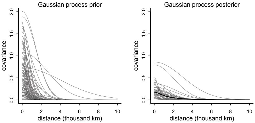
Figure 14.11. Left: Prior distribution of spatial covariance functions. Each curve shows a joint sample from the prior of ρ 2 and η 2 . Right: Posterior distribution of the spatial covariance. The dark curve displays the posterior mean covariance at each distance. The thin curves show 50 functions sampled from the joint posterior distribution of ρ 2 and η 2 .
Figure 14.11 shows the result. Each combination of values for ρ 2 and η 2 produces a relationship between covariance and distance. The posterior median function, shown by the thick curve, represents a center of plausibility. But the other curves show that there’s a lot of uncertainty about the spatial covariance. Curves that peak at twice the posterior median peak, around 0.2, are commonplace. And curves that peak at half the median are very common, as well. There’s a lot of uncertainty about how strong the spatial effect is, but the majority of posterior curves decline to zero covariance before 4000 kilometers.
It’s hard to interpret these covariances directly, because they are on the log-count scale, just like everything else in a Poisson GLM. So let’s consider the correlations among societies that are implied by the posterior median. First, we push the parameters back through the function for K, the covariance matrix:
14.42 # compute posterior median covariance among societies
K <- matrix(0,nrow=10,ncol=10)
for ( i in 1:10 )
for ( j in 1:10 )
K[i,j] <- median(post$etasq) *
exp( -median(post$rhosq) * islandsDistMatrix[i,j]^2 )
diag(K) <- median(post$etasq) + 0.01Second, we convert K to a correlation matrix:
14.43 # convert to correlation matrix
Rho <- round( cov2cor(K) , 2 )
# add row/col names for conveniencecolnames(Rho) <- c("Ml","Ti","SC","Ya","Fi","Tr","Ch","Mn","To","Ha")
rownames(Rho) <- colnames(Rho)
RhoMl Ti SC Ya Fi Tr Ch Mn To Ha Ml 1.00 0.79 0.70 0.00 0.31 0.05 0.00 0.00 0.08 0 Ti 0.79 1.00 0.87 0.00 0.31 0.05 0.00 0.01 0.06 0 SC 0.70 0.87 1.00 0.00 0.17 0.11 0.01 0.02 0.02 0 Ya 0.00 0.00 0.00 1.00 0.00 0.01 0.16 0.14 0.00 0 Fi 0.31 0.31 0.17 0.00 1.00 0.00 0.00 0.00 0.61 0 Tr 0.05 0.05 0.11 0.01 0.00 1.00 0.09 0.56 0.00 0 Ch 0.00 0.00 0.01 0.16 0.00 0.09 1.00 0.32 0.00 0 Mn 0.00 0.01 0.02 0.14 0.00 0.56 0.32 1.00 0.00 0 To 0.08 0.06 0.02 0.00 0.61 0.00 0.00 0.00 1.00 0 Ha 0.00 0.00 0.00 0.00 0.00 0.00 0.00 0.00 0.00 1
The cluster of small societies in the upper-left of the matrix—Malekula (Ml), Tikopia (Ti), and Santa Cruz (SC)—are highly correlated, all above 0.8 with one another. As you’ll see in a moment, these societies are very close together, and they also have similar tool totals. These correlations were estimating with log population in the model, remember, and so suggest some additional resemblance even accounting for the average association between population and tools. On the other end of spectrum is Hawaii (Ha), which is so far from all of the other societies that the correlation decays to zero everyplace. Other societies display a range of correlations.
To make some sense of the variation in these correlations, let’s plot them on a crude map of the Pacific Ocean. The Kline2 data frame provides latitude and longitude for each society, to make this easy. I’ll also scale the size of each society on the map in proportion to its log population.
R code14.44 # scale point size to logpop
psize <- d$logpop / max(d$logpop)
psize <- exp(psize*1.5)-2
# plot raw data and labels
plot( d$lon2 , d$lat , xlab="longitude" , ylab="latitude" ,
col=rangi2 , cex=psize , pch=16 , xlim=c(-50,30) )
labels <- as.character(d$culture)
text( d$lon2 , d$lat , labels=labels , cex=0.7 , pos=c(2,4,3,3,4,1,3,2,4,2) )
# overlay lines shaded by Rho
for( i in 1:10 )
for ( j in 1:10 )
if ( i < j )
lines( c( d$lon2[i],d$lon2[j] ) , c( d$lat[i],d$lat[j] ) ,
lwd=2 , col=col.alpha("black",Rho[i,j]^2) )The result appears on the left side of Figure 14.12. Darker lines indicate stronger correlations, with pure white being zero correlation and pure black 100% correlation. The cluster of three close societies—Malekula, Tikopia, and Santa Cruz—stand out. Close societies have
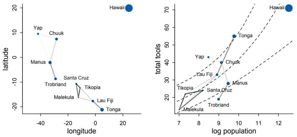
Figure 14.12. Left: Posterior correlations among societies in geographic space. Right: Same posterior correlations, now shown against relationship between total tools and log population.
stronger correlations. But since we can’t see total tools on this map, it’s hard to see what the consequence of these correlations is supposed to be.
More sense can be made of these correlations, if we also compare against the simultaneous relationship between tools and log population. Here’s a plot that combines the average posterior predictive relationship between log population and total tools with the shaded correlation lines for each pair of societies:
R code
14.45 # compute posterior median relationship, ignoring distance
logpop.seq <- seq( from=6 , to=14 , length.out=30 )
lambda <- sapply( logpop.seq , function(lp) exp( post$a + post$bp*lp ) )
lambda.median <- apply( lambda , 2 , median )
lambda.PI80 <- apply( lambda , 2 , PI , prob=0.8 )
# plot raw data and labels
plot( d$logpop , d$total_tools , col=rangi2 , cex=psize , pch=16 ,
xlab="log population" , ylab="total tools" )
text( d$logpop , d$total_tools , labels=labels , cex=0.7 ,
pos=c(4,3,4,2,2,1,4,4,4,2) )
# display posterior predictions
lines( logpop.seq , lambda.median , lty=2 )
lines( logpop.seq , lambda.PI80[1,] , lty=2 )
lines( logpop.seq , lambda.PI80[2,] , lty=2 )
# overlay correlations
for( i in 1:10 )
for ( j in 1:10 )
if ( i < j )lines( c( d$logpop[i],d$logpop[j] ) ,
c( d$total_tools[i],d$total_tools[j] ) ,
lwd=2 , col=col.alpha("black",Rho[i,j]^2) )This plot appears in the right-hand side of Figure 14.12. Now it’s easier to appreciate that the correlations among Malekula, Tikopia, and Santa Cruz describe the fact that they are below the expected number of tools for their populations. All three societies lying below the expectation, and being so close, is consistent with spatial covariance. The posterior correlations merely describe this feature of the data. Similarly, Manus and the Trobriands are geographically close, have a substantial posterior correlation, and fewer tools than expected for their population sizes. Tonga has more tools than expected for its population, and its proximity to Fiji counteracts some of the tug Fiji’s smaller neighbors—Malekula, Tikopia, and Santa Cruz—exert on it. So the model seems to think Fiji would have fewer tools, if it weren’t for Tonga.
Of course the correlations that this model describes by geographic distance may be the result of other, unmeasured commonalities between geographically close societies. For example, Manus and the Trobriands are geologically and ecologically quite different from Fiji and Tonga. So it could be availability of, for example, tool stone that explains some of the correlations. The Gaussian process regression is a grand and powerful descriptive model. As a result, its output is always compatible with many different causal explanations.
Rethinking: Dispersion by other names. The model in this section uses a Poisson likelihood, which is often sensitive to outliers, like the Hawaii data. You could use a gamma-Poisson likelihood instead, as explained in Chapter 12. But note that the varying effects in this example already induce additional dispersion around the Poisson mean. Adding Gaussian noise to each Poisson observation is another traditional way to handle over-dispersion in Poisson models. But do try the model with gamma-Poisson as well, so you can compare.
Overthinking: Non-centered islands. To build a non-centered Gaussian process, we can use the same general trick of converting the covariance matrix to a Cholesky factor and then multiplying that factor by the z-scores of each varying effect. The covariance matrix is defined the same way. We just end up with some intermediate steps. Here is the Oceanic societies Gaussian process model in non-centered form:
R code
14.46 m14.8nc <- ulam(
alist(
T ~ dpois(lambda),
lambda <- (a*P^b/g)*exp(k[society]),
# non-centered Gaussian Process prior
transpars> vector[10]: k <<- L_SIGMA * z,
vector[10]: z ~ normal( 0 , 1 ),
transpars> matrix[10,10]: L_SIGMA <<- cholesky_decompose( SIGMA ),
transpars> matrix[10,10]: SIGMA <- cov_GPL2( Dmat , etasq , rhosq , 0.01 ),
c(a,b,g) ~ dexp( 1 ),
etasq ~ dexp( 2 ),
rhosq ~ dexp( 0.5 )), data=dat_list , chains=4 , cores=4 , iter=2000 )The new element above is the Stan function cholesky_decompose, which takes covariance (or correlation) matrix and returns its Cholesky factor. That Cholesky factor can then be mixed with z-scores as before to produce varying effects on the right scale. If you check the posterior, you’ll see this version samples more efficiently. As always, the cost is that the model is harder to read. With a very large SIGMA matrix, often there is no choice but to use the Cholesky (non-centered) parameterization. The next example, for example, is like this.
14.5.2. Example: Phylogenetic distance. Species, like islands, are more or less distance from one another. However their distance is not physical but rather temporal—how long since a common ancestor? Evolutionary biologists investigate how phylogenetic relationships influence patterns of variation in the bodies and brains of different species. It’s a fact that species with more recent common ancestors have higher trait correlations. Do these correlations matter?
Phylogenetic distance can have two important causal influences. The first is that two species that only recently separated tend to be more similar, assuming their traits are not maintained by selection but rather drifting neutrally around. The second causal influence is indirect. Phylogenetic distance is a proxy for unobserved variables that generate covariation among species, even when selection matters. Closely related species likely share more of these, but distantly related species share many fewer. For example, all mammals nurse their young with milk. Flight in birds similarly influences many traits. These discrete, life history altering traits can have strong causal influence on other traits. When not observed, phylogenetic distance is a potentially useful proxy for these variables. But only if the trait model captures the right details.217 These methods do not just work automatically, as they are too often ritually presented in journals.
Consider as an example the causal influence of group size (G) on brain size (B). Hypotheses connecting these variables are popular, because primates (including humans) are unusual in both. Most primates live in social groups. Most mammals do not. Second, primates have relatively large brains. There is a family of hypotheses linking these two features. Suppose for example that group living, whatever its cause, could select for larger brains, because once you live with others, a larger brain helps to cope with the complexity of cooperation and manipulation. This hypothesis implies a causal time series. Let’s draw it:
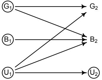
The subscripts are time points in the evolutionary history of different populations. So G1 is group size at time 1 and G2 is group size in the next time point. There are plausibly many potential confounds, shown here as U1 and U2. Each variable influences itself in the next time
step, as you might expect in an evolving system. There is also a causal influence of G1 on B2 a species’ recent group size influenced its current brain size. This is what we’d like to estimate. However the confounds U1 also possibly influence everything. As in previous examples, circled variables are unobserved. So we can’t just condition on U1 to block confounding. We also don’t even have G1 to use in a model, but only its descendant G2. But note that if we did have measurements of G1 and U1, we could use these and not worry at all about phylogeny.
Since we haven’t observed the past, we need some way to estimate its influence. This is where the branching history of the species might help. Phylogeny is associated with the patterns of covariation across species, because recently diverged species tend to be more similar. So phylogenetic relationships, expressed as distance, can be used to partially reconstruct confounds. This depends upon having both a good phylogeny and a good model of the relationship between phylogenetic distance and trait evolution. Neither is a trivial problem. But the approach is justified in theory, if not always possible in practice.
It will help to draw this approach and then use it in an actual model.
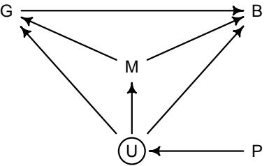
There’s a lot going on here, but we can take it one piece at a time. Again, we’re interested in G → B. There is one confound we know for sure, body mass (M). It possibly influences both G and B. So we’ll include that in the model. The unobserved confounds U could potentially influence all three variables. Finally, we let the phylogenetic relationships (P) influence U. How is P causal? If we traveled back in time and delayed a split between two species, it could influence the expected differences in their traits. So it is really the timing of the split that is causal, not the phylogeny. Of course P may also influence G and B and M directly. But those arrows aren’t our concern right now, so I’ve omitted them for clarity.
We want to be sure any association between group sizeGand brain size B is not through a backdoor. As always, we look for all the paths betweenGand B, identify which are backdoors, and consider if there are any methods for closing the backdoor paths. In the DAG above, there are backdoor paths through M and through U. We can condition on M to block that confound. But we can’t condition on U. But if we can use P to somehow reconstruct the covariation that U induces between G and B, that could be enough.
That’s the strategy. Now implementing that strategy is famously hard. GLMs that try to include phylogenetic distance often go by the name phylogenetic regression. The original phylogenetic regression approach treats phylogenetic distance in a highly constrained and unrealistic way, based on a neutral model of divergence with time.218 There are many variants. But all of them use some function of phylogenetic distance to model the covariation among species. So learning the basic phylogenetic regression model helps bootstrap your understanding, even though you really should use something better in your own analyses. After introducing the basic phylogenetic regression, I’ll show you how to more flexibly model phylogenetic distance. There is no universally correct function that maps phylogeny onto the confounds that matter. So flexibility is needed.
To begin, load the primates data and its phylogeny as well:
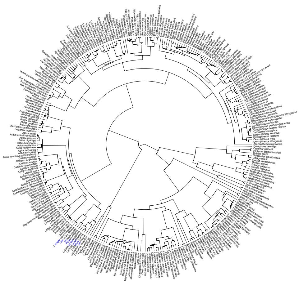
Figure 14.13. Consensus phylogeny for 301 primate species. See the citations in ?Primates301 for sources.
R code
14.47 library(rethinking)
data(Primates301)
data(Primates301_nex)
# plot it using ape package - install.packages('ape') if needed
library(ape)
plot( ladderize(Primates301_nex) , type="fan" , font=1 , no.margin=TRUE ,
label.offset=1 , cex=0.5 )I’ve plotted this phylogeny as Figure 14.13. We’re going to use this tree as a way to model unobserved confounds. At the same time, we’d like to deal with the fact that some groups of closely related species may be over-represented in nature. There are lots of lemurs for example. This produces an imbalance in sampling issue, analogous to an ordinary multilevel modeling context. And varying effects can help us here as well. But we’ll get the varying effects, as it were, from the phylogenetic tree structure.
Before we do anything with the tree, however, let’s run an ordinary regression analyzing (log) group size as a function of (log) brain size and (log) body size. But I want to build this ordinary regression in an un-ordinary style, because it will help you understand the next step, where we stick the phylogenetic information inside. Think of all of the species as a single variable, a vector of 301 trait values. Of course some of these values are more similar to one another. In a typical regression, we model those similarities using predictor variables. After conditioning on the predictor variables, the model expects correlations. So we can write such a model using a big, multi-variate outcome distribution. It looks like this:
B ∼ MVNormal(µ, S) µi = α + βGGi + βMMi
where B is a vector of species brain sizes and S is a covariance matrix with as many rows and columns as there are species. In an ordinary regression, this matrix takes the form:
S = σ 2 I
where σ is the same standard deviation you’ve used since Chapter 4 and I is an identity matrix, which is just a matrix with 1 along the diagonal and zeros everywhere else. You can think of it as a correlation matrix in which all of the correlations are zero. So multiplying the variance into it just gives each species the same (residual) variance. It’s an ordinary linear regression, but thought of as having a single, multi-variate outcome.
Let’s fit this model to the primate data. First we need to trim down to the species for which we have group size, brain size, and body size data:
R code14.48 d <- Primates301
d$name <- as.character(d$name)
dstan <- d[ complete.cases( d$group_size , d$body , d$brain ) , ]
spp_obs <- dstan$nameYou should have 151 species left. Now to make a list with standardized logged variables and pass it all to ulam:
R code14.49 dat_list <- list(
N_spp = nrow(dstan),
M = standardize(log(dstan$body)),
B = standardize(log(dstan$brain)),
G = standardize(log(dstan$group_size)),
Imat = diag(nrow(dstan)) )
m14.9 <- ulam(
alist(
B ~ multi_normal( mu , SIGMA ),
mu <- a + bM*M + bG*G,
matrix[N_spp,N_spp]: SIGMA <- Imat * sigma_sq,
a ~ normal( 0 , 1 ),
c(bM,bG) ~ normal( 0 , 0.5 ),
sigma_sq ~ exponential( 1 )
), data=dat_list , chains=4 , cores=4 )
precis( m14.9 )
| mean | sd | 5.5% | 94.5% | n_eff | Rhat | |
|---|---|---|---|---|---|---|
| a | 0.00 | 0.02 | -0.03 | 0.03 | 1859 | 1 |
| bG | 0.12 | 0.02 | 0.09 | 0.16 | 1572 | 1 |
| bM | 0.89 | 0.02 | 0.86 | 0.93 | 1481 | 1 |
| sigma_sq | 0.05 | 0.01 | 0.04 | 0.06 | 2040 | 1 |
Looks like a reliably positive association between brain size and group size, as well as a strong association between body mass and brain size. There is no basis yet to interpret these associations causally, because we know these data are swirling with confounds.
Now we’ll conduct two different kinds of phylogenetic regression. In both, all we have to do is replace the covariance matrix S above with a different matrix that encodes some phylogenetic information. The first regression is one of the oldest and most conservative, a Brownian motion interpretation of the phylogeny that implies a very particular covariance matrix. Brownian motion just means Gaussian random walks. If species traits drift randomly with respect to one another after speciation, then the covariance between a pair of species ends up being linearly related to the phylogenetic branch distance between them the further apart, the less covariance, as a proportion of distance. Of course the traits we are interested in obviously do not evolve neutrally, and they also evolve at different rates in different parts of the tree. But what you are about to do is unfortunately the most common method of phylogenetic control.
Let’s compute the implied covariance matrix, the distance matrix, and show how they are related. The ape R package has all of the functions you need.
14.50 library(ape)
tree_trimmed <- keep.tip( Primates301_nex, spp_obs )
Rbm <- corBrownian( phy=tree_trimmed )
V <- vcv(Rbm)
Dmat <- cophenetic( tree_trimmed )
plot( Dmat , V , xlab="phylogenetic distance" , ylab="covariance" )I don’t show the plot here, but if you run the code, you’ll see a scatterplot with pairs of species as points. The horizontal axis is phylogenetic, or patristic, distance. The vertical is the covariance under the Brownian model. They are really just inverses of one another. You can see this even more clearly if you use image(V) and image(Dmat) to plot heat maps of each.
Now we can just insert this new matrix into our regression. The model is otherwise the same. But first we need to get the rows and columns in the same order as the rest of the data and then convert it to a correlation matrix, so we can estimate the residual variance. Then we can just replace the identity matrix with our new correlation matrix and go.
14.51 # put species in right order
dat_list$V <- V[ spp_obs , spp_obs ]
# convert to correlation matrix
dat_list$R <- dat_list$V / max(V)
# Brownian motion model
m14.10 <- ulam(
alist(
B ~ multi_normal( mu , SIGMA ),
mu <- a + bM*M + bG*G,R code
matrix[N_spp,N_spp]: SIGMA <- R * sigma_sq,
a ~ normal( 0 , 1 ),
c(bM,bG) ~ normal( 0 , 0.5 ),
sigma_sq ~ exponential( 1 )
), data=dat_list , chains=4 , cores=4 )
precis( m14.10 )mean sd 5.5% 94.5% n_eff Rhat a -0.20 0.17 -0.47 0.06 2152 1 bG -0.01 0.02 -0.04 0.02 2691 1 bM 0.70 0.04 0.64 0.76 1935 1 sigma_sq 0.16 0.02 0.13 0.19 2251 1
This model annihilates group size—the posterior mean is almost zero and there is a lot of mass on both sides of zero. The big change from the previous model suggests that there is a lot of clustering of brain size in the tree and that this produces a spurious relationship with group size, which also clusters in the tree. How the model uses this clustering depends upon the details of the correlation matrix we gave it.
The Brownian motion model is a special kind of Gaussian process in which the covariance declines in a very rigid way with increasing distance. There is no need to be so rigid and good reason to think evolution is not well-described by Brownian motion. It’s very common to use something called Pagel’s lambda to modify the Brownian motion model. But all this does is scale all of the species correlations by a common factor. It maintains the same arbitrary and unrealistic distance model. Another common alternative is the Ornstein– Uhlenbeck process (or OU process), which is a damped Brownian motion process that tends to return towards some mean (or means). What this does in practice is constrain the variation, making the relationship between phylogenetic distance and covariance nonlinear.219 More precisely, the OU process just defines the covariance between two species i and j as:
\[K(i,j) = \eta^2 \exp(-\rho^2 D\_{ij})\]
This is an exponential distance kernel, unlike the quadratic kernel in the previous example. The exponential kernel says that covariance between points (species) declines rapidly, making for much less smooth functions. It is also usually harder to fit to data, since it is a much rougher function. This means in practice that you’ll need to be careful about priors, potentially making them narrower.
But the OU process is still a Gaussian process, and you can fit it the same way as the quadratic kernel in the previous section. The literature on phylogenetic regression has not emphasized this fact. But expressing the model as a Gaussian process makes it possible to customize the function space as the problem requires.220 This framing isn’t yet common. Biologists tend to use phylogenies under a cloud of superstition and fearful button pushing. This is however a rapidly changing area, including new approaches that are not yet easy to implement.221 Hopefully this also makes clear that there is no uniquely correct way to include phylogenetic distance. If the goal is to estimate a causal effect, then it isn’t good enough to reject some null model. We need to usefully reconstruct patterns among unmeasured confounds. And different evolutionary histories will require different models. It will often be true that the information in a phylogeny is inadequate for causal inference.
To build the Gaussian process regression, we need a distance matrix. We already have that—you computed it earlier. Then we just need the Gaussian process construction line of code. In this example, we’ll use the OU process kernel, which is known more generally as the L1 norm, which ulam provides as cov_GPL1. But see the Overthinking box further down, to see how to write your own Gaussian process kernels.
14.52 # add scaled and reordered distance matrix
dat_list$Dmat <- Dmat[ spp_obs , spp_obs ] / max(Dmat)
m14.11 <- ulam(
alist(
B ~ multi_normal( mu , SIGMA ),
mu <- a + bM*M + bG*G,
matrix[N_spp,N_spp]: SIGMA <- cov_GPL1( Dmat , etasq , rhosq , 0.01 ),
a ~ normal(0,1),
c(bM,bG) ~ normal(0,0.5),
etasq ~ half_normal(1,0.25),
rhosq ~ half_normal(3,0.25)
), data=dat_list , chains=4 , cores=4 )
precis( m14.11 )
mean sd 5.5% 94.5% n_eff Rhat
a -0.07 0.08 -0.19 0.06 2168 1| bG | 0.05 | 0.02 | 0.01 | 0.09 | 2634 | 1 |
|---|---|---|---|---|---|---|
| bM | 0.83 | 0.03 | 0.79 | 0.88 | 2280 | 1 |
| etasq | 0.03 | 0.01 | 0.03 | 0.05 | 2060 | 1 |
| rhosq | 2.79 | 0.26 | 2.36 | 3.20 | 2192 | 1 |
Now group size is seemingly associated with brain size again. The association is small, but most of the posterior mass is above zero. Why are the results different? The answer must be that the inferred covariance function looks rather different than the Brownian motion model. So let’s look at the posterior covariance functions implied by etasq and rhosq. Remember that these two parameters interact to produce the covariance function, and they are almost always strongly correlated in the posterior, so you can’t really see what’s going on by looking at them separately. We need to extract them and push them back through the Gaussian process covariance function:
14.53 post <- extract.samples(m14.11)
plot( NULL , xlim=c(0,max(dat_list$Dmat)) , ylim=c(0,1.5) ,
xlab="phylogenetic distance" , ylab="covariance" )
# posterior
for ( i in 1:30 )
curve( post$etasq[i]*exp(-post$rhosq[i]*x) , add=TRUE , col=rangi2 )
# prior mean and 89% interval
eta <- abs(rnorm(1e3,1,0.25))
rho <- abs(rnorm(1e3,3,0.25))
d_seq <- seq(from=0,to=1,length.out=50)
K <- sapply( d_seq , function(x) eta*exp(-rho*x) )R code
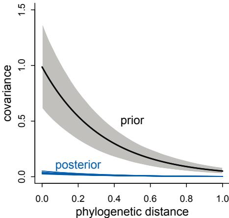
Figure 14.14. Posterior covariance functions for the Gaussian process phylogenetic regression (blue), compared to the prior (gray). Unlike the Brownian motion model, in which covariance starts high and decays linearly with distance, this model favors a very small covariation at all distances.
lines( d_seq , colMeans(K) , lwd=2 )
shade( apply(K,2,PI) , d_seq )
text( 0.5 , 0.5 , "prior" )
text( 0.2 , 0.1 , "posterior" , col=rangi2 )The result is shown in Figure 14.14. The horizontal axis is the standardized phylogenetic distance—1 just means the longest distance in the sample. The vertical axis is covariance. The blue curves are 30 draws from the posterior distribution. The black curve is the prior mean. The posterior is pressed up against the bottom axis, indicating a very low covariance between species at any distance. There just isn’t a lot of phylogenetic covariance for brain sizes, at least according to this model and these data. As a result, the phylogenetic distance doesn’t completely explain away the association between group size and brain size, as it did in the Brownian motion model.
Overthinking: Building custom kernels. The rethinking package provides cov_GPL1 (the OU kernel) and cov_GPL2 (the quadratic kernel) for building Gaussian process covariance matrices. But it’s easy to build your own, if you use Stan directly. Let’s look at stancode(m14.11). The top part is a custom functions block, containing the cov_GPL1 function:
functions{
matrix cov_GPL1(matrix x, real sq_alpha, real sq_rho, real delta) {
int N = dims(x)[1];
matrix[N, N] K;
for (i in 1:(N-1)) {
K[i, i] = sq_alpha + delta;
for (j in (i + 1):N) {
K[i, j] = sq_alpha * exp(-sq_rho * x[i,j] );
K[j, i] = K[i, j];
}
}
K[N, N] = sq_alpha + delta;
return K;
}
}This function takes as input a distance matrix x and the parameters of the Gaussian process. It then loops over all the cells in the covariance matrix K, computing the value of each. To modify the kernel, you’d change the line that computes each covariance:
K[i, j] = sq_alpha * exp(-sq_rho * x[i,j] );
For example, the quadratic kernel just squares the x[i,j]. All that remains is to call the function inside the model block.
14.6. Summary
This chapter extended the basic multilevel strategy of partial pooling to slopes as well as intercepts. Accomplishing this meant modeling covariation in the statistical population of parameters. The LKJcorr prior was introduced as a convenient family of priors for correlation matrices. You saw how covariance models can be applied to causal inference, using instrumental variables and the front-door criterion. Gaussian processes represent a practical method of extending the varying effects strategy to continuous dimensions of similarity, such as spatial, network, phylogenetic, or any other abstract distance between entities in the data. The next chapter continues to develop the broader multilevel approach by applying it to commonplace problems in statistical inference: measurement error and missing data.
14.7. Practice
Problems are labeled Easy (E), Medium (M), and Hard (H).
14E1. Add to the following model varying slopes on the predictor x.
yi ∼ Normal(µi
, σ)
µi = αgroup[i] + βxi
αgroup ∼ Normal(α, σα)
α ∼ Normal(0, 10)
β ∼ Normal(0, 1)
σ ∼ Exponential(1)
σα ∼ Exponential(1)14E2. Think up a context in which varying intercepts will be positively correlated with varying slopes. Provide a mechanistic explanation for the correlation.
14E3. When is it possible for a varying slopes model to have fewer effective parameters (as estimated by WAIC or PSIS) than the corresponding model with fixed (unpooled) slopes? Explain.
14M1. Repeat the café robot simulation from the beginning of the chapter. This time, set rho to zero, so that there is no correlation between intercepts and slopes. How does the posterior distribution of the correlation reflect this change in the underlying simulation?
14M2. Fit this multilevel model to the simulated café data:
\[W\_{\rm i} \sim \text{Normal}(\mu\_{i}, \sigma)\]
\[\mu\_{i} = \alpha\_{\text{cAF}[i]} + \beta\_{\text{cAF}[i]} A\_{i}\]
\[\alpha\_{\text{cAF}} \sim \text{Normal}(\alpha, \sigma\_{\alpha})\]
\[\beta\_{\text{cAF}} \sim \text{Normal}(\beta, \sigma\_{\beta})\]
\[\alpha \sim \text{Normal}(0, 10)\]
\[\beta \sim \text{Normal}(0, 10)\]
\[\sigma, \sigma\_{\alpha}, \sigma\_{\beta} \sim \text{Exponential}(1)\]
Use WAIC to compare this model to the model from the chapter, the one that uses a multi-variate Gaussian prior. Explain the result.
14M3. Re-estimate the varying slopes model for the UCBadmit data, now using a non-centered parameterization. Compare the efficiency of the forms of the model, using n_eff. Which is better? Which chain sampled faster?
14M4. Use WAIC to compare the Gaussian process model of Oceanic tools to the models fit to the same data in Chapter 11. Pay special attention to the effective numbers of parameters, as estimated by WAIC.
14M5. Modify the phylogenetic distance example to use group size as the outcome and brain size as a predictor. Assuming brain size influences group size, what is your estimate of the effect? How does phylogeny influence the estimate?
14H1. Let’s revisit the Bangladesh fertility data, data(bangladesh), from the practice problems for Chapter 13. Fit a model with both varying intercepts by district_id and varying slopes of urban by district_id. You are still predicting use.contraception. Inspect the correlation between the intercepts and slopes. Can you interpret this correlation, in terms of what it tells you about the pattern of contraceptive use in the sample? It might help to plot the mean (or median) varying effect estimates for both the intercepts and slopes, by district. Then you can visualize the correlation and maybe more easily think through what it means to have a particular correlation. Plotting predicted proportion of women using contraception, with urban women on one axis and rural on the other, might also help.
14H2. Now consider the predictor variables age.centered and living.children, also contained in data(bangladesh). Suppose that age influences contraceptive use (changing attitudes) and number of children (older people have had more time to have kids). Number of children may also directly influence contraceptive use. Draw a DAG that reflects these hypothetical relationships. Then build models needed to evaluate the DAG. You will need at least two models. Retain district and urban, as in 14H1. What do you conclude about the causal influence of age and children?
14H3. Modify any models from 14H2 that contained that children variable and model the variable now as a monotonic ordered category, like education from the week we did ordered categories. Education in that example had 8 categories. Children here will have fewer (no one in the sample had 8 children). So modify the code appropriately. What do you conclude about the causal influence of each additional child on use of contraception?
14H4. Varying effects models are useful for modeling time series, as well as spatial clustering. In a time series, the observations cluster by entities that have continuity through time, such as individuals. Since observations within individuals are likely highly correlated, the multilevel structure can help quite a lot. You’ll use the data in data(Oxboys), which is 234 height measurements on 26 boys from an Oxford Boys Club (I think these were like youth athletic leagues?), at 9 different ages (centered and standardized) per boy. You’ll be interested in predicting height, using age, clustered by Subject (individual boy). Fit a model with varying intercepts and slopes (on age), clustered by Subject. Present
and interpret the parameter estimates. Which varying effect contributes more variation to the heights, the intercept or the slope?
14H5. Now consider the correlation between the varying intercepts and slopes. Can you explain its value? How would this estimated correlation influence your predictions about a new sample of boys?
14H6. Use mvrnorm (in library(MASS)) or rmvnorm (in library(mvtnorm)) to simulate a new sample of boys, based upon the posterior mean values of the parameters. That is, try to simulate varying intercepts and slopes, using the relevant parameter estimates, and then plot the predicted trends of height on age, one trend for each simulated boy you produce. A sample of 10 simulated boys is plenty, to illustrate the lesson. You can ignore uncertainty in the posterior, just to make the problem a little easier. But if you want to include the uncertainty about the parameters, go for it. Note that you can construct an arbitrary variance-covariance matrix to pass to either mvrnorm or rmvnorm with something like:
14.54 S <- matrix( c( sa^2 , sa*sb*rho , sa*sb*rho , sb^2 ) , nrow=2 )where sa is the standard deviation of the first variable, sb is the standard deviation of the second variable, and rho is the correlation between them.

15 Missing Data and Other Opportunities
A big advantage of Bayesian inference is that it obviates the need to be clever. For example, there’s a classic probability puzzle known as Bertrand’s box paradox. 222 The version that I prefer involves pancakes. Suppose I cook three pancakes. The first pancake is burnt on both sides (BB). The second pancake is burnt on only one side (BU). The third pancake is not burnt at all (UU). Now I serve you—at random—one of these pancakes, and the side facing up on your plate is burnt. What is the probability that the other side is also burnt?
This is a hard problem, if we rely upon intuition. Most people say “one-half,” but that is quite wrong. And with no false modesty, my intuition is no better. But I have learned to solve these problems by cold hard ruthless application of conditional probability. There’s no need to be clever when you can be ruthless.
So let’s get ruthless. Applying conditional probability means using what we do know to refine our knowledge about what we wish to know. In other words:
\[\Pr(\text{want to know}|\text{already known})\]
In this case, we know the up side is burnt. We want to know whether or not the down side is burnt. The definition of conditional probability tells us:
\[\Pr(\text{burnt down}|\text{burnt up}) = \frac{\Pr(\text{burnt up}, \text{burnt down})}{\Pr(\text{burnt up})}\]
This is just the definition of conditional probability, labeled with our pancake problem. We want to know if the down side is burnt, and the information we have is that the up side is burnt. We condition on the information, so we update our state of information in light of it. The definition tells us that the probability we want is just the probability of the burnt/burnt pancake divided by the probability of seeing a burnt side up. The probability of the burnt/burnt pancake is 1/3, because a pancake was selected at random. The probability the up side is burnt must average over each way we can get dealt a burnt top side of the pancake. This is:
\[\Pr(\text{burnt up}) = \Pr(\text{BB})(1) + \Pr(\text{BU})(0.5) + \Pr(\text{UU})(0) = (1/3) + (1/3)(1/2) = 0.5\]
So all together:
\[\Pr(\text{burnt down}|\text{burnt up}) = \frac{1/3}{1/2} = \frac{2}{3}\]
If you don’t quite believe this answer, you can do a quick simulation to confirm it.
R code15.1 # simulate a pancake and return randomly ordered sides
sim_pancake <- function() {
pancake <- sample(1:3,1)
sides <- matrix(c(1,1,1,0,0,0),2,3)[,pancake]
sample(sides)
}
# sim 10,000 pancakes
pancakes <- replicate( 1e4 , sim_pancake() )
up <- pancakes[1,]
down <- pancakes[2,]
# compute proportion 1/1 (BB) out of all 1/1 and 1/0
num_11_10 <- sum( up==1 )
num_11 <- sum( up==1 & down==1 )
num_11/num_11_10[1] 0.6777889
Two-thirds.
If you want to derive some intuition now at the end, having seen the right answer, the trick is to count sides of the pancakes, not the pancakes themselves. Yes, there are 2 pancakes that have at least one burnt side. And only one of those has 2 burnt sides. But it is the sides, not the pancakes, that matter. Conditional on the up side being burnt, there are three sides that could be down. Two of those sides are burnt. So the probability is 2 out of 3.
Probability theory is not difficult mathematically. It is just counting. But it is hard to interpret and apply. Doing so often seems to require some cleverness, and authors have an incentive to solve problems in clever ways, just to show off. But we don’t need that cleverness, if we ruthlessly apply conditional probability. And that’s the real trick of the Bayesian approach: to apply conditional probability in all places, for data and parameters. The benefit is that once we define our information state—our assumptions—we can let the rules of probability do the rest. The work that gets done is the revelation of the implications of our assumptions. Model fitting, as we’ve been practicing it, is the same un-clever approach. We define the model and introduce the data, and conditional probability does the rest, revealing the implications of our assumptions, in light of the evidence.
In this chapter, you’ll meet two commonplace applications of this assume-and-deduce strategy. The first is the incorporation of measurement error into our models. The second is the estimation of missing data through Bayesian imputation. You’ll see a fully worked, introductory example of each.
In neither application do you have to intuit the consequences of measurement errors nor the implications of missing values in order to design the models. All you have to do is state your information about the error or about the variables with missing values. Logic does the rest. Well, your computer does the rest. But it’s just using fancy algorithms to perform Bayesian updating. It’s not at all clever. But the implications it reveals are both counterintuitive and valuable.
15.1. Measurement error
Back in Chapter 5, you met the divorce and marriage data for the United States. Those data demonstrated a simple spurious association among the predictors, as well as how multiple regression can sort it out. What we ignored at the time is that both the divorce rate variable and the marriage rate variable are measured with substantial error, and that error is reported in the form of standard errors. Importantly, the amount of error varies a lot across States. Here, you’ll see a simple and useful way to incorporate that information into the model. Then we’ll let logic reveal the implications.
Let’s begin by plotting the measurement error of the outcome as an error bar:
15.2 library(rethinking)
data(WaffleDivorce)
d <- WaffleDivorce
# points
plot( d$Divorce ~ d$MedianAgeMarriage , ylim=c(4,15) ,
xlab="Median age marriage" , ylab="Divorce rate" )
# standard errors
for ( i in 1:nrow(d) ) {
ci <- d$Divorce[i] + c(-1,1)*d$Divorce.SE[i]
x <- d$MedianAgeMarriage[i]
lines( c(x,x) , ci )
}The plot is shown on the left in Figure 15.1. Notice that there is a lot of variation in how uncertain the observed divorce rate is, as reflected in varying lengths of the vertical line segments. Why does the error vary so much? Large States provide better samples, so their measurement error is smaller. The data are displayed this way, to show the association between the population size of each State and its measurement error, in the right-hand plot in Figure 15.1.
Since the values in same States are more certain than in others, it makes sense for the more certain estimates to influence the regression more. There are all manner of ad hoc procedures for weighting some points more than others, and these can help. But they leave a lot of information on the table. And they prevent a helpful phenomenon that arises automatically in the fully Bayesian approach: Information flows among the measurements to provide improved estimates of the data itself. So let’s see how to state the information as a model.
Rethinking: Generative thinking, Bayesian inference. Bayesian models are generative, meaning they can be used to simulate observations just as well as they can be used to estimate parameters. One benefit of this fact is that a statistical model can be developed by thinking hard about how the data might have arisen. This includes sampling and measurement, as well as the nature of the process we are studying. Then let Bayesian updating discover the implications. These implications may include the inability to infer the generative process from data. Bayes is an honest partner. It is not afraid to hurt your feelings.
15.1.1. Error on the outcome. To incorporate measurement error, let’s begin by thinking generatively. If we were to simulate measurement error, what would it look like? The first
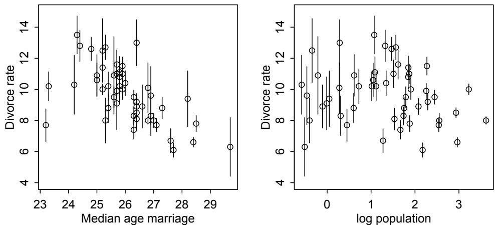
Figure 15.1. Left: Divorce rate by median age of marriage, States of the United States. Vertical bars show plus and minus one standard deviation of the Gaussian uncertainty in measured divorce rate. Right: Divorce rate, again with standard deviations, against log population of each State. Smaller States produce more uncertain estimates.
step would be to generate the true values of the variables. Then we simulate the observation process itself, where the measurement error arises. It is just part of the statistical model and likewise part of the causal model.
Recall the causal model of the divorce example from Chapter 5. Let’s take that same model and now add observation error on the outcome:
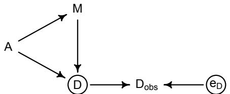
There’s a lot going on here. But we can proceed one step at a time. The left triangle of this DAG is the same system that we worked with back in Chapter 5. Age at marriage (A) influences divorce (D) both directly and indirectly, passing through marriage rate (M). Then we have the observation model. The true divorce rate D cannot be observed, so it is circled as an unobserved node. However we do get to observe Dobs, which is a function of both the true rate D and some unobserved error eD.
What are we supposed to do now? Note that Dobs is a descendent of D. Using it in place of D doesn’t necessarily introduce confounding. Probably the majority of regressions are really using proxies like Dobs, because most variables are measurements with some error. But even though it doesn’t necessarily open a non-causal path, using a proxy can introduce systematic bias, distorting the estimates. Since the extent of measurement error varies across States in a way that is associated with variables of interest, that is likely in this example.
We could do better by using D instead of Dobs. But we don’t have D. However we can try to reconstruct it, respecting the uncertainty to avoid false confidence. In these data, the reported standard errors Divorce.SE were calculated with knowledge of the process that produces the errors eD. How can we use this information in a statistical model? It’s just like a simulation, but in reverse. If you wanted to simulate measurement error, you would assign a distribution to each observation and sample from it. For example, suppose the true value of a measurement is 10 meters. If it is measured with Gaussian error with standard deviation of 2 meters, this implies a probability distribution for any realized measurement y:
\[\mathcal{Y} \sim \text{Normal}(10, 2)\]
As the measurement error here shrinks, all the probability piles up on 10. But when there is error, many measurements are more and less plausible. This is what I mean by saying that ordinary data are a special case of a distribution. And here is the key insight: If we don’t know the true value (10 in this example), then we can just put a parameter there and let Bayes do the rest.
Here’s how to define the error distribution for each divorce rate. For each observed value Dobs,i , there will be one parameter, Dtrue,i , defined by:
\[D\_{\text{ones},i} \sim \text{Normal}(D\_{\text{TRUE},i}, D\_{\text{SE},i})\]
All this does is define the measurement Dobs,i as having the specified Gaussian distribution centered on the unknown parameter Dtrue,i . So the above defines a probability for each State i’s observed divorce rate, given a known measurement error. If you simulated observed divorce rates from known true rates, it would look like:
D_obs <- rnorm( N_states , D_true , D_se )
A simulation like this goes from assumptions about the distribution to data. When we instead estimate D_true, we run it in reverse, using Bayesian updating to go from data to distribution. This is what we’ve been doing since the beginning.
This is a lot to take in. But we’ll go one step at a time. Recall that the goal is to model divorce rate D as a linear function of age at marriage A and marriage rate M. Here’s what the model looks like, with the measurement errors highlighted in blue:
| ∼ Normal(Dtrue,i , Dse,i) Dobs,i |
[distribution for observed values] |
|---|---|
| Normal(µi , σ) Dtrue,i ∼ |
[distribution for true values] |
| µi = α + βAAi + βMMi |
[linear model to assess A → D] |
| α ∼ Normal(0, 0.2) |
|
| βA Normal(0, 0.5) ∼ |
|
| βM Normal(0, 0.5) ∼ |
|
| σ Exponential(1) ∼ |
This is like a linear regression, but with the addition of the top line that connects the observation to the true value. Each Dtrue parameter also gets a second role as the mean of another distribution, one that predicts the observed measurement. A cool implication that will arise here is that information flows in both directions—the uncertainty in measurement influences the regression parameters in the linear model, and the regression parameters in the linear model also influence the uncertainty in the measurements. There will be shrinkage.
Here is the ulam version of the model, with all the variables standardized:
15.3 dlist <- list(
D_obs = standardize( d$Divorce ),D_sd = d$Divorce.SE / sd( d$Divorce ),
M = standardize( d$Marriage ),
A = standardize( d$MedianAgeMarriage ),
N = nrow(d)
)
m15.1 <- ulam(
alist(
D_obs ~ dnorm( D_true , D_sd ),
vector[N]:D_true ~ dnorm( mu , sigma ),
mu <- a + bA*A + bM*M,
a ~ dnorm(0,0.2),
bA ~ dnorm(0,0.5),
bM ~ dnorm(0,0.5),
sigma ~ dexp(1)
) , data=dlist , chains=4 , cores=4 )Consider the posterior means (abbreviating the precis output below):
R code
15.4 precis( m15.1 , depth=2 )mean sd 5.5% 94.5% n_eff Rhat
D_true[1] 1.18 0.37 0.60 1.78 1696 1.00
D_true[2] 0.68 0.58 -0.20 1.63 2137 1.00
D_true[3] 0.43 0.34 -0.09 0.96 1953 1.00
...
D_true[48] 0.55 0.46 -0.15 1.30 2564 1.00
D_true[49] -0.64 0.27 -1.09 -0.20 3153 1.00
D_true[50] 0.84 0.59 -0.13 1.77 1815 1.00
a -0.06 0.10 -0.21 0.11 1314 1.00
bA -0.61 0.16 -0.86 -0.37 1021 1.01
bM 0.05 0.17 -0.21 0.31 936 1.01
sigma 0.60 0.11 0.44 0.78 628 1.00If you look back at Chapter 5, you’ll see that the former estimate for bA was about −1. Now it’s almost half that, but still reliably negative. So compared to the original regression that ignores measurement error, the association between divorce and age at marriage has been reduced. The effect that measurement error has depends upon the context. Sometimes it exaggerates effects, as in this example. Other times it hides them. But you can’t safely assume that measurement error makes estimates conservative.223
If you look again at Figure 15.1, you can see a hint of why this has happened. States with extremely low and high ages at marriage tend to also have more uncertain divorce rates. As a result those rates have been shrunk towards the expected mean defined by the regression line. Figure 15.2 displays this shrinkage phenomenon. On the left of the figure, the difference between the observed and estimated divorce rates is shown on the vertical axis, while the standard error of the observed is shown on the horizontal. The dashed line at zero indicates no change from observed to estimated. Notice that States with more uncertain divorce rates—farther right on the plot—have estimates more different from observed. This is your
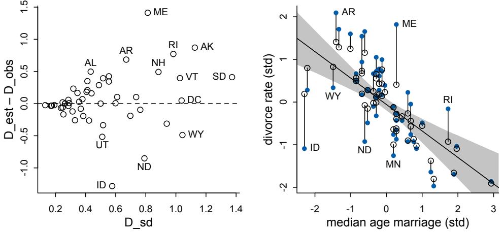
Figure 15.2. Left: Shrinkage resulting from modeling measurement error. The less error in the original measurement, the less shrinkage in the posterior. Right: Comparison of regression that ignores measurement error (dashed line and gray shading) with one that incorporates measurement error (blue line and shading). The points and line segments show the posterior means and standard deviations for each divorce rate, Dest,i .
friend shrinkage from the previous two chapters. Less certain estimates are improved by pooling information from more certain estimates.
This shrinkage results in pulling divorce rates towards the regression line, as seen in the right-hand plot in the same figure. This plot shows the posterior mean divorce rate for each State against its observed median age at marriage. The vertical line segments show the posterior standard deviations of each divorce rate—the estimates have moved, but they are still uncertain.
As a result of their movement, however, the regression trend has moved. The old noerror regression is shown in gray. The fancy new with-error regression is shown in blue. Well, really both the estimates and the trend have moved one another at the same time. For a State with an uncertain divorce rate, the trend has strongly influenced the new estimate of divorce rate. For a State with a fairly certain divorce rate—a small standard error—the State has instead strongly influenced the trend. The balance of all of this information is the shift in both the estimated divorce rates and the regression relationship.
15.1.2. Error on both outcome and predictor. What happens when there is measurement error on predictor variables as well? The basic approach is the same. Again, consider the problem generatively: Each observed predictor value is a draw from a distribution with an unknown mean, the true value, but known standard deviation. So we define a vector of parameters, one for each unknown true value, and then make those parameters the means of a family of Gaussian distributions with known standard deviations. Here’s the updated DAG:
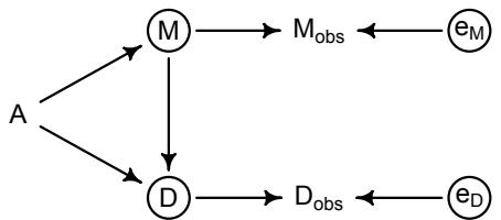
Now there is a Mobs to mirror Dobs. Likewise there is an error eM to match. This DAG assumes that the errors eD and eM are independent of one another. This is not necessarily the case.
Here’s the updated model, with the new bits in blue:
\[\begin{aligned} D\_{\mathsf{ous},i} & \sim \text{Normal}(D\_{\mathsf{r}\mathsf{u}\mathsf{u},i}, D\_{\mathsf{s}\mathsf{u},i}) & \text{[distribution for observed $D$ values]}\\ D\_{\mathsf{r}\mathsf{u}\mathsf{u}\mathsf{u},i} & \sim \text{Normal}(\mu\_{i}, \sigma) & \text{[distribution for true $D$ values]}\\ \mu\_{i} & \alpha + \beta\_{\mathsf{A}}A\_{i} + \beta\_{\mathsf{M}}M\_{\mathsf{r}\mathsf{u}\mathsf{u},i} & \text{[linear model]}\\ M\_{\mathsf{ous},i} & \sim \text{Normal}(M\_{\mathsf{r}\mathsf{u}\mathsf{u},i}, M\_{\mathsf{s}\mathsf{s},i}) & \text{[distribution for observed $M$ values]}\\ M\_{\mathsf{r}\mathsf{u}\mathsf{u},i} & \sim \text{Normal}(0,1) & \text{[distribution for true $M$ values]}\\ \alpha & \sim \text{Normal}(0, \mathbf{0}.2) &\\ \beta\_{\mathsf{A}} & \sim \text{Normal}(0, \mathbf{0}.5) &\\ \beta\_{\mathsf{M}} & \sim \text{Normal}(0, \mathbf{0}.5) &\\ \sigma & \sim \text{Exponential}(1) & \end{aligned}\]
The Mtrue parameters will hold the posterior distributions of the true marriage rates. And fitting the model is much like before:
R code
15.5 dlist <- list(
D_obs = standardize( d$Divorce ),
D_sd = d$Divorce.SE / sd( d$Divorce ),
M_obs = standardize( d$Marriage ),
M_sd = d$Marriage.SE / sd( d$Marriage ),
A = standardize( d$MedianAgeMarriage ),
N = nrow(d)
)
m15.2 <- ulam(
alist(
D_obs ~ dnorm( D_true , D_sd ),
vector[N]:D_true ~ dnorm( mu , sigma ),
mu <- a + bA*A + bM*M_true[i],
M_obs ~ dnorm( M_true , M_sd ),
vector[N]:M_true ~ dnorm( 0 , 1 ),
a ~ dnorm(0,0.2),
bA ~ dnorm(0,0.5),
bM ~ dnorm(0,0.5),
sigma ~ dexp( 1 )
) , data=dlist , chains=4 , cores=4 )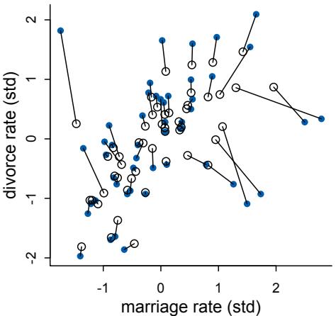
Figure 15.3. Shrinkage of both divorce rate and marriage rate. Solid points are the observed values. Open points are posterior means. Lines connect pairs of points for the same State. Both variables are shrunk towards the inferred regression relationship.
If you inspect the precis output, you’ll see that the coefficients for age at marriage and marriage rate are essentially unchanged from the previous model. So adding error on the predictor didn’t change the major inference. But it did provide updated estimates of marriage rate itself. We can visualize this by the shrinkage of both marriage and divorce rates:
R code
15.6 post <- extract.samples( m15.2 )
D_true <- apply( post$D_true , 2 , mean )
M_true <- apply( post$M_true , 2 , mean )
plot( dlist$M_obs , dlist$D_obs , pch=16 , col=rangi2 ,
xlab="marriage rate (std)" , ylab="divorce rate (std)" )
points( M_true , D_true )
for ( i in 1:nrow(d) )
lines( c( dlist$M_obs[i] , M_true[i] ) , c( dlist$D_obs[i] , D_true[i] ) )The result is Figure 15.3. What has happened is that since the States with highly uncertain marriage rates tend to be small States with high marriage rates, pooling has resulted in smaller estimates for those States.
The big take home point for this section is that when you have a distribution of values, don’t reduce it down to a single value to use in a regression. Instead, use the entire distribution. Anytime we use an average value, discarding the uncertainty around that average, we risk overconfidence and spurious inference. This doesn’t only apply to measurement error, but also to cases in which data are averaged before analysis.
In the previous model, with error on both the outcome and one of the predictors, we used a standardized Normal(0,1) prior for the M values. This is okay, but it ignores some information. Consider again the DAG for this system: A → M → D, A → D. This implies that a better prior for the M values would include A as a predictor. In other words, the entire generative model belongs. We’ll attempt this in a practice problem at the end of the chapter.
15.1.3. Measurement terrors. In the models above, measurement error is rather benign. The errors are uncorrelated with one another and with the other variables in the model. This means there are no new confounds (non-causal paths) introduced by the errors. But sometimes errors are more difficult to manage.
Consider for example a DAG in which the errors on D and M are correlated with one another, because they are both influenced by a variable P:
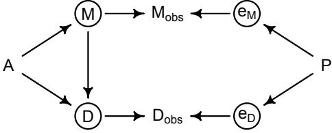
In this case, if we naively regress Dobs on Mobs, then there is an open non-causal path through P. If we have information about the measurement process, such that we can model the true variables D and M, there is still hope. But we’ll need to consider the covariance between the errors. This is computationally similar to how we did instrumental variable regression in the previous chapter. There’s a problem at the end of this chapter where I ask you to attempt this.
Another unfortunate situation can arise when another variable influences the error and creates another non-causal path. For example, suppose that the true marriage rate M influences the error on divorce rate D:
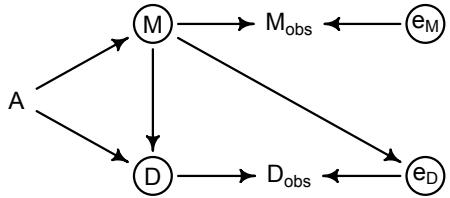
Why might this happen? If marriages are rare, then there aren’t as many couples that could possibly get divorced. This means a smaller sample size to measure the divorce rate. So smaller M induces a larger error eD. This produces a non-causal path from Mobs to Dobs that passes through eD. And again, if we can average over the uncertainty in the true M and D, using information about the measurement process, then we might do alright. But ignoring the measurement error isn’t alright. And that’s what almost everyone does almost every time.224
Another pattern of measurement error to worry about is when a causal variable is measured less precisely than a non-causal variable. Suppose for example that we know D and M very precisely but that now A is measured with error. Also assume that M has zero causal effect on D, like this:
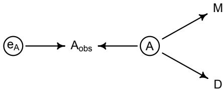
In this circumstance, it can happen that a naive regression of D on Aobs and M will strongly suggest that M influences D. The reason is that M contains information about the true A. And M is measured more precisely than A is. It’s like a proxy A. Here’s a small simulation you can toy with that will produce such a frustration:
15.7 N <- 500
A <- rnorm(N)
M <- rnorm(N,-A)
D <- rnorm(N,A)
A_obs <- rnorm(N,A)When you have your own data and your own particular measurement concerns, all of this can be overwhelming. But the way to proceed is the same as always: Use your background knowledge to write down a generative model or models, simulate data from these models in order to understand the inferential risks, and design a statistical approach that can work at least in theory.
15.2. Missing data
With measurement error, the insight is to realize that any uncertain piece of data can be replaced by a distribution that reflects uncertainty. But sometimes data are simply missing no measurement is available at all. At first, this seems like a lost cause. What can be done when there is no measurement at all, not even one with error?
The most common treatment of missing values is just to drop all cases with any missing values. This is known as complete case analysis. It is the default and silent behavior of most statistical software. Another common response is to replace missing values with some assumed value, like the mean of the variable or a reference value like zero. Neither of these treatments is safe. Complete case analysis is at best inefficient. It throws away data. But it can also produce bias, depending upon the causal details. Replacing missing values with static values is never warranted—we do not know those values, and if you fix them, the model will think it knows them with certainty.
So what can we do instead? We can think causally about missingness, and we can use the model to impute missing values. A generative model tells you whether the process that produced the missing values will also prevent the identification of causal effects. Sometimes it does. Other times it does not. Luckily, we can add missingness to a DAG and use the same criteria you already learned to figure out whether it produces confounding. A generative model also provides information about values you have not yet seen.225 And this information can be used to average over our uncertainty and make full use of the non-missing values, dropping nothing.
All this will become clearer, if we draw some diagrams. We’ll start with some simple, fictional examples. Then we’ll turn to some real examples.
Rethinking: Missing data are meaningful data. The fact that a variable has an unobserved value is still an observation. It is data, just with a very special value. The meaning of this value depends upon the context. Consider for example a questionnaire on personal income. If some people refuse to fill in their income, this may be associated with low (or high) income. Therefore a model that tries to predict the missing values can be enlightening. In ecology, the absence of an observation of a species is a subtle kind of observation. It could mean the species isn’t there. Or it could mean it is there but you didn’t see it. An entire category of models, occupancy models, 226 exists to take this duality into account. Missing values are always produced by some process, and thinking about that process can sometimes solve big problems.
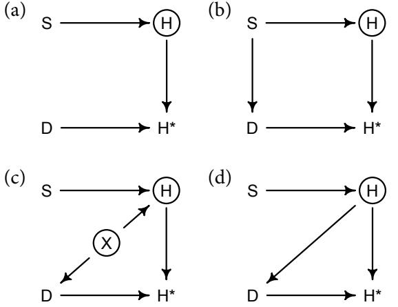
Figure 15.4. Four causal scenarios for the missing homework. See text for a complete explanation. (a) Dogs (D) eat homework (H) completely at random. (b) Dogs eat homework of students who study (S) too much. (c) Dogs eat more homework in noisy (X) homes, where the homework is also worse. (d) Dogs prefer to eat bad homework.
15.2.1. DAG ate my homework. Consider a sample of students, all of whom own dogs. The students produce homework (H). This homework varies in quality, influenced by how much each student studies (S). We could simulate 100 students, their attributes, and their homework like this:
R code
15.8 N <- 100
S <- rnorm( N )
H <- rbinom( N , size=10 , inv_logit(S) )I’ve assumed here that homework H will be graded on a 10-point scale. More studying produces more points, on average.
And then some dogs eat some homework. One way to get a grasp on the problem of missing data is to think of missingness as its own variable, a 0/1 indicator for missingness. So let D be a 0/1 indicator variable for whether each dog ate homework. Once homework has been eaten, we cannot observe the true distribution of homework. But we do get to observe H∗ , a copy of H with missing values where D = 1. In DAG form, this implies H → H∗ ← D.
We’d like to learn the causal influence of studying (S) on homework (H), S → H. But since we don’t observe H, we have to use H∗ instead. So we are relying on S → H∗ being a good approximation of S → H. When will this be true? The impact of any missing values in H∗ depends upon how the missing values are generated. It depends upon their cause. Let’s consider four scenarios, depicted as DAGs in Figure 15.4.
The simplest scenario, (a) in the upper left, is when dogs are completely random. A dog’s decision to eat a piece of homework or not is not influenced by any relevant variable. Therefore there is no arrow entering D in the DAG. Let’s simulate some random eating:
R code
15.9 D <- rbern( N ) # dogs completely random
Hm <- H
Hm[D==1] <- NAThat Hm variable is H∗ . We can’t use * in a variable name. Look inside Hm and you’ll see random NAs scattered about. Is this a problem? We can decide by considering whether the outcome H is independent of D. More generally, a minimal condition for missing values to be benign is that the outcome is independent of (d-separated from) them. In this case, H is independent of D (H ⊥⊥ D), because H∗ is a collider.
A more intuitive way to think about this scenario is the following. Since the missing values are completely random, missingness doesn’t necessarily change the overall distribution of homework scores. It removes data, and that makes estimation less efficient. But missing homework doesn’t necessarily bias our estimate of the causal effect of studying. You should try to build a binomial model to estimate the causal effect of S on H, using both the completely observed data and the data with missing values. There’s a practice problem at the end of this chapter that asks you to do this.
Now consider DAG (b) in the upper right of Figure 15.4. Here studying influences whether a dog eats homework, S → D. Suppose for example that students who study a lot do not play with their dogs. Then the dogs take revenge by eating homework. Again let’s simulate:
15.10 D <- ifelse( S > 0 , 1 , 0 )
Hm <- H
Hm[D==1] <- NANow every student who studies more than average (0) is missing homework. This scenario isn’t as benign as the previous. But it isn’t doom either. Notice that there is now a non-causal path (a backdoor path) from H → H∗ ← D ← S. If we don’t close this path, it will confound inference along S → H. Luckily, we can close the non-causal path by conditioning on S, and we want to condition on S anyway. So this scenario isn’t necessarily bad, as long as we can condition on the variable that influences missingness (the dogs D). Again there is a problem at the end that asks you to compare inference with all the homework and without missing homework.
This doesn’t mean there is no danger here. If we get the functions or distributions wrong, then we may get the wrong answer and the missing data may prevent us from seeing the absurdity of it in posterior predictive checks. Suppose for example that studying doesn’t help at all until a student does more than the average amount (0). In that case, we never get to see homework from those students, so we can’t possibly figure out the function that relates study effort to homework score.
The next scenario, Figure 15.4 (c), is more difficult. The basic situation is the same: There is a variable that influences both H and D. Previously this was S. Now it is a new variable X, the noisy level of the student’s house. In a noisy house, students produce worse homework, X → H. Simultaneously, dogs in noisy houses tend to misbehave, X → D. I’ve put a circle around X to signal that it is unobserved. Now when we regress H∗ on S, a new non-causal path is in play: H∗ ← D ← X → H.
The tricky question, however, is what effect this path has on our estimate of S → H. Let’s actually code this one out, using the simulated data. Here’s a complete data simulation for the DAG in Figure 15.4 (c):
15.11 set.seed(501)
N <- 1000
X <- rnorm(N)
S <- rnorm(N)
H <- rbinom( N , size=10 , inv_logit( 2 + S - 2*X ) )D <- ifelse( X > 1 , 1 , 0 ) Hm <- H Hm[D==1] <- NA
Assuming a simple binomial model, first let’s see what we get when we fully observe H. Remember, we haven’t observed X, so we can’t put it in the model.
R code15.12 dat_list <- list(
H = H,
S = S )
m15.3 <- ulam(
alist(
H ~ binomial( 10 , p ),
logit(p) <- a + bS*S,
a ~ normal( 0 , 1 ),
bS ~ normal( 0 , 0.5 )
), data=dat_list , chains=4 )
precis( m15.3 )mean sd 5.5% 94.5% n_eff Rhat a 1.11 0.03 1.07 1.15 1265 1 bS 0.69 0.03 0.65 0.73 1366 1
The true coefficient on S should be 1.00. We don’t expect to get that exactly, but the estimate above is way off. This model used the complete data, before dogs ate any homework, so it can’t be missingness that is the problem. This is just a case of omitted variable bias (Chapter 10). Recall that in a generalized linear model, even if an unobserved variable like X doesn’t structurally confound or interact with the predictor of interest like S, that doesn’t mean that it won’t cause bias in estimation of the effect of S. The reason is that there are ceiling and floor effects on the outcome variable that induce interactions among all predictors.
Now what impact does missing data have? Surely it will make things even worse. Let’s see. We’ll run the same model now, but with H∗ instead of H, dropping cases where D = 1.
R code
15.13 dat_list0 <- list( H = H[D==0] , S = S[D==0] )
m15.4 <- ulam(
alist(
H ~ binomial( 10 , p ),
logit(p) <- a + bS*S,
a ~ normal( 0 , 1 ),
bS ~ normal( 0 , 0.5 )
), data=dat_list0 , chains=4 )
precis( m15.4 )mean sd 5.5% 94.5% n_eff Rhat
a 1.80 0.04 1.74 1.85 1051 1
bS 0.83 0.03 0.78 0.88 1060 1The estimate for bS is still biased, but not as badly. This is only one example, but you can run thousands of simulations like this one (I show you how in the Overthinking box at the end of the section), and you’ll get this pattern on average. How has dropping students helped our estimate? The homework that is missing is from noisy houses. And it is noisy houses that mess up our estimate of bS, through omitted variable bias. So when we delete those houses from the data, the estimate actually gets better.
Note that this improvement is not a general property of missing data in such a DAG. For example, if you change the missingness rule instead to:
15.14 D <- ifelse( abs(X) < 1 , 1 , 0 )Now missingness makes things worse. Give it a try. What happens under missingness depends upon the details of the functions in the full structural causal model. The DAG isn’t enough to say what will happen. But the DAG is enough to say that we should be wary.
Just one more set of dogs remain. In Figure 15.4 (d), there is no X, but there is a path from H → D. Now dogs prefer to eat bad homework. This is possibly because their owners feed it to them, but maybe it somehow tastes better too. To simulate from this DAG:
15.15 N <- 100
S <- rnorm(N)
H <- rbinom( N , size=10 , inv_logit(S) )
D <- ifelse( H < 5 , 1 , 0 )
Hm <- H; Hm[D==1] <- NAGo ahead and try to estimate the causal effect S → H. You won’t be able to do a good job. And there is nothing to do here, because there is nothing we can condition on to block the non-causal path S → H → D → H∗ . This type of missingness, in which the variable causes its own missing values, is the worst. Unless you know the mechanism that produces the missingness (D in this case), there is little hope. But even if you do know the mechanism, sometimes the only solution is to take better measurements.
The point of these examples is not to give you nightmares. The point is to illustrate the diverse consequences of missing data. But the diversity is explicable causally, in terms of which variables cause missing values in which other variables. And the point of emphasizing simulation is to empower you to explore your own scenarios, the ones relevant to your own research. Even when we cannot completely eliminate the impact of missing data, we might be able to show, through simulation, that the expected impact is rather small.
Rethinking: Naming completely at random. Statistical terminology can be very confusing. The field uses ordinary words in highly technical ways. The everyday meanings of words like likelihood, significant, and confidence barely resemble their statistical definitions. The topic of missing data is no better. The dog-homework scenarios (Figure 15.4) sometimes go by the unhelpful names (a) missing completely at random (MCAR), (b) and (c) missing at random (MAR), and (d) the impressively absurd missing not at random (MNAR).227 The semantic difference between random and completely random is insignificant for nearly all people. No one likes these terms, but you’ll still see them in use. Even if these terms were easy to remember, they are not sufficient to decide how to handle missing data, as the difference between scenarios (b) and (c) demonstrates. Don’t worry about categorization. Sketch the causal model, and then figure out your next move.
R code
15.2.2. Imputing primates. Addressing missing data often involves the imputation of missing values. We impute both to avoid biased estimation and so that we can use all of the observed (not missing) data. The key idea with imputation is that any generative model necessarily contains information about variables that have not been observed. Some data go missing, but the model stays the same. In theory then imputing missing data is easy. In practice there can be challenges, as always.
To see how this works, let’s return to the primate milk example, from Chapter 5. We used data(milk) to illustrate masking, using both neocortex percent and body mass to predict milk energy. One aspect of those data are 12 missing values in the neocortex.perc column. We used a complete-case analysis back then, which means we dropped those 12 cases from the analysis. That means we also dropped 12 perfectly good body mass and milk energy values. That left us with only 17 cases to work with. Was that a bad idea?
To answer that question, we need to think more clearly about why those values are missing. The basic DAG from this example is:
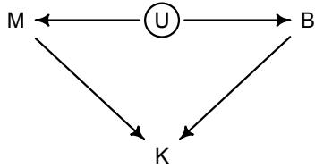
where M is body mass, B is neocortex percent, K is milk energy, and U is some unobserved variable that renders M and B positively correlated. We want to add missingness to this graph, just like we added missingness to the dog-homework graphs in the previous section. We haven’t observed B (neocortex percent). We’ve instead observed B ∗ , a partially observed set of values generated by B and some process. Which process? We don’t know yet. All we know is that the observed values B ∗ are a function of B and the “missingness” process. Whatever the process, it generates a variable RB that indicates which species have missing values. The variable RB is like the vector of dogs D in the dog-homework section.
The crucial question is which variables influence RB. Let’s consider three possibilities.
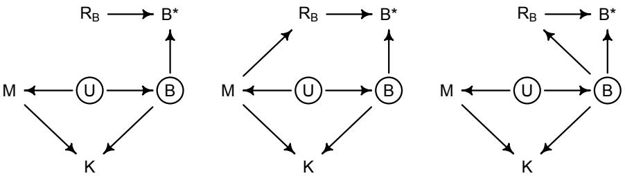
In all three DAGs above, the variable B is circled now to indicate that it is unobserved. Each DAG is a different hypothesis about what causes the missing brain values RB. Let’s consider each, going from left to right.
On the left, nothing influences RB. It is completely random. In this case, there is no new non-causal path introduced. Dropping the species with missing brain values wastes information—it means dropping all the observed mass values too—but it doesn’t necessarily bias inference.
In the middle, now body mass M influences which species have missing values. This could happen, for example, if smaller primates like lemurs are less often studied than larger primates like gorillas. If M influences RB, it also creates a new non-causal path B ∗ ← RB ← M → K. But luckily conditioning on M blocks this path, and we want to condition on M anyway. We still want to impute missing values, so that we don’t throw away information.
How do we know if M influences RB? You could test this idea by trying to measure the causal influence of M on RB. But keep in mind that all that backdoor path stuff still applies. Do you think you can estimate the causal influence of M on RB?
The third example DAG, on the right, shows brain size B itself influencing RB. This could happen because anthropologists are more interested in large-brained species. There is a lot more research on chimpanzees, for example, than on lemurs. This scenario is awful. If true, it means that estimation of B → K will be biased by a non-causal path through RB. It will also not be possible to test, with these data, whether B influences RB. Lots of different graphs can lead to this scenario. Here’s another possibility:
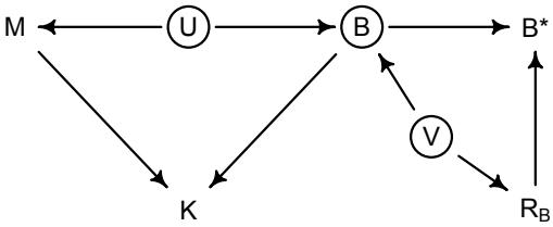
Now it isn’t the B values themselves that produce missingness. Rather there is an unobserved variable V that influences both B and RB. V could be for example phylogenetic similarity to humans. Humans have an unreasonable amount of neocortex—that is the reason we pay attention to it—and other primates closely related to us also tend to have more neocortex. If those primates are studied more intensely, B values will be missing more as distance from humans increases. Just about the only hope in this scenario is to have detailed knowledge of the process that produces RB, allowing imputation of B. And that will nearly always require strong modeling assumptions, assumptions which usually cannot be tested with the data.
In every DAG described above, we want to impute missing values of B. In the first and second, we do so in order to not throw away corresponding values of M. In the third, we have to impute to hope for any sensible estimate of B → K. So let’s see how to actually do the imputation.
The statistical trick with Bayesian imputation is to model the variable that has missing values. Each missing value is assigned a unique parameter. The observed values give us information about the distribution of the values. This distribution becomes a prior for the missing values. This prior will then be updated by full model. So there will be a posterior distribution for each missing value. Conceptually this is like the measurement error case—if we don’t know something, we condition it on what we know and let Bayes figure it out.
In our case, the variable with missing values is neocortex percent. Again, we’ll call it B, for “brain”:
\[B = [0.55, B\_2, B\_3, B\_4, 0.65, 0.65, \dots, 0.76, 0.75]\]
For every index i at which there is a missing value, there is also a parameter Bi that will form a posterior distribution for it. The simplest model will simply impute B from its own normal distribution. Here it is, with the neocortex pieces in blue:
\[\begin{aligned} K\_i &\sim \text{Normal}(\mu\_i, \sigma) & \text{[distribution for outcome } k] \\ \mu\_i &= \alpha + \beta\_B B\_i + \beta\_M \log M\_i & \text{[linear model]} \\ B\_i &\sim \text{Normal}(\nu, \sigma\_B) & \text{[distribation for obs/missing } B] \\ \alpha &\sim \text{Normal}(0, 0.5) \\ \beta\_B &\sim \text{Normal}(0, 0.5) \\ \beta\_M &\sim \text{Normal}(0, 0.5) \\ \sigma &\sim \text{Normal}(1) \\ \nu &\sim \text{Normal}(0.5, 1) \\ \sigma\_B &\sim \text{Exponential}(1) \end{aligned}\]
This model ignores that B and M are associated through U. But let’s start with this model, just to keep things simple. The interpretation of Bi ∼ Normal(ν, σB) is awkward at first. Note that when Bi is observed, then this line is a likelihood, just like any old linear regression. The model learns the distributions of ν and σB that are consistent with the data. But when Bi is missing and therefore a parameter, that same line is interpreted as a prior. Since the parameters ν and σB are also estimated, the prior is learned from the data, just like the varying effects in previous chapters.
One issue with this model is that it assumes each B value has a standardized Gaussian uncertainty. But we know that these values are bounded between zero and one, because they are proportions. So it is possible to do a little better. In the practice problems at the end of the chapter, you’ll see how. But keep in mind that assigning a Gaussian distribution doesn’t really mean that the frequency distribution of the variable is a bell curve. It just means we will use only the mean and variance to describe it. The Gaussian is a very conservative choice, because it is the flattest unbounded distribution with a given variance (Chapter 10). But as described way back in Chapter 7, if you have reason to suspect the tails of the distribution are thick, then definitely do not use a Gaussian distribution.
Implementing an imputation model can be done several different ways. All of the ways are a little awkward, because the locations of missing values have to respected, and that means plenty of index management. The approach I’ll use here hews closely to the discussion just above: We’ll merge the observed values and parameters into a vector that we’ll use as “data” in the regression. For convenience, ulam can automate this merging. The Overthinking box at the end of this section presents a full implementation in raw Stan code.
To fit the model with ulam, first get the data loaded and transform the predictors:
R code15.16 library(rethinking)
data(milk)
d <- milk
d$neocortex.prop <- d$neocortex.perc / 100
d$logmass <- log(d$mass)
dat_list <- list(
K = standardize( d$kcal.per.g ),
B = standardize( d$neocortex.prop ),
M = standardize( d$logmass ) )The model code looks absolutely ordinary, except for defining a distribution for B.
15.17 m15.5 <- ulam(
alist(
K ~ dnorm( mu , sigma ),
mu <- a + bB*B + bM*M,
B ~ dnorm( nu , sigma_B ),
c(a,nu) ~ dnorm( 0 , 0.5 ),
c(bB,bM) ~ dnorm( 0, 0.5 ),
sigma_B ~ dexp( 1 ),
sigma ~ dexp( 1 )
) , data=dat_list , chains=4 , cores=4 )When you start the model, it will notify you that it found 12 NA values and is trying to impute them. Once it finishes, take a look at the posterior summary:
15.18 precis( m15.5 , depth=2 )mean sd 5.5% 94.5% n_eff Rhat
nu -0.04 0.20 -0.35 0.28 2013 1
a 0.03 0.16 -0.22 0.28 2319 1
bM -0.55 0.21 -0.88 -0.21 1238 1
bB 0.50 0.25 0.09 0.88 909 1
sigma_B 1.00 0.17 0.77 1.31 1593 1
sigma 0.84 0.15 0.63 1.11 1266 1
B_impute[1] -0.56 0.91 -1.95 0.95 2602 1
B_impute[2] -0.69 0.91 -2.10 0.79 2025 1
B_impute[3] -0.68 0.94 -2.10 0.84 2086 1
B_impute[4] -0.25 0.87 -1.61 1.15 3091 1
B_impute[5] 0.48 0.85 -0.93 1.82 2532 1
B_impute[6] -0.16 0.85 -1.50 1.16 2626 1
B_impute[7] 0.19 0.85 -1.08 1.58 2640 1
B_impute[8] 0.28 0.86 -1.06 1.62 3697 1
B_impute[9] 0.52 0.87 -0.93 1.84 2574 1
B_impute[10] -0.46 0.89 -1.87 0.93 2092 1
B_impute[11] -0.27 0.86 -1.61 1.09 2650 1
B_impute[12] 0.17 0.85 -1.21 1.49 2749 1Each of the 12 imputed distributions for missing values is shown here, along with the ordinary regression parameters above them. To see how including all cases has impacted inference, let’s do a quick comparison to the estimates that drop missing cases. I’ll drop the cases with missing values, but the model will be identical.
15.19 obs_idx <- which( !is.na(d$neocortex.prop) )
dat_list_obs <- list(
K = dat_list$K[obs_idx],
B = dat_list$B[obs_idx],
M = dat_list$M[obs_idx] )
m15.6 <- ulam(
alist(
K ~ dnorm( mu , sigma ),R code
mu <- a + bB*B + bM*M,
B ~ dnorm( nu , sigma_B ),
c(a,nu) ~ dnorm( 0 , 0.5 ),
c(bB,bM) ~ dnorm( 0, 0.5 ),
sigma_B ~ dexp( 1 ),
sigma ~ dexp( 1 )
) , data=dat_list_obs , chains=4 , cores=4 )
precis( m15.6 )mean sd 5.5% 94.5% n_eff Rhat
nu 0.00 0.22 -0.34 0.37 1821 1
a 0.10 0.20 -0.21 0.42 1923 1
bM -0.63 0.25 -1.01 -0.21 1276 1
bB 0.59 0.27 0.14 1.01 1244 1
sigma_B 1.04 0.18 0.79 1.36 1458 1
sigma 0.88 0.19 0.64 1.20 1145 1Comparing this posterior to the previous will be easier with a plot:
R code
15.20 plot( coeftab(m15.5,m15.6) , pars=c("bB","bM") )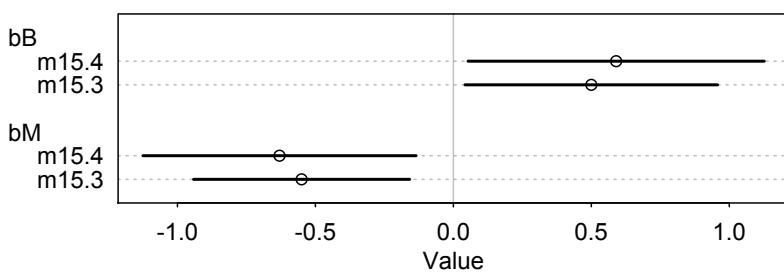
The model that imputes the missing values, m15.3, has narrower marginal distributions for both effects. How could this happen? We used more information, the values of body mass that are not missing but are discarded by m15.4. These values suggest a slightly smaller influence of body mass, bM, and this also cascades into bB.
Let’s do some plotting to visualize what’s happened here.
R code
15.21 post <- extract.samples( m15.5 )
B_impute_mu <- apply( post$B_impute , 2 , mean )
B_impute_ci <- apply( post$B_impute , 2 , PI )
# B vs K
plot( dat_list$B , dat_list$K , pch=16 , col=rangi2 ,
xlab="neocortex percent (std)" , ylab="kcal milk (std)" )
miss_idx <- which( is.na(dat_list$B) )
Ki <- dat_list$K[miss_idx]
points( B_impute_mu , Ki )
for ( i in 1:12 ) lines( B_impute_ci[,i] , rep(Ki[i],2) )
# M vs B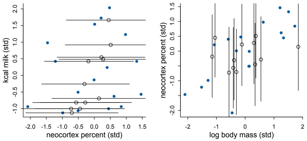
Figure 15.5. Left: Inferred distribution of milk energy (vertical) and neocortex proportion (horizontal), with imputed values shown by open points. The line segments are 89% posterior compatibility intervals. Right: Inferred distribution between the two predictors, neocortex proportion and log mass. Imputed values again shown by open points.
plot( dat_list$M , dat_list$B , pch=16 , col=rangi2 ,
ylab="neocortex percent (std)" , xlab="log body mass (std)" )
Mi <- dat_list$M[miss_idx]
points( Mi , B_impute_mu )
for ( i in 1:12 ) lines( rep(Mi[i],2) , B_impute_ci[,i] )Figure 15.5 displays both the inferred relationship between milk energy and neocortex (left) and the relationship between the two predictors (right). Both plots show imputed neocortex values in blue, with 89% compatibility intervals shown by the line segments. Although there’s a lot of uncertainty in the imputed values—hey, Bayesian inference isn’t magic, just logic they do show a gentle tilt towards the regression relationship. This has happened because the observed values provide information that guides the estimation of the missing values.
The right-hand plot shows the inferred relationship between the two predictors. We already know that these two predictors are positively associated—that’s what creates the masking problem. But notice here that the imputed values do not show an upward slope. They do not, because the imputation model—the first regression with neocortex (observed and missing) as the outcome—assumed no relationship.
We can improve this model by changing the imputation model to estimate the relationship between the two predictors. This really just means that we use the entire generative model. In the DAG, B and M are associated as a result of U. If we can include that fact in the model, we might make better imputations and therefore better inferences. The technique is only to change the imputation line of the model from the simple:
Bi ∼ Normal(ν, σB)
to a bivariate normal that includes both M and B:
(Mi , Bi) ∼ MVNormal((µM, µB), S)
The S matrix is another covariance matrix, and it will measure the correlation between M and B, using the observed cases, and then use that correlation to infer the missing B values. Note that this is the simplest model we could have of the association between M and B. It assumes that the covariance is sufficient to describe their relationship. That will not always be the case, as many different bivariate relationships can produce the same covariance. If you have a better idea, then you should use that instead.
Here’s the ulam implementation. This is complex code, because we have to construct a variable that includes both the observed M values and the merged list of observed and imputed B values. I’ll also do the merging more explicitly. In the Overthinking box at the end, I walk through the Stan code, explaining some of the coding details.
R code
15.22 m15.7 <- ulam(
alist(
# K as function of B and M
K ~ dnorm( mu , sigma ),
mu <- a + bB*B_merge + bM*M,
# M and B correlation
MB ~ multi_normal( c(muM,muB) , Rho_BM , Sigma_BM ),
matrix[29,2]:MB <<- append_col( M , B_merge ),
# define B_merge as mix of observed and imputed values
vector[29]:B_merge <- merge_missing( B , B_impute ),
# priors
c(a,muB,muM) ~ dnorm( 0 , 0.5 ),
c(bB,bM) ~ dnorm( 0, 0.5 ),
sigma ~ dexp( 1 ),
Rho_BM ~ lkj_corr(2),
Sigma_BM ~ dexp(1)
) , data=dat_list , chains=4 , cores=4 )
precis( m15.7 , depth=3 , pars=c("bM","bB","Rho_BM" ) )mean sd 5.5% 94.5% n_eff Rhat bM -0.65 0.22 -1.00 -0.30 1262 1 bB 0.58 0.26 0.16 0.99 1048 1 Rho_BM[1,1] 1.00 0.00 1.00 1.00 NaN NaN Rho_BM[1,2] 0.60 0.13 0.37 0.78 1592 1 Rho_BM[2,1] 0.60 0.13 0.37 0.78 1592 1 Rho_BM[2,2] 1.00 0.00 1.00 1.00 1981 1
The slopes bM and bB haven’t changed much, although bM is perhaps a little more precise now. We’re interested in that correlation and how it has influenced the imputed values. The posterior correlation is quite strong, 0.6 on average. This shows the strong positive relationship between M and B that we already knew existed.
What does this correlation do to the imputed values? You can use the same plotting code as before. Figure 15.6 displays the same kind of plots as before, but now for the new
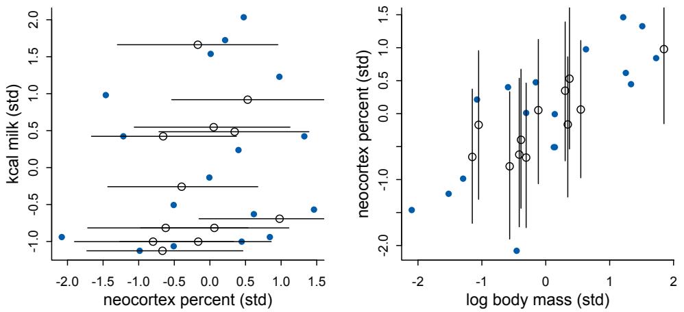
Figure 15.6. Same relationships as shown in Figure 15.5, but now for the imputation model that estimates the association between the predictors. The information in the association between predictors has been used to infer a stronger relationship between milk energy and the imputed values.
imputation model. On the right, you can see now that the model has imputed in a way to preserve the positive association between neocortex and log mass. Although in this example this doesn’t make a big difference in the inferred relationships with the outcome, it is clearly better. Doing better is good.
Rethinking: Multiple imputations. Missing data imputation has a messy history. There are many forms of imputation, and most of them are ad hoc devices without a strong basis in probability theory: Hot-deck imputation, cold-deck imputation, mean substitution, stochastic imputation, among others. None of these procedures is considered respectable today. A common non-Bayesian procedure is multiple imputation. 228 Multiple imputation was developed in the context of survey non-response, and it actually has a Bayesian justification. But it was invented when Bayesian imputation on the desktop was impractical, so it tries to approximate the full Bayesian solution to a “missing at random” missingness model. If you aren’t comfortable dropping incomplete cases, then you shouldn’t be comfortable using multiple imputation either. The procedure performs multiple draws from an approximate posterior distribution of the missing values, performs separate analyses with these draws, and then combines the analyses in a way that approximates full Bayesian imputation. Multiple imputation is more limited than full Bayesian imputation, so now we just use the real thing. But lots of non-Bayesian analyses still use multiple imputation. Remember that frequentist statistics isn’t a theory of how to produce estimates but rather just a theory of how to evaluate them.
Overthinking: Stan imputation algorithm. In principle, imputation is just using the same model but replacing data with parameters. Data are observed variables. Parameters are unobserved variables. The same generative model allows us to learn about both. But in practice, additional programming is necessary. It’s necessary, because we have to construct a new variable that is a mix of observed and unobserved values. The ulam code for m15.5 automates this. But it is worth seeing the guts of the machine, because it will increase understanding and teach you how to do this manually, in raw Stan code.
If you inspect the Stan code stancode(m15.5), you’ll see a functions block at the top. This is where you can put special code that you don’t want cluttering up the model block. In this case: functions{
vector merge_missing( int[] miss_indexes , vector x_obs , vector x_miss ) {
int N = dims(x_obs)[1];
int N_miss = dims(x_miss)[1];
vector[N] merged;
merged = x_obs;
for ( i in 1:N_miss )
merged[ miss_indexes[i] ] = x_miss[i];
return merged;
}This code exists only to merge a vector of observed values with a vector of parameters to stand in place of missing values. It is called in the model block. Here are the important lines:
B_merge = merge_missing(B_missidx, to_vector(B), B_impute);
B_merge ~ normal( nu , sigma_B );
for ( i in 1:29 ) {
mu[i] = a + bB * B_merge[i] + bM * M[i];
}
K ~ normal( mu , sigma );The first line above merges the observed data B with the imputation parameters in B_impute. The vector B_missidx is just a list of the index positions of the missing values. If you use ulam, it builds B_missidx for you. But if you use Stan directly, you’ll need to build it yourself. One line is enough:
R code 15.23 B_missidx <- which( is.na( dat_list$B ) )
You pass B_missidx to the Stan model as data. The function merge_missing replaces each missing value with the value of each corresponding parameter in B_impute. This is a bit awkward—it is joyless index shuffling. But it gets the job done, and in the end we have a vector B_merge that contains both observed values and imputation parameters in all the right places. The next lines of code then use B_merge. The second line above is just the probability of the brain (neocortex percent) values, as stated by the model. Then the loop constructs the linear predictor mu for each species, with B_merge appearing, so that both observed values and imputation parameters are used as appropriate.
You can use merge_missing directly in ulam models as well. It will declare the merged vector and the vector of imputation parameters. The model m15.5 contains an example. Even m15.5 inserts merge_missing behind the scenes. See: m15.5@formula_parsed$formula. If you use Stan directly, you’ll need to declare all of this yourself. You can see the necessary declarations in the parameters and model blocks of stancode(m15.5).
15.2.3. Where is your god now? Sometimes there are no statistical solutions to scientific problems. But even then, careful statistical thinking can be useful because it will tell us that there is no statistical solution. Here’s an example involving missing data.
Religion is a human universal, as common among human societies as walking on two legs and naming stars. Anthropologists, archaeologists, and scholars of religion are sometimes curious about the impact of religious beliefs on the welfare of human societies. Some of the most successful religious traditions involve gods (and other supernatural entities) that enforce moral norms. For example, in the Abrahamic traditions, God punishes the wicked and rewards the just. Such gods might be called “moralizing gods.” In other traditions, gods behave in their own self-interest, with no interest in encouraging humans to cooperate with one another. Does such a difference in belief have any consequences for the society? For example, if people who believe in a moralizing god are better at cooperating with one another,
}
then maybe societies that believe in moralizing gods grow faster and tend to replace societies with less moralizing gods.
Let’s look at a set of historical data that was used to evaluate this idea.229
15.24 data(Moralizing_gods)
str(Moralizing_gods)'data.frame': 864 obs. of 5 variables:
$ polity : Factor w/ 30 levels "Big Island Hawaii",..: 1 1 1 1 1 1 ...
$ year : int 1000 1100 1200 1300 1400 1500 1600 1700 1800 -600 ...
$ population : num 3.73 3.73 3.6 4.03 4.31 ...
$ moralizing_gods: int NA NA NA NA NA NA NA NA 1 NA ...
$ writing : int 0 0 0 0 0 0 0 0 0 0 ...These data are population sizes (on the log scale) of different regions (polity) in different centuries (year). The key explanatory variable is moralizing_gods, which indicates whether members of a society believed in supernatural enforcement of morality (1), did not believe (0), or there is insufficient evidence for assigning a value (NA). This last value (NA) is usually associated with lack of any written evidence about religious belief. There is also an indicator variable for literacy (writing).
Does belief in moralizing gods increase the rate of population growth? This is a difficult causal query. There are plausibly many unobserved confounds that could produce a noncausal association between population growth rate and the content of religious traditions. And belief in moralizing gods may not produce an immediately detectable increase in population. Instead the causal effect could work over long time periods or only during periods of conflict or ecological stress. Minimally, what we need is some comparison of population growth rates before and after each society adopts moralizing gods. This is not a causal identification strategy that does anything about confounds—the appearance of moralizing gods and larger populations could still be driven by other (unmeasured) variables. There is no sense in which we can think of the year that moralizing gods appear as being a random treatment, in the sense of a regression discontinuity (Chapter 14, page 461). But if we playfully assume that there are no confounds, how should we go about this analysis?
The first obstacle is that there are a lot of missing values in the moralizing_gods variable. This prevents us from knowing exactly when (if ever) each society adopts belief in moralizing gods. How many values are missing? Let’s count:
R code
15.25 table( Moralizing_gods$moralizing_gods , useNA="always" )0 1
Of 864 cases, 528 of them (60%) are missing. Only 17 of the observed cases are zeros, which means “no moralizing gods.” This is a lot of missing data, to be sure. But the raw amount of missing data is not necessarily a reason to worry. Remember the homework-eating dogs from earlier—the impact of missing data depends upon the process that produces missing data. If the missing gods are scattered at random, then we’re in luck. It’ll be useful to visualize the missingness pattern.
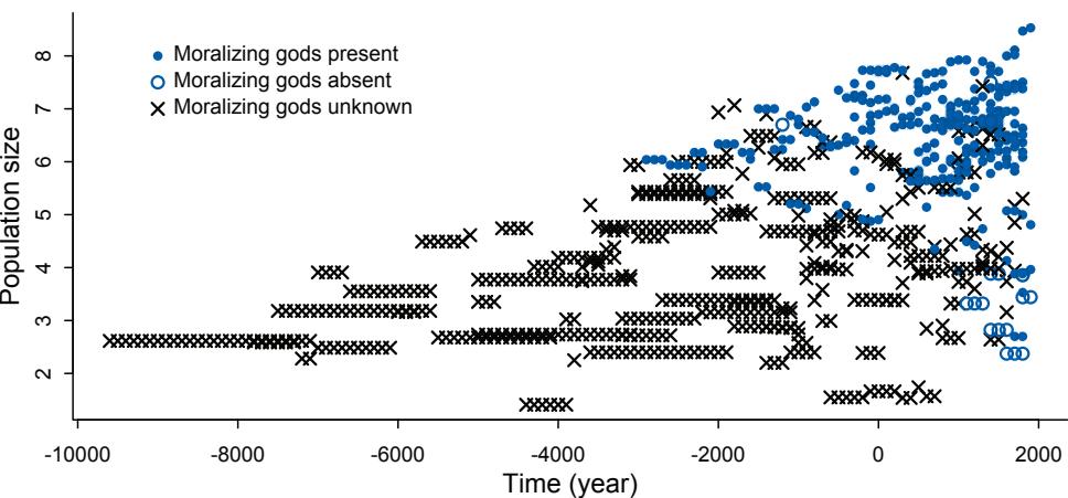
Figure 15.7. Missing values in the Moralizing_gods data. The blue points, both open and filled, are observed values for the presence of beliefs about moralizing gods. The x symbols are unknowns, the missing values.
R code
15.26 symbol <- ifelse( Moralizing_gods$moralizing_gods==1 , 16 , 1 )
symbol <- ifelse( is.na(Moralizing_gods$moralizing_gods) , 4 , symbol )
color <- ifelse( is.na(Moralizing_gods$moralizing_gods) , "black" , rangi2 )
plot( Moralizing_gods$year , Moralizing_gods$population , pch=symbol ,
col=color , xlab="Time (year)" , ylab="Population size" , lwd=1.5 )The result is shown in Figure 15.7. I’ve just plotted log population against year. The symbols show the value of moralizing_gods. Filled blue points have value 1 (belief in moralizing gods known to be present). The open blue points have value 0 (belief in moralizing gods known to be absent). The × symbols are points where the value is NA. This is a highly non-random missingness pattern. The reason is that written records are usually needed to determine historical religious beliefs. Let’s look at the cross-tabulation of gods and literacy:
R code15.27 with( Moralizing_gods ,
table( gods=moralizing_gods , literacy=writing , useNA="always" ) )literacy
gods 0 1 <NA>
0 16 1 0
1 9 310 0
<NA> 442 86 0442 (84%) of 528 missing values are for non-literate polities. No writing means no evidence of any kind, in most cases. And as you can see in Figure 15.7, missing values are associated with smaller polities. This is possibly because smaller polities were (in the past) less likely to be literate. These data are structured by the strong association between literacy, moralizing gods, and missing values. Beneath that mass of × symbols in Figure 15.7, belief in moralizing gods could be common or rare, depending on your theoretical preference.
This situation cannot be saved by statistics, but it is useful to reason why. After all, in many cases missing data don’t block inference. First we must consider whether we can just ignore the missing values, using a complete case analysis. But doing that in this context will almost certainly bias our inference, because the missingness is strongly associated with other variables, like writing, which are in turn strongly associated with the outcome. It’ll help to consider the causal structure of missingness. Here’s an optimistic guess:
Here P is rate of population growth (not the same as the population size variable in the data), Gis the presence of belief in moralizing gods (which is unobserved), G ∗ is the observed variable with missing values, W is writing, and RG is the missing values indicator. This is an optimistic scenario, because it assumes there are no unobserved confounds among P, G, and W. These are purely observational data, recall. But the goal is to use this example to think through the impact of missing data. If we can’t recover from missing data with the DAG above, adding confounds isn’t going to help.
Remember from the previous sections that the goal is to determine whether the outcome (here P) is independent of missingness (here RG). This is clearly not a dog-eats-homeworkat-random situation, because RG is not completely random. It assumes missingness RG is explained entirely by an observed variable (W). Unfortunately, if P influences W, if we condition on W to try to separate P and RG, it could makes things worse. It’s like conditioning on the outcome. A variable caused by the outcome will naturally have a strong association with the outcome and potentially explain away causal associations with other variables. I’ve made a practice problem at the end of the chapter to explain this better. Furthermore, in this case, writing is very strongly associated with missing values. Conditioning on RG would not help, and so conditioning on a variable that almost uniquely determines it would not necessarily help. We could make very favorable assumptions about the functional relationships among the variables, so that confounding would be weak. But structurally there isn’t any reason to trust an estimate of G → P here.
There is still hope, if we are willing to make strong assumptions. If we could somehow condition on G instead of G ∗ , we’d be safe and clear. This is where imputation can help, by reconstructing G with appropriate uncertainty. This is not trivial, however, because successful imputation requires a good approximation of the generative model of the variable. How is G generated? There is no obvious answer. Consider for example the data for Hawaii. By 1778, Hawaii was a large and complex polity with moralizing gods. What happened in 1778? Captain James Cook and his crew finally made contact. Here is Hawaii:
15.28 haw <- which( Moralizing_gods$polity=="Big Island Hawaii" )
columns <- c("year","writing","moralizing_gods")
t( Moralizing_gods[ haw , columns ] )| 1 | 2 | 3 | 4 | 5 | 6 | 7 | 8 | 9 | |
|---|---|---|---|---|---|---|---|---|---|
| year | 1000 | 1100 | 1200 | 1300 | 1400 | 1500 | 1600 | 1700 | 1800 |
| writing | 0 | 0 | 0 | 0 | 0 | 0 | 0 | 0 | 0 |
| moralizing_gods | NA | NA | NA | NA | NA | NA | NA | NA | 1 |
After Captain Cook, Hawaii is correctly coded with 1 for belief in moralizing gods. It is also a fact that Hawaii never developed its own writing system. So there is no direct evidence of when moralizing gods appeared in Hawaii. Any imputation model needs to decide how to fill in those NA values. With so much missing data, any imputation model would necessarily make very strong assumptions.
The strongest assumption would be just to replace all of the NA values with some constant, like zero. This implies a generative model in which any polity that believes in moralizing gods will never produce a missing value. In the case of Hawaii, it assumes that moralizing gods appear only after Captain Cook arrives. This procedure results in biased estimates of time of adoption of moralizing gods, because presumably more than just Hawaii believed in moralizing gods before they started writing about them. You might think no analyst would impute missing values this way. But this sort of arbitrary imputation is not rare.230
What else could we do? In principle we could perform a model-based imputation of the missing values in moralizing_gods. But we don’t have any obviously correct way to do this. We can’t just associate presence/absence of moralizing gods with population size, because that’s the very question under investigation. Assuming the answer seems like a bad idea. Sometimes all that statistics can do for us is confirm that we’ll just have to gather more evidence. Here that means doing research to replace NA values with observations.
But if we were going to try to impute the missing values, there is another obstacle. The moralizing_gods variable is discrete. It can take the values of zero or one only. Whether imputing or dealing with measurement error, discrete variables are computationally trickier than continuous variables. The next section shows you how to handle them.
Rethinking: Present details about missing data. The moralizing gods example contains a lot of missing data—60% of the primary exposure variable is NA. Obviously in cases like this one, it is very important to inform readers about missing data and carefully justify how they were handled. But even in more routine contexts, with more modest amounts of missing data, clear documentation of missing data and its treatment is necessary. This is best done with a causal model that makes transparent what is being assumed about the source of missing values and simultaneously justifies how they are handled. But the minimum is to report the counts of missing values in each variable and what was done with them.
15.3. Categorical errors and discrete absences
The examples above focused on nice continuous variables. In the section on measurement error, the variables were continuous. In the section on missing data, neocortex percent is continuous. When a variable is continuous, you can just assign a parameter to each unknown value—whether it is measured with error or rather completely missing—and let the Markov chain do the hard part.
But when a variable is instead discrete—0/1 or 1,2,3,4 for example—then the Markov chain needs some extra tutoring. Discrete unobserved variables require discrete parameters. There are two issues with discrete parameters. First, a discrete variable will not produce a smooth surface for Hamiltonian Monte Carlo to glide around on. HMC just doesn’t do discrete variables. Second, other estimation approaches also have problems with discrete parameter spaces, because discrete jumps are difficult to calibrate. Chains tend to get stuck for long periods.
But that doesn’t mean we are stuck. In almost every case, we don’t need to sample discrete parameters at all. Instead we can use a special technique, known to experts as a “weighted average,” to remove discrete parameters from the model. After sampling the other parameters, we can then use their samples to compute the posterior distribution of any discrete parameter that we removed. So no information is given up. And removing the discrete parameters actually makes the Markov chain more efficient, whatever engine you are using, so it is usually worth doing, even if you aren’t using HMC. The technique can even be useful when the parameters aren’t discrete, because removing continuous parameters also speeds up the chain.
This all sounds too good to be true. It is all true. But implementing it is not at all obvious. In this section, I’ll teach you how to do it, using the simplest example possible. The key idea, whatever the context, is that whether a variable is observed (data) or not (parameter), the generative model defines its information. There is a little bit of mathematics in this section, but no more than you learned in secondary school. Once you grasp the general approach, you can apply it to discrete variables that are not binary, including count and categorical variables.
15.3.1. Discrete cats. Imagine a neighborhood in which every house contains a songbird. Suppose we survey the neighborhood and sample one minute of song from each house, recording the number of notes. You notice that some houses also have house cats, and wonder if the presence of a cat changes the amount that each bird sings. So you try to also figure out which houses have cats. You can do this easily in some cases, either by seeing the cat or by asking a human resident. But in about 20% of houses, you can’t determine whether or not a cat lives there.
This very silly example sets us a very practical working example of how to cope with discrete missing data. We will translate this story into a generative model, simulate data from it, and then build a statistical model that copes with the missing values. Let’s consider the story above first as a DAG:

The presence/absence of a cat C influences the number of sung notes N. Because of missing values RC however, we only observe C ∗ . To make this into a fully generative model, we must now pick functions for each arrow above. Here are my choices, in statistical notation:
| Poisson(λi) Ni ∼ |
[Probability of notes sung] |
|---|---|
| λi = α + βCi log |
[Rate of notes as function of cat] |
| ∼ Bernoulli(k) Ci |
[Probability cat is present] |
| Bernoulli(r) RC,i ∼ |
[Probability of not knowing Ci ] |
And then to actually simulate some demonstration data, we’ll have to pick values for α, β, k, and r. Here’s a working simulation.
15.29 set.seed(9)
N_houses <- 100L
alpha <- 5
beta <- (-3)
k <- 0.5
r <- 0.2cat <- rbern( N_houses , k )
notes <- rpois( N_houses , alpha + beta*cat )
R_C <- rbern( N_houses , r )
cat_obs <- cat
cat_obs[R_C==1] <- (-9L)
dat <- list(
notes = notes,
cat = cat_obs,
RC = R_C,
N = as.integer(N_houses) )At the end, I’ve replaced each unknown value of cat_obs with −9. There is nothing special about this value. The model will skip them. But it is usually good to use some invalid value, so that if you make a mistake in coding, an error will result. In this case, since cat has a Bernoulli distribution, if the model ever asks for the probability of observing −9, there should be an error, because −9 is impossible.
To program this model, we cannot declare a parameter for each unobserved cat. So instead we’ll just average over our uncertainty in whether the cat was there or not. What this means, precisely, is that the likelihood of observing Ni notes, unconditional on Ci , is:
Pr(Ni) = (probability of a cat)(probability of Ni when there is a cat) + (probability of no cat)(probability of Ni when there is no cat) Pr(Ni) = Pr(Ci = 1) Pr(Ni |Ci = 1) + Pr(Ci = 0) Pr(Ni |Ci = 0)
When we don’t know Ci , we compute the likelihood of Ni for each possible value of Ci—here one or zero—and then average these likelihoods using the probabilities that Ci takes on each value. The above expression is what we need to code into the model. We can do this either by using Stan directly or by using custom distribution in ulam(). Let me show you the ulam() code. Then I’ll explain it.
R code
15.30 m15.8 <- ulam(
alist(
# singing bird model
## cat known present/absent:
notes|RC==0 ~ poisson( lambda ),
log(lambda) <- a + b*cat,
## cat NA:
notes|RC==1 ~ custom( log_sum_exp(
log(k) + poisson_lpmf( notes | exp(a + b) ),
log(1-k) + poisson_lpmf( notes | exp(a) )
) ),
# priors
a ~ normal(0,1),
b ~ normal(0,0.5),
# sneaking cat model
cat|RC==0 ~ bernoulli(k),k ~ beta(2,2)
), data=dat , chains=4 , cores=4 )The likelihood of notes at the top is split into two cases. You can read notes|RC==0 as “the probability of N when RC = 0.” So the first line in the model code above is just the ordinary Poisson probability when the cat is known present or absent (RC = 0). The next lines are the average likelihood, when we haven’t observed the presence or absence of the cat, when RC = 1. It looks complicated, but it is just the previous expression on the log scale. The term log(k) + poisson_lpmf( notes | exp(a + b) ) is log(Pr(Ci = 1) Pr(Ni |Ci = 1)), and log(1-k) + poisson_lpmf( notes | exp(a) ) is log(Pr(Ci = 0) Pr(Ni |Ci = 0)). These two terms are then combined to make the weighted sum, on the log scale, using the helper function log_sum_exp. This function just takes a vector of log-probabilities, exponentiates them, sums them, and then returns the log of the sum. But it does all of this in a numerically stable way.
The rest of the model above is more familiar. Be sure to note however the cat presence/absence model at the bottom. When the cat is known present or absent, RC = 0, we want to use that observation to update the parameter k, the probability a cat is present. This is the same k in the likelihood. This means that the non-missing observations inform the prior k for the missing observations. Take a look at the posterior of m15.6 and verify that it mixes well and produces results that are consistent with the data generating process.
Now suppose we want to infer the unknown C values. To compute the probability that any particular cat was present or absent, we can refer back to the generative model. The thing we want to know is Pr(Ci = 1). Prior to seeing the data, this is just the prior Pr(Ci = 1) = k. Once we observe Ni , the number of notes sung, we can update this prior with Bayes’ rule. In this case:
\[\Pr(\mathbf{C}\_{i} = 1 | N\_{i}) = \frac{\Pr(N\_{i} | \mathbf{C}\_{i} = 1)\Pr(\mathbf{C}\_{i} = 1)}{\Pr(N\_{i} | \mathbf{C}\_{i} = 1)\Pr(\mathbf{C}\_{i} = 1) + \Pr(N\_{i} | \mathbf{C}\_{i} = 0)\Pr(\mathbf{C}\_{i} = 0)}\]
This looks like a mess. But really it is just a definition. The top is the probability of Ni notes when Ci = 1. The bottom is just the average probability of Ni notes. There are just two terms to calculate, and we actually already used them in our model. The denominator in the expression above is the same average probability of Ni that we wrote into the model code.
To compute Pr(Ci = 1|Ni) for each i, we just need a few extra lines in the model code. We’ll perform these calculations in Stan’s generated quantities block, which means the calculations are performed only once per HMC transition and are saved in the returned samples. When using ulam, we can tag a line with gq> to indicate this is what we want. Here is the updated model, with the new lines at the bottom:
15.31 m15.9 <- ulam(
alist(
# singing bird model
notes|RC==0 ~ poisson( lambda ),
notes|RC==1 ~ custom( log_sum_exp(
log(k) + poisson_lpmf( notes | exp(a + b) ),
log(1-k) + poisson_lpmf( notes | exp(a) )
) ),
log(lambda) <- a + b*cat,a ~ normal(0,1),
b ~ normal(0,0.5),
# sneaking cat model
cat|RC==0 ~ bernoulli(k),
k ~ beta(2,2),
# imputed values
gq> vector[N]:PrC1 <- exp(lpC1)/(exp(lpC1)+exp(lpC0)),
gq> vector[N]:lpC1 <- log(k) + poisson_lpmf( notes[i] | exp(a+b) ),
gq> vector[N]:lpC0 <- log(1-k) + poisson_lpmf( notes[i] | exp(a) )
), data=dat , chains=4 , cores=4 )Those three lines that begin with gq> perform the calculations for Pr(Ci = 1|Ni). The first one defines a vector to hold the probabilities, and the formula is just the mathematical expression from before, Bayes rule. The exp stuff is necessary because we do the other calculations on the log scale, as always. The next two lines are just the same likelihood calculations as before, the likelihoods of Ni conditional on the cat being present (lpC1) or absent (lpC0).
In the practice problems at the end, I’ll ask you to compare the posterior probabilities in PrC1 to the true values from the simulation. You can process these samples just like any other parameter, even though we computed them in an unusual way.
The strategy presented here extrapolates to discrete variables with more than two possible values. In that case, you just need more than two terms in your average likelihood. For example, if houses can have up to two cats, then cats might be instead binomially distributed across houses. Then the code for the likelihood might be instead:
notes|RC==1 ~ custom( log_sum_exp(
binomial_lpmf(2|2,k) + poisson_lpmf( notes | exp(a + b*2) ),
binomial_lpmf(1|2,k) + poisson_lpmf( notes | exp(a + b*1) ),
binomial_lpmf(0|2,k) + poisson_lpmf( notes | exp(a + b*0) )
) )Read each line above as the log probability of a specific number of cats, assuming cats are binomially distributed with maximum 2 and probability k, plus the log probability of a certain number of notes, assuming that specific number of cats. Unordered categories work the same way, but the leading terms would be from some simplex of probabilities.
The same approach also works when you have more than one discrete variable with missing values. In that case, you need a different average likelihood (custom() distribution) for each combination of missing values. For example, suppose we also classify each house i by whether or not a dog (Di) lives there. So a house can have one of four possible observed combinations: (1) a cat and a dog, (2) a cat, (3) a dog, (4) neither a cat nor a dog (sad). Again for some fraction of houses, we were unable to learn whether or not they have a dog. Now in the data, a house can have either or both the cat variable and the dog variable NA. If both are NA, then we must average over all four possibilities listed above, with terms for both the prior probability of a cat and a dog, like this:
\[\begin{split} \Pr(N\_{l}) = \Pr(\mathbf{C}\_{l} = 1) \Pr(D\_{l} = 1) \Pr(N\_{l}|\mathbf{C}\_{l} = 1, D\_{l} = 1) \\ + \Pr(\mathbf{C}\_{l} = 1) \Pr(D\_{l} = 0) \Pr(N\_{l}|\mathbf{C}\_{l} = 1, D\_{l} = 0) \\ + \Pr(\mathbf{C}\_{l} = 0) \Pr(D\_{l} = 1) \Pr(N\_{l}|\mathbf{C}\_{l} = 0, D\_{l} = 1) \end{split}\]
\[+\Pr(C\_i=0)\Pr(D\_i=0)\Pr(N\_i|C\_i=0, D\_i=0)\]
If only the cat is NA and the dog is known present (Di = 1), then we only have to average over possibilities (1) and (3), like this:
\[\Pr(N\_l) = \Pr(C\_l = 1)\Pr(N\_l | C\_l = 1, D\_l = 1) + \Pr(C\_l = 0)\Pr(N\_l | C\_l = 0, D\_l = 1)\]
If only the dog is NA and the cat is known absent (Ci = 0), we average over possibilities (3) and (4), like this:
\[\Pr(N\_l) = \Pr(D\_l = 1)\Pr(N\_l | C\_l = 0, D\_l = 1) + \Pr(D\_l = 0)\Pr(N\_l | C\_l = 0, D\_l = 0)\]
In principle, this is algorithmic and easy. In practice, it makes for complicated code. You have to account all combinations of missingness and assign each a different average likelihood.
We’ll see this general technique again in the next chapter, where we’ll encounter a state space model. State space models can have a large number of discrete (or continuous) unobserved variables. Typically we don’t write out each possibility in the code, but instead use an algorithm to work over all of the possibilities and compute the necessary average likelihood. For example, in a hidden Markov model, an algorithm known as the forward algorithm is used to do the averaging. The Stan user manual provides an example.
15.3.2. Discrete error. The example above concerned missing data. But when the data are measured instead with error, the procedure is very similar. Suppose for example that in the example above each house is assigned a probability of a cat being present. Call this probability ki . When we are sure there is a cat there, ki = 1. When we are sure there is no cat, ki = 0. When we think it is a coin flip, ki = 0.5. These ki values replace the parameter k in the previous model, becoming the weights for averaging over our uncertainty.
15.4. Summary
This chapter has been a quick introduction to the design and implementation of measurement error and missing data models. Measurement error and missing data have causes. Incorporating those causes into the generative model helps us decide how error and missingness impact inference as well as how to design a statistical procedure. This chapter highlights the general principles of the book, that effective statistical modeling requires both careful thought about how the data were generated and delicate attention to numerical algorithms. Neither can lift inference alone.
15.5. Practice
Problems are labeled Easy (E), Medium (M), and Hard (H).
15E1. Rewrite the Oceanic tools model (from Chapter 11) below so that it assumes measured error on the log population sizes of each society. You don’t need to fit the model to data. Just modify the mathematical formula below.
\[T\_i \sim \text{Poisson}(\mu\_i)\]
\[\log \mu\_i = \alpha + \beta \log P\_i\]
\[\alpha \sim \text{Normal}(0, 1.5)\]
\[\beta \sim \text{Normal}(0, 1)\]
15E2. Rewrite the same model so that it allows imputation of missing values for log population. There aren’t any missing values in the variable, but you can still write down a model formula that would imply imputation, if any values were missing.
15M1. Using the mathematical form of the imputation model in the chapter, explain what is being assumed about how the missing values were generated.
15M2. Reconsider the primate milk missing data example from the chapter. This time, assign B a distribution that is properly bounded between zero and 1. A beta distribution, for example, is a good choice.
15M3. Repeat the divorce data measurement error models, but this time double the standard errors. Can you explain how doubling the standard errors impacts inference?
15M4. Simulate data from this DAG: X → Y → Z. Now fit a model that predicts Y using both X and Z. What kind of confound arises, in terms of inferring the causal influence of X on Y?
15M5. Return to the singing bird model, m15.9, and compare the posterior estimates of cat presence (PrC1) to the true simulated values. How good is the model at inferring the missing data? Can you think of a way to change the simulation so that the precision of the inference is stronger?
15M6. Return to the four dog-eats-homework missing data examples. Simulate each and then fit one or more models to try to recover valid estimates for S → H.
15H1. The data in data(elephants) are counts of matings observed for bull elephants of differing ages. There is a strong positive relationship between age and matings. However, age is not always assessed accurately. First, fit a Poisson model predicting MATINGS with AGE as a predictor. Second, assume that the observed AGE values are uncertain and have a standard error of ±5 years. Re-estimate the relationship between MATINGS and AGE, incorporating this measurement error. Compare the inferences of the two models.
15H2. Repeat the model fitting problem above, now increasing the assumed standard error on AGE. How large does the standard error have to get before the posterior mean for the coefficient on AGE reaches zero?
15H3. The fact that information flows in all directions among parameters sometimes leads to rather unintuitive conclusions. Here’s an example from missing data imputation, in which imputation of a single datum reverses the direction of an inferred relationship. Use these data:
R code15.32 set.seed(100)
x <- c( rnorm(10) , NA )
y <- c( rnorm(10,x) , 100 )
d <- list(x=x,y=y)These data comprise 11 cases, one of which has a missing predictor value. You can quickly confirm that a regression of y on x for only the complete cases indicates a strong positive relationship between the two variables. But now fit this model, imputing the one missing value for x:
yi ∼ Normal(µi , σ) µi = α + βxi xi ∼ Normal(0, 1) α ∼ Normal(0, 100) β ∼ Normal(0, 100) σ ∼ Exponential(1)
Be sure to run multiple chains. What happens to the posterior distribution of β? Be sure to inspect the full density. Can you explain the change in inference?
15H4. Using data(Primates301), consider the relationship between brain volume (brain) and body mass (body). These variables are presented as single values for each species. However, there is always a range of sizes in a species, and some of these measurements are taken from very small samples. So these values are measured with some unknown error.
We don’t have the raw measurements to work with—that would be best. But we can imagine what might happen if we had them. Suppose error is proportional to the measurement. This makes sense, because larger animals have larger variation. As a consequence, the uncertainty is not uniform across the values and this could mean trouble.
Let’s make up some standard errors for these measurements, to see what might happen. Load the data and scale the the measurements so the maximum is 1 in both cases:
15.33 library(rethinking)
data(Primates301)
d <- Primates301
cc <- complete.cases( d$brain , d$body )
B <- d$brain[cc]
M <- d$body[cc]
B <- B / max(B)
M <- M / max(M)Now I’ll make up some standard errors for B and M, assuming error is 10% of the measurement.
| 15.34 |
|---|
Let’s model these variables with this relationship:
\[\begin{aligned} B\_i &\sim \text{Log-Normal}(\mu\_i, \sigma) \\ \mu\_i &= \alpha + \beta \log M\_i \end{aligned}\]
This says that brain volume is a log-normal variable, and the mean on the log scale is given by µ. What this model implies is that the expected value of B is:
\[\operatorname{E}(B\_i|M\_i) = \exp(\alpha)M\_i^{\beta}\]
So this is a standard allometric scaling relationship—incredibly common in biology.
Ignoring measurement error, the corresponding ulam model is:
15.35 dat_list <- list( B = B , M = M )
m15H4 <- ulam(
alist(
B ~ dlnorm( mu , sigma ),
mu <- a + b*log(M),
a ~ normal(0,1),
b ~ normal(0,1),
sigma ~ exponential(1)
) , data=dat_list )Your job is to add the measurement errors to this model. Use the divorce/marriage example in the chapter as a guide. It might help to initialize the unobserved true values of B and M using the observed values, by adding a list like this to ulam:
15.36 start=list( M_true=dat_list$M , B_true=dat_list$B )
R code
R code
Compare the inference of the measurement error model to those of m1.1 above. Has anything changed? Why or why not?
15H5. Now consider missing values—this data set is lousy with them. You can ignore measurement error in this problem. Let’s get a quick idea of the missing values by counting them in each variable:
R code
15.37 library(rethinking)
data(Primates301)
d <- Primates301
colSums( is.na(d) )We’ll continue to focus on just brain and body, to stave off insanity. Consider only those species with measured body masses:
R code
15.38 cc <- complete.cases( d$body )
M <- d$body[cc]
M <- M / max(M)
B <- d$brain[cc]
B <- B / max( B , na.rm=TRUE )You should end up with 238 species and 56 missing brain values among them.
First, consider whether there is a pattern to the missing values. Does it look like missing values are associated with particular values of body mass? Draw a DAG that represents how missingness works in this case. Which type (MCAR, MAR, MNAR) is this?
Second, impute missing values for brain size. It might help to initialize the 56 imputed variables to a valid value:
R code 15.39 start=list( B_impute=rep(0.5,56) )
This just helps the chain get started.
Compare the inferences to an analysis that drops all the missing values. Has anything changed? Why or why not? Hint: Consider the density of data in the ranges where there are missing values. You might want to plot the imputed brain sizes together with the observed values.
15H6. Return to the divorce rate measurement error model. This time try to incorporate the full generative system: A → M → D, A → D. What this means is that the prior for M should include A somehow, because it is influenced by A.
15H7. Some lad named Andrew made an eight-sided spinner. He wanted to know if it is fair. So he spun it a bunch of times, recording the counts of each value. Then he accidentally spilled coffee over the 4s and 5s. The surviving data are summarized below.
| Value | 1 | 2 | 3 | 4 | 5 | 6 | 7 | 8 |
|---|---|---|---|---|---|---|---|---|
| Frequency | 18 | 19 | 22 | NA | NA | 19 | 20 | 22 |
Your job is to impute the two missing values in the table above. Andrew doesn’t remember how many times he spun the spinner. So you will have to assign a prior distribution for the total number of spins and then marginalize over the unknown total. Andrew is not sure the spinner is fair (every value is equally likely), but he’s confident that none of the values is twice as likely as any other. Use a Dirichlet distribution to capture this prior belief. Plot the joint posterior distribution of 4s and 5s.
16 Generalized Linear Madness
When I asked my high school physics teacher about statistics, she told me a joke. Here’s how I remember it. A physicist, an engineer, and a statistician go bow hunting together. After many hours, they spot a deer in the distance. The physicist does a quick ballistic calculation, ignoring air resistance. The arrow flies true but falls a few meters short of the target. The deer doesn’t notice. The engineer smirks, introduces a fudge factor for air resistance, and shoots. The second arrow lands instead a few meters long. The deer still doesn’t notice. The statistician takes the average and yells, “We got it!”
The sciences construct theories of natural processes. Eventually these theories are expressed formally, as mathematical models. Such models are specialized, make precise predictions, and can fail in equally precise ways. Being wrong in precise ways is useful, because the failures borrow meaning from the cause and effect relationships built into the models. This is true of the physicist and the engineer in the joke. They were wrong in very precise ways that give us hints about which causes were at fault.
Applied statistics has to apply to all the sciences, and so it is often much vaguer about models. Instead it focuses on average performance, regardless of the model. The generalized linear models in the preceding chapters are not credible scientific models of most natural processes. They are powerful, geocentric (Chapter 4) descriptions of associations. In combination with a logic of causal inference, for example DAGs and do-calculus, generalized linear models can nevertheless be unreasonably powerful.
But there are problems with this GLMs-plus-DAGs approach. Not everything can be modeled as a GLM—a linear combination of variables mapped onto a non-linear outcome. But if it is the only approach you know, then you have to use it. Other times the theory of interest can be expressed as a GLM, but the theory implies that some of the parameters are fixed at special values. We might never notice, if we start with GLMs instead of real models. And when a GLM fails, it’s not easy to learn from the failure. Debugging epicycles is a game no one can win. If we could replace the heuristic DAG with an actual structural causal model, we might solve all these problems at once.
In this chapter, I will go beyond generalized linear madness. I’ll work through examples in which the scientific context provides a causal model that will breathe life into the statistical model. I’ve chosen examples which are individually distinct and highlight different challenges in developing and translating causal models into bespoke (see the Rethinking box below) statistical models. You won’t require any specialized scientific expertise to grasp these examples. And the basic strategy is the same as it has been from the start: Define a generative model of a phenomenon and then use that model to design strategies for causal inference and statistical estimation.
Unlike the other chapters in this book, there is some mathematics in this chapter, and it really cannot be avoided. But all you need is some algebra. We won’t so much do math as express ideas with math. We will also work directly with Stan model code, since ulam() is not flexible enough for some of the examples. If you aren’t interested in the code, you can ignore it. But as usual, seeing the implementation often helps to clarify the concepts.
Rethinking: Bespoken for. Mass production has some advantages, but it also makes our clothes fit badly. Garments bought off-the-shelf are not manufactured with you in mind. They are not bespoke products, designed for any particular person with a particular body. Unless you are lucky to have a perfectly average body shape, you will need a tailor to get better.
Statistical analyses are similar. Generalized linear models are off-the-shelf products, mass produced for a consumer market of impatient researchers with diverse goals. Science asked statisticians for tools that could be used anywhere. And so they delivered. But the clothes don’t always fit.
One problem with off-the-shelf models is that they interrupt expertise. A typical researcher knows a lot about their subject. Evidence of this is the detailed objections a scientist makes when someone from another specialty tries to build a theoretical model for their subject. But then when those scientists turn to analyze their own data, they use tools that forbid the use of that knowledge. There is no way in a standard GLM to incorporate it. Even worse, if the only models researchers are ever taught are GLMs (or GLMMs), these models may crowd out the formation of informed, bespoke scientific models. GLMs are unreasonably powerful. But we should remember that they are usually only geocentric devices. Better bespoke models are eventually necessary, both for better fit and better inference.
16.1. Geometric people
Back inChapter 4, you met linear regression in the context of building a predictive model of height using weight. You even saw how to measure non-linear associations between the two variables. But nothing in that example was scientifically satisfying. The height-weight model was just a statistical device. It contains no biological information and tells us nothing about how the association between height and weight arises. Consider for example that weight obviously does not cause height, at least not in humans. If anything, the causal relationship is the reverse.
So now let’s try to do better. Why? Because when the model is scientifically inspired, rather than just statistically required, disagreements between model and data are informative of real causal relationships.
Suppose for example that a person is shaped like a cylinder. Of course a person isn’t exactly shaped like a cylinder. There are arms and a head. But let’s see how far this cylinder model gets us. The weight of the cylinder is a consequence of the volume of the cylinder. And the volume of the cylinder is a consequence of growth in the height and width of the cylinder. So if we can relate the height to the volume, then we’d have a model to predict weight from height.
16.1.1. The scientific model. Let’s do it. Sometime a long time ago you learned, and sensibly forgot, that the formula for the volume of a person-cylinder is:
\[V = \pi r^2 h\]
where r is the person’s radius and h is its height. See Figure 16.1. 231 We don’t know each individual’s radius, but let’s assume that each individual’s radius is some constant proportion
Figure 16.1. The “Vitruvian Can” model of human weight as a function of height. If Vitruvian Man were a cylinder, we could estimate his weight by calculating his volume V as a function of his height h and radius r.
p of height. This means r = ph. Substituting this into the formula:
\[V = \pi (\mathfrak{p}h)^2 h = \pi \mathfrak{p}^2 h^3\]
Finally, weight is some proportion of volume—how many kilograms are there per cubic centimeter? So we need a parameter k to express this translation between volume and weight.
\[W = kV = k\pi p^2 h^3\]
And this is our formula for expected weight, given an individual’s height h. This is not obviously an ordinary generalized linear model. But that’s okay. It has a causal structure, it makes predictions, and we can fit it to data.
Rethinking: Spherical cows. Useful mathematical modeling typically involves ridiculous assumptions. For example, the assumption above that people are shaped like cylinders. This type of assumption can be called a spherical cow, after the book Consider a Spherical Cow: A Course in Environmental Problem Solving. 232 Strategic, simplifying assumptions are features of all useful models. By first understanding the simplified model, it is easier to later add in relevant detail, where the flaws in the simpler model help us decide which details are relevant. Non-mathematical models are also simplifications, but usually the simplifications are not explicit. This makes it harder to identify their flaws.233 And sometimes simple models perform well, because they are simple in the right ways.
16.1.2. The statistical model. We can use the cylinder formula in a statistical model. To do so however, we need to make some more choices. Here’s the model outline. I’ll explain each piece afterwards.
| Log-Normal(µi , σ) Wi ∼ |
[Distribution for weight] |
|---|---|
| 2 3 exp(µi) = kπp h i |
[expected median of weight] |
| ∼ k some prior |
[prior relation between weight and volume] |
| ∼ p some prior |
[prior proportionality of radius to height] |
| σ Exponential(1) ∼ |
[our old friend, sigma] |
From the top, the first thing to decide is the distribution for the observed outcome variable, weight Wi . This variable is positive—weight can’t be negative—and continuous. So I’ve chosen a Log-Normal distribution. The Log-Normal distribution is parameterized by the mean of the logarithm, which is called µi . The median of the Log-Normal is exp(µi). In the model
above, I’ve assigned this median to be the cylinder function. Finally, we need priors for the three parameters k, p, and σ.
One of the major advantages of having a scientifically inspired model is that the parameters have meanings. These meanings constitute prior information that we can use to choose informative distributions. This is especially useful in these contexts, because often there are more scientifically-required parameters than can be directly identified by the data. We can nevertheless do useful estimation, given some scientific constraints on the parameters. That is the case in this example.
The first thing to notice about the parameters k and p is that they are multiplied in the model and the data have no way to estimate anything except their product. The technical way this problem could be described is that k and p, given this model and these data, are not identifiable. We could just replace the product kp2 with a new parameter θ and estimate that instead. Like this:
\[\exp(\mu\_i) = \pi \theta h\_i^3\]
We’ll get the same predictions. What we won’t get is an easy way to assign a prior to θ. So even if we are going to use θ = kp2 trick, we’ll need to think still about k and p.
Let’s think about the parameter p. It is the ratio of the radius to the height, p = r/h. So it must be greater than zero. It must also be less than one, because few people are wider than they are tall. It is almost certainly less than one-half, because a person as wide as they are tall would have 2r = h, making p = (h/2)/h = 0.5. So p is probably much less than 0.5. Putting all of this together, what we want is a distribution bounded between zero and one with most of the prior mass below 0.5. A beta distribution will do:
\[\mathcal{P} \sim \text{Beta}(2, 18)\]
This prior will have mean 2/(2 + 18) = 0.1. We really need to do some prior predictive simulations to do better (see the practice problems at the end of this chapter). But that takes care of p for the moment.
The parameter k is the proportion of volume that is weight. It really just translates measurement scales, because changing the units of volume or weight will change its value. For example, if height is measured in centimeters and weight is measured in kilograms, then volume has units cm3 , and so k must have units kg/cm3 . The definition of k, in that case, is just how many kilograms there are per cubic centimeter. So to scale the prior right, we need to have some information about how heavy a cubic centimeter of person is. We could look that up, or maybe use our own bodies to get a prior.
Rethinking: Priors are never arbitrary. It’s commonplace to hear the fearful claim that Bayes is untrustworthy because priors are arbitrary. It is true that people sometimes treat priors that way. But priors are only arbitrary when scientists ignore domain knowledge. Even when we stick with GLMs, prior predictive simulations force us to engage with background knowledge to produce useful, nonarbitrary priors. When we have a more scientifically grounded model, the parameters have even more meaning. The p and k parameters in the cylinder example have scientific meanings that let us assign priors that could even be measured physically. Using flat priors in this example, out of some metaphysical commitment to ignorance, would be a mistake.
But suppose you couldn’t look it up. What then? A very useful trick is to instead get rid of the measurement scales altogether—measurement scales are arbitrary human inventions and then use the known biological constraints to locate the prior. How do we get rid of measurement scale? We can divide the observed variables by some reference values. This will divide out the units. For example, suppose that we divide both height and weight by their mean values.
16.1 library(rethinking)
data(Howell1)
d <- Howell1
# scale observed variables
d$w <- d$weight / mean(d$weight)
d$h <- d$height / mean(d$height)The new variables w and h have means of 1. There is nothing special about using the means here. We just need some reference value to divide out the units. Now consider what a plausible value of k might be, under this scaling. Suppose we have an individual of average height and weight. In that case wi = 1 and hi = 1. Plugging these into the formula:
\[1 = k \pi p^2 1^3\]
Assuming p < 0.5, then k must be greater than 1. I suggest we constrain k to be positive (it has to be) and give it a prior mean around 2.
\[k \sim \text{Exponential}(0.5)\]
We could certainly do better than this, with some prior predictive simulation. But this will get us started.
Now let’s pull all the threads together into a tapestry of code.
16.2 m16.1 <- ulam(
alist(
w ~ dlnorm( mu , sigma ),
exp(mu) <- 3.141593 * k * p^2 * h^3,
p ~ beta( 2 , 18 ),
k ~ exponential( 0.5 ),
sigma ~ exponential( 1 )
), data=d , chains=4 , cores=4 )Take a look at the precis output. Can you make sense of the posterior distributions of p and k? How were the priors updated?
While you think of answers to those questions, let’s inspect what the posterior does with the lack of identifiability of k and p. The pairs(m16.1) plot is the easiest way to appreciate it. I show this plot in Figure 16.2, on the left. There is a narrow curved ridge in the posterior where combinations of k and p produce the same product kp2 . This results in a strong negative correlation between the two parameters—if one gets bigger, the other has to get smaller to maintain the same product. Because we used informative priors, we were able to fit this model anyway. But there is still no independent information about these parameters in the data itself. At least not with this model. There’s no reason in principle that k and p aren’t also functions of height (or age). For example, muscle and fat have very different densities.
R code
Figure 16.2. Left: Posterior distribution of k and p. Because only the product kp2 appears in the model definition, the data alone cannot identify k and p, but only the product. The prior distributions make estimation possible. Right: The cylinder model fit to the data. Note the poor fit at short heights.
So k isn’t necessarily a constant, because relative muscle mass isn’t a constant. Similarly, the ratio of body width to height isn’t constant over development. So p may change as well.
The idea that p may change can help us understand the posterior predictions. Let’s plot the posterior predictive distribution across the observed range of height.
R code16.3 h_seq <- seq( from=0 , to=max(d$h) , length.out=30 )
w_sim <- sim( m16.1 , data=list(h=h_seq) )
mu_mean <- apply( w_sim , 2 , mean )
w_CI <- apply( w_sim , 2 , PI )
plot( d$h , d$w , xlim=c(0,max(d$h)) , ylim=c(0,max(d$w)) , col=rangi2 ,
lwd=2 , xlab="height (scaled)" , ylab="weight (scaled)" )
lines( h_seq , mu_mean )
shade( w_CI , h_seq )The result is displayed in the right panel of Figure 16.2. First, note that the model gets the general scaling relationship right. The exponent on height is fixed by theory at 3. We didn’t estimate it. But it does a great job. Second, note the poor fit for the smallest heights in the sample. This is possibly a symptom of p being different for children, as well as possibly k. The important lesson is that misfit for a scientific model gives us useful hints. If this were just a linear regression, the parameters wouldn’t have biological meanings and we would fix it by spinning up some epicycles.
16.1.3. GLM in disguise. Before moving on to the next example, consider what happens to this model when we relate the logarithm of weight to height. In that case, the expectation is:
\[ \log \omega\_i = \mu\_i = \log(k\pi p^2 h\_i^3). \]
Now since multiplication becomes addition on the log scale, we can rewrite this as:
\[ \log \omega\_l = \log(k) + \log(\pi) + 2\log(p) + 3\log(h\_l). \]
On the log scale, this is a linear regression. The first three terms above comprise the intercept. Then the term 3 log(hi)is a predictor variable with a fixed coefficient of 3. Theory gave us the value of that coefficient. We didn’t need to estimate it. But it still has the form of an ordinary linear regression term.
I point this out to highlight one of the reasons that generalized linear models are so powerful. Lots of natural relationships are GLM relationships, on a specific scale of measurement. At the same time, the GLM approach wants to simply estimate parameters which may be informed by a proper theory, as in this case.
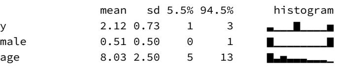

[1] 0.6333333
About two-thirds of the choices are for the majority color, but only half the children are actually following the majority. The above is only one simulation, but it demonstrates the problem. When different hidden strategies can produce the same behavior, inference about strategy is more complicated than just counting behavior.
We’ll consider 5 different strategies children might use.
- Follow the Majority: Copy the majority demonstrated color.
- Follow the Minority: Copy the minority demonstrated color.
- Maverick: Choose the color that no demonstrator chose.
- Random: Choose a color at random, ignoring the demonstrators.
- Follow First: Copy the color that was demonstrated first. This was either the majority color (when majority_first equals 1) or the minority color (when 0).
Each strategy entails a vector of three probabilities, one for each choice. For example, Random is [1/3, 1/3, 1/3]. The complicated one is Follow First, which depends upon the order of presentation.
An obvious question is: Why these strategies? Because they seem a priori plausible. If there are some that you think are not plausible, or other strategies that you feel are more plausible, the same generative framework can accomodate them.
16.2.2. The statistical model. Now we need a statistical model that reflects the generative model above. Remember, statistical models run in reverse of generative models. In the generative model, we assume strategies and simulate observed behavior. In the statistical model, we instead assume observed behavior (the data) and simulate strategies (parameters).
In this example, we can’t directly measure each child’s strategy. It is an unobserved variable. But each strategy has a specific probability of producing each choice. We can use that fact to compute the probability of each choice, given parameters which specify the probability of each strategy. Then we let Bayes loose and get the posterior distribution of each strategy back. Before we can let Bayes loose, we’ll need to enumerate the parameters, assign priors to each, and also figure out some technical issues for coding. I’ll move through these tasks slowly.
The unobserved variables are the probabilities that a child uses each of the five strategies. This means five values, but since these must sum to one, we need only four parameters. There is a variable type called a simplex that handles this for us. A simplex is a vector of values that must sum to some constant, usually one. Stan allows us to declare a vector of parameters as a simplex, and then Stan handles the bookkeeping of the constant sum for us. We can give this simplex a Dirichlet prior, which is a prior for probability distributions. We used both Dirichlet and a simplex already back in Chapter 12 to construct ordered categorical predictors(page 393). We’ll use a weak uniform prior on the simplex of strategy probabilities, which we’ll label p:
\[p \sim \text{Dirichlet}([4, 4, 4, 4, 4])\]
As you saw back in Chapter 12, this prior doesn’t mean that we expect the strategies to be equally probable. Instead it means that we expect that any one of them could be more or less probable than any other. If you make those 4s larger, the prior starts to say that we expect them to be actually equal.
Now how to express the probability of the data, the likelihood? For each observed choice yi , each strategy s implies a probability of seeing yi . Call this Pr(yi |s), the probability of the data, conditional on assuming a specific strategy s. For example assuming s = 1, the majority strategy, then Pr(yi = 2|s = 1) = 1. This is just the mathy way of saying that a child using the majority strategy always follows the majority color choice.
We don’t know s though. We can’t observe it directly. However we do have a probability for each s in the model. These are the elements of the simplex p. So to get the unconditional probability of the data Pr(yi) we just need to use p to average over the unknown strategy s:
\[\Pr(y\_i) = \sum\_{s=1}^{5} p\_s \Pr(y\_i|s)\]
Read this as the probability of yi is the weighted average of the probabilities of yi conditional on each strategy s. This expression is a mixture, as in earlier chapters. Sometimes you’ll read that this marginalizes out the unknown strategy. This just means averaging over the strategies, using some probability of each to get the weight of each in the average. Above, the values in p provide these weights.
Okay, so we have our statistical model now. Let’s write it in a more conventional form:
\[\begin{aligned} \mathcal{y}\_{i} &\sim \text{Categorical}(\theta) \\ \theta\_{j} &= \sum\_{s=1}^{5} p\_{s} \Pr(j|s) \qquad \text{for } j = 1...3 \\ \mathcal{p} &\sim \text{Dirichlet}([4, 4, 4, 4, 4]) \end{aligned}\]
The vector θ holds the average probability of each behavior, conditional on p. As a generative model, the above implies that all children are identical—each child on each trial has some probability ps of using strategy s. Of course there are individual differences among the children. But since we don’t have any repeat observations of each child in these data, we can’t do much better than the above. But if we did have repeat observations, we’d assign a unique simplex p to each child, power up the partial pooling, and enjoy the fireworks.
16.2.3. Coding the statistical model. Coding this model means explicitly coding the logic of each strategy, those Pr(j|s) terms above. We will write this model directly in Stan, because it will actually make it both easier to code and easier to extend. There have been some optional Stan models in previous chapters. But now it’s not optional. I’ve included the model code in the rethinking package. You can load and display it with:
R code16.7 data(Boxes_model)
cat(Boxes_model)I’ll put the explanation of the Stan code in the Overthinking box further down, so you can focus on the coding details later.
To run the sampler, all that remains is to prepare the data list and then invoke stan(). The data list needs only the sample size N, the vector of choices y, and the vector of presentation order majority_first.
R code
16.8 # prep data
dat_list <- list(
N = nrow(Boxes),
y = Boxes$y,
majority_first = Boxes$majority_first )
# run the sampler
m16.2 <- stan( model_code=Boxes_model , data=dat_list , chains=3 , cores=3 )
# show marginal posterior for pp_labels <- c("1 Majority","2 Minority","3 Maverick","4 Random",
"5 Follow First")
plot( precis(m16.2,2) , labels=p_labels )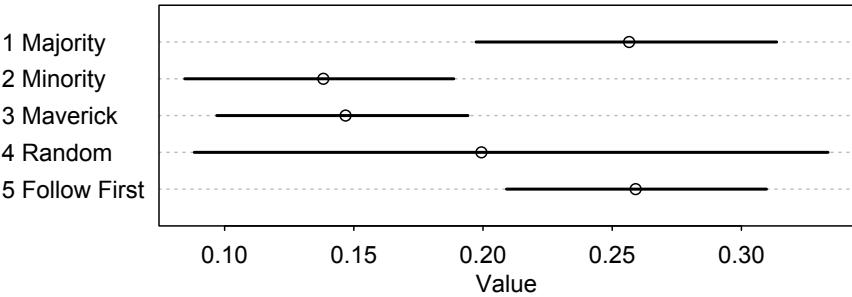
Recall that 45% of the sample chose the majority color. But the posterior distribution is consistent with somewhere between 20% and 30% of children following the majority copying strategy. Conditional on this model, a similar proportion just copied the first color that was demonstrated. This is what hidden state models can do for us—prevent us from confusing behavior with strategy.
This model can be extended to allow the probabilities of each strategy to vary by age, gender, or anything else. In principle, this is easy—you just make ps conditional on the predictor variables. In practice, there are coding decisions to make. I say more about this in the Overthinking box below.
Overthinking: Stan code for the Boxes model. A Stan model needs three "blocks" of code. I'll explain
each in order. The first block is the data block. This block just names the observed variables and
declares their types. For this model, it looks like this:data{
int N;
int y[N];
int majority_first[N];The integer N is just a count of observed cases. It’s the number of rows in data(Boxes). Then the outcome y and predictor majority_first are declared as integer vectors of length N. You could hard-code the length as the number 629. But then you have to change the model code every time the number of cases changes. The second block a Stan model needs is the parameters block. This is like the data block, but for unobserved variables. These are the variables that we get posterior samples for. In this model, it contains only the simplex p:
parameters{
simplex[5] p;
}The third block is the heart, the model block. This block calculates the log-probability of the variables, both observed (data) and unobserved (parameters). This is the numerator in Bayes’ theorem, and Stan uses it to run the Hamiltonian simulation (see Chapter 9). I’ll take this block in pieces. At the top, we declare a vector to hold probability calculations for each strategy. We’ll reuse this vector on each row of the data, to compute different probabilities.
model{
}
vector[5] phi;
Next we assign the prior.// prior
p ~ dirichlet( rep_vector(4,5) );
Now the heart of the matter. We loop over all rows. For each row i, we compute the log-probability of the observed y[i]. Each strategy has its own if…then to assign the probability of the data, conditional on that strategy. This gives us:
// probability of data
for ( i in 1:N ) {
if ( y[i]==2 ) phi[1]=1; else phi[1]=0; // majority
if ( y[i]==3 ) phi[2]=1; else phi[2]=0; // minority
if ( y[i]==1 ) phi[3]=1; else phi[3]=0; // maverick
phi[4]=1.0/3.0; // random
if ( majority_first[i]==1 ) // follow first
if ( y[i]==2 ) phi[5]=1; else phi[5]=0;
else
if ( y[i]==3 ) phi[5]=1; else phi[5]=0;Now we need to include the p parameters. We do this by adding each log(ps) to the log-probabilities computed above. Then we add the average probability to the target, which is just Stan’s name for the total log-probability.
// compute log( p_s * Pr(y_i|s) )
for ( s in 1:5 ) phi[s] = log(p[s]) + log(phi[s]);
// compute average log-probability of y_i
target += log_sum_exp( phi );That log_sum_exp function computes the marginal log-probability of the data, log Pr(yi), as defined in the main text. log_sum_exp takes the phi vector, which contains the individual log-probabilities for each strategy, and returns the logarithm of their sum on the probability scale. It’s used a lot in Stan models like this, models with discrete parameters.
To modify the model to include predictor variables, there are many options. So falling back again on some real theory will help to focus the effort. The simplest sort of modification is to allow the p simplex to vary by some discrete category, like gender. In that case, we add the variable gender to the data block and add a dimension to p in the parameters block, like this:
simplex[5] p[2];And then in the model block, just index p by both strategy and gender with p[gender[i],s]:
for ( s in 1:5 ) phi[s] = log(p[gender[i],s]) + log(phi[s]);
This model is in the rethinking package as data(Boxes_model_gender). A continuous covariate like age presents many more choices. Gaussian processes, splines, polynomials can all manage the job. Each must be coded a different way. The Stan model data(Boxes_model_age) shows a simple linear age trend example, in which each p is assigned a linear model on the logit scale, and these are transformed with multi-inverse-logit to the simplex scale. This is entirely geocentric. If you have a stronger theory, it helps.
16.2.4. State space models. The Boxes model above resembles a broader class of model known as a state space model. These models posit multiple hidden states that produce observations. Typically the states are dynamic, changing over time. When the states are discrete categories, the model may be called a hidden Markov model (HMM). Many time series models are state space models, since the true state of the time series is not observed, only the noisy measures. There is an example later in this chapter.
16.3. Ordinary differential nut cracking
The Panda nut has nothing to do with bears. It is a big, hard nut produced by the evergreen tree Panda oleosa. People have been eating delicious Panda nuts for millennia, cracking them open with stone and steel tools. Other animals have a harder time getting into these nuts. But the chimpanzees of Ivory Coast manage the same way people do, by using tools.
The chimpanzees use stone and wooden hammers to open Panda nuts, and they do so with high efficiency.
In this section, we’re going to model the development of nut opening skill among these chimpanzees. Let’s load the data and outline the project:
16.9 library(rethinking)
data(Panda_nuts)R code
These data are records of individual bouts of nut opening.235 Each row is an individual-bout pair. The variables of immediate interest are the outcome nuts_opened, the duration pf the bout in seconds, and the individual’s age. The research question is how nut opening skill develops and which factors contribute to it. One reason to care about this question is that tool use in primates is very rare. Yet humans cannot live without tools. How did we end up this way? Understanding the evolution of human technology benefits from species comparisons that tease apart the relative contributions of cognition, dexterity, social learning, and strength. We’re not going to achieve all that in this section. But we will get started. And we won’t use a GLM.
16.3.1. Scientific model. We need a generative model of nut opening rate as it varies by age. Let’s consider the dumbest model, which is nevertheless smarter than a GLM. Suppose the only factor that matters is the individual’s strength. As the individual ages, it gets stronger and nut opening rate increases. Obviously the ape needs some knowledge, but we’ll assume this comes easy and that body strength is the limiting factor. If the model does a poor job, then we’ll have a good reason to reconsider this assumption.
In animals with terminal growth—they reach a stable adult body mass—size increases in proportion to the distance remaining to maximum size. This implies that the instantaneous rate of change in mass with age t is:
\[\frac{\mathrm{d}M}{\mathrm{d}t} = k(M\_{\mathrm{max}} - M\_t)\]
where k is a parameter that measures the rate of skill gain with age. The equation above tells us how fast mass changes at any given age. But we need a formula for the mass at a given age. Solving differential equations is beyond the level of this book. But you don’t actually have to know how to solve it—any computer algebra system can do it. This particular differential equation is actually a biology classic,236 and its solution is:
\[M\_t = M\_{\text{max}} \left( 1 - \exp(-kt) \right),\]
We’ll plot this function later, when we do prior predictive simulations. It makes decelerating curves that level off at Mmax. If you want to glance ahead, examples are shown on the left in Figure 16.4 (page 540).
We actually care about strength. Mass isn’t strength. So suppose now that strength is proportional to mass: St = βMt . The parameter β simply measures the proportionality. Now we need some way to relate strength to the rate of nut cracking. We could assume it too is simply proportional. But consider that strength helps in at least three ways. First, it let’s the animal lift a heavier hammer. Heavier hammers have greater momentum. Second, it let’s the animal accelerate the hammer faster than gravity. Third, stronger animals also have longer limbs, which gives them more efficient levers. So it makes sense to assume increasing returns to strength. Mathematically, this implies a function for the rate of nut opening like:
\[\lambda = \alpha \mathcal{S}\_t^\theta = \alpha \left(\beta M\_{\text{max}} (1 - \exp(-kt))\right)^\theta\]
where θ is some exponent greater than 1. A realistic implication of assuming increasing returns to strength is that there will be a threshold below which an individual cannot open a single nut in reasonable time. The new parameter α expresses the proportionality of strength to nut opening. It translates Newtons of force into nuts per second.
Now we have a function for the rate of nuts opened, λ. But it is a soup of parameters. We can simplify it, however. First, we can just rescale body mass Mmax so that it equals 1. This might seem like cheating. But measurement scales are arbitrary. So making Mmax = 1 just sets the measurement scale. Doing this gives us:
\[ \lambda = \alpha \beta^{\theta} (1 - \exp(-kt))^{\theta} \]
The product αβθ in the front just rescales strength to nuts-opened-per-second. So we can replace it with a single parameter:
\[ \lambda = \phi (1 - \exp(-kt))^{\theta} \]
That’s much better. One cost to this simplification is that it has hidden some useful facts. For example, average adult mass differs for males and females. An adult male chimpanzee can be 10 kilograms heavier than an adult female chimpanzee. You’ll attempt to express that fact in a practice problem at the end of the chapter.
16.3.2. Statistical model. To use the model above for estimation, we need a likelihood function and priors. The likelihood is straightforward. If the number of nuts opened is far less than the number of available nuts, then the Poisson distribution has the right constraints. This gives us:
\[\begin{aligned} n\_i &\sim \text{Poisson}(\lambda\_i) \\ \lambda\_i &= d\_i \phi (1 - \exp(-kt\_i))^{\theta} \end{aligned}\]
where ni is the number of nuts opened, di is the duration spent opening nuts, and ti is the individual’s age on observation i. The only thing we’ve added is the exposure di . Back in Chapter 11, we added an exposure to a Poisson model by adding the log of the duration to the linear model. We don’t use the log here, because the model isn’t linear and has no log link function. We are coding the rate λ directly. So the duration di just multiplies the rate to give us the expected number of nuts opened. It is like if I told you that I can open λ = 0.4 nuts per second. To calculate how many nuts I could open in d = 10 seconds, you just multiply 0.4 by 10 to get 4 nuts per 10 seconds.
What about priors? To get sensible priors here, we need to consider relevant biological facts and also simulate to see how to translate those facts into distributional assumptions. The most relevant fact is that a chimpanzee reaches adult mass around 12 years of age. So the prior growth curves need to plateau around 12. We need distributions for k and θ that accomplish this. And then the prior for ϕ should have a mean around the maximum rate of nut opening. I am not really an expert on nut opening. But let’s suppose a professional chimpanzee could open one nut per second—several nuts can be pounded at once.
Here are my suggestions for priors:
ϕ ∼ Log-Normal(log(1), 0.1) k ∼ Log-Normal(log(2), 0.25) θ ∼ Log-Normal(log(5), 0.25)
All three are Log-Normal, because all three parameters have to be positive and continuous. We can simulate from these priors and draw the implied prior growth and rate curves.
16.10 N <- 1e4
phi <- rlnorm( N , log(1) , 0.1 )
k <- rlnorm( N , log(2), 0.25 )
theta <- rlnorm( N , log(5) , 0.25 )
# relative grow curve
plot( NULL , xlim=c(0,1.5) , ylim=c(0,1) , xaxt="n" , xlab="age" ,
ylab="body mass" )
at <- c(0,0.25,0.5,0.75,1,1.25,1.5)
axis( 1 , at=at , labels=round(at*max(Panda_nuts$age)) )
for ( i in 1:20 ) curve( (1-exp(-k[i]*x)) , add=TRUE , col=grau() , lwd=1.5 )
# implied rate of nut opening curve
plot( NULL , xlim=c(0,1.5) , ylim=c(0,1.2) , xaxt="n" , xlab="age" ,
ylab="nuts per second" )
at <- c(0,0.25,0.5,0.75,1,1.25,1.5)
axis( 1 , at=at , labels=round(at*max(Panda_nuts$age)) )
for ( i in 1:20 ) curve( phi[i]*(1-exp(-k[i]*x))^theta[i] , add=TRUE ,
col=grau() , lwd=1.5 )The plots are displayed in Figure 16.4. It will help to inspect the distribution of each parameter with dens(). But these plots that combine all of the parameters are essential for understanding their implications.
Coding this model presents no new problems. We just build the usual data list and express the likelihood and priors in ulam:
16.11 dat_list <- list(
n = as.integer( Panda_nuts$nuts_opened ),
age = Panda_nuts$age / max(Panda_nuts$age),
seconds = Panda_nuts$seconds )
m16.4 <- ulam(
alist(
n ~ poisson( lambda ),
lambda <- seconds*phi*(1-exp(-k*age))^theta,
phi ~ lognormal( log(1) , 0.1 ),
k ~ lognormal( log(2) , 0.25 ),
theta ~ lognormal( log(5) , 0.25 )
), data=dat_list , chains=4 )R code
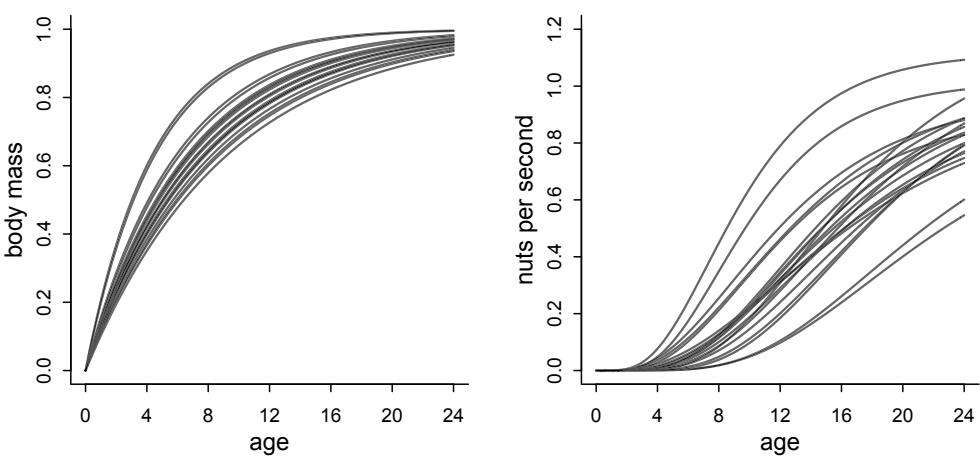
Figure 16.4. Prior predictive simulation for the nut opening model. Left: Prior growth curves, normalizing average adult mass to 1. This prior tries to start leveling off around age 12, like a real chimpanzee. Right: Prior nut opening rates. This prior allows many different patterns. But they are all increasing with age and assume that baby chimpanzees cannot open nuts.
Now do your duty by checking the chain diagnostics. The marginal distribution of each parameter isn’t as interesting here as the posterior developmental curve. So let’s go straight to producing that.
R code
16.12 post <- extract.samples(m16.4)
plot( NULL , xlim=c(0,1) , ylim=c(0,1.5) , xlab="age" ,
ylab="nuts per second" , xaxt="n" )
at <- c(0,0.25,0.5,0.75,1,1.25,1.5)
axis( 1 , at=at , labels=round(at*max(Panda_nuts$age)) )
# raw data
pts <- dat_list$n / dat_list$seconds
point_size <- normalize( dat_list$seconds )
points( jitter(dat_list$age) , pts , col=rangi2 , lwd=2 , cex=point_size*3 )
# 30 posterior curves
for ( i in 1:30 ) with( post ,
curve( phi[i]*(1-exp(-k[i]*x))^theta[i] , add=TRUE , col=grau() ) )The result is shown in Figure 16.5. The blue points are the raw data, with size scaled by the duration of each observation. The curves are 30 skill curves drawn from the posterior distribution. These curves level off around the age of maximum body size, consistent with the idea that strength is the main limiting factor. This doesn’t mean that there isn’t knowledge involved. There is still plenty of variation to explain.
16.3.3. Covariates and individual differences. The model here is stupidly simple. But it is a scientifically reasonable start. You could extend it to include covariates like sex and
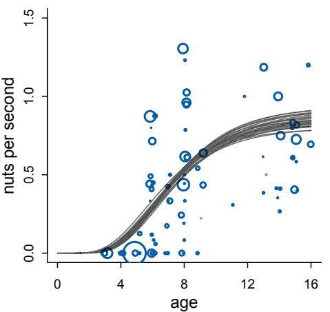
Figure 16.5. Posterior predictive distribution for the nut opening model. Blue points are raw data, number opened divided by seconds. Point size is proportional to the duration of that observation. The curves are 30 draws from the posterior distribution.
individual differences in strength. There are repeat observations of individuals, and even repeat observations across different years, that could be used to estimate individual varying effects. The practice problems at the end of the chapter explore these applications.
Note for the moment that some of the model parameters make sense as varying by individual while others do not. The scaling parameter θ for example is a feature of the physics, not of an individual. Which parameters are allowed to vary by individual is something to be decided by scientific knowledge of the parameters. And this is another reason to avoid GLMs, so that the parameters have firmer scientific meaning.
Yet another improvement to this model might be to use a more realistic model of chimpanzee growth. There are detailed published growth curves for chimpanzees.237 Male chimpanzees do experience a growth spurt around age 10. So their growth rate actually increases shortly before reaching maximum size. Incorporating this into the model might help improve predictions for males at least.
16.4. Population dynamics
It all starts with radiation released by fusion reactions inside a dwarf star in a minor arm of an insignificant spiral galaxy. Eight minutes away as the photon travels, on the third planet, that radiation allows clever plants to make sugar. Then the hare eats those clever plants and steals their sugar. The clever lynx eats the hare. Everyone is just eating starlight.
The population of hares and lynx fluctuate over time, and understanding nature requires understanding such fluctuations. The numbers of hares and lynx at any time influence the numbers in the near future. You might say that the most important cause of hares is hares. But predators, like the lynx, are also causes. To model phenomena like this, variables at one time influence the values of those same variables in the next.
In this section, we’ll model a time series of hare and lynx populations.238 Load the data and display it:
16.13 library(rethinking)
data(Lynx_Hare)
plot( 1:21 , Lynx_Hare[,3] , ylim=c(0,90) , xlab="year" ,
ylab="thousands of pelts" , xaxt="n" , type="l" , lwd=1.5 )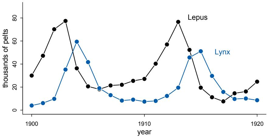
Figure 16.6. Twenty years of lynx (Lynx canadensis) and hare (Lepus americanus) pelts, as recorded by the Hudson Bay Company.
at <- c(1,11,21)
axis( 1 , at=at , labels=Lynx_Hare$Year[at] )
lines( 1:21 , Lynx_Hare[,2] , lwd=1.5 , col=rangi2 )
points( 1:21 , Lynx_Hare[,3] , bg="black" , col="white" , pch=21 , cex=1.4 )
points( 1:21 , Lynx_Hare[,2] , bg=rangi2 , col="white" , pch=21 , cex=1.4 )
text( 17 , 80 , "Lepus" , pos=2 )
text( 19 , 50 , "Lynx" , pos=2 , col=rangi2 )Figure 16.6 displays this time series. These are odd data, records of pelts not live animals.239 The number of hare pelts and number of lynx pelts seem to be related somehow. Both fluctuate, but they seem to fluctuate together.
A common geocentric way to model a time series like this would be to use something called an autoregressive model. In an autoregressive model, the value of the outcome in the previous time step is called a lag variable and added as a predictor to the right side of a linear model. For example, we might model the mean number of hares at time t as:
\[\mathcal{E}(H\_t) = \alpha + \beta\_1 H\_{t-1}\]
where Ht is the number of hares at time t. If β1 is less than 1, then hares tend to regress to some mean population size α. We could continue by adding an epicycle for the predator:
\[\mathcal{E}(H\_t) = \alpha + \beta\_1 H\_{t-1} + \beta\_2 L\_{t-1}\]
where Lt−1 is the number of lynx in the previous time period. Sometimes people add even deeper lags, like this:
\[\mathcal{E}(H\_t) = \alpha + \beta\_1 H\_{t-1} + \beta\_2 L\_{t-1} + \beta\_3 H\_{t-2}\]
Now not only does the most recent population size Ht−1 predict the present, but so too does the population size two time periods ago Ht−2. Everything from prices to temperature to wars has been modeled this way.
There are several famous problems with autoregressive models, despite how often they are used. They are surely generalized linear madness. First, nothing that happened two time periods ago causes the present, except through its influence on the state of the system one time period ago. So no lag beyond one period makes any causal sense. It’s pure predictive epicycle. Of course some causal influences act slower than others. But that means you need another variable, not that the distance past can influence the present. Second, if the state of the system, Ht and Lt here, are measured with error, then the model is propagating error. It isn’t the observed Ht−1 that influences Ht , but rather the real unobserved Ht−1. In other words, what we really need is a state space model. Third, in most cases there is no biological, economic, or physical interpretation of the parameters. Consider for example the α intercept in the equations above. It implies that even when there are no hares, Ht−1 = 0, there can be α hares in the next period. Sometimes all this nonsense is okay, if all you care about is forecasting. But often these models don’t even make good forecasts, because getting the future right often depends upon having a decent causal model.
It’s easy to do better, if you use a little science. In this section, we’ll model the hares and lynx using an incredibly basic ecological model. In the process, you’ll see how to fit systems of ordinary differential equations (ODEs) to data.
16.4.1. The scientific model. The hare population reproduces at a rate that depends upon the plants. And it shrinks at a rate that depends upon predators. Let Ht be the number of hares at time t. Then we can assert that the rate of change in the hare population is:
\[\frac{\text{d}H}{\text{d}t} = H\_t \times \text{(birth rate)} - H\_t \times \text{(death rate)}\]
Everything is multiplied by Ht , because if there are no hares, then there are no births or deaths. Reproduction and death are per capita processes. The simplest ecological model makes birth and death rates constant. Let’s call the birth rate bH and the mortality rate mH.
\[\frac{\mathrm{d}H}{\mathrm{d}t} = H\_t b\_H - H\_t m\_H = H\_t (b\_H - m\_H)\]
The per capita growth rate is the difference between the birth rate and the death rate. I think of this as the first law of ecology. Every model must include it in some form.
The form we want to use here modifies the mortality rate so it also depends upon the presence of a predator, the clever lynx. Let Lt be the number of lynx at time t. Then we can write:
\[\frac{\mathrm{d}H}{\mathrm{d}t} = H\_t (b\_H - L\_t m\_H)\]
Similar logic gives us a similar equation for the rate of change in the lynx population:
\[\frac{\mathbf{d}L}{\mathbf{d}t} = L\_t (H\_t b\_L - m\_L)\]
In this case, it is birth that depends upon the other species and mortality that is a constant.
Now we have a model in which the population dynamics of the two species are determined by two coupled ordinary differential equations (ODEs). This isn’t a realistic model. The plants that hares eat are not constantly available, and lynx eat more than just hares. But let’s see how far we can get with this model, a biological one in which the parameters mean something. Failures teach us.
This particular model is a famous one, the Lotka-Volterra model. 240 It models simple predator-prey interactions and demonstrates several important things about ecological
dynamics. Lots can be proved about it without using any data at all. For example, the population tends to be unstable, cycling up and down like in Figure 16.6. This is interesting, because it suggests that, while nature is more complicated, all that is necessary to see cyclical population dynamics is captured in a stupidly simple model.
The previous section also used a differential equation model. In that case we could explicitly solve it to get an expression for the value of the variable at any time t. We can’t do that here. These equations have no explicit solution that tells us which Ht and Lt to expect at any time t. So how do we use them? We solve them numerically, through simulation. Let me show you how. Then we’ll turn to making this into a statistical model.
A differential equation is just a way to update a variable. The equation dH/dt tells us how to update H after each tiny unit of passing time dt. This means that once we have a value for H, we can update it by just applying the equation dH/dt over and over again. Specifically, we update like this:
\[H\_{\rm t+dt} = H\_{\rm t} + \mathbf{d}t \frac{\mathbf{d}H}{\mathbf{d}t} = H\_{\rm t} + \mathbf{d}t H\_{\rm t} (b\_H - L\_t m\_H)\]
We do have to be careful how we do this, because math in a computer is tricky, as you’ve seen before. In particular, the value we choose for dt needs to be small enough to provide a good approximation of continuous time. But this tactic really does work. And it allows us to see what the model implies, before we’ve fit it to data.
Let’s write a function to simulate lynx-hare dynamics. This function just needs to apply the strategy above to both H and L. Here’s some code that is hopefully easy to read:
R code
16.14 sim_lynx_hare <- function( n_steps , init , theta , dt=0.002 ) {
L <- rep(NA,n_steps)
H <- rep(NA,n_steps)
L[1] <- init[1]
H[1] <- init[2]
for ( i in 2:n_steps ) {
H[i] <- H[i-1] + dt*H[i-1]*( theta[1] - theta[2]*L[i-1] )
L[i] <- L[i-1] + dt*L[i-1]*( theta[3]*H[i-1] - theta[4] )
}
return( cbind(L,H) )
}We tell this function how long to simulate with n_steps, which initial population sizes to use with init, and which values of the parameters to use with theta. The time interval is dt. I’ve set it to default to 0.002, which works in this example. But the right value in general depends upon the model and the parameters.
Now let’s use the function to simulate.
R code
16.15 theta <- c( 0.5 , 0.05 , 0.025 , 0.5 )
z <- sim_lynx_hare( 1e4 , as.numeric(Lynx_Hare[1,2:3]) , theta )
plot( z[,2] , type="l" , ylim=c(0,max(z[,2])) , lwd=2 , xaxt="n" ,
ylab="number (thousands)" , xlab="" )
lines( z[,1] , col=rangi2 , lwd=2 )
mtext( "time" , 1 )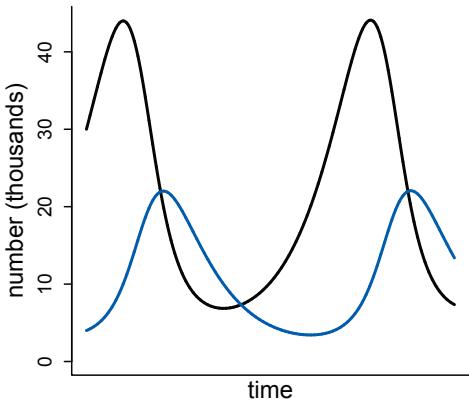
Figure 16.7. Simulated population dynamics from the lynx-hare model. Black: Hare population. Blue: Lynx population. This model produces repeating cycles of predators and prey.
The result is displayed in Figure 16.7. The black curve is the hare population, and the blue is the lynx population. This model produces cycles, similar to what we see in the data. The model behaves this way, because lynx eat hares. Once the hares are eaten, the lynx begin to die off. Then the cycle repeats.
16.4.2. The statistical model. To turn the lynx-hare model into a statistical analysis, we need to connect the deterministic population dynamics to the observed data. Observed data have many reasons not to exactly match a deterministic expectation. The most obvious is that we never get to count every hare and lynx. We just have partial samples. So we need to model both the underlying population dynamics and the observation process.
Let Ht and Lt as before represent the numbers of hares and lynx at time t. And now let ht and ℓt represent the observed numbers of hares and lynx. While Ht causes Ht+dt , the observed ht does not cause anything. It’s just a pale reflection of the unobserved state of the system at time t. We have to use a statistical model to project it back to the underlying model of Ht and Lt . Then we can make a prediction for ht+dt and ℓt+dt .
To do this, we need to assign an error distribution to the observation process. To do this in a principled way, we should outline the generative process that goes from the true state of nature, Ht , to the measurement, ht . First, hares get trapped. Suppose each hare is trapped with some probability pt which varies year to year, for all sorts of reasons. Third, the actual number of pelts were rounded to the nearest 100 and divided by 1000. So they are no longer counts exactly. This all sounds like a mess. That’s measurement for you.
We can do this though. Suppose for example there is a population of Ht = 104 hares. Suppose also that the annual trapping rate varies according to a beta distribution pt ∼ Beta(2, 18). This means the average is 10%, but it is very rarely double that. We get a binomial count of pelts sampled for the population of hares, and then that is rounded to the nearest 100 and divided by 1000. Let’s see what this sort of distribution looks like:
16.16 N <- 1e4
Ht <- 1e4
p <- rbeta(N,2,18)
h <- rbinom( N , size=Ht , prob=p )
h <- round( h/1000 , 2 )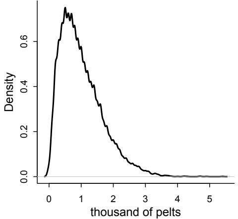
Figure 16.8. Simulated distribution for the observation model in which trapping probability varies from year to year. In this case, a wide range of pelt counts are consistent with the same true population size. This makes inference about population size difficult.
dens( h , xlab=“thousand of pelts” , lwd=2 )
I show this density in Figure 16.8. The variation in pt leads to a skewed error distribution. Try changing Ht and the distribution of p in the code above and see how the distribution changes.
There are several reasonable ways to approximate this distribution. We could for example just use a Log-Normal distribution. It has the right constraints and skew. For example:
\[h\_t \sim \text{Log-Normal}(\log(pH\_t), \sigma\_H)\]
This gives ht a median of pHt , the expected proportion of the hare population that is trapped. The parameter σH controls the dispersion. An important fact about this measurement process is that there is no good way to estimate p, not without lots of data at least. So we’re going to just fix it with a strong prior. If this makes you uncomfortable, notice that the model has forced us to realize that we cannot do any better than relative population estimates, unless we have a good way to know p. A typical time series model would just happily spin on its epicycles, teaching us nothing this useful.
We will ignore rounding error, since it is at most 50/4000 = 0.0125 = 1.25% of the pelt count. But if you are curious how to incorporate rounding into a statistical model, see the Overthinking box later on. It isn’t hard to do—we just think generatively and that provides the solution.
Let’s lay out the full statistical model now. First we have the probabilities of the observed variables, the pelts:
| ∼ Log-Normal(log(pHHt), σH) ht |
[Prob observed hare pelts] |
|---|---|
| ℓt ∼ Log-Normal(log(pLLt), σL) |
[Prob observed lynx pelts] |
Then we need to define the unobserved variables. Let’s start with the unobserved population sizes of lynx Lt and hare Ht .
\[\begin{aligned} H\_1 &\sim \text{Log-Normal}(\log 10, 1) & \text{[Prior for initial have population]} \\ L\_1 &\sim \text{Log-Normal}(\log 10, 1) & \text{[Prior for initial byux population]} \\ H\_{T>1} &= H\_1 + \int\_1^T H\_t(b\_H - m\_H L\_t) \text{dt} & \text{[Moded for hare population]} \\ L\_{T>1} &= L\_1 + \int\_1^T L\_t (b\_L H\_t - m\_L) \text{dt} & \text{[Model for lyux population]} \end{aligned}\]
The first two lines above assign priors to the initial population sizes at time t = 1. In the third and fourth lines, the differential equation model defines all times after that, through integration. This just means summing up all the changes in the time interval to T. And finally all the parameters need priors.
| σH Exponential(1) ∼ |
[Prior for measurement dispersion] |
|---|---|
| σL Exponential(1) ∼ |
[Prior for measurement dispersion] |
| Beta(αH, βH) pH ∼ |
[Prior for hare trap probability] |
| ∼ Beta(αL, βL) pL |
[Prior for lynx trap probability] |
| ∼ Half-Normal(1, 0.5) bH |
[Prior hare birth rate] |
| ∼ Half-Normal(0.05, 0.05) bL |
[Prior lynx birth rate] |
| Half-Normal(0.05, 0.05) ∼ mH |
[Prior hare mortality rate] |
| Half-Normal(1, 0.5) mL ∼ |
[Prior lynx mortality rate] |
In the problems at the end of the chapter, I’ll ask you to conduct prior predictive simulations with these priors.
Now we’re ready to start engineering the sampler. The obstacle in this model is computing Ht and Lt for each time t. The differential equations define these variables, but our sampler needs to numerically solve them on each iteration. So we need to write the numerical integration we did earlier, when we simulated the model, into our Bayesian sampler. Fortunately, Stan already has functions for solving differential equations. So this will be easier than it sounds. The Stan User’s Guide(https://mc-stan.org) contains a full section on programming this type of model, with several examples.
We’ll do this model directly in Stan. You can load the Stan code and display it with:
16.17 data(Lynx_Hare_model)
cat(Lynx_Hare_model)I won’t reproduce the entire model here. But I will point out the unusual pieces that handle the differential equations. The first unusual piece is at the top, the functions block. This is an optional block that lets us write special calculations that we can use in the model. This is where we put a function that computes the values of the differential equations. Look at the code—seriously, look at it—and you’ll see the dpop_dt function at the start of the model. The pop here is for population. This function returns the rates of change in the population. It takes as input the time t, the initial state of the population pop_init, and a vector of parameters theta. Then it computes the rates of change in lynx and hares.
The model uses this function to determine the values of Ht and Lt . All we really have to do is pass the name of the function and its inputs to Stan’s helpful integrate_ode_rk45 function. This function does the integration for us. In this model, we do this in the transformed parameters block, so the results will appear as parameters in the posterior. But they are actually deterministic functions of the other parameters, the birth and mortality rates and the initial population sizes. The results are stored in a matrix called pop, which has a row for each observed time point and a column for each species.
The rest of the model is rather ordinary. The model block declares the priors and relates the solved equations to the observed data with:
for ( t in 1:N )
for ( k in 1:2 )
pelts[t,k] ~ lognormal( log(pop[t,k]*p[k]) , sigma[k] );There is also code in generated quantities to go ahead and perform posterior predictive simulations. We’ll plot those after sampling.
Now we’re ready. Prepare the data list and fire up the engines:
R code
16.18 dat_list <- list(
N = nrow(Lynx_Hare),
pelts = Lynx_Hare[,2:3] )
m16.5 <- stan( model_code=Lynx_Hare_model , data=dat_list , chains=3 ,
cores=3 , control=list( adapt_delta=0.95 ) )As always, check the chains. But sampling should be rapid and smooth. You could inspect the parameters. Each has a biological meaning. But they all cooperate in a very non-linear way to produce the population dynamics, so it isn’t easy to read the dynamics from the individual parameters. So let’s plot posterior predictions, at both the pelt (observed) and population (unobserved) levels. For the pelts, this will plot the raw data and overlay 21 simulated time series from the posterior.
R code
16.19 post <- extract.samples(m16.5)
pelts <- dat_list$pelts
plot( 1:21 , pelts[,2] , pch=16 , ylim=c(0,120) , xlab="year" ,
ylab="thousands of pelts" , xaxt="n" )
at <- c(1,11,21)
axis( 1 , at=at , labels=Lynx_Hare$Year[at] )
points( 1:21 , pelts[,1] , col=rangi2 , pch=16 )
# 21 time series from posterior
for ( s in 1:21 ) {
lines( 1:21 , post$pelts_pred[s,,2] , col=col.alpha("black",0.2) , lwd=2 )
lines( 1:21 , post$pelts_pred[s,,1] , col=col.alpha(rangi2,0.3) , lwd=2 )
}
# text labels
text( 17 , 90 , "Lepus" , pos=2 )
text( 19 , 50 , "Lynx" , pos=2 , col=rangi2 )The result is shown in the top plot of Figure 16.9. The black points and trends are the hare pelts. The blue points and trends are the lynx pelts. Note the jaggedness of the predicted trends. This is a result of the model assuming uncorrelated measurement errors across time
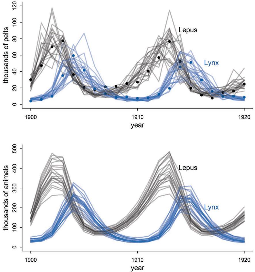
Figure 16.9. Posterior predictions for the lynx-hare model. Top: Posterior pelts. The points are the data, black for hares and blue for lynx. Each trend is a predicted time series from the posterior distribution. The jagged path is caused by uncorrelated measurement error. Bottom: Posterior populations. Unlike the pelt predictions, these are smooth trajectories without measurement error.
points. The underlying population may be smooth, but the measurements will not be. This is an example of why it is almost always a mistake to model a time series as if observed data cause observed data in the next time step. This is what is often done in autoregressive models. But if there is measurement error, and there always is, the data are emissions of some unseen state. The hidden states are the causes. The measurements don’t cause anything.
It is helpful to compare the pelt predictions to the population predictions. So here are 21 simulations of population dynamics from the posterior:
R code
16.20 plot( NULL , pch=16 , xlim=c(1,21) , ylim=c(0,500) , xlab="year" ,
ylab="thousands of animals" , xaxt="n" )
at <- c(1,11,21)axis( 1 , at=at , labels=Lynx_Hare$Year[at] )
for ( s in 1:21 ) {
lines( 1:21 , post$pop[s,,2] , col=col.alpha("black",0.2) , lwd=2 )
lines( 1:21 , post$pop[s,,1] , col=col.alpha(rangi2,0.4) , lwd=2 )
}The result is the bottom plot in Figure 16.9. Compared to the pelt time series, these population dynamics are smooth. There is a lot of uncertainty about population size, of course. But each trajectory connects smoothly, because there is no measurement error at this level. The differential equation model is deterministic, so it shows no stochasticity.
16.4.3. Lynx lessons. There are good reasons to doubt that this model is a good explanation of the population dynamics of hares and lynx. While lynx really do depend almost exclusively on hares at times, hares are eaten by lots of predators. So the hare cycles are probably not caused by the lynx. In other words, there is a confound lurking here. Real ecologies are complicated. In the practice problems at the end, I’ll ask you to use this model on an experimental predator-prey system that lacks all those complexities. I’ll also ask you to compare an autoregressive model and see how many epicycles you need to approach the forecasting quality of the simple predator-prey model.
16.5. Summary
This chapter demonstrated four analyses in which a statistical model is motived directly by a scientific model. This approach stands in contrast to the customary approach of going directly from a vague scientific model, whether a DAG or just a bowl of variables, to a generalized linear model. The goal was to illustrate both the advantages and challenges of translating scientifically informed structural causal models into statistical machines. The goal was not to persuade you to never use a generalized linear model. But hopefully it inspires you to see the use of a GLM as a decision in itself, not an obligation.
16.6. Practice
Problems are labeled Easy (E), Medium (M), and Hard (H).
16E1. What are some disadvantages of generalized linear models (GLMs)?
16E2. Can you think of one or more famous scientific models which do not have the additive structure of a GLM?
16E3. Some models do not look like GLMs at first, but can be transformed through a logarithm into an additive combination of terms. Do you know any scientific models like this?
16M1. Modify the cylinder height model, m16.1, so that the exponent 3 on height is instead a free parameter. Do you recover the value of 3 or not? Plot the posterior predictions for the new model. How do they differ from those of m16.1?
16M2. Conduct a prior predictive simulation for the cylinder height model. Begin with the priors in the chapter. Do these produce reasonable prior height distributions? If not, which modifications do you suggest?
16M3. Use prior predictive simulations to investigate the lynx-hare model. Begin with the priors in the chapter. Which population dynamics do these produce? Can you suggest any improvements to the priors, on the basis of your simulations?
16M4. Modify the cylinder height model to use a sphere instead of a cylinder. What choices do you have to make now? Is this a better model, on a predictive basis? Why or why not?
16H1. Modify the Panda nut opening model so that male and female chimpanzees have different maximum adult body mass. The sex variable in data(Panda_nuts) provides the information you need. Be sure to incorporate the fact that you know, prior to seeing the data, that males are on average larger than females at maturity.
16H2. Now return to the Panda nut model and try to incorporate individual differences. There are two parameters, ϕ and k, which plausibly vary by individual. Pick one of these, allow it to vary by individual, and use partial pooling to avoid overfitting. The variable chimpanzee in data(Panda_nuts) tells you which observations belong to which individuals.
16H3. The chapter asserts that a typical, geocentric time series model might be one that uses lag variables. Here you’ll fit such a model and compare it to the ODE model in the chapter. An autoregressive time series uses earlier values of the state variables to predict new values of the same variables. These earlier values are called lag variables. You can construct the lag variables here with:
16.21 data(Lynx_Hare)
dat_ar1 <- list(
L = Lynx_Hare$Lynx[2:21],
L_lag1 = Lynx_Hare$Lynx[1:20],
H = Lynx_Hare$Hare[2:21],
H_lag1 = Lynx_Hare$Hare[1:20] )Now you can use L_lag1 and H_lag1 as predictors of the outcomes L and H. Like this:
\[\begin{aligned} L\_t &\sim \text{Log-Normal}(\log \mu\_{L,t}, \sigma\_L) \\ \mu\_{L,t} &= \alpha\_L + \beta\_{LL} L\_{t-1} + \beta\_{LH} H\_{t-1} \\ H\_t &\sim \text{Log-Normal}(\log \mu\_{H,t}, \sigma\_H) \\ \mu\_{H,t} &= \alpha\_H + \beta\_{HH} H\_{t-1} + \beta\_{HL} L\_{t-1} \end{aligned}\]
where Lt−1 and Ht−1 are the lag variables. Use ulam() to fit this model. Be careful of the priors of the α and β parameters. Compare the posterior predictions of the autoregressive model to the ODE model in the chapter. How do the predictions differ? Can you explain why, using the structures of the models?
16H4. Adapt the autoregressive model to use a two-step lag variable. This means that Lt−2 and Ht−2, in addition to Lt−1 and Ht−1, will appear in the equation for µ. This implies that prediction depends upon not only what happened just before now, but also on what happened two time steps ago. How does this model perform, compared to the ODE model?
16H5. Population dynamic models are typically very difficult to fit to empirical data. The lynx-hare example in the chapter was easy, partly because the data are unusually simple and partly because the chapter did the difficult prior selection for you. Here’s another data set that will impress upon you both how hard the task can be and how badly Lotka-Volterra fits empirical data in general. The data in data(Mites) are numbers of predator and prey mites living on fruit.241 Model these data using the same Lotka-Volterra ODE system from the chapter. These data are actual counts of individuals, not just their pelts. You will need to adapt the Stan code in data(Lynx_Hare_model). Note that the priors will need to be rescaled, because the outcome variables are on a different scale. Prior predictive simulation will help. Keep in mind as well that the time variable and the birth and death parameters go together. If you rescale the time dimension, that implies you must also rescale the parameters.

17 Horoscopes
Statistics courses and books—this one included—tend to resemble horoscopes. There are two senses to this resemblance. First, in order to remain plausibly correct, they must remain tremendously vague. This is because the targets of the advice, for both horoscopes and statistical advice, are diverse. But only the most general advice applies to all cases. A horoscope uses only the basic facts of birth to forecast life events, and a textbook statistical guide uses only the basic facts of measurement and design to dictate a model. It is easy to do better, once more detail is available. In the case of statistical analysis, it is typically only the scientist who can provide that detail, not the statistician.242
Second, there are strong incentives for both astrologers and statisticians to exaggerate the power and importance of their advice. No one likes an astrologer who forecasts doom, and few want a statistician who admits the answers as desired are not in the data as collected. Scientists desire results, and they will buy and attend to statisticians and statistical procedures that promise them. What we end up with is too often horoscopic: vague and optimistic, but still claiming critical importance.243
Statistical inference is indeed critically important. But only as much as every other part of research. Scientific discovery is not an additive process, in which sin in one part can be atoned by virtue in another. Everything interacts.244 So equally when science works as intended as when it does not, every part of the process deserves our attention. Statistical analysis can neither be uniquely credited with science’s success, nor can it be uniquely blamed for its failures and follies.
And there are plenty of failures and follies. Science, you may have heard, is not perfect. The Lancet is one of the oldest and most prestigious medical journals in the world. This is what its editor-in-chief, Richard Horton, wrote in its pages in 2015:245
The case against science is straightforward: much of the scientific literature, perhaps half, may simply be untrue. Afflicted by studies with small sample sizes, tiny effects, invalid exploratory analyses, and flagrant conflicts of interest, together with an obsession for pursuing fashionable trends of dubious importance, science has taken a turn towards darkness.
Rethinking: Mercury rising. If I should offer you horoscopic advice, this is what I’d say. Thinking generatively—how the data could arise—solves many problems. Many statistical problems cannot be solved with statistics. All variables are measured with error. Conditioning on variables creates as many problems as it solves. There is no inference without assumption, but do not choose your assumptions for the sake of inference. Build complex models one piece at a time. Be critical. Be kind. How do we know that much of the published scientific literature is untrue? There are two major methods.
First, it is hard to repeat many published findings, even those in the best journals.246 Some of this lack of repeatability arises from methodological subtleties, not because the findings are false. But many famous findings cannot be repeated, no matter who tries. There is a sense in which this should be unsurprising, given the nature of statistical testing. But the high false-discovery rate has become a great concern, partly because many placed unrealistic faith in significance testing and partly because it is hugely expensive to try to develop drugs and therapies from unrepeatable medical findings. It is even more expensive to design policy around false nutritional, psychological, economic, or ecological discoveries.247 But the basic reputation of science is also at stake, all material costs aside. Why pay attention to breathlessly announced new discoveries, when as many as half of them turn out to be false?
Second, the history of the sciences is equal parts wonder and blunder. The periodic table of the elements looks impressive now, but its story is unglamorous. There were more false elemental discoveries than there are current elements in the periodic table.248 Don’t think that all these false discoveries were performed by frauds and cranks. Enrico Fermi (1901– 1954) was one of the greatest physicists of the twentieth century. He discovered two heavy elements, ausonium (Ao, atomic number 93) and hesperium (Es, atomic number 94). These atomic numbers are now assigned to neptunium and plutonium, because Fermi had not actually discovered either. He mistook a mix of lighter already-discovered elements. These sorts of errors, and many other sorts of errors, were routine on the path to the current periodic table. Its story is one of error, ego, fraud, and correction. Other sciences look similar. Philosophers of science actually have a term, the pessimistic induction, for the observation that because most science has been wrong, most science is wrong.249
How can we reconcile such messy history, and widespread contemporary failure, with obvious successes like General Relativity? Science is a population-level process of variation and selective retention. It does not operate on individual hypotheses, but rather on populations of hypotheses. It comprises a mix of dynamics that may, over long periods of time, reveal the clockwork of nature.250 But these same dynamics generate error. So it’s entirely possible for most findings at any one point in time to be false but for science in the long term to still function. This is analogous to how natural selection can adapt a biological population to its environment, even though most individual variation in any one generation is maladaptive.
What is included in these dynamics? Here’s a list of some salient pieces of the dynamic of scientific discovery, in no particular order. You might make your own list here, as there’s nothing special about mine.
- Quality of theory and predictions: If most theories are wrong, most findings will be false positives. Karl Popper argued that all that matters for a theory to be scientific is that it be falsifiable. But for science to be effective, we must require more of theory. There was a brief quantitative version of this argument on page 51. A good theory specifies precise predictions that provide precise tests, and more than one model is usually necessary.
- Dynamics of funding: Who gets funded, and how does the process select for particular forms of research? If there are no sources of long-term funding, then necessary long-term research will not be done. If people who already have funding judge who gets new funding, research may become overly conservative and possibly corrupt.
- (3) Quality of measurement: Research design matters, all agree; but often this is forgotten when interpreting results. A persistent problem is designs with low signalto-noise ratios.251 Poor signal will not mean no findings, just unreliable ones.
- Quality of data analysis: The topic of this book, but still much broader than it has indicated. Many common practices in the sciences exacerbate false discovery.252 If you are not designing your analysis before you see the data, then your analysis may overfit the data in ways that regularization cannot reliably address.
- Quality of peer review: Good pre-publication peer review is invaluable. But much of it is not so good. Many mistakes get through, and many brilliant papers do not. Peer review selects for hyperbole, since honestly admitting limitations of work only hurts a paper’s chances. Is this nevertheless the best system we can devise? Let’s hope not.
- Post-publication peer review: What happens to a finding after publication is just as important as what happens before. It is common for invalid analyses to be published in top-tier journals, only to be torn apart on blogs.255 But there is no system for linking published papers to later peer criticism, and there are few formal incentives to conduct it. Even retracted papers continue to be cited.
- Replication and meta-analysis: The most important aspects of science are repetition and synthesis.256 No single study is definitive, but incentives to replicate and summarize are weaker than incentives to produce novel findings. Top-tier journals prioritize news. But if the literature is biased, then aggregating the literature just magnifies bias.
We tend to focus on the statistical analysis, perhaps because it is the only piece for which we have formulas and theorems. But every piece deserves attention and improvement. Sadly, many pieces are not under individual control, so social solutions are needed.
But there is an aspect of science that you do personally control: openness. Pre-plan your research together with the statistical analysis. Doing so will improve both the research design and the statistics. Document it in the form of a mock analysis that you would not be ashamed to share with a colleague. Register it publicly, perhaps in a simple repository, like Github or any other. But your webpage will do just fine, as well. Then collect the data. Then analyze the data as planned. If you must change the plan, that’s fine. But document the changes and justify them. Provide all of the data and scripts necessary to repeat your analysis. Do not provide scripts and data “on request,” but rather put them online so reviewers of your paper can access them without your interaction. There are of course cases in which full data cannot be released, due to privacy concerns. But the bulk of science is not of that sort.
The data and its analysis are the scientific product. The paper is just an advertisement. If you do your honest best to design, conduct, and document your research, so that others can build directly upon it, you can make a difference.

Endnotes
Chapter 1
1. I draw this metaphor from Collins and Pinch (1998), The Golem: What You Should Know about Science. It is very similar to E. T. Jaynes’ 2003 metaphor of statistical models as robots, although with a less precise and more monstrous implication. [1]
2. There are probably no algorithms nor machines that never break, bend, or malfunction. A common citation for this observation is Wittgenstein (1953), Philosophical Investigations, section 193. Malfunction will interest us, later in the book, when we consider more complex models and the procedures needed to fit them to data. [2]
3. See Mulkay and Gilbert (1981). I sometimes teach a PhD core course that includes some philosophy of science, and PhD students are nearly all shocked by how little their causal philosophy resembles that of Popper or any other philosopher of science. The first half of Ian Hacking’s Representing and Intervening (1983) is probably the quickest way into the history of the philosophy of science. It’s getting out of date, but remains readable and broad minded. [4]
4. Maybe best to begin with Popper’s last book, The Myth of the Framework (1996). I also recommend interested readers to go straight to a modern translation of Popper’s earlier Logic of Scientific Discovery. Chapters 6, 8, 9 and 10 in particular demonstrate that Popper appreciated the difficulties with describing science as an exercise in falsification. Other later writings, many collected in Objective Knowledge: An Evolutionary Approach, show that Popper viewed the generation of scientific knowledge as an evolutionary process that admits many different methods. [4]
5. Meehl (1967) observed that this leads to a methodological paradox, as improvements in measurement make it easier to reject the null. But since the research hypothesis has not made any specific quantitative prediction, more accurate measurement doesn’t lead to stronger corroboration. See also Andrew Gelman’s comments in a September 5, 2014 blog post: http://andrewgelman.com/2014/09/05/confirmationist-falsificationist-paradigmsscience/. [5]
6. George E. P. Box is famous for this dictum. As far as I can tell, his first published use of it was as a section heading in a 1979 paper (Box, 1979). Population biologists like myself are more familiar with a philosophically similar essay about modeling in general by Richard Levins, “The Strategy of Model Building in Population Biology” (Levins, 1966). [5]
7. Ohta and Gillespie (1996). [5]
8. Hubbell (2001). The theory has been productive in that it has forced greater clarity of modeling and understanding of relations between theory and data. But the theory has had its difficulties. See Clark (2012). For a more general skeptical attitude towards “neutrality,” see Proulx and Adler (2010). [5]
9. For direct application of Kimura’s model to cultural variation, see for example Hahn and Bentley (2003). All of the same epistemic problems reemerge here, but in a context with much less precision of theory. Hahn and Bentley have since adopted a more nuanced view of the issue. See their comment to Lansing and Cox (2011), as well as the similar comment by Feldman. [5]
10. Gillespie (1977). [5]
11. Lansing and Cox (2011). See objections by Hahn, Bentley, and Feldman in the peer commentary to the article. [7]
12. See Cho (2011) for a December 2011 summary focusing on debates about measurement. [8]
13. For an autopsy of the experiment, see (posted 2012) http://profmattstrassler.com/articles-and-posts/particlephysics-basics/ neutrinos/neutrinos-faster-than-light/opera-what-went-wrong/. [9]
14. See Mulkay and Gilbert (1981) for many examples of “Popperism” from practicing scientists, including famous ones. [9]
15. For an accessible history of some measurement issues in the development of physics and biology, including early experiments on relativity and abiogenesis, I recommend Collins and Pinch (1998). Some scientists have read this book as an attack on science. However, as the authors clarify in the second edition, this was not their intention. Science makes myths, like all cultures do. That doesn’t necessarily imply that science does not work. See also Daston and Galison (2007), which tours concepts of objective measurement, spanning several centuries. [9]
16. The first chapter of Sober (2008) contains a similar discussion of modus tollens. Note that the statistical philosophy of Sober’s book is quite different from that of the book you are holding. In particular, Sober is weakly anti-Bayesian. This is important, because it emphasizes that rejecting modus tollens as a model of statistical inference has nothing to do with any debates about Bayesian versus non-Bayesian tools. [9]
17. Popper himself had to deal with this kind of theory, because the rise of quantum mechanics in his lifetime presented rather serious challenges to the notion that measurement was unproblematic. See Chapter 9 in his Logic of Scientific Discovery, for example. [9]
18. See the Afterword to the 2nd edition of Collins and Pinch (1998) for examples of textbooks getting it wrong by presenting tidy fables about the definitiveness of evidence. [10]
19. A great deal has been written about the sociology of science and the interface of science and public interest. Interested novices might begin with Kitcher (2011), Science in a Democratic Society, which has a very broad topical scope and so can serve as an introduction to many dilemmas. [10]
20. Yes, even procedures that claim to be free of assumptions do have assumptions and are a kind of model. All systems of formal representation, including numbers, do not directly reference reality. For example, there is more than one way to construct “real” numbers in mathematics, and there are important consequences in some applications. In application, all formal systems are like models. See http://plato.stanford.edu/entries/philosophymathematics/ for a short overview of some different stances that can be sustained towards reasoning in mathematical systems. [10]
21. Most scholars trace frequentism to British logician John Venn (1834–1923), as for example presented in his 1876 book. Speaking of the proportion of male births in all births, Venn said, “probability is nothing but that proportion” (page 84). Venn taught Fisher some of his maths, so this may be where Fisher acquired his opposition to Bayesian probability. Regardless, it seems to be a peculiar English invention. [11]
22. Fisher (1956). See also Fisher (1955), the first major section of which discusses the same point. Some people would dispute that Fisher was a “frequentist,” because he championed his own likelihood methods over the methods of Neyman and Pearson. But Fisher definitely rejected the broader Bayesian approach to probability theory. See Endnote 27. [11]
23. This last sentence is a rephrasing from Lindley (1971): “A statistician faced with some data often embeds it in a family of possible data that is just as much a product of his fantasy as is a prior distribution.” Dennis V. Lindley (1923–2013) was a prominent defender of Bayesian data analysis when it had very few defenders. [11]
24. It’s hard to find an accessible introduction to image analysis, because it’s a very computational subject. At the intermediate level, see Marin and Robert (2007), Chapter 8. You can hum over their mathematics and still acquaint yourself with the different goals and procedures. See also Jaynes (1984) for spirited comments on the history of Bayesian image analysis and his pessimistic assessment of non-Bayesian approaches. There are better non-Bayesian approaches since. [11]
25. Binmore (2009) describes the history within economics and related fields and provides a critique that I am sympathetic to. [12]
26. See Gigerenzer et al. (2004). [12]
27. Fisher (1925), page 9. See Gelman and Robert (2013) for reflection on intemperate anti-Bayesian attitudes from the middle of last century. [13]
28. See McGrayne (2011) for a non-technical history of Bayesian data analysis. See also Fienberg (2006), which describes (among many other things) applied use of Bayesian multilevel models in election prediction, beginning in the early 1960s. [13]
29. Silver (2012) calls overfitting the most important thing in statistics that you’ve never heard of. This reflects overfitting’s importance and how rarely it features in introductory statistics courses. Silver’s book is a well-written, non-technical survey of modeling and prediction in a range of domains. [13]
30. See Theobald (2010) for a fascinating example in which multiple non-null phylogenetic models are contrasted. [14]
31. See Sankararaman et al. (2012) for a thorough explanation, including why current evidence suggests that there really was interbreeding. [14]
32. See Fienberg (2006), page 24. [16]
33. See Wang et al. (2015) for a vivid example. [16]
34. The biologist Sewall Wright (1889-1988) began developing his “path analysis” approach to causal inference in genetics around the year 1918. See Wright 1921. The next largest contributions came from Donald Rubin’s potential-outcomes approach Rubin (1974) and Judea Pearl’s more graphic approach (Pearl, 2000). A spirited, opinionated, and accessible overview is given by Pearl in his 2018 book (Pearl and MacKenzie, 2018). [17]
35. Some philosophers and statisticians have held this view. Karl Pearson, one of the most important statisticians of the twentieth century, wrote: “Beyond such discarded fundamentals as ‘matter’ and ‘force’ lies still another fetish among the inscrutable arcana of modern science, namely, the category of cause and effect.” (Pearson, 1911, p. vi of 3rd edition) This quote is playful, but the book contains an entire chapter of “Contingency and Correlation” with a section titled “The Category of Association, as replacing Causation.” The general message was that “cause” is a primitive concept that science should grow beyond and replace with refined notions of association and variation. [17]
36. The phrase “causal salad” comes from Jag Bhalla’s 2018 blog post: https://bigthink.com/errors-we-liveby/judea-pearls-the-book-of-why-brings-news-of-a-new-science-of-causes. The post reviews Pearl and MacKenzie (2018). [17]
Chapter 2
37. Morison (1942). Globe illustration modified from public domain illustration at the Wikipedia entry for Martin Behaim. In addition to underestimating the circumference, Colombo also overestimated the size of Asia and the distance between mainland China and Japan. [19]
38. This distinction and vocabulary derive from Savage (1962). Savage used the terms to express a range of models considering less and more realism. Statistical models are rarely large worlds. And smaller worlds can sometimes be more useful than large ones. [19]
39. See Robert (2007) for thorough coverage of the decision-theoretic optimality of Bayesian inference. [19]
40. See Simon (1969) and chapters in Gigerenzer et al. (2000). [20]
41. See Cox (1946). Jaynes (2003) and Van Horn (2003) explain the Cox theorem and its role in inference. See also Skilling and Knuth (2019), which demonstrates how this view of probability theory unifies seemingly different domains. [24]
42. See Gelman and Robert (2013) for examples. [24]
43. I first encountered this globe tossing strategy in Gelman and Nolan (2002). Since I’ve been using it in classrooms, several people have told me that they have seen it in other places, but I’ve been unable to find a primeval citation, if there is one. [28]
44. There is actually a set of theorems, the No Free Lunch theorems. These theorems—and others which are similar but named and derived separately—effectively state that there is no optimal way to pick priors (for Bayesians) or select estimators or procedures (for non-Bayesians). See Wolpert and Macready (1997) for example. [31]
45. This is a subtle point that will be expanded in other places. On the topic of accuracy of assumptions versus information processing, see e.g. Appendix A of Jaynes (1985): The Gaussian, or normal, error distribution needn’t be physically correct in order to be the most useful assumption. [32]
46. Kronecker (1823–1891), an important number theorist, was quoted as stating “God made the integers, all else is the work of humans” (Die ganzen Zahlen hat der liebe Gott gemacht, alles andere ist Menschenwerk). There appears to be no consensus among mathematicians about which parts of mathematics are discovered rather than invented. But all admit that applied mathematical models are “the work of humans.” [32]
47. The usual non-Bayesian definition of “likelihood’ is a function of the parameters that is conditional on the data, written L(θ|y). Mathematically this function is indeed a probability distribution, but only over the data y. In Bayesian statistics, it is fine to write f(y|θ), so it makes no sense to say the”likelihood” isn’t a probability distribution over the data. If you get confused, just remember that the mathematical function returns a number that has a specific meaning. That meaning, in this case, is the probability (or probability density) of the data, given the parameters. [33]
48. This approach is usually identified with Bruno de Finetti and L. J. Savage. See Kadane (2011) for review and explanation. [35]
49. See Berger and Berry (1988), for example, for further exploration of these ideas. [35]
Chapter 3
50. Gigerenzer and Hoffrage (1995). There is a large empirical literature, which you can find by searching forward on the Gigerenzer and Hoffrage paper. [50]
51. Feynman (1967) provides a good defense of this device in scientific discovery. [50]
52. For a binary outcome problem of this kind, the posterior density is given by dbeta(p,w+1,n-w+1), where p is the proportion of interest, w is the observed count of water, and n is the number of tosses. If you’re curious about how to prove this fact, look up “beta-binomial conjugate prior.” I avoid discussing the analytical approach in this book, because very few problems are so simple that they have exact analytical solutions like this. [51]
53. See Ioannidis (2005) for another narrative of the same idea. The problem is possibly worse than the simple calculation suggests. On the other hand, real scientific inference is more subtle than mere truth or falsehood of an hypothesis. I personally don’t like to frame scientific discovery in this way. But many, if not most, scientists tend to think in such binary terms, so this calculation should be disturbing. [51]
54. I learned this term from Sander Greenland and his collaborators. See Amrhein et al. (2019) and Gelman and Greenland (2019). [54]
55. Fisher (1925), in Chapter III within section 12 on the normal distribution. There are a couple of other places in the book in which the same resort to convenience or convention is used. Fisher seems to indicate that the 5% mark was already widely practiced by 1925 and already without clear justification. [56]
56. Fisher (1956). [56]
57. See Box and Tiao (1973), page 84 and then page 122 for a general discussion. [56]
58. Gelman et al. (2013), page 33, comment on differences between percentile intervals and HPDIs. [57]
59. See Henrion and Fischoff (1986) for examples from the estimation of physical constants, such as the speed of light. [58]
60. Robert (2007) provides concise proofs of optimal estimators under several standard loss functions, like this one. It also covers the history of the topic, as well as many related issues in deriving good decisions from statistical procedures. [60]
61. Rice (2010) presents an interesting construction of classical Fisherian testing through the adoption of loss functions. [61]
62. See Hauer (2004) for three tales from transportation safety in which testing resulted in premature incorrect decisions and a demonstrable and continuing loss of human life. [61]
63. It is poorly appreciated that coin tosses are very hard to bias, as long as you catch them in the air. Once they land and bounce and spin, however, it is very easy to bias them. [66]
64. E. T. Jaynes (1922–1998) said all of this much more succinctly: Jaynes (1985), page 351, “It would be very nice to have a formal apparatus that gives us some ‘optimal’ way of recognizing unusual phenomena and inventing new classes of hypotheses that are most likely to contain the true one; but this remains an art for the creative human mind.” See also Box (1980) for a similar perspective. [68]
Chapter 4
65. Leo Breiman, at the start of Chapter 9 of his classic book on probability theory (Breiman, 1968), says “there is really no completely satisfying answer” to the question “why normal?” Many mathematical results remain mysterious, even after we prove them. So if you don’t quite get why the normal distribution is the limiting distribution, you are in good company. [73]
66. For the reader hungry for mathematical details, see Frank (2009) for a nicely illustrated explanation of this, using Fourier transforms. [73]
67. Technically, the distribution of sums converges to normal only when the original distribution has finite variance. What this means practically is that the magnitude of any newly sampled value cannot be so big as to overwhelm all of the previous values. There are natural phenomena with effectively infinite variance, but we won’t be working with any. Or rather, when we do, I won’t comment on it. [74]
68. The most famous non-technical book about this topic is Taleb (2007). This book has had a large impact. There is also a quite large technical literature on the topic. Note that the terms heavy tail and fat tail sometimes have precise technical definitions. [76]
69. A very nice essay by Pasquale Cirillo and Nassim Nicholas Taleb, “The Decline of Violent Conflicts: What Do The Data Really Say?,” focuses on this issue. [76]
70. Howell (2010) and Howell (2000). See also Lee and DeVore (1976). Much more raw data is available for download from https://tspace.library.utoronto.ca/handle/1807/10395. [79]
71. Jaynes (2003), page 21–22. See that book’s index for other mentions in various statistical arguments. [81]
72. See Jaynes (1986) for an entertaining example concerning the beer preferences of left-handed kangaroos. There is an updated 1996 version of this paper available online. [81]
73. The strategy is the same grid approximation strategy as before(page 39). But now there are two dimensions, and so there is a geometric (literally) increase in bother. The algorithm is mercifully short, however, if not transparent. Think of the code as being six distinct commands. The first two lines of code just establish the range of µ and σ values, respectively, to calculate over, as well as how many points to calculate in-between. The third line of code expands those chosen µ and σ values into a matrix of all of the combinations of µ and σ. This matrix is stored in a data frame, post. In the monstrous fourth line of code, shown in expanded form to make it easier to read, the log-likelihood at each combination of µ and σ is computed. This line looks so awful, because we have to be careful here to do everything on the log scale. Otherwise rounding error will quickly make all of the posterior probabilities zero. So what sapply does is pass the unique combination of µ and σ on each row of post to a function that computes the log-likelihood of each observed height, and adds all of these log-likelihoods
together (sum). In the fifth line, we multiply the prior by the likelihood to get the product that is proportional to the posterior density. The priors are also on the log scale, and so we add them to the log-likelihood, which is equivalent to multiplying the raw densities by the likelihood. Finally, the obstacle for getting back on the probability scale is that rounding error is always a threat when moving from log-probability to probability. If you use the obvious approach, like exp( post$prod ), you’ll get a vector full of zeros, which isn’t very helpful. This is a result of R’s rounding very small probabilities to zero. Remember, in large samples, all unique samples are unlikely. This is why you have to work with log-probability. The code in the box dodges this problem by scaling all of the log-products by the maximum log-product. As a result, the values in post$prob are not all zero, but they also aren’t exactly probabilities. Instead they are relative posterior probabilities. But that’s good enough for what we wish to do with these values. [85]
74. The most accessible of Galton’s writings on the topic has been reprinted as Galton (1989). [92]
75. See Reilly and Zeringue (2004) for an example using predator-prey dynamics. We’ll engage with this example in Chapter 16. [94]
76. The implied definition of α in a parabolic model is α = E yi − β1 E xi − β2 E x 2 i . Now even when the average xi is zero, E xi = 0, the average square will likely not be zero. So α becomes hard to directly interpret again. [112]
77. For much more discussion of knot choice, see Fahrmeir et al. (2013) and Wood (2017). A common approach is to use Wood’s knot choice algorithm as implemented by default in the R package mgcv. [117]
78. A very popular and comprehensive text is Wood (2017). [120]
Chapter 5
79. “How to Measure a Storm’s Fury One Breakfast at a Time.” The Wall Street Journal: September 1, 2011. [123]
80. See Meehl (1990), in particular the “crud factor” described on page 204. [123]
81. Debates about causal inference go back a long time. David Hume is key citation. One curious obstacle in modern statistics is that classic causal reasoning requires that if A causes B, then B will always appear when A appears. But with probabilistic relationships, like those described in most contemporary scientific models, it is unsurprising to talk about probabilistic causes, in which B only sometimes follows A. See http://plato.stanford.edu/entries/causation-probabilistic/. [124]
82. See Pearl (2014) for an accessible introduction, with discussion. See also Rubin (2005) for a related approach. An important perspective missing in these is an emphasis on rigorous scientific models that make precise predictions. This tension builds throughout the book and asserts itself in Chapter 16. [124]
83. See Freckleton (2002). [137]
84. Data from Table 2 of Hinde and Milligan (2011). [144]
85. See Decety et al. (2015) for the original and retraction notice. See Shariff et al. (2016) for the reanalysis. [153]
86. See Gelman and Stern (2006) for further explanation, and see Nieuwenhuis et al. (2011) for some evidence of how commonly this mistake occurs. [158]
Chapter 6
87. This example is joint work with Paul Smaldino. I think we sketched it on a napkin at a conference in Jena, Germany in 2017. [161]
88. See Berkson (1946) A related phenomenon is range restriction that results from selection, which reduces the correlation between criteria and subsequent performance. This is one reason that standardized test scores do not correlate with success in school. They might also just not predict success at all. But even if they did, it’s not surprising that they are uncorrelated with success after selection. See Dawes (1975). [161]
89. Rosenbaum (1984) calls it concomitant variable bias. See also Chapter 9 in Gelman and Hill (2007). There isn’t really any standard terminology for this issue. It is a component of generalized mediation analysis, and some fields discuss it under that banner. [170]
90. See Pearl (2016), chapter 2. You’ll often see the “d” in d-separation defined as “dependency.” That would certainly make more sense. But the term d-separation comes from a more general theory of graphs. Directed graphs involve d-separation and undirected graphs involve instead u-separation. Anyway, if you want to call it “dependency separation,” I won’t mind. [174]
91. Montgomery et al. (2018) found that almost half of experimental studies in three top Political Science journals conditioned on post-treatment variables, despite the fact that most political science programs warn against this. The paper contains a number of examples to help you think through post-treatment conditioning. [175]
92. I learned this example from Dr. Julia Rohrer. See her 2017 blog post http://www.the100.ci/2017/04/21/whatsan-age-effect-net-of-all-time-varying-covariates/ as well as the papers Rohrer (2017) and Glenn (2009). [176]
93. This example is from Breen (2018). [180]
94. See Pearl (2014). [183]
95. This definition is actually a little too narrow. Experimental manipulation is not required, just blocking of non-causal paths. [183]
96. See Blom et al. (2018). [188]
97. See Pearl (2000), as well as Pearl and MacKenzie (2018). [188]
Chapter 7
98. De Revolutionibus, Book 1, Chapter 10. [191]
99. See e.g. Akaike (1978), as well as discussion in Burnham and Anderson (2002). [193]
100. When priors are flat and models are simple, this will always be true. But later in the book, you’ll work with other types of models, like multilevel regressions, for which adding parameters does not necessarily lead to better fit to sample. [194]
101. Data from Table 1 of McHenry and Coffing (2000). [194]
102. Gauss 1809, Theoria motus corporum coelestium in sectionibus conicis solem ambientum. [196]
103. See Grünwald (2007) for a book-length treatment of these ideas. [201]
104. There are many discussions of bias and variance in the literature, some much more mathematical than others. For a broad treatment, I recommend Chapter 7 of Hastie, Tibshirani and Friedman’s 2009 book, which explores BIC, AIC, cross-validation and other measures, all in the context of the bias-variance trade-off. [201]
105. I first encountered this kind of example in Jaynes (1976), page 246. Jaynes himself credits G. David Forney’s 1972 information theory course notes. Forney is an important figure in information theory, having won several awards for his contributions. [203]
106. As of 2019, calibration and Brier scores are available online https://projects.fivethirtyeight.com/checkingour-work/. Silver (2012) contains a chapter, Chapter 4, that unfortunately pushes calibration as the most important diagnostic for prediction. There is a more nuanced endnote, however, that makes the same point as I do in the Rethinking box. [204]
107. Calibration makes sense to frequentists, who define probability as objective frequency. Among Bayesians, in contrast, there is no agreement. Strictly speaking, there are no “true” probabilities of events, because probability is epistemological and nature is deterministic. See Jaynes (2003), Chapter 9. Gneiting et al. (2007) provide a flexible definition: Consistency between the distributional forecasts and the observations. They develop a useful approach, but they admit it has a “frequentist flavour”(page 264). No one recommends claiming that predictions are good, just because they are calibrated. [204]
108. Shannon (1948). For a more accessible introduction, see the venerable textbook Elements of Information Theory, by Cover and Thomas. Slightly more advanced, but having lots of added value, is Jaynes’ (2003, Chapter 11) presentation. A foundational book in applying information theory to statistical inference is Kullback (1959), but it’s not easy reading. [205]
109. See two famous editorials on the topic: Shannon (1956) and Elias (1958). Elias’ editorial is a clever work of satire and remains as current today as it was in 1958. Both of these one-page editorials are readily available online. [205]
110. I really wish I could say there is an accessible introduction to maximum entropy, at the level of most natural and social scientists’ math training. If there is, I haven’t found it yet. Jaynes (2003) is an essential source, but if your integral calculus is rusty, progress will be very slow. Better might be Steven Frank’s papers (2009; 2011) that explain the approach and relate it to common distributions in nature. You can mainly hum over the maths in these and still get the major concepts. See also Harte (2011), for a textbook presentation of applications in ecology. [207]
111. Kullback and Leibler (1951). Note however that Kullback and Leibler did not name this measure after themselves. See Kullback (1987) for Solomon Kullback’s reflections on the nomenclature. For what it’s worth, Kullback and Leibler make it clear in their 1951 paper that Harold Jeffreys had used this measure already in the development of Bayesian statistics. [207]
112. In non-Bayesian statistics, under somewhat general conditions, a difference between two deviances has a chi-squared distribution. The factor of 2 is there to scale it the proper way. Wilks (1938) is the usually primordial citation. [210]
113. See Zhang and Yang (2015). [217]
114. Gelfand (1996). [217]
115. Vehtari et al. (2016). [217]
116. See Gelfand (1996). There is also a very clear presentation in Magnusson et al. (2019). [218]
117. See Vehtari et al. (2019b). [218]
118. Akaike (1973). See also Akaike (1974, 1978, 1981a), where AIC was further developed and related to Bayesian approaches. Ecologists tend to know about AIC from Burnham and Anderson (2002). [219]
119. A common approximation in the case of small N is AICc = Dtrain + 2k 1−(k+1)/N . As N grows, this expression approaches AIC. See Burnham and Anderson (2002). [219]
120. Lunn et al. (2013) contains a fairly understandable presentation of DIC, including a number of different ways to compute it. [219]
121. Quote in Akaike (1981b). [219]
122. Watanabe (2010). Gelman et al. (2014) re-dub WAIC the “Watanabe-Akaike Information Criterion” to give explicit credit to Watanabe, in the same way people renamed AIC after Akaike. Gelman et al. (2014) is worthwhile also for the broad perspective it takes on the inference problem. [220]
123. There was a tribal exchange over this issue in 2018. See Gronau and Wagenmakers (2019) and Vehtari et al. (2019c). The exchange focused on comparing Bayes factors to PSIS, but it is relevant to WAIC as well. This exchange is reminiscent of similar debates over BIC and AIC from the 1990s. [221]
124. Schwarz (1978). [221]
125. Gelman and Rubin (1995). See also section 7.4, page 182, of Gelman et al. (2013). [221]
126. See Watanabe (2018b) and Watanabe (2018a). Watanabe has some useful material on his website. See http://watanabe-www.math.dis.titech.ac.jp/users/swatanab/psiscv.html. [223]
127. See results reported in Watanabe (2018b). See also Vehtari et al. (2016). See also some simulations reported on Watanabe’s website: http://watanabe-www.math.dis.titech.ac.jp/users/swatanab/ [223]
128. This is closely related to minimum description length. See Grünwald (2007). [225]
129. Aki Vehtari and colleagues are working on conditions for the reliability of the normal error approximation. It’s worth checking his working papers for updates. [229]
130. The first edition had a section on model averaging, but the topic has been dropped in this edition to save space. The approach is really focused on prediction, not inference, and so it doesn’t fit the flow of the second edition. But it is an important approach. The traditional approach is to use weights to average predictions (not parameters) of each model. But if the set of models isn’t carefully chosen, one can do better with model “stacking.” See Yao et al. (2018). [229]
131. The distributions name comes from a 1908 paper by William Sealy Gosset, which he published under the pseudonym “Student.” One story told is that Gosset was required by his employer (Guinness Brewery) to publish anonymously, or rather he voluntarily hid his identity, to disguise that Guinness was using statistics to improve beer. Regardless, the distribution was derived earlier in 1876, within the Bayesian framework. See Pfanzagl and Sheynin (1996). [233]
132. Specifically, if the variance has an inverse-gamma distribution σ 2 ∼ inverse-gamma(ν/2, ν/2), then the resulting distribution is Student-t with shape parameter (degrees of freedom) ν. [233]
133. See “The Decline of Violent Conflicts: What Do The Data Really Say?” by Pasquale Cirillo and Nassim Nicholas Taleb, Nobel Foundation Symposium 161: The Causes of Peace. You can find it readily by searching online. [234]
134. William Henry Harrison’s military history earned him the nickname “Old Tippecanoe.” Tippecanoe was the sight of a large battle between Native Americans and Harrison, in 1811. In popular imagination, Harrison was cursed by the Native Americans in the aftermath of the battle. [234]
Chapter 8
135. All manatee facts here taken from Lightsey et al. (2006); Rommel et al. (2007). Scar chart in figure from the free educational materials at http://www.learner.org/jnorth/tm/manatee/RollCall.html. [237]
136. Wald (1943). See Mangel and Samaniego (1984) for a more accessible presentation and historical context. [237]
137. Wald (1950). Wald’s foundational paper is Wald (1939). Fienberg (2006) is a highly recommended read for historical context. For more technical discussions, see Berger (1985), Robert (2007), and Jaynes (2003) page 406. [239]
138. GDP is Gross Domestic Product. It’s the most common measure of economic performance, but also one of the silliest. Using GDP to measure the health of an economy is like using heat to measure the quality of a chemical reaction. [239]
139. Riley et al. (1999). [239]
140. From Nunn and Puga (2012). [242]
141. A good example is the extensive modern tunnel system in the Faroe Islands. The natural geology of the islands is very rugged, such that it has historically been much easier to travel by water than by land. But in the late twentieth century, the Danish government invested heavily in tunnel construction, greatly reducing the effective ruggedness of the islands. [252]
142. Modified example from Grafen and Hails (2002), which is a great non-Bayesian applied statistics book you might also enjoy. It has a rather unique geometric presentation of some of the standard linear models. [253]
143. Data from Nettle (1998). [261]
Chapter 9
144. See the introduction of Gigerenzer et al. (1990) for more on this history. See also Rao (1997) for an example page from a book of random numbers, with similar commentary on the cultural shift. [263]
145. The traveling individual metaphor is one of two common metaphors. The other is of a mountain climber who maps a mountain range by random jumps. See Kruscke (2011) for a very similar story-based explanation about a politician who raises funds at different locations. Kruschke’s book is excellent. It has a rather different style and coverage than this one, so may bring a lot of added value to the reader, in terms of getting a different perspective and a different set of examples. [264]
146. Metropolis et al. (1953). The algorithm has been named after the first author of this paper, however it’s not clear how each co-author participated in discovery and implementation of the algorithm. Among the other authors were Edward Teller, most famous as the father of the hydrogen bomb, and Marshall Rosenbluth, a renown physicist in his own right, as well as their wives Augusta and Arianna (respectively), who did much of the computer programming. Nicholas Metropolis lead the research group. Their work was in turn based on earlier work with Stanislaw Ulam: Metropolis and Ulam (1949). [267]
147. Hastings (1970). [267]
148. Geman and Geman (1984) is the original. See Casella and George (1992) as well. Note that Gibbs sampling is named after physicist and mathematician J. W. Gibbs, one of the founders of statistical physics. However, Gibbs died in the year 1903, long before even the Metropolis algorithm was invented. Instead it is named after Gibbs, both to honor him and in light of the algorithm’s connections to statistical physics. [267]
149. Chapter 16 of Jaynes (2003). [271]
150. See Neal (2012) and Betancourt (2017). [273]
151. Not actually the total, but rather the sum of squared momentums: K = ∑ i p 2 i /2, where p is a vector of momentum values. This expression takes its form from energy conservation, which is something we’ll discuss later on under the topic of divergent transitions. [274]
152. See Hoffman and Gelman (2011), as well as additional details in the Stan user manual. [274]
153. See the code in Neal (2012). [277]
154. See Robert and Casella (2011) for a concise history of MCMC that covers both computation and mathematical foundations. [278]
155. See Vehtari et al. (2019a), https://arxiv.org/abs/1903.08008. The term “trank plot” is my own. I’m trying to make fetch happen. [284]
156. For some more detail and background citations, see Chapter 6 in Brooks et al. (2011). [288]
157. Gelman and Rubin (1992). [289]
158. Gelman 2008: https://andrewgelman.com/2008/05/13/the\_folk\_theore/ [293]
159. As an example, a 2018 paper published in a high impact journal based its conclusions on chains of 5-million samples with effective sample sizes (n_eff) of 66. See Muñoz-Rodríguez et al. (2018) and critical analysis at https://github.com/mmatschiner/kumara. [296]
Chapter 10
160. Grosberg (1998). For topological perspective, see Raymer and Smith (2007). [299]
161. Williams (1980). See also Caticha and Griffin (2007); Griffin (2008) for a clearer argument with some worked examples. See Jaynes (1988) for historical context. [300]
162. Jaynes (2003), page 351. [303]
163. Williams (1980). [304]
164. Williams (1980). See also Caticha and Griffin (2007); Griffin (2008) for a clearer argument with some worked examples. See Jaynes (1988) for historical context. [304]
165. E. T. Jaynes called this phenomenon “entropy concentration.” See Jaynes (2003), pages 365–370. [305]
166. A generalized normal distribution has variance α 2Γ(3/β)/Γ(1/β). We can define a family of such distributions with equal variance by choosing the shape β and solving for the α that makes the variance expression equal to any chosen σ 2 . The solution is α = σ √Γ(1/β) Γ(3/β) . This density is provided by rethinking as dgnorm, in case you want to play around with it. [305]
167. I learned this proof from Keith Conrad’s “Probability distributions and maximum entropy” notes, found online. [306]
168. The first line of the function just samples 3 uniform random numbers, with no joint constraint. The second line then solves for the relative value of the 4th value, by using the stated expected value G.The rest of the function just normalizes to a probability distribution and computes entropy. [309]
169. McCullagh and Nelder (1989) is the central citation for the conventional generalized linear models. The term “generalized linear model” is due to Nelder and Wedderburn (1972). The terminology can be confusing, because there is also the “general linear model.” Nelder later regretted the choice. See Senn (2003), page 127. [313]
170. Frank (2007). [315]
171. Not a real distribution. [316]
172. Nuzzo (2014). See also Simmons et al. (2011). [319]
Chapter 11
173. Leopold Kroneker was supposed to have said, “God made the integers, all else is the work of man.” (Die ganzen Zahlen hat der liebe Gott gemacht, alles andere ist Menschenwerk. [323]
174. Silk et al. (2005). [325]
175. Bickel et al. (1975). [340]
176. Simpson (1951). [345]
177. See Pearl (2014), for example. So much has been written about Simpson’s paradox that you can find it explained in seemingly contradictory ways. [345]
178. Kline and Boyd (2010). [347]
179. See Koster and McElreath (2017) for a published Stan example with varying effects, applied to behavioral choice. [360]
180. There seems to be no primordial citation for this transformation. A common citation is Baker (1994), who cites a lot of prior ad hoc use. McCullagh and Nelder (1989) explain the transformation beginning on page 209. [363]
181. Welsh and Lind (1995). [367]
Chapter 12
182. Williams (1975, 1982). Bolker (2008) contains a clear presentation in the context of ecological data. [370]
183. Another very common parameterization is α = ¯pθ and β = (1 − ¯p)θ. The ¯p and θ version is more useful for modeling, because we typically want to attach a linear model to the beta distribution’s central tendency, one measure of which is ¯p. [371]
184. Hilbe (2011) is an entire book devoted to gamma-Poisson regression. [373]
185. See Lambert (1992) for the first presentation of this type of model. The basic zero-inflated approach is older, but Lambert presented the version we use here, with log and logit links to two separate linear models. [377]
186. See Bürkner and Vuorre (2018) and Liddell and Kruschke (2018). [380]
187. McCullagh (1980) is credited with introducing and popularizing this approach. See also Fullerton (2009) for an overview with comparison of different model types. [380]
188. Cushman et al. (2006). [381]
189. The construction in this section is based on the strategy in Bürkner and Charpentier (2018). This is the same technique that is built into the brms package, which also uses Stan to perform sampling. [391]
190. Named after Peter Dirichlet (1805–1859), a German mathematician. His name, and the distribution, are often pronounced either like diRIKlay or diRISHlay. Legend has it that Peter himself pronounced it with the hard K. Dirichlet had the best mathematical teachers and made great contributions in many areas of mathematics. He also married Rebecka Mendelssohn, who was Felix and Fanny Mendelssohn’s younger sister. [393]
191. Jung et al. (2014). [397]
Chapter 13
192. Wearing’s wife Deborah has written a book about their life after the illness (Wearing, 2005). His story has also appeared in a number of documentaries. A quick internet search will turn up a number of news articles, as well. [399]
193. See section 6, page 20, of Gelman (2005) for an entertaining list of wildly different definitions of “random effect.” [401]
194. Vonesh and Bolker (2005). [401]
195. I adopt the terminology of Gelman (2005), who argues that the common term random effects hardly aids with understanding, for most people. Indeed, it seems to encourage misunderstanding, partly because the terms fixed and random mean different things to different statisticians. See pages 20–21 of Gelman’s paper. I fully realize, however, that by trying to spread Gelman’s alternative jargon, I am essentially spitting into a very strong wind. [402]
196. It’s also common for the “multi” to refer to multiple linear models. This is especially true in the literature on “hierarchical linear models.” Regardless, we’re talking about the same kind of robot here. [403]
197. Note that there is still uncertainty about the regularization. So this model isn’t exactly the same as just assuming a regularizing prior with a constant standard deviation 1.6. Instead the intercepts for each tank average over the uncertainty in σ (and α¯). [404]
198. This fact has been understood much longer than multilevel models have been practical to use. See Stein (1955) for an influential non-Bayesian paper. [408]
199. This example is from Neal (2003), page 732. In that paper, he just calls it a “funnel.” The Devil never comes up. [421]
200. See Gelman and Little (1997) for an early paper. There are many recent applications, as well as extensions. See Gao et al. (2019). [430]
201. See Pearl and Bareinboim (2014). See also Balzer (2017) for an overview from the perspective of epidemiology. [431]
202. See O’Hagan (1979). [432]
Chapter 14
. Lewandowski et al. (2009). The “LKJ” part of the name comes from the first letters of the last names of the authors, who themselves called the approach the “onion method.” For use in Bayesian models, see the explanation in the latest version of the Stan reference manual. [442]
. See Gelfand et al. (1995), as well as Roberts and Sahu (1997). See also Papaspiliopoulos et al. (2007) for a more recent overview. See Betancourt and Girolami (2013) for a discussion focusing of Hamiltonian Monte Carlo. [453]
. See Pearl (1995). There is a sizable and largely-pessimistic literature about testing instrumental variable assumptions. If you can find something aimed at your own field, the examples will be more meaningful. [455]
. See Pearl (2011). [456]
- . See Angrist and Krueger (1991). [456]
- . Feyrer and Sacerdote (2009). [460]
- . See Caniglia et al. (2019). [460]
. See Angrist and Krueger (1995) and Kleibergen and Zivot (2003). To my knowledge, there is still no systematic and theoretically-informed understanding of parametric instrumental variable estimators, Bayesian or otherwise. This is odd, because there is a formal non-parametric theory for them, arising from DAGs. But the truth is probably that estimation is often impractical, even when the DAG says there is an instrument. [460]
. See Cohen and Malloy (2014). I learned this example from Alex Chino’s blog. See the 2011 posting: http://www.alexchinco.com/example-front-door-criterion/ [461]
- . Thistlethwaite and Campbell (1960). [461]
- . See Gelman and Imbens (2019) for some pointed examples and advice. [461]
- . See Cinelli and Hazlett (2020) for a recent advance in causal sensitivity analysis. [461]
- . Koster and Leckie (2014). [462]
- . See Neal (1998) for a highly cited overview, with notes on implementation. [468]
. See Uyeda et al. (2018) for discussion of problems with traditional methods and the impact of powerful binary traits like milk. [477]
- . See Felsenstein (1985) and Grafen (1989). [478]
- . Uhlenbeck and Ornstein (1930). Also see Cooper et al. (2016) for problems fitting these models. [482]
- . See Jones and Moriarty (2013), Landis et al. (2013), and Meagher et al. (2018). [482]
. See for example Blomberg et al. (2019). [482]
Chapter 15
. Joseph Bertrand, 1889, Calcul des probabilités. [489]
. There are several good articles on this topic, each with its own style and variation of notation. See Hernán and Cole (2009), Loken and Gelman (2017), Brakenhoff et al. (2018), van Smeden et al. (2019). [494]
. See Hernán and Cole (2009) for constructive complaints about this. [498]
. See Molenberghs et al. (2014) for an overview of contemporary approaches, Bayesian and otherwise. [499]
. See MacKenzie et al. (2017), which is a comprehensive book with applied intent. [499]
227. See Rubin (1976); Rubin and Little (2002) for background and additional terminology. Section 4 of Rubin’s 1976 article is valuable for the clear definitions of causes of missing data. [503]
228. Rubin (1987). [511]
229. Whitehouse et al. (2019). See raw data download in supplemental. The version here drops some extra variables, but otherwise is the same data necessary to replicate the results in the paper. See full documentation and data at https://github.com/babeheim/moralizing-gods-reanalysis. [513]
230. There are two analyses in the original paper (Whitehouse et al., 2019), and both treat NA as zero. The paper doesn’t mention missing data in the moralizing gods variable, so it wasn’t noticed during peer review. But because the authors were responsible and provided all the data and analysis code, several people independently noticed the NA-to-zero issue after publication. The authors deserve much credit for their transparency. For the record, the original authors still defend the decision to replace NA with zero. You can read the criticisms and the authors responses for yourself: Beheim et al. (2019), Savage et al. (2019). In my opinion, the debate is confused by many irrelevant arguments. No reliable inference can be made from these data, but some agents on all sides want to say the evidence supports their existing positions. [516]
Chapter 16
231. “Vitruvian Can” pun donated by Clint Johns @DrClintonJohns via Twitter. [526]
232. Harte (1988). [527]
233. There are many good articles about the philosophy of model building. I’ll recommend three: Levins (1966), Wimsatt (2002), Smaldino (2017). [527]
234. From van Leeuwen et al. (2018). Thanks to Anne Sibilsky for furnishing the illustration in Figure 16.3. [531]
235. From Boesch et al. (2019). Data kindly provided by Roger Mundry, who designed the clever analysis in the paper. [537]
236. von Bertalanffy (1934). [537]
237. See Walker et al. (2006) and Leigh and Shea (1996). [541]
238.This example is based on a Stan case study by Bob Carpenter. https://mc-stan.org/users/documentation/casestudies/lotka-volterra-predator-prey.html [541]
239. Hewitt (1921). Note that the lynx data and hare data come from different regions in most cases. While these data are often used to illustrate population dynamics, there is a deep literature suggesting they aren’t a great example. A little searching will turn up a lot. [542]
240. Volterra (1926), Lotka (1925). [543]
241. Data are from Huffaker (1958). [551]
Chapter 17
242. See Speed (1986) for extended comments like this, aimed at statisticians. You can find a copy of this essay online with a quick internet search. [553]
243. A related phenomenon in popular culture and in science is the Forer effect or Barnum effect. See Forer (1949) and Meehl (1956). [553]
244. There have been a few attempts to model these mutual interactions. See McElreath and Smaldino (2015). [553]
245. Horton (2015). [553]
246. Maybe better to say “especially those in the best journals.” See Ioannidis (2005) and also Ioannidis (2012) for a highly cited and debated argument. There is a lot of recent and better work in this area, including the Many Labs Replication Projects for social psychology, which have both confirmed and rejected famous findings. [554]
247. A particularly infamous example of an un-replicable economic finding that had a big impact on policy is Reinhart and Rogoff (2010). Although apparently, if not actually, influential in national and international budget debates, the finding was based on odd inclusion criteria and an Excel spreadsheet error. See Herndon et al. (2014). Many other false findings result from no error at all, just misleading samples. The answer is not always in the data, remember. But if you torture the data long enough, it will confess. [554]
248. Fontani et al. (2014). This is a fantastic book which catalogs and explains hundreds of false discoveries in elemental chemistry and physics. [554]
249. Laudan (1981). To be fair, there are several ways to interpret the pessimistic induction. Newtonian mechanics, for example, is strictly wrong. But it’s an amazingly successful theory nevertheless. I made a similar point about the geocentric model of the solar system, back in Chapter 4. But there are plenty of less successful theories that have also turned out to be false, despite being held to be true for decades or generations. [554]
250. This is the standard view in history and philosophy of science. See for introduction Campbell (1985); Hull (1988); Kitcher (2000); Popper (1963, 1996). [554]
251. See Sedlemeier and Gigerenzer (1989) and more recent publications on the same topic. [555]
252. See for examples relevant to the process of discovery: Gelman and Loken (2013, 2014); Simmons et al. (2011, 2013). [555]
253. See Fanelli (2012); Franco et al. (2014); Rosenthal (1979). This one has the best title of the genre: Ferguson and Heene (2012). [555]
254. Ecologist Art Shapiro published his satirical “Laws of Field Ecology Research” in Bulletin of the Entomological Society of Canada in the early 1980s. I can’t find the original citation, but a copy provided by Art reads: “Law #4: Never state explicitly the limits on generalizing from your results. The referees will take you at your word and recommend rejection.” Sadly that has always been my experience as well. [555]
255. Two excellent examples of this phenomenon occurred in 2014 and 2015. First, Lin et al. (2014) published an analysis of gene expression that was terribly confounded by batch effects. Basically, they ran a bad experiment. Yoav Gilad discovered this and released a reanalysis on Twitter, later published as Gilad and Mizrahi-Man (2015). The original authors continue to deny the results were in error, and the saga continues. The second involves a competition held by Lior Pachtor on his blog: https://liorpachter.wordpress.com/2015/05/26/pachters-p-valueprize/. I recommend reading the whole thing, including the comments, which is where the action is. [555]
256. Replication and meta-analysis obviously interact strongly with all the other forces. For a unique article addressing replication and meta-analysis for the incentives they provide in the quality of research, see O’Rourke and Detsky (1989). [555]

Bibliography
- Akaike, H. (1973). Information theory and an extension of the maximum likelihood principle. In Petrov, B. N. and Csaki, F., editors, Second International Symposium on Information Theory, pages 267–281.
- Akaike, H. (1974). A new look at the statistical model identification. IEEE Transactions on Automatic Control, 19(6):716–723.
- Akaike, H. (1978). A Bayesian analysis of the minimum AIC procedure. Ann. Inst. Statist. Math., 30:9–14.
- Akaike, H. (1981a). Likelihood of a model and information criteria. Journal of Econometrics, 16:3–14.
- Akaike, H. (1981b). This week’s citation classic. Current Contents Engineering, Technology, and Applied Sciences, 12:42.
- Amrhein, V., Greenland, S., and McShane, B. (2019). Scientists rise up against statistical significance. Nature, 567(7748):305–307.
- Angrist, J. D. and Krueger, A. B. (1991). Does compulsory school attendance affect schooling and earnings? The Quarterly Journal of Economics, 106(4):979–1014.
- Angrist, J. D. and Krueger, A. B. (1995). Split-sample instrumental variables estimates of the return to schooling. Journal of Business & Economic Statistics, 13(2):225–235.
- Baker, S. G. (1994). The multinomial-Poisson transformation. Journal of the Royal Statistical Society, Series D, 43(4):495–504.
- Balzer, L. B. (2017). “All generalizations are dangerous, even this one”. Epidemiology, 28(4).
- Beheim, B., Atkinson, Q., Bulbulia, J., Gervais, W. M., Gray, R., Henrich, J., Lang, M., Monroe, M. W., Muthukrishna, M., Norenzayan, A., and et al. (2019). Corrected analyses show that moralizing gods precede complex societies but serious data concerns remain. psyarxiv.com/jwa2n.
- Berger, J. O. (1985). Statistical Decision Theory and Bayesian Analysis. Springer-Verlag, New York, 2nd edition.
- Berger, J. O. and Berry, D. A. (1988). Statistical analysis and the illusion of objectivity. American Scientist, pages 159–165.
- Berkson, J. (1946). Limitations of the application of fourfold table analysis to hospital data. Biometrics Bulletin, 2:27–53.
- Betancourt, M. (2017). A conceptual introduction to Hamiltonian Monte Carlo. arXiv:1701.02434.
- Betancourt, M. J. and Girolami, M. (2013). Hamiltonian Monte Carlo for hierarchical models. arXiv:1312.0906.
- Bickel, P. J., Hammel, E. A., and O’Connell, J. W. (1975). Sex bias in graduate admission: Data from Berkeley. Science, 187(4175):398–404.
- Binmore, K. (2009). Rational Decisions. Princeton University Press.
- Blom, T., Bongers, S., and Mooij, J. M. (2018). Beyond structural causal models: Causal constraints models.
- Blomberg, S. P., Rathnayake, S. I., and Moreau, C. M. (2019). Beyond brownian motion and the ornstein-uhlenbeck process: Stochastic diffusion models for the evolution of quantitative characters. The American Naturalist, 0(0):000–000.
- Boesch, C., Bombjaková, D., Meier, A., and Mundry, R. (2019). Learning curves and teaching when acquiring nut-cracking in humans and chimpanzees. Scientific Reports, 9(1):1515.
- Bolker, B. (2008). Ecological Models and Data in R. Princeton University Press.
- Box, G. E. P. (1979). Robustness in the strategy of scientific model building. In Launer, R. and Wilkinson, G., editors, Robustness in Statistics. Academic Press, New York.
- Box, G. E. P. (1980). Sampling and Bayes’ inference in scientific modelling and robustness. Journal of the Royal Statistical Society A, 143:383–430.
- Box, G. E. P. and Tiao, G. C. (1973). Bayesian Inference in Statistical Analysis. Addison-Wesley Pub. Co., Reading, Mass.
- Brakenhoff, T. B., van Smeden, M., Visseren, F. L. J., and Groenwold, R. H. H. (2018). Random measurement error: Why worry? An example of cardiovascular risk factors. PLOS ONE, 13:1–8.
- Breen, R. (2018). Some methodological problems in the study of multigenerational mobility. European Sociological Review, 34:603–611.
- Breiman, L. (1968). Probability. Addison-Wesley Pub. Co.
- Brooks, S., Gelman, A., Jones, G. L., and Meng, X., editors (2011). Handbook of Markov Chain Monte Carlo. Handbooks of Modern Statistical Methods. Chapman & Hall/CRC.
- Burnham, K. and Anderson, D. (2002). Model Selection and Multimodel Inference: A Practical Information-Theoretic Approach. Springer-Verlag, 2nd edition.
- Bürkner, P. C. and Charpentier, E. (2018). Modeling monotonic effects of ordinal predictors in bayesian regression models. doi:10.31234/osf.io/9qkhj.
- Bürkner, P. C. and Vuorre, M. (2018). Ordinal regression models in psychology: A tutorial. doi:10.31234/osf.io/x8swp.
- Campbell, D. T. (1985). Toward an epistemologically-relevant sociology of science. Science, Technology, & Human Values, 10(1):38–48.
- Caniglia, E. C., Zash, R., Swanson, S. A., Wirth, K. E., Diseko, M., Mayondi, G., Lockman, S., Mmalane, M., Makhema, J., Dryden-Peterson, S., Kponee-Shovein, K. Z., John, O., Murray, E. J., and Shapiro, R. L. (2019). Methodological challenges when studying distance to care as an exposure in health research. American Journal of Epidemiology, 188(9):1674–1681.
- Casella, G. and George, E. I. (1992). Explaining the Gibbs sampler. The American Statistician, 46(3):167–174.
- Caticha, A. and Griffin, A. (2007). Updating probabilities. In Mohammad-Djafari, A., editor, Bayesian Inference and Maximum Entropy Methods in Science and Engineering, volume 872 ofAIP Conf. Proc.
- Cho, A. (2011). Superluminal neutrinos: Where does the time go? Science, 334(6060):1200–1201.
- Cinelli, C. and Hazlett, C. (2020). Making sense of sensitivity: extending omitted variable bias. Journal of the Royal Statistical Society: Series B (Statistical Methodology), 82(1):39–67.
- Clark, J. S. (2012). The coherence problem with the unified neutral theory of biodiversity. Trends in Ecology and Evolution, 27:198–2002.
- Cohen, L. and Malloy, C. J. (2014). Friends in high places. American Economic Journal: Economic Policy, 6:63–91.
- Collins, H. M. and Pinch, T. (1998). The Golem: What You Should Know about Science. Cambridge University Press, 2nd edition.
- Cooper, N., Thomas, G. H., Venditti, C., Meade, A., and Freckleton, R. P. (2016). A cautionary note on the use of ornstein uhlenbeck models in macroevolutionary studies. Biological Journal of the Linnean Society, 118(1):64–77.
- Cox, R. T. (1946). Probability, frequency and reasonable expectation. American Journal of Physics, 14:1–10.
- Cushman, F., Young, L., and Hauser, M. (2006). The role of conscious reasoning and intuition in moral judgment: Testing three principles of harm. Psychological Science, 17(12):1082–1089.
- Daston, L. J. and Galison, P. (2007). Objectivity. MIT Press, Cambridge, MA.
- Dawes, R. (1975). Graduate admission variables and future success. Science, 28:721–723.
- Decety, J., Cowell, J., Lee, K., Mahasneh, R., Malcolm-Smith, S., Selcuk, B., and Zhou, X. (2015). Retracted: The negative association between religiousness and children’s altruism across the world. Current Biology, 25(22):2951 – 2955.
- Elias, P. (1958). Two famous papers. IRE Transactions: on Information Theory, 4:99.
- Fahrmeir, L., Kneib, T., Lang, S., and Marx, B. (2013). Regression. Springer.
- Fanelli, D. (2012). Negative results are disappearing from most disciplines and countries. Scientometrics, 90(3):891–904.
- Felsenstein, J. (1985). Phylogenies and the comparative method. The American Naturalist, 125:1–15.
- Ferguson, C. J. and Heene, M. (2012). A vast graveyard of undead theories: Publication bias and psychological science’s aversion to the null. Perspectives on Psychological Science, 7(6):555–561.
- Feynman, R. (1967). The Character of Physical Law. MIT Press.
- Feyrer, J. and Sacerdote, B. (2009). Colonialism and modern income: Islands as natural experiments. The Review of Economics and Statistics, 91(2):245–262.
- Fienberg, S. E. (2006). When did Bayesian inference become “Bayesian”? Bayesian Analysis, 1(1):1– 40.
- Fisher, R. A. (1925). Statistical Methods for Research Workers. Oliver and Boyd, Edinburgh.
- Fisher, R. A. (1955). Statistical methods and scientific induction. Journal of the Royal Statistical Society B, 17(1):69–78.
- Fisher, R. A. (1956). Statistical Methods and Scientific Inference. Hafner, New York, NY.
- Fontani, M., Costa, M., and Orna, M. V. (2014). The Lost Elements: The Periodic Table’s Shadow Side. Oxford University Press, Oxford.
- Forer, B. (1949). The fallacy of personal validation: A classroom demonstration of gullibility. Journal of Abnormal and Social Psychology, 44:118–123.
- Franco, A., Malhotra, N., and Simonovits, G. (2014). Publication bias in the social sciences: Unlocking the file drawer. Science, 345:1502–1505.
- Frank, S. (2007). Dynamics of Cancer: Incidence, Inheritance, and Evolution. Princeton University Press, Princeton, NJ.
- Frank, S. A. (2009). The common patterns of nature. Journal of Evolutionary Biology, 22:1563–1585.
- Frank, S. A. (2011). Measurement scale in maximum entropy models of species abundance. Journal of Evolutionary Biology, 24:485–496.
- Freckleton, R. P. (2002). On the misuse of residuals in ecology: regression of residuals vs. multiple regression. Journal of Animal Ecology, 71:542–545.
- Fullerton, A. S. (2009). A conceptual framework for ordered logistic regression models. Sociological Methods & Research, 38(2):306–347.
- Galton, F. (1989). Kinship and correlation. Statistical Science, 4(2):81–86.
- Gao, Y., Kennedy, L., Simpson, D., and Gelman, A. (2019). Improving multilevel regression and poststratification with structured priors. arXiv:1908.06716.
- Gelfand, A. E. (1996). Model determination using sampling-based methods. Markov Chain Monte Carlo in Practice, pages 145–161.
- Gelfand, A. E., Sahu, S. K., and Carlin, B. P. (1995). Efficient parameterisations for normal linear mixed models. Biometrika, (82):479–488.
- Gelman, A. (2005). Analysis of variance: Why it is more important than ever. The Annals of Statistics, 33(1):1–53.
- Gelman, A., Carlin, J. C., Stern, H. S., Dunson, D. B., Vehtari, A., and Rubin, D. B. (2013). Bayesian Data Analysis. Chapman & Hall/CRC, 3rd edition.
- Gelman, A. and Greenland, S. (2019). Are confidence intervals better termed “uncertainty intervals”? BMJ, 366:l5381.
- Gelman, A. and Hill, J. (2007). Data Analysis Using Regression and Multilevel/Hierarchical Models. Cambridge University Press.
- Gelman, A., Hwang, J., and Vehtari, A. (2014). Understanding predictive information criteria for bayesian models. Statistics and Computing, 24(6):997–1016.
- Gelman, A. and Imbens, G. (2019). Why high-order polynomials should not be used in regression discontinuity designs. Journal of Business & Economic Statistics, 37(3):447–456.
- Gelman, A. and Little, T. (1997). Poststratification into many categories using hierarchical logistic regression. Survey Methodology, 23:127‒135.
- Gelman, A. and Loken, E. (2013). The garden of forking paths: Why multiple comparisons can be a problem, even when there is no ‘fishing expedition’ or ‘p-hacking’ and the research hypothesis was posited ahead of time. Technical report, Department of Statistics, Columbia University.
- Gelman, A. and Loken, E. (2014). Ethics and statistics: The AAA tranche of subprime science. CHANCE, 27(1):51–56.
- Gelman, A. and Nolan, D. (2002). Teaching Statistics: A Bag of Tricks. Oxford University Press.
- Gelman, A. and Robert, C. P. (2013). “Not only defended but also applied”: The perceived absurdity of Bayesian inference. The American Statistician, 67(1):1–5.
- Gelman, A. and Rubin, D. (1992). Inference from iterative simulation using multiple sequences. Statistical Science, 7:457–511.
- Gelman, A. and Rubin, D. B. (1995). Avoiding model selection in Bayesian social research. Sociological Methodology, 25:165–173.
- Gelman, A. and Stern, H. (2006). The difference between “significant” and “not significant” is not itself statistically significant. The American Statistician, 60(4):328–331.
- Geman, S. and Geman, D. (1984). Stochastic relaxation, Gibbs distributions, and the Bayesian restoration of images. IEEE Transactions on Pattern Analysis and Machine Intelligence, 6(6):721–741.
- Gigerenzer, G. and Hoffrage, U. (1995). How to improve Bayesian reasoning without instruction: Frequency formats. Psychological Review, 102:684–704.
- Gigerenzer, G., Krauss, S., and Vitouch, O. (2004). The null ritual: What you always wanted to know about significance testing but were afraid to ask. In Kaplan, D., editor, The Sage handbook of quantitative methodology for the social sciences, pages 391–408. Sage Publications, Inc., Thousand Oaks.
- Gigerenzer, G., Swijtink, Z., Porter, T., Daston, L., Beatty, J., and Kruger, L. (1990). The Empire of Chance: How Probability Changed Science and Everyday Life. Cambridge University Press.
- Gigerenzer, G., Todd, P., andThe ABC Research Group (2000). Simple HeuristicsThat Make Us Smart. Oxford University Press, Oxford.
- Gilad, Y. and Mizrahi-Man, O. (2015). A reanalysis of mouse encode comparative gene expression data. F1000Research, 4(121).
- Gillespie, J. H. (1977). Sampling theory for alleles in a random environment. Nature, 266:443–445.
- Glenn, N. (2009). Is the apparent u-shape of well-being over the life course a result of inappropriate use of control variables? a commentary on blanchflower and oswald. Social Science and Medicine, 69:481–485.
- Gneiting, T., Balabdaoui, F., and Raftery, A. E. (2007). Probabilistic forecasts, calibration and sharpness. Journal of the Royal Statistical Society B, 69:243–268.
- Grafen, A. (1989). The phylogenetic regression. Philosophical Transactions of the Royal Society of London. Series B, Biological Sciences, 326(1233):119–157.
- Grafen, A. and Hails, R. (2002). Modern Statistics for the Life Sciences. Oxford University Press, Oxford.
- Griffin, A. (2008). Maximum Entropy: The Universal Method for Inference. PhD thesis, University of Albany, State University of New York, Department of Physics.
- Gronau, Q. F. and Wagenmakers, E.-J. (2019). Limitations of Bayesian leave-one-out cross-validation for model selection. Computational Brain & Behavior, 2(1):1–11.
- Grosberg, A. (1998). Entropy of a knot: Simple arguments about difficult problem. In Stasiak, A., Katrich, V., and Kauffman, L. H., editors, Ideal Knots, pages 129–142. World Scientific.
- Grünwald, P. D. (2007). The Minimum Description Length Principle. MIT Press, Cambridge MA.
- Hacking, I. (1983). Representing and Intervening: Introductory Topics in the Philosophy of Natural Science. Cambridge University Press, Cambridge.
- Hahn, M. W. and Bentley, R. A. (2003). Drift as a mechanism for cultural change: an example from baby names. Proceedings of the Royal Society B, 270:S120–S123.
- Harte, J. (1988). Consider A Spherical Cow: A Course in Environmental Problem Solving. University Science Books.
- Harte, J. (2011). Maximum Entropy and Ecology: A Theory of Abundance, Distribution, and Energetics. Oxford Series in Ecology and Evolution. Oxford University Press, Oxford.
- Hastie, T., Tibshirani, R., and Friedman, J. (2009). The Elements of Statistical Learning: Data Mining, Inference, and Prediction. Springer, 2nd edition.
- Hastings, W. (1970). Monte Carlo sampling methods using Markov chains and their applications. Biometrika, 57(1):97–109.
- Hauer, E. (2004). The harm done by tests of significance. Accident Analysis & Prevention, 36:495–500.
- Henrion, M. and Fischoff, B. (1986). Assessing uncertainty in physcial constants. American Journal of Physics, 54:791–798.
- Herndon, T., Ash, M., and Pollin, R. (2014). Does high public debt consistently stifle economic growth? A critique of Reinhart and Rogoff. Cambridge Journal of Economics, 38(2):257–279.
- Hernán, M. A. and Cole, S. R. (2009). Invited Commentary: Causal diagrams and measurement bias. Am. J. Epidemiol., 170(8):959–962.
- Hewitt, C. G. (1921). The Conservation of the Wild Life of Canada. Charles Scribner’s Sons.
- Hilbe, J. M. (2011). Negative Binomial Regression. Cambridge University Press, Cambridge, 2nd edition.
- Hinde, K. and Milligan, L. M. (2011). Primate milk synthesis: Proximate mechanisms and ultimate perspectives. Evolutionary Anthropology, 20:9–23.
- Hoffman, M. D. and Gelman, A. (2011). The No-U-Turn sampler: Adaptively setting path lengths in hamiltonian monte carlo. arXiv:1111.4246.
- Horton, R. (2015). What is medicine’s 5 sigma? The Lancet, 385(April 11):1380.
- Howell, N. (2000). Demography of the Dobe !Kung. Aldine de Gruyter, New York.
- Howell, N. (2010). Life Histories of the Dobe !Kung: Food, Fatness, and Well-being over the Life-span. Origins of Human Behavior and Culture. University of California Press.
- Hubbell, S. P. (2001). The Unified Neutral Theory of Biodiversity and Biogeography. Princeton University Press, Princeton.
- Huffaker, C. B. (1958). Experimental studies on predation: Dispersion factor and predator-prey oscillations. Hilgardia, 27:795–835.
- Hull, D. L. (1988). Science as a Process: An Evolutionary Account of the Social and Conceptual Development of Science. University of Chicago Press, Chicago, IL.
- Ioannidis, J. P. A. (2005). Why most published research findings are false. PLoS Medicine, 2(8):0696– 0701.
- Ioannidis, J. P. A. (2012). Why science is not necessarily self-correction. Perspectives on Psychological Science, 7(6):645–654.
- Jaynes, E. T. (1976). Confidence intervals vs Bayesian intervals. In Harper, W. L. and Hooker, C. A., editors, Foundations of Probability Theory, Statistical Inference, and Statistical Theories of Science, page 175.
- Jaynes, E. T. (1984). The intutive inadequancy of classical statistics. Epistemologia, 7:43–74.
- Jaynes, E. T. (1985). Highly informative priors. Bayesian Statistics, 2:329–360.
- Jaynes, E. T. (1986). Monkeys, kangaroos and N. In Justice, J. H., editor, Maximum-Entropy and Bayesian Methods in Applied Statistics, page 26. Cambridge University Press, Cambridge.
- Jaynes, E. T. (1988). The relation of Bayesian and maximum entropy methods. In Erickson, G. J. and Smith, C. R., editors, Maximum Entropy and Bayesian Methods in Science and Engineering, volume 1, pages 25–29. Kluwer Academic Publishers.
- Jaynes, E. T. (2003). Probability Theory: The Logic of Science. Cambridge University Press.
- Jones, N. S. and Moriarty, J. (2013). Evolutionary inference for function-valued traits: Gaussian process regression on phylogenies. J R Soc Interface, 10(78):20120616.
- Jung, K., Shavitt, S., Viswanathan, M., and Hilbe, J. M. (2014). Female hurricanes are deadlier than male hurricanes. Proceedings of the National Academy of Sciences USA, 111(24):8782–8787.
- Kadane, J. B. (2011). Principles of Uncertainty. Chapman & Hall/CRC.
- Kitcher, P. (2000). Reviving the sociology of science. Philosophy of Science, 67:S33–S44.
- Kitcher, P. (2011). Science in a Democratic Society. Prometheus Books, Amherst, New York.
- Kleibergen, F. and Zivot, E. (2003). Bayesian and classical approaches to instrumental variable regression. Journal of Econometrics, 114(1):29 – 72.
- Kline, M. A. and Boyd, R. (2010). Population size predicts technological complexity in Oceania. Proc. R. Soc. B, 277:2559–2564.
- Koster, J. and McElreath, R. (2017). Multinomial analysis of behavior: statistical methods. Behavioral Ecology and Sociobiology, 71(9):138.
- Koster, J. M. and Leckie, G. (2014). Food sharing networks in lowland Nicaragua: An application of the social relations model to count data. Social Networks, 38:100 – 110.
- Kruscke, J. K. (2011). Doing Bayesian Data Analysis. Academic Press, Burlington, MA.
- Kullback, S. (1959). Information Theory and Statistics. John Wiley and Sons, NY.
- Kullback, S. (1987). The Kullback-Leibler distance. The American Statistician, 41(4):340.
- Kullback, S. and Leibler, R. A. (1951). On information and sufficiency. Annals of Mathematical Statistics, 22(1):79–86.
- Lambert, D. (1992). Zero-inflated Poisson regression, with an application to defects in manufacturing. Technometrics, 34:1–14.
- Landis, M. J., Schraiber, J. G., and Liang, M. (2013). Phylogenetic analysis using Lévy processes: finding jumps in the evolution of continuous traits. Syst. Biol., 62(2):193–204.
- Lansing, J. S. and Cox, M. P. (2011). The domain of the replicators: Selection, neutrality, and cultural evolution (with commentary). Current Anthropology, 52:105–125.
- Laudan, L. (1981). A confutation of convergent realism. Philosophy of Science, 48(1):19–49.
- Lee, R. B. and DeVore, I., editors (1976). Kalahari Hunter-Gatherers: Studies of the !Kung San and Their Neighbors. Harvard University Press, Cambridge.
- Leigh, S. R. and Shea, B. T. (1996). Ontogeny of body size variation in African apes. Am. J. Phys. Anthropol., 99(1):43–65.
- Levins, R. (1966). The strategy of model building in population biology. American Scientist, 54.
- Lewandowski, D., Kurowicka, D., and Joe, H. (2009). Generating random correlation matrices based on vines and extended onion method. Journal of Multivariate Analysis, 100:1989–2001.
- Liddell, T. M. and Kruschke, J. K. (2018). Analyzing ordinal data with metric models: What could possibly go wrong? Journal of Experimental Social Psychology, 79:328 – 348.
- Lightsey, J. D., Rommel, S. A., Costidis, A. M., and Pitchford, T. D. (2006). Methods used during gross necropsy to determine watercraft-related mortality in the Florida manatee (Trichechus manatus latirostris). Journal of Zoo and Wildlife Medicine, 37(3):262–275.
- Lin, S., Lin, Y., Nery, J. R., Urich, M. A., Breschi, A., Davis, C. A., Dobin, A., Zaleski, C., Beer, M. A., Chapman, W. C., Gingeras, T. R., Ecker, J. R., and Snyder, M. P. (2014). Comparison of the transcriptional landscapes between human and mouse tissues. Proc. Natl. Acad. Sci. U.S.A., 111(48):17224–17229.
- Lindley, D. V. (1971). Estimation of many parameters. In Godambe, V. P. and Sprott, D. A., editors, Foundations of Statistical Inference. Holt, Rinehart and Winston, Toronto.
- Loken, E. and Gelman, A. (2017). Measurement error and the replication crisis. Science, 355(6325):584–585.
- Lotka, A. J. (1925). Principles of Physical Biology. Waverly, Baltimore.
- Lunn, D., Jackson, C., Best, N., Thomas, A., and Spiegelhalter, D. (2013). The BUGS Book. CRC Press.
- MacKenzie, D., Nichols, J., Royle, J., Pollock, K., Bailey, L., and Hines, J. (2017). Occupancy Estimation and Modeling: Inferring Patterns and Dynamics of Species Occurrence (2nd edition). Academic Press.
- Magnusson, M., Andersen, M., Jonasson, J., and Vehtari, A. (2019). Bayesian leave-one-out crossvalidation for large data. Proceedings of the 36th International Conference on Machine Learning, 97:4244–4253.
- Mangel, M. and Samaniego, F. (1984). Abraham Wald’s work on aircraft survivability. Journal of the American Statistical Association, 79:259–267.
- Marin, J.-M. and Robert, C. (2007). Bayesian Core: A Practical Approach to Computational Bayesian Statistics. Springer.
- McCullagh, P. (1980). Regression models for ordinal data. Journal of the Royal Statistical Society, Series B, 42:109–142.
- McCullagh, P. and Nelder, J. A. (1989). Generalized Linear Models. Chapman & Hall/CRC, Boca Raton, Florida, 2nd edition.
- McElreath, R. and Smaldino, P. (2015). Replication, communication, and the population dynamics of scientific discovery. PLoS One, 10(8):e0136088. doi:10.1371/journal.pone.0136088.
- McGrayne, S. B. (2011). The Theory That Would Not Die: How Bayes’ Rule Cracked the Enigma Code, Hunted Down Russian Submarines, and Emerged Triumphant from Two Centuries of Controversy. Yale University Press.
- McHenry, H. M. and Coffing, K. (2000). Australopithecus to Homo: Transformations in body and mind. Annual Review of Anthropology, 29:125–146.
- Meagher, J. P., Damoulas, T., Jones, K. E., and Girolami, M. (2018). Phylogenetic gaussian processes for bat echolocation. In Statistical Data Science, chapter 7, pages 111–124.
- Meehl, P. E. (1956). Wanted—a good cookbook. The American Psychologist, 11:263–272.
- Meehl, P. E. (1967). Theory-testing in psychology and physics: A methodological paradox. Philosophy of Science, 34:103–115.
- Meehl, P. E. (1990). Why summaries of research on psychological theories are often uninterpretable. Psychological Reports, 66:195–244.
- Metropolis, N., Rosenbluth, A., Rosenbluth, M., Teller, A., and Teller, E. (1953). Equations of state calculations by fast computing machines. Journal of Chemical Physics, 21(6):1087–1092.
- Metropolis, N. and Ulam, S. (1949). The Monte Carlo method. Journal of the American Statistical Association, 44(247):335–341.
- Molenberghs, G., Fitzmaurice, G., Kenward, M. G., Tsiatis, A., and Verbeke, G. (2014). Handbook of Missing Data Methodology. CRC Press.
- Montgomery, J. M., Nyhan, B., and Torres, M. (2018). How conditioning on posttreatment variables can ruin your experiment and what to do about it. American Journal of Political Science, 62(3):760– 775.
- Morison, S. E. (1942). Admiral of the Ocean Sea: A Life of Christopher Columbus. Little, Brown and Company, Boston.
- Mulkay, M. and Gilbert, G. N. (1981). Putting philosophy to work: Karl Popper’s influence on scientific practice. Philosophy of the Social Sciences, 11:389–407.
- Muñoz-Rodríguez, P., Carruthers, T., Wood, J. R. I., Williams, B. R. M., Weitemier, K., Kronmiller, B., Ellis, D., Anglin, N. L., Longway, L., Harris, S. A., Rausher, M. D., Kelly, S., Liston, A., and Scotland, R. W. (2018). Reconciling Conflicting Phylogenies in the Origin of Sweet Potato and Dispersal to Polynesia. Current Biology, 28(8):1246–1256.
- Neal, R. M. (1998). Regression and classification using Gaussian process priors. In Bernardo, J. M., editor, Bayesian Statistics, volume 6, pages 475–501. Oxford University Press.
- Neal, R. M. (2003). Slice sampling. The Annals of Statistics, 31:706–767.
- Neal, R. M. (2012). MCMC using Hamiltonian dynamics. arXiv:1206.1901. Published as Chapter 5 of the Handbook of Markov Chain Monte Carlo, 2011.
- Nelder, J. and Wedderburn, R. (1972). Generalized linear models. Journal of the Royal Statistical Society, Series A, 135:370–384.
- Nettle, D. (1998). Explaining global patterns of language diversity. Journal of Anthropological Archaeology, 17:354–74.
- Nieuwenhuis, S., Forstmann, B. U., and Wagenmakers, E.-J. (2011). Erroneous analyses of interactions in neuroscience: a problem of significance. Nature Neuroscience, 14(9):1105–1107.
- Nunn, N. and Puga, D. (2012). Ruggedness: The blessing of bad geography in Africa. Review of Economics and Statistics, 94:20–36.
- Nuzzo, R. (2014). Statistical errors. Nature, 506:150–152.
- O’Hagan, A. (1979). On outlier rejection phenomena in bayes inference. Journal of the Royal Statistical Society: Series B (Methodological), 41(3):358–367.
- Ohta, T. and Gillespie, J. H. (1996). Development of neutral and nearly neutral theories. Theoretical Population Biology, 49:128–142.
- O’Rourke, K. and Detsky, A. S. (1989). Meta-analysis in medical research: Strong encouragement for higher quality in individual research efforts. Journal of Clinical Epidemiology, 42(10):1021–1024.
- Papaspiliopoulos, O., Roberts, G. O., and Skold, M. (2007). A general framework for the parametrization of hierarchical models. Statistical Science, (22):59–73.
- Pearl, J. (1995). On the testability of causal models with latent and instrumental variables. In Proceedings of the Eleventh Conference on Uncertainty in Artificial Intelligence, UAI’95, page 435‒443, San Francisco, CA, USA. Morgan Kaufmann Publishers Inc.
- Pearl, J. (2000). Causality: Models of Reasoning and Inference. Cambridge University Press, Cambridge.
- Pearl, J. (2011). Invited Commentary: Understanding Bias Amplification. American Journal of Epidemiology, 174(11):1223–1227.
- Pearl, J. (2014). Understanding Simpson’s paradox. The American Statistician, 68:8–13.
- Pearl, J. (2016). Causal Inference in Statistics: A Primer. John Wiley and Sons.
- Pearl, J. and Bareinboim, E. (2014). External validity: From do-calculus to transportability across populations. Statist. Sci., 29(4):579–595.
- Pearl, J. and MacKenzie, D. (2018). The Book of Why: The New Science of Cause and Effect. Basic Books, New York.
- Pearson, K. (1911). The Grammar of Science. A. and C. Black, London.
- Pfanzagl, J. and Sheynin, O. (1996). Studies in the history of probability and statistics. Biometrika, 83:891–898.
- Popper, K. (1963). Conjectures and Refutations: The Growth of Scientific Knowledge. Routledge, New York.
- Popper, K. (1996). The Myth of the Framework: In Defence of Science and Rationality. Routledge.
- Proulx, S. R. and Adler, F. R. (2010). The standard of neutrality: still flapping in the breeze? Journal of Evolutionary Biology, 23:1339–1350.
- Rao, C. R. (1997). Statistics and Truth: Putting Chance To Work. World Scientific Publishing.
- Raymer, D. M. and Smith, D. E. (2007). Spontaneous knotting of an agitated string. Proceedings of the National Academy of Sciences, 104(42):16432–16437.
- Reilly, C. and Zeringue, A. (2004). Improved predictions of lynx trappings using a biologial model. In Gelman, A. and Meng, X., editors, Applied Bayesian Modeling and Causal Inference from Incomplete-Data Perspectives, pages 297–308. John Wiley and Sons.
- Reinhart, C. and Rogoff, K. (2010). Growth in a time of debt. American Economic Review, 100(2):573– 578.
- Rice, K. (2010). A decision-theoretic formulation of Fisher’s approach to testing. The American Statistician, 64(4):345–349.
- Riley, S. J., DeGloria, S. D., and Elliot, R. (1999). A terrain ruggedness index that quantifies topographic heterogeneity. Intermountain Journal of Sciences, 5:23–27.
- Robert, C. and Casella, G. (2011). A short history of Markov chain Monte Carlo: Subjective recollections from incomplete data. In Brooks, S., Gelman, A., Jones, G., and Meng, X.-L., editors, Handbook of Markov Chain Monte Carlo, chapter 2. CRC Press.
- Robert, C. P. (2007). The Bayesian Choice: from decision-theoretic foundations to computational implementation. Springer Texts in Statistics. Springer, 2nd edition.
- Roberts, G. O. and Sahu, S. K. (1997). Updating schemes, correlation structure, blocking and parameterisation for the Gibbs sampler. Journal of the Royal Statistical Society, Series B, (59):291–317.
- Rohrer, J. M. (2017). Thinking clearly about correlations and causation: Graphical causal models for observational data. Advances in Methods and Practices in Psychological Science, 1:27–42.
- Rommel, S. A., Costidis, A. M., Pitchford, T. D., Lightsey, J. D., Snyder, R. H., and Haubold, E. M. (2007). Forensic methods for characterizing watercraft from watercraft-induced wounds on the Florida manatee (Trichechus manatus latirostris). Marine Mammal Science, 23(1):110–132.
- Rosenbaum, P. R. (1984). The consequences of adjustment for a concomitant variable that has been affected by the treatment. Journal of the Royal Statistical Society A, 147(5):656–666.
- Rosenthal, R. (1979). The file drawer problem and tolerance for null results. Psychological Bulletin, 86(3):638–641.
- Rubin, D. (1974). Estimating causal effects of treatments in randomized and nonrandomized studies. Journal of Educational Psychology, 66:688‒701.
- Rubin, D. (1987). Multiple Imputation for Nonresponse in Surveys. John Wiley & Sons, Inc.
- Rubin, D. B. (1976). Inference and missing data. Biometrika, 63:581–592.
- Rubin, D. B. (2005). Causal inference using potential outcomes: Design, modeling, decisions. Journal of the American Statistical Association, 100(469):322–331.
- Rubin, D. B. and Little, R. J. A. (2002). Statistical analysis with missing data. Wiley, New York, 2nd edition.
- Sankararaman, S., Patterson, N., Li, H., Pääbo, S., and Reich, D. (2012). The date of interbreeding between Neandertals and modern humans. PLoS Genetics, 8(10):e1002947.
- Savage, L. J. (1962). The Foundations of Statistical Inference. Methuen.
- Savage, P. E., Whitehouse, H., François, P., Currie, T. E., Feeney, K., Cioni, E., Purcell, R., Ross, R. M., Larson, J., Baines, J., and et al. (2019). Reply to beheim et al.: Reanalyses confirm robustness of original analyses. osf.io/preprints/socarxiv/xjryt.
- Schwarz, G. E. (1978). Estimating the dimension of a model. Annals of Statistics, 6:461–464.
- Sedlemeier, P. and Gigerenzer, G. (1989). Do studies of statistical power have an effect on the power of studies? Psychological Bulletin, 105(2):309–316.
- Senn, S. (2003). A conversation with John Nelder. Statistical Science, 18:118–131.
- Shannon, C. E. (1948). A mathematical theory of communication. The Bell System Technical Journal, 27:379–423.
- Shannon, C. E. (1956). The bandwagon. IRE Transactions: on Information Theory, 2:3.
- Shariff, A. F., Willard, A. K., Muthukrishna, M., Kramer, S. R., and Henrich, J. (2016). What is the association between religious affiliation and children’s altruism? Current Biology, 26(15):R699– R700.
- Silk, J. B., Brosnan, S. F., Vonk, J., Henrich, J., Povinelli, D. J., Richardson, A. S., Lambeth, S. P., Mascaro, J., and Schapiro, S. J. (2005). Chimpanzees are indifferent to the welfare of unrelated group members. Nature, 437:1357–1359.
- Silver, N. (2012). The Signal and the Noise: Why So Many Predictions Fail—but Some Don’t. Penguin Press, New York.
- Simmons, J. P., Nelson, L. D., and Simonsohn, U. (2011). False-positive psychology: Undisclosed flexibility in data collection and analysis allows presenting anything as significant. Psychological Science, 22:1359–1366.
- Simmons, J. P., Nelson, L. D., and Simonsohn, U. (2013). Life after p-hacking. SSRN Scholarly Paper ID 2205186, Social Science Research Network, Rochester, NY.
- Simon, H. (1969). The Sciences of the Artificial. MIT Press, Cambridge, Mass.
- Simpson, E. H. (1951). The interpretation of interaction in contingency tables. Journal of the Royal Statistical Society, Series B, 13:238–241.
- Skilling, J. and Knuth, K. H. (2019). The symmetrical foundation of measure, probability, and quantum theories. Annalen der Physik, 531:1800057.
Smaldino, P. (2017). Models are stupid, and we need more of them. In Vallacher, R. R., Read, S. J., and Nowak, A., editors, Computational Social Psychology, chapter 14.
- Sober, E. (2008). Evidence and Evolution: The logic behind the science. Cambridge University Press, Cambridge.
- Speed, T. (1986). Questions, answers and statistics. In International Conference on Teaching Statistics 2. International Association for Statistical Education.
- Stein, C. (1955). Inadmissibility of the usual estimator for the mean of a multivatiate normal distribution. In Proceedings of the Third Berkeley Symposium of Mathematical Statistics and Probability, volume 1, pages 197–206, Berkeley. University of California Press.
- Taleb, N. N. (2007). The Black Swan: the Impact of the Highly Improbable. Random House, New York.
- Theobald, D. L. (2010). A formal test of the theory of universal common ancestry. Nature, 465:219– 222.
- Thistlethwaite, D. and Campbell, D. (1960). Regression-discontinuity analysis: An alternative to the ex post facto experiment. Journal of Educational Psychology, 51:309‒317.
- Uhlenbeck, G. E. and Ornstein, L. S. (1930). On the theory of the Brownian motion. Phys. Rev., 36:823–841.
- Uyeda, J. C., Zenil-Ferguson, R., and Pennell, M. W. (2018). Rethinking phylogenetic comparative methods. Systematic Biology, 67(6):1091–1109.
- van der Lee, R. and Ellemers, N. (2015). Gender contributes to personal research funding success in the netherlands. Proceedings of the National Academy of Sciences, 112(40):12349–12353.
- Van Horn, K. S. (2003). Constructing a logic of plausible inference: A guide to Cox’s theorem. International Journal of Approximate Reasoning, 34:3–24.
- van Leeuwen, E. J. C., Cohen, E., Collier-Baker, E., Rapold, C. J., Schäfer, M., Schütte, S., and Haun, D. B. M. (2018). The development of human social learning across seven societies. Nature Communications, 9(1):2076.
- van Smeden, M., Lash, T. L., and Groenwold, R. H. H. (2019). Five myths about measurement error in epidemiologic research. doi:10.17605/OSF.IO/MSX8D.
- Vehtari, A., Gelman, A., and Gabry, J. (2016). Practical Bayesian model evaluation using leave-oneout cross-validation and WAIC. Statistics and Computing, 27(5):1413‒1432.
- Vehtari, A., Gelman, A., Simpson, D., Carpenter, B., and Bürkner, P.-C. (2019a). Rank-normalization, folding, and localization: An improved Rb for assessing convergence of MCMC.
- Vehtari, A., Simpson, D., Gelman, A., Yao, Y., and Gabry, J. (2019b). Pareto smoothed importance sampling.
- Vehtari, A., Simpson, D. P., Yao, Y., and Gelman, A. (2019c). Limitations of “limitations of Bayesian leave-one-out cross-validation for model selection”. Computational Brain & Behavior, 2(1):22–27.
- Venn, J. (1876). The Logic of Chance. Macmillan and Co, New York, 2nd edition.
- Volterra, V. (1926). Fluctuations in the abundance of a species considered mathematically. Nature, 118(2972):558–560.
- von Bertalanffy, L. (1934). Untersuchungen über die Gesetzlichkeit des Wachstums. Wilhelm Roux’ Archiv für Entwicklungsmechanik der Organismen, 131(4):613–652.
- Vonesh, J. R. and Bolker, B. M. (2005). Compensatory larval responses shift trade-offs associated with predator-induced hatching plasticity. Ecology, 86:1580–1591.
- Wald, A. (1939). Contributions to the theory of statistical estimation and testing hypotheses. Annals of Mathematical Statistics, 10(4):299–326.
- Wald, A. (1943). A method of estimating plane vulnerability based on damage of survivors. Technical report, Statistical Research Group, Columbia University.
- Wald, A. (1950). Statistical Decision Functions. J. Wiley, New York.
- Walker, R., Hill, K., Burger, O., and Hurtado, A. M. (2006). Life in the slow lane revisited: Ontogenetic separation between chimpanzees and humans. American Journal of Physical Anthropology, 129(4):577–583.
- Wang, W., Rothschild, D., Goel, S., and Gelman, A. (2015). Forecasting elections with nonrepresentative polls. International Journal of Forecasting, 31(3):980–991.
- Watanabe, S. (2010). Asymptotic equivalence of Bayes cross validation and Widely Applicable Information Criterion in singular learning theory. Journal of Machine Learning Research, 11:3571–3594.
- Watanabe, S. (2018a). Higher order equivalence of Bayes cross validation and WAIC. In Ay, N., Gibilisco, P., and Matúš, F., editors, Information Geometry and Its Applications, pages 47–73, Cham. Springer International Publishing.
- Watanabe, S. (2018b). Mathematical Theory of Bayesian Statistics. CRC Press.
Wearing, D. (2005). Forever Today: A True Story of Lost Memory and Never-Ending Love. Doubleday.
- Welsh, Jr., H. H. and Lind, A. (1995). Habitat correlates of the Del Norte salamander, Plethodon elongatus (Caudata: Plethodontidae) in northwestern California. Journal of Herpetology, 29:198– 210.
- Whitehouse, H., Francois, P., Savage, P. E., Currie, T. E., Feeney, K. C., Cioni, E., Purcell, R., Ross, R. M., Larson, J., Baines, J., Ter Haar, B., Covey, A., and Turchin, P. (2019). Complex societies precede moralizing gods throughout world history. Nature, 568(7751):226–229.
- Wilks, S. S. (1938). The large-sample distribution of the likelihood ratio for testing composite hypotheses. The Annals of Mathematical Statistics, 9:60–62.
- Williams, D. A. (1975). The analysis of binary responses from toxicological experiments involving reproduction and teratogenicity. Biometrics, 31:949–952.
- Williams, D. A. (1982). Extra-binomial variation in logistic linear models. Journal of the Royal Statistical Society, Series C, 31(2):144–148.
- Williams, P. M. (1980). Bayesian conditionalisation and the principle of minimum information. British Journal for the Philosophy of Science, 31:131–144.
- Wimsatt, W. (2002). Using false models to elaborate constraints on processes: Blending inheritance in organic and cultural evolution. Philosophy of Science, 69(S3):S12–S24.
- Wittgenstein, L. (1953). Philosophische Untersuchungen. Wissenschaftliche Buchgesellschaft, Frankfurt 2001.
- Wolpert, D. and Macready, W. (1997). No free lunch theorems for optimization. IEEE Transactions on Evolutionary Computation, page 67.
- Wood, S. N. (2017). Generalized Additive Models: an introduction with R (2nd ed). CRC/Taylor and Francis.
- Wright, S. (1921). Correlation and causation. Agricultural Research, 20:557‒585.
- Yao, Y., Vehtari, A., Simpson, D., and Gelman, A. (2018). Using stacking to average Bayesian predictive distributions (with discussion). Bayesian Analysis, 13(3):917‒1007.
- Zhang, Y. and Yang, Y. (2015). Cross-validation for selecting a model selection procedure. Journal of Econometrics, 187:950112.

Citation index
Akaike (1973), 564, 573 Cox (1946), 559, 574 Akaike (1974), 564, 573 Cushman et al. (2006), 568, 574 Akaike (1978), 563, 564, 573 Daston and Galison (2007), 558, 574 Akaike (1981a), 564, 573 Dawes (1975), 562, 574 Akaike (1981b), 564, 573 Decety et al. (2015), 562, 574 Amrhein et al. (2019), 560, 573 Elias (1958), 564, 575 Angrist and Krueger (1991), 569, 573 Fahrmeir et al. (2013), 562, 575 Angrist and Krueger (1995), 569, 573 Fanelli (2012), 571, 575 Baker (1994), 567, 573 Felsenstein (1985), 569, 575 Balzer (2017), 568, 573 Ferguson and Heene (2012), 571, 575 Beheim et al. (2019), 570, 573 Feynman (1967), 560, 575 Berger and Berry (1988), 560, 573 Feyrer and Sacerdote (2009), 569, 575 Berger (1985), 565, 573 Fienberg (2006), 559, 565, 575 Berkson (1946), 562, 573 Fisher (1925), 559, 560, 575 Betancourt and Girolami (2013), 569, 573 Fisher (1955), 558, 575 Betancourt (2017), 566, 573 Fisher (1956), 558, 560, 575 Bickel et al. (1975), 567, 573 Fontani et al. (2014), 571, 575 Binmore (2009), 559, 573 Forer (1949), 570, 575 Blom et al. (2018), 563, 573 Franco et al. (2014), 571, 575 Blomberg et al. (2019), 569, 573 Frank (2007), 567, 575 Boesch et al. (2019), 570, 573 Frank (2009), 561, 564, 575 Bolker (2008), 567, 574 Frank (2011), 564, 575 Box and Tiao (1973), 560, 574 Freckleton (2002), 562, 575 Box (1979), 557, 574 Fullerton (2009), 568, 575 Box (1980), 561, 574 Galton (1989), 562, 575 Brakenhoff et al. (2018), 569, 574 Gao et al. (2019), 568, 575 Breen (2018), 563, 574 Gelfand et al. (1995), 569, 575 Breiman (1968), 561, 574 Gelfand (1996), 564, 575 Brooks et al. (2011), 566, 574 Gelman and Greenland (2019), 560, 575 Burnham and Anderson (2002), 563, 564, 574 Gelman and Hill (2007), 562, 575 Bürkner and Charpentier (2018), 568, 574 Gelman and Imbens (2019), 569, 575 Bürkner and Vuorre (2018), 568, 574 Gelman and Little (1997), 568, 576 Campbell (1985), 571, 574 Gelman and Loken (2013), 571, 576 Caniglia et al. (2019), 569, 574 Gelman and Loken (2014), 571, 576 Casella and George (1992), 566, 574 Gelman and Nolan (2002), 560, 576 Caticha and Griffin (2007), 566, 567, 574 Gelman and Robert (2013), 559, 560, 576 Cho (2011), 558, 574 Gelman and Rubin (1992), 566, 576 Cinelli and Hazlett (2020), 569, 574 Gelman and Rubin (1995), 564, 576 Clark (2012), 557, 574 Gelman and Stern (2006), 562, 576 Cohen and Malloy (2014), 569, 574 Gelman et al. (2013), 560, 564, 575 Collins and Pinch (1998), 557, 558, 574 Gelman et al. (2014), 564, 575 Cooper et al. (2016), 569, 574 Gelman (2005), 568, 575
Geman and Geman (1984), 566, 576 Kullback (1987), 564, 578 Gigerenzer and Hoffrage (1995), 560, 576 Lambert (1992), 568, 578 Gigerenzer et al. (1990), 566, 576 Landis et al. (2013), 569, 578 Gigerenzer et al. (2000), 559, 576 Lansing and Cox (2011), 557, 558, 578 Gigerenzer et al. (2004), 559, 576 Laudan (1981), 571, 578 Gilad and Mizrahi-Man (2015), 571, 576 Lee and DeVore (1976), 561, 578 Gillespie (1977), 557, 576 Leigh and Shea (1996), 570, 578 Glenn (2009), 563, 576 Levins (1966), 557, 570, 578 Gneiting et al. (2007), 563, 576 Lewandowski et al. (2009), 569, 578 Grafen and Hails (2002), 565, 576 Liddell and Kruschke (2018), 568, 578 Grafen (1989), 569, 576 Lightsey et al. (2006), 565, 578 Griffin (2008), 566, 567, 576 Lin et al. (2014), 571, 578 Gronau and Wagenmakers (2019), 564, 576 Lindley (1971), 558, 578 Grosberg (1998), 566, 576 Loken and Gelman (2017), 569, 578 Grünwald (2007), 563, 565, 576 Lotka (1925), 570, 578 Hacking (1983), 557, 576 Lunn et al. (2013), 564, 578 Hahn and Bentley (2003), 557, 576 MacKenzie et al. (2017), 569, 578 Harte (1988), 570, 577 Magnusson et al. (2019), 564, 578 Harte (2011), 564, 577 Mangel and Samaniego (1984), 565, 579 Hastie et al. (2009), 563, 577 Marin and Robert (2007), 558, 579 Hastings (1970), 566, 577 McCullagh and Nelder (1989), 567, 579 Hauer (2004), 561, 577 McCullagh (1980), 568, 579 Henrion and Fischoff (1986), 561, 577 McElreath and Smaldino (2015), 570, 579 Herndon et al. (2014), 571, 577 McGrayne (2011), 559, 579 Hernán and Cole (2009), 569, 577 McHenry and Coffing (2000), 563, 579 Hewitt (1921), 570, 577 Meagher et al. (2018), 569, 579 Hilbe (2011), 568, 577 Meehl (1956), 570, 579 Hinde and Milligan (2011), 562, 577 Meehl (1967), 557, 579 Hoffman and Gelman (2011), 566, 577 Meehl (1990), 562, 579 Horton (2015), 570, 577 Metropolis and Ulam (1949), 566, 579 Howell (2000), 561, 577 Metropolis et al. (1953), 566, 579 Howell (2010), 561, 577 Molenberghs et al. (2014), 569, 579 Hubbell (2001), 557, 577 Montgomery et al. (2018), 563, 579 Huffaker (1958), 570, 577 Morison (1942), 559, 579 Hull (1988), 571, 577 Mulkay and Gilbert (1981), 557, 558, 579 Ioannidis (2005), 560, 570, 577 Muñoz-Rodríguez et al. (2018), 566, 579 Ioannidis (2012), 570, 577 Neal (1998), 569, 579 Jaynes (1976), 563, 577 Neal (2003), 568, 579 Jaynes (1984), 558, 577 Neal (2012), 566, 579 Jaynes (1985), 560, 561, 577 Nelder and Wedderburn (1972), 567, 579 Jaynes (1986), 561, 577 Nettle (1998), 565, 579 Jaynes (1988), 566, 567, 577 Nieuwenhuis et al. (2011), 562, 579 Jaynes (2003), 557, 559, 561, 563–567, 577 Nunn and Puga (2012), 565, 580 Jones and Moriarty (2013), 569, 577 Nuzzo (2014), 567, 580 Jung et al. (2014), 568, 577 O’Hagan (1979), 568, 580 Kadane (2011), 560, 578 O’Rourke and Detsky (1989), 571, 580 Kitcher (2000), 571, 578 Ohta and Gillespie (1996), 557, 580 Kitcher (2011), 558, 578 Papaspiliopoulos et al. (2007), 569, 580 Kleibergen and Zivot (2003), 569, 578 Pearl and Bareinboim (2014), 568, 580 Kline and Boyd (2010), 567, 578 Pearl and MacKenzie (2018), 559, 563, 580 Koster and Leckie (2014), 569, 578 Pearl (1995), 569, 580 Koster and McElreath (2017), 567, 578 Pearl (2000), 559, 563, 580 Kruscke (2011), 566, 578 Pearl (2011), 569, 580 Kullback and Leibler (1951), 564, 578 Pearl (2014), 562, 563, 567, 580 Kullback (1959), 564, 578 Pearl (2016), 563, 580
Pearson (1911), 559, 580 Vonesh and Bolker (2005), 568, 582 Pfanzagl and Sheynin (1996), 565, 580 Wald (1939), 565, 582 Popper (1963), 571, 580 Wald (1943), 565, 582 Popper (1996), 557, 571, 580 Wald (1950), 565, 582 Proulx and Adler (2010), 557, 580 Walker et al. (2006), 570, 582 Rao (1997), 566, 580 Wang et al. (2015), 559, 582 Raymer and Smith (2007), 566, 580 Watanabe (2010), 564, 583 Reilly and Zeringue (2004), 562, 580 Watanabe (2018a), 564, 583 Reinhart and Rogoff (2010), 571, 580 Watanabe (2018b), 564, 583 Rice (2010), 561, 580 Wearing (2005), 568, 583 Riley et al. (1999), 565, 580 Welsh and Lind (1995), 567, 583 Robert and Casella (2011), 566, 580 Whitehouse et al. (2019), 570, 583 Roberts and Sahu (1997), 569, 580 Wilks (1938), 564, 583 Robert (2007), 559, 561, 565, 580 Williams (1975), 567, 583 Rohrer (2017), 563, 581 Williams (1980), 566, 567, 583 Rommel et al. (2007), 565, 581 Williams (1982), 567, 583 Wimsatt (2002), 570, 583 Rosenbaum (1984), 562, 581 Wittgenstein (1953), 557, 583 Rosenthal (1979), 571, 581 Wolpert and Macready (1997), 560, 583 Rubin and Little (2002), 570, 581 Wood (2017), 562, 583 Rubin (1974), 559, 581 Wright (1921), 559, 583 Rubin (1976), 570, 581 Yao et al. (2018), 565, 583 Rubin (1987), 570, 581 Zhang and Yang (2015), 564, 583 Rubin (2005), 562, 581 van Leeuwen et al. (2018), 570, 582 Sankararaman et al. (2012), 559, 581 van der Lee and Ellemers (2015), 367, 582 Savage et al. (2019), 570, 581 von Bertalanffy (1934), 570, 582 Savage (1962), 559, 581 van Smeden et al. (2019), 569, 582 Schwarz (1978), 564, 581 Sedlemeier and Gigerenzer (1989), 571, 581 Senn (2003), 567, 581 Shannon (1948), 563, 581 Shannon (1956), 564, 581 Shariff et al. (2016), 562, 581 Silk et al. (2005), 567, 581 Silver (2012), 559, 563, 581 Simmons et al. (2011), 567, 571, 581 Simmons et al. (2013), 571, 581 Simon (1969), 559, 581 Simpson (1951), 567, 581 Skilling and Knuth (2019), 559, 581 Smaldino (2017), 570, 581 Sober (2008), 558, 582 Speed (1986), 570, 582 Stein (1955), 568, 582 Taleb (2007), 561, 582 Theobald (2010), 559, 582 Thistlethwaite and Campbell (1960), 569, 582 Uhlenbeck and Ornstein (1930), 569, 582 Uyeda et al. (2018), 569, 582 Van Horn (2003), 559, 582 Vehtari et al. (2016), 564, 582 Vehtari et al. (2019a), 566, 582 Vehtari et al. (2019b), 564, 582 Vehtari et al. (2019c), 564, 582 Venn (1876), 558, 582 Volterra (1926), 570, 582

Topic index
absolute deer, 336 causal analysis, 16 absolute effects, 336 causal inference, 124 aggregated binomial regression, 325 causal models, 16 AIC, 219 causal salad, 17, 170 Akaike information criterion, 219 centered parameterization, 421 ape package, 478, 481 centering, 100 autocorrelation, 272 Cholesky decomposition, 453 autocorrelation, of samples, 287 collider, 176, 185 automatic differentiation, 286 collider bias, 162, 176 autoregressive model, 542, 551 Colombo, Cristoforo, 19
complete case analysis, 146, 499, 515 b-splines, 110 complete pooling, 408 backdoor, 184 backpropagation, 286 complete-case, 504 basis function, 115 complete.cases, 146 Bayes factor, 221 concentration of measure, 268 Bayes’ theorem, 36 concomitant variable bias, 170 Bayesian data analysis, 10 conditional independence, 311 Bayesian information criterion, 193, 221 conditioning, 237 Bayesian updating, 29 confidence interval, 54 Bayesianism, 12 confounding, 183 Berkson’s paradox, 161 conjugate pairs, 267 Bertrand’s box paradox, 489 consistency, model, 221 beta distribution, 393 consistent, 221 beta-binomial, 370 constrasts, 331 bias amplifier, 456 continuous mixture, 370 bias-variance trade-off, 201 contrast, 156, 158 bias-variance tradeoff, see also overfitting convergence, MCMC, 284 binomial distribution, 307 correlation matrix, prior for, 442 binomial regression, 323 correlation, among parameters, 100 bivariate normal distribution, 510 correlation, spurious, 129 body mass, 148 counterfactual, 140 Brownian motion, 481 counterfactual predictions, 135 Buridan’s ass, 250 credible interval, 54 burn-in, 288
categorical, 359 cross-classified, 415 categorical variables, 124 cross-validation, 13, 192, 217
axis, 114 Columbus, Christopher, 19 compatibility interval, 54 b-spline, 114 Bayesian imputation, 490 conditional independencies, 130, 151, 174, 187 cross entropy, 208 calibration, 204 cross-classification, 447 categorical variable, 153 cross-classified multilevel model, 447
cross-validation, Pareto-smoothed importance gamma distribution, 315 sampling, 217 gamma-Poisson, 356, 373, 476 cumulative link, 369, 380 garden of forking data, 20 Curse of Tippecanoe, 234 Gaussian process regression, 468 d-separation, 174 generalized additive models, 120 DAG, 17, 128 generalized linear madness, 525 data block, 535 generalized linear model, 312, 313 data compression, 201 and information criteria, 320 data dredging, 234 generalized linear models, 300, 323
data generating process, 171 generated quantities, 335, 519 data sharing, 555 geocentric model, 71 data(Howell1), 87, 97, 153 Gibbs sampling, 267 data(milk), 144, 156 GPL2, 471 data(WaffleDivorce), 126 gradient, 273 dbetabinom, 371 graphical causal model, 17 deer, absolute, 336 graphical causal models, 16 descendent, 185 grid approximation, 40 deviance, 210 Deviance Information Criterion, 219 Hamilton, William Rowan, 272 differential equations, 543 Hamiltonian Monte Carlo, 271 Directed acyclic graph, 151 heavy tails, 76 directed acyclic graph, 17, 128 hidden Markov model, 521, 536 Dirichlet distribution, 393 hierarchical model, 401 discrete measurement error, 516 highest posterior density interval, 56 dispersion, 370 Histomancy, 314 divergence, see also Kullback-Leibler divergence, Hybrid Monte Carlo, 272 207, 304, 306 hyperparameters, 403 divergent transition, 278, 293 hyperpriors, 403 divergent transitions, 290, 407, 416, 419, 420 do-operator, 188 identifiable, 528
identity matrix, 480 effective number of parameters, 220 importance sampling, 217
falsification, 9 instrumental variable, 455, 498 fat tails, 76 instrumental variables, 437 folk theorem of statistical computing, 293, 296 instrumental variables, with dagitty, 459 fork, 184 interaction, 124, 238 forward algorithm, 521 interaction, continuous, 252 Fourier series, 71 inverse problem, 531 frequentist, 11 inverse-link function, 327 front-door criterion, 460 inverse-logit, 317
Galileo, 11 Kelvin, 323 Galton, Francis, 92 Kline2, 471
Gaussian processes, 436
dummy data, 62 identification, 16 entropy, cross, 208 imputation, 504 epicycle, 71 imputation, multiple, 511 exchangable, 419 impute, 499 exchangeable, 81 included variable bias, 170 exclusion restriction, 455 index variable, 155 exponential distribution, 118, 314 indicator variable, 154 exponential distribution, as prior, 407 information criteria, 13, 192, 217, 219 exponential family, 7, 75, 314 information criteria, multilevel models, 426 exposure, 357 information entropy, 28, 206, 300 extract.samples, 90 information theory, 76, 193, 204, 205 factors, 153 Kullback-Leibler divergence, 207
large world, 19 missing values, 146 leapfrog steps, 274 missing values, discrete, 516 leave-one-out cross-validation, 217 misspecified, 441 likelihood, 27, 33, 316 mixed effects model, 401 likelihood, average, 37 mixing, MCMC, 284 likelihood, marginal, 37 mixture model, 376 linear model, 92 mixture, continuous, 375 linear model, generalized, 312 model averaging, 229 linear regression, 71 model block, 535 link, 104, 107 model checking, 63, 426 link function, 313, 316 model comparison, 13, 226 LKJcorr probability density, 442 model selection, 225 lme4, 420 moderation, 238 log link, 318 modus tollens, 7 log scoring rule, 204 MRP, 430 log-linear, 351 multicollinearity, 163 log-pointwise-predictive-density, 210, 218, 220 multilevel model, 14, 400 log_sum_exp, 222 multilevel model, cross-classified, 447 logistic, 317 453 logit link, 316, 319 multinomial distribution, 359 Lord Kelvin, 323 multinomial logistic regression, 359 loss function, 59 multinomial logit, 359 Lotka-Volterra model, 543 multinomial-Poisson transformation, 363
main effects, 253 multiple imputation, 511 Markov chain Monte Carlo, 45, 263 multiple regression, 123 Markov equivalence, 134, 151, 153 multivariate linear model, 458 maxent, 207 multivariate regression, 510 maximum a posteriori, 58, 87 maximum entropy, 7, 34, 76, 207, 300 n_eff, 287 maximum entropy classifier, 359 negative binomial, 356 maximum entropy distribution, 303 negative-binomial, 373 maximum entropy, binomial distribution, 312 no pooling, 409 maximum entropy, Gaussian, 306 no-U-turn sampler, 274 maximum entropy, Wallis derivation, 303 non-centered parameterization, 421, 447, 453 maximum likelihood estimate, 44 non-identifiability, 169 maximum treedepth, 294 null model, 6 MCMC, 51, 263 number of samples, effective, 287 MCMC, convergence, 284 NUTS, 274 MCMC, mixing, 284 MCMC, stationarity, 284 observation error, 8 mcreplicate, 213 occupancy models, 499 measurement error, 7, 490 Ockham’s razor, 191 measurement error, discrete, 516 omitted variable bias, 170, 320, 502 mediation, 129, 344 open science, 554, 555 meta-analysis, 555 ordered categorical, 369 Metropolis algorithm, 45, 267 ordered categories, 380 milk energy, 144 ordered predictor variables, 391 Minimum Description Length, 201 ordinary differential equations, 543 missing at random, 503 ordinary least squares, 196 missing completely at random, 503 Ornstein‒Uhlenbeck process, 482
knots, 115 missing data, 490 missing not at random, 503 logarithmic scaling, 148 multilevel model, non-centered parameterization, logistic regression, 325 multilevel regression and post-stratification, 430 lppd, 220 multinomial-Poisson transformation, derivation, 365
outlier, 230 relative risk, 337 outliers, dropping, 232 relative shark, 336 over-dispersion, 369, 370, 407, 476 reparameterize, 420 overfitting, 3, 13, 20, 192–194 repeatability, 554 p-hacking, 97 residuals, 135, 314 p-values, misinterpretation, 12 residuals, uncertainty in, 137 Pagel’s lambda, 482 ridge regression, 216 pairs, 168 rlkjcorr, 442 parameter, 27, 34 robust regression, 233, 261 parameters, 32 rugged, dataset, 242 parameters block, 535 Pareto distribution, 217, 218 sampling distribution, 11, 63 partial pooling, 14, 409 Saturn, 11 patristic distance, 477 sensitivity analysis, 319, 461 peer review, 555 sharing, data, 555 percentile intervals, 55 shark, relative, 336 phylogenetic regression, 477, 478 shrinkage, 405, 495 pipe, 185 sim, 108, 109 point estimate, 58 sim.train.test, 213 Poisson distribution, 315, 346 sim_train_test, 212 Poisson regression, 323 simplex, 394, 533 polynomial regression, 110 Simpson’s paradox, 183, 345 pooling, 405 simulation, 61 post-stratification, 430 small world, 19 post-treatment bias, 170 social network, 467 posterior distribution, 36 social relations model, 462 posterior predictive check, 135 softmax, 359 posterior predictive distribution, 65 spherical cow, 527 posterior probability, 27 spline, 114 power analysis, 61 spurious correlation, 129 pre-registration, 555 Stan, 263 precision, as inverse variance, 76 standard error, 44 predictor variable, 91 standardize, 111 prequential, 225 Stanisław Ulam, 264 principle of indifference, 26 stargazing, 193 prior, 34 start values, 89 prior predictive, 82 state space model, 521, 536, 543 prior predictive simulation, 95, 97 stationarity, MCMC, 284 prior probability, 27 step size, 274 priors, 94 stochastic, 78 process models, 5 stochastic block model, 467 proportional odds, 336, 337 Student’s t, 233 PSIS, 217 subjective Bayesian, 35 Ptolemy, 71 subjective belief, 11
quadratic approximation, 42, 87 tails, heavy and thin, 76 quap, 42, 87 test sample, 211
random effects, 401 thin tails, 76 randomization, 28 Thomson, William, 323 randomized controlled experiments, 16 tide prediction, 323 RDD, 461 time series, 536, 541 regression discontinuity, 461, 513 trace plot, 284, 288 regularizing prior, 192, 214, 404 trace rank plot, 284 relative effects, 336 training sample, 211
replication, 554 testable implications, 130
trank plot, 284 , 288 transformed parameters, 335 , 453 transitivity, 467 transportability, 431 treedepth, 294 triptych, 257 two-stage least squares, 460
U-turn, 274 ulam , 280 underfitting, 192 , see also overfitting , 201
variance-covariance, 90 varying effects, 402 , 435 varying intercepts, 402 , 405 varying slopes, 436 , 437 , 441
14.4. Social relations as correlated varying effects
Once you grasp the basic strategy of using covariance matrixes to represent populations of correlated effects, you can accomplish a lot of different and scientifically relevant modeling goals. In this section, I present an example that constructs a custom covariance matrix with special scientific meaning.
The data we’ll work with are data(KosterLeckie), which loads two different tables, kl_dyads and kl_households. See ?KosterLeckie for more details.215
R code
14.30 library(rethinking) data(KosterLeckie)
effects to these counts with a log link, as in the previous chapters. This gives us the first part of the model:
\[\begin{aligned} \mathcal{Y}\_{A \to B} &\sim \text{Poisson}(\lambda\_{AB}) \\ \log \lambda\_{AB} &= \alpha + \mathbf{g}\_A + r\_B + d\_{AB} \end{aligned}\]
The linear model has an intercept α that represents the average gifting rate (on the log scale) across all dyads. The other effects will be offsets from this average. Then gA is a varying effect parameter for the generalized giving tendency of household A, regardless of dyad. The effect rB is the generalized receiving of household B, regardless of dyad. Finally the effect dAB is the dyad-specific rate that A gives to B. There is a corresponding linear model for the other direction within the same dyad:
\[\begin{aligned} \mathcal{Y}\_{B \to A} &\sim \text{Poisson}(\lambda\_{BA}) \\ \log \lambda\_{BA} &= \alpha + \mathbf{g}\_B + r\_A + d\_{BA} \end{aligned}\]
Together, this all implies that each household H needs varying effects, a gH and a rH. In addition each dyad AB has two varying effects, dAB and dBA. We want to allow the g and r parameters to be correlated—do people who give a lot also get a lot? We also want to allow the dyad effects to be correlated—is there balance within dyads? We can do all of this with two different multi-normal priors. The first will represent the population of household effects:
\[ \begin{pmatrix} \mathbf{g}\_i \\ \mathbf{r}\_i \end{pmatrix} \sim \text{MVNormal}\left( \begin{pmatrix} 0 \\ 0 \end{pmatrix}, \begin{pmatrix} \sigma\_{\mathbf{g}}^2 & \sigma\_{\mathbf{g}} \sigma\_r \rho\_{\mathbf{g}r} \\ \sigma\_{\mathbf{g}} \sigma\_r \rho\_{\mathbf{g}r} & \sigma\_r^2 \end{pmatrix} \right), \]
For any household i, a pair of g and r parameters are assigned a prior with a typical covariance matrix with two standard deviations and a correlation parameter. There’s nothing new here.
The second multi-normal prior will represent the population of dyad effects:
\[ \begin{pmatrix} d\_{ij} \\ d\_{ji} \end{pmatrix} \sim \text{MVNormal}\left( \begin{pmatrix} 0 \\ 0 \end{pmatrix}, \begin{pmatrix} \sigma\_d^2 & \sigma\_d^2 \rho\_d \\ \sigma\_d^2 \rho\_d & \sigma\_d^2 \end{pmatrix} \right), \]
For a dyad with households i and j, there is a pair of dyad effects with a prior with another covariance matrix. But this matrix is funny. Take a close look and you’ll see that there is only one standard deviation parameter, σd. Why? Because the labels in each dyad are arbitrary. It isn’t meaningful which household comes first or second. So both parameters must have the same variance. But we do want to estimate their correlation, and that is what ρd will do for us. If ρd is positive, then when one household gives more within a dyad, so too does the other. If ρd is negative, then when one households gives more, the other gives less. If ρd is instead near zero, then there is no pattern within dyads.
Let’s build this model now. We need to construct the dyad covariance matrix in a custom way, and we need to be careful with indexing the varying effects. Here is the model:
I’ve broken this up into sections, to make it easier to read. The top section is the two outcomes, each direction of gifting in the dyad. Each linear model contains the intercept a. Then comes a giving effect for the household giving on that line, gr[hidA,1] or gr[hidB,1]. That “1” is for the first column of the gr matrix. Then comes the receiving effect for the household receiving, either gr[hidB,2] or gr[hidA,2]. Finally, the dyad effects d[did,1] for household A and d[did,2] for household B. This is because we put household A in the first column of the d matrix. The order is arbitrary. A and B are just labels.
The next chunk of code defines the matrix of giving and receiving effects. The matrix gr will have a row for each household and 2 columns. The first column will be the giving varying effect and the second column will be the receiving varying effect, just like in the linear models.
The third chunk defines the special dyad matrix. These are non-centered, for the sake of efficient mixing. The special piece is the rep_vector(sigma_d,2). This copies the standard deviation into a vector of length 2 and composes the covariance matrix from there. So we end up with the correct covariance matrix, with the same variance for both effects.
Finally, there is a single line at the bottom that computes the correlation matrix for the dyads. This is necessary, because the model is parameterized using a Cholesky factor. The function Chol_to_Corr multiplies a matrix by its own transpose. This is how a Cholesky factor is made back into its original matrix. If you want to interpret the correlations among the effects, then this is a useful calculation. The gq> at the start of the line places the line in Stan’s generated quantities block, which holds code that is executed after each Hamiltonian transition. So anything you want calculated from each sample should be tagged in this way. It will show up in the posterior distribution.
This model contains a lot of parameters. There are 600 dyad parameters, for example. But we can get some useful information from the covariance matrix components:
As in other models with covariance matrixes, since the diagonal cells are always 1, you can ignore those lines in the output. The parameters Rho_gr[1,2] and Rho_gr[2,1] are actually the same parameter, because the matrix is symmetric. The correlation between general giving and receiving is negative, with an 89% compatibility interval from about −0.7 to −0.1. This implies that individuals who give more across all dyads tend to receive less. The standard deviation parameters sigma_gr[1] and sigma_gr[2] show clear evidence that rates of giving are more variable than rates of receiving.
Let’s plot these giving and receiving effects, so you can see this covariance structure in the parameters. We want to calculate, for each household, its posterior predictive giving and receiving rates, across all dyads. We can do this by using the linear model directly to add the intercept a to each giving or receiving parameter:
If you look at str(g), you’ll see a matrix with 4000 rows (samples) and 25 columns (households). These are the posterior distributions of giving for each household. The matrix r is the same for receiving. Eg_mu and Er_mu holds the means on the outcome scale. That’s why they were exponentiated.
Before plotting those points, I’d like to also show the uncertainty around each. How can we do that? There is uncertainty in both directions, because there is a distribution with some correlation structure here. We could just plot the columns in g and r. Try plot(exp(g[,1]),exp(r[,1])) for example to show the posterior distribution of giving/receiving for household number 1. That is messy, but it does show the uncertainty in each household’s values.
We can produce a cleaner visualization with some contours. On the latent scale of the linear model, the bivariate distribution of each g and r is approximately Gaussian. So we can describe its shape with an ellipse. If we then project this ellipse onto the outcome scale, we’ll have a clean contour for the uncertainty.
Figure 14.9. Left: Expected giving and receiving, absent any dyad-specific effects. Each point is a household and the ellipses show 50% compatibility regions. There is a negative relationship between average giving and average receiving across households. Right: Dyad-specific effects, absent generalized giving and receiving. After accounting for overall rates of giving and receiving, residual gifts are strongly correlated within dyads.
The left side of Figure 14.9 shows the result. Note the negative relationship between giving on the horizontal and receiving on the vertical. The dashed line shows where the two rates would be equal. The households with the lowest rates of giving have some of the highest rates of receiving. This likely reflects need-based gifts. Likewise the households with the highest rates of giving have some of the lowest rates of receiving. That is the negative correlation we saw in the precis output. Note also the greater variation in giving rates. That corresponds to the standard deviation parameters.
Now what about the dyad effects? Let’s look at that covariance matrix:
The correlation here is positive and strong. And there is more variation among dyads than there is among household in giving rates. This implies that pairs of households are balanced if one household gives less than average (after accounting for generalized giving and receiving), then the other probably gives less as well. We can plot the raw dyad effects to see how strong this pattern is:
The result is the right-hand plot in Figure 14.9. These are only posterior means—there is a lot of uncertainty about each dyad. But there is an astonishing amount of balance. This could reflect reciprocity, adjusted for overall wealth levels. Or it could reflect types of relationships among households, like kin obligations, that we haven’t included in the model.
The full data set contains a number of covariates that can be used to explain these effects: economic activities, relationships, distances among households. A model like this one, with only varying effects, can partition the variation and show us where the action is. But our goal is to gain some causal understanding through adding more information to the model.
Rethinking: Where everybody knows your name. The gift example is a social network model. In that light, an important feature missing from this model is the transitivity of social relationships. If household A is friends with household B, and household C is friends with household B, then households A and C are more likely to be friends. This isn’t magic. It just arises from unobserved factors that create correlated relationships. For example, people who go to the same pub tend to know one another. The pub is an unmeasured confound for inferring causes of social relations. Models that can estimate and expect transitivity can be better. This can be done using something called a stochastic block model. To fit such a model, however, we’ll need some techniques in the next chapter.